Last Seen Blogs


Text
2000AD Drawing method, actions and art style
I'm having a hard time thinking about what i could arite about in these posts since almost everything i talked about in my journals last semester was about all the harships i came across from draiwng a comic seriously for the first fime. This time, i already knew what i had to do so it's more about trying to note down my process on how i came to conclusions and decisions about designs and other such things but they happen so subocnsciously that i have to keep track on what i have to talk about ahah..anyway here's a journal on something very imporant: what i'm gonna use to make this comic!
So when Monty came around to see what our ideas and concepts were for this comic a few weeks ago, i showed him what i had thought about until now (mostly designs, concept art, themes and art style) and altough he liked everything, he made one remark that stuck with me: "this is an action comic so i would suggest that you focus less on details and more on dynamism. Make use of thicker lines and don't be afraid to use more black". At first i thought "well i mean sure" but then i realized that i do often tend to go a lot in details and create nice compositions almost unconsciously by using thin lines and very little black spots, and then end up with quite motionless bodies where only expressions change and the background engages the eye.
I re-read my best comics and i realize that altough i play around with the camera angle at times, bodies don’t move that much...it kinda hurts to say but i’ve got a bit of a “talking heads syndrome” going on. I only make my readers engage with the text and with the details and not with what is actually happening.The only action that really moved the body in my last comic “Among Tales” is in page 4 where i am running...and that’s it. I guess it’s to be expected since most of my comics are about...pondering and talking and wondering rather than actual ...actiony stuff. I myself am quite the motionless person so I guess this realization should not come as a surprise.
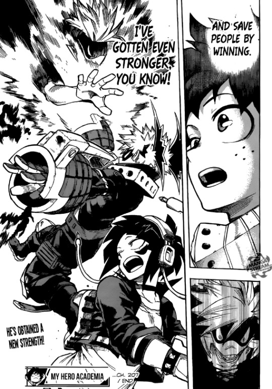
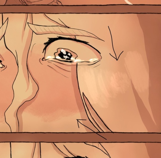
I looked at the few action-y webcomics and mangas I love and i noticed that when it comes to the action itself, what really makes the reader engage with whats happening is actually perspective! I mean of course the main thing is having intense action with lots of dynamic poses and i get that, but I feel like a pose really becomes powerful when you see it from a point of view that enhances the action that is happening! Shounen mangas especially do that and i definetely can feel the impact of their actions because of it. If we take for example Boku No Hero Academia by Horikoshi, even fairly simple actions like the one in this page gain much more depth and impact simply because the angle is slightly tilted and the perspective is from below Jiro’s point of view (girl being saved).
So yeah, perspective was really something I tried for the first time to play with in terms of focusing on the people rather on the buildings! In Among tales I used perspective to show how big the library but in this case it was about enhancing movement and making the reader feel as if they are seeing the action right there as it is happening!
(insert images here)
I feel like i could have pushed the perspective even more but in that case it would have become a bit excessive and since I’m not that great with it I feel like i would have wasted too much time on it. I think i found a good balance... also i really love the panel with axel slicing the throat...i feel like the arm just slightly being foreshortened gives much more strengh to the move!
The other thing that Monty talked about, about the inking and the lines and the details, I just agree. I use a very thin line because it allows me to add many details but in this comic the point is not details but AAACCCTION so i’m going to go for a much ticker and rougher inking style!
I’d like to say that i want to imitate the manga style a bit...but that’s not style y’know? I never tried go for a rougher inking style but I know for certain that I want to not focus on details i can’t complete this comic on my Cintiq. When I work on my cintiq, I simply can’t help but focus on the details, and since I work on Pain Tool Sai, the lines and brushes are just smoother. If i were to ink this comic on my cintiq, I would end up with simply...thicker black lines sadly. My other classmates who often work digitally like me have decided to work on this comic tradionally to have that traditional 2000AD look...and i’d lie if i said i didn’t think about it too but i sadly fear that would be a bit too much of a long shot...I’d have to learn about traditional inking and learn to draw on A3 papers....which is jjust too much. I already decided that for this project what i was gonna really focus on is the sci-fi feel, the actions and the emotions (cause that’s just a must for my comics...i don’t enhance their emotions there’ just 0 for me)...so i think that i will let my traditional skills shine another time.
No for this project, I decided i will make the entire comic on my ipad using Procreate, which i think is a nice compromise between traditional and full digital. It may not sound like that ot someone who is full traditional, but Procreate is actually not that fancy of a digital program, and was mostly designed for people who work traditionally and want to have fun with some digital art. The app and the brushes it offers are much more “life-like”, and since the ipad is acting as paper, it just feels a lot more like i’m just drawing on paper. My hand too is more relaxed, and the pen even has a tilt sensibility....so yeah...i think this is a fair compromise!
0 notes
Text
Finally
So aside the fact that i lost two big blogs draft and rage quitted making blogs all together for a very long time, I think the readon i haven’t done that many journals is because I spent most of the time researching.
Just a whole lot of researching.
I need to research a lot of reference pictures and ideas in order to have a clear idea in mind for what i want to do so I am honest when I say that I spent the entirety of february just researching and thinking about ideas.
Now that I am done I can finally start gushing it all out in these journals and normally lay down my process.
For 2000AD
After reading the script I was really happy because I actually liked the story, it reminded me a lot of a manga kind of plot so it was easy to imagine in my head how to divide the panels and pace the story. The only problem i had was that we were limited to only four pages, and the script had divided the actions per panel in a way that each panel had at least 3 actions happening at the same time. Before getting into that however let’s talk about the story itself, the characters and the setting.
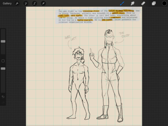
So we don’t actually get that much detailed nformation about how anything looks like. After reading through the script a third third, i highlighted all the things I had freedom to design. Here’s the finished result:
As you can see, we basically have the freedom to design everything. What we know for sure is that Axel Lott is young, handsome and athletic while The Tooth is tall, lean and everything about him is sharp. We also know the ray gun is hefty. There. Those are about almost all the adjectives we are given. Funnily enough, there’s not even one part in the script that mentions that this happens in the future, we only assume so cause the story comes from future shocks. Anyway I’m rambling now: point is that i realized i had the freedom to decide the feel of the entire story through the setting and theme of the comic. Whcih is also probably why i took such a long time researching and coming up with designs and ideas. Since we were given almost no guideliens on how anything looked like, the kind of feeling the reader is supposed to get from the art is completely up to me. I can easily turn this into either a dark and gory story or fluffy and warm story. It’s all about how i want to design this.
At the beginning I wanted the story to have a very elegant feel: i wanted everything to be slightly art nouveu themed. The clothes, the guns, the buildings...i wanted to make everything look graceful..almost like a couture show? I wanted to use as inspiration Alphonse Mucha and have lots of flowery designs and roccoco decorations. But when it got down to designing it ...my hand was not having it, and neither was my inspiration. It just felt forced, i just could not come up with anything that felt right...that felt like the idea in my head, which is why I don’t even have any concept art doodles. I realized that while my idea was cool and that it intrigued me, it’s not what my subconscious had for this story. So I went back to the beginning.
What did i like about the story? What did it remidn me of? Easy: cheesy action and mangas. So i decided to start from there: how would i go about drawing cheesy actions and manga? what would I highlight? What feel would i give it? Well first of all, it would happen in what i define my personal dream world, so that would mean that it would be a urban fantasy setting. Secondly, i focus on expressions and characther development, so that means I would highlight on how the main characthers clash against each other, how their personalities are expressed through their faces and actions and bodies. Thirdly, designs would be based now on how cool they look, but on how realistic it would be: would the characther actually wear this? would a hybrid actually look like this? would a building like this work for an organization like this? I would focus on not making things look pretty or thematically interesting, but as “ah...i could see this actually happening..i could believe this” i can get it to look like. When I got my thoughts together, and tried to finally get my hand again at some concept art, I finally started drawing with inspiration! I guess i’ll leave mucha and art nouveau for another time. Here’s some concept art for the main characthers, the hybrids, and the gun!


You’ll notice that I have widely ignored the part where the script says that the hybrids look vicious. Well I mean, rather than ignored I’d say that I simply deduced that they looked vicious because they were ANGRY that they were being collared and mistreated by strangers and that their creators had been killed. In all honesty, I can’t help but think: if i wanted to sell some hybrids to some war loving companies, i would not sell some random hybrids that simply look like some beefed up steroid dudes with animal heads glued on top that can punch things slightly harder than normal beefed up steroid dudes. I mean the script says that “WISDOM had targeted six munitions giants, stealing prototype weapons...the latest was lance biowep, maker of hybrid bio-weapons”. Nowhere in these sentences does it says that these weapons have to be the “kill and destroy” type. The script says that the hybrids are a shark, a lion and a rhino, and im sorry but these animals don’t destroy just whatever they see in their path, that’s somethin machines do. These animals are simply somewhat strong! If you wanted to make actually strong “kill and destroy” hybrids, you’d use animals that have physical capabilities that surpass nature, like I dunno mantis shrimps (the lil dudes can punch at over 50 miles per hour and hard enough to shatter aquarium glass...see now if that was made into a hybrid...i could see that messing stuff up). But if we go for animals the ones in the script, no no no, them being bulky would make 0 sense. So that’s why i went for those designs: the lion is agile, intimidating and has a dominative personality, perfect for interrogations that will make anyone spit it out immediately, the shark is a female (since in the ocean the females are always stronger) from the mako species meaning that in the ocean it is unrivaled in terms of speed and matches in terms of aggressiveness even the great white sharks...great for bringing down entire submarines with just a small fleet of them. Now the rhino. I can’t remotely understand why out of all the animals in the world you’d choose a rhino to use for hybrid experiements outside of the fact that it has a cool horn. So I designed him to actually be a failure. As in, since these are all prototypes, I thought “hey we tried to make a rhino hybrid and hes really good at heavy lifting stuff but to be honest we don’t know what else he’d do...he’s also a coward and whatever frightens him will be charged at with the huge horn he has....yeah...” ... See? it don’t sound smart. Plus rhinos and humans have nothing NOTHING in common except the fact we both don’t have hair. What I drew is what i think is the only possible way for a hybrid prototype between a rhino and a man to look like. End of the story. Don’t mix humans and rhinos.
About the main characthers! It was quite easy for me to create them since from the beginning i had quite a clear idea of how i wanted them to look like. There’ no denying that they are heavily inspired from manga, especially the Tooth, whose final designs came to mind after watching a character called Ban from a manga\anime called “The Seven Deadly Sins”. Looking back, I can also see i subconsciously thought about Midoriya from Boku No Hero Academia when desinging Axel Lott...with the whole young look hair and the freckles. However it’s only because of that! Axel comes from axelotls...so it comes natural for me to think that he should also have hair that would reach the sides of his face, and have freckles just like them. Also axelotls are super tiny, so axel also gets to be a tiny dude, which also makes a nice contrast against the Tooth. I really wanted T. to look slighly feminine, maybe it’s because i subconsciously connect sharpness with elegance and femeninity. I had some troubles with his hair but I really like his final design.
Their clothes.... ....ok I was really looking forward to designing their clothes but gods help me it took me a week to finalize them. And by them I mean T.’s clothes, cause axel’s clothes were quite simple...i mean the boy is naked half the time and the other he has a suit so it was not that hard. The uniforms of the WISDOM workers also came pretty easily, since it was simply the first scrapped design of T.’s clothes. It was too basic for the absolute eccentric sharp diva T is and thought hey that would make a good uniform for his goons. But yeah...T’s design was.....a horrible performance on my part. In my mind I was so sure about how i wanted him to look like but i guess my mind and inspiration and hand were not collaborating. The script described it as a tight-fitting black jumpsuit .... and interestingly enough, at first i wanted him to wear heels and wear a jumpsuit for women...like a gala jumpsuit...but it never really looked right. When i thought about it, the script never talked about him not wearing anything else so I wanted to put something over him like a jacket ..i mean you can’t tell him a man like him doesn’t have an eccentric but practical outfit...i just don’t believe it. I went through a lot of designs as you can see. In the end, thanks to the character Ban, I finally ended up with a design that i liked. The long gloves with have reinforced knockled to make he will punch those teeth out!
The buildings! I really wanted the buildings to not be typical, but since futuristic architecture is not my fortè I spend a good amount of hours cooped up in the library looking for books in avant garde architecture to help me out. I was beyong ecstatic to find these two books! Look at all these fantastic images! It was pretty easy coming up with a final design, since all i had in mind was to find a building that simply “did not look from this time”. With the help of these two books, the lance biowep building, the secret hideout, the corridors, and the bunker ended not being a huge problem in terms of desinging.
the gun! I had a vague idea about what i wanted but not something concrete in mind. Once again i spent a good amount of hours in the library looking for books for inspirations. You know at first, for a very short period of time, I actually attempted at looking for inspiration in the actual sci-fi comic book section, but i immediately got bored and went away. See if i actually made a comic ouf of this script, I really would not want my comics to look anything like the traditional sci-fi works (especially like the ones that future shocks has published) because there are few things that go against my aesthetics and definitions of pretty as much as those drawings. So yeah...in every aspect of the designing process I really focused on findind inspiration from sources that had nothing to do per se with sci-fi...which i’m glad i did. i also did some concept art for the null-beam by myself at the top of my head without thinking too much about it, but none of the guns really clicked for me, so i got this book to help me find some better mechanical inspirations, which definetely helped. In regards to the beam itself, I knew for sure i wanted it to look white and almost like white fire, but just for the funs I decided to experiment with different types of beams and their effects on targets, to see if i could mix them up and come up with more interesting ideas! It payed out in the end!!
Thumbnails
Whoooo boy so there....that’s all the stuff i worked on during the first part of the semester. With the designs out of the way, i started working on the thumbnails and by the gods above was it an excruciating experience. I agonized over the fact that the the script had shoved in every panel so many actions...i felt like it had basically ruined the weight of every action by meshing them up together. My options were either to make more panels and divide the actions among them, or put less emphasis on the drawings and so manage to shove everything within one panel. Now while it may seem strange to hear (Read?) this from someone who spent the entire previous blog entry complaining about how many panels there were for page and how in my comics i’d almost never go over 5 panels per page, I much rather prefer to have 8 panels but where each action ha it own emphasis raher than bleak drawings....thats just simply not what my art is about. So yes, the first thing people will notice is that every page has either one or two additional panels. Honetly i really feel like this script really did not make use of the comic as a story telling medium and just used it as a “here’s some pictures to imagine the story better”...my thumbnails really focus on fixing that, which is why you’ll also see that i have cut up some of the dialogue boxes or bubbles among the panels to add more emphasis or better pacing. If i had to be honest, having so many panels in my pages scares me: more panels within the same page means that each panel will have to make space for the other, making them overalll...much smaller than what i am used to. I don’t like having small panels...which i think stems from the fact that I see comics a lot like a story board for animation, which is a mistake. So altought it scares me a bit, I am gonna accept this challenge and see how i work with smaller panels. On another note, people might also notice that the perspective in each panel keeps on changing. When monty came to talk to us, he advised me to make ure that my drawings will look dynamic, since in this comic words don’t do much. When i thought about what makes comics dynamic, I feel a constant change in perspective and direction goes a long way.
0 notes
Text
After reading the script...
I...
I LIKE IT?????? I...God knows i was expecting something horrible but i actively like this script...i mean it’s cheesy as hell and definetely reminds me of old comics but..but its not that bad. It reminds me a lot of a manga.
However i do have a problem with it.
THERE’S A THOUSAND THINGS HAPPENING AND WE ONLY GET 4 PAGES??
Here’s a breakdown
Page 1:
Box 1 -> Axel and the tooth are fighting -> axel loses one tooth) -> flies out the window -> Hybrid animals are getting carried off by henchman
Box 2 -> Axel flies through the window and into a forecourt
Box 3 -> axel slams against a sculpture that has a dead biody impaled on it
Box 4 -> T. Lifts Axel by his lapels while two men are trying to containa rhino dude -> the two dudes exchange dialogue
Box 5 -> T. Punches Axel -> he hits of the crew that was containing the rhino -> T. Talks more
Box 6 -> Rhino dude impales Axel through his back -> T. Draws out his gun -> Axel screams and T. Talks even more
Page 2:
Box 1 -> T fires his gun -> axel starts dissolving while T talks more
Box 2 -> T picks up the tooth that fell out while talking
Box 3 -> axels tooth sits in a sphere
Box 4 -> his face starts to regrow
Box 5 -> sphere shatters with his body regrowing
Box 6 -> body full and naked -> axel goes mhm while holding a shard of glass
Page 3:
Box 1 -> he looks out of the trophy room and sees a henchman walking down
Box 2 -> axel kills the henchman
Box 3 -> axel enters the warehouse
Box 4-> axel stands by some nullbeams
Box 5 -> axel stands in the middle of the hangar -> t and his crew stand beside him -> t tells him to put the gun down
Box 6 -> axel turns around and t talks -> axel responds
Page 4:
Box 1 -> t shoots axel again -> axel starts dissolving again -> t talks more
Box 2 -> axel continues to dissolve but starts talking to t
Box 3 -> axel smiles almost completely dissolved and talks
Box 4 -> t and his crew turn around to see a whole lot of naked axels scremaing
Box 5 -> everything gets dissolved.
(
(Rest of the blog was lost due to internet issues...I’ll get back to this eventually but I’m rage quitting it for now.)
0 notes
Text
New semester, new projects ᕦ(ò_óˇ)ᕤ
I am really happy with how last semester’s project came out, i definetely hope that i can put into practice all the things that i learned from the mistakes i made throughout the process ahah.
This time around we will have two main projects: one will be in collaboration with 2000AD (they give us a script and we create the comic off the script) and the other one in collaboration with the V&A Dundee museum (still a mysteryyy).
Since we still won’t know anything about the V&A project until next tuesday, i will start by rambling about the first project: Future Shocks- An inconvenient Tooth!!
We basically have to turn the script that we have been given into a full black and white comic. I haven’t read the script yet cause i want to write my first post with still a white slate but obviously i’ve already heard some things from both the professor and my classmates and some things i can just guess. It’s obviously a sci-fi...which is really scary since its incredibly out of my comfort zone...i mean ive ever only worked in the slice of life urban/modern fantasy genre so the fact that this script (which is also the first script ive ever received,.. never made comics for other people) is sci-fi is definetely intimidating. I’ve heard from some classmates the script is not that good and typical old-generation comic readers....which i managed to guess cause i read the frist sentence and it started with “two men are fighting” and i swear i just went “wow 2000AD really making your originality shine there”. I have the feeling its gonna be very fighting/very “im manlier” based and not much ..characther based. I’ve seen people complain a lot about it so i am lowkey scared on just how badly scriptd and how badly the story is in general.
However after talking a bit more with the professor i understood that we have been given just the directions and curves of a road we must build ourselves: we were given a story but how we tell the story is up to us, and i guess sometimes the way you tell a story makes all the difference. I mean you might have an amazing story but if you tell it badly it still won’t have the same impact. Also after talking with the professor even more he told me that in the end when it comes to comics you need to be able to separate the two to some extent. A comic is a combination of text and images, but both of them need to be able to stand on their own. Of course there are exceptions to this but mostly these components need to be good by themselves, and then when combined create an incredibl experience!
So this...you know this helps. In my mind, im gonna imagine that 2000AD came to me saying “hey we wanna try something new, you have a very different style from what we usually do and we wanna see what you can do with this story, show us something new!” And i mean in the end sci-fi is just science fantasy and heckity heck i am a world-building obsessive fanatic, i am sure i can give this story a good delivery. I wanna tell this story like only i can so....yeah ..going in slightly scared but mostly hopeful (*´꒳`*)!
0 notes
Text
About: Me
Well, i feel like i talked about everything i wanted to share about my process and obstacles and such and such. So there’s only thing left to talk about, which is my after-it-is-all-done reflection.
When i finished the last page, and put together the pdf file, i felt ...well i dont know how to really describe it. It’s my favorite part of the entire comic process: looking at the finished piece. Every time i finish a drawing or comic page i look at it say “yasss, this looks better than anything i’ve done before! i’ve improved! Level up baby yeah!”. But this time... i felt something on a completely different level. I felt like i wasn’t even the same artist! The amount of thing i learned and gained this time around is just...overwhelming almost. There were so many things that i picked up as i went along with the pages that I just...simply feel like have evolved rather than improved.
You know this reminds of the time I tried to enter a comics class in a art academy during my summer break . I had an interview with the comic art professor, who looked at my drawings and said “I feel like you’re more of an illustrator rather than a comic artist”, and then i showed my works to the illustrations professor who said to me “i feel like you’re more of a comic artist rather than an illustrator”..to which i said “make up your minds goddamn minds”.. but the point is that i was in a limbo. Am I an illustrator or a comic artist? I thought that through this module I would finally abandon the illustrator area and frolic in the fields of comic art only. But that’s not what happened exactly. I didn’t change the way my art looks. It’s still full of an insane amount of details, intense atmosphere through light and shadows and (at times) challenging compositions. But i feel like this time, the comic art professor wouldn’t think my art is not comics! I took what made my art part of the illustration department and brought it with me to the comic field. I molded it so that it wouldn’t feel like the two things were fighting but rather collaborating to make a good comic reading experience!
I guess in a sense, i learned to respect the other elements of comics. Lettering, panel layout, page limits and positioning, DEADLINES, story telling.... there is just so much more i used to convey my themes. And i feel like that really made my comics evolve from being “illustrations that look like comics” to “comics with full illustrations”.
Basically, i think I really just learned that the art alone does not make the comic.
Next semester I’m planning on pushing the boundaries even more. There are so many things that I still haven’t explored, that I haven’t taken advantage of. By the end of this master I want to catch a glimpse of the kind of artist I can be
I think this was my first step.

1 note
·
View note
Text
About: The Story itself!
I realized I never really talked about the story in general! I mean i posted the breakdown of the story some time ago but since then it went under some modifications so mhm..yeah ..brace for a long post.
When I first realized I was going to make a comci for this module, the story of me meeting Šahrazād immediately came to mind and i didn’t even question myself: I knew from the start that i wanted to use it. The idea had been floating about in my head for years now, especially after I had written two whole essays on Šahrazād and her importance from both a feminist and philosophical perspective. I always liked to believe that Šahrazād was part beduin, and during her childhood had met many mythological creatures and heroes that would tell her all the tales that she would then retell in the thousand and one nights. I always wanted to explore the concept in a comic, and sometimes i fantasized about making an entire anthology of re-invented versions of the stories of the thousand and one nights, with me meeting Šahrazād as the beginning of the anthology. Now i don’t think I’ll ever make that anthology, but I definitely thought its introduction idea was perfect for the comic assignment.
Soon after, during class we met Monty Nero, who gave us some advices on how to properly write a plot that is engaging to the reader. One of his advices was that the plot should be so that it can be summarized in two phrases or less. Doing that not only helps you see whether your story is complicated or not, but also whether the summary sounds inviting!
A summary of my story would have looked like this:
“A young comic artist and her friend look for and find Šahrazād, the most famous story teller in the world, to ask about the origins of her incredible stories”
When i read this summary, i felt something strange...i felt like something was missing....
This was all that my comic was about, that was it. I mean if this was the beginning of that anthology it would work perfectly! But this is only a comic of 12 pages...so if the reader were to open the comic and read it they would be left with “...what...thats it?”. It felt like a waste to use this module’s comic assignment on a comic only meant to be an introduction.... and honestly, a comic like this wouldnt have any impact on the reader. The reader maybe would think “Oh thats cool”, but then just put down the comic and move on...and i dont like that. I wanted to also send over a message! One of the main reasons why I love Šahrazād and the thousand and one nights so much is because they celebrate the importance of telling stories to each other. I think that’s such an undervalued part of the human experience and wanted to explore that concept with this idea
But with only 12 page, how can i explore Šahrazād’s past and at the same time send over the message of story telling? The focus of the comic was divided in two and there was no space of them.
I tried to think about this rationally: “I know i want to make a short comic that can stand on its own. I don’t want to make an introduction..so i have to understand how short comics work”.
I love webcomics, so i decided to look at one-shot webcomics. They’re online comics of max 5 to 10 pages, compact and usually require no previous information. They explore concepts or send over messages without needing the responsibility of carrying on the concept. The one that i looked at to “study”, so to say, was “Weeds” by Mollie Rose.
It’s a 11 page comic about how a gardener learns that “weeds are only weeds if you don’t want them”, which is a metaphor for having wrong assumptions about people. The comic conveys the message that you shouldn’t assume bad things about others just because rumors tell you not to trust them. It’s an important lesson, that the artist sends by showing the readers what those wrong assumptions hide. Assuming that weeds should only be removed and thrown away hides that they can used in the kitchen and make the garden look more alive. Assuming that witches are all bad hides that they also have feelings and maybe are just looking for company.
From this i extrapolated that you can convey a message about something by making the readers re-discover that something.
This is where i finally started seeing the light! The importance of story telling as part of the human experience is undervalued because it’s taken for granted. I could make people re-discover the importance of story-telling by showing that the most famous story teller in world literature knew her tales not from books but from others! But how to disclose that message?
Extrapolating again, i understood that to convey a message about something in a short story, you usually need a factor that drives you towards re-discovering that something. In weeds, the bad rumors about witches leads the the gardener to act unkind to the witch, who then curses the gardener (because of hurt feelings), through which then the gardener realizes her mistake.
I have to admit that Monty Nero had mentioned something similar when he came during that one lecture: in order for a story to progress, you need something the main character is fighting against. At the time i had discarded this suggestion because i thought my story was too different for this suggestion to apply. “I’m not fighting anyone in this story, it doesn’t count”...but when i thought about it later i think what he meant was that the plot needs something that drives the character towards that main message! Weeds used the consequences of being unkind to people. So then what could drive me towards re-discovering the importance of story telling? This is where it HIT ME LIKE A FREIGHT TRAIN.
Until now I had never realized that in my story the weakest and most superficial link....was me! I was just a random kid who went up to to Sahrazad and was like “yo where did you learn your tales?”! Technically speaking, i was the second-most important character, both because i ask “the question” and because i am the only link between the world of the readers and the imaginary world of the story. But i had no value to the story itself, i added nothing! This was the hole that i felt back when i made the summary for my plot!
I tried to put myself int he shoes of the reader and asked myself “why is this kid asking Sahrazad this? what’s driving her?”...so then i asked myself.. “why would i ask this to Sahrazad”..... “...wait hold on...i wouldn’t ask such a question...all the books say that she was a learned and cultured woman who had spend all her life reading...i would take that for granted!!.....so then ...what would i ask her?”
Another reason why I really like Sahrazad as a character is because i ....I honestly just respect her as a story teller! Can you imagine being so confident in your stories that you put your life on the line, marry a dude that has been literally killing killing one wife per day, tell him a story each night in such an amazing way that he becomes enchanted and has to hear more?
So if i have to be honest with myself..I think if i were to really meet her the first thing i would ask her is...how can one become good telling stories? How could i achieve something even remotely similar? I mean im technically also trying to become a storyteller...and to be honest i struggle a lot with doubts and insecurities... and..
That’s when it all became clear.
Doubts and self-esteem issues are probably the most common trait among all artists of any kind, so if I were to use this as that famous “something to drive the story forward”, not only do i gain more value as a character instead of being only a “question-asker”...but I also then become a representation of all artists that are going through the same insecurities! In that case, it would be like all readers are asking her that question! That gives the comic an additional aspect and value! Plus, the comic medium is perfect: i can represent artists and their insecurities not only through my speech but through my gestures and expressions! I can let them relate to me, so that the message that Sahrazad sends over is that much more impactful!
it felt good to put all the pieces together, and now a summary of my story would look like this:
“A young comic artist battling with insecurities seeks out Sahrazad of the thousand and one nights, to ask her what she needs in order to become a good story teller”
Now i don’t feel that gap anymore. I can see that a reader can pick up this comic, read it, and gain something from it.
0 notes
Text
About: Sharazad Design
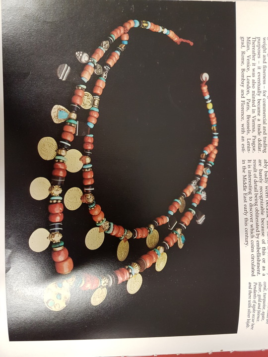
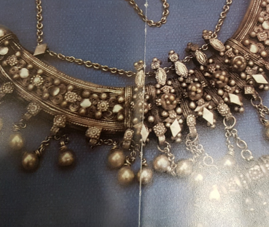
The main focus! Now her design was the most important one in the story! And also the hardest...I had to make sure that her design would absolutely enchant the reader, making her both part and not part of this world! As i mentioned before in some posts, in my head, she is part beduin, so her jewellery is beduin, while her clothes are mostly persian! I used many refrence pictures from “The art of bedouin jewellery - A saudi arabian profile” by Heather Colyer Ross to really insire me with the shapes of her jewellery.
Rings and earrings:


Necklaces with coins, charm cases, triangular pendants:
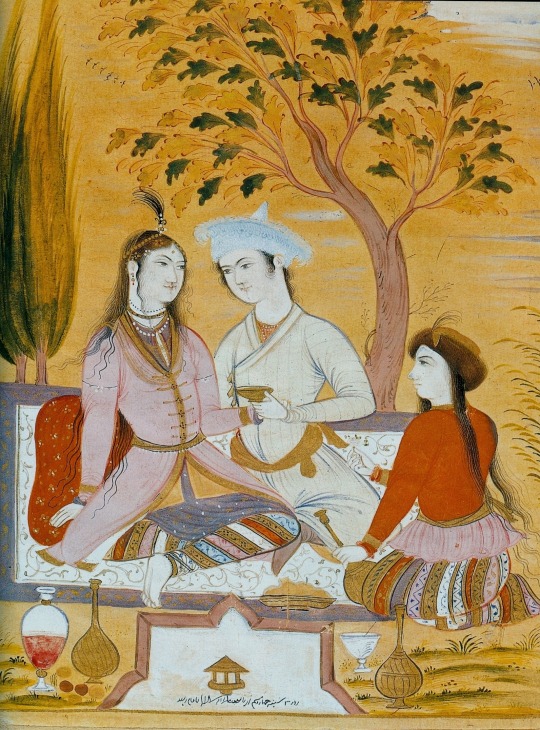
The inspirations for her clothes, instead come from the MANY persian miniatures i collected from various online museum archives. I wanted to make sure that her clothes would not simply make people say “oh hey she’s wearing arabic clothes”...like i didn’t want readers so simply associate her clothes with “the east” as if they were looking at Jasmine from Disney or something...So i really put effort in trying to make her clothes look ...real? Adding details people do not recognize so that instead of connecting it to their image of the east, they learn about the east...does that make sense? I hope so.


I hope that Sharazad ‘s final design shows her culture, instead of a westernized idea of that culture.

0 notes
Text
About: Everybody’s Design
I wanted to show here the designs of everybody that appears and some thoughts on all of them! I mean a good 40% of the feel of the comic depends on the details of the drawings, which is why i spent a lot of time making sure the designs were all consistent and portrayed that same feeling of “this looks like another world but i can’t quite put my feeling on it”. Since we’re dealing with the thousand and one nights (which are persian with a mixture of other cultures), I used as inspirations ancient persian miniatures for the clothes and the designs of some of the creatures, so I’ll show that too! Here we goooo
First let’s talk about the characters whose full design was set from the beginning and didn’t need any inspiration for since they are mine.
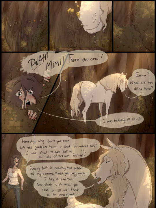
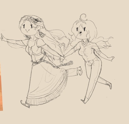
Moi: I was probably the easiest, since I just draw myself 98% of the time. The design tinkering was mostly on the clothes with didn’t change almost at all from the beginning to the end. The only thing that i changed was that the shirt is now tucked in instead of flapping around. I felt that between the hair and the scarf there was already enough flapping ahah! However, i wanted to wear normal enough clothes so that readers could identify so that’s why my design sticks out a little bit from the rest.
Mimi: Mimi, apart from being the one that gives the comic more personality, is also i think the middle point between my design (normal world) and the imaginary world. His design is also very basic, so that people can easily recognize him as a horse. The only tinkering was for his hair, which i used as a little side detail to entertain the readers (beginning of the story neatly in a hair style, end of the story all messy and everywhere)
Cuup and Kole: Since they were plot devices to bring the story forward, their design had to remain simple, so to attract just enough attention to intrigue the readers but not catch them completely! Their designs did not change at all from the beginning.
Annndd now here’s a long list of all the characters that had to be designed:
Sharazad will have a post on her own later.
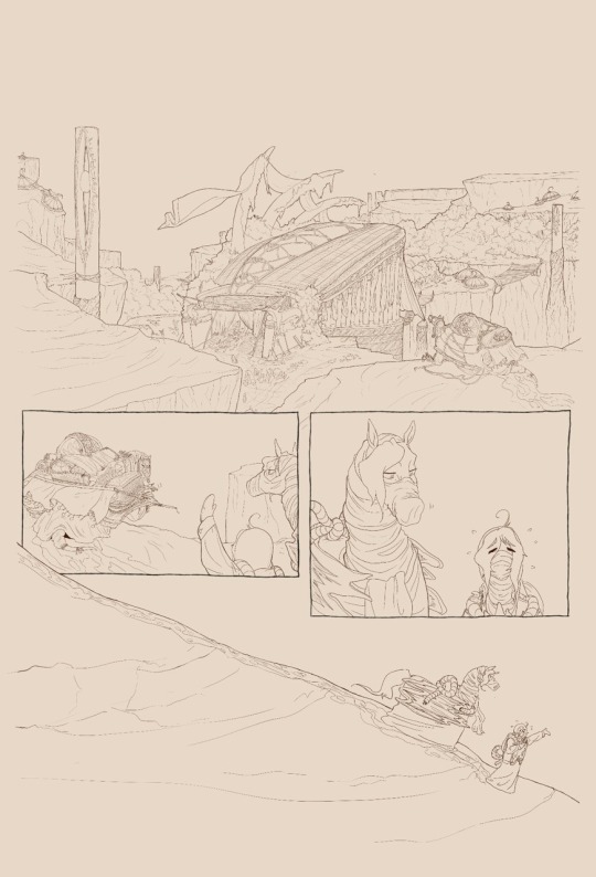
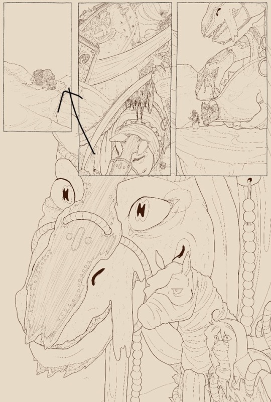
Djinns: The most prominent mythological creature present in the thousand and one nights. Instead of putting many little ones everywhere, i thought it would be more interesting to have only two but bring them closer to the spotlight, so that they would be the easiest ones to recognize! (for those that know persian mythology anyway) Fun facts: The djinn in the library is Div-e Sepid, the White Demon, who’s actually a Div (creature from zoroastrianism)! From the persian epic of Shahnameh, he’s the chieftain of the divs of Mazandaran. He is a huge being, and gets dismembered by Rostam in his last labour (hence the scars).

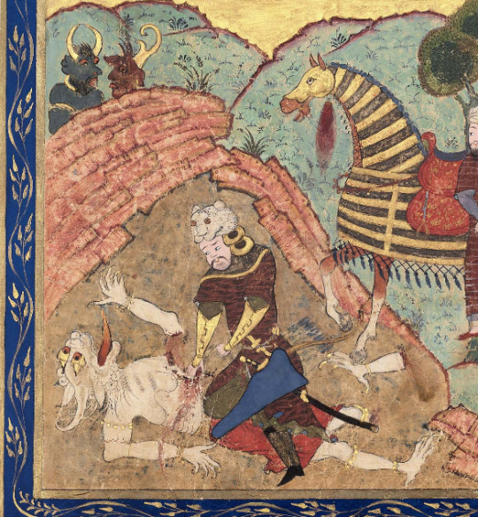
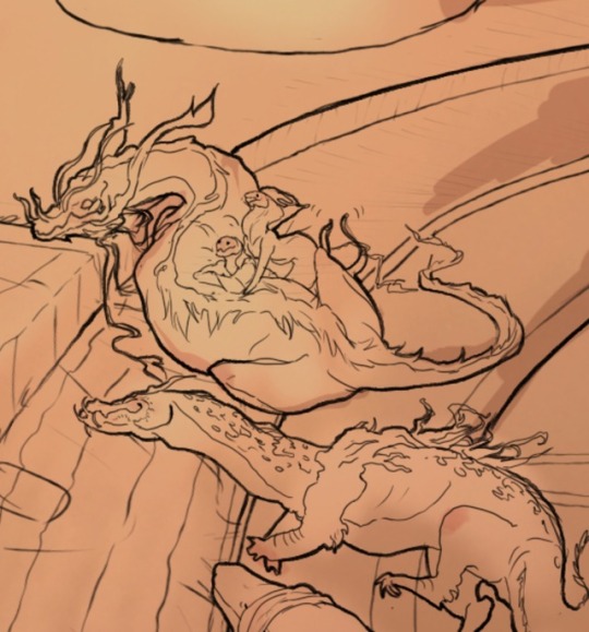
Dragons: Another very prominent mythological creature of persian mythology. Now i’m slightly obsessed with dragons, so the ones in the nights all range between being either very inspired or not inspired at all. The only important thing in their designs that i always kept in mind was that i did not want them to look like typical dragons, not even Cuup and Kole. Fun Facts: The dragon lying down like a cat appears in the third labour of Rostam ( In the epic of Shahnameh), and tries to kill his horse. The dragon that tells stories to little sharazad is a mixture of different designs of the dragon that attacks and gets killed by Isfandyar (Firdausi’s Shahnameh).
The birds: Middle eastern mytholgy likes their big birds, so obviously i included a Simurgh (benevolent, mythical bird in Iranian mythology, appears in te epic of Shahnameh), a Rok (enormous legendary bird of prey from various mythologies, appears in the Thousand and One nights, the Huma (another bird from iranian mythology, said to never touch the ground), and a Konrul (turkish phoenix, slightly re-interpreted). Not much design tinkering happened here...they’re just...big birds....with lots of fluffy feathers.
Serpents: There are two snake-like creatures, the Bashe (appears in the thousand and one nights, swallong elephants and what not) and the Zahhak (an evil figure of persian mythology, which I slightly re-interpreted because there are so many different descriptions of him that i like to believe that he is a single big serpent but if you look into his eyes you will see the form he wants you to see, hence the eye cover). Again, like for the dragons, my main goal was making them look like snakes but ....not letting them be easily recognizable.

Additional: There are also nagas, harpies (who have a baby and you should appreciate cause a baby harpy is adorable), a cyclop, a female water ifrit, qilins... yeah i had fun with this.
1 note
·
View note
Text
About: The feel of the comic
There were two main things I tried to achieve when creating this assignment: send a message through the story, and send a feeling through the art. The message is explained in another post, so here i want to talk about the “feeling”, what i mean by that and why i’m so adamant about it .
Bluntly put, i would say I’m trying to instill in the reader a feeling of “wonder”. Like when you go to a country you’ve never been to before with a language you’ve never heard before. I want the reader to read the comic as if they are entering another world. Why? I just like it to be honest, I’m an artist that loves to draw her fantasy imaginary world, and likes to bring people it, and comics are one of the best mediums to do so. Plus, this story is about the thousand and one nights, which is also full of fantasy and wondrous things. So, really, what better way to celebrate the thousand and one nights and Sharazad, if not by giving the reader this sense of wonder?
To instil this sense of wonder in the reader, i used two main “illusions”, if you will.
First of all, I tried to use a style that gave the low key impression that it was handmade a long time ago. This is because when we see old documents, like for example medieval times, you are unconsciously transported in another era, like that text is a direct window on that different time, and the same goes for the pictures. I believe that when we see something that looks “old” or “worn out” or done without means of technology or modern tools, we immediately look at the text with a different mindset. It’s not something contemporary to you, and therefore your way of judging it doesn’t match it, and so instead of judging it, we simply accept it. I think this visual illusion, is very useful in the fantasy comic genre. The story and drawings portray unrealistic things or creatures that don’t exist, but because they are portrayed in a manner that looks as if it comes from another time, you don’t necessarily feel the need to question what you are seeing, and instead simply think “ah...so that’s how it looked like in the past”.I believe it helps the reader get more immersed in the experience. Of course, making something look somewhat old through digital means is a bit of a paradox, and like i said, it’s only a ow key impression that should work only on the unconscious level of the reader. However there are a few details and aspects that can do the trick, like for example never using rulers to make the panels (hence why they are visibly wobbly), using a natural looking brush and leaving marks here and there, and of course using a sepia monochromatic coloring.

However, simply doing this is not enough to completely immerse the reader, which is why i united it with an incredible amount of details.
When looking at my comic, it’s clear to see that lot of effort was put into in the drawings. The biology of the creatures is anatomically correct, the architecture of the buildings is complicated, the floors has carpets and tiles, every creature is clothed and holding something that is recognizable, there are decorations on the columns, etc. But why? In my opinion, filling the drawings with such an enormous amount of detail gives a sense of realism, without necessarily using a realistic drawing style. By drawing the neck muscles of the dragons, i give a sense of biological accuracy, without having to draw like Stjepan Sejic.

Moreover, when we look at a picture, everything that is left blank or unclear, remains a question that we answer for ourselves, using everyday knowledge. This however makes what they are looking at more familiar, and therefore eliminates that sense of “a world you don’t belong to”.
Let’s use the merchant’s belongings as an example.


If i were to draw the merchant’s belongings in a simpler manner (so maybe like, just a few shapes mostly covered by drags or cloth), the reader would wonder “what’s the merchant carrying?”, and use their idea of “a merchant” to answer that question. "They’re probably carrying food or clothes, vases maybe”. And that would be it. The reader has added their image of a merchant in the drawing. They filled in the gaps with everyday knowledge and went on with the story. But that works against what I’m trying to achieve. Like I said, I’m trying to pull the reader into another world that they don’t know....how can i give that illusion if they are using their reality to fill in the blanks? Instead, by making every object that the merchant is carrying identifiable but not recognizable, the readers can’t fill in the gaps and simply left to wonder “what is that?” and they can’t answer the question because they lack the knowledge of “that world”. “What’s that huge glass sphere with that thing in it? Is that a plant? A creature? What would that be for?”, “What’s that dragon reading? It looks like weird scribbles but they seem structured, is it a language?”
You see what i mean?
So this is why my art looks the way it does: to give readers a feeling of wonder...hopefully anyway
0 notes
Text
About: Coloring vs Atmosphere
I realized that until now I still didn’t mention what i ended up going with in terms of coloring the comic (i should really check how many times ive written “more on that later” and then didn’t actually write more on it later).
In the end, I decided the best course of action would be to go for a monochromatic sepia coloring. I already talked pretty extensively on why i had to consider this option some post blogs ago, but I’d like to add some more thoughts about it. When i first started planning this comic, i was sure i was going to color the entire thing: i wanna make something very nice looking so i gotta color its what im best at! ...but thinking about it I realize that in this master the aim was to learn how to make comics, not how to make something look very nice. I mean of course it’s part of the process, but if there is one thing i learned from this first semester is that a comic is definetely not about only how the images look. It’s a big part of it, but lettering and the story are equally important. I mean in the end, comics are an art form where artists are trying to convey a meaning through image sequences. The way they do that depends entirely on the artist, and its exactly the artist job to decide how to convey the information\themes through their comic. In this case, it’s clear that the portrayal of the themes of my comic are not dependent on the colors...but rather on the dialogues and the lineart.
Moreover, altough i don’t wanna pat myself in the back, it would be a lie to say that i dont already feel somewhat confident in my coloring skills. I put a lot of thoughts in the color schemes and always manage to express through them the right feelings. But this module was about learning how to make comics, so if i already know how to color and convey meaning through them, it feels like im wasting opportunity and time to focus more on other things that i havent maybe explored before in the comic medium.
Also, looking at it now, I feel like maybe it looks better this way. The sepia monochrome fits really well with the overall style and feel of the comic, I will talk about this in the next journal i swear.
but yeah...in the end this really was the best course of action...im quite happy about it!
0 notes
Text
About: Hand lettering vs Typed Lettering
Until now, I had always found lettering and speech balloons a very big challenge. Not only does my handwriting look like a baroque version of chicken scratch, but writing on my drawing tablet was really hard. However I would never want to just paste text on my comics and use fonts because i felt like it never really matched the feeling of my comics. So I just kinda...did my best at it. In my latest years I started to experiment more with my speech baloons, making them slightly transparent since that could let readers see some of the details behind, play with the tails or with the shape of the ballons to make them match more the dialogue and so forth. Still there was still something inherenty wrong with them but I couldn’t really put my hand on what?
In one of our in-class tutorials, our professors showed us how to insert text in comics using Illustrator. I was tempted... but no fonts really matched the feeling of my comic. Then our professor showed us a way to make our own fonts and I thought “whoa the perfect solution to my problem: no hand lettering which takes time and continuous effort to make it look legible but still maintain the feeling of the comic”. I really liked the idea and how my font had come out, but when actually using it in speech bubbles, I noticed that creating your own font is ..quite hard and complicated. Not the process itself mind you, but the problem was that the letters were a bit too wonky when put next to each other. I’m sure that given much more I would have figured it out and made it look good....but the reality is that I think i still liked my hand written version better. For this comic anyhow! But then I had to face the same problems I had at the beginning.
When Monty Nero came to see our works for the second time, I showed him an example of my lettering from my previous comics and told me that they looked good and could work in my comic, but there were some inherent problems that had to be fixed to make it look professional:
First, the font size had to stop fluctuating. Which makes sense, and although i remember trying to make it all look the same, I guess it was still visible to the naked eye. I think the size difference came from the fact that I would write the dialogue directly into each bubble (which i draw before hand) and unconsciously would try to adjust the size per each singular bubble. I found a fix to that problem however! I thought that it would be much easier then to write all the text together and then just split it up among the speech bubbles! and gosh well it worked like a charm! Not only did the font size vary, but the spaces between each word and the sizes of each singular letter didn’t change either. So yes tht was definetely something that i fixed!
Secondly, Monty pointed out that there was too much space between my lines, which he attributed to the fact that my l,g,y,t and j were too...excessive? Which is true I tend to make the tails very long. Because of that the space between the lines was too much and looked unprofessional. Now that I had never taken into consideration nor ever noticed. After fixing my letters’ tails and measuring the space between the lines, I saw that it looked much stylish and easy to read.
Thirdly, the font was too big. Which fair enough...can’t believe how much that made my comic look less unprofessional. That was easy to solve.
Lastly, and I think this was the one I less expected and didn’t notice, is that Monty pointed out that there was too little space between the speech bubbles and the text! At first I felt like disagreeing. I mean he was right, but I didn’t want my speech bubbles to be much bigger than the text because i felt like it would make it look...a bit too formal? I felt like it would make the text look too much like...text and not enough like just spoken words. However I have to admit that when i tried it out, it did look better. The space between text and speech bubble fluctuates a bit but I personally like that!

Honestly I feel pretty proud of it came out! Probably the best lettering I’ve ever done.
0 notes
Text
About: Challenging myself with panel layout
So here’s a thing instead that i am really happy about (wow didn’t realize i’ve only been whining about myself until now): I really pushed myself to explore layouts.
When looking at my old comics i realized that the panels were neat boxes that were always attached to each other, leaving no space in-between, and the drawings would only be within them.
I then looked at my favorite comics and realized that....they’re the complete opposite. Panels are very dynamic, there’s much space between them and drawings would play within\outside\above\below\through them.


In the pictures there are examples from 2 webcomics that I really love: Daughter Of The Lilies by Meg Syv and Tigress Queen by Allison Shaw. In all the pages the drawings and the panels are dynamic and work in harmony with each other...while when looking at my comics it feels...much more static...and I mean of course I like it but i feel like it works slightly better when read online while scrolling than when looking at an A4 page.
Hence why in this comic I really pushed myself! And I think that I have achieved satisfying results!


To be completely honest I did not really follow any examples. In reLity when i first did my thumbnails they actually looked more like my old comics. But i figured all that i just talked about while drawing the first page, and just...kinda went with the flow! I think that when it comes to A4 pages these kind of layouts work really well and make up for the lost dynamism that you get in webcomics through the continous scrolling. I also realized that some of my pages actually are quite similar with some of the examples that ive shown altough it wasnt necessarily my intention. Its good to know that spending hours reading your favorite comics does in fact let you absorb some of their qualities~
0 notes
Text
About: Moving on
So I already talked about how both my sloppy time management and perfectionism were in the way of my comic process in the previous journal, however I’d like to talk about another problem (that came out of the previous two) that is also one of the hardest for me to deal with: moving on and then coming back later.
I’ve been watching this very nice documentary called “Urasawa Naoki no Manben”. It’s directed by a very famous japanese mangaka, where they go to various mangaka’s offices and film them as they work on their mangas. It’s really inspiring to see masters at work, but I couldn’t help but notice that no matter how many years they had behind them, many of them still struggled with deadlines and perfectionism...and often they are working like crazy and worrying about small things just as the deadline was mere hours away.
I mean of course it made me feel better cause it means that it’s not a defect i have but simply a thing that all artists have and have to balance with deadlines. The thing however that all the mangakas did and i didn’t was that they would move on. They would see they were stuck on a detail so they were like “alright im gonna come back on this later” and just work on the rest of the pages. When i made that realization I just..kinda felt....stupid i guess? You would see them struggle with maybe eye placement or expressions or clothes for like an hour, decide to leave it at their best attempt, move forward, and if they had time go back to it. Or maybe even just leave it blank and come back to it much later.
It seems so obvious and simple but I...never did that. For some reason I was obsessed with the idea that I had to work on everything in sequence. I can’t move on to the next panel if I haven’t finished the previous one. I can’t color this page if the previous one is not already completed. And the worst part is that sometimes I would waste time just aimlessly trying to distract myself from the problem when I could have just worked on the rest of the comic while taking a pause from the hard bit.
A similar problem is that I somehow at one point decided that I have to complete each page singularly. I mean i do all the thumbnails together and all....but then the scketch the lineart and the coloring all happen together. Then I move on to the next page and I gotta start all over again. Sketch lineart coloring. Sketch lineart coloring. At first I never really noticed how much this annoyed me because time would pass between each page and so I didn’t mind...but now that i’m working on pages one after another I see that..um....it does not...work nicely. I feel like i always have to reset my hand to “sketch” after i just spent 3 hours on coloring. And of course it doesn’t reset just like that cause hands aren’t machiens so then my sketches look really wonky and abstract because my hand and my mindset are set on creating an atmosphere and my hand is moving too fast for the sketch to make sense. Or when I move from inking to coloring, my hand is still fixated on being very slow to not mess up the lines so my coloring not only takes twice the time, but I’m too fixated on details and add too much.
Not only does this slow me down, but it creates inconsistencies between my pages.
So yeah...there’s a note for next time
1 note
·
View note
Text
About: Things that I used to do which...simply didn’t work
So I never really done something like this before. Until I joined this master art and comcis have always been a hobby, a hobby that was not timed. It was soemthing i would do in my free time and simply have fun with. Now that I am in this master I realized that many parts of what I thought was my comic-making process were: time consuming, overly complicated, do not work when printed or do not work when there’s a time limit. I had to change many things on how I do things in order to meet the deadline (which hopefully i managed...)
Inking: I have a very thin lineart. I like it because it allows me to detail my works more, since white space has always been an eyesore for me. When I started inking, I realized my lines were very thin because of how big the canvas was. At first I liked it because i thought well good more space for details...but in the end i realized that that doen’t really work when you have a deadline. Moreover, because i work digitally, I would continusly zoom in to work on my details and before i owuld realize it an hour and a half woul pass and I had spent it all on detailing the drapes on the back of the merchant that appear once in the entire comic. Obviously this could not work. The worst part of it all was when i printed my first inked page, which made it awfully clear that an overly thin lineart would not work at all: the lines were barely visible.

Details: I love details. I love to add as many little details as possible to every single part of my drawing. It adds characther, and when viweing my works digitally, people can zoom in and find always soemthing new that they hadn’t noticed before. This however doesn’t work when printing. Like I said above, I would get so caught up detailing because of the big canvas size and my thin lines that I would add so many details that when it would come out in printing it would all look clustered and you couldn’ really actually...see the details...which is ironic.
Long format: Until now my comics would be webcomic format, so that means that my comics were always as long as i needed them to be. You need to add more dialogue which you hadn’t planned in the thumbnails’? Just make the canvas longer and add one more panel in one of the pages! easy! But here, since I had to print, I couldn’t make my pages longer. I had a set size which I had to use and couldn’t make larger nor smaller. And since I couldn’t add simply more pages because of the deadline, I struggled a lot with trying to fit everythign in the limited space.
Colors: Coloring is one of my strongest suits. I’m good at giving nice contrasts and tones through my colors so to give a richer experience to my readers. Usually it works really well also with my details because there’s so much to color that the end product is very intense and rich (sometimes too much probably but usually it looks good). However I realized that I had to choose between colors and details. I can’t do both. Not when I don’t have as much time as i need. Plus, I’m really neatpicky about how i choose my colors...at times it takes me days to figure out the color palettes.
Taking my time: Don’t really have to explain here...clearly you need a schedule in order to make it to the deadlines. I think this is really about discipline... sometimes you rage quit while drawing when what you’re making doens’t look right. And at times it’s fien to do that, but I realized that you can’t do that everytime...soemtiems you gotta push through cause otherwise your page will just stagnate.
Working at night: I almost always used to work at night, because it was the time where nobody needed anaything from me, so i could wholeheartedly focus on drawing. But apart from the fact that now that i am in a master that gives access to a full studio where i can go work with my classmates, working at night makes you do a lot of mistakes. You get sloppy. Before, I would simply fix those mistakes the next day, but here I can’t afford to do that. Every minute counts...and i need sleep.
Perfectionism: my worst problem which i thought was a strong suit. Im really hard and specific about how i want my end product to look like. I have an image in my mind and i want what im making to match that image. When im working on a page i make sure i like everything. Which is great usually. But again....once again....when a deadline is involved perfectionism is not something you can afford. Of course you can’t be sloppy but you aiming for perfection ends up only delaying your work. I had to realize constalty whether i was making sure i was doing a good job or whether i was simply being stubborn. Also had to realize and understand that readers to not look at my pages the way i do...not every single thing has to be perfect.
0 notes
Text
Journal #2: What’s been happening two
Alrighty once again, so we are now in the last three weeks of the semester and Im in the final process of the comic. There’s nothing else I really have to plan so I should be able to make long long journals about everything that has happened in these last months and ...just narrate this lovely and excruciating experience that has been planning and making this comic. I’ll divide the journals based on what I’m talking about so that the topics are not all over the place!
0 notes
Text
Journal#1: What’s been happening until now and what’s hopefully gonna happen later
Alright so, I realize there’s been radio silence until now, I’m still getting used to uploading weekly updates on how my process has been going and need to realize that everything i do revolving this project is actually part of the process and not just ...well..drawings. I feel like I’m a little behind, but thinking about it rationally, it’s not that bad (i hope so anyway...have to make it):
September: I basically spent September just tinkering with the concept. I had been sitting on this idea of “a comic about me meeting Scheherazade” for almost three years, but I never really sat down and thought how to turn it into a full start to finish comic...so there were some holes here and there. More on that on another journal. Anyway, by the end of september I had a strong idea of what i wanted my comic to look like, and made some concept art and doodles.
October (right now): So when i first tried to draw the pages ..I got a horrible realization: am I representing the culture correctly? I realized all of a sudden that altough i knew what i wanted my comic to look like, I didn't know how the details had to look like. By “had to look like” i mean that...i mean I’m drawing a comic that’s tying to the Arabian nights am I not? I’m representing god knows how many shades of cultures..I can’t just come up with how Sheherezade looks like or how her clothes look like or show the creatures from the thousand and one nights look like...I had to do some research...I wanna do it properly. At first I tried to do just....you know...quickly search on google some images. But the more I scrolled down the more i felt like it was all from a western perspective....all the images i was looking at were illustrations from western illustrators. I then tried to scrap that and just look up...uh. old Arabian fashion? obviously i only got more unsatisfying results that looked more like outfit themes for tumblr girls. I was spending too much time trying to look for the right pictures....and i was getting frustrated cause I felt like i was cutting off my artistic creativity. I mean the comic might be about the arabian nights..but its taking place in my imaginary world...so my view of it is still important right? so from there I decided the easiest way to avoid both putting a western perspective and putting in my personal interpretation: spending A LOT OF TIME getting familiar with ancient eastern art and epic literature and from there get inspiration on how things look like. It took a lot of time and research, using museum archives and also borrowing some books from the library, but it paid off. Sheherezade’s clothes and design are much more representing of her culture.
So yeah..october was mostly researching. I’ll share more on that later on another journal with some screenshots.
Small confession: technically speaking I could have still kept on drawing...but honestly I was experiencing what i suppose one could call cold feet. I was researching and at the same time hiding from actually starting to draw. This has definitely set me back on the process, but it’s not all for naught, since now i have no doubts about any part of my comic. I still like the thumbnails that i uploaded at the very beginning, and therefore will change the look of them only as I go, instead of just wasting more time on planning instead of actually drawing. In the end of the day I just...gotta start drawing. Which I have, by the way, and luckily for me it’s the research has proven to be useful. I’m not wasting time thinking about designs or how to fill space because I drenched my artistic “mind” with persian and indian miniature art and jewellery books. I’m just ...drawing and thinking about eastern art. I’m not saying im drawing persian art ...but im getting inspired by eastern art instead of a western idea of persian art...which is good enough for me.
so yeah...not all for naught. Still stressing...but at least im drawing and thats the most imporant part right?
What’s next: I have 12 pages that I have to finish before in around one month and a half, which is not impossible. What I have to think about is how much I want to do in these 12 pages. At first, I wanted to go hard and color plus shade and light, but I have to think realistically now. At the moment, I’m going to stick with that idea. However instead of completely finishing each page, i’ll finishing the inking of all the pages, and from there decide whether I’d rather, in case, either give up colors or light and shade. Reastically speaking, color might have to be the ones to get taken out, simply because they take more time. With light and shadows I can still give a very good feeling of the atmosphere, which can’t be said about colors. Losing colors is gonna take a lot away from the comic, but it won’t take away the most important things. I have done a test on how only light and shadows would look like, and the result is not bad.

So basically, I have an emergency back up plan, in case I realize the time is short.
Additional notes: A big part of what eats away the time I put in my comics is lettering. I don’t like writing the dialogue for my comics because it takes AGESS to get them to look right, but it’s my preferred option over having to type dialogue using fonts, because while i dont like writing dialogue...i absolutely ABHOR fonts. Luckily, during class we learned on how to make our own fonts and I think that could be a good solution. We also learned how to make speech bubbles on illustrator...but the process looked quite long and I feel drawing them ismuch easier. Or at least it is for me, since I always draw speech bubbles first and then write in them the dialogue..which apparently according to my teacher is something not many people do. Personally i find it much easier...and taking into consideration how i wanna go about comic (with the whole inking and then maybe coloring and shading), i think being able to just add dialogue later with illustrator after already having the speech bubbles in the pages sounds easier than having to spend hours on lettering by hand.
...phew that was a lot of typing. But that hopefully clears up everything that happened until now in regards to the process towards my comic. By the way, i can’t keep calling it simply “comic” can I? I need to start thinking about a name....
anyway more journals to come yaaay
1 note
·
View note
Text

An inktober that involves the species the merchant is part of. Has nothing to do with the comic cause the merchant leaves in the second page..but it was good practice for the characther design hurrhurr
0 notes