
Last Seen Blogs

w-nders
m

nukaworldnerd
hello, hi ...or.. servus

pinkskiesandlovelytimes
Hello Lovely

haryanatradition-blog
Untitled
moon-writers
Moon_Writers
Text
I've been thinking a lot lately about the role of technology and mental health. Back in prehistoric times, we had stressors that alerted and fired in our brains when, for example, we were being chased by a tiger or beat. One of two things would then happen, we would either be eaten and die, or we would escape and our levels of stress and anxiety would return to a steady state. With constant technological devices sending us reminders requests, memos, and social interactions, our brains are constantly firing with stress and anxiety, unfortunately, these symptoms are also associated with the rewards part of the brain. So when we are responding and continuing to stay connected, our brains read that as progress and achievement, ultimately failing further usage. The watch and overall concept of time seem like one of the first instances of our ability to not shut off the brain. “But the watches also made the workers conscious of time outside the shop, causing workers to organize and schedule their personal time more strictly, and creating a dichotomy between what Landes calls “my” time and “company” time [5]. The 16th and 17th centuries saw the first maxims about wasting time. The notions of efficiency and productivity introduced in the workplace spread into the personal life. The watch, not the house clock or the clock tower, was the agent of the spread of these notions.”
Another part of the article that really stuck out to me was this line. The wearable computer, like the watch before it, will change the pace of society due to this increasing synchronization. The concept of synchronization is so fascinating, and how we all abide by certain standards of time. The classic job spans from 9am to 5pm, flooding the transportations systems and leaving them in a lull around noon. What if this structure didn’t exist or we used it to operate in more balanced shifts?
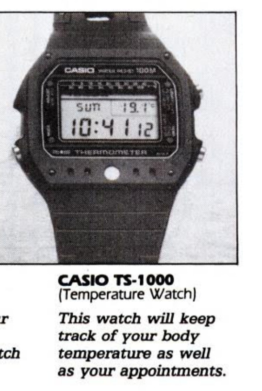
The last thought is on the "watches more than a good time" article with the different displays of digital watches. Such a random smattering of features, like the Casio TS-1000 which will keep track of your body temp and your appointments. Furthermore, how they are written to fit different personas is not only interesting but quite comical.
0 notes
Text
HOI Week 10
1. Compare your understanding and expectations about the exhibit (especially, the work(s) you researched) before and after our visit.
I found the exhibit to be a little challenging with limited didactic. The research I did before our visit was quite helpful and made the experience more enjoyable. I was shocked they did not mention more about Susan Kare’s work, or females in technology.
2. Can you make any connections to contemporary works, artists, or designers that interest you?
I really enjoyed the graphical technology publications with simple printed colors and unique illustrations/typefaces.
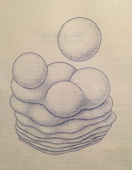
Also, the computer-generated visual pieces like the one below.

3. What do you make of the exhibit title, Thinking Machines? Is it an appropriate title? Why or why not?
I think its quite interesting and appropriate. I think it was a time when we started to really think about how machines can be useful and when machines started to do independent thinking.
0 notes
Text
History of Interface - WK 7
If I were to take one of the most popular voice assistants like Siri, Alexa, or Google and make an immediate user experience change, I think it would be around transparency. All three of them skirt around the topic of privacy and security. With these systems being so personal and utilized as home devices, its imperative that people feel safe implementing them into their day to day and personal lives. How this would be executed is a challenging question but I think having these systems explain how they work and what is happening is critical to peoples bond with the product and to what extent they utilize it. It also clarifies ethical bounds if there is a clear understanding that this is a technological tool vs a real person, although it operates in a SIMILAR capacity there are distinct differences.
My second change order would be around tone. As of now, Alexa is notably a more polite style voice assistant vs Siri, who is a little sassier. What if you could change the personality and response style?
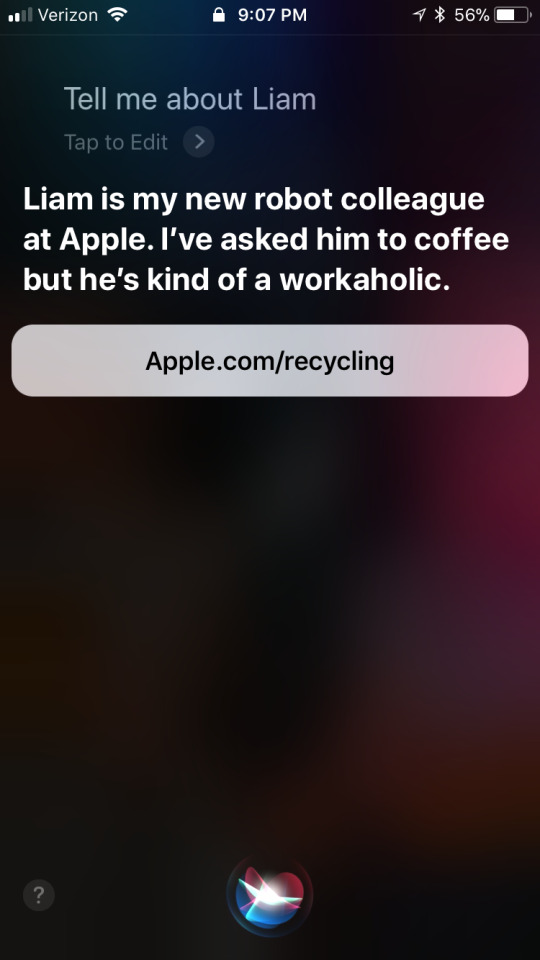
When playing with Siri, here are a few things I found that were fun and sassy:


Or I would give Alexa more jokes, I love Alexa’s jokes.
Last year in my usability class, I had a teacher who actually works as a UX researcher for the Amazon Alexa. Hearing a bit about how they assess changes, prototype new ideas, and ultimately implement was fascinating. She was quite private around the security part of Alexa with allegations around what is and isn’t being recorded.
0 notes
Text
History of Interface - WK 6
Both of these articles really came BI (before iPhone), and more importantly before the 4G network. Large-scale computing and connectivity was revolutionized with the release of 4G and changed how we connect forever. I can’t help but think of the work I’m doing with the Verizon connected futures III grant. As they prepare to release 5G in the coming years the possibilities start to really expand. Faster connectivity, lower lag times, and larger scale data transferring are just a few benefits included with the 5G network.
Additionally, I can’t help think about the progress of voice and chat controlled systems like Alexa, Siri, Watson, etc. Even in the past two years the personal assistant that once stemmed from the palm pilot to the iPhone and now in our homes and devices are starting to infiltrate into our day-to-day. They have totally encompassed the ideas of
“Easy to learn” should be self-explanatory. Even if a tool is super-efficient and incredibly powerful, if it’s too hard to learn, it’ll be relegated to the “experts only” ghetto.
Many of the principles mentioned in the article still are prevalent in the way we design large systems and new systems today. Each of these sections and larger categories have been further blown out and expanded upon through human-centered design practices and design thinking strategies.
It’s easy to learn.
It’s efficient.
It’s expressive.
0 notes
Text
History of Interface - WK 5
“Man's population and gross product are increasing at a considerable rate, but the complexity of his problems grows still faster, and the urgency with which solutions must be found becomes steadily greater in response to the increased rate of activity and the increasingly global nature of that activity.” pg 1
I think for some time we have feared the growth of computers and augmented intelligence. The fear of computers taking over our jobs and being able to perform tasks more efficiently and with fewer errors. Yet the complexity of our tasks has increased with technology and no longer are monotonous chores part of our day-to-day. Instead, were consumed with ever-increasing strategic responsibilities. No longer should the computer age or AI age be feared. It's with the aid of technology that we can gain some control back into our working lives.
The global network we have created allows us (more like demands us) to be connected all the time. Productivity has increased exponentially but what about mental health? The inability to disconnect from work and social media has our digital lives thriving while our physical relationships dwindle. Is there a way to integrate intelligent systems that allow us to disconnect? Taking time-consuming tasks out of the equation and allowing for reasoning and strategy to be the key responsibilities?
Although many people still fear the age of AI, neural networks, and machine learning could possibly afford a lifestyle less consumed.
As an auxiliary device, there is a gadget that is held like a pencil and, instead of a point, has a special sensing mechanism that you can pass over a line of the special printing from your writing machine (or one like it). The signals which this reading stylus sends through the flexible - 13 - connecting wire to the writing machine are used to determine which characters are being sensed and thus to cause the automatic typing of a duplicate string of characters. An information-storage mechanism in the writing machine permits you to sweep the reading stylus over the characters much faster than the writer can type; the writer will catch up with you when you stop to think about what word or string of words should be duplicated next, or while you reposition the straightedge guide along which you run the stylus.
How foreign was the idea of a typewriter or keys on a computer, yet look at the drastic change in capabilities and efficiency it has brought us? The description outlined reminds us just how alien these things sound when your only frame of reference is whats existing.
0 notes
Text
History of Interface WK3
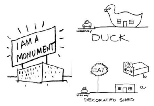
I found this article really interesting, I was unaware of the long entangled history of physical advertisements. The progression involved several trades like the circus to the media, to architecture, to politics and so on. A few points stood out in particular. Just last year I met the famous architecture couple the Robert Venturi’s, Denise Scott Brown who produced Learning from Las Vegas. A book about the wildly captivating signage of Las Vagas and the pull to design for the common and public vs the extravagant and self-absorbed. One of my favorite pieces they produced was the “Duck and the decorated shed” which further illustrated their point (and a few other things) in a comical and pointed manner.
The second point in the article that really captured my attention was the Calcium light. I had never heard of it before and upon doing some digging I found a few fascinating videos and a picture depicting how it worked. The ingenious of the pre-industrial ages blows my mind. How they figured out that they could light the calcium and it would produce enough light to illuminate a projection without melting the calcium is impressive, to say the least.

The last thing I wanted to mention as I reflect upon the progression of advertisement and entertainment was how this concept is moving into our new digital lives. The web and our other digital and social platforms and continually plagued with ads and politics and eye-catching announcements. Its almost being numbing and we are no longer able to explore the wonderful view the web presents without visually impairing ads blocking our view. I can only imagine the black mirror version of our future as the development of AR and VR steamrolls ahead. I’ll end with this quote from pg 22.
“Walter Benjamin saw such visual extravaganzas as hieroglyphs and image-writing by which the bulging capitalist society expressed its ideals and desires, constituting the subjects roaming the city streets as consumers obsessively looking for new treats and pleasures.2”
0 notes
Text
HOI-Documenting User Interfaces in Daily Life
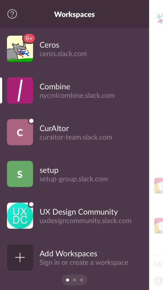
Slack Channel
Checked 43 times in 1 day
-This interface is increasingly seeping into my day to day life. From school to work this communication channel allows for simple conversations and groups to house content.
-Asking a simple question is easier and no longer requires the formality of an email.
-Additionally, it also serves as an easy file sharing platform.

Shower Speaker
Used 1 time every day
-Walk to shower, pair with phone
-Skip songs or adjust volume to liking
-Simple 5 button product: power, pause, play, volume, and pair
-There is no screen, just a simple set of buttons


Laundry Machine
Used 1 time every week
-Clothes weight on a clear scale by pounds pay to depend on weight
-Monetary amount displayed as coins are entered
-Digital time log once the machine has started
-Simple affirmations of working and minutes left

Instagram
Checked 56 times in 1 day
-Simple to use with the scroll and double tap as the main functions
-Constant content
-Image forefront with text secondary
-Behavioral tick
0 notes
Text
Game Play Project
Core concept was around creating a fun and simple card game that gave players the flexibility to create their own game piece and play with the idea of saving instead of killing (getting people out of the game). This concept was developed out of these questions:
- How might I make a game that has a flexible
amount of players needed
- How might I create a game that involves activity?
- How might I create a game that changes the idea of “killing”
- How might I make this game fun
Core Game Mechanics:
1. Mimicry
2. Chance
3. Assertiveness
4. Politics/Empathy
Whats needed for the game:
2 Players Minimum
1 Deck of Cards
? Tokens (one for each player)
15 Players max
Rules
Everyone will draw 3 cards and keep those cards as their “action cards” for the game. They will also get a token.
Once everyone has 3 cards, you will go around the circle and each person will pick a name of an animal which will be associated with their token (like a rabbit, or horse, etc..).
In order to take someone's token you will have to say their animal name when one of your action cards are drawn. BUT, the token is only exchanged when a player is on their last card. If two players have the same action card, the first person to shout another player's token name and will be the winner of that round.
You can use a shield 1 time during the game. The shield is used by shouting pita if you think your animal name is being said. If a player completes saying your animal name before you say pita, the shield is defective and you lose it.
Gameplay
The game starts by flipping cards over one by one (someone is the
designated dealer). Once the deck runs out the game is over.
Objective
Invoke thinking around:
- The idea of killing and eliminating in “kind way”
- Inclusion & engagement
- Playful actions with politics (juvenile but purposeful)Save as many animals as you can before the deck runs out. The winners will be the one who have the most animal tokens at the end of the deck as well as the people who originally owned those tokens…. Cheer on whoever takes your token, they will be responsible for the fate of your animal. Personal Objectives
Keep players engaged the whole time.
User Feedback
Three rounds of testing looking at:
-Motions:
- Some stood up (squats) some did
simple hand gestures like touching their
nose, kissing, or hair tossing)
-The amount of kill cards
-The time it took to complete a game (varied)Feedback:
- 3 kill cards instead of one
- Can’t get any kill cards back
- wanted a line of defense (shield)Notable changes:
- People's actions were too varied and the time
played to much of a factor. - Some way to make killing seem not prevalent
when someone gets out
- Give relation to the shield and the game
0 notes
Text
Project: Grow A Game MS2
The three cards I picked were destroying, privacy, and crime.
First, I thought about this combination in terms of destroying in order to retain your privacy. Some examples included snapchat, shredding bank documents, or clearing your browser history etc. But, with the third card of crime added I started to think of situations where destroying privacy was a crime like in the case of Snowden (whistle blowing), or a crime where you didn’t want to be caught so you destroyed the evidence and retained your privacy. Ultimately, I flipped it from a negative to a positive and made it about keeping your privacy (for safety reasons) through destruction which was ultimately a crime. More of a moral dilemma than a crime.
The game I thought of was about being in the protective services. The main concept would be that you have to make certain decisions in order to retain your privacy, but these decisions are destructive and illegal. The game would be a text adventure that had you play out your “destiny.” An important game mechanism I wanted to incorporate was a timer for each question in order to evoke instinct and to create a sense of urgency in moving through the game.
0 notes
Text
MS2 | Reading 4 | Defining Play
I loved the quote on the second page by J. Barnard Gilmore that states “Certainly everyone knows what play is not even if everyone can’t agree on just what play is.” This really sums up this reading for me and overall concept of game perception.
It’s much easier to say what something is not than what something is.
This reading was all about defining the definition range of play and games according to Salen and Zimmerman. Exploring beyond the traditional definition with set rules and constrains to the playful nature of play and games in everyday life. The three main concepts explored are “Being playful”, “Lucid Activities” and “game play”. Before reading this article my understanding of play and games struck in the first two categories but not so much in the “being playful” category. Even now, i’m not sure I would go so far as to stretch its definition to playful everyday interactions, but it does provide an interesting thought. Ultimately the article defines play as “Play is a free movement within a more rigid structure” . The term “rigid structure” was especially interesting to me and how fluid it can be. They discuss it as existing in all forms of play whether they are immediately defined, evolving or unconscious components is simple interactions.
Everything seems to have several definitions and relating parts in this reading which was a bit confusing and disorienting to the actual point of the reading. But, another concept that sparked my attention was the concept of “Transformative play” with the four different categories associated (This dives into the mechanics of lucid activities as well):
Agôn: competitive play
Alea: Chance-based play
Mimicry: simulation or make believe play
Ilinx: vertigo or physically based play.
0 notes
Text
MS2 | Reading Response 3
I really enjoyed this reading from Dunne & Raby on Design Noir, chapter 3. We are so concerned with the products and new releases of the next iPhone that we don’t really think about the experience that originated from telecommunication and music on the go. We are far more concerned with the packaging and design features in our day to day life.
Two quotes that really stood out to me in this reading were:
“The mental interface between the individual and the product is where the ‘experience’ lies. Electronic technology makes this meeting more fluid, more complex and more interesting.”
“These products and services work on radically different aesthetic principal from traditional products: it is what they do that creates pleasure, not how they look and feel”
Both of these quotes really drive home what they mean by design noir and conceptual products vs conceptual design. Filtering out the products that are limited and with presets vs something that invokes critical thinking and reflection.
The example of the truth phone reminded me of a recent documentary I watched about Ashley Madison. Its a sort of dating site that was specifically created for infidelity and sexual promiscuity. Giving personal interactions and physical connections. This a platform that has blown up in the last decade with tinder, bumble, grinder etc, anything your looking for these days seems to have an outlet. In this case a website is no longer a website, it transforms into this playground of sexual possibilities and interconnections. Not saying I agree with this sort of site, but the example certainly makes you think and wonder what would happen if this was a common accepted practice in our day to day lives. How would relationships change? Similarly in the truth phone, how would phone calls start to change?
0 notes
Text
MS2 | Reading Response 2
This response is to the reading in Chapter VII “Walking the City,” sub chapter “From the Concept of the City to Urban Practices” by Michel De Certeau. This reading remind me of my undergraduate studies as an architecture major, specifically related to the difficulties of urban planning. This article sheds light on the grayscale that exists in the world of urban planning and the difficulties of cultivating a thriving growing city for all socioeconomic classes. Michel mentions several networks that exist in a urban environment and the corruption of well of necessary networks by profiteers. The shape of cities its constantly changing because of the continuous fluctuation in power, importance of an endless set of networks all connected to the singular system. Michel says “Administration is combined with a process of elimination in this place organized by "speculative" and classificatory operations.' On the one hand, there is a differentiation and redistribution of the parts and functions of the city, as a result of inversions, displacements, accumulations, etc.; on the other there is a rejection of everything that is not capable of being dealt with in this way and so constitutes the "waste products" of a functionalist administration (abnormality, deviance, illness, death, etc.). To be sure, progress allows an increasing number of these waste products.” Throughout this article, the mention of power and social structures is the crucial element. It’s the interwoven networks with their tunnel vision goals that are creating divides and gaps. Towards the end of the section, the panoptic prison is mentioned, “transforming a human multiplicity into a "disciplinary" society.” This project born out of the French revolution with good intentions forefront created a traumatic system involving power and surveillance, all done with a simple set of tools and plans. We must understand the complex political systems at play to start to grasp urban planning and how we might create symbiotic relationships between spaces and people.
0 notes
Text
MS2 | Reading Response 1
The chapter on environments in Madeline Schwartzman’s article “See yourself seeing” discusses speculative responsive projects that push the boundaries of human senses. As I read this article, I start to think about the adverse preliminary reaction I often have to obscure projects such as Malstaf’s “Shrink” and Beesley “Hylozoic Soil”. Both quite different, but with common themes that highlight full blown environmental sensory experiences in an unusual way. I think it’s safe to assume that most projects exploring these sort of foreign sensory elements are enough to invoke an icky initial feeling in just about anyone. It’s only until the mention of its context and precedence emerges, do I start to feel comfortable enough to see the value and art behind it. The inspiration of the coral reefs for the Hylozoic soil, and the feeling of a cocoon for the Shrink project. But what are we so afraid of, what about being thrown off our accustom rituals is so perturbing and anxiety evoking? She goes on to mention control towards the end of the article saying “control” is a key component that has fine balance still unknown.
So, how are these projects actually teaching us to evolve with increasingly complex surroundings? I think this answer to this question is rooted in the natural systems currently at play. The ecosystem, atmosphere, etc.. all very complex situations that have endless amounts of variation and more importantly bring a sense of familiarity and comfort to problem solving and environmental shifts.
0 notes
Photo

“An Algorithm-Based Typeface
Scher’s elegant visual identity, unveiled today, conveys that all the distinct schools are under the New School umbrella by printing the names of each school (Parsons, Lang, Performing Arts, Social Research, etc.) underneath a main New School logo.
The identity uses a complex custom typeface, called Neue, in which each letterform comes in three distinct widths (regular, extended, and very extended). Neue, named for The New School, is a customized version of the font Irma, used in the environmental graphics of the University Center and designed by Dutch typographer Peter Bil’ak. Scher commissioned Bil’ak to draw and program Neue with an algorithm that scrambles the letterforms' various widths, so a given word typed in Neue can be printed in a wild variety of permutations. This means that each distinct school's name has a striking, individual typographic flavor (the A in Parsons is wider than the A in Lang, for example), but they're still printed in the same typeface.
The effect is a bit like the words are being reflected in a funhouse mirror: a stretched-out H, a scrunched-up E, a fat O in one word and a skinny one in the next. Scher says it’s the only typeface she knows of that uses an algorithm to systematically alter the widths of each letterform.”
0 notes
Text
communities of practice + local resources research
Important mediums 1st semester:
-js/jq
-typography
-animation
-3D modeling
Here are some of the resources I found that are available and important to first semester goals. They include Parsons resources, as well as museums, online learning platforms, mentors, references, print shops, and companies.
Shops:
-Letterpress Brooklyn: http://www.sesameletterpress.com
Companies:
-Pentagram (Manhattan)
-Ceros (Chelsea)
-Five Agency (Brooklyn)
References (people)
-SL (former boss)
-MG (former colleague)
-SM (Carbone Smolan Agency)
Museums:
-MOMA
-Whitney
-Guggenheim
Resources: -Design Sponge (http://www.designsponge.com/)-Gizmodo-Code academy -AIGA-Red Dot Design Award-JS pocket guide-Metal shop/ laser cutters/CNC machines. -Sven Travis -Dorkshops -Writing center
1 note
·
View note