Last Seen Blogs

baldursyourgate
Yet another sideblog for my hyperfixation

rokurkrk
valentin

asydicsydney
AsydicSydney
oc-rp-account
Vito Udonta
Text
reflection
This was one of the most enjoyable and interesting starts to a research paper hat I’ve conducted. I think being so interested in this field of design definitely helped the research process as I actually enjoyed the time spent reading books and other people’s academic essays and journals.
I struggled a bit at first when it came to narrowing down the scope of my topic and also finding a niche to explore that I d could make connections between history and actual tangible design because that is where I am most interested.
It was in my second time getting the ‘Sixty years of Vogue’ book out from the AUT library and reading some of its chapters again that I realised where the vital connection that linked all the decades of fashion and design together was. It was in finding what the constant variable is in fashion (ie: what sells fashion) and how that variable and what informed that variable changed over time through design.
I also struggled when it came to cutting down my word count as I think, in the beginning, I came at this writing from an essay perspective having done a lot of research and being prepared and excited to divulge all that I’d learned. But eventually I realised it’s just a taster to a bigger project for potentially next year.
Aforementioned, once I got my topic/research question refined, the process was really interesting and enlightening and I was so in awe of what I learned about this area of design and its different roots and backgrounds. I really cannot wait to explore this further.
0 notes
Text
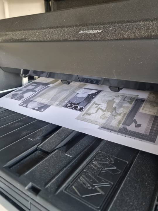
So I had the idea to print different layers on different pieces of transparency/tracing paper. Most places won't print on A2 transparency except I managed to find someone who could. However, when we tested printing my design on just normal A2, the colours came out all washed out and faded and started to chew up the paper for some reason. So I will have to take my deisgn to be printed normally on one sheet of normal A2 tomorrow at Pink Lime
0 notes
Photo
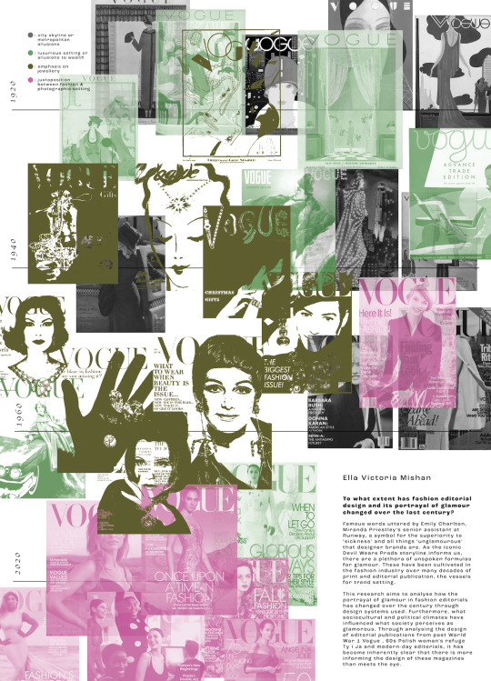
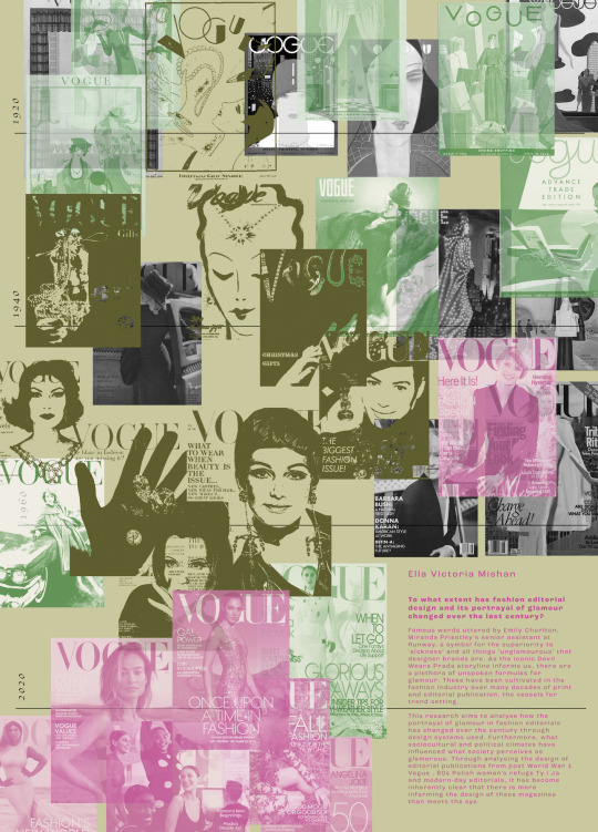
Upon final reflection I decided I prefer the white background as it just feels cleaner and crisper and helped the images to stand out more. Also I stopped the final date line where the images end so it doesn’t interfere with the text and fixed the text spacing and aesthetic by dropping some words and moving it around a bit.
0 notes
Photo

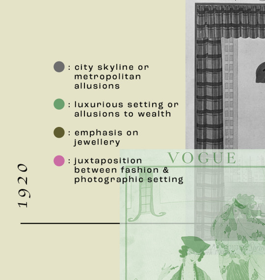
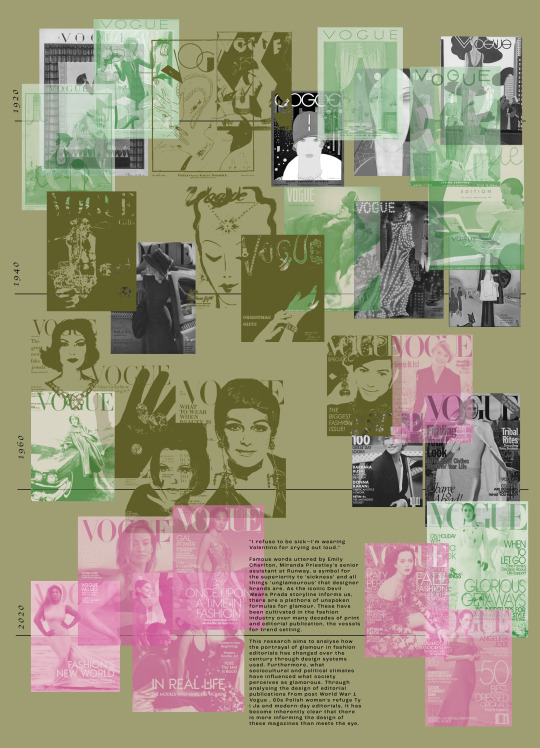
I decided to add a key to help the meaning behind the colours and treatment of the images make sense - I want people to be able to read this poster and understand it and I think the key definitely helps this.
0 notes
Photo
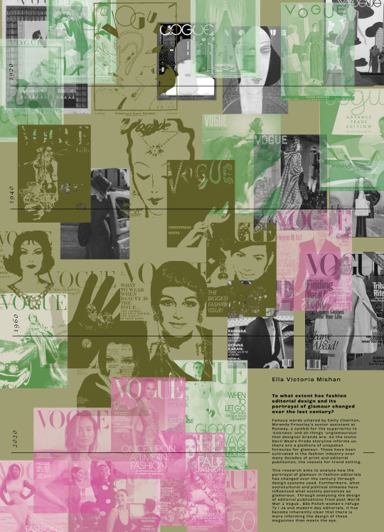
Made the background a lighter green and changed the text to pink to see if this works better - feels a bit too clashy for me still
0 notes
Photo
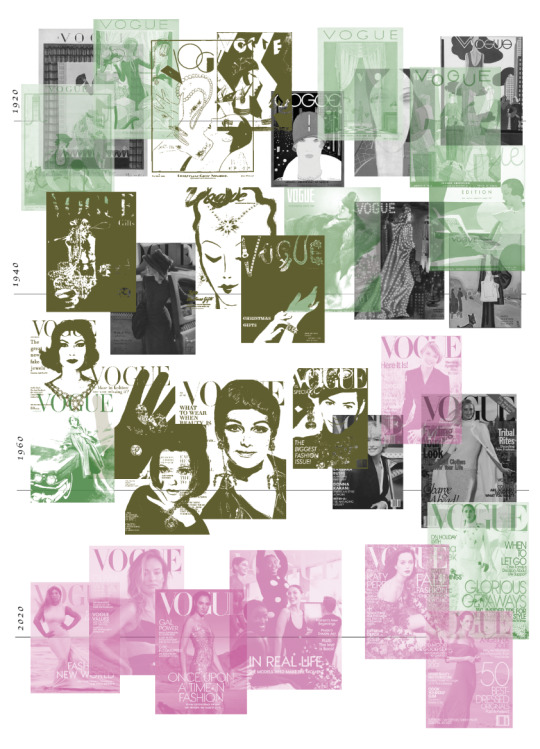
After receiving some more feedback from some friends, I decided to blow up all the images and get rid of the margins to make it feel more like a poster and less like a research map ??
The only thing about this is that the date lines kind of get masked in amongst the chaos of it all... like there is a purpose - the colours have meaning and so do the placement of the images (it’s in chronological order) - but then maybe that’s kind of a cool thing - talks to my research topic of glamour being this ever-changing thing that’s chaotic and hard to follow but actually underneath it all there’s method and reasoning behind it all .
0 notes
Photo
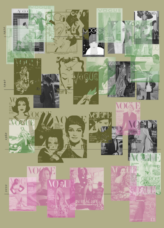
Based on some feedback I received from Aakifa I have made a background colour just because there was a lot of white and there’s already going to be a full document of white.
I’ve also started trying to add the abstract into the poster to see how the layout fits - I’m finding it really tricky to make it look good
0 notes
Photo
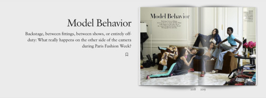
This article (screenshotted from online) from a Vogue I received in the mail recently is really interesting to me having just written about the trends in modern day editorial being very focused on ‘being real’ translating authentic content and showing famous figures and people we put on a pedestal in a more genuine light - portraying them as real humans with real problems just like us -
This article is the behind the scenes at fashion week - model ‘behaviour’ what they get up to in between shows - very real normal human things “on the other side of the camera” their normal people
0 notes
Photo

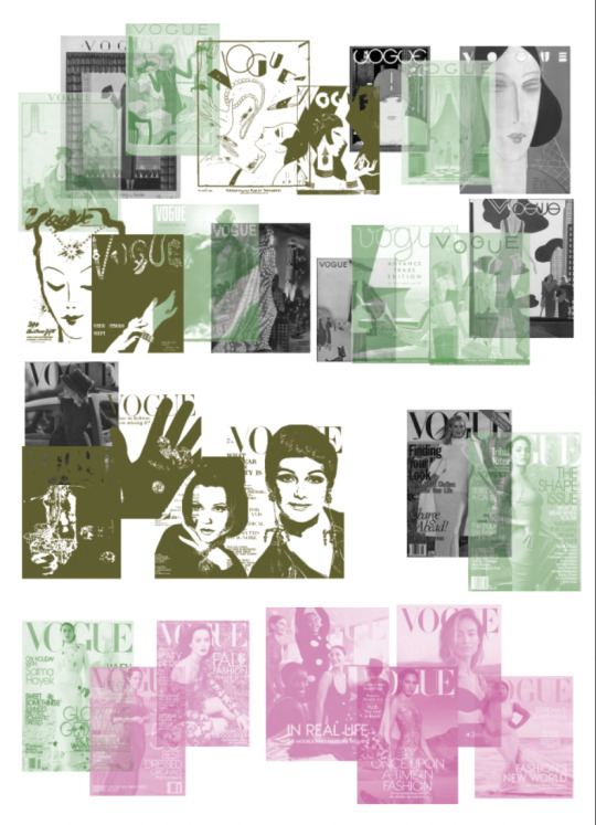
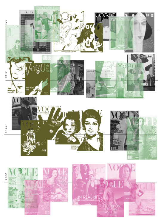
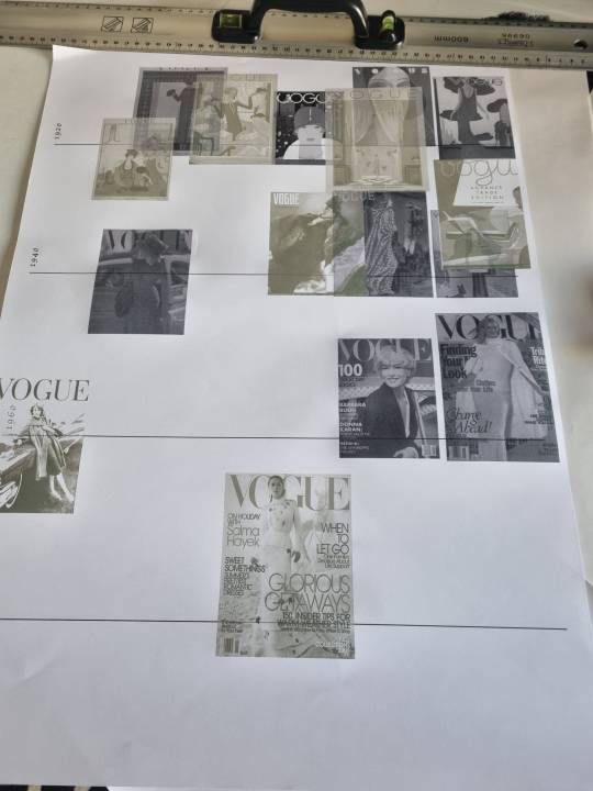
Looking at some sort of timeline of vogue covers where the colour of the over is attributed to what design system/way it portrays glamour so that you can see, zoomed out, how that focus has changed over time.
For example the greyscale images are covers that feature a city skyline or monument in them and the khaki images are covers that heroes jewellery and focused on that aspect of fashion.
This is interesting to me because you can clearly see that period in-between the 40s and 80s where jewellery and headshot images that could hero the jewellery were really popular as at the time, that’s what sold glamour.
0 notes
Photo
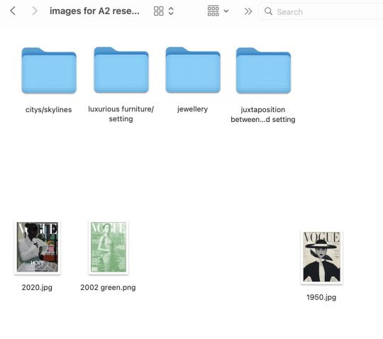
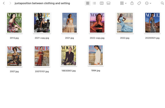
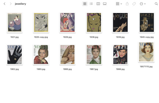
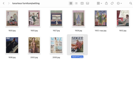

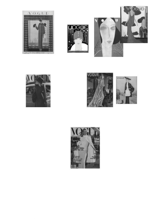
I’ve started grouping Vogue covers I find from https://archive.vogue.com/issues/1975 into 4 different categories (different ways to portray glamour). To get a good range I am trying to pick a couple of covers from every decade.
0 notes
Text
Tools used to convey glamour to categorise Vogue covers for poster
italics = chosen categories
- city skylines or backgrounds
- luxurious furniture/photographic setting
- smiling
- bored, uninterested facial expression (unfazed by photographer, beautiful clothing, setting etc - people envy her)
- lots of text
- little text
- facial (beauty) close up
- full body (fashion/clothing) shot
- juxtaposition between setting and outfit
- famous actresses & singers
- emphasis or focus on jewellery
0 notes
Photo
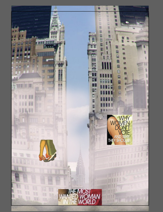
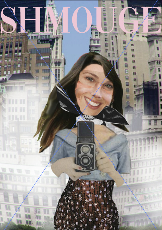
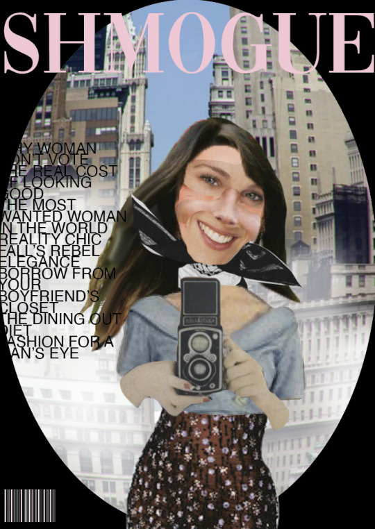
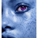
Image making - trying to combine elements from what I’ve learned about Vogue and how they portray glamour over different time periods into one collaged image - using vogue images from the 1950s all the way up till now
0 notes
Photo
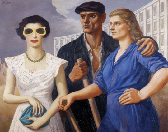
Found this really amazing, fascinating painting from the 1950′s which perfectly encapsulates how communist Poland/Polish society viewed glamour at the time.
https://culture.pl/en/work/figures-wojciech-fangor
“Wojciech Fangor’s painting ... bearing the laconic title Figures (Postaci), is one of the most canonical works from that period. It is based on straightforward dichotomies: now and then, on this side and on that one. He tells his audience: you can judge for yourselves which is better.
In the canvas, there are two women. The one of the left hand side is the antagonist: slim, in a fitted, fashionable dress, patterned with English writing (Miami, New York, Wall Street, London, Coca-cola). Her manicured hands, which surely haven’t been calloused by hard labour, hold an elegant green bag. Her face is hidden behind a pair of large yellow-framed sunglasses and make-up. It probably hasn’t been long since she visited a hairdresser. Her outfit is complemented by a bead necklace. She looks important.
Her positive counterpart is a whole different story. Her stance is proud, relaxed, resting one of her hands on her hip, and the other – on a shovel’s handle. She is strong, self-assured, and natural. Under the rolled up sleeves of her jumpsuit we see well-built forearms. The man standing besides here, also wearing a worker’s outfit, holds a shovel or a pickaxe handle in his right hand, and embraces his partner with his left. Both of them are healthy, tanned, and fit. They are not defined by clothes or accessories from the West, but by their tools...
In the background, we see a symbolic representation of the effects of these two positions. On the left hand side, there are ruins (let’s remember that the painting was created five years after the war), while on the right, behind the workers, we see a freshly constructed, multi-storey building with rows of windows divided by simple architectonic elements, in a typical socialist realist style. Even the weather in the painting is meaningful. The clear blue sky on the right side of the composition seems to be threatened by the clouds approaching from above the ruins”.
0 notes
Text
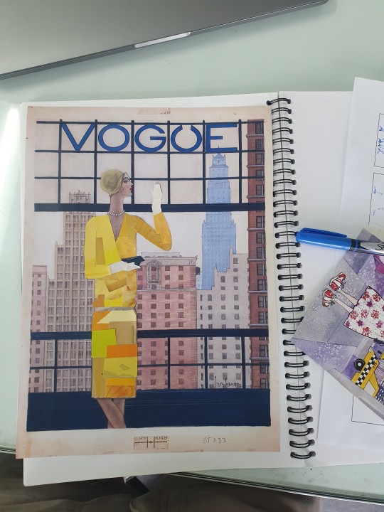
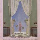
Playing around with the idea of re creating an old old magazine cover (Georger Lepape for Vogue in the 20s) with pieces from new magazines
0 notes
Photo
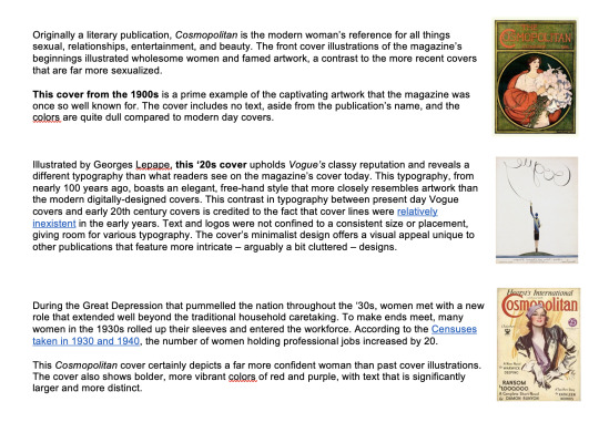
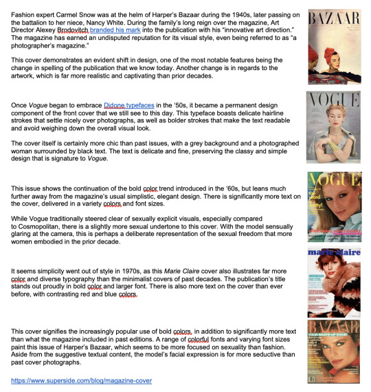
https://www.superside.com/blog/magazine-cover
These are some notes I took from this post from Superside Blog on the evolution on fashion magazine covers - it talks specifically to the change in design systems over the decades which is really interesting.
0 notes
Photo
First draft of my abstract - looking at anecdotes or fun iconic quotes well known in the fashion world to open this text - immediately this line from Devil Wears Prada came to mind;
One editor (Rebecca Mader) throws out the idea of "enamel," which she quickly dismisses. Then she suggests, "They're showing a lot of florals right now." Miranda stops her in icy fashion. "Florals? For Spring? Groundbreaking." (In the script there were periods between "florals" and "for spring." Streep's cadence seems to phrase it as a question.)
"Doing flowered stuff in the spring is a cliché, and I do think that's one of the reasons that that line resonates," McKenna says. "It's almost like having a sports line in a movie for men. It's in a secret code that women understand, which is: Every year in the fall they try to sell you plaid, and in the spring they are trying to sell you floral prints, and you've probably got 10 of those in your closet, and they are trying to give you a compelling reason to sell you shit you already have."
https://www.thrillist.com/entertainment/nation/the-devil-wears-prada-aline-brosh-mckenna-florals-for-spring
0 notes
Photo
Had a chat with Aakifa trying to narrow down my direction further and just clarify where I’m going - I’ve definitely felt a bit confused but this conversation and these notes I’ve made have really helped me.
0 notes