
ellie-evans-games-t1
Video Game Design and Development
75 posts
Don't wanna be here? Send us removal request.
Last Seen Blogs

msw33
Man's World 33
xxbun-artxx
XxBun-artxX

sparrowlucero
Uncharismatic Megafauna

dora16reszegi
Dóra

kumaneko514
フィルムと彼女
Text
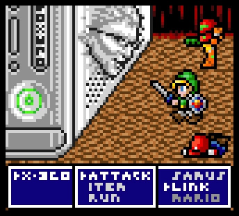
Limbo
Limbo uses a very minimalist art style of very monotone colour palette and 2D style. This creates a very tense and menacing atmosphere. The first part of the game has a lot more tension then the second part of the game. However the eerie feeling of being alone in an abandoned city. Limbo ,like its successor, makes you play as a child. This makes you more scared as you are playing as a child. However this adds to the grotesqueness of the death animations. Which are already pretty grotesque as it is. One of the scariest parts of the game is the giant spider at the beginning of the game. Whilst only a silhouette, you can see all the hairs on it making it look even creepier. Its size and movements also add to its creepiness.
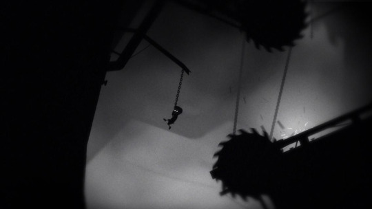
The sound in game is unconventional, as all the sounds come from what’s happening in game. This makes for a tense, creepy atmosphere and intriguing puzzles that force you to use sound to navigate areas.
0 notes
Text
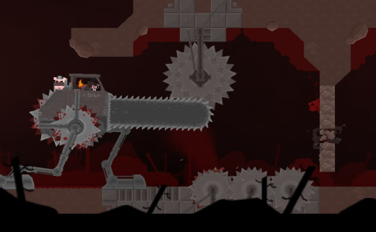
Super Meat Boy
Super Meat Boy’s art style simple. It consists of a lot of the same assets being used through out the game. So it uses a tile map. The characters themselves are very simple. Usually being at its core a shape with a face and limbs. The most complicated assets usually being the saw blades that’ll damage Super Meat Boy. Whilst Super Meat Boy’s art is very simple it still has intriguing little elements, such as blood being splattered on the wall or floor that meat boy lands on. Or the blood being splattered every where when super meat boy hits a saw blade. There is also mini levels in which the art style changes to a pixel art style and you get to play through as a pixel art meat boy. I like that it has a switch up in art style as it keeps the game play fresh.
The game play of Super Meat Boy is simple but also tremendously hard. The only controls in Super Meat Boy is run and jump. Which is fairly simple controls. However the levels themselves are very hard with just these two controls. Whilst Meat Boy can land on walls he’ll slowly slip down them making you have to repeatedly jump or think quickly. As well when he lands on a saw blade or gets hurt he instantly dies forcing you to restart.

0 notes
Text
Rieko Kodama
Rieko Kodama was one of the first female game artist/designers. She worked on art for Sonic and Phantasy Star II as well as others. Their art is mainly pixel based however there are some non-pixel based ones. The non-pixel based ones have more of an anime/manga look to them which I really like. THeir pixel art is both simple and complicated depending on the game or the sprite. Such as Sonic’s sprite is fairly complicated cause of the amount of pixels used where as the main character sprites in Phantasy Star II are fairly simple. I really like their pixel art style as well because of how well it conveys what it needs to whilst still using simple colours and shapes.

0 notes
Text
Pedro Medeiros / Mini Boss - animation
Pedro Medeiros/Mini Boss’ animation are majority pixel art. They are usually complicated (however some are very simple) but use the core concepts of pixel art and animation very well. Their animation spans many different genres and ideas. A lot of them are used for teaching people how to animate or draw certain things in pixel art such as the ones below. The animation and art is very smooth and usually character based. I think I could use similar animation and art for close up interactions such as shopkeepers or other npcs. Maybe for boss fights as well. I could also try to make my animations as smooth.

0 notes
Text
Evaluation
During this project I have really enjoyed being able to use Photoshop for drawing and designing. This is because I wouldn’t usually get to use Photoshop for drawing a lot or this often. I also really like drawing and designing characters as well as other things. I have also enjoyed learning how to animate using Photoshop, as I never knew how to do it before. I have also enjoyed leaning how to use Unreal as it is new to me. However, whilst I’m decent at coding in Unreal, I generally dislike coding as it can get really infuriating to do it at times. I also disliked having to use pixel art for it as well as trying certain other art styles in design sessions. This is because I have only a few art styles I like to draw in. These styles being closer to cartoons, anime and comics. Unless it is technology which I also enjoy drawing. So I would prefer to try and create a game in a different art style that I prefer next time.Next time I would probably try top come up with more ideas instead of getting stuck and focused on one idea. As I do this a lot and is a habit I need to get out of. This would also mean experimenting with more ideas in creating level assets as well as characters and the game idea in general.Overall, I have really enjoyed this project as it is the first time I have made a proper game with assets not just code.
0 notes
Text
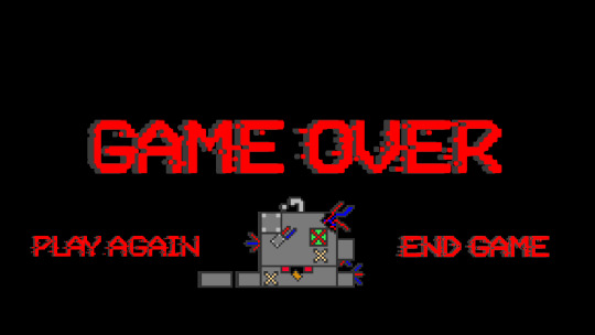
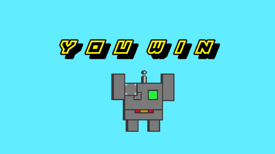
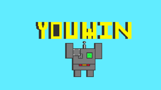
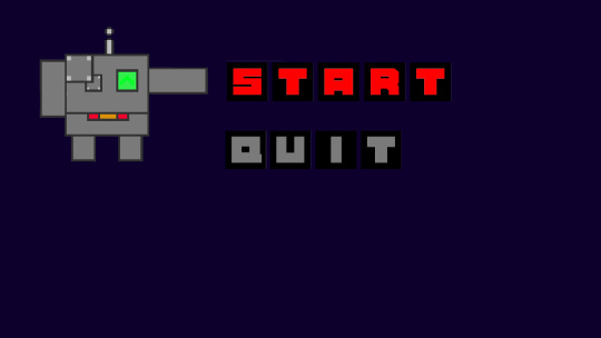
Custom Start, Win and Lose screens.
Lose Screens:
This lose screen is one I have highly adapted. It uses an interesting font that I found on Da Font. It has a retro pixel aesthetic as well as being kind of futuristic. It fits in well with the game’s more sci-fi theme. It makes for a great game over text as it looks like the game’s text is almost corrupted in a way. This gives the game over seem more threatening.Each game over screen has a different kind of font. One the previously mentioned glitchy pixel font. Another has a kind of metal gear looking font with the final one having a big blocky font. All these fonts have their positives and their negatives however I prefer the glitchy pixel font the most for the game over screen As well, this goes for all the game over screens, seeing the character you play as broken and destroyed is also quite threatening and disturbing. As it makes you feel as if you have destroyed this character by failing to protect them. I think theses game over screens could be made better with a little animation. Such as the words moving up and down or small explosions coming from you character. This would make the game over screen feel more alive and not just like a static image. This would in turn make the game as a whole feel more alive.


Win Screens:
Each of the win screens are very similar with only a change in font. These changes include a big blocky font, an outlined with shadow font and an isometric font that looks 3D. I think that the font I like the most is the outlined with shadow font as it doesn’t make the yellow as much of an eyesore as the other two fonts do. The colours used are bright and bold. This draws your attention to the whole screen. The bright colour are also supposed too make you feel good about yourself for winning. Compared to the game over screens these screens are very bright in colour. The happy expression on your character is also meant to maker you feel good. It could be improved by animating the character jump up and down in excitement from winning. This is all supposed to give a happy and excited atmosphere.

Start Screens:
The start/menu screens are also all basically the same but with a change of font. One has a big blocky font whilst the other has a smaller blocky font with an outline. I prefer the blocky font with outline as it generally looks more appealing. It also gives a cleaner more sci-fi looking aesthetic compared to the other font. Both start screens will have your character moving and pointing at the options. With maybe a happy expression when you hover over start and a sad or angry expression when you hover over quit. This would make the game feel more alive as well as giving your character more personality.

0 notes
Text
Azur Lane CrossWave menus flow diagram.
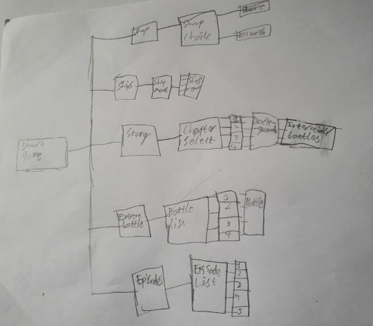
This is a flow diagram of Azur Lane Cross-wave's menu systems. There is a main menu in which you can either create a new game save, load an old save, access the option or exit the game. When u load or start a new game you will be shortly greeted by a secondary menu. This menu will have things like settings, story, extreme battles, episodes, the shops as well as the character/ship menu. Each of these options then have their own UIs/menus unique to each option. Such as the ship/character menu has images of all the characters which you can then either purchase/recruit or can you can select a character and check their skills or change their equipment. The Store has a split in which store you choose to use both stores have the same Ui but with different equipment to buy and sell. If u access extreme battled you’ll be taken to a list off battles you can complete, accessing episodes takes you to a list of smaller stories specific to characters. If u select story you c an access chapters to play through. In these chapters you’ll have cut scenes and battles. If all 3 of your characters/ships die in battle you’ll be kicked out of the battle and will have to try again. You’ll be given a screen that gives you a D grade before being sent back to the map or menu.
0 notes
Text
UIs
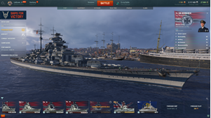
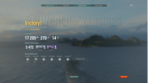
World of Warships (otherwise known as WOWS) has an intriguing menu/interface. On the main menu all the options you can choose all on the same screen. From showing your ships at the bottom of the screen to showing the battle option at the top. Nearly everything you need to check are on the same screen. As well in game you have a mini map on the bottom left with your speed. Your consumable at the bottom of your screen with your turning just above it. When you finish a battle you get a screen showing if you have won or loss as well as the xp and credits or achievements you gained from the battle.
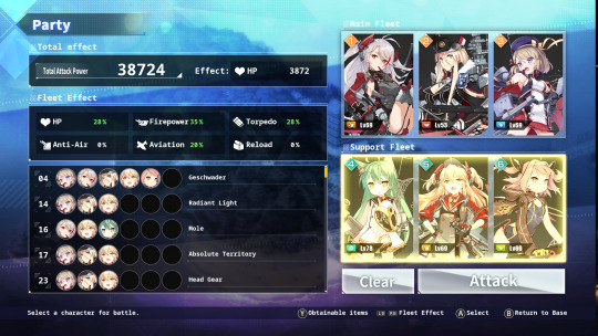
Azur Lane Crosswave. The new pc and console spin-off of the mobile game Azure Lane has multiple, menus in it. However these menus are fairly simple and very intuitive. There is a main menu to start the game with a secondary main menu in game that then has the many options for you. Including shops a character screen and multiple different stories/battle options. During battles you have your abilities in the bottom right corner with the inputs next to them. At the end of battles you get shown a screen that gives you a grade depending on how well you have done in the battle as well as your xp and coins gained. Also any other drops that you acquire in the battle.


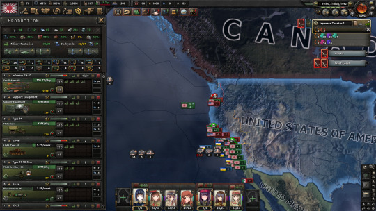
Hearts of Iron IV (or HOI4) a semi real time strategy game that has many menus/UIs. It has a UI for selecting mods and dlc then there is another main menu inside the game. This menu has the single player multiplayer and options as well as exit game on. As it is a strategy game there is multiple menus depending on what you need to do. Such as research and National focuses in there own separate UIs. There is also a UI for every type of combat in game. When the game gets to 1945 or you choose to end the game you’ll get a screen that show which country and which faction has done the best and which has done the worst.

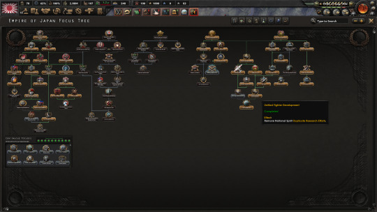

(Anime images in Hoi4 is because of a mod I have enabled. The images would usually be images of the historical leaders and commanders)
0 notes
Text
Game Over screens
The Missile Command game over screen is definitely something I will not be trying to replicate. The colours it uses don’t work well together and the intense flashing of colours is seizure inducing. Overall, it is a very bad game over screen.
A game Over screen I will take inspiration from is the Kirby Super Star game over screens. This is because I like the fact that you can see your character as well as interact with them if you choose end game. I think this is a really cool thing to do. It adds more to the interactivity as well as the character. This is something I may try to implement in my game.
0 notes
Text
The Best UI I’ve used.
I’d have to say the best UI I’ve used has to be between Assassins Creed 2 or Assassins Creed Syndicate. This is because they both have that sleek futuristic animus look. They are also fairly intuitive. I also like the fact that you can preview what armour and weapons you can get will look like in then before equipping them or buying/acquiring them.
0 notes
Text
My opinion on medium.com’s UI blogpost.
https://medium.com/super-jump/top-5-best-video-game-uis-db941d6a9357
I agree with a lot of this post. I thin that diegetic UI are amazing if executed correctly. However they can be a little confusing at times. I have a personal love for the aesthetic of the Assassins Creed 2 UI as well as the Persona 5 UI. However I don’t agree with the controller cursor. Whilst it is a good innovation for menu navigation. I find that at times when you want to quickly move or check things it can become vey annoying and painful to use.
0 notes
Text
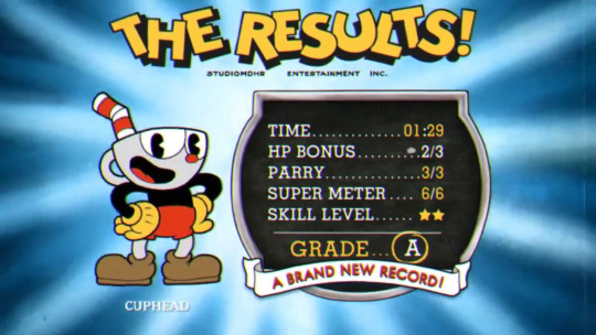
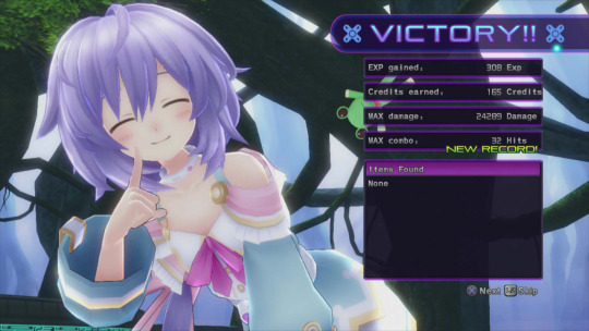
Win and Loss Screens
Win and Loss screens usually cover most of the screen and allow the player to know if they have won or lost.
Victory Screens

Loss Screens:

0 notes
Text
UI and UX
UI stands for User Interface. The User Interface is what the the player uses to interact with the game or how the game shows the user information.
UX stand for User Experience. The User Experience is how the player/user reacts to the game/UI. Such as how the UI feels to use.
These are important as you need the player to be able to receive information from the game about how well they are doing or just what they are doing in the game. The UX is also very important as it lets us know how the player are receiving he game and how much they like how they can interact with it and vice versa.
0 notes
Text
Super Mario Odyssey
Super Mario Odyssey came out in 2017 on the Nintendo Switch and adds many new mechanics to the game. I haven’t played it however I have watched playthroughs of it and it looks very fun to play.
I like the new gameplay mechanics that has been added to the game and many of the nostalgic throw backs it has. I like the new mechanic of cappy. This allows Mario to throw his hat at enemies or other objects and take control of them. This looks really fun. It also allows for interesting puzzles to be created to collect the power moon or other collectibles. The other mechanic I really like is the classic 2D Mario sections. In these sections you get to play as classic pixel Mario and play through small levels. One of which is the very first time Mario appeared in, when u have to fight Donkey Kong. Also, whilst using motion controls for certain actions can be a little awkward, I think it’s a good addition to the game.


To improve the game, I think that All the buttons on the controller should be utilised. This is because it makes the game a little easier and doesn't waste controller space. This is because the game currently uses two buttons for hat throw, two for jumping and the triggers do the same thing. This wastes a lot of potential controller space. I also think that the bosses could become more difficult at the end of the game. This is because the Broodals who you fight throughout the game do not change much in the last battle you have with them other than when they use a mech of sorts. This make their fights seem repetitive and boring toward the end of the game.

0 notes
Text
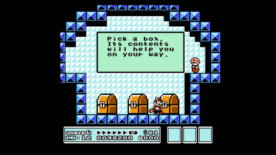
Super Mario Bros. 3 Review
Super Mario Bros. 3 was the third instalment in the Mario series. It plays as most of the Mario games do. However, it was the first Mario game to have the Tanooki suit. I did very much enjoy playing it.
I really like the overall design and aesthetic of the game. It already has great pixel art for its time, so the art already looks really good. However, one of my favourite things about the art design for the game is how it is obviously not real. It’s happening on a stage. It’s a performance. This is made obvious in the start screen as it opens curtains onto the main menu, as you would start a stage performance. Also, all of the platforms have shadows screws or something holding them up. Thus, showing that these are props. The stage aesthetic is furthermore shown via the dark areas at the end of the level when your character goes “off stage”. I think this is a really interesting aesthetic for a game.

Some things I dislike about the game are some of the mechanics. Two of these being the bouncy note blocks and the toad houses. I dislike the bouncy note blocks as the mechanic for them involves you being really precise on your jump to get the maximum height and if you don’t, you’ll slowly bounce of the block. Whilst this does add to the challenge of the game, I would prefer it if either the window to get maximum jump height was a little larger or it didn’t try to bounce you off of it when not moving. I think the toad houses should have more skill to them like some of the new ones in Mario Maker 2 and not just rely on you getting lucky.

0 notes
Text
Top 3 favourite 2D games.
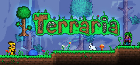
Terraria: I like the pixel art design, although at times it can look a little awkward, mostly on the more humanoid characters. I love the boss designs as well as the RPG mechanics although the grinding can become annoying. I also find it best played with friends. I do also like the customisation you can do with your characters as I love being able to customise things.
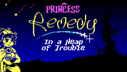
Princess Remedy: In a Heap of Trouble: I like this game because it has a simple yet appealing art style of using bright coloured outlines on a dark/black background. The gameplay is also very fun as it is a bullet hell game in which you have to move around enemies or shoot them to complete the level. The characters in the game are also appealing although mostly comical.
Undertale: I like Undertale because of its characters and story. Whilst the combat in Undertale is fairly simple and the art style during combat interactions is also fairly simple in colour but more detailed overall. I love how the characters interact with you and the sense of humour the game has. I also like that there is multiple routes in the game and the fact that you don’t have to fight the monsters you encounter you can mercy them instead. It’s a very different experience from most games.

0 notes
Text
David Perry - Aladdin + Earthworm Jim
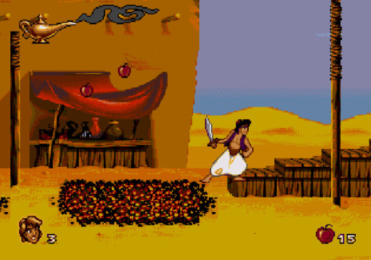
The Aladdin game released on the SNES and Sega Mega Drive has very appealing graphics/pixel art. The animations are also animated well. The bright colours and animations allow you to feel as if your are actually playing in the world of Aladdin. The added effects of the genie pulling you back up when you fall or collecting apples as well as many other features/sprites used immerses you in the world of Aladdin more.

Earthworm Jim ,which was also released on the SNES and Sega Mega Drive and Game Gear. The backgrounds in Earthworm Jim are very intriguing and give a lot of atmosphere and tell a story their own way. The animation of Earthworm Jim is also very fluid as well as comical, as he is a worm in a humanoid body thing.
0 notes