
elsiegibbonsportfolio-blog
UNIVERSITY PORTFOLIO
Elsie Gibbons - UCAS ID : 1488211061
17 posts
Don't wanna be here? Send us removal request.
Last Seen Blogs
pray4jensen
"Cas, we've talked about this. Personal space?"

geesebumps-stuff
Goosebumps Hell
remodelersriversideca15
Wiggerside Remodeling

gravureidolgentlemensclub
Gravure Idol Gentlemens Club
chaineiga
映画『CHAIN/チェイン』
Text
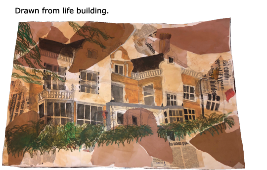
Tudor Grange House Drawing - Observational/Drawn from life.
As a big opener to begin the development of my portfolio - I will be presenting not only fashion designs, illustrations and research but also art work on the side that could be relevant towards this portfolio. I chose to begin with a strong, prominent piece, of a drawn from life historic building drawn through my art course. I have used technical skills in dying the paper before hand with wet tea-bags to produce a sepia, antique style. I mainly used oil pastels to gather the colour - blending easily the oil pastels to mix carefully. Through developing the structure of the houses' design, I have always kept the communication elements alive - through the processing of the art-work from an early development to the colouring stages I've always wanted the audience to involve themselves in how I create my work, research and develop the skills along the way. With this drawing in particular, I felt I was in constant communication as the audience were watching the progression along the way, waiting for the house to come to life.
0 notes
Text
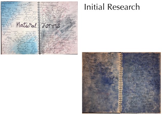
Final Major Project - Initial Research.
For my current project which was my final major project, I was researching and developing my ideas into the question of, ‘How the movement of water can be presented through fashion’. I decided through this project that I was going to explore down a more digital and communicative aspect against my art work, delving deeper into the admiration I have for my fashion side. I decided to include these two pieces of heavy initial research to show the early stages of how I tend to develop the formation and structure of my ideas.
0 notes
Text
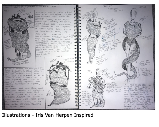
A big part of developing my ideas is forming illustrations, for these variety of hand drawn figurines I have explored into the influence of Iris Van Herpen, who is infamous for her ‘Crystalisation’ water dress. In this case of illustrations I have chosen to incorporate her style of unique, wacky fashion concepts with my own style of artwork - using contouring lines and fine liners. By producing a series of rough sketches before hand, I'm able to see the progression and later on development of the ideas that will come to life through digital medias, such as Photoshop. I also felt it was necessary for myself to sketch the ideas that came to mind straight into my book as I would be able to constantly reflect back onto when producing them practically. I've always felt that whenever I've drawn out figurines or clothing, I tend to stick with black pens or fineliners as they stand out a lot more, especially when making quick, flash drawings the black colours can really make the designs bang on the paper. As I'm constantly staying connected with the audience through my research, ideas and designs - I've analysed and branched off the technical ideas that inspired the dresses.
0 notes
Text
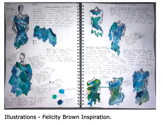
Somehow different from Iris Van Herpens style but still constructs her work with the same style of using waters movement - I have researched upon Felicity Browns infamous ‘Textured Ruffle dress’ to collate a variety of illustrations developed from her inspiration designed in my own way of art. In contrast to the previous illustrations I decided that since I’m working with water and eventually moving onto a digital platform, that water would lighten the pages up more and add the depth into the hand drawn illustrations. I didn’t want to stick with the generic water colour, of sheer and see through aspects which I decided to use more of a mono-tonal style of darker shades of blues, greens and some yellows - creating a diverse colour palette along the dresses. As i’m constantly trying to communicate the flow of water through the dresses having the fine liner outcomes of shaky, drooping lines underneath the acrylic paint I believe presents the stand-still movements that I wanted to achieve.
0 notes
Text
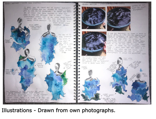
As these drawings are solely designed from my own photographs which have been stuck down on the left side, I felt it was an essential asset to include this page as it shows the difference from using an artists influence to create illustrations comparing to your own sourced photographs to develop into my style of art work. I again have drawn out seven different water movement inspired dresses - by taking snippets out of the photographs I’m able to construct together an usunual style of dress. The choice of how I decide to position the colouring of acrylic paints is structured through a method I love if paint blotting, by not filling the entirety of the dresses outline it gives the effect of the water ‘moving’ inside of the dress as well. The eventual outcome of these illustrations will be sourced through the digital media, as I always feel that having a collection drawn down before is such an accessible way to develop the ideas onto a digital platform.
0 notes
Text
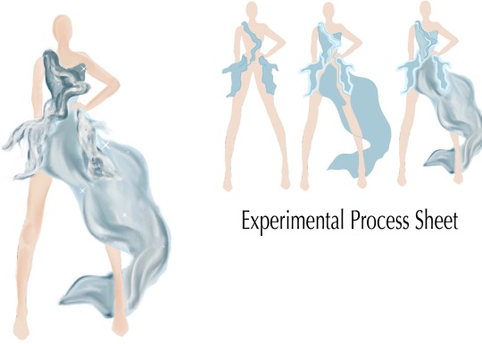
Final major project - Digital Experimental Illustrations.
With these having been my beginning experimental illustrations, I wanted to immediately start with the contouring and waving lines that fold around the figurine. The whole concept of having the motion of the water is to show how its movements whether being moved by weather or it's natural state can be reproduced on the dresses.
The choice of using dresses through these series of illustrations is very much as I view 'water' itself as a flowing, rushing motion of constant movement from splashing, running or still movement - dresses themselves are known to be long, weightless and flowing. I felt it was absolutely perfect to convey the instant message without any detailing - of how the water flows just by having the dress itself as a primary movement. As this being my first experiment - I didn't want it to be extremely perfect as it's exploration into which details work best to present the motions and which colours bring out the dark and light tones of the water. However, having already a double page spread on hand drawn illustrations, also having captured the process of the dress being detailed and carefully coloured - I was able to see the development of ideas springing to life.
0 notes
Text
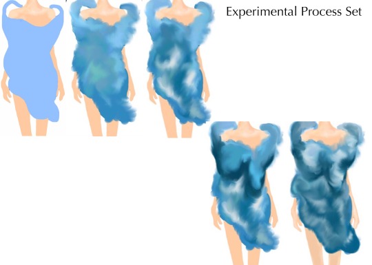
Final Major Project - Digital Experimental Illustrations.
In these second experiment illustrations I have channelled the influence of Felicity Brown - with her infamous ‘Ruffled water dress'. I fell in admiration with the intercret swirling details that she applied around the chest areas of her dresses, I knew I had to take that small but such fascinating section and bring it into my own illustrations. With already having the research illustration page influenced from her designs as was able to play around with the hand drawn illustrations developed through Photoshop until I progressed to the outcome above. What I also love about the colours of the dress is how strongly they connect back with the original acrylic blotted painted illustrations, I’ve stuck with the mixed mono-tonal colours which I feel present the comparison look from paper to digital perfectly.
I felt with this dress - I wanted to lightly include the feature of her 'swirls' into the top layer and bottom layer of the dress. I felt with my swirls being more contoured almost looking wave-like, they would have more of a water motion effect especially with each one being a colour darker from one another. As I developed through designing these processes I felt I was slowly capturing the waters movement - as well as staying in touch with capturing the audiences attention to how the motion is produced along the dress.
0 notes
Text
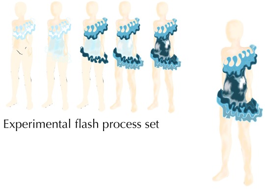
Final Major Project - Digital Experimental Illustrations.
Final experiment - very different to the past two which were a lot more held back on how flowing and drape the styles are, I wanted to use my own creative imagination through this illustration which I believe turned out much more practical than the past experiments. I'd chosen to follow down a more long, garmented style in this as I wanted to produce the motion out of the garments structure instead of the detailing - which I see has worked to its best ability. I've stuck with the grey, blue and white undertones, however - this style has a stronger, icy smooth touch to it, from just the look of the colours curving around the figurine and the motion being presented strongly in the contouring lines around the end of the dresses tail. The motion itself I feel has conveyed itself most strongly through this illustration - having the dress itself fall elegantly around the legs and upper body already keeps in-touch with how strong the message is presenting itself.
0 notes
Text
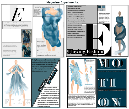
Final Major Project - Digital Magazine Experiments.
As I was constantly trying to connect with the audience through this project I wanted to expand my ideas more and look further into how brands/designers target their audience more personally. I picked these four especially as my best magazine experiments as each have different structural layouts, monotonal colours and a different digital illustration - which was the main centre to the audience. I wanted to focus on the target audience through these experiments, within these four I was focused on an older ‘adult audience’ as I stuck with the mono-tonal block colours, simplicity typography and bold navigation around the spread. I created this idea especially to fit into my portfolio almost as a mini-side project along the FMP, as I knew it would create a strong route of development that I would be able to dive into and explore within the ways of targeting an audience and how the communication can be delivered.
0 notes
Text
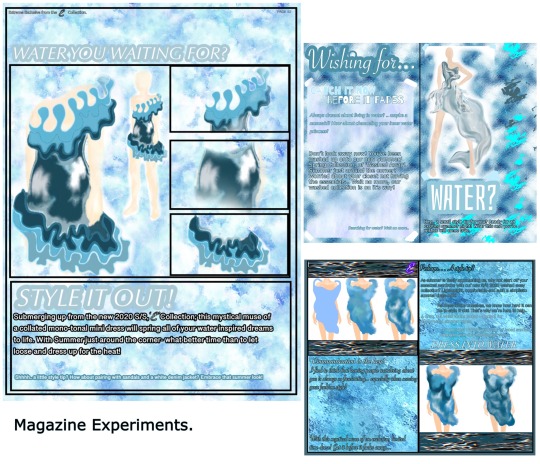
Final Major Project - Magazine Experiments.
Another mini magazine spread I created, but instead I wanted to focus on a younger audience, more specially targeting into a ‘teenage/adolescent audience’. Through researching and collating ideas from teen structured magazines such as ‘Seventeen, Vogue Teen and Vanity Fair’ I gathered ideas on layouts, colours and structural aspects to bring into my own experiments. As well as, bringing in my digital illustrations I wanted to focus the magazines spread as the attraction upon them - as a way to connect the colour methods of blues, water patterns and attractive typography to the eyes of the audience.
With looking at a younger audience, I chose to develop into a lot more personal, informal and exciting subject terminology as well as creating the colour methods in such a diverse, water-washed out way I wanted to stay in touch with communicational movement of water by having the whole spreads surrounded with water aspects - even without mentioning it, just having the look of it was enough.
0 notes
Text
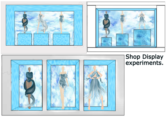
Final Major Project - Shop Display Experiments.
Finally - Another further exploration into a more ‘marketing’ side of my project concept, from looking into the magazine experiments I felt I could further my exploration and research into how shop/floor displays target and attract an audience. From having designed a floor display from my previous personal job, I brought in my own ideals and knowledge on how the display should stand out and represent, which I feel brings in a more personal aspect to the design.
I’ve chosen three of my most bold, unique shop/mannequin displays that I feel present the strong message of staying in touch with waters movement by the elements of the display being surrounded with patterned water- the digital illustrations being the main attraction for the displays. I also kept in touch with the communication of my main question of water presented through fashion by continuously using the illustrations as my main attraction, as well as the water elements having been developed through the displays. I felt it was important to tie the project ideas together through a progressive state by using the illustrations to show the experiments they’ve been through.
The choice of including these into my portfolio was very important as I found that having the magazines tied to the display created a ‘targeting audience’ technical mini side project along with the FMP. I wanted to showcase my developed abilities within Photoshop over the progression of the project, which I feel has been communicated here.
0 notes
Text
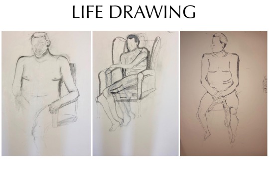
Life Drawing Set.
Through my two years at college, it was mandatory that an every Monday 'Life Drawing' session was attended, as an important side project along side my course. I felt life drawing was very essential, especially for the on-going designing of my illustrations - having being able to gain knowledge of how the project the correct composition of the model you’re drawing, the proportions and how observational drawings can be played around with was a huge help into developing how I design my hand-drawn illustrations and my digital ones - as I was able to transfer my skills into them.
I’ve chosen to include these into my portfolio as the drawings show a different side from my fashion work into my more artistic, drawn from life ability. I wanted to be able to present a variety of life drawing pieces in which I picked out my most favourable.
0 notes
Text
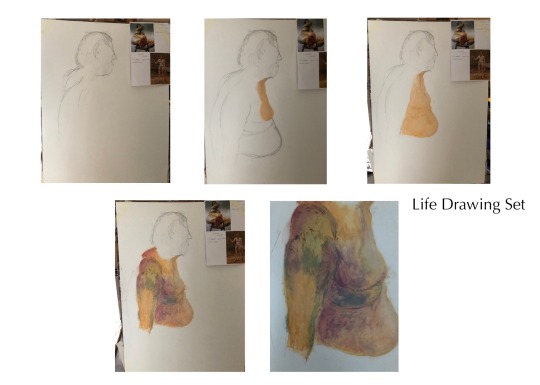
Life Drawing Set.
Another big love of mine is being able to use Oil Pastels efficiently, especially when projecting them into life drawing where skin is your main base. I picked out this procession drawing as one of my favourites because of the composition having a strong side profiling and the heavy, compacted oils mixed together to create the developed skin tone. For this piece I channeled through both Jenny Saville and Lucien Frueds’ use of their oil pastel techniques - I took inspiration on how they blended and chose out the pastels to complete their skin tone looks. By having the experience of life drawing and using skin tones, I am able to show the different variety of abilities that I am able to range from.
0 notes
Text
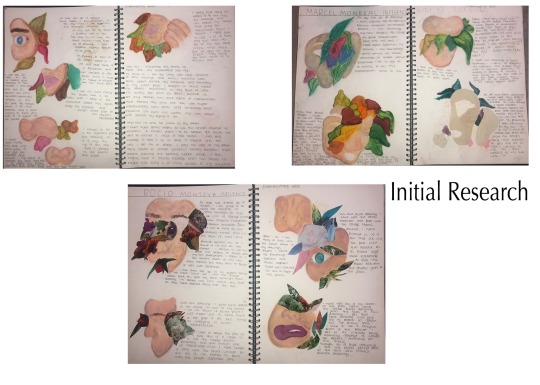
Unit 12 Project - Initial Research.
I wanted to include another previous project that I feel will build more of a structure to the portfolio, as the 'UNIT 12' itself was based on 'Engaging with an audience'. I felt it was most important to include a series of research, practical ideas and an end product that strongly present the flow of communication through digital materials. I've included the initial research as it's based upon, 'Beauty behind flowers' which represents the flowers almost-like a mask to hide the individuals insecurities/problems that eventually open up. Also as a way to present the practical elements I'm developing by designing facial features with flowers bursting out.
By communicating with the audience with just the design itself and the analysation on how the flowers are in comparison with the features, the message itself of flowers hiding someone's problems is so fluent within these designs - which is what I loved about keeping in touch with the communication aspect as it's always fascinating to see their opinions and how you represent the designs to them.
0 notes
Text
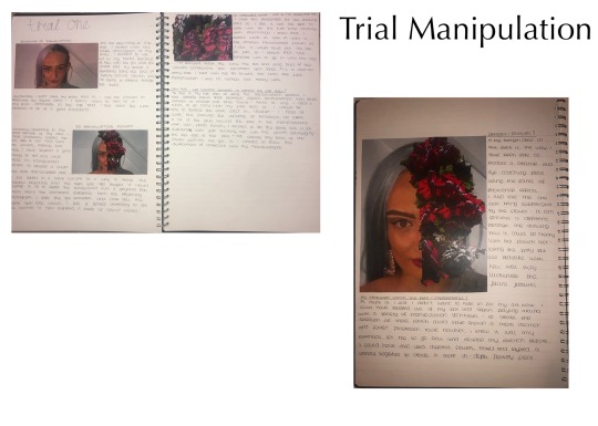
Unit 12 Project - Trial Photoshop Experiments.
Within this first trial experiment, I’ve been able to connect with the conceptual message of 'Flowers pushing apart an individuals problems to reveal the beauty' which with this first experiment is slowly developing to life. As this being my first exploration within the 3D medias within Photoshop, I wasn't expecting the first trial to be perfect which having the progression from a beginners element to the final form of manipulation 3D work is essential to keep track of.
Another aspect of what I loved about having the connection with the audience was the experimental stages - just as the same through my illustrations as well as in these manipulations. I felt there was always another individual involved with the researching and development of the experiments - as it was essential to always reflect back on the audience and how their constant connection matters with your work. Within the trial/experimental work, I found it fascinating when documenting how the development of the exploration can be shown from start to finish, especially with having the face being pushed part with a huge flower sprouting out - the processing of starting the 3D manipulations to pushing the features apart was always fascinating to see up-close. I felt it would be an essential asset to include the sections of this last project into my portfolio as it projects my developed abilities within the use of Photoshop.
0 notes
Text
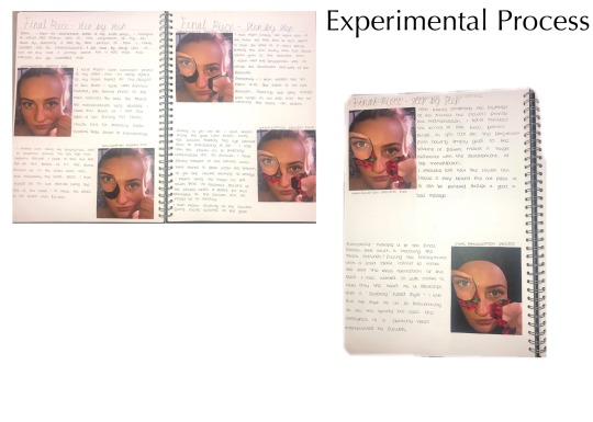
Unit 12 Project - Experimental Processes.
A big part of the communication aspect within this project, just as the same with the fashion illustrations was keeping the audience involved within the processes of the experiments. As the audience can see for themselves the ideas that have been developed, how the uses of digital media can create such illusional work and how they could create the work themselves - having the communication aspect feels as if you're work is not just for yourself but for the other individual. I also found keeping the step-by-step processing as a strong technical feature to build up the structual aspects through my work, I loved seeing how every stage bought the designs/manipulations to life through the progression of your work.
0 notes
Text
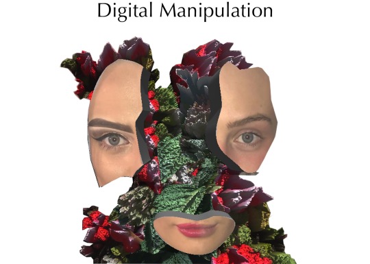
Unit 12 Project - Final Outcome.
To complete the journey of my portfolio, not only did I want to start with such an extravagant piece but also end with an illusional, unique final outcome on my previous project. I chose to include this as my end product for my portfolio as it’s such an important progressional piece of work comparing to the first piece I added. As it shows the developed stages through the pieces of work that I have included, as you’re able to view my different abilities ranging from drawings, digital media and a love for annotating.
I felt that within the unit 12 project of communicating with an audience, it's developed my knowledge within using my artistic abilities, being fashion or art to communicate a message across in forms of research, practical work, technical skills and a final outcome. I felt that within this project I was constantly reverting to the audiences, by communicating my message through the digital designs - not even needing the message itself as the design can almost tell it's own story.
1 note
·
View note