
Third year Illustration + Animation student from Manchester, England. Feel free to have a look about!
If you'd like to enquire about a commission or work, please email me using the 'Contact' link above.
382 posts
Don't wanna be here? Send us removal request.
Last Seen Blogs

rory-celeste
~ a journey of fortunate travels ~
simplylatte
Sleepy Coffee

conservationofhope
"Born a wildlife warrior, die a wildlife warrior."

kateifer-blog
College Experimentation
cordialcaps
Hello
Photo
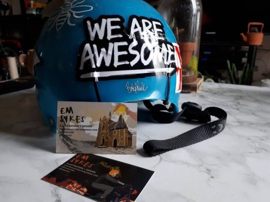
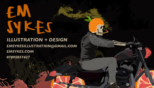
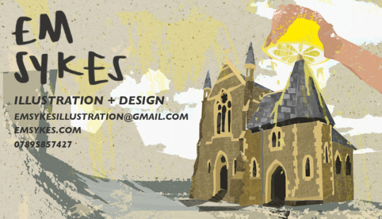
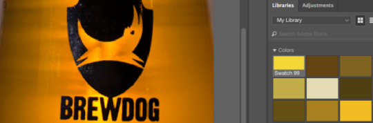
My business cards have arrived! They look great. I’m glad I’ve used these designs on each side, as they both represent the best of my visual language. The Elvis juice illustration is one of my favourites, and the Tarn Hows illustration is a good way of showing potential clients and employers I can use good concept and think up decent ideas.
1 note
·
View note
Photo
Finding better ways of layering my textures and using colour, finally finding my feet for redesigning the front cover of my book!
0 notes
Text
Portfolio Reviews
As part of my portfolio reviews, I’ve been in contact with several people in the industry to gather feedback and advice for my portfolio so far.
Rose Lloyd
Rose Lloyd is a Stockport alumni, and has risen far in the industry. She’s represented by Eye Candy agency, who are massive in the illustration world. Her work is bright, bold and at such high quality she’s had clients such as the BBC, The Times, and the British Medical Journal. She uses texture and shape as a forefront for her work, which is something that makes me very lucky to have been able to speak with her about my work, as it’s not just inspiring but also very similar to my own work. Having a creative who can understand your work and the processes behind it, is brilliant in getting feedback.
One of the first points Rose made when looking through my work is that she could see that I had a versatile range of media in my visual language, as well as my output. She mentioned that versatility is important, and that if you use more than one medium in your working style, let potential clients and agencies know that. I’m going to continue using different styles, as well as employing various techniques such as using mock ups, as well as if suits best - photography of my work, such as t-shirts, prints and books if needs be.
Rose also suggested the I add my contact details to the back, as it’s a nice note to end with. I currently have mine at the front, so I’ll see if other artists suggest the same.
Business cards were also suggested, which I’m currently designing! I’m also ensuring I keep my font, colours, and general feel consistent - I’m a brand as an illustrator and clients and agencies need to see that, purely because it looks so professional.
Rose, speaking about getting work, also mentioned looking up art directors in Manchester, and just getting yourself out there, emailing your portfolio over so you’re in their books and getting your name out there for potential work! She also mentioned if I wanted to go into editorial work, it’s well worth getting current articles and adapting them as your own. Editorial is so fast paced, so it’s good to get into that fast frame of thinking and ways of applying your skillset to text in a short amount of time. It’ll also put your work into context and be super applicable for potential clients.
It was wonderful to speak to Rose, and really nice to see how far you can go in the illustration world!
Flow Creative
I was given the amazing opportunity by Barney to visit the team at Flow, a huge agency in Manchester. They're a design agency who specialise in motion design an animation, but are super versatile. They have a massive client base and a team who are always looking for work from freelance illustrators - so it’s safe to say they have a good eye for the illustration industry.
I spoke with Karl Doran, the creative director, and Sarah - accounts manager, as well as other members of the team. Feedback included my portfolio, website and social media accounts being consistent, presentation of my work being well ordered, and they liked how my website is an open portfolio. Karl commented that my mix of mockups and full digital photos was refreshing, and that mockups used with my (Re)Collection work, as well as both print and digital campaigns is brilliant - agencies and potential clients love to see things in context, and the applicability of your work, so to keep that up!
Feedback also included to add sketchbook workings, and work leading up to it - this may be drafts or screenshots - it’s important that clients see this, as it puts your work into context some more, and shows the importance of your process, and how you’ve worked as a designer. I definitely need to start adding these!
After showing my ident animations, it was amazing to see that the whole team actually really liked what I had going on - for something I’m really new to, a process that I struggled with, and is still a work in progress - they loved the looping of the saxo wheels, the general over-the-top-ness of the 90′s items, and the lo-fi, VHS feel. Points to improve on were looping my work, perhaps simplifying transitions, and putting them on my instagram as loops or GIFs, as people looking for work such as agencies and clients absolutely love this. Karl mentioned that I should check out Ruffmercy on instagram, and I’m so glad he did! I’m so inspired right now!
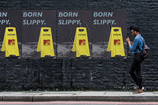
When chatting, I mentioned how I felt worried that by using the MTV logo so much in my (Re)Collection work, I may be ‘ripping off’ the brand, however the whole team said that it’s a good thing - people in the industry have published ‘knock off’ potential designs and actually gotten work off the original brands!
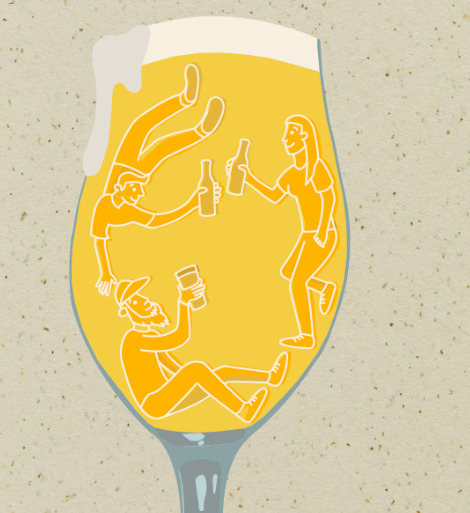
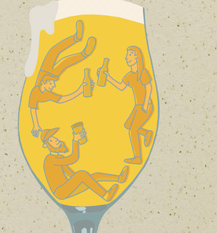
They also mentioned that using Beer Paper from GF Smith for my Beer work was so effective and a really nice touch, and possibly even creating business cards that are beermats! I am SO getting on that! Beermats are collectible, usable, and the thought of someone lifting their mug off it while looking for inspiration and seeing my contact details is a great idea!
An amazing feedback experience with lots of things to take back, and my confidence boosted. Thank you for checking my work out and for your time!
Tyler Spangler
I contacted Tyler last year for a small interview about his views on the creative industry, and so contacted him again this year for some feedback on my PDF portfolio. Tyler is based in California, and uses amazing colours in bold designs covering character, text, and many types of concepts. He has some amazing clients including Chanel, Nike, Outkast, and has featured online in Dazed and Confused, and Hi-Fructose magazine. He’s lovely to talk to and has always had time to give me advice, and is in a great position to learn from and get advice from from within the industry.
On sending him my portfolio, he mentioned that he remembered my work from last year because he likes my uses of texture! This is great, as being able to be consistent with my visual language means that I’ll be able to stay in people’s minds and proves better to staying in the radar as a creative!
He mentioned that he thinks it may be nice to include project information on my PDF portfolio, similarly to how I do on my website - that it’ll give the viewer some more context. At the moment I only have my captions as to what they are, media, and when they were done. However, my website captions, such as here - simply even with how and why I came about it, why it’s grapefruit, etc. I think this is a great idea, as as well as working sketches and drafts, it gives the full information to viewers and potential clients. If I’m sending a PDF portfolio over it typically means I can’t show someone my work in person, where I’d normally explain and talk through what I’d been working on and why. So that’s a great piece of feedback!
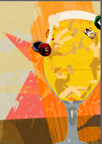
He also mentioned that his favourite piece in my portfolio is Elvis Juice, so I’m glad I’ve put it so prominently on my business cards! A few people have mentioned that it’s their favourite when looking through my work, and so it’ll be nice to be able to show people my best work here, especially in chances were first impressions are small, short, and therefore need to be really good and lasting, and an essence of my visual language as a whole.
I’m going to add small captions to my work, making sure it doesn’t take over too much or become too much of a read.
Ken Maylor
Ken is a proper old school illustrator. He’s based in Lancashire, and has been illustrating for decades. He’s produced work for the likes of Star Trek and Elvis Presley annuals, Oyston’s Estate Agency, produced spray positives of photographs for various catalogues, as well as being a police officer for years, he created drawings for the Police and Crimewatch, as well as airbrushing. We couldn’t find any of his old work together, but he now mainly fly ties - as you can see here, he’s got an incredibly craft hand and so it’s no surprise he did so well with airbrushing and producing realistic drawings for the Police and Crimewatch!
Looking through my updated portfolio with captions and sketches of the process thanks to Flow Creative’s and Tyler Spangler’s feedback, he had lots of positive feedback.
Generally, he said he loves the colours I’ve used, for myself as a brand, and the boldness in the illustrations - they grab attention. The use of my batman making faces image as my logo alongside hand-drawn type is quirky, and he thinks they’re positive and there’s humour. This is great, as I’d love this to be a first impression for agencies and potential clients!
Looking through my (Re)Collection work, compiled together with suggestion from Tutorial Feedback to categorise my work, the ‘90′s Called’ poster design reminded him of 90s films such as Lethal Weapon - knowing that the use of items to promote nostalgia has set off in this way for a variety of people who remember the ‘90s differently is great! The (Re)Collection campaign is definitely nostalgic and giving the right message about the ‘90s.
The Inflatable Sofa piece casts a good image and Ken said it made him wonder whether watching tv is relaxing, as he saw the sofa as floating on the ceefax due to its transparency - which is a new way of myself looking at it - considering it to be possible to be used for an editorial piece covering technology etc!
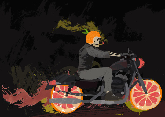
Going to the beer area/pieces of my portfolio, he suggested that Elvis Juice could appeal to bikers, and the ways in which the grapefruit is used for the wheels is again humorous and thought provoking - it’s lovely and refreshign to see that a fresh pair of eyes can see something like this consistent throughout my work when I’ve never noticed it before! He also mentioned that the sketches and process components are great - the feedback from before has paid off!
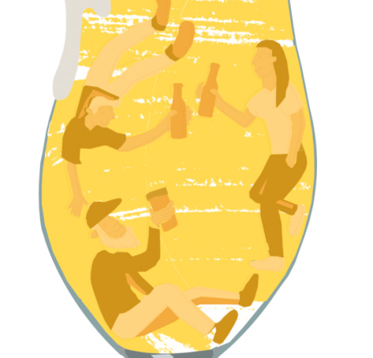
The use of texture and paint dragged over on such a large scale gives a lovely effect in Beer Dive and allows a relaxing thing to look at - I never thought of this as a relaxing piece, but it’s now something I can use within my visual language if I need to create something relaxing or scenic!
The Red Screes design is very relevant to the suggestion of where the ale is from, helping promote its locality - continuing to use the culture of the client and what my work is based on proves well and really shows that there’s deeper meaning and a lot of work put in behind my illustrations - I’ll definitely keep working like this.
The craft beer book is accessible, readable for both experts and non-experts, and makes you want to go out and try craft beer! This is wonderful, exactly what I set out to create when I made this - from a portfolio page, I’ve managed to get the best choice and range of photos for Ken to be able to tell this!
The Brodie’s Prime fox stance works well, as it looks mischievous but as hough he could be affectionate too, with a good stance considered in the sketches to show he’s on the prowl for mischief.
The Tarn Hows XPA piece with the lemon over the building is brilliant and works well with the spotted background, representing the way the lemon is squeezed and he also loved how it makes you think - one of my most conceptual pieces which I’m glad it’s not just me that thinks of it in this way!
The Palace cinema piece sets the tone well and the selection of what I’ve illustrated is so apt to the location, using Lancashire roses shows so much relevance.
The House Plant piece is so differential in terms of shapes used - he said he could see a sloth, a birds head, a goose - he mentioned that you look for shapes when looking at the illustration and it casts your eye all round. The more you look, the more you see - and then he saw an elephant looking away! And now I see it!
I’ve had some amazing feedback from Ken, and I’m so glad I was able to get feedback from such a practiced illustrator with a different variety of work to other artists I’ve looked at - it’s wonderful to see that artists from different disciplines can help me see my work differently, and can bring wonderful suggestions and feedback.
Eva Stalinski
Eva Stalinski is an illustrator based in the Netherlands, who works with bright colours and bold outlines, with most of her work screen printed as merchandise. Her work is here! Like Chris Madden and Tyler Spangler, I contacted Eva last year for some insight into the creative industry, and received some amazing information and advice! Again, I contacted her for a portfolio review and received some really good feedback.
On looking through my PDF portfolio via. email, she mentioned that she really liked the bright colours used, especially yellow - I never realised myself how much I use yellow, and just how much it works nicely with my work!
She also mentioned that my work is different from hers in discipline, and in that she uses bold outline a lot, however she could really see my work as merchandise! I’d love to explore screen printing some more as I have a screen printing kit at home, and I love using it!
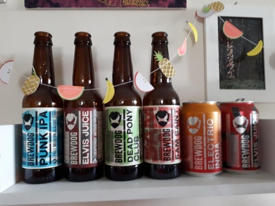
Finally, she mentioned that my beer work is really together and nice. She suggested looking at International breweries, as it’s always good to branch out and get myself out there! It’s strange, because as much as I love beer, I’ve never thought about this so I might do this!
Thank you to everyone, as I’ve had so much help with my work generally, and my portfolio has improved massively!
1 note
·
View note
Text
Getting so much inspiration from this recent discovery, all illustrated by Alex Foster! Going to use information and tips from this and other research to make my map better in this unit!
0 notes
Photo
Playing with colour hierarchy of line and main colours before I add textures. It really makes a difference!
0 notes
Photo
Colour catching, using colour as best as I can, and experimenting with minimal colours in the layout of my updated Future Self zine - working on the feedback from my last units!
0 notes
Text
Future Self: Part 2
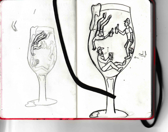
Looking forward to this next unit, my final unit (!), I’m revisiting my previous Future Self work - covering craft beers. I enjoyed this unit so much, and really managed to channel my visual language, interests, and subject matter here.
Looking at feedback I received, there are a few things I can improve on. I need to use colour more sophisticatedly, and having the extra time to consider more specific design elements other than the basis of the zine itself will allow me to create a really cutting edge piece of work, that represents me. The posters I made as secondary pieces of work were okay, but they reused work and I need to come up with something more innovative, that boasts my visual language and learned skillset of beer culture and design - I’m thinking of illustrating new and successful work from the unit onto beer mats, merchandise, or bottle labels. I may even redesign a whole brand!
Type was a big one. I wanted to capture the casualness, note-y kind of inexpert manner of the zine’s purpose, but I think it’s let my visual work down a little. Finding the right type and just giving the zine a re-jig, re colour and applying a nice scheme will up its professional-ness - the (Re)Collection unit really helped me get to grips with branding and authenticity, and I’m so excited to use new skills and styles learned and put them into this unit!
The photographic content needs to be more consistent - I’m going to retake photos of all of the beers I tried, and get them into a really nice, professional context. I got good feedback on my acknowledgements page, that the colours, and photos applied worked really well, so I’ll keep those the same.
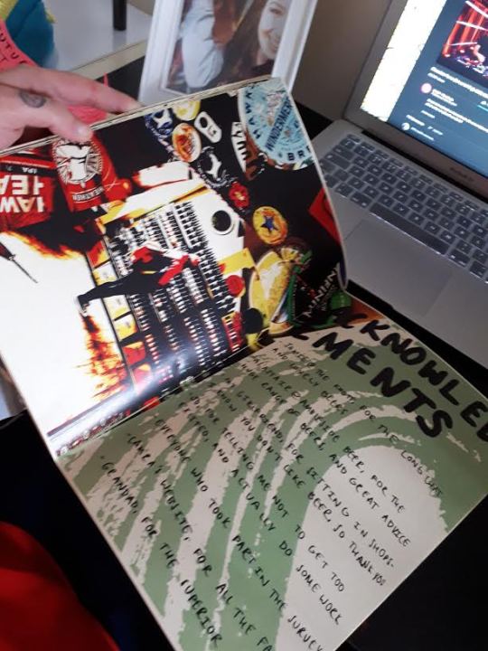
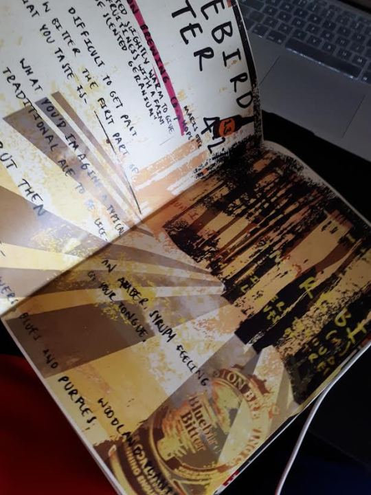
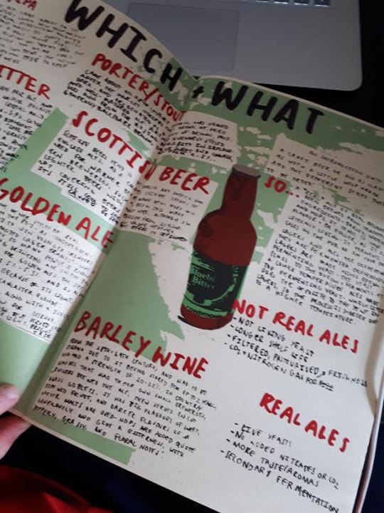
Pages such as Bluebird Bitter, and the facts pages need completely redoing, or taking out with better content putting in. New type will make it much better, but the layout definitely needs sorting, as I’ve evolved so much more since then. It’s crazy!
I’ve also drunk much more beer since then, found new breweries, tried newer beers and styles, and found out so much more. I’m going to see if I can cover a little more!
The map of beer I covered was great, but I think Jo’s suggestion of letting that be an actual fold-out unit of the book will give it a more ‘mappy’ feel, and a larger size will allow it to look better.
Time to get to it!
0 notes
Text
Potential Client List
A summary of my dream clients, some huge, some super big. They're mostly a mix of editorial and commercial companies, as well as some agencies specialising in design and advertising, as that’s where I feel I really thrive as an illustrator with my visual language.
The Guardian and Observer
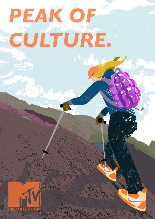
An absolutely huge name in the illustration world, and so much exposure! Editorial turnover is pretty fast, but I’ve really enjoyed working on the one day briefs, particularly the recent editorial brief. James mentioned in my tutorial feedback that when I’m rushed, and particularly in that brief, I used shadows in a way that really worked with the limited colours in the illustration as a whole, and it just gave it a very finished feel. I’d like to keep working faster and more effectively, and hopefully this next unit will let me get better at this! My recent work has begun to take on quite an editorial, narrative and representational feel and using perspective has allowed my work to stand out in smaller dimensions (see Peak of Culture below). I know where to email, and the Editorial Directories have a few people based at the Guardian and its different departments’ contact details.
Diva Magazine
I’d love to work for Diva Magazine, as I have quite a lot of interest in the magazine itself, topics it covers and discusses, as well as the culture around Diva. If you’ve not worked out by now, as obvious as it is, I’m super gay. Diva Magazine strengthens feelings of belonging for many lesbians and gay women throughout the UK and globally, and actually having a printed publication to represent ourselves is wonderful. My What Do You See? zine covered sexuality, identity, and gender. My work can adapt and I can cover topics that Diva covers. I identify with the audience and so getting into the mindset and getting to grips with what they would require from me would be great!
Wired Magazine
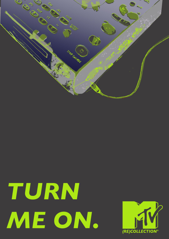
The one day editorial brief was actually for an article from Wired Magazine, and a lot of the work for my (Re)Collection unit was based on ‘90s tech, such as this Minidisc player illustration.
Being able to illustrate technological items and quickly cover subjects based on their articles with my visual language aiding this as best as I can is a skillset that I already have for working with them. Adding subtle mark making and texture to tech items and close detail may prove interesting for the audience. The art director has made themselves pretty available and left lots of details to be able to contact them, which is pretty good for confidence.
NME/Q Magazine
I’ve grouped these two together, because a lot of the reasons why I would like to work for them and why my work suits to the client are the same. Both magazines cover modern culture, film, music, and have quite an alternative/indie scene. I’m a reader of both, and am familiar with the things covered. I am in the age group of the main audience, and identify with the client’s needs. Although my Elvis Juice illustration is covering craft beer, it’s got a very laid back, alternative feel to it, something I think NME and Q would like. NME have recently announced they’re stopping their printed issues, to focus on online exposure and social media - my work with (Re)Collection and the social media mockups for MTV, as well as work with simple animations and GIFs could prove to be something useful for them and that I, as an illustrator, could be well suited to working for them.
Eye Candy Illustration Agency
Such a big agency and big name in Illustration. My all time inspiration, Chris Madden works alongside them, and their client base is absolutely huge. BBC, The Guardian, The Times, BREWERIES. I feel that I’d fit in amongst the artists there, such as David Humphries, who uses subtle texture but slightly differently to me with shape. Knowing that Eye Candy like to take on illustrators that works stand out a little more, and Eugene and Louise, who aren’t afraid to exaggerate character features and add an alternative twist to their works.
Being represented by an agency would mean that a little of my commission would go towards them, however Eye Candy are an insanely well established agency with a lot of respect, lots of clients, and lots of opportunities.
0 notes
Text
Professional Practice Talks
I’ve had so many amazing Professional Practice Talks at uni, but the best one that’s really left a lot of advice for myself is Emma’s Careers lecture.
At the start of the course we were told that because art careers are how they are, you have to work really hard to get where you need to. That’s still true, but Emma’s talk really helped me see how that can be done. It busted a lot of myths and preconceptions, and made me feel so much better about it!
The first thing that Emma outlined was that there is no one way to set your practice into motion. You can either go full time with something as your main income, such as working within a studio or agency, or teaching - I’m not really interested in teaching, but if I did get the chance and it fit comfortably - working full time within a collective, agency, or studio would be absolutely amazing.
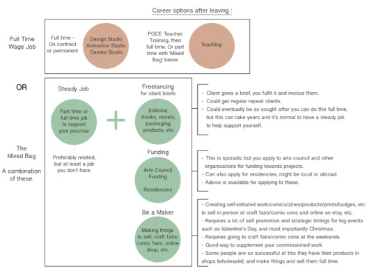
As well as this, you can get a part time job, get your main income from that, and work almost part time freelance. I’ve always loved the idea of working freelance, you take all of the commission, you’re your own boss, but before this I’d never known where or how to start. But, obviously until you have so many contacts and you’d have to have a hell of a lot of super big commissions constantly to have freelance as your main income, the steady job is the main income.
The most important thing that Emma outlined in this Professional Practice Talk was that there is nothing wrong with working part-time after graduation. She mentioned that she herself did it, and after speaking to the amazingly successful Chris Madden last year, he mentioned that he’s, after quite a lot of success and a few years in the industry, just left his part time job. I learned that it’s more important, and probably smarter, to make sure you can get your main source of money, get your rent paid, food etc, and building up your contacts and client base at a nice balance. You’re not thrown into the deep end, and it should be a little more relaxed.
Emma also let us know about looking for funding schemes and residencies - the Arts Council have great funds and schemes, and they're a good way of gaining quite big and out there works to be put on show - the Arts Council are quite likely to allow you to work in a public space. Additionally, she mentioned selling your own work - this is something I’ve done for a little while - I started with commissioned tattoo designs and tattoo-styled illustrations for people - then sold my zines, and various prints. Once I get more professional work together, this will be something that I can definitely have alongside whatever I go into - it’s a nice little top up from main income, and I’m my own boss! This could be either things sold online through my BigCartel store, or at print fairs! As well as that, preparation ahead of things like Christmas and seasonal events are key, as it will take a while to design, create and print cards in time for people to start buying them! I had a little bit of experience with Christmas cards in a brief this year, and it’s something I’m definitely going to look into in the future.
Knowing that the preparation isn’t as bad as you think, such as working out expenses, how much you need to live off each month, and just knowing that it’s okay to not be in full time work after graduation is okay and normal, is so great to know. It’s made the next steps after university much more possible to see for me now, and I’m definitely going to spread my wings and see what’s out there for me.
0 notes
Photo
Evolution of the design for my illustration icon. It’s important that I ensure it’s my style, and represents me, so I got rid of the outlines and added texture! Pretty happy with how the shape is neat and my textures hold the energy nicely.
0 notes
Text
Summary of Tutorial Feedbacks
I’ll try to keep these in chronological order! So far, I’ve managed to document 5, and a variety of peer feedback sessions, tutorials, and audio feedback from various points throughout my units this year so far.
Feedback from peers after formative pinup, Future Self Part 1.
I got some great feedback from my peers after pinning up all of our work! I was surprised with how interested so many people were too, considering I’m probably one of very few in the class who drink beer. Key points included peers really enjoying how and how much I used texture in my work, and on such a large scale - looking at this is great because I’d really aimed to push m texture to the next level, particularly in pieces such as IPA ‘74. I wanted my work to be much more moving, energetic, and set the mood for what I was illustrating - this is something that I aspire to keep working toward and using my texture so well as it’s a key part of my visual language, and pushing it will help me to professionally get my work places such as editorial pieces, where striking design in such an essence of an illustration is essential - articles need to be illustrated and represented so concisely, and the smarter I use texture and shape in my illustrations, the better I’ll be able to get at this.
Peers also suggested taking my work to actually getting work from craft beer breweries, and I’m so happy to say that that’s where I took it and I got a commission! Baby steps! It was also clear that everyone could see that I’d done my research from gathering leaflets, publications, and labels and tasting notes on the board and in my sketchbook. This has proven a great way of me working and I’m just going to keep delving myself into my work in this way in future!
Feedback from the end of Future Self Part 1.
Audio feedback from Jo and James was great, they said that I’m getting my visual language together more and more, and that a natural Authorstrator approach, although slightly scary for me time wise towards the end of the brief, helped me delve into the brief more than I’d originally suggested - I remember telling Jo how I wanted to create a small range of packaging for a brewery, and she immediately said I could do much more than that. And I’m happy that it’s clear that that’s what I’ve done! Considerations into materials and presentation were clear, I’d spent a lot of time (and money!) sourcing the beer paper form GF Smith and it really did pay off, my work and zine looks great, even from stuff just printed on it, being able to say that something I self published about beer is actually printed on spent beer grain and recycled beer mats is really cool and adds to it, and it just takes my work that bit further. I’ll definitely keep considering things like this, and I think that attention to such detail in the presentation and work behind my work takes it that step further. I’ve even printed some mock ups for my business cards on it, because not only does it incorporate time and effort put into my work and how I present myself as an illustrator, but it also adds a bit of me to it, and it’s a little more than just a textured card.
One thing to improve on would be my type, and how everything’s hand-written. I think Jo and James felt that although it did represent the laid back, informal nature of the zine, there’s scope to experiment with it more and further my work professionally by adding some digital type - it’s much more legible, and I think with clients seeing that I can mix both my work and text well, as well as using type that will represent their companies and needs for briefs more, would look much better and more professional. I think so far, I’ve definitely done this when it’s come to my Illustrator Authorstrator brief, using Gill Sans in my work not only matches the MTV branding, but it has something very swift and ‘90s about it, as well as intertwining nicely with the energetic colour, imagery and texture of my posters and visual language as a whole.
Audio Feedback from Illustrator Authorstrator so far
Feedback from about halfway through my Illustrator Authorstrator unit was probably the most shaping feedback I’ve had so far this year. The initial research and start to the unit was difficult as I knew that I wanted to cover the ‘90s but I didn’t know how. There were ideas being played around via. email between Jo and I, ideas of nostalgia, widening the culture I was covering, but initially the work I’d put up was still covering the ‘Big Beat’ genre. Jo mentioned after looking at my work, that producing my work for something like an MTV or Channel 4 ident, for a ‘90s event would be great. This was just the feedback I needed, as it managed to tie everything I was visually communicating together, and using objects such as the inflatable sofa that I was developing at the time, really iconic objects from the ‘90s would just do so well in a campaign to show that! It’d bring nostalgia back to people and allow people to really feel the ‘90s.
From then on, using an MTV campaign and creating the (Re)Collection brand and campaign allowed me to push my work a little further and step my visual language, design and picture making skills up that little bit more to be able to almost get to that professional level. This unit from this feedback proved really successful and I got a lot of advances in my working style and output, I improved on how I present my work, using mockups, and I got some really good things to put in my portfolio and on my website. Even the animation got brought along to a level that it went beyond short animations, but the animations had frames I added on that went into the (Re)Collection logo, really adding to it and allowing me to have something, along with samples, to add audio to and really give it that extra dimension and widen how I work.
Feedback on the branding of the MTV (Re)Collection and Illustrator Authorstrator so far
Another tutorial shortly after the previous one included some really good feedback to focus on and some tips on where to go with the feedback I’d got from the audio feedback. The MTV logos that I’d put into the animation as was needed neatening a little more, there’s differences you can see between the transition of the MTV logo and the MTV (Re)Collection logo in the animations, as you can see here. The logo on the very left is what it was before the feedback, and then adapting and adding on the (Re)Collection logo to each animation really took it further and just made it that bit better and finished.
Feedback also included that some animations just needed a bit more movement and frames for them, it wasn’t that they were too short but that there just needed to be a bit more of a smoother move for some things, especially in the RoboDog animation. Working on this, there were too little frames and so much movement between them that I needed to take on a new method of working and actually changing frames and moving the legs etc of the RoboDog to make new frames in between. All in all, this added to the glitch feel of the RoboDog’s behaviour and concept as a toy, and provided a lot more movement and made the animation better.
I was then told to start looking at what audio to use, and look at using VHS effects for my final animation - adding the VCR effect would add the nostalgia to the animation side of things, as well as really keep the aesthetic consistent throughout the whole unit. I started looking at sample videos online and added them as an overlay to my work, and it gave this! There's still room for improvement with it but I’m really happy with how much the video effects add to it and really encapsulate the ‘90s feel of the animations.
Feedback for the Illustrator Authorstrator unit, after the final hand in for it
Feedback from James and Barney was really good, they mentioned that I’d produced a lot of work, and this came from great feedback from the last tutorial pointing me in the right direction, and myself as an illustrator adapting how I work to produce better work. I was told my visual language came through more, and it’s evolved with the brief, and it’s great because I’ll be able to apply it to more and more briefs, and I think that with the Future Self Part 1 brief, shows that my visual language is coming together and developing much more, and I can now apply my illustrative style to more work now - this gives me great confidence to push on with this for the Future Self part 2 unit!
Other feedback included presenting these works at the degree show, and using a combi VHS tv from the ‘90s to be able to show my animations on on a loop, as this would really stand out and impress people at the show and just give this extra something to authenticate what the unit is about. I am also going to look into using the tour poster designs and putting them onto flyers, as this is how things were distributed in the ‘90s and how club nights are advertised now - just adding to the realness of it and the tour side of it.
Looking forward to the Future Self Part 2 unit, I’m definitely going to take in this feedback, neaten up my work from the past 2 units, and keep pushing my visual language and using texture how I have, and adapting it to the best that it can be for the brief ahead and what I cover.
Feedback for Business Card mockups
I’m in the process of designing and sending off my designs for my business cards, part of my PDP - as well as for myself in the industry, to hand out to clients, contacts, and people at my degree show. After sending in my mockups to Barney, he gave me some feedback.
Firstly, he said that all designs represent myself and look professional - which is the main thing I wanted to nail! He said that he prefers the ‘Em Sykes’ text to be in my handwriting, as it has more character and looks more dynamic. I think this is fitting as I feel it’s a lot less uniform, and represents me more. It’s also consistent with the design of my website, store, social media, portfolio, and my blog. He mentioned to probably avoid the swimmer image, as it’s the weakest in the set. This is helpful as it’s one of the designs gone in terms of whittling down what to have on the final design!
On the Tarn Hows business card (building), the contact details are quite hard to read - and it’s probably best to move the text closer to the main Em Sykes text - I might experiment with this as the Tarn Hows design is quite conceptual illustration, and with my business cards giving a first impression to potential clients and contacts, it’ll show that I can make good decisions about representation and be innovative with my design. Barney also mentioned it may be worth me avoiding the use of the term ‘texture fiend’ - although it’s something I use to aptly describe myself, my style could always change, and I may not be wanted by clients just for texture. Finally, he mentioned that if I’m using illustrations on both sides of the business card, it might be worth co-ordinating both designs so that the colours match - this could be more comfortable to look at - I might think about this, as I feel that I like the contrast and it’s more cutting edge.
2 notes
·
View notes
Photo

Tutorial Feedback from Illustrator/Authorstrator
I absolutely cannot believe how well I’ve done in this unit! I got my marks back yesterday as well as feedback in my tutorial. Hard work pays off! This was a really long unit which allowed me to explore a lot of subjects and angles to approach my work from, and produce a hell of a lot of work.
Feedback I got included that I’ve got a strong visual language, that I managed to create a confident, bold, loud media campaign that is almost ready to actually be something professional with a little tweaking, and that the ways I have incorporated the colours I have into my work has shown the mood of the ‘90s.
I worked really hard to get the fonts right, researching fonts for The Guardian for my mock up piece, the (Re)Collection logo and aesthetic to ensure authenticity of the brand and campaign, and its applicability for the industry, fitting into MTV’s social media outlets as well as print advertisement. I’m really happy that I’ve managed to channel my visual language to another brief as well as the Future Self part 1, and I’m going to continue to apply it as best as I can and allow it to adapt to future briefs and works. I really worked with colour, especially since my last tutorial feedback, using colour palettes from initial research into ‘90s dance music and print media etc. It actually took me up until I saw my works in my studio space printed out and in their mockups that the colours had really effectively worked, especially in the phone piece. I’m really happy that I’ve adapted myself slightly to make more decisions, contacting my tutors and coming up with catchy slogans and titles for the posters, and creating tour dates - I’ve almost taken on the role of designer here, something I’m hoping will look really good in my portfolio as a more rounded creative to future clients.
Barney mentioned that there just needs to be a little tweaking, for instance in my Strapped In? piece, theres a slightly smaller gap between both words vertically than the others, and I think this was a little mistake of using separate text boxes in Photoshop in the design process. Going back to this and reprinting the Saxo work in good time for the degree show will allow me to be able to ensure all of my work is super consistent, and that these little tweaks will help encapsulate my work nicely.
Reflecting, at first I really struggled with the subject matter of this brief. With the music mapping brief being so vague, it was really easy for me to jump onto one music genre and focus on Big Beat, but it wasn’t enough. Good contact with my tutors, and looking back to how I did well in my last unit allowed me to be able to take on a good Authorstrator response and delve into the ‘90s as a whole. This then took me to dance music and club life in the ‘90s, going out into fashion, society, looking at other creatives’ works on the ‘90s, such as Adrienne Sallinger’s exhibition into teenage bedrooms, reflection of how my work is going along the way, looking into the MTV branding in the ‘90s itself, and looking into animation more - I really did struggle with getting my animation to capture what I wanted to, because it felt so different to getting down my strong visual language in the campaign posters. But looking at research such as this, using very minimal technology, lo-fi work soon came round quite nicely.
There’s still bits of tweaking to do with paper, and looking for a thin paper that I can get my posters printed on for a good price, possibly making some of the posters even bigger and pasting them up at the degree show, as well as reverting my animation back to the first draft, adding more bits, changing the sound, and outputting this onto a small combi TV for the degree show to really allow it to show the ‘90s - looking forward, it’s all about just tweaking bits, and encapsulating my work to something that does it justice, and that people at my degree show can see that the output and showing of it has been really well thought out.
1 note
·
View note
Text
Skills Audit & Action Plan (And a bit of a reflective PDP post)
Although it’s been a while since I initially worked on this part of my Survive Guide, I feel that it’s really helped shape my work as a whole, as well as my visual language and the front I put on as a professional illustrator.
Looking into my strengths, specific skills, and how they can be applied within the industry has helped me open my mind and think about where I can take my work, as well as apply these strengths to units after this exercise - I’ve become much more confident as an illustrator, and also spent more time honing the skills that I feel are primary to what I do, and rather than shaping myself into an industry, it has helped me shape an industry to me - there is a place for everybody, and as Keith Haring said, art is for everybody. I’ve now just gotta make mine really good!
In the audit, skills I highlighted were:
2D Digital
It’s pretty clear that my most primary method of working is 2D - recently, I have been adding things such as drop shadows, slight dimensions to my work however, such as here. I think that allowing my work to remain 2D keeps texture as the forefront of my visual language - I would like to explore into 3D design, however it’s quite a ‘clean’ dominated area from what I’ve seen, and I still have so much more exploring and prospering to do within 2D! 2D work is also super fitting for media and units that I’ve worked across, for instance editorial briefs, commissions for a beer bottle label, and media campaigns - things to be put onto posters, billboards, and even small animations.
Abstract
Abstract is a weird one, I see my work as quite abstract in how I use texture as a shape form and a platform to add onto my illustrations and the parts around that one texture I’ve used. Looking back to second year, my What Do You See? Zine was very abstract, images and shape were intertwined, the zine was a method of enticing an audience to dissect what they saw and become engulfed in the chaos that had been laid before them. Although I feel that this was a successful piece of work and I enjoyed my methods of working, I think I’ve evolved a little more as an illustrator since, and even in the process methods of how I worked, layering, distorting allowing things to be in front of what I see as more important now; legibility, message, perspective, gesture, and shape, I’d like to say abstract work could be something I perhaps look into in the future, or if I want to create extra pieces of work, accompaniments for a client, crops of parts of texture and works could prove as nice abstract pieces. My textures set so much of a mood for me and my work that I feel that this could be, if done rightly, a strong thing to keep hold of - I guess it’s a case of whatever creativity I yield and what’s required of me in the future!
Animation
Animation will aaaaaaalways be something I keep aspiring to do. It’s something I keep doing, and something that’s been included in my work each year, but I still can’t quite put my finger on it and keep it mine. Experimentation with stop motion in James’ workshop in first year really got me more confident in seeing that animation wasn’t people sat behind MacBooks on really fancy software that nobody else could do, it was more than Pixar stuff, but it was and still is, simple movements, lo-fi ways of making things happen, making them happen in a different way, and I think a method of me either enhancing my work or adding a little movement to it. Drawn frames have been something I’ve used a lot, particularly in my Illustrator/Authorstrator unit, I’ve drawn hundereds. Some have worked out lovely, and some just haven’t done it for me. Compiling an animation of a collection of ‘90s inspired MTV idents was a huge learning step for me. I learned things along the way, mastered making GIFS, became a little more familiar with frame rates, and saw the importance to detail and consistency. For me, I think the biggest thing is the context requiring the animation, media used, and simplicity. I need to stop focusing on how many frames I have and how intricate it is (although this did work for such specific movements in the Inflatable Man ident animation), but really nailing what I need to. I was recently shown a bit of work from one of the artists in the We Are Goodness agency, and it just blew my mind that a few variations of one frame can come together and be so effective. I’ve begun to become familiar with Adobe Character Animator, and I think this’ll be a great place to start looking at developing my animation skills - there’ll be less of a separation of stuff being too hand rendered and media use being limited (my Jeff Koons animation was almost solely line, and even after hours of deliberation it still didn’t mix in properly), and working with my illustrations and introducing a little movement.
Architecture
Architecture is a strange one. I still struggle to see past fancy pants diagrams and blue prints, but in my work it’s something quite comfortable for me. I like illustrating things. I loved the concept of how objects evoke nostalgia and memories in my (Re)Collection unit, and having something to focus on and make it really work is something I love doing, not just in Architecture based work, but as a whole. First year saw me use a little sketch from inside the John Rylands Library in a screen print experiment, to commissioned work outside of uni of The Palace Cinema, which I actually just casually showed the owner who I work for, and she actually loved!
I’ve more and more begun to look into what actually makes up what I’m illustrating, for instance in the Palace Cinema illustration, I spent hours gathering the different colours of the bricks, to make it look bricky. I’ve begun to see that you can own something that’s real, make it your illustrative style and visual language without it having to be realistic. I spent less time on making sure every little thing was the exact same, and used the colours and shapes I’d studied within each detail to highlight them, exaggerate them, introduce daring blues into greys, and oranges into bricks, to get an end result I was pretty impressed with. I think that’s what helps make my work so striking. Not just the texture and shape, but separating myself from expectations, what it should look like, and make the item itemy.
Business
If I’m honest, I’m a bit of a kid and easily stereotype this bit. I see grey computer chairs and a murky office. BUT, applying myself into the industry, as well as other industries as an illustrator, has really helped me realise the importance of illustrating for business. If you work well and present as a confident, professional illustrator, you’ll be taken seriously. Businesses look to you as an illustrator who specialises in something that they don’t, and it’s important that you keep in mind that that’s why you’re there. If a business wants you to illustrate something, or illustrate them as a company, you need the output to gather the essence of them. Even if I got a commission for a magazine on something like wooden pegs, it’d be so important to study their importance, function, and what the client wants and needs. I think that the b biggest creative challenges I’ve faced, especially in one day briefs, have been because I’ve either not been familiar with the subject topic, or the industry itself. Recently, again, I’ve become involved within the cinema business. It’s all about illustrating things you’re not comfortable with, or haven’t illustrated before. But that adaptability, to a certain level, and making it yours, it’s what’s important. Publications and organisations such as the Financial Times, Guardian, and Business Insider/Weekly are highly successful commissions for illustrators and I’d like to aim high!
Collage
I like to see past collage as something kids did in school as an ‘art’ class. It’s all about instinct, and for me, collage is my skills of bringing hand rendered things, textures, markmaking, objects, cut shapes, together with Photoshop and creating something unique and eye-catching. I like to see my illustrations as collages themselves, I’m literally adding bits and bobs together for people to stand back and go ‘Oh, yeah its a person climbing a mountain but she’s made up of all bits and bobs, that’s pretty cool that’. For something that I used to see as just photomontage and for people who’s work was solely strong as hand-rendered and perhaps just scanned in, it’s now a skill I see over a lot of the time, but definitely the roots of my visual language.
Design
DESIGN IS SO IMPORTANT TO ME, I NEVER REALISED HOW MUCH I ACTUALLY FIT INTO AND ROCK THE LABEL AS DESIGNER! I think that since working on my Future Self part one, the beer project, I’ve begun making much more informed decisions about my work. Type, placement, composition have all become really important in my creative process. Design allows me to make my work apply to certain things, such as my zine being more than just a zine for uni, but a self-published piece that I can have in my store and say “I made this, it’s about beer, it’s unique, and you can buy it if you’d like” and be confident in saying that! Each illustration now has so many possibilities, and I think that design is more important than ever for me because such texture-based works need the design element there, to allow for space around them, and elements within them that push them that little further to being something that’s worthy of being professional. Design has also taken on now as being a part of my actual visual language rather than just a skill - it’s now on the drafts for my business cards, as I do see myself as a designer. I’d like to think that because of the informed decisions and time put behind my recent (Re)Collection work, the logo, the brand, authenticity, space as advertisements themselves, that my work’s been seen not only by university as design-led, but the outside world and the industry. I’ve been asked to design and illustrate actual things outside of university because of my skills and design behind my final works.
Fantasy
I’ve developed past someone that saw fantasy work as pixies, fanfic illustrations and very 3D based, realistic work. I think I actually fell into the Fantasy skillset by accident! A major step in dong this was probably my Future Self part 1 work, such as the illustrative responses, Elvis Juice and IPA ’74. I I mean, a skeleton fully clad in biker gear, with a grapefruit helmet, on a bike with grapefruit wheels is cool, but it’s definitely not real. But I managed to illustrate that, and make it conceptually plausible. Channelling my responses to the tastes and experiences from the beers I was trying, the content for my unit, past what I just tasted, to what it felt like and would really work as was probably one of the first big things that allowed me to start feeling like a proper illustrator. I saw Elvis Juice as a badass, punchy, refreshing fruity number, and channelled Brewdog’s punk scheme of things as was, to create a damn cool illustration. I saw drinking the first proper IPA I’d ever had, the most hops I’d ever tasted at once, into a pool, no, a sea of beer. I added colours I’d never have thought to add to something when illustrating beer, and it really worked.
Editorial
Almost as a combination of both fantasy and design, I like to push the boundaries of what something should look like and represent, but also keep it cool and professional - not too abstract - although I take much more of an Authorstrator response, I like to keep to the brief and adapt to the client’s needs, but keep my visual language at the forefront of things. The one day brief really helped me to see this - although it was a slightly shoddier version of my better work, it still grasped the topic and article content - I enjoy the challenges of using limited colour pallettes, and although I like to make my work hyper representative of what I’m illustrating, taking the actual colours away from something and applying a new palette can really help embolden my work and add meaning and context however I may need to. I like creating work that I can see applied throughout various media in the industry. Although my Peak of Culture piece wasn’t for anything editorial as such, it was the first piece in my (Re)Collection work that really hit it as a piece that could be distributed into the media. The way that I’d really worked with the perspective of the climber’s legs, to allow her to stand out, and make sure that you could see she was climbing and almost leaping - the true lengths she was going to - was something important for me - it was as if I’d adapted this frame of mind where I can see that I may have a limited size of image, or audience - either familiar with my style or not - to get as much as I need to out there, in the best way that I can. I like making my work accompaniable, and strive to see the final outcome as something I could see out there as a professional piece.
Merchandise
Merchandise isn’t something I have too much experience with, as I’ve made t-shirts as a secondary product to my What Do You See? Zine, but it was very rookie and basic. The t-shirts had linocut designs of mini illustrations featured in my zine, and although they were somewhat aesthetically okay, there’s something more I need to keep doing. I enjoyed getting appropriate photos to fit the feel and crowd of my t-shirts, and putting them online - I’ve also learned the importance of social media as an illustrator, as well as self-promotion. Plus, my visual language has evolved from there. Being more confident now, I’d love to be able to adapt some of the ‘90s work I’ve used in my (Re)Collection work onto t-shirts and even tea towels - ‘90s fashion is such a comeback right now and it could really nicely adapt. Perhaps screen printing work and illustrations, definitely text, would prove quite nice as some merchandise. My own merchandise is also important, as it’s a source of money. Aside from commissions, getting my own work out there as something saleable is important - I’ve got prints and my zine of past works up there in my store, but there’s so much more I could do. Merchandise in terms of commissions for others is something I really really aspire to become involved in - campaigns such as Everpress are really good ways of me kickstarting this and getting my work, on t-shirts and merchandise, out there into the industry - it has a very tight knit creative crowd, and there could be fashion designers and brand owners amongst them. Aiming high, I aspire to create merchandise for brands such as Vans, to even smaller brands - merchandise for bands, posters, t-shirts has always been something I've liked to do - it’s applying! I’ve currently been experimenting with screen print at home using DIY stencils, mixing colours and applying ink in ways that create texture - this has proven successful, and with some tweaking could be something I could further with and really grasp onto for my last unit.
Narrative
I very naturally and comfortably allow my work to take on a narrative approach, as my visual language can be very high-energy, and telling of the subject. If an object or character requires movement, I’ve adapted the surroundings or features using shape, space or form to be able to enhance the movement. Pieces such as the Saxo or Dancer from my (Re)Collection work, required a lot of time into skewing, perspective, and strength in colour to be able to get their angle, energy, and capturing their possible movement. I think that narrative is something I improve on with each brief (hopefully!), adapting to the needs of what's asked of me, and how my work can meet that.
Social Issues
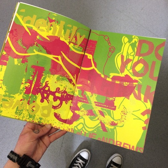
Social issues are something I’m very aware of, and as many people know, voiced around. Because of this, I do take time to explore any issues I cover, and although most of the time I do tend to choose briefs that don’t cover social issues, when I’ve had works that include concepts of it, or decisions that require a moral or social input, I’ve always been happy to add to it and take the time to think it through. I think the most prominent socially aware piece I’ve made is one of the double page spreads for my What Do You See? Zine. I’d collaborated with photography student Ellie Andrews to swap works covering sexuality and identity, and mixed with her work as well as my own illustrations, it became a successful piece, I think covering it as it should be. Freely. There was nudity, masturbation, and topics that required equal exposure. Gender fluidity, the male and female body, and it would have proved quite difficult if I hadn’t considered why I was covering this, and how. I ensured every subject was covered, and that things weren’t too vulgar or in your face, but things such as the female nipple, and male anatomy were clear for all to see. These are such things that currently are being more accepted in society, but art is a great platform to be able to get this out as well as laying out facts.
Generic Skills
The generic skills I selected as my strongest, rating at 4 and 5, were:
-Coherent visual language
- Reading and understanding a brief
- Using visual research
- Recording your process
- Making corrections to your work
- Working in a given format
- Scanning artwork
- Preparing artwork digitally
- Sending hi-res artwork
- Sending a professional email
- Verbal and written communication
- Working to a deadline
- Working under pressure
- Working independently
- Working in a team
- Adapting to change
- Establishing client needs
I feel that I work really well on all of these, my visual language is something that’s come together really neatly over time and something that will continue to develop thanks to these exercises, my briefs, and feedback, as well as the creative process itself. I’m used to recording my processes, however things like working to my sketchbook need to be looked at nicely as well as stuff on here - I need a good balance as sometimes I forget how important my sketches etc are. So much of my work is prepared digitally, and preparing for things such as the One Week Exhibition at Kosmonaut at the start of the year really helped me to get a hang of hi-res, the right format of colour, and sending things over to be printed. Emailing practitioners to get feedback is something I’ve worked really well on, as I managed to hear back from some great people! I’m hoping to do the same again when asking for Portfolio Reviews.
Specialist Skills
Specialist skills concerning the parts of the industry I aspire to go into include creating a range of works which link, and marketing myself - I think I’ve managed to do this well throughout - the previous units, both the Future Self part 1 and (Re)Collection had really helped me to get out there and pull my work together as one combined, consistent piece. I was lucky enough to get a commission out of my work in Future Self part 1, as a small brewery in Ambleside that I’d visited saw my work on Twitter, illustrative responses to beers similar to theirs and beers they were interested in, and asked me to create a bottle label for them! Putting myself out there as an illustrator as if I were being commissioned by the people I’m interested in is very cheeky but also very effective. Obviously I wasn’t commissioned by MTV for the (Re)Collection unit (I wish), but by allowing my work to look as though I had been professionally commissioned actually made myself look really professional and stepped me up out there a little bit. Because I’d put my work into mockups and adapted it that it were possible that I could have been commissioned, it really did attain a lot of comments and likes, a lot of people paid attention and I actually felt really confident. Emma Reynolds’ talks about being a professional out there also restored a lot of confidence - you don’t and you won’t hear back from a lot of people when asking for work or putting yourself forwards as an illustrator - particularly concerning things like editorial work - you have to put the work in as an illustrator and contact the right people - and if you don’t hear back, you don’t hear back. There are so many opportunities out there, that you just keep going and something will find you. Looking at the directories for agencies and editorial contacts was also a real confidence booster - I’m sure I’ll be terrified when I get to it, but it’s so nice to see that there’s people I can actually get in touch with in terms of getting my work out there! Aaah! The ability to visualise clearly was also something I rated myself quite well for, as I enjoy the creative process of brainstorming potential ideas, writing about them, what works and what doesn’t, and along with research and drafts, selecting the best ideas to represent not only my abilities and visual language, but the brief itself. Finally, one of the skills includes working to a tight deadline - I’ve really worked hard to get what I needed to done as well as I can, and as best as I can this year particularly - and after all of the grouchiness, tiredness and stress, it really pays off and I take a lot of pride in it. This is something I keep aspiring to do, as the final unit coming up is being cut a little short as I’m away for the actual deadline (!) so I’ll have to keep cracking on and ensure I can get everything handed in a little earlier and to the best that I can.
Action Plan
1) I need to learn more from professionals on how to deal with clients and financially work, such as sending invoices, how much to charge people, and taxes.
Professional practice talks with Emma Reynolds and Jo have really really helped me to be able to see how you work as a professional in terms of dealing with clients and finance - I’ve looked at what powers I’d have as a professional in terms of not being paid, and how to go about any difficulties with a client. I’ve also learned the hard way in terms of being paid on time - it’s best to ensure you have the money in case you don’t get paid on time! Looking at day rates for new graduates and what kind of work costs what is definitely something worth talking to illustrators about - it’s normally the same generally, and people are normally happy to share it with you. This may be something I may ask my contacts when getting some Portfolio Reviews, as this is pretty important to know and learn about before I graduate. Talking is good!
2) Get myself braver and used to the commission process - the best ways to create rapport and how to approach the market myself.
Creating rapport is something that still scares me now, but I’ve started noticing people and illustrators alike in the creative industry are actually really nice, and like-minded - sending messages to thank them for following me, commenting on work that’s really nice, and general appreciation is so important.
3) Market myself - find people who are interested, followers etc.
It’s important that I continue to get myself out there, as this isn’t something that just happens. Especially with the importance of social media, although people use it so much, clients don’t just flock to you. It’s important that I ensure I keep my portfolio up to date, available online for people to see my best work, keep my website looking clean, and always have business cards to hand - you could meet someone that could be a potential client anywhere! Looking into the people who illustrators and those out in the industry are interested in, in contact with, and look up to is always a good way for me to not only open my eyes, but keep up to date with happenings in the industry, as well as trends, and good things to know.
4) Filter thoughts/ideas into the best that I can
This is a work in progress for me, and as a creative, I think it always will be. You can’t get better at something by not doing it. I’m going to keep filtering my ideas to the best that I can, and if I have the time to in a brief or a commission, sit back and think about if and how I could do something better, not only visually but as a professional. This proved really important in my work creating the logo for the (Re)Collection campaign, where authenticity was key. I actually had to look and find out what font the Guardian used, and when finding out how expensive it was, had to use the help of other creatives out there in the same position to be able to create a worthy piece!
5) Become more sophisticated with my craft, how I work, techniques, and myself.
God, I don’t leave myself much rest do I? This is so vital. The art world changes, and after learning through university how much illustration has actually merged into different disciplines, it’s more important than ever that my work is sophisticated, out there, and as professional as I can get it. Looking at my work and how I create it constantly will be something I need to get into the habit of doing, as it’s the only way I’m going to improve it! Looking back at my book cover from last year, to my most recent work, is quite scary - something I thought was the best I could be at the time compared to now, is so different!
0 notes