
Last Seen Blogs

shopcamiseteria-blog
Shop Camiseteria

juupiterism
Juupiter

nessietwihard02
Mrs Da’Neer Morozova 👸🏻

legendarytaleflower
camerounlimousine2

suspiciousbehaviorproductions
SUSPICIOUS TUMBLR
Text
Looking at the websites

After wrapping up the first semester, I was preparing to complete the final task, which was to create a website, and I looked for examples of personal websites. Many developers were evaluated as personal websites for portfolio use in the attached photo site. After learning how to use html and CSS, all of the works seemed to complicated and difficult. There were several difficulties when I attempted to apply everything I had learned during the semester to the final task. Among them, trying to differentiate and properly using flexbox and grid was the most difficult.
However, it seems that this process has resulted in a new perspective on web development. Simple news websites, I learned, are similarly made up of a number of pieces. Looking at the portfolio of personal websites above, I was also impressed by the use of colors. Finally, I realized that researching and planning various information before designing is critical in order to make an unique and accessible website. I could see how much attention and effort went into creating a single website.
Photo source : awwwards.com/
0 notes
Text
The biggest challenge in Digital media society.
Living in a digital era, we have faced loads of problems caused by social media, film, TV and so on. Of course, digital media did not only bring those drawbacks. As we started using smartphone, our life have been convenient more than ever. We have also been able to access to numerous information from digital media, which cause some problems such as fake news, privacy and digital divide.
Here, I would like to focus on talking about digital divide in this post. It means the gap between those who are struggling with using digital devices or searching information and those who are not. However, due to the pandemic, digital media field has boomed. Most schools and companies had enquired people to use video communication application at home before governments announced relaxed regulatory policy. In this sense, we found out that digital divide applies to lots of people. One report show that age, social class, region and level of education is closely correlated with levels of digital skills.
The issue of the digital divide has been raised. The reason why I came up with this aspect is the digital divide affects fake news and brings socio-economic gap. It is obvious that people who easily believe in fake news are mostly elderly, poor and uneducated people. Furthermore, our society has been more dependent on technology and digital media. All the information we are looking for can be easily accessed through an Internet search. The quality of information people can access depends on the ability to use and access digital information, which end up bridging socio-economic gap.
Considering that the digital divide is the global problem between developing countries and developed countries, it seems that digital divide is urgent problem. In spite of the fact that many governments have been trying people to engage in media literacy education, the digital divide is widening in a rapidly changing society. I believe that we should be able to censor digital information for what is right and wrong ourselves while we are using vast amount of information provided for free.
Ref:
https://www.accenture.com/ie-en/insights/local/digital-divide
https://www.bbc.co.uk/bitesize/guides/zkhykqt/revision/5
0 notes
Text
Planning and Researching
This week, we have learnt about a web design process. Before building a website, the most essential part is to understand requests from clients and get to plan and research on it. Based on the client’s brief, we should set the plan. In this process, we could give multiple questions to ourselves.
-what is purpose of your website?
-what are the goals?
-what would you like to be perceived through your website?
-what is your vision of what the site should do?
-who are the users of your site? and why will they come to the site? (audiences and goals)
-what will users do on the site?
Also, a competitive review should be contained in the process. After finding a few websites, we should examine the website, content, experiences, and layout choices. If we decide our plan and content, the next step is how will we organise it. In this case, we will create a sitemap. Following that, we will build a wireframe.
Anyway, specific and creative plans and research must be needed to move on to the design stage. So, good plans should be made in consideration of the client's needs, the characteristics of users, and the purpose of the site.
0 notes
Text
Wordpress

Last week, we were introduced ‘Wordpress’ which is mostly used when you show your portfolio or need a simple personal homepage. Using this, unlike building sites using html and css, non-experts can easily create homepages. You can create a homepage that suits your personal tastes by using various templates and themes. Wordpress can be referred to as a content management system(CMS) in that the user can add, edit, and delete content on the website.
During the lab class, we got our own user name and password so that we were able to login on Wordpress. There was a college server called ‘knuth’.
We also needed to install a STFP client to access and put files on the server. As I used Mac, I had to install a Cyberduck. Once I got into Wordpress, there were many options that I could use for creating the website. We were taught how to customize the site. The appearance menu provides us to control almost all aspects of my site.
Photo source : Google
0 notes
Text
CSS GRID

We finally got into the most complicated part of CSS, which is grid layout.
Grid layout is a two dimensional system and is a set of intersecting horizontal and vertical lines(columns and rows). It basically has a same concept with flexbox. There are parent element called a grid container and their children called grid items.
As we can see in the photo attached, a grid is made up of lines. The space between the lines are tracks and the space between tracks are gaps. With using grid, we were able to create a layout that is seen on website such as RTE.
Tracks can be defined by using px or %. Also, we can use <fr>.
e.g. grid-template-columns : 1fr 1fr 1fr
It shows three equal width tracks taking up the available space in the container. It can also be written as : grid-template-columns : repeat(3, 1fr)
When placing items, we can use lines and area.
By using grid-column-start, grid-column-end, grid-row-start, and grid-row-end, we can position items between lines. As short hand, we can also use grid-column : start/end, and grid-row : start/end.
With the grid-area property, we can assign a name to an area, then lay it out with grid-template-areas.
Lastly, gaps between grid items, can be produced by using grid-column-gap and grid-row-gap.
Photo source : Google
0 notes
Text
My first Profile Website
We have been through half of the first semester so far! And we finally completed our first assignments which was to create our profile website, with using HTML and CSS.
Firstly, I had to create two pages containing my photo, name, and personal information in HTML files. In this process, I used all of the elements I have been learning, such as header, main, heading, p, blockquote, a, list, and footer.
After creating the basic webpages, I needed to apply CSS stylesheet to make it look like a proper website. Since there were few instructions on assignment brief, I had to find an appropriate property for each element. I found flexbox was very useful for dividing the items and aligning them in a line. So, I put a bit of technique on the second page, using flexbox. I faced an issue when I tried to get rid of the gab between two paragraph elements. I could fix it by sitting the margin to 0.
Even though I was struggling to get decent visibility, it was exciting to create my own website and found out how HTML and CSS actually work on the web.
0 notes
Text
Flexbox

In the previous class, we were introduced flexbox which will be applied for in many uses. Although there were many rules and properties that seemed to be similar to each other, I found it pretty useful in terms of positioning the elements.
First of all, I could use the parent element which is the flex container in order to inherent values. In this sense, I can use the property called display. (e.g. display: flex;)
Here are some more properties for the flex container.
- flex-direction : row, row-reverse, column, column-reverse
By default, this establishes main-axis and defines the direction as a row(left to right)
- flex-wrap : By default, flex items try to fit in one line.
- justify-content : defines alignment along the main axis. (flex-start, flex-end, center, space-between, space-around, space-evenly)
- align-items : defines how the flex items is placed along the cross axis.
In addition, I was taught the properties of the flex items.
- order
- flex-grow : how much space inside the flex container the item should take up.
- flex-shrink
- flex-basis
Photo source : google
0 notes
Text
CSS Box Model

In the class, we were taught many stuffs in terms of making html webpage look better. We learned every elements has a box in the document flow and the box can be manipulated by CSS. Also, there are block boxes and inline boxes.
The most interesting part was the box model. It is how CSS controls white-space and borders around elements. Here are more details.
1. Padding : the space between the content and the border of the box
e.g. h2 { padding:1.5rem; }
We can also specify sides for the padding(left, right, bottom, top). We can write the sizes for each padding. But, we can specify all sides in one declaration to make it simple. In this case, it should be written in the order of top, right, bottom, and left. When it comes to 2 values, the order will be top/bottom and right/left.
2. Margin : the space around the border
e.g. p { margin: 20px; }
We use margin to put white-space around an object. All inline elements lack margin except for image. When we want to make the values short, we could use the same shorthand with padding as I mentioned above. Margin can have negative values, which means the elements can overlap each other according to the size of margin.
3. Border : any kind of line surrounding the box
We were introduced a number of border properties such as border-width, border-style, and border-color. Border-style is including dashed, dotted, double, solid, and so on.
e.g. aside { 1px dotted #000000 }
Photo source : Google
0 notes
Text
First Practice of CSS
In this week, I was finally taught what is CSS and how can we apply this language to HTML. I would have mentioned in a previous post that I was afraid of getting started CSS without fully understanding HTML. Apparently, it was not. I found that CSS was helpful for me to figure out the meaning and use of elements that I could not understand.
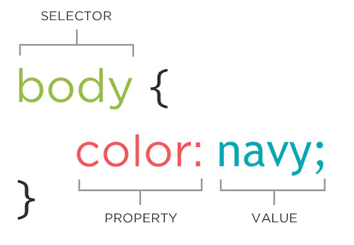
First, we looked at the basic rule of CSS. These are three parts of the rule:
1. The selector : identifying HTML elements.
And inside of curly brackets,
2. Properties : define what you want to do with the elements. (for instance, size, colour, styles, text, position, and so on)
3. Values : the changes that you want to make to the properties.
After we were introduced to how CSS works, we were given a simple worksheet that we need to apply the rules we had learnt. While I was working on CSS, I took more time to select the most valid element from the HTML sheet. In this sense, I had to look back at the ways of selection from the previous class. I was also confused about getting rid of underlines from the link elements, which was the part everyone was struggling with. To remove the underlines, I had to target the <a> element since it is the specific link element having an underline.
It seemed to me it was interesting even though I was in trouble to deal with removing the underlines. I am excited to move on next phase of CSS!
0 notes
Text
Learning HTML gets tricky!

I would talk about what I learnt in the Web Authoring class in this week. It had been understandable to learn elements of HTML and apply them to ATOM to see actual web pages until I was taught these elements called <div>, <span>, <class>, and <id>.
First of all, speaking of the ID attribute, it is basically an identification for specific elements which have to be identified in the CSS process. As far as I understand how Id works in HTML, It does not show up on the web page, which makes me doubt if I am doing it correctly.
What is worse, we also looked at the class attribute which is similar to ID but it can appear multiple times on a page. Although I do not exactly get the difference between ID and class, It will work out once I get into the CSS process.
Lastly, I also learnt generic grouping elements such as <div> and <span>. <div>has no meaning and it is a block element. <span> is an inline element and it is grouping a section of text.
Through this week’s lab class, I found it was complicated but interesting to distinguish and apply various types of elements.
0 notes
Text
Widespread outage of Facebook, Instagram and WhatsApp
Back to Monday, there was an issue that had affected to the whole world for 6 hours. As we discussed at the beginning of Web Authoring class, the outage paralyzed the social media platform. It made us being unable to access services. The outage was one of the largest errors we have ever experienced.
Through this huge global issue, we realized that our reliance on social media platforms is severe so that many of us have been seeking alternatives to Facebook, Instagram ,and WhatsApp in order to deal with an unexpected error.
Besides, we could think of our privacy issue again because of the rumor saying that the outage has to do with hacking. However, several Facebook employees said that the outage was caused by an internal technical fault and was not related to a hack.
Since we noticed that the global outage across several media platforms was heavily impacting the companies and people, we may have to find a way being out of these massive implications.
1 note
·
View note
Photo
Since I started participating in my first Web Authoring Lab class, I have been interested in HTML, CSS, and JAVA!
Entering the code and seeing how the webpage is built, I have been wondering if HTML could also be replaced by Artificial Intelligence.
The reason why I came up with this thought is that we live in the digital era, which means everything has become digitalised. For instance, robot journalism has risen recently. It cannot make sophisticating news as real journalists do, it can produce news based on the database such as sports news. Moreover, some major news companies have replaced breaking news with robot-generated news.
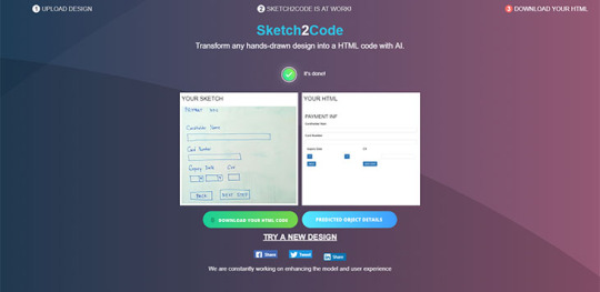
In this sense, I looked up the case in which AI makes a website by using HTML. The photo attached is what I found! It is called Sketh2Code which is developed by Microsoft in 2019.
Basically, if you upload your drawing on the web, it converts your sketch into an HTML codebase and shows the website!
My lecturer told us in class that he had been teaching HTML for many years and during that time, HTML had also been evolved so that we could make the code easily compared to the past. Now, I think it seems useless to learn HTML. But, there are still some flaws in terms of accuracy. Some elements are not generated properly.
So, I am still in doubt that AI can eventually take our positions.
0 notes
Text
Prologue
Hi there, I am Euni from South Korea.
I will be posting loads of thoughts, opinions, articles and images about my Web Authoring class! Even though I have no background about either HTML or CSS, it would be fun to record how I improve my coding skills in this blog.
Keep an eye on my tumblr, more content coming soon!
1 note
·
View note