
fashiontextiles
Shannah's Fashion Blog
Fashion & Textiles student - design processes and final outcomes start to finish
40 posts
Don't wanna be here? Send us removal request.
Last Seen Blogs


freireneto-blog-blog
BLOCO DE NOTÍCIAS

24mediabd-blog
24mediabd

maurineds-blog
Untitled
stemgirlchic
stemgirlchic
Text
Blog post 40:
Final Evaluation -
For my FMP I have explored the book Peter Pan and created mind maps and mood boards to establish a concept for my project. I decided to focus on the theme of sea life which acted as the starting point for my experimental work. As Peter Pan is a boy who refused to grow up I decided to use playful processes such as; mark making and finger painting to create repeat prints in Photoshop and to inspire samples using simple methods of fabric manipulation. From this I produced a range of experimental pieces that effected the outcome of my final 6 A4 collection.
Throughout the project, I have determined that I will create a spring/summer collection for women and children. I decided to do this by embracing the childish and adventurous imagination of Peter Pan and use this to impact upon the techniques and processes that I decided to use throughout the FMP. I did this by using multiple processes such as; mark making, finger painting, block printing, and by splatting and splodging dyes onto fabrics, along with a variety of other processes. I chose these techniques specifically as I wanted to use a range of messy, playful and unsophisticated processes that are commonly used by children and to also use them in a simple and easy manner that children may use.
I feel that my choice of creating a women’s and children’s collection effectively communicates my book and concept as the book is based on a boy who doesn’t want to grow up. This led me to think about today’s society and how women go to drastic lengths to change their appearance by using cosmetic procedures and also potentially damaging treatments such as; makeup, false nails, spray tan, bleached hair or fake eyelashes. These are a short list of the type of things that women will go through for the opportunity to look younger and more youthful. I created the children’s wear collection to represent the children in the book who want to be young and playful forever. I also created the women’s collection to reflect the extensive actions that women carry out, to change the way they look in a hope to become a younger version of themselves.
I feel that I have effectively explored the context of my project and used the information that I have extracted from my book as a guide to the types of techniques that I want to experiment with an the way that I want to approach them.
I have used a range of research sources throughout the project such as; internet, book, film, blog and lots of primary trips to gather further research towards my concept. I feel that my primary research visiting Southend Aquarium, Colchester Zoo and Palma Aquarium were crucial aspects of my project because I was able to do a range of primary drawings that I have then developed using different processes that could have been developed and included within my final collection.
I have been developing some of my samples by using different types of dyes, materials and by turning them into digital repeat prints which was very helpful in establishing which methods were most effective. I learned that certain elements would not be sustainable in my fashion collection such as the Brusho dye that I used which transferred onto all surfaces that came into contact with the samples, however, I did learn of new fabric transfer dyes that worked effectively as a substitute. I did encounter some problems throughout the project but I learned to overcome them by changing simple aspects such as the dye that I used or the material that it is printed onto.
I have kept a time plan for my project to keep track of targets and deadlines. I have also used regular checklists which were extremely effective as I used them as action plans to enable myself to effectively organise what I should be doing next. I have also regularly kept on track with my blog posts which were very easy to write as I was able to do them in my own time and add links and photographs of key research and experimental work.
I have explored all of the techniques that I set out to do within my project proposal except for the pearl and bead embellished piece. I haven’t done this as I felt that after doing some experimentation this idea did not reflect the idea or context of my theme. I feel that it would be too complex for a child to construct and therefore it would not be beneficial for my project as it would not communicate the way that a child may create a piece of art work and would be too complicated. I have set out to create unsophisticated and playful samples that do not require difficult instructions or complex skills. however I did create an embroidery sample as I planned to create this sample within the beginning of my project.
I have used Photoshop throughout my project to create mood boards, final presentation boards, final line ups and repeat prints. I have really enjoyed using Photoshop and feel that I have effectively developed my skills and ability when using the software. I will definetely use Photoshop within future projects as it has a broad range of tools that can be used to develop experimental work further.
I have presented my sketchbook appropriately for my concept, and I do feel that the first few pages of my sketchbook look fairly messy because I am not very confident with my handwriting and therefore opted to write all of my written work onto my blog as it looks more tidy and professional. I did structure the layout of my sketchbook pages so that the sea life element is very obvious and consistent throughout the pages.
If I was to change anything about the project, I would have begun with the block printing much earlier because I feel that with the time that I have had, I haven’t been able to develop it as much as I would have liked and I really enjoyed this process. Thanks to experimenting with the block printing, I was led to using children’s block prints which were developed within Photoshop and constructed for my final collection. I would also planned my days to be more practical and would have begun the design process of my final collection at least a week earlier than I have, as I feel this would have allowed more time for further developments.
1 note
·
View note
Photo


Blog post 39:
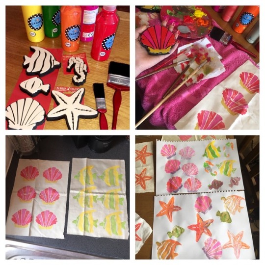
Final 6 A4 Collection -
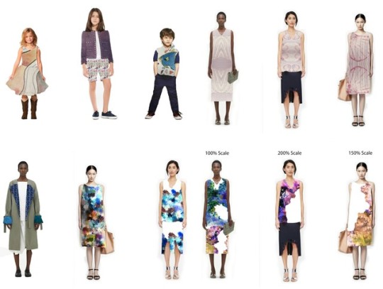
I have created my final 6 A4 size collection for my concept of sea life that was extracted and developed from my choice of book, Peter Pan.
I originally planned to create my final samples in A3 size but after constructing multiple experimental work, I realised my experiments looked more professional and tidy when created in a smaller scale of A4. I created the designs for my collection originally using kids paints and children’s painting stamps/block prints. I chose to use these as they looked more neat and less scruffy like the experimental work that I created using block prints that I created using string and wood.
After creating the painted block print designs using the children's painting stamps, I then scanned in the designs on the photocopier and developed the original designs on Photoshop. Using Photoshop, I continuously changed the scale, composition, arrangement and colour of the original designs to achieve 6 final digital samples that worked well together as a collection.
During the making process of the designs, I took into consideration the multiple effects of scale and as this was something that I previously experimented with in a previous fashion line up that I created to learn how multiple Photoshop tools change the overall outcome of the prints. For my final collection, I wanted to use light, delicate and beach-like materials to communicate my sea life concept. I decided to add a fringed/tassel effect to two of my samples because I liked the effect that this element gave to my "deconstructed denim" experimental piece that I created inspired by current fashion trends. I felt the fringing imitates old beach towels and rough beach bag materials with loose threads.
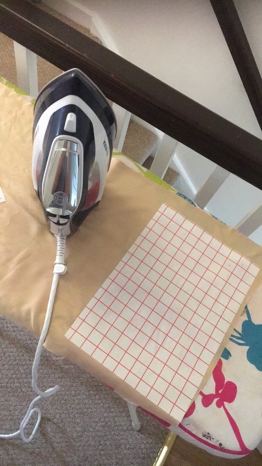
The developed designs that I created within Photoshop were constructed using heat transfer paper. The designs were printed onto the paper and then ironed onto my materials. I chose to use the heat transfer paper as I really enjoyed experimenting with heat transfer dyes and I liked to see the multiples outcomes depending on the materials that I use, which helped me to decide the best textures to use for the best quality outcome for my final collection.
Two of my designs are slightly different to the other four. The first being the pink, red and yellow repeat shell print which is the original painted experimental piece. I wanted to use this because I really liked the outcome of this sample. I had to cut the piece into A4 size and added the fringing effect to add a unoriginal feature to this sample.
The second different design is the repeat shell print in negative colours. I decided to create this sample because I wanted 1 piece within my collection to stand out and be original, much like Peter's vein and arrogant personality. The green and blue colours within this piece give an unusual twist to my overall collection but works well.
During the creation of my collection I had to overcome a couple of problems. The first issue that I had was the first negative shell design that I printed onto heat transfer paper but the background of the design was black which did not fit with my collection and gave a harsh effect to my collection. I improved the final outcome of this piece by using Photoshop's "Quick Selection" tool to select the original pink design's shell and repeated the pink shell 8 times in total. I then used a effect/filter called "Difference" which created the negative green and blue colours. I then ensured the background was white and reprinted the design again, onto the heat transfer paper.
The second problem I had was using the heat transfer paper itself, because I created my final four samples using a different brand of paper that I had not previously used before. My first attempt using the new brand transfer paper was very messy and scruffy looking as the instructions were unclear and I was unaware of how to effectively use the process. I wasn’t sure if I should place a towel over the paper before ironing to ensure the design does not burn or melt. I also was not sure how long to keep the heat on the paper for the design to transfer successfully. My first trial of using the new brand's paper did come out smudged, ripped and with a section melted away. After carrying out this trial test, I learned that the best way to use the paper for a professional outcome is by simply placing the design onto the material and ironing over the transfer paper using maximum heat and no protective towel. I also learned that by letting the transfer paper cool down, the design peeled from the paper much smoother and easier.
I created my collection for women and children because I wanted my to use my concept of sea life to show the imaginative and childish personality of a boy who doesn’t want to grow up which is the main story-line within my book. I used this side of Peter's personality to influence the child-like and unsophisticated techniques and processes that I experimented with throughout my project.
I also created my collection for women because they are commonly seen in the media, and in today’s society using extreme procedures to look younger and more youthful. I noticed that many women such as BaddieWinkle use vibrant colours and exotic prints to appear younger and more fun. Therefore, I created my collection based on the overall idea of people wanting to be young and stay young forever. I felt that by using my concept of sea life I have successfully created my collection to have no age range or be of a design that is gender specific as I want my collection to be imaginative and enjoyed by everyone.
0 notes
Photo

Blog Post 38:
Women’s and Children’s final presentation boards -
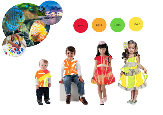
I have chose to create two final presentation boards for each collection because I didn’t want my boards to look over-crowded and because each collection varies slightly in the use of colours.
Within my final presentation boards, I have included 3 images that I felt were most important from my mood board because each of the 3 images show the elements that influenced the designs that I have created and visually show some context behind my final collection.
Although I don’t usually like to use muted white backgrounds, within boards like this I feel it is important not to use too much colour if possible as it would look too overwhelming and would greatly impact how an audience react to my work. I have also included my fashion line ups and my refined colour pallet which has helped me to reflect how well my designs and refined colour pallet work together and if I have effectively used the colour’s to produce my final collection.
For evaluation of both collection’s see blog post (37)
0 notes
Photo

Blog Post 37:
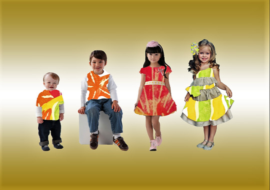
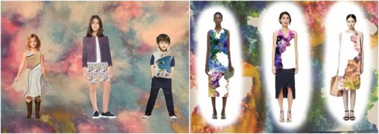
Women’s and Children’s wear final line up -
As I have decided to create my final collection for women and children, I decided that it would be best to create two separate final fashion line ups to display how my collection/range would look if it were created into a garment. I do really like each of my final line up’s because they both perfectly project the impression of child-hood and wanting to be younger or dress younger. I first decided to create a women’s collection as I noticed than many women, such as BaddieWinkle were in fact, using their style to reflect a younger and more fun version of themselves. I also, thought that since I wanted my final prints and the techniques that I use to reflect the mind of a childish boy who doesn’t want to grow up, that I should also include my collection to have a children’s range also.
My favourite two garments within the women’s collection is the large scale colourful piece and also, the large scale orange starfish printed dress which is alongside. The two are my favourite as I have turned a very child-like print into something more sophisticated but also playful and creative just by the use of changing the scale multiple times to achieve a pattern that I felt worked best within the women’s collection. My least favourite piece within the collection is the repeat shell print in negative colour’s. If I was to create this sample again I would probably of included another element to the design and stuck with the colour pallet that I had created for this collection. I chose to do this unusual piece as I thought it would be unique if an element of my collection was the opposite of one of my prints which although it is, and I do like it, it just doesn’t work too well within this collection. If I had more time to purchase the materials I need, and extra time to reconstruct this piece, I would have made the changes to better-fit with my collection. Although this piece does not fit too well, I still don’t think it impacts on the effectiveness of my final collection.
Within the children’s collection, my favourite piece is the layered yellow and green dress because I like how the layers in this piece work well together and overall make this dress really detailed and pretty. I also like the green and yellow colour’s within this dress and how the thick white line detail and multiple layers break up some of the colour’s which makes the dress not look “too much” or cluttered.
I would definitely say that my favourite final line up is the children’s collection because I realised that even if the design/print is not visible or clear, the garments still look child-like, playful and professional. Due to the size of the children’s garments, they were a lot easier to achieve different designs and high scale prints that looked nice and worked well as a collection. I also feel that the pose and expression of the children show just how happy, playful and joyful children are, which is very nice to reflect within my collection as I have been trying to reflect a child’s imaginative personality within my designs.
Within the background of each of my collections, I chose to use a gradient overlay in two colour’s that I felt complimented each collection. I have never liked using muted white backgrounds within my final line up’s as I feel that by adding a simple amount of colour to the background, I can make my collection stand out more and appear more appealing to an audience. I also think the use of a colour within the background makes my line up’s look more creative and playful and I feel this would help to communicate the child-like idea behind my overall concept.
0 notes
Photo


Blog post 36:
Palma, Majorca, Aquarium and Beach -
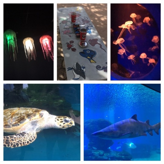
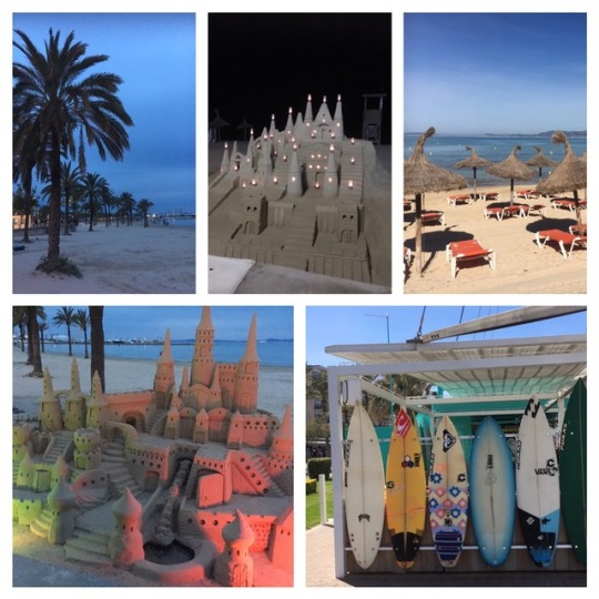
I have visited Palma, Majorca’s beach and aquarium to gather some further primary research for my project. I first of all started my trip by visiting the beach on several occasions within my first day to see how the atmosphere on the beach changed depending on the time of day. During the day time, I experienced lots of music, singing, and crowds of people whereas during the night, the beach is some-what empty but is more calm and relaxing with less noise. I really enjoyed going into the water, collecting sea shells and viewing the large scale sand castles that are scattered around the beach, as I feel these are elements that bring out an “inner-child” state of mind in adults and is something that is also very much enjoyed by children of all ages. The beach is somewhere that children visit to have fun and explore, and I feel that the fact that grown, middle aged, men are spending hours a day building huge extravagant sand castles just simply shows how adults sometimes want to act and feel again and show how they want to interact with their inner-child once again. This reminds me of my research of BaddieWinkle who is a 85 year old women who uses her fashion an lifestyle to reflect her younger years as I feel that adults to become more adventurous and childish when in a fun environment such as the beach.
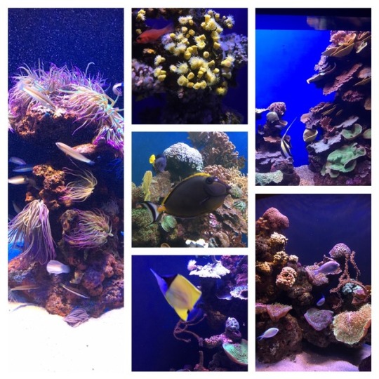
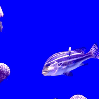
I then visited the Aquarium, which had a very family-friendly atmosphere and at the main entrance, had a very cheerful Pirate mascot handing out maps. After receiving a map, I had a very fun experience standing in front of a green screen where a photographer took an photo of me “surrounded” by fish. This was really fun as it was like a way of showing a child’s imagination using today’s advance technology. I then went on to explore the inside of the aquarium and viewed many different tanks of all different sizes that show a range of beautiful and unusual fish and live sea plants and corals. I really enjoyed viewing the multiple types of fish as each had very unique markings and colours. I also really liked to look at the live corals and plants because of how unique the shapes were and I liked to watch the movement of them within the water as they were very pretty. My favourite tank was definitely the sea turtles because I was able to more effectively see the size and markings of the animal up close in a larger scale. Sea turtles are very beautiful and thanks to the playfulness of these animals, I was able to witness many children screaming with excitement. I also found an outdoor play area within the aquarium with a Pirates ship, surrounded by a fake sea turtle, shark and starfish for children to play among. This was really interesting as it reflects how children do incorporate sea life into every-day life for their amusement and fun. Lots of children loved playing among the sea themed play area and were very happy and excited. This to me, reflects how Peter acts within the book when he is around the Pirates and Meramids as he becomes more mischievous, adventurous and silly. I think the excitement of the children within the play area did show how the concept of sea life does make children happy and shows how the sea life concept does effect not only adults and children, but the traits of Peter also.
1 note
·
View note
Photo
Blog post 35:
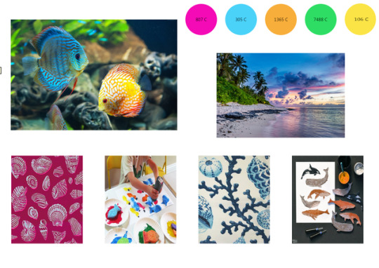
Refined mood board -
I previously created two very basic mood boards which were communicating some elements associated with my concept but didn’t communicate the bigger picture and overall idea. Therefore, I wanted to create a new and refined mood board with a basic layout that is consisting of images that individually communicate the concept and techniques that I have been exploring throughout.
I chose to include an image of the beach and aquatic fish in larger scale than the 4 underneath images as these were my main focus and inspiration for the outcome of my final collection. I then wanted to include some images that relate to my experimentation's style and technique as I felt this would be the best way to show how I have constructed, developed and explored the design of my final collection.
My concept is sea life as this was an element that I extracted from my chosen book Peter Pan, that I felt was most interesting. I then wanted to include the childish, naive and innocent imagination of Peter and therefore, chose to use and experiment with a range of techniques that are commonly explored by young children, primarily of primary school ages. I felt that by combining my sea life concept with Peters personality I can effectively communicate my chosen book within the final collection I produce and although the images within my board do not reflect Peter Pan directly, I feel that the image of a child using an unsophisticated child-like process, does effectively communicate the imaginative side to Peters personality which is exactly the element that I have been keen to express within my work.
Within my board, I have also included my refined colour pallet which is made up of creative, playful and bright colours that are commonly seen within kids paints. I felt it would be fun to explore the child-like techniques with a range of children's resources such as kids paints, brushes and stamps.
0 notes
Photo

Blog post 34:
Full Evaluation & Effectiveness of experiment inside sketchbook.
I used a very playful and creative printing process to create samples with sea life inspired prints. I chose to use this technique/process as it is often used by children and is a follow on and development from my previous block printing experiment.
See blog post (16) for block print experiment.
1 note
·
View note
Photo

Blog post 33:
I decided to visit the beach after I created a mind map with lots of elements related to the sea side. I also drew some of the things that I written such as deck chairs and Ice cream.
The reason for my visit, is because the beach is often a place that is visited by children who want to have fun among the water and shells, and to explore! Which is an exciting atmosphere that I want to some-how reflect upon my audience when they see my final collection. I also wanted to gather some sea shells which I used within my print making. I created a "painted" piece inspired by Ruth Issett that was a photocopied version of one of my samples, and I used a shell and sea plant to create the unusual blue patchy print over top of the piece which gave a really nice sea effect as I also used the photocopier settings to turn this one piece blue. The beach was unfortunately empty on this day, so I wasn't able to experience the excitement that different elements of the sea side bring to people, which would have been helpful for my research.
0 notes
Text
Effectiveness of blog
Blog post 32:
My blog has been very successful as I was able to easily document my design processes, evaluations, primary and secondary research. I was also easily able to attach images, videos or links to specific pages which made it more easy to evaluate and contrast between posts.
I really like the layout and colours I have used within my blog as I feel the layout is a very neutral and simple design which is also easy to navigate between certain posts and doesn’t look to overwhelming. For example; the blogs default layout is very boring as the posts go in a singular line which I feel looks too plain and this then takes a lot more time to look through, but in comparison to my edited blog, my posts are in rows of 2 which takes advantage of the extra space and looks more neat. This also makes my blog appear more full and professional looking. From using a blog, I have been developing my writing skills and expanding my vocabulary as I have been continuously using a thesaurus throughout the project as I wanted my work to be more descriptive and I feel I have successfully achieved this. I plan to use a blog for future projects as it looks more tidy and professional rather than using a scruffy note pad or scrap paper. Hand writing is also very difficult for me as I find it hard to be more descriptive and to write neatly. Also, I like that posts can easily be edited throughout the project and further information can be added to specific text at any time which is a great help as it enables me to expand on my evaluations and research whenever I want to.
A blog typically consists of informal diary-style text entries. Many blogs provide information on specific things ranging from beauty, gaming, sports and politics. Others function as more personal online diaries or online brand advertising. A typical blog combines text, images, videos, and links to other blogs and web pages. Blogging is a great thing to do as it helps to build your own network, practice writing and grammar skills, build up your confidence, and helps you to speak more coherently along with many over positive reasons to start blogging. Some of the most common blogging sites today are; Tumblr, WorldPress and Blogger. Tumblr is a really good site to use due to the simplicity and minimal prep time, along with the fact that using the platform is free and has the use of extensive customisation tools for individuality. Although there are some downsides to the site such as no option to use widgets and the worry that if Tumblrs servers go down, then so does your blog, which has previously happened to myself in a previous project. WorldPress is also a good site to use as a number of large companies use it, making it more sufficient to promoting your brand and ideas, and along with this, the site also has very easy content updates and the ability to analyse your content performance by using the sharing and commenting functionality which lets you monitor users engagement. however some features on the site such as custom themes can be more tricky because of the development process and the time it takes to make, therefore most blogs all look the same making it hard for specific blogs to stand out and look very boring. Blogger can also be a good platform to use for someone who likes the option of using widgets and is easy to use. The biggest downside to this platform is the fact that all content is owned by google, therefore they have the right to shut it down, or shutdown your access to it at any time and along with this, the site also has minimal customisation options.
Two blogs that I have been looking at are @thelovelyseas and @jeannemrtn which are both completely opposite to each other. The Lovely seas is an aquatic animal blog which focuses on outstanding and beautiful sea life photography. The blog layout is also very nice, and well compositioned. The muted white background also enhances the deep blue colour and very much communicates the beauty of the earths wildlife and nature. The colours of each image are also of a high definition and the images all work well together. Although the images are very similar colours throughout, the images do not overwhelm the blog’s content due to the carefully considered layout. Personally, I feel this blog is great and everything works really well together. I also think it would be nice to read some personal statements from divers or members of the public who may of came into contact with these wonderful animals as it is very intriguing. Looking at this blog, as got me to consider and reflect on how effectively my own work communicates my concept and how effectively I may be doing this.
Furthermore, Jeannemrtn is a printed textile artist who constructs beautiful printed collections. The prints consist of asymmetric patterns and exhilarating use of a colour a pallet. The prints are very detailed and unusual, but very unique! I really like the layout of the blog because the frosty white background enhances the colours of the prints and gives an illuminated and sophisticated effect. The patterns and colours are also very playful and some, are very “child-like” which is a great comparison between my own work as I have been constructing a colour pallet that communicates the imaginative and childish imagination Peter Pan.

0 notes
Text
Technique & Inspiration
Blog post 31:
The samples I have created within my project using messy dyes, paints and printing processes are very relevant to my concept and impact on the final outcome of my collection. Peter Pan is a very naive, adventurous and arrogant boy who doesn’t want to change his ways or grow up. Therefore, I am communicating this side of him by using simple techniques and processes within my children’s collection to reflect how a child may use art supplies and even by using the same processes that primary school children would use.
what is block printing ?
“ Woodblock printing on textiles is the process of printing patterns on textiles, usually of linen, cotton or silk, by means of incised wooden blocks. It is the earliest, simplest and slowest of all methods of textile printing. Block printing by hand is a slow process.”
I have took inspiration for this experimentation from Pattern Curator which led me to the current trends where I identified block printing. I have also been inspired by an artist called Lili Arnold, and although she does not use block printing, she does use multiple printing techniques and processes which are very similar to the work that I have been producing within my experiments.
https://en.wikipedia.org/wiki/Woodblock_printing_on_textiles
0 notes
Text
Reflection & Problem solving
Blog post 30:
Some techniques that I have used were some-what challenging due to the fact I had never used them before such as; Woven tapestry, Heat transfer inks and Brusho dyes. First of all, the tapestry sample was very interesting to construct but along with the other two techniques, I have never done this process before. It was a very complex task to learn and took many hours to achieve a complete sample. The most challenging element of this experiment was the fact that I had to use online guides and tutorials to self-teach myself this complicated technique because I was very keen to experiment with this. After many hours of research, I was able to fully understand the weaving technique and also the correct measurements to build a loom that the tapestry could be constructed on. I also watched around 10 different tutorials on various ways to build a loom and begin the weaving process which helped me greatly as I was then able to have an understanding of a simple way that I could create this piece.
Secondly, I really enjoyed experimenting with the heat transfer dyes because it was a very playful process which was very exciting to discover the final outcomes. I was very unsuccessful with the first 5/6 samples that I created using this process as the transfer dye did not work effectively with many materials. However, after further experimentation I was able to find a material that worked with this process almost perfectly but I would not use this process within my final collection because it is too unreliable.
Furthermore, The brusho dyes were very confusing at first as I was not aware of how to use them or to mix the powder with water before use. This made my sample very difficult as I was constantly creating horrible blocks of colour and the powder was transferring from my samples onto everything that came into contact. I did eventually seek advice from peers and tutors and learned of the proper way to use the dyes which was understandably very helpful. I have not yet decided if I would use this within my collection as the first experiments would not work as a collection due to the dye transferring but, If i did recreate the samples and the dye did not transfer, I would consider using and developing the samples as a base cloth for my block printing designs because the colourful pattern would look nice underneath.
I would definitely say that my current design inspirations for my final collection are Grandma Baddie Winkle who is my main inspiration for my women’s-wear collection along with Lili Arnold, JuJuJust and the research of current fashion trends which led me to the block printing process.
I feel that the meaning behind my concept is very imaginative because of the way I am trying to reflect Peter Pans personality and the places that he visits. I feel strongly about my choice of concept and the decisions I have made throughout the project because I feel I have successfully used the overall context of the book to greatly impact my work for the better.
0 notes
Text
Reflection of concept & ideas
Blog post 29:
Overall, reflecting on the work have produced, I would definitely say that my most successful outcomes were the woven tapestry sample, Pom Pom sample and my Photoshop digital line ups because I feel they each reflect my theme and would potentially work well together as long as the colours within each piece were more refined so that they would work better as a collection.
I also feel that my heat transfer experiment was fun to test with, however, I would say this was the least successful outcome overall, because some materials did not work effectively (or at all) and the dyes are not reliable enough to use within a fashion collection as the final result may not always turn out the same regardless of using the exact same colours and materials.
To move forward within my project, I am definitely going to explore deeper into block printing as each of the printing processes I have really enjoyed and feel that this may be a technique that would frequently be used within my final collection. I have also decided that my final 6 samples, would look better and more professional in a smaller scale and therefore will to some experimentation to decide which size works best for my collection. I would also like my final samples to be on light and flowing materials to better communicate my concept.
I feel that my concept works really good for my project because I have extracted the concept of sea life based on some of the areas that Peter visits whilst in Neverland, and I have also effectively selected my use of techniques and processes based upon Peters personality. Along with this, I have also chose to use delicate, flowing materials based on the Spring/Summer collection that I have chosen to create and took inspiration from my secondary research into commonly used beach materials. I have definitely incorporated Peters imagination throughout the project by using childish, incomplex and unsophisticated processes which were inspired from books, current trend boards and my primary research. I am creating a women’s and children’s collection and I have been considering using the children’s collection based on peters personality and the women's collection based on a women’s more sophisticated and mature personality, because of the way that women continuously try to achieve a younger and more youthful appearance upon today’s society. Peter never wants to grow up and women try to stay looking young, therefore, I feel the two sides have a lot in common. I would like my samples to reflect the differences by using mature (for women) and childish (for children) prints to represent both, but I also want to have the element that links to the fact that both want to stay young forever. I have also used some constructed textile techniques within my experimentation which are more commonly used by elder people, and I feel this would reflect the mature side of women, yet use the colours and patterns to reflect the inner desire to want to be young again. If I did this, I would re-create and develop my constructed textile samples and use the woven tapestry and Pom Pom sample to not only reflect my concept of sea life, but also a women’s personality.
0 notes
Photo
Blog post 28:
Heat transfer dye experiment -written evaluation for this experiment is in sketchbook alongside the work. I really liked using this process as it was very exciting to see how different materials and colours effected the outcome of this technique and I would also think that this is something that could be used and enjoyed by young children among supervision of an adult.
1 note
·
View note
Photo

Blog post 27:
Checklist -I have been using checklists throughout the project to ensure that I do not miss any tasks. I have continuously been writing next action plans in the form of a checklist to be sure that all practical and written work is up to date and so I can remember to write all of my evaluations for my experiment work on my blog. I find this very helpful as I am a very forgetful person and therefore, I rely on these simple lists to be sure that I am on track with the FMP deadline and that I do not miss any key information that may be crucial for submission. I will continue to do this in future projects as it is very helpful and I can maintain organisation and keep on track with my planning and time keeping.
0 notes
Photo
Blog post 26:
Fashion collection line up -
I created four fashion collections ranging in design, scale, colour and shape. I created this digital collection because I am now starting to think about how my final collection may look if it were created into a garment. I created the designs using my previous Brusho dye development prints, block print experiment and some of my primary aquatic drawings. I have chosen to create a children's and women's wear collection so I felt that It would be best to use women and children as my models and create fun and unusual line ups using my designs.
I also added some of my digital work to the background of two of my line ups as I don’t particularly like the muted white background as it doesn't give a fun or excited effect to my collections. I do really like how each garment looked overall and it has greatly impacted on how I think my collection should look when I start to create it. I haven't decided on the design or techniques I will use to create my final collection as of yet, as I have to be sure that the colours and prints work well together as a collection. I also want to refine my colour palette before I begin to create my collection as I have currently create two variations within my previous mood boards. within my collection of various scale, I really like how I have used negative space to enhance the design of my prints because to me, this looks more professional and appealing.
0 notes
Photo
Blog post 25:
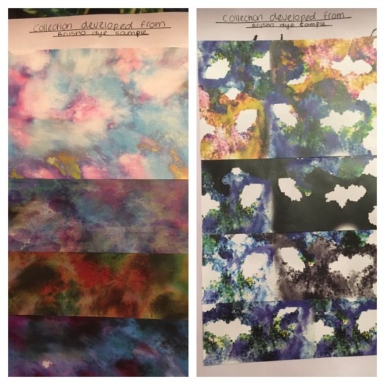
Brusho dye Photoshop developments -
I created two unique digital collections of four, which were developed from the Brusho dye samples I had created to represent the messy way that a child may use paints. The original designs were created in a playful, fun and child-like way so that they could be used within Photoshop as a background or arrangement. I really like how both collections turned out as the first were very colourful and reminded me of all the outstanding colours that are seen among sea animals and sea beds, I would like to use two of these to screen print over using one of my fish design in possible a block colour of possibly black to see how the background colour may effect how the design appears to a audience and if it looks interesting to a child. I created the second collection using random cut-out sections of the first collection because I wanted to experiment with negative space and the effect of shadow, this was to reflect the shadow of Peter Pan within the book in a mysterious and unusual way. Although the colours are very different to the first collection, this was due to a range of filters that I applied to the prints to achieve a different colour pallet altogether within this collection. If I did change anything it would be to enhance the brightness and saturation of the first collection and also add some of my illustrations onto the print digitally which I may also do depending on the time that I have. However, I did like that easy print was individual and had multiple colour variations which I feel are all unique and individually impact and represent my overall concept. I am currently prioritizing the list of things I need to be doing to stay on track for my fmp hand in day.
0 notes
Photo


Blog post 24:
Photographer, Artist & Fashion movement research -
Jett & Kathryn Britnell -
Professional photographers and explorers who specialize in underwater, nature, exploration, and travel photojournalism. their photo’s have appeared in a wide variety of publications world-wide, and have also provided stunning images for advertising. Jett has explored remote reefs and shipwrecks throughout his career alongside his wife and has received many awards for his outstanding work. Kathryn has experienced many encounters with whale sharks, sea turtles, sea lions and many others whilst in zero degree centigrade iceberg infested waters in Alaska and has explored the ocean’s depths after dark. Jett was welcomed into the distinguished ranks of the Ocean Artists Society (OAS), a unique alliance of the world’s top marine life artists, painters, sculptors, photographers, filmmakers, and writers coming together to use ocean art to inspire people around the world to greater awareness of our need to protect and preserve our natural world. Jett and Kathryn are amazing photographers who I have taken a liking for due to their amazing sense of composition and use of colours and/or filters. I feel these two elements are what makes their work beautiful as it captures the innocence of the sea creatures in their natural habitats. I really love the sea lion photo as this was the first image that made me curious to find out more about the photographer behind the work. The unique mammal appears very sweet and innocent due to the gaze of its big “puppy dog” eyes, this for me gives a sense of a heart warming atmosphere that reminds me of the beautiful nature of my own animals. From initially finding these two photographers, I wanted to find my own way of capturing the innocent and nurturing “child-like” nature of sea animals through photography and illustration and I feel that I did effectively do this through my primary images and drawings from Colchester Zoo.
Vladimir Stankovic -
He is a Graphic designer who creates series of illustrations inspired by vintage books and the beauty of colors. All the elements within his work are created with coloured pencils, watercolors on paper, and then scanned and digitally arranged. I first found this artist at the beginning of the literature project when I was deciding on a concept for my work. I found his work because I knew I was interested in the sea life element of my book Peter Pan, and I decided to find an artist to use as inspiration for my theme. I also wrote within my project proposal of his work and that I would use elements of watercolour to reflect his work within my own. I have continuously compared his work with my own throughout the project so that I can effectively achieve a range of beautiful sea life related designs and potentially use them in my collection. I will continue to look at his work until the end of my project as it has very much helped me with the decisions I have made regarding the colours and designs.
Cultural punk movement -
Punk fashion adapted everyday objects for aesthetic effect: ripped clothing was held together by safety pins or wrapped with tape and ordinary clothing was customized by embellishing it with marker or adorning it with paint. Leather jackets were often decorated with painted band logos, pins and buttons, and metal studs or spikes during the 1970s. I learned of this movement when researching the history behind distressed denim as I felt that learning the history behind the technique may impact the way I construct my sample. I decided to create a sample based on deconstructed/distressed denim when researching the latest fashion trends because of the way it resembled waves which has a beach-like effect which would look really nice within my collection if I used this technique.
0 notes