florasearlethirdyear
Flora Searle
Final Year Visual Communication Student
247 posts
Last active 60 minutes ago
Don't wanna be here? Send us removal request.
Last Seen Blogs

miffydollie
mae

puretheseries
P U R E is a movement

orewatabest
おれ的わたし的2016ベスト

xjadax
JADA

morbidpaintz
Fixated on Fear
Text
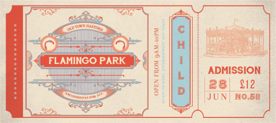
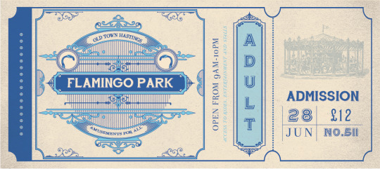
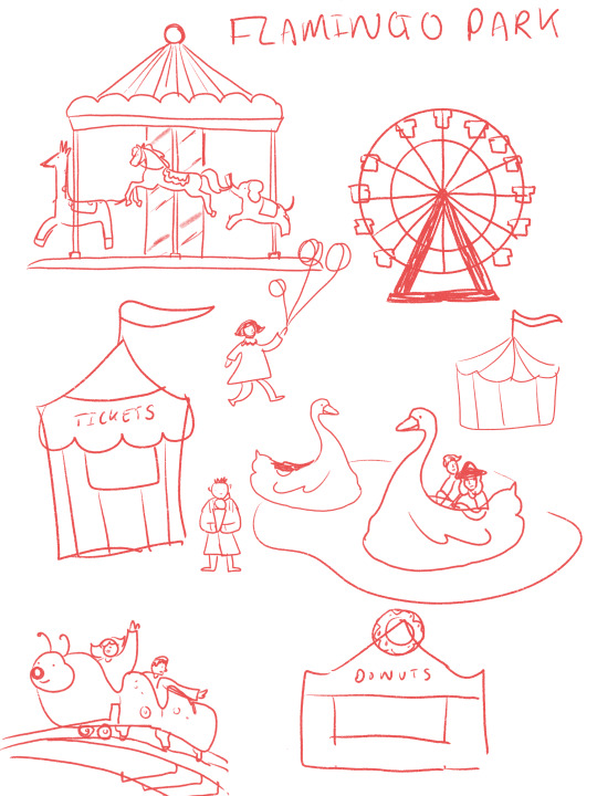
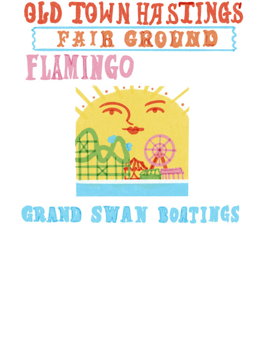
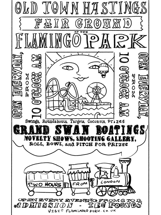
FMP: Ticket Remake. LO2.
Found previous designs to lack visual interest so tried again.
0 notes


Text
FMP: Poster Development. LO2.


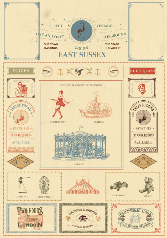
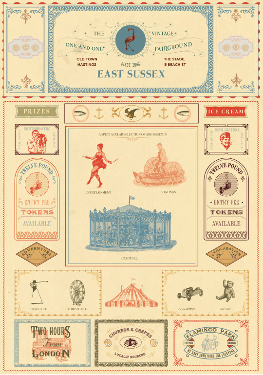

Poster in progress. Documented stages. Made adjustments based on feedback from designers on Reddit, got flamed.
0 notes
Text
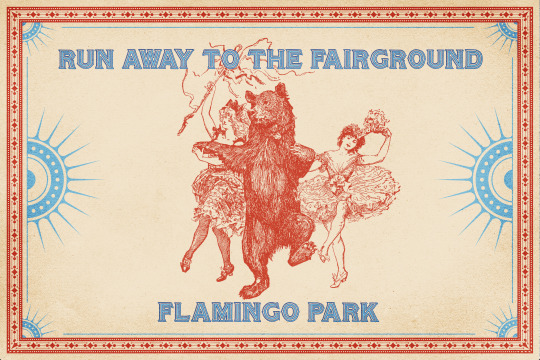
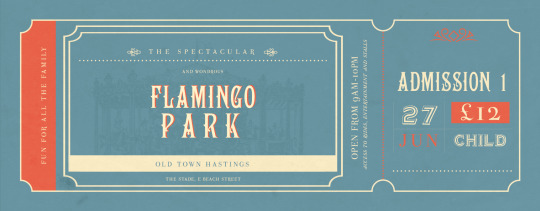
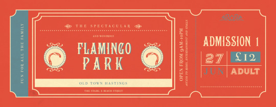
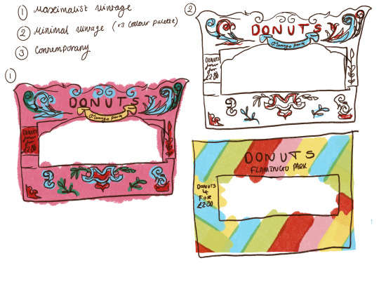
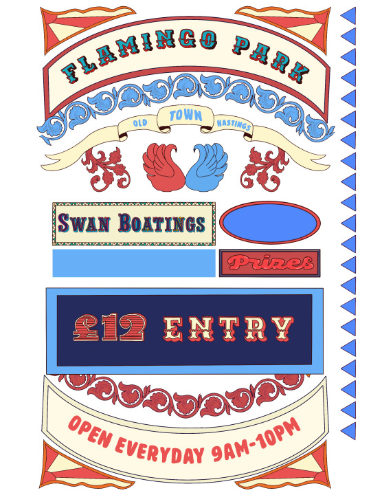
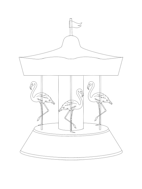
FMP: Logo Developments. LO2.

Concern with flamingo image leading viewers to believe it's a zoo, should use the term 'amusements' for more clarification, but i think the carousel communicates more effectively.
0 notes
Text
FMP: The Artistic Crisis Period Pt.2. LO2.


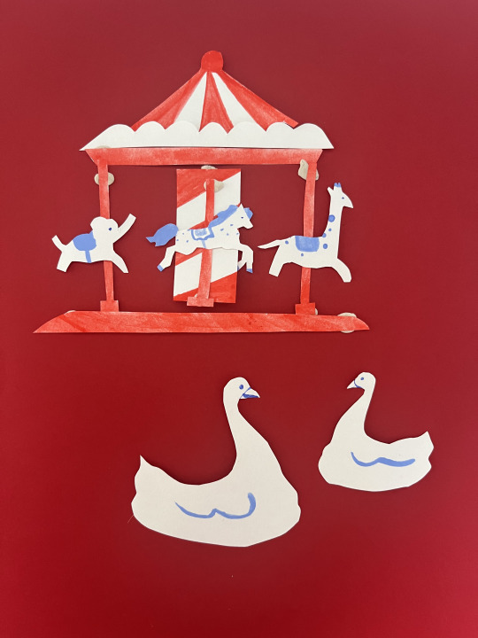


Point at which I thought I found an artistic direction, but didn't work out. Tried minimalist style illustration with individual riso cut outs, as well as paper. Then tried a more detailed approach. Both ultimately weren't what I was envisioning for the project so I set about making a logo to start. This then gave me the confidence to continue with a Victorian style.
0 notes
Text
Weekly Plan for Submission. LO3:
Week 9: April 17th - April 23rd
April 17th - April 19th:
Travel home
Laser appointment
Poster advertisement
April 20th - April 21st:
Finalise poster
April 22nd:
Draft outline for process book.
Compile initial research and notes.
April 23rd:
Studio day and sign ups
Work on fairground sketches.
Prepare for market day on April 24th.
Week 10: April 24th - April 30th
April 24th:
Begin design of Instagram page
April 25th - April 26th:
Finish poster
April 27th:
Finish Instagram page
Begin ride signage
April 28th:
Design tickets.
Work on process book (research, initial concepts).
April 29th - April 30th:
Design of sitemap
Design of food stall signage
Continue working on process book (problem-solving, reflections).
Prep for final presentation on May 1st
Week 11: May 1st - May 7th
May 1st - May 2nd:
Final presentation
Review and refine designs based on feedback.
May 3rd - May 4th:
Finalise fairground designs.
Continue working on process book (layout, content).
May 5th:
Complete content for process book.
Refine process book layout.
May 6th - May 7th:
Studio day on May 7th.
Conduct final reviews of designs and process book.
Design business card
Week 12: May 8th - May 13th (Final Week)
May 8th:
Tutorial sign-ups.
Adjustments to designs and process book.
May 9th:
Print and assemble all materials.
Conduct final check.
May 10th:
Review portfolio
May 11th:
Finalize preparations for submission.
May 12th:
Tutorial sign-ups.
Confirm all materials are ready for submission.
Week 13:
May 13th:
Hand in project
0 notes
Text
FMP: The Artistic Crisis Period Pt.1. Experiments and Advice. LO2 & LO3.


Started Thursday in yet another bad art block. Worked on a poster and scrapped designs multiple times, went for a walk to take a step back but felt still in a rut. Discussed with Sally potential directions and advised me to go to Hastings again, or explore more local seasides. Visiting Hastings will be difficult as the trains are expensive and very long. My boyfriend could take me but is not free for another two weeks, time I can't waste at this stage. I will be keeping an eye on the trains and buses for discounted journeys, as I do agree it would be more helpful for me to see it properly in-person, perhaps gather some perspective from the town's residents.
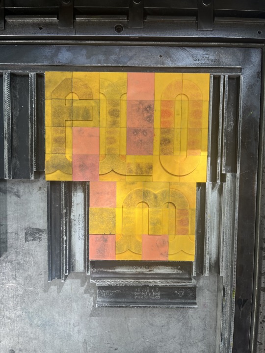
I also sought advice from Joseph in the print and bindery room, discussing methods in which I could make ornamental type. Ornamental type is rare and at university we only have very small metal blocks of individual patterns. So in order to achieve this, Joseph showed me the large wooden block prints and how ornamental metal blocks could be used in conjunction with this. Joseph also got me thinking about what I truly love to do. We discussed how the combination of 19th century design with contemporary is probable, but difficult.
When thinking to practises I enjoy I thought back to my time on the illustration course and how I loved creating things more, because I wasn't striving for perfectionism. I think I have been going through an art block because of the pressure of creating something "perfect" for my last project...after all, this is something that is going to represent me and has the potential of determining my future in the industry. So, taking myself back to the basics and drawing freely, I felt this image to encompass what I want to achieve:
Inspired by Louise Lockhart, imagery would be playful and contemporary. In my research I found that she uses paper cut outs, and this was my favourite use of material during my illustration course. I find it easily malleable and there's a charm in the odd mistakes. Bringing it back to my studies of ornamental design, Lockhart employs the use of more traditional type in her work, and this is where I can see this becoming a part of my project. The next consideration is how this applies to the signage in the fairground, but that's a thought for next week. My next step is to get started on the cutouts!
Sally also gave me some books to look at for inspiring type:


Ladies of Letterpress By Jessica C. White and Kseniya Thomas.
I loved all these ornamental styles but again, I found it so hard to visualise how I could make it with the skills that I have. The whale picture got me thinking back to the more naive illustrations and ultimately led me to this idea.
0 notes
Text
FMP: Tutorial and Experiments. LO2, LO3.
My feedback for this tutorial was primarily defining the audience and creating a brand identity around this. Dot talked about how this idea linked into my original Pollock's focus on bringing back nostalgia for the older generation, and how this can be translated into signage inspired by vintage fairground artwork. In perfect coincidence, Dot's grandmother Valerie Falla has been a resident at Hastings her whole life and Dot recalls visiting Flamingo Park throughout her childhood. Dot's grandmother Valerie Falla hints to the nostalgia for her childhood in her artwork.
The question of this project is how do we frame the fairground as something also for the older generation? Think to the story of Flamingo Park and why some people might reminisce over it. I did conduct research into Flamingo Parks history but sadly there doesn't seem to be any. Dot and I theorise it as having originated in the early 2000s. So in this case it's more a nostalgia for seaside attractions elsewhere, which can be applied to Flamingo Park.
We discussed the visual direction of this, which is what I have been very stuck on these past few weeks. Whilst places like Dreamland and Kingsland in Poole take on a contemporary direction, this doesn't feel reflective of Hastings rich history, so Dot was saying I can take it in a vintage direction.
Some things to consider:
What do I want people to feel?
I want them to feel nostalgia for the past and think, 'that's cool, I never see fairgrounds like this now!'
How can the public be involved?
Perhaps the produce sold in the park is produced in the local shops. There are many signwriters in Hastings also.
Why come to the park?
Flamingo Park can add to the enjoyment of all generations.
Additional Advice:
Think outside the box, a motorway advertisement could draw tourists. Advertisements in London tube stations, also.
First think about the visual assets/style, THEN introduce colour.
Suggestion from classmate:
The Printed Peanut - turns out this is Louise Lockhart who I have looked at! She used the naive style I have considered.
I started thinking about the visual style here:

Solutions:
Promotional Material: Print Poster and Instagram
1 Food Stall Signage Redesign
1 Ride Signage Redesign
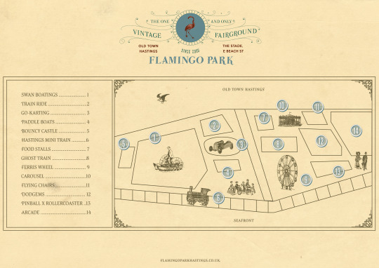
Ticket Design
Site Map
Postcard
0 notes
Text
FMP: Visual Experiments. LO2.


Throughout the Easter break I found myself in a bit of an artistic rut. Nothing was working out how I envisioned it and I felt almost too paralysed to draw (perhaps burnout). However, exploring various forms of artistic approaches allowed me to fully understand what worked and what didn't. Although my intent to combine old fashioned ornamental lettering with more contemporary colours, the design was just ultimately lacking cohesiveness and a clear brand identity.


0 notes
Text
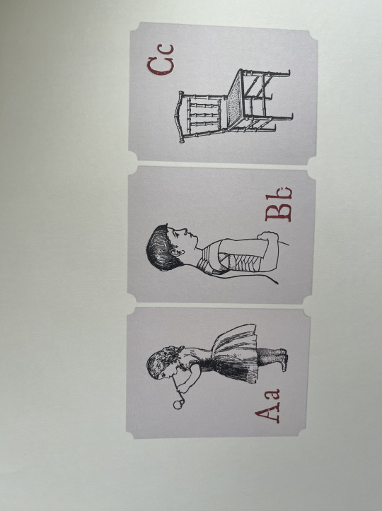
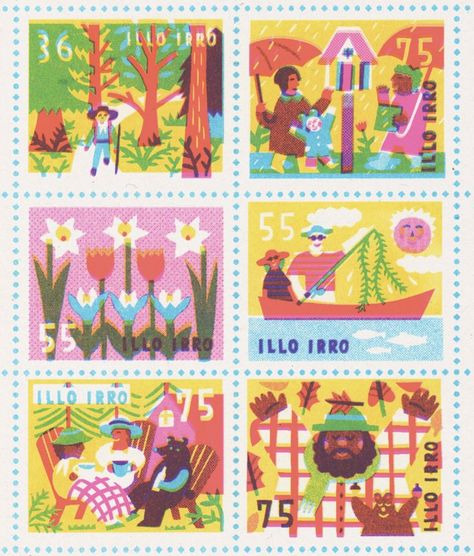
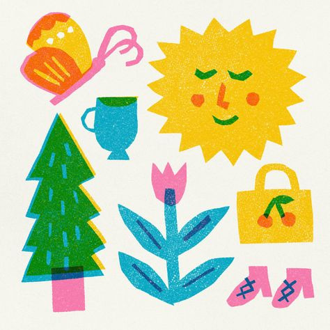
FMP: Inspiring Visual Moodboard, 1970's Naive Illustration. LO2:


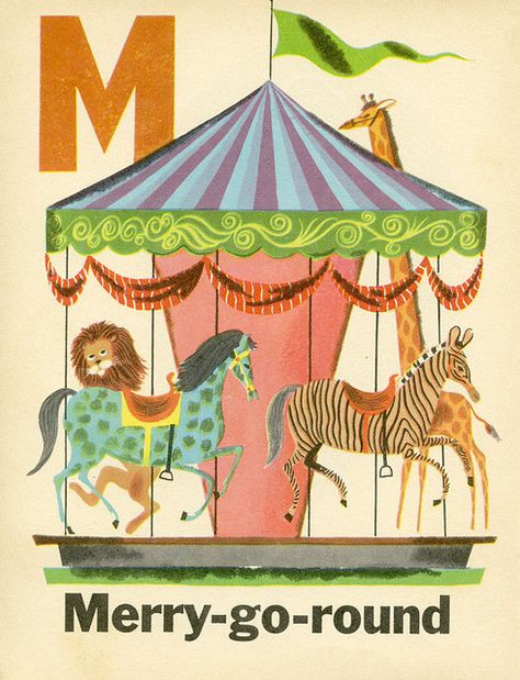
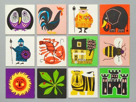
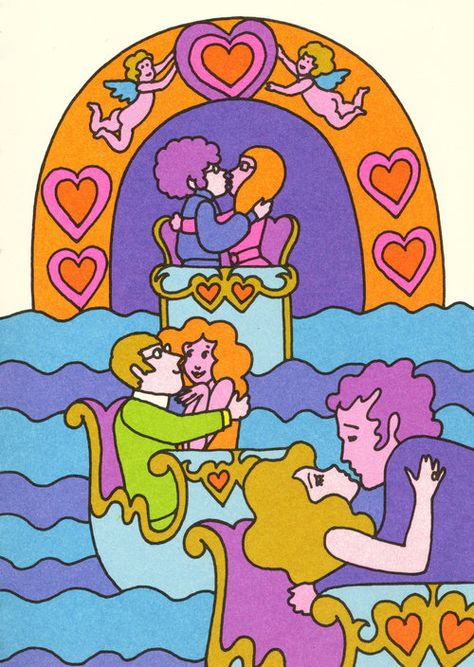
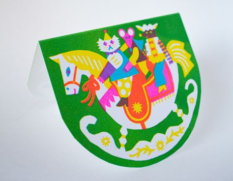
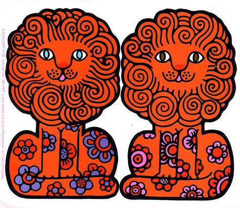
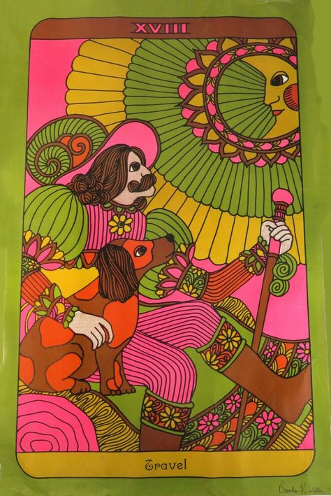
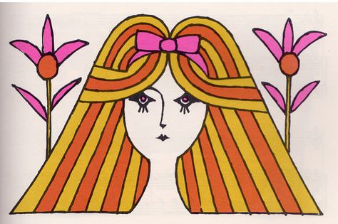

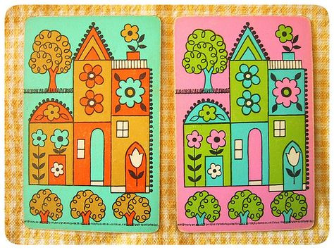
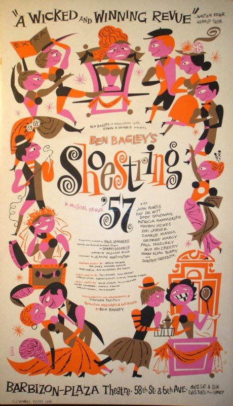

Collecting imagery to inform my visual approach. My mum showed me her old memory card games (featured in this selection) that made me think to naive illustration for this project. I envision this style working best in form of risograph, but I'd like to conduct experimentations to decide the approach.


2 notes
·
View notes
Text
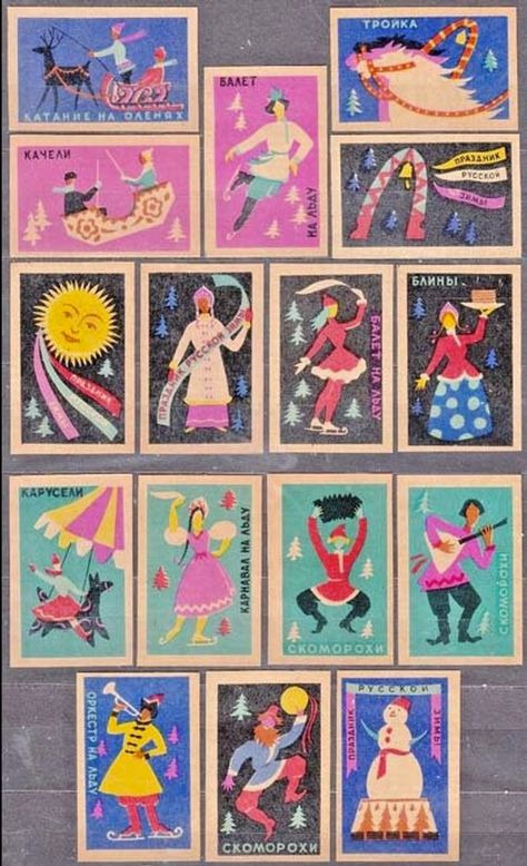
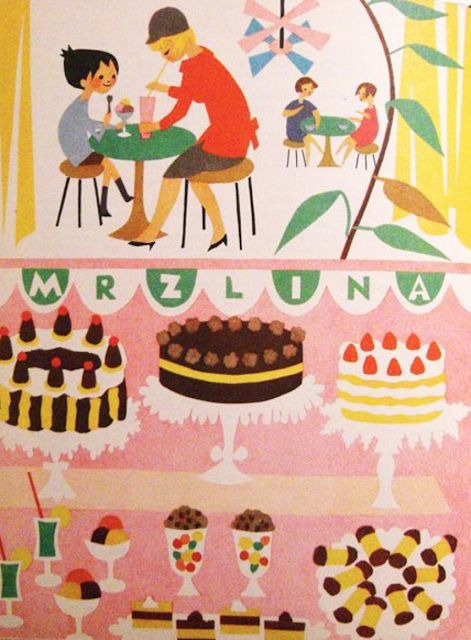
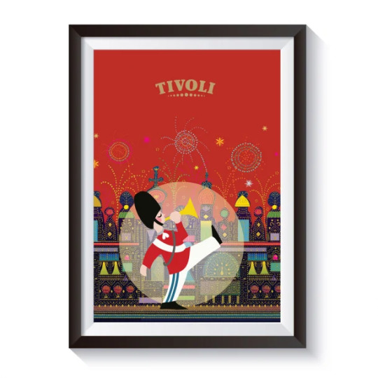
FMP: Tivoli. LO1/LO2.
As I was getting stuck in my head as to how to approach the design of my project, I showed my mum a collection of images I had gathered on Pinterest and from the V&A/University of Sheffield that I thought could be potential visual directions. We begun narrowing down what we thought worked best, excluding imagery that was heavily painterly, such as the vintage Coney Island material. This is because I have to think realistically about what I can make within my skill level-I'm not a fine artist.

Imagery we leaned towards was more colourful and naive in style, in fact, my mum's favourite was Tivoli's posters! For her, it made her think to illustrations present in her childhood (1970's).
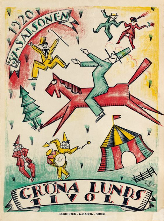
So, what is Tivoli?
Tivoli Gardens amusement park in central Copenhagen offers rides, games, musicals, ballet, and major concerts. The park is best known for its wooden roller coaster, Rutschebanen (The Mountain Coaster), built in 1914. It is one of the world's oldest wooden roller coasters that is still operating today.
I selected Tivoli as a point of study as its success is founded in the preservation of its original buildings and rides. Another example of this is Tivoli's Pantomime Theatre, Tivoli's oldest building. It is listed due to its exotic exterior and the unique baroque stage inside.

See how it all links back to Pollock's!
When trying to research into what Tivoli actually was, I found finding the answer to this on their website to be difficult-in fact, there wasn't a description at all. On 'The Company' section, it talks of fiscal reports and sustainability, and gives no indication into what the place is. The same criticisms were said in response to Dreamland's 2017 campaign, so it is important that I ensure effective communication in my work. The same obscurity can be said for Tivoli's posters, but their playful illustrative execution is something I'd like to bring into my project.
1960's-70's Posters:
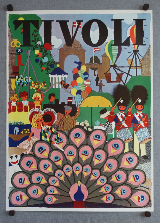
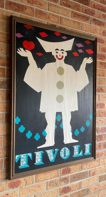

House artist Thomas Winkler still embraces the original designs of Tivoli's old posters. He is also responsible for the overall design of the park.
"I have my hands in everything except the plants, whether it's the color of the benches, decorations or the letters above the lawn," he explains.��
[on the 2023 posters]: "It is important to preserve history, but at the same time something new must happen. So a mixture of tradition and innovation," he explains.

Kristensen, T. (2023). Tivoli turns 180 years old. [online]. Available from: https://www.magasinetkunst.dk/Home/Detail/MTU2Njg%3D [Accessed 29/03/2024]
2 notes
·
View notes