Last Seen Blogs
dailyamlyrics
AM lyrics and maladaptive daydreaming

uouotys-blog
팔로워하지마라
islaytonlost
Lost

mikewoz2
Untitled

kychocoru
Ky_chocoru
Text
Film posters
https://www.joblo.com/movie-posters/2019/io/image-35062

https://www.boredpanda.com/types-of-movie-posters/?utm_source=google&utm_medium=organic&utm_campaign=organic

https://www.complex.com/pop-culture/the-most-iconic-movie-posters-of-all-time/metropolis

https://www.pinterest.co.uk/pin/797207571530550164/
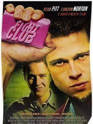
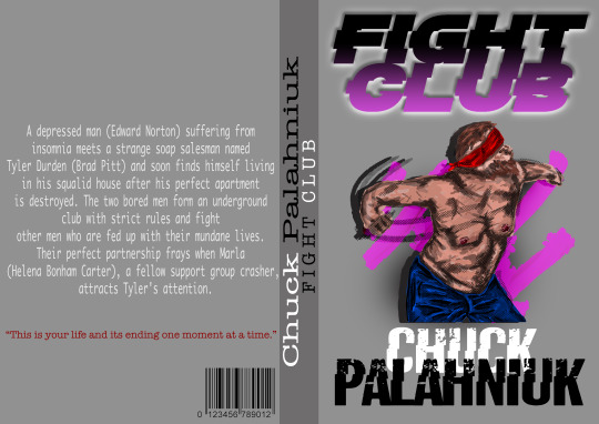
https://www.mauvais-genres.com/en/movie-posters/19377-fight-club-movie-poster-15x21-in-1999-david-fincher-brad-pitt-3701092827915.html

I chose these poster designers as they all have relations to the film poster of fight club. I like how in John wick they used the barrel of the gun Asas th “O” for John. This relates in fight club with the soup and how its been printed on to it and incorporating the design in with the title.
I also liked the titanic for having the characters and then the boat and its similar to fight club with the soup and then the characters. I like the way they add these things to help show off the film on the poster and also gives u a insider on. what it could be based on or even more than that.
And again same for the last film “IO” I like the background being faded then having a main character bold in the foreground. this is like the first fight club poster when brad Pitt holds the soup up he's in the foreground then his buddy is slightly faded in the background. also the load of text at the bottom of the poster. Very similar layouts these two have.
0 notes
Text
Little White Lies.,.,. https://lwlies.com
https://www.pinterest.co.uk/pin/99431104251663348/
https://lwlies.com/back-issues/
http://www.jaguarshoes.com/little-white-lies/

https://lwlies.com/back-issues/

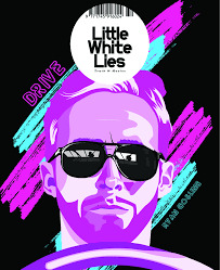
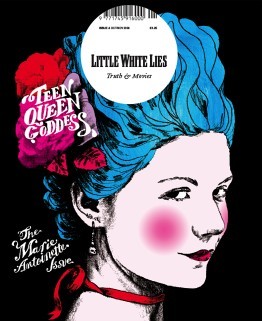
Little White lies is a project iv done before and was a fun one. Ironically I did a fighting theme on that was based on “Day Of The Fight”. I love the layouts on this magazine front covers. I really related to the first example due to the vibrant colours behind the subject and I used this style in my final poster design.
I also like the colour placements on some of the covers. on some just round the eyes lips and hair. And all so being very bright and stand out therefore being attractive to the eye. There not a lot going on its not to busy and thats what I tried to go for with mine. just a character some colours nothing too complicated . I do like the use of text they apply on the covers really makes it a graphic design feel.
0 notes


Text
Evaluation
The project is about creating book posters and film posters but constantly remembering your audience. The theme of my project is based on FIGHT CLUB and thus being an 18+.
So my focus was 18 and over so iv been making posters adult friendly and not kid friendly.
I showed these processes by doing sketches, carbon prints, screen prints and digital work. All these processes linked up and overlaid each other and it all blended nicely.
My honest thoughts on the project was good as I had fight club but with the problems I had else where it made the project mean nothing to me and then resulting in no motivation to complete work. After doing some looking into it I feel like if I was 100% with the project I believe I could of created some interesting concepts. The processes was different on digital as theres so much to do on computer and forever learning but was easy due to knowing a bit already to a standard. But practical I already done in previous projects and from different years so now its the case of perfecting them processes.
The problems I faced was work just not looking good and being terrible and not worth using in any designs for the future. I did overcome them by doing more of the design. Like more printing or sketches and just producing loads of work and then picking out the favourites. Rather then doing a couple and being forced to use them.
The journey I took was like being in a car in a foreign country and trying to get to your destination 60miles away… It was a confusing time when id miss a few lessons then Id be behind and then the time off really threw me off from where I was going with the whole idea of what I wanted to do and where to take the final piece.
Well, with the limited time on the practical iv used the simple things of digital work, screen printing, carbon printing, a few pencils/graphites nothing much but like I said earlier I found these designs blended up nicely and it worked and flowed when digitising them.
I recapped and analysed my work on Tumblr. I wrote up about my work uploaded research and did critical analysis. Research was a last minute thing, I did some on different films relating to FIGHT CLUB which was rather interesting but artists wasn’t looked at but I also added video links to the blog informing on how to screen print and half tone. But with the limited time I had back I gave it a good go.
To tie up everything the start I was slowly fading and did less and less until nothing for over a month so a lot was missed and nothing was being added work wise. So a lot of these questions are hard to answer due to not really ever knowing how I felt in the project. I found that connection with the whole aspect of fighting in FIGHT CLUB and that was nice but when I wasn’t motivated to do anything it was really hard to do the work in which I didn’t want to do. I did start a boxing painting of my own but I did this as I wanted to express myself on the canvas and I didn’t feel like I could do any of that with this project. I felt isolated and we have done enough of that this year in 2020 but when I found my feet and came back I felt refreshed and actually started doing work at home and getting it done. With only two weeks obviously wish it was more but I did encounter some bad days in this time but I believe more could of been done 100% however I tried my best at what I could of done in those times.
0 notes
Text
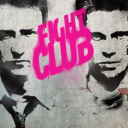
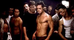
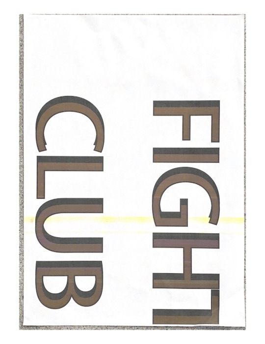
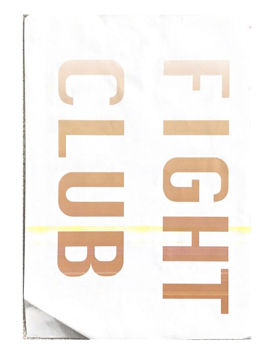
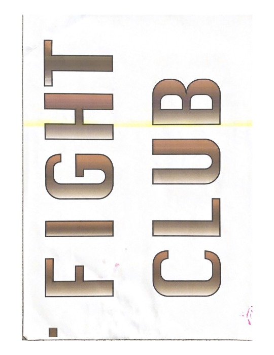
FIGHT CLUB
https://www.imdb.com/title/tt0137523/plotsummary
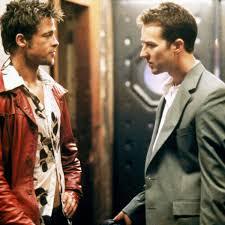
An insomniac unnamed narrator needs a fantasy to escape from his deadly boring life, he tries joining a cancer support group however the only thing they do in the group is cry into each others chest, but then he is on a plane on his way back from what a viewer would assume is a business trip our unnamed narrator encounters Tyler Durden, a soap selling bad-ass who happens to run a secret fight club in the diner parking lot with his friend who follows 8 simple rules set out by Tyler, our unnamed narrator of course is taken into this scheme ran by Tyler.
I love the mood on fight club with a guy that's lost in the world and finds a guy who runs a fight club and almost finds himself again. And found surrounding himself with others with the same problems helped him.

0 notes
Text
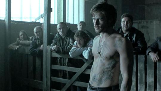
LOCK STOCK and two smoking barrels
https://www.imdb.com/title/tt0120735/plotsummary
Four Jack-the-lads find themselves heavily - seriously heavily - in debt to an East End hard man and his enforcers after a crooked card game. Overhearing their neighbours in the next flat plotting to hold up a group of out-of-their-depth drug growers, our heros decide to stitch up the robbers in turn. In a way the confusion really starts when a pair of antique double-barrelled shotguns go missing in a completely different scam.
Lock Stock is a similar film to Snatch with the crooked and corrupt games and the same director, Guy Ritchi, is clearly visible between his films and then having David Fincher direct fight club there's difference in plot twists and the summary of the film. they play the same part of leaving u hooked wanted to watch more with the interesting scenes of the violence, fighting, gambling and the corrupt plays. This films leaves u on edge with them in debt and need to make back 500,00 or risk loosing the pub due to a foul play in poker.


0 notes
Text
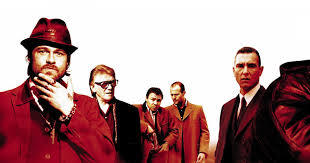
Snatch
Corrupt boxing promoters, violent bookmakers, a Russian gangster, incompetent amateur robbers and supposedly Jewish jewelers fight to track down a priceless stolen diamond.
Using Snatch as a similarity to Fight Club because it involves with fighting “Bare Knuckle” And the action it involves. Snatch being to do with an illegal boxing promoter who finds a gypsy and uses him to fight but it’s corrupt due to a a gangsta who tells him to make his fighter throw the fights so he can win big. But turns south when he accidentally knocks them out. I also like how brad Pitt is in the same two films and plays very similar roles with fighting bare knuckle.

2 notes
·
View notes
Text
About my work...
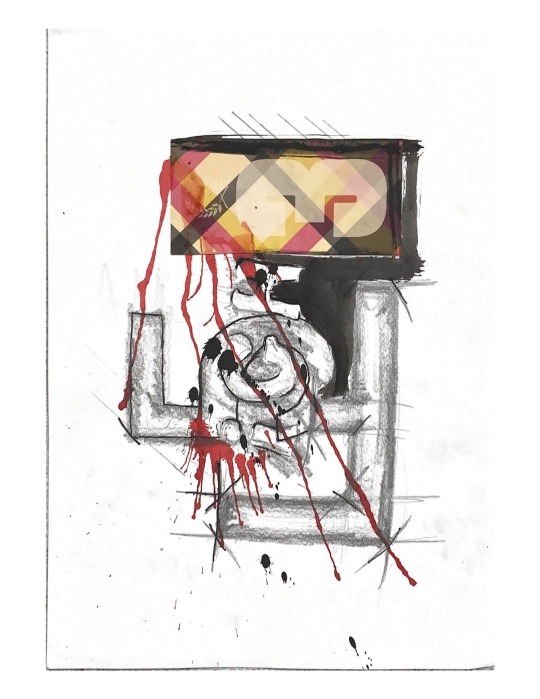
With the work I have done I used a lot or reds and pinks. red being blood and the pink being the soup theme. I uses black and white with touches of red to draw the eye. I went with blocky bold but sharp points for my titles that I have creating. I used quite aggressive and dominant front covers to show it isn't no nice book/film.
0 notes
Text
How To Do Half Tone...
https://www.youtube.com/watch?v=usDDwwraaRk
This is a link to the process of doing half tone on photoshop. this was helpful if I ever got stuck on a stage and forgot so I referred back to this to help.
0 notes
Text
How To Screen Print
https://www.customplanet.co.uk/what-is-screen-printing-step-by-step-i50
This is a link on how to screen print and this helped with getting the process to good quality.
0 notes
Text
Using Paint Brush...
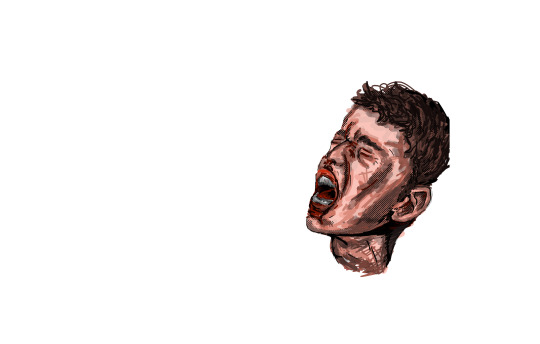
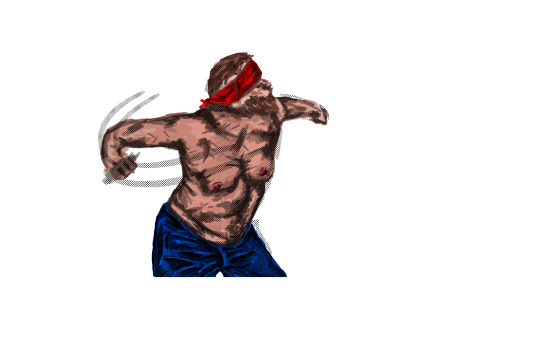
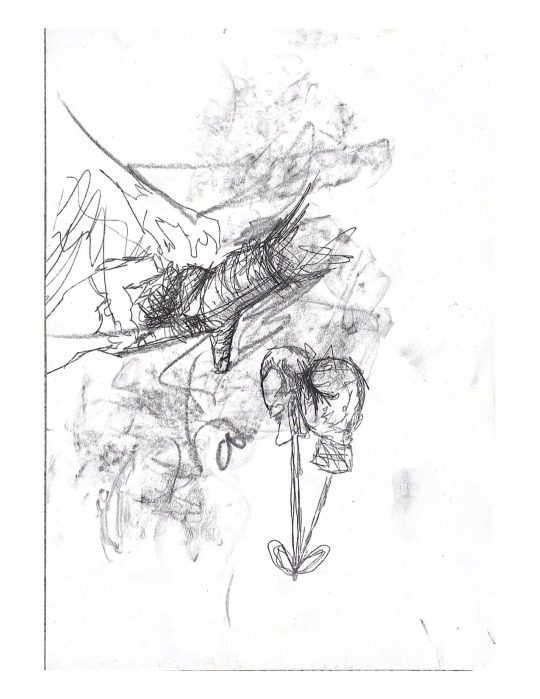
Im really happy with the outcome. the screaming drawing looks bit like a kid which doesn't fit the audience I'm doing this for but I like it as it adds emotions and pain to what fighting is. But I ended up going with the big man swinging for the fences and thats what fight club was, not much skill but more brawls. Inside scrapping. I found this process very easy due to doing the same technique at home in my own designs and potential commissions.
0 notes
Text
Screen Prints On Photoshop, Film Poster Designs...
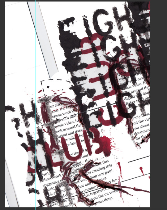
This was my screen print laid out on photoshop just playing around with the angles and the placement for the background
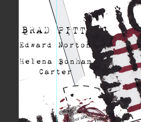
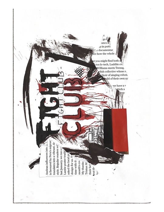
I then downloaded a font off “DAFONT” was a type writer style font and added the main names of the film onto the poster.
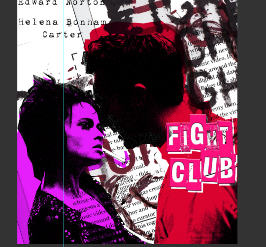
I then grabbed two of the actors and placed on the poster and desaturated the images. I then lasso around the images roughly then on a new layer I bucket filled the selection with a colour. I went for a pink and red theme being the pink of the soup and the red being like blood.

this is what it is like before I then added the images back onto.

for the title I went with this textured block style font. Also got this off Dafont. I used bevel and emboss to make it stick out like its 3d and then went with a pink colour. I dropped inner shadows to make a black line on the upper part of the letters which made it more 3d effective.
0 notes
Text
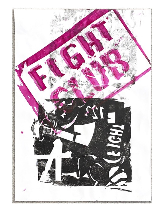
Colour Overlay...
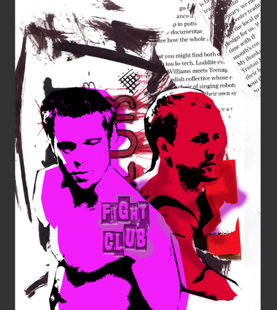
Using another screen print for my background as I love the text in the back and the slight colours of the reds. similar process the the over work I did where I just desaturated the image. this time I used threshold and found the point of the most detail. then after that I then again went in with the pen tool and selected around the image and then on a new layer I bucket filled the image with a colour. With the title I went for like a stamp effect like fight club had been stamped into the page but seemed bit boring so played around with it.
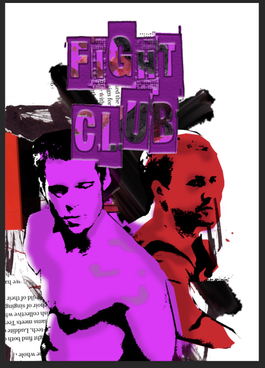
I then darkened up the colours and then the same with the title and also added an overlay of a screen print iv done over the letters giving it a rough look and I found some red part and used this for a bloody effect. I moved the title to middle top to make it more visible and bigger but didn't really like its placement. I cut away at the background, moved the text in different positions and using an oil brush I added an “x” look behind the characters to bring them forward.
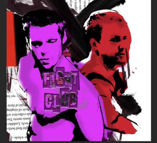
Happy with everything apart from the title I just played around with that and decided that on the characters chest was the better placement for the title. I then cropped the image down so there wasn't a lot of empty space.

I then added the actors names onto the poster but then inverted the background and this then really made the characters pop and stand out and I love the white text against the black background.

I then added the director of the film onto the oil paint stroke. I really love the layout and the colours of the poster and I think the invert on the background really made the poster stand out more.
0 notes
Text
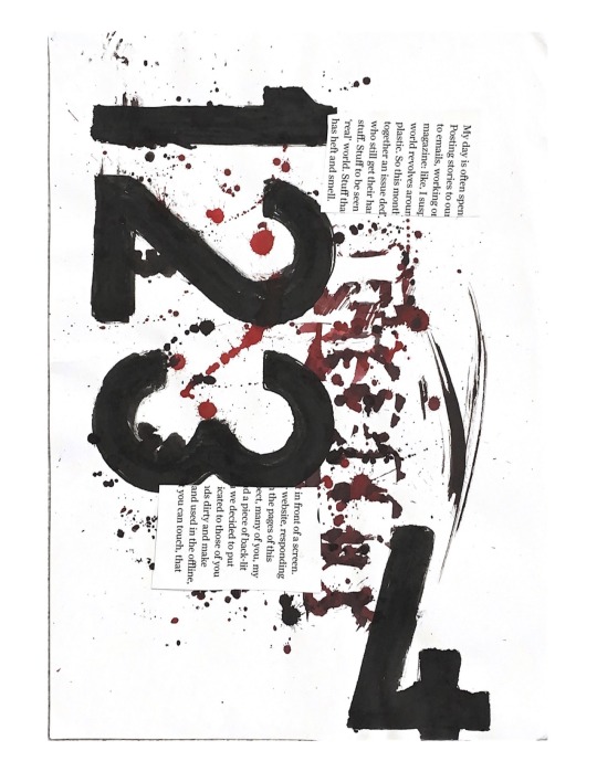
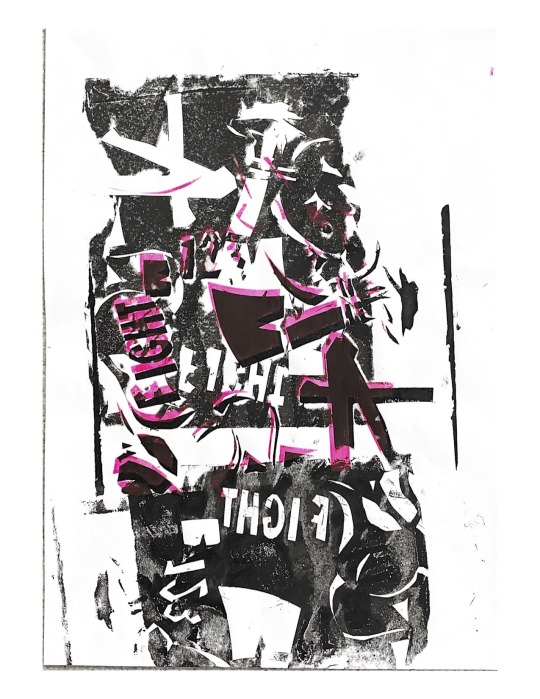
Carbon Print
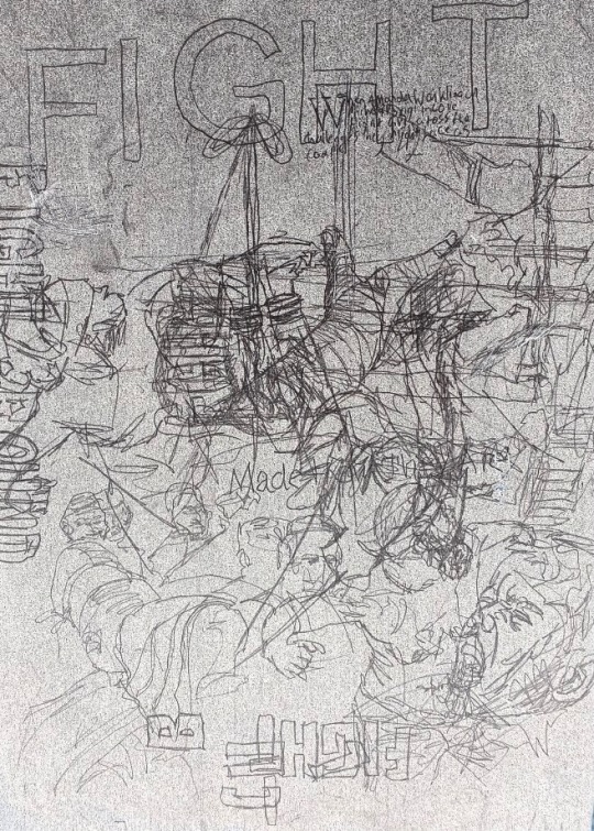
This was on my carbon print paper and I inverted it whilst it was against the window. Although a lot is going on it really seems to tell a story.
0 notes
Text
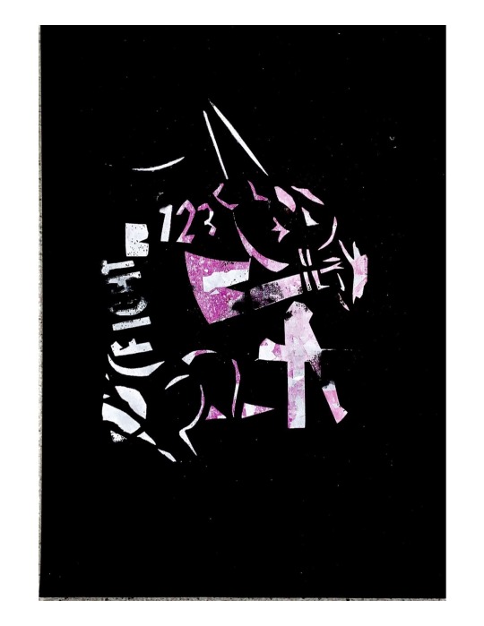
Original Designs for digital and screen print...


These were the texts I designed in week one and the carbon prints I did on my own imagery and some I found in magazines. I'm really happy with these outcomes and have used a couple in some poster designs.
0 notes
Text


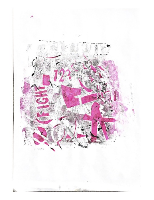

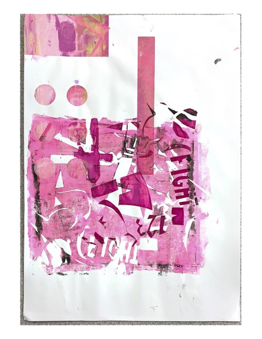

These were all my final bits of work from the screen printing I did. I used text I designed back in week one and then used some of my own boxing emery on a couple of designs. I really liked the double print as it gave it a fuzzy look specially when one of the prints then the next was a pinky colour. the colours really worked well in this and I'm really happy with the outcome. some have been used in the backgrounds of posters I designed and even mixed with others to create new backgrounds.
0 notes