freya-amelia-smith
MULTI VERSE
(Creating a zine using graphics and words)
53 posts
Don't wanna be here? Send us removal request.
Last Seen Blogs
pahimadeepak
Pahima Deepak
virieu
irrlicht
pahimadeepak
Pahima Deepak
kadehimdebirivar
Miar
starlightbooktales
starlightbooktales
Text
LEARNING OBJECTIVES FOR THIS WEEK !
Learning Objectives for Wednesday 27th January 2021: DONE
3. Be able to use evaluation
in support of art and
design activity
3.1 Critically evaluate creative
solutions against identified characteristics
and context for a chosen art and design activity
Thursday 28th January - Learning Objective : DONE
Add analysis to your blog each week (like a diary entry) highlighting your personal development on your project creatively PLEASE make sure you add commentary on how you this has informed your personal development and changes throughout the project
Friday 29th January ~ Learning Objectives : DONE
1. Complete your evaluation (see the handout assigned to GC) 1000 words min
2. Work on your blog and add any analysis or reflection to gaps
3. Add 500 words to your blog highlighting the importance of context within art
4. Those who have assessment feedback please be working through your targets
0 notes
Text
EVALUATION !
This project is called MULTIVERSE, and my task was to create a zine using a collection of words linking to this topic that was given to use on google classroom. With these words, I were asked to pick out a minimum of 12 words and did so, but I only dedicate my zine to four words out the 12, and those four words were PARALLEL, REALITY, TIME AND ELEMENT, all the work I create during this project was created using the programs of adobe photoshop, illustrator, Lightroom, InDesign and procreate.
A zine is a small looking magazine that norThis project is called MULTIVERSE, and my task was to create a zine using a collection of words linking to this topic that was given to use on google classroom. With these words, I were asked to pick out a minimum of 12 words and did so, but I only dedicate my zine to four words out the 12, and those four words were PARALLEL, REALITY, TIME AND ELEMENT, all the work I create during this project was created using the programs of adobe photoshop, illustrator, Lightroom, InDesign and procreate.
A zine is a small looking magazine that normally is used for advertisement or to spread the word about something, In my case, it was to show artwork that portrays word that I have chosen.
A big part of this project was researching because I need to first research about zines as I didn't really know what they were I also need to research how to make one and how they work so I was able to create mockups and outcome that are the right size after doing this it helped me a lot to understand zine, and I was able to get on with creating, but then I knew it was time to create the outcome to go in my zine so I had to research and look up a lot of artist and designers for inspiration the pain website I used for inspiration was Pinterest due to me being able to create a board that I could go back to and inspire me.
The artist that I research that helped me a lot would probably be Ranganath krishnamani because he enables me to find a style that I like and help me open my mind to think or outcomes that I create this artist help me with the topic of reality as he a series of outcomes called a shift in the playing field and before I found him I knew I wanted to use social media and technology in my outcome, but didn't know how to do it so when I found his work it inspired me and I was able to think of loads of different ideas.
Each page in my zine is dedicated to a topic of my choice and the target was to show that word through artwork, for example, the word PARALLEL I used images such a building and shapes line and by doing this I put art together that represented parallel another page in my zine was about time so I used a lot of clocks to show that topic, the big part of this project is the MARS side or it MATHS ART RELIGION AND SCIENCES so another thing I had to have it mind was making sure I was showing this throughout the project and in my outcomes.
With me creating my zine I thought they would be a load of different problems doing it but in fact, there wasn't that many the main problem that I came across was one finding artist that had focused on the word time as I was really struggling with inspiration I need someone to inspire me but after a lot of searching on Pinterest and Google I finally came across outcomes that inspired me but was still unable to find an artist that focused on the topic time another struggle and I think the last struggle I had was trying to keep a team throughout my project and in my case, it was a colour pallet I wanted to use my colour pallet through but sometimes it would fit with the aesthetic so I have to think and think until I come you with and outcome using the colour pallet that I choose but overall the journey of my project had many ups as i was creating consatly but had some down fulls exspesaly went I have a brain block on ideas but came over quickly due to looking at pintrest the that got the ball rolling so a smooth journey i would say with this project.
As this project had a task that was very different from the other projects that I have done there was a lot of learning involved and learning new skills and techniques including different programs to learn such as in design and new techniques on photoshop the main skill that I learn that I’m really pleased with was the dissolve effect/liquefy effect on photoshop that is used in my time poster in my zine another new technique that I approached was a log print/rubbing this was another technique that I used on my time pages for my zine and it was interesting to learn a new skill and in the future, I may want to learn about wood printing similar to linocuts and screenprinting but using wood. Are used a lot of old skills that I have collected over my time at college including collage thing halftoning and just my way of laying out my artwork and also a big part of graphics and getting my topic out there was using typography and I learnt a lot about how important typography is and I learn every day when creating new outcomes.
My favourite skill overall that I have learnt would be the liquefying effect on photoshop and also photography. I knew a lot about photography as I have grown up in a photographers household but I learn a lot more about capturing the topic of something through a photograph and I also learn a lot about Lightroom as that is where I edited the photos. With photoshop I watched many videos on how to do the liquefying effect and now I have that skill which I’m really happy about. I mentioned in my blog that I wanted to learn the program in design and I’m learning as I go along and I’m still figuring out the program watching videos but hopefully, I will be able to use that throughout my time at college and after and hopefully mastering it similar to illustrator and photoshop.
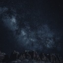
Due to us being a national lockdown the college isn’t open so we have been having to work from home and to present our work we have been using the website Tumblr I created account name is multi-verse and was adding all my outcomes and journey throughout this project onto my blog I really do prefer doing it a digital way rather than writing in a journal and sticking stuff in a sketchbook as one it gives you better quality pictures and it also allows you to choose statics and have a theme of your whole website page. Are used different ways to show my work and the journey of here the most common way was doing screenshots of how I got to an outcome and explaining step-by-step how I did it I also uploaded videos on my blog for me drawing on my iPad which is a cool way of seeing the development of an outcome. By doing all this work in this type of way I feel that I have displayed multi-verse and the project brief well on my blog and I feel that if someone was to look at it they would get an understanding of what it’s about and know what it’s about. Because especially at the beginning of my blog by explains a lot about space the multi-verse and theories delving into the more science and maths side of it and then as you go along through my blog you see research in me developing outcomes and by doing this I was able to develop outcomes to the best of my ability and be pleased with the outcome is at the end and then look well done.
With my blog I started off with a brain block I didn’t know what to do so the first thing I did to plan for this project was create spider diagrams that I could put all different connotations of my chosen word onto and search pictures on Pinterest and add them to the board by doing this I was able to refer back to them when I had another brain block further into the project. I also created a layout of how I wanted my zine to look and this helped me have a strict approach onto the scene as I knew that I wanted it to look like that so I stuck with that and as it was on my blog I knew that that’s what I showed that I wanted to be like so I wanted my outcome to show that I had followed my planning. And there are many different ways once I finish my outcomes that I evaluated them but normally I would just put my outcome on my blog and explain what my intentions were and what context I wanted to show and talk a little about the piece of artwork. One thing that I find it’s really important with any project is you try and see your work from someone else if you and try and give yourself critical feedback so you can push yourself and work harder I always do this on every topic are normally I get my family members to look at my artwork and say things about them and things that I need to change and things that are good so I work on it until I’m happy and pleased with everything on the page.

With this project a big part to me was the context as I wanted to show the words well through using artwork I feel the best piece of our that does show context is my reality pieces because you can see many different feelings and emotions through that piece of artwork and people can link personally to it where is with the other ones they do show context but not as deeply as the reality pages. But overall this project has worked really well and I’m really happy with how my final mock ups came out each page portrays a word in a good way and you know what the theme of the pages I’ve used many different skills and techniques including digital drawings typography log prints etc, but there are weaknesses to my outcomes and I would like to work on them in the future if I had the time and that would be maybe changing the theme of the background within the project as that was one thing that I was wary about and was concerned but the reason I chose are quite bold and colourful background with me looking at the word multi-verse and focusing on the word multi and thinking of loads of different colours so I had different approaches to the topic and they link back to everything which I think is a good thing to have but I play to my strengths which is always a good thing as you know that there will be a good outcome at the end by also worked on my weaknesses and learn new skills which I will use in further projects.

#MULTIVERSE#END#OF#PROJECT#EVALUATION#HAPPY#ZINE#PARALLEL#TIME#REALITY#ELEMENT#SKILLS#LEARNT#PHOTGRAPHS
0 notes
Text
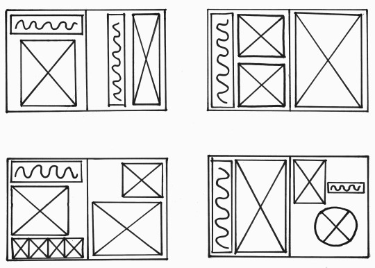
PAGES IN ORDER FOR ZINE !


1 note
·
View note
Text
FINAL OUTCOMES FOR ZINE !
LAST PAGE !
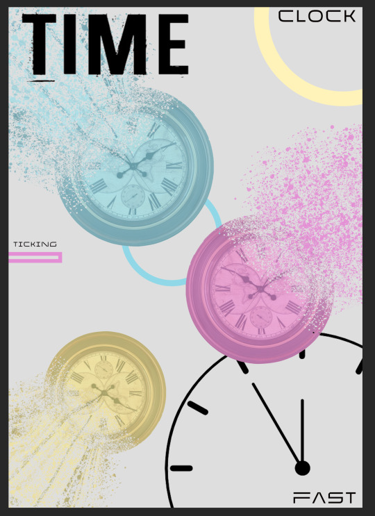
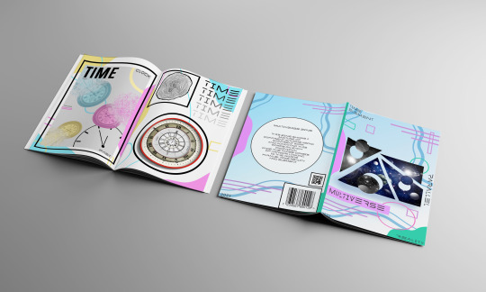
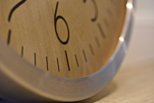
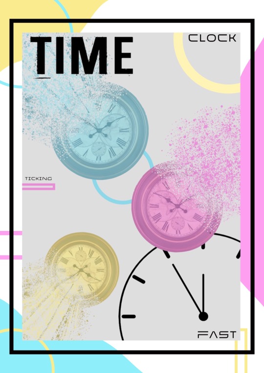
My final page for my zine was focusing on the word time when I chose the word time I was really struggling to think of ideas to use but are used Pinterest for inspiration and finally come up with ideas the first page is a poster that I created dedicating it to clocks I wanted to learn new technique of the dissolving affect as I wanted to portray the message of time fading away and time dissolving because sometimes it feels that time goes so fast and I also want to keep the theme of my colours throughout my outcomes and it works really well with the back ground as grey out of all of my outcomes this was the most technical as I had to use a lot of layers liquefying tools brush tools and mask a lot of layers as well I also used typography that I created on the first week of our project to try and inspire me and it looks really good. The second page I was struggling with as well as I thought what else can I use to create outcomes so I decided to do a log print the reason for this is you can tell time and length with a log due to the rings that are shown when you cataloguing half which shows how old that tree was and I thought that was a good way of showing time the second outcome that I used on the second page was a collage of clocks I wanted to show the message that time is endless and I done this by creating o’clock within o’clock within o’clock et cetera sort of similar affect to a pattern that is used for hypnotherapy. Overall this page does portray the topic time as it contains clocks and typography that says time but as the final page I think it suits the last page as I have used a lot of techniques within one spread have used a mixture of digital and Manual art .
0 notes
Text
FINAL OUTCOMES FOR ZINE !
FOURTH PAGE !
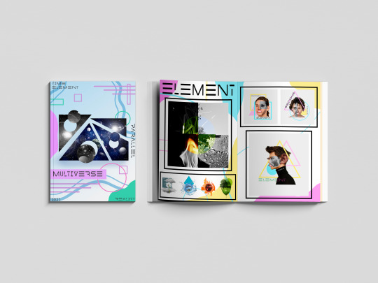
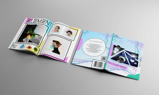
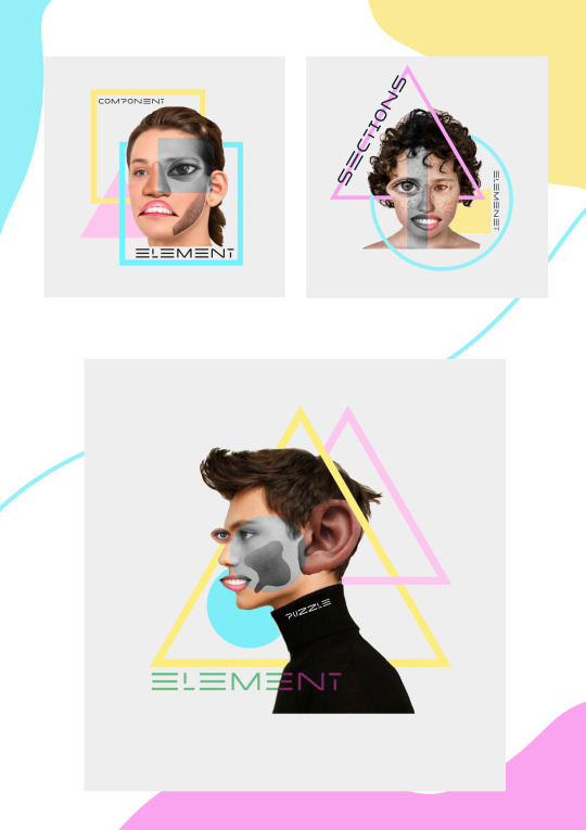
The last part of my zine contains a four pages the first page after the photo page is focusing on the topic element I was really excited to do this word as I knew that it would incorporate photography which is something different I also knew that it was going to use more a photo shop skills to create different bits the first thing that I done to create this page would create the element icons representing each of the four elements water fire air on Earth The reason I started to do these at the outcomes was to give myself something to help me with inspiration and it really did help the main thing on this page was the photography as it was different to all the other pages I used imagery that I had taken of fire earth air and water and combined them into one to create a tile effect and then I took a section of the image and change the colour of it also to try and represent an element of the image being changed I was trying to look at the word element in different ways and that’s why my second page is different from my first as I was focusing on the different type of element. The second page for element contains a collage of a persons face the reason I done this is because I was taking elements of individual people of the different sex and different race and different age and combined them together to meet to make a new face I also Inc the shape of a triangle as a triangle is known to represent elements of the world as many people get a tattoo of four triangles represent in the elements so I knew that I wanted to incorporate that I also use the same technique of changing a section of the image to a different colour again focusing on a section relating back to the word element but overall I’m thrilled with the outcome of this page and think that it betrays the word well.
0 notes
Text
FINAL OUTCOMES FOR ZINE !
MIDDLE PAGE !
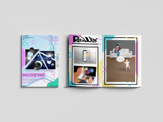
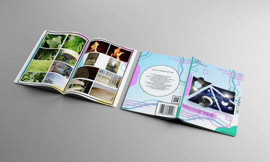
With my zine I didn’t want to just incorporate digital outcomes using photo shop and procreate I also wanted to incorporate photography as it’s something different from previous projects so I decided to make the middle page of my scene a photo page similar to books such as autobiographies as they contain images of the person who ever wrote the book as like and look at their life so I want to do incorporate images that I took around my house in the garden and when I went on a walk I was restricted to what photos I could take due to us being in a lockdown but I managed to get the majority of the photos that I wanted but was unable to get photos linking to the word reality. On my blog I showed the equipment that I used to take the photographs and I was really happy with how they come out and I feel like they betray the words that I have chosen well. If there was anything different I could do to this page I would’ve liked to add photos to do with reality as I had good ideas but as I was unable to do them unfortunately was unable to get them to use on this page but overall this page sums up all of the words that I chose for the topic Multiverse.
0 notes
Text
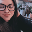
FINAL OUTCOMES FOR ZINE !
SECOND PAGES !
This is the second part of my scene which was dedicated to the word reality when I decided to do the word reality I knew I want it incorporate something to do with technology and social media and the message I was trying to betray through these outcomes was people are so engrossed into their phones and social media that they are missing the reality of the outside world and that is why the second page I created a digital drawing of a woman sitting on her phone looking through social media and this is betrayed by her halo around her of all of the social media apps and then in front of her her child is taking her first steps and I tried to show that people are missing vital parts of reality by being in grossed in the fake reality of social media. To create the majority of all these outcomes for the reality page are used procreate and used a mixture of different brushes and tools but overall I feel that the page has come together and does show a reality of nowadays and the colours work well together and link back to the background of the scene which I have used throughout the project as theme.

0 notes
Text
FINAL OUTCOMES FOR ZINE !
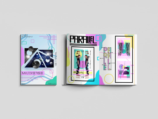
FRONT PAGE, BACK PAGE AND FIRST PAGES !
Below you can see the mock ups for my zine. I’m really happy with how my outcomes looked together and I feel like each topic to do with multi-verse is portrayed very well in each page of my zine.
The first page that you can see is my Front cover page I decided I wanted to stick with a restricted colour palette for the front cover so I decided to stick with the colours of pink purple blue and turquoise the reason I chose these colours is because it represents multi-verse as when I think of those colours I think of space and planets and stars. When you look at the front cover the first thing you see is the image that I chose of space I decided to slice it up and take bits out sections of the image and offset them and change the colour to black and white so I had more diversity within the front cover. You can also see the back cover I decided I wanted to keep the same background from the front cover but just take away a lot of shapes type and the image and I replaced it with a blurb a barcode and a QR code the reason I done this is Because zines normally have a blurb on the back to describe what the meaning of the scene is and also as scenes are sold I decided to use a barcode and Q are to look professional.
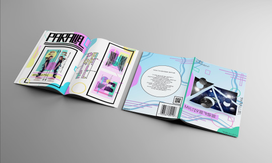
The first page of my Zine is dedicated to the word parallel I incorporated a lot of lines and shapes into the outcomes for parallel as I feel that something I think of when I think of the word parallel the first page I created a collage on photo shop of a person standing opposite themselves so that they are parallel I also used effects On procreate to make the image of the woman glitch so she looks like loads of lines which works really well but I feel like this betrays parallel well as they are both parallel to each other I have parallel lines and shapes within it. The second page I was really happy with as are used images of buildings from my own gallery and I created them so they were opposite each other and had that parallel effect of looking through the alleyway again are used the parallel lines that are normally used in maths to show that something is parallel as I wanted to incorporate maths into it as this is our Mars project.
0 notes
Text
ZEKA DESIGN ! (PEOPLE POSTER COLLECTION)
https://www.zekagraphic.com/portfolio/people/

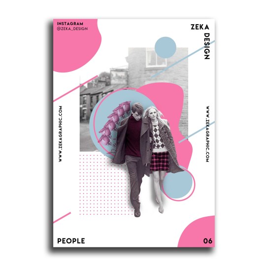
When I knew that I was going to make a zine for this project I went on Pinterest and looked at scene designs to help me with inspiration and I came across zeka design and found their different poster designs and I instantly knew that I wanted to do something similar with using the funky colours and shapes so I decided to lay my first page out similar to this and create my own style within this design so the first thing I decided to do was choose a colour palette that I knew was fun and bright and I could use throughout this zine.
The reason I like this so much is the way that the layout is it simple but affective and that’s one of my favourite things about graphics you can do small things within it like add shapes to the background and it brings a design to life and they’ve also use different techniques within it. Another thing that I liked was the type that was used it’s really simple but it works and I like the fact that it’s around the edge and I have used this in my outcomes but I’ve also added type within the image. As you can see on the top one there is black outlines and I really liked the look of it as it looks quite pop art like so I decided to frame all my images and out comes with a black frame as it’s quite bold and it makes a statement but overall this is where my ideas and inspiration come from to create my zine.
0 notes
Text
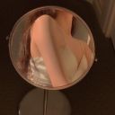
LAURA STAUGAITIS !


Laura staugaitis is a photographer she does many different styles of photography but when I was looking at the work I was drawn to a section that included mirrors. As you’ve seen on my blog I took for photos linking to the words that I have chosen for my zine but her work doesn’t link to that photography in links to an outcome that I created using my photography no styles are used was used on the page for element in my zine I like the fact that she had put a circle in the middle of a photo with a different image so are used a similar style to her bye selecting a circle of one of my images and changing the colour of it so similar to her work she has a circle that is a completely different image to what is around it and I like that affect as it represents different elements of the world where I was with mine I had different elements of colour and it works really well with my colour palette and style for my zine.
She does create other photography but it wasn’t something that I could link my work to or get inspiration from she mainly focuses her work outdoors she is from America but has travelled around the world and taken photos of many different places a lot of her work is very simple she contains some photos that are literally a bench with a bottle on but the way that she uses the lighting and positioning of a camera works really well and that’s the same with her mirror photography she is able to take the photo without having herself in the mirror but using that effect that she is over the top of it which works really well. But overall I really like her work but I mainly focused on this section of her work as it links back to my outcome
1 note
·
View note
Text
MY PHOTOGRAPHY !
ELEMENT


PARALLEL

TIME


all this photography was taken around my home I went on walks to get some images and took photos of my garden as-well I was unable to take photos relating t the word reality due to us being in a lock down and not allowed travel but I have done many outcome on the topic so I'm not worried.
To take these images I use my camera (Nikon D750) and I use a range or different lease including :
Sigma 85mm 1:14 portrait lence
Sigma 105mm 1:2.8 macro lence
Nikon 24-120mm 1:4 AFS lence

1 note
·
View note
Text
DANIEL SANCHEZ !
https://dribbble.com/batpapi


When I was trying to get inspiration for an outcome for my element pages in my zine I was looking on Pinterest and came across the artist Daniel Sanchez I liked his work as it was different to the others that were trying to represent element the reason I liked it is because it was using a new technique of collagen but not collagen thing manually it was collagen digitally and I like the way that it looked and I feel like it represented element well as I was taking individual elements from different faces and creating a new face another thing that I liked about his work was one his use of colour and it linked to my theme of my colour palette well to he Inc shape within his collages which was one thing I knew I wanted to do as throughout my zine I have a running theme of using shapes in my background to represent different things throughout the topics.
Daniel Sanchez has done a couple more different collages throughout his work but they weren’t the look that I was going for I wanted to show layering and a diversity throughout my work and where he has some bits of work that merge into one which was not the thing I was looking for as I wanted to show individual pieces. Another thing that I liked about his collages where the clean edges around the images I feel like it gives it in the tidy look and I wanted to Play to my strengths in this project and my strength is keeping things neat and sophisticated and by doing this it carries out that strength.
0 notes
Text
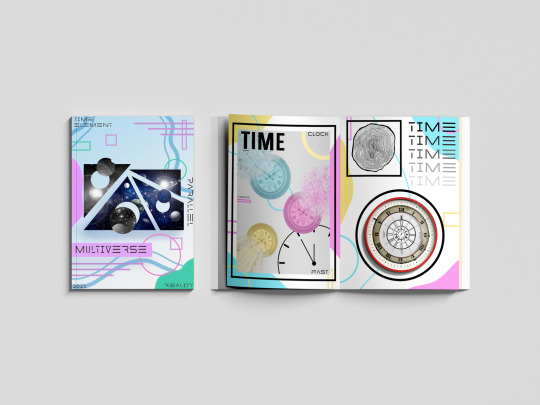
SECOND PAGE FOR TIME !

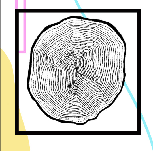
The first part of this page is a log print to represent time as you can tell how old a tree is by counting the rings on the log i used a piece of paper and a graphic stick and took a rubbing but then when over the lines using a fine-liner then photoshopped it and threshold it on photoshop and place on my second page document.
The second part of this page I created a collage of clock and layered different clocks other one another to try and show that time is endless like on of those images that are used for hypnotherapy I created this on photoshop by using the magic wand tool and the move tool and just resized them.

The last bit I added to this page is type I made the type into a gradian by electing lighter clues as I went on to create the illusion of the word time fading away like what time does in reality I used the font MADE Future X HEADER from the website da font.
0 notes
Text
TIME PAGE FOR ZINE !
This is my first time page I used the same technique to create the background as all my other pages just used a different outcome to display on it.
0 notes
Text
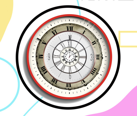
TIME OUTCOME !

To create the effect for my time outcome I had to learn a new technique. The first thing I have to do was find an image of a clock once I had found this image of o'clock I transferred it onto an a for document on photo shop after I had done this I then duplicated layer by using the command cmd j and then selected the background of the duplicated copy and deleted it.

After I done this I then created a new layer labelling it white background.

After I had done this I then selected that duplicated copy of the background and duplicated it again and then selecting the first duplicate copy I then went to filter at the top of the desktop and selected liquefy.
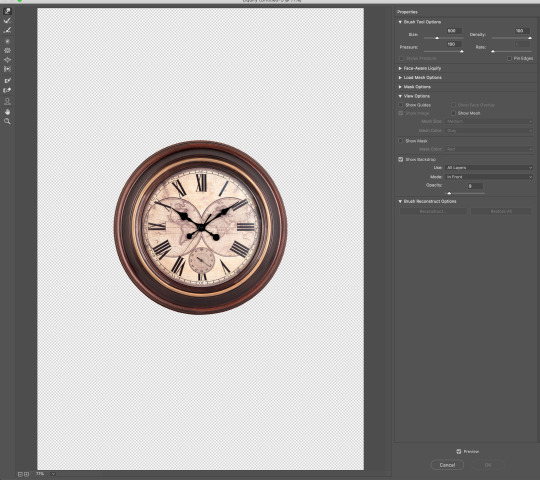

This image then came up I made sure that my settings were right honey and the brush sizes right and then I started dragging the image to distort the picture.
This is what you look like once I've done this I pressed okay and then it transferred onto my photo shop document.
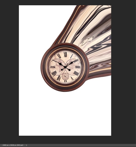
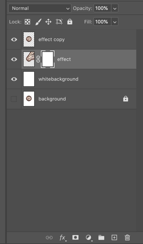
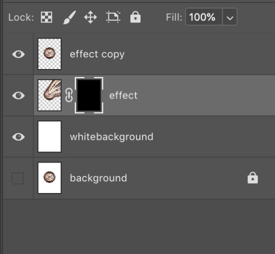
Once it had transferred onto my photo shop document I selected the layer and masked it once I have masked layer I then selected the masks layer and used to feel effects Anfield the page with the colour black I name went to the second duplicated layer and mask that but leaving the layer White.
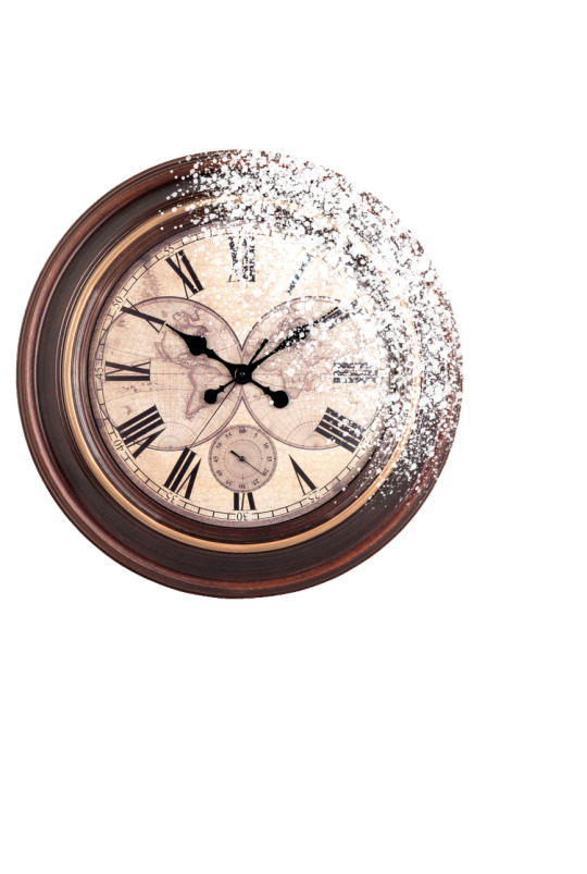
I then selected the brush tool and then selected a splatter brush and using the colour White I went round the edge of the image he's created the effect of the side of the clock dissolving.
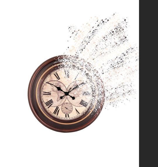
I then selected the first duplicate copy and selected the layer that is masked and using the same brush with the colour white and used different sizes to create a dissolving effect and create it to look like the clock was fading away.
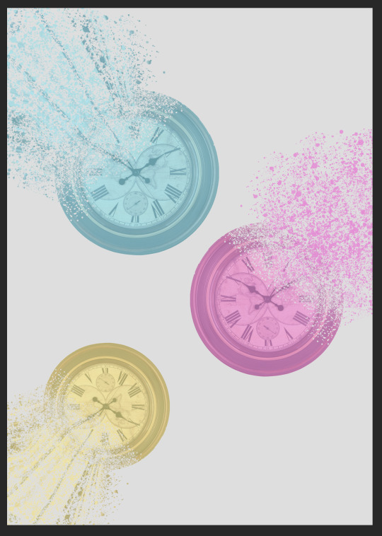
I then copied and pasted the image onto a new document on photo shop and copied it again two more times and by selecting each individual layer I created a colour overlay on each of them using the colour blue pink pink and yellow to keep a running theme throughout my work.

Once I had arranged in the way I liked I then added shakes to the background similar to that backgrounds of all my zine pages and the shape I also included was outline of a clock.
The last step to create this outcome was using type are used one of my type pieces that I've done at the beginning of this project and placed it on the left top hand corner and arrange them in the way that I wanted and finally had this outcome.
0 notes
Text
SECOND ELEMENT PAGE FOR ZINE!
After I created background I then selected the outcomes I created on the photo shop and procreate and paste it onto the A4 document and then arranged into the places that I felt looked good and made my favourite outcome of the three biggest.
I then use the shaped tool and selected the rectangle and made blackline borders around the outcomes to keep that running style throughout zine.
0 notes
Video
How I created my collages in procreate.
0 notes