Text
Final Visual Assets
Final Assets 1


Final Assets 2


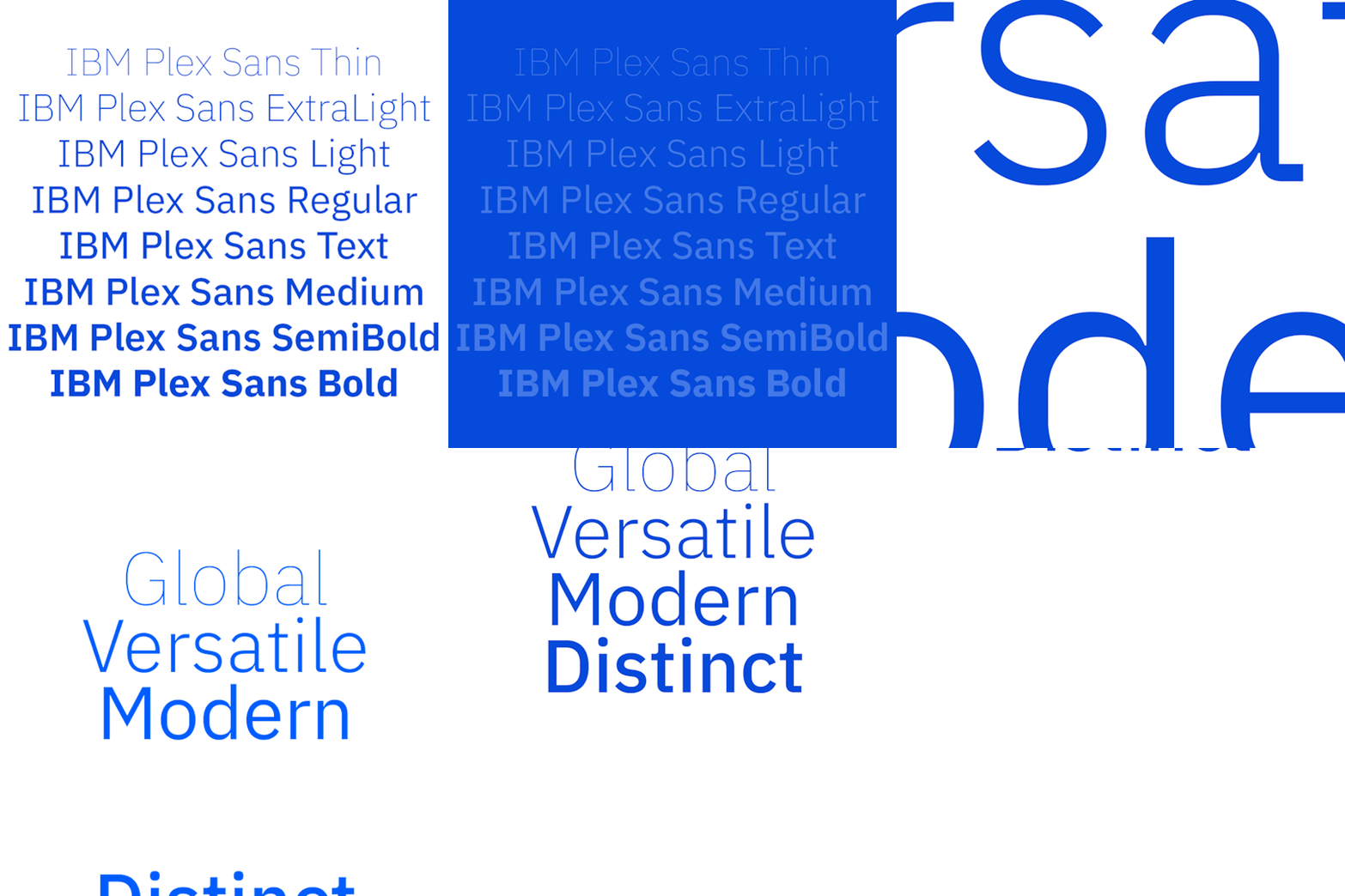
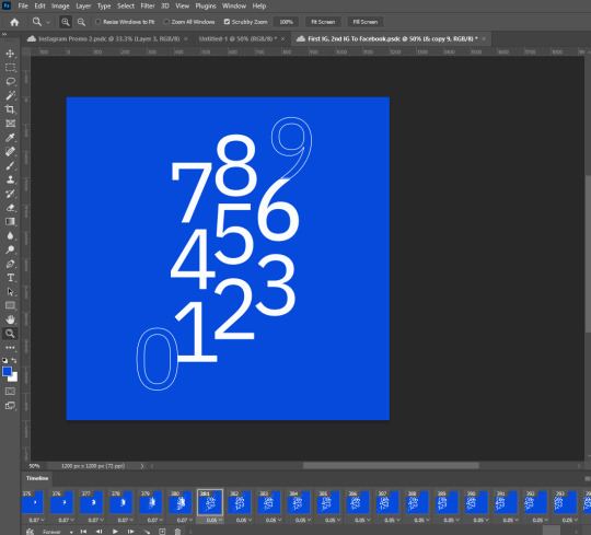
For my animations, I have created 2 animations which are essentially the same, but on different formats being Instagram and Facebook (4 in total). Therefore for my animations I have had to alter the sizing and proportions of each visual asset to make it match the frame; twice.
Transitioning/Visual techniques used:
Tweening (opacity and positioning changes)
Change in typeface weight
Left to right/Right to left
Repetition
Zoom in/out
The tweening was the main technique I used for this project. It allowed for opacity and positional changes. When tweening I had to think about how many frames to add between the transition of frames. My animations were exported as a mp4 file with a framerate of 30 frames per second. If more frames are added from the tween, this allows for a more cleaner transition as the multiple frames have distinct positions that move slightly from each other. The range of tweening numbers I used for the frames ranged from 6-24, depending on the transition.
If I were to do the project again, I would strongly focus on time management. I believe that my first animation was fairly poor, but my second one was much better as I had learned more about how to create an animation as I did it more from watching James and Karol’s videos on blackboard and completing activities. Thus, I would focus on changing the first animation to make the transitions cleaner and refining the frames. With that being said, I believe my animations fit the brief and criteria. Each frame was thought out, with each asset being a part of the IBM Plex Sans typeface, whether it be the characters, weights, or words that describe it.
0 notes
Text
Asset Making - Development and Refinement
For my composition making I have used InDesign, Illustrator, and mostly Photoshop to create them. All animations were made through Photoshop, using both the ‘Video Timeline’ animation method and the ‘Frame by Frame’ animation method (thanks to Karol and James for the videos). When I transitioned from frame to frame, I have heavily used the ‘tween’ tool which allows for a clean transition from one frame to another, which changes the position and opacity between the frames.


Illustrator

Assets made from Illustrator then pasted on to Photoshop.
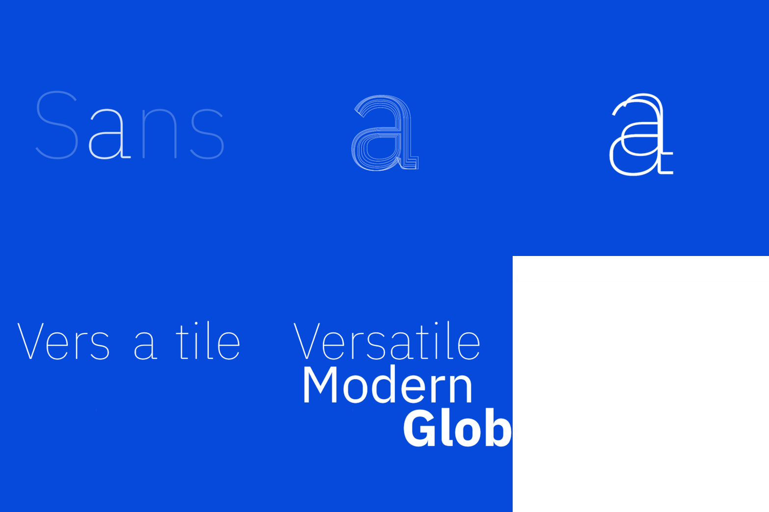
Part of my animation achieved through illustrator and photoshop.

Tweened transitions, with gradient overlapping on top of the text to make it change colour.

InDesign
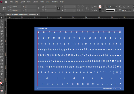

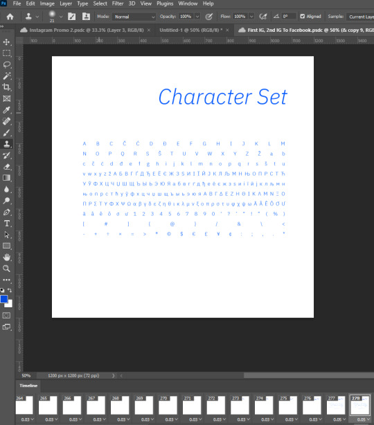
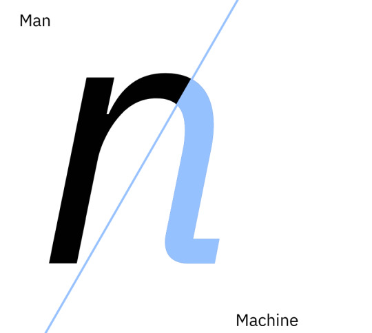
Here are some of the compositions from my InDesign booklet which I have integrated into my animation. Because the animation requires different sizes, I have had to reshape and refine the compositions to make it fit the canvas. I have also recolored it through photoshop, from the pale blue to the bold blue.

Man and Machine
https://www.ibm.com/design/impact/plex/

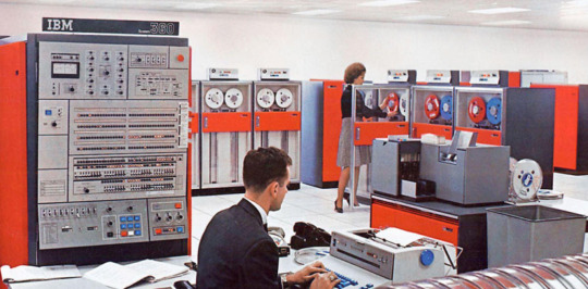
Here I have taken and altered an image of an IBM worker. I felt the need to create this composition for my animation as the typeface would not be possible without the combination of man and machine. This visual asset was made entirely from photoshop. I have recolored the image to match the colour scheme of my animation, using gradient maps. I have also applied a filter (cutout) to simplify the aesthetic of the image, matching my animation’s aesthetic

This part of my animation included various techniques on photoshop. For the transitioning I have used the tween tool. This allowed for movement of the text and the image. I tweened each frame of the text adding 6 frames between each word (for example, Man to Timeless) for it to show up smoothly. I also wanted to do this to allow time for the viewer to process each word, not being too fast or too slow. There were also many layers; the text itself, the split gradient map, and a cutout of the man in the image. Therefore, I had to think about each layer and also plan the final outcome. The cutout of the man gets more noticeable (brightness alteration) with the same progression as the ‘Man’ text shows up on the screen (opacity change). It also overlaps the text when it transitions to the right. The split gradient map I thought was a nice addition to show contrast as man and machine are completely separate entities. This also affected the colour change of the text when it transitions towards the gradient map. The words under man and machine essentially describe the origin and characteristics of the typeface, IBM Plex Sans.
0 notes
Text

Here is my first prototyping with 2 visual assets of the description of the typeface (Global, Versatile, Modern, Distinct) and the character set. This was exported to the web as a gif through photoshop, in which I used to create this frame by frame animation.
I have changed the colour of my animation from a pale blue to a more bold blue. I believe this accentuates the compositing arrangements of the assets making it stand out much more.
0 notes
Text
Research: IBM Plex Sans


“We created Plex as part of a system, and as part of our identity. Just like the other elements of our brand; just like mankind and machine; Plex and IBM are better together. “
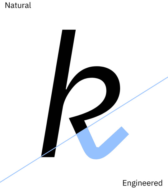


Selectric Typewriter 1961: Plex’s engineered counter-forms reflect shapes that appear in some IBM classic designs, like the Selectric Typewriter. These forms are vital in making Plex unique.
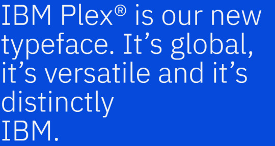
From looking at IBM’s official page for the typeface, I have garnered a lot of useful information regarding what the typeface is all about. The words that are used throughout the page that describe the typeface are Modern, Versatile, Global, and Distinct. Therefore, I will incorporate these words in to my animations as they essentially describe the typeface as a whole for what it is. They also describe the typeface to have a ‘Man and Machine’ relationship, juxtaposing each other towards the typeface’s embodiment, which was originated through man and machine, as it would not be possible without them. This is an interesting origin in which I will ideate towards adding to my animation, possibly through a visual asset(s).
https://www.ibm.com/plex/
1 note
·
View note
Text
Type as Hero
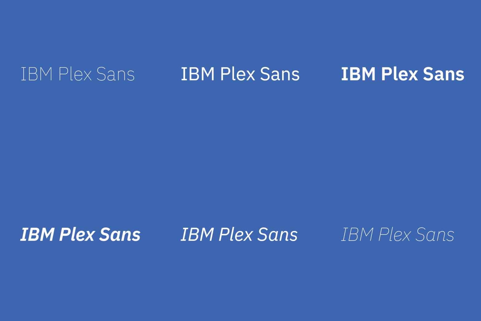
For the Type as Hero Project 2, this Tumblr page will document the progression of the following animations I will create; being 2 Instagram promos (1200x1200 pixels) and 2 Facebook promos (1280x720 pixels). My animations will be based off the typeface I was given by Karol for the first part of the 2nd Semester, which I have created a type specimen booklet for (IBM Plex Sans). I plan to utilise some visual assets from my booklet and integrate it towards some of my animations, as well as creating new compositions as well, exploring what IBM Plex is all about. My approach to the aesthetic of the animation will mostly be simplistic, with transitions that move smoothly and fast at times.
For the colour scheme, I will just keep it to a minimal blue and white, although I will consider the change of blue as seen in the gif above. The compositions I will create will be modern, distinct, and versatile.
0 notes