
Last Seen Blogs

biancachopchop
Miaou
star-candy7
Acabado

spirit-science-articles
Untitled

s-i-y-a-h-i-s-t
*Kıvırcıkk*
innerthoughtsproses-blog
Thoughts & Prose
Text
Queen of Pinafores and Miniskirts.
Reviewing the highs and lows of the Queen of Pinafores and Miniskirts, Mary Quant.
A lot of people know Mary Quant as the woman who was an extraordinary and out of the box designer. She was not afraid to use different kinds of fabric that were never used in the industry before such as upholstery, latex and etc. V&A has recently honoured her and showed some of her amazing pieces in a recent exhibition.

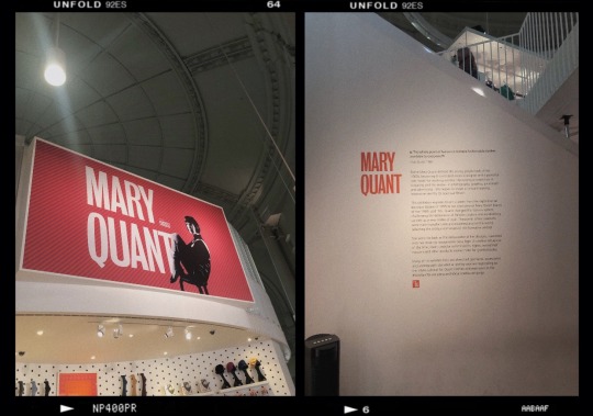
After walking a few distance from South Kensington Station, I came across a stoplight just before the crossing. There I saw somewhat a reminder of the exhibition I was going into. To be honest, I never really knew of Mary Quant and so I didn’t know what to expect. I have been to a few exhibitions in the V&A before and it was the first time to see something like this. A bright, vibrant coloured signs as you look down making you feel like you’re almost the exhibition.
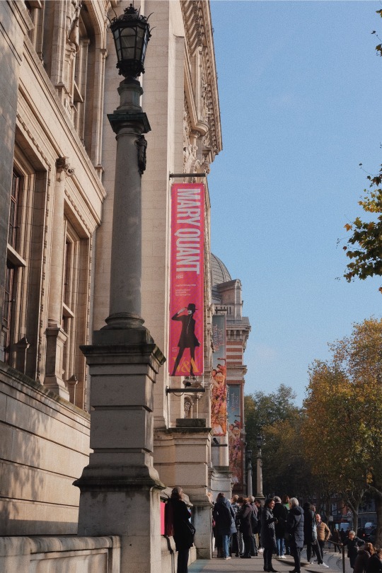
A few moments later, I arrive at the meeting place my tutor had set for us. While we were waiting for some of my classmates to arrive, I was just admiring the V&A, just as I normally do when I get fascinated by architecture. I saw this poster again of Mary Quants Exhibition. I still remember how it was so easy for it to catch your eye with the bright pink colour contrasting the black dress the woman was wearing on the photo. If you had not already been going to the exhibition, the poster itself would have intruiged you to go inside and see what it has to offer.
A TRUE ICON.
Upon entering the exhibitions, these are the two most striking bit that I have noticed.
1. Mary Quant’s signature sitting pose. In one of the articles that I came across online, it says that the reason for Mary Quant sitting like that is that she was someone who never wanted to be taken too seriously. This was her little way of defying the common standards society was then imposing to women.
2. When I entered, the first thing I noticed was this wall leading up to a staircase. It was an overview of what the exhibition housed and what a true icon Mary Quant was. It mainly said that even though Mary Quant defined the young, playful look for the 1960s but became one of Britain’s best designers ever known in the world. She was a role model for working women and helped to shape a forward looking society post-war.
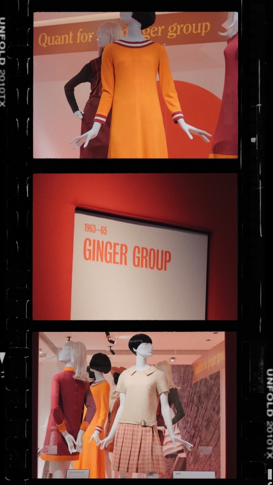
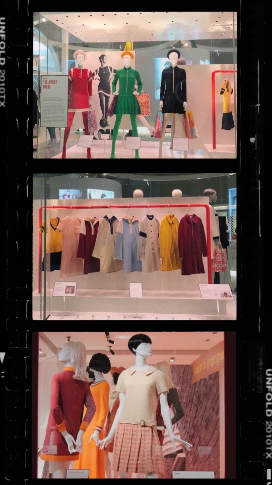
THE GINGER GROUP.
“Quant clothes at budget prices to buy a piece at a time.”
In 1963, Mary Quant came into a new territory with her Ginger Group Collection. The name was a political term for a pressure group, derived from the use of ginger as a verb to pep things up. It was Quant’s aim to change the course of fashion. One of her ways was by producing fun, edgy clothing for a wider clientele.
In the first photo, you can see a mannequin rocking a dark hair bob-cut with fringe which was a very 1960′s clean look. However, you then become entranced with her striking orange dress. This dress was just a plain silhoutte but because of it’s good colour combination with the red and white stripes that are lined on her wrists and on her neck, it instantly becomes young and fresh. The material of the dress looks as if it was made of a country with colder weather.
The last photo for me seemed a little underwhelming. When I saw it, it made me curious as to why Mary Quant wanted to include this piece in the Ginger Group Collection. I think because she wanted to cater to different styles, she made on that was a little on the conservative side. In that era, wearing that length of skirt would have not been considered as conservative. However, because I knew that she was the inventor some might say of mini-skirts, I wasn’t expecting something in that length to be included in her collection. The top was very simple yet elegant and structured. I also like the detail of the buckle, which I found later on in the exhibition that she was very fond of. I also saw the mannequin’s hairstyle which was definitely embodying Mary Quant.
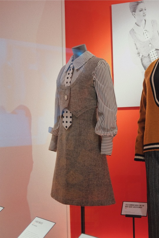
Borrowing from the Boys.
One of my favourite parts of the exhibition. As everyone probably knows, Mary Quant was not one to try and fit in into society’s norms. She was one of the few who braved standing out. She would take tailoring clothes intended for the city gents’ suits or even military uniforms and re-vamps them into her own fun, unique style.
1. In the first photo we see a pinafore dress paired with a necktie and a striped polo shirt. This was worn by Elizabeth Gibbons. When I saw this I instantly thought, “Menswear”. It was a really clever way of playing and inserting menswear into women’s clothing. She somehow made a masculine figure into a feminine silhoutte. The polo shirt looks very crisp but also looks like a soft fabric has been used to make it. The pinafore however, looks as if it was really made for Winter Season. It looks as if it’s made of wool and ofcourse, who would miss the quirky polka-dot print the necktie had. If I was to live in that era and see a woman wearing that, I would feel empowered.
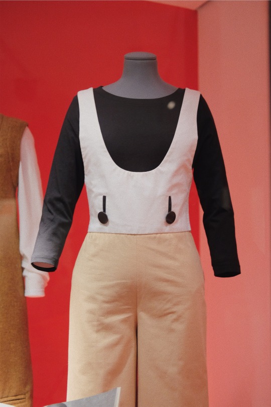
2. In the next photo, we see a sweatshirt, pinafore top and trousers ensemble. This to me resembles woman at work, a powerful woman at work rather. It looks as if it was assembled to look like work dungarees. This piece was released in 1963 and it was aimed for women in their 30s. Again, Mary Quant wanted to defy the norms of society and take mostly men’s clothing and incorporate it into womenswear. Trousers were considered inappropriate for women and are banned for them to wear in formal settings such as restaurants. Quant’s trousers are smart and practical and she used to wear them anywhere she wanted.
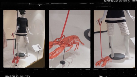
The Lobster Bag/Accessory
There wasn’t anything much written in the plaques about this bag/accessory which was really disappointing as it was the highlight and what was striking with this outfit. It completely does not go with anything she’s wearing and yet it compliments the whole outfit. Everything in her outfit looks so soft and delicate. Even when you look at the petal like or ruffle detailing of her shorts, you’d focus on how delicate it looks. It is definitely in contrast with how hard and stiff the lobster bag/accessory is. This was a very good play on softs and hards in terms of fashion contrasts.
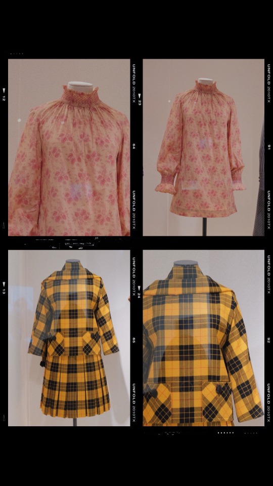
Comparing high necks and different prints.
We have, in my opinion, two very different styles of garments. First, the top photo is a dress and the bottom is a two piece garment. The reason I think comparing both of these would be interesting is because of their kind-of similar high necks and different prints/vibe.
1. The Liberty Print Smocked Dress. This garment is the like feminine wearable art. The fabric looks so soft and delicate, the colour combination could not be more perfect. The way the different shades of pinks are mixed together, the way the print stands out not in a very aggresive but in a gentle manner. The high gathered neck makes the garment look so conservative and classy at the same time. The length is just perfect not too offend anyone in contact and it just divine. It makes you instantly feel like you’re ready to brace spring or summer in beautiful style. This was worn by Claire Fiander.
2. The Two Piece Tartan. In contrast with the first dress, this two piece is a mix of feminine with a more aggressive sense of masculinity. It was Mary Quant who wore this piece in bright tartan for her first publicised visit to New York. What I love about this piece is that even though it’s a skirt, you can still see the structure with the subtle pleats. You can also see the minor details that are very Mary Quant such as the buttons and the high neck we previously saw in the first dress. I love how this is a little longer in terms of length and it still looks very edgy and unusual.

8 out of 10.
I have had my fair shares in visiting exhibitions and with this one, I wasn’t aware of it. I can definitely say that it has been different from the Designer Exhibitions I went to as it was more raw and personal. It wasn’t like Christian Dior’s where it was filled with different designer’s history with working with the brand, same as when I came to see Balenciaga’s Exhibition. This was more like Mary Quant’s art in garment form. It was an embodiment of everything she stood for, how she was a true icon. How she became one of the best designers the world has to know. In 10 out of 10, I would probably give it an 8. It did not expect much from it and it ended up giving me so much knowledge, respect and interest with what Mary Quant had to offer. The impact it had on me was different because it felt like you were being educated in the kind of different norms society had in the 60s versus how it is now. It gives you an idea that if it wasn’t for someone like Mary Quant to break the norm, we would still have been living to the same standards in 2019.
Work of Art by Mary Quant.
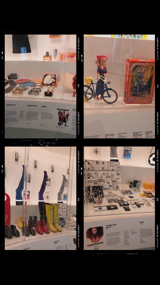
One of the few exhibitions that surpassed my expectations. I think this was mainly because it was not focused on how she started the brand, it was more like she was the brand. I seldom see any other things apart from garments in exhibitions, given some always include handbags or shoes but in Mary Quant’s exhibtion, they gave us a glimpse of her make up products, socks, quirkly shoes and even barbie dolls. They gave us an overview of how they market stuff to different kinds of audiences and how they definitely cater to every style you can possibly think of. Overall, I think if you have the chance to see this, you should. It definitely is a work of art and in my opinion, it feeds inspiration to your creative hunger.
8 notes
·
View notes