
giannisbct-blog
Gianni Gambassi
My journey through the Bachelor of Creative Technologies at AUT
202 posts
Don't wanna be here? Send us removal request.
Last Seen Blogs

hugeheavytities
Untitled

kingofanemptyworld
King of Nothing

gutsheapofrawiron
xiangling's number 1 hypeman

soilthesimpletruth
It's All About The Soil

zuiaaa-blog1
Júlia Rafaela Hanauer
Text
Raw Analysis
I thought I would share my raw “data” that informed my analysis, because well, why not? As you will see I most definitely didn’t reference properly, or at all throughout this process so forgive me but its more to show all the things I didn’t include in the hand in.
SPYCE ANALYSIS
Video
Music is inquisitive, curious and intriguing. reminds me of Sergers Prokofiev’s Peter and The Wolf.
Coupled with the start of the video where you see the machine with the lights turning on but it isn’t clear as to what it is
Interior photo in second shot shows the restaurant to be clean and look more like a co-working space or a big open plan office a lot of tech companies are moving towards, hints at the “innovative” angle as well as the robotics
No ‘faffing’ around with their explanations, just get straight to the point with the facts. Mirrors the precision of the robot
“Humble starts in our fraternity basement” looking to show that they are made for the average person, by the average person.
Basic prototypes and back story give that “wow” factor to entice the customer
Very transparent in the whole process of making the food. i.e. explain how the woks cook, how they are heated, how they came up with the menu…
“perfectly cook your meal every time”
Once introduced the concept and the mechanical expertise, bring in the experts in food. Shows that they have all the bases covered
Appeal to both the students by having this innovative approach but also the older generation by bringing in a top chef
“Guess his email address” shows the commitment and the drive of these people, makes for a cool story and adds a wow factor to the backstory
The chef who says he was also puzzled by the idea and then likes the idea, used to sway skeptics
Every team member is justified
Using the idea of robotics as the way of the future and the vegetable focused menu (as meat is not sustainable) to show that they themselves are forward thinkers and look to the future.
Order system is familiar to people as it is a screen that they can navigate through touch and order without actually having to interact with someone.
“Affordable, tasty and nutritious” - no human error keeps it consistent and no humans means it’s cheaper
Music at the end goes back to that curious nature that almost invites you to come try yourself
The food is the end product the consumers see so lots of shots feature the food itself, as well as it cooking
Key point they mention is that the meals are “complex”, these aren’t basic or low number of ingredient meals
Can see your meal being cooked
Everything is automated except for the toppings so it is suited for people who don’t want to interact with others, which is a lot of the younger generation
Vibrant and energetic shows the wellness side and the “fun” factor
a lot of energy has gone into adding the personal touch, (your name while its cooking)
Website
“Wholesome and delicious food” the reason behind it anyhow it came about, the engineers working with the Michelin-Star chef, the salads themselves are all wholesome
Being a restaurant, primarily all their photos are of food and the space. They also include the human touch by having photos of the people behind the counter. Shows that they are just like any other restaurant and they aren’t trying to put people out of jobs
The Our Philosophy section puts the consumer first and two they are doing all of this to impress you, the consumer.
FAQs - Our Mission - Talks about the benefit of the robotic kitchen in terms of the cost factor and the nutrition.
FAQs - Our Mission - Diplomatic in the sense of ‘job cutting’ but show that they pride quality over quantity when it comes to staff.
Backstory has a wow/cool factor to it in terms of why and even how they got Daniel Boulud on board.
While talking about the technical aspects they talk about the process but much of the language is very human focused, to potentially bring it out of the typical sterile robot mindset.
Human aspect is to counter the typical feelings associated with automation and robots.
Instagram features very little of the actual system and focuses solely on the people and the food itself.
Highlighted on the landing page “Excellence Elevated” presenting the idea that their system innovates the food experience
Very simple process all up
The report concluded that jobs that involve “predictable physical activities” — such as cooking or serving food, cleaning kitchens, collecting dirty dishes and preparing beverages — are the most susceptible to automation.
Because the industry’s human labor tends to be lower paid, robots cooks have yet to be adopted, the report said. As the technology becomes cheaper and more widespread, however, that could change.
“Our restaurant is really efficient because people focus on what people are good at, but the robot handles the high volume tasks — like the cooking and washing — that robots are good at,”
https://www.washingtonpost.com/news/innovations/wp/2018/05/17/will-robots-replace-chefs-at-this-new-boston-restaurant-they-already-have/?noredirect=on
From reviews
people really enjoy watching the food getting made - similar to teppanyaki restaurant?
The being able to see aspect makes it seem “smarter” rather than it being in a box like the rotimatic
Unlike the Moley robot kitchen, it doesn’t aim to automate for the sake of automating the process, space aims to improve the process by making healthy meals quick and accessible.
https://www.moley.com/
The patent extends to both the cooking of the ingredients and/or mixing ingredients by complete automation.
We were four really hungry MIT students and water polo teammates tired of spending $10 on take-out lunches and dinners. Our athletic appetites required better nutrition but our student budgets didn’t allow for that kind of expense. While we ate our bland chopped salads and stir-frys, we dreamed of an alternative: a robot that cooked tasty and nutritious meals, served them, and cleaned up after.
https://www.spyce.com/who-we-are/
From a commercial standpoint the idea is solid, but buying ingredients and cooking your own meals is cheaper, so is Spyce the best solution to wanting cheaper healthy meals?
A simple google search will find you plenty of meals for under $10 that are healthy and easy to make and extend beyond the basic chicken and rice.
In essence the robot is a self portioning, cooking and cleaning system. The meals are still decided by humans, the method is still decided by humans and the art (presentation) is still done by the humans. The robot doesn’t have to do any of the thinking or checking if the meal is cooked.
high volume tasks
Look at:
Reviews
youtube reviews (https://www.youtube.com/watch?v=SuIIaEND70A)
news stories
facebook
Automated cooking
rotimatic
cat food automation
mechanical harry
automatic pan stirrer
process automation
is there cooking method the best
are there better style meals
Main Takeaways so far
The automation allows the food to be consistent, delicious and exactly as intended every time so there are no surprises
The automation allows the staff to be more customer focused/ allows the business to focus on other aspects as they are not held back by the process.
Questions so far
Does an automated system really allow you to focus on something else when it comes to food, as cooking is an involved process and an experience?
Can this be extended to a personal version that allows you to not have to worry about the cooking?
Can automation turn dinner into less of a chore by removing the need to be involved? Can it just be something that is ready when you want it to be without effort from you? (look at sci fi for inspiration)
Does the system they use result in even cooking of the food?
What is the effect of short wait times for food that is supposedly Michelin-Star? Does it seem tacky? Is it a throwaway?
Is the salad bowl and their method of making it the best for personal value and nutrition?
Can the idea be extend beyond just salad bowls?
Why Automation?
2 notes
·
View notes
Text
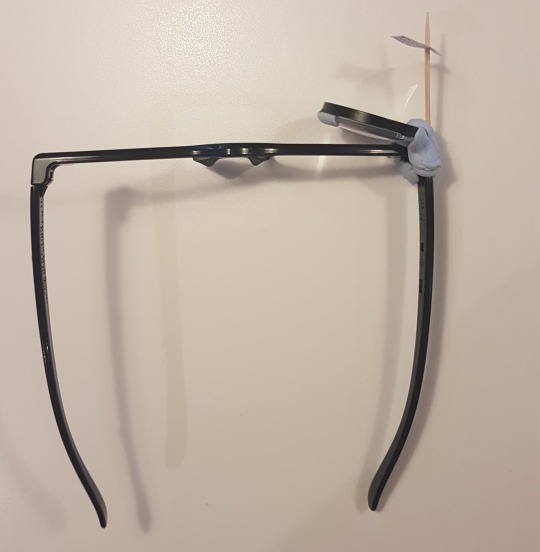
DIY Google Glass
So last week was a very basic form of evaluation I feel and didn’t really dive that deeply into the different features of glass, and as I used sunglasses, they didn’t really give the full impression of wearing Glass. So this week I went full DIY and made this.

Made from a pair of old Cinema 3D glasses, a lens from a cardboard headset, a toothpick, a piece of paper and a large amount of blueback, my version of Google Glass actually doesn’t contain any glass.


My goal was to experience the fact of constantly having something in your vision (although not directly in your line of sight) and only being able to view it with one eye, just like Glass. I wrote myself a (very) small to do list as I got home and sat down to continue with work for both my job and uni, knowing that before I went to bed I had to complete the list and some things like “Feed the Cat” were time sensitive. The idea being that I could continue with my work and use it as an analog reminder for things that I would normally have set a reminder on my phone for. So I guess in a very small way it was a way of testing the lack of need to actually check my phone but I didn’t factor this into the test as I still used my phone in this time for virtually everything else.
The first thing I noticed was that when I was working on my laptop, I tend to look a bit more down than when I am say walking down the street, so the “Glass” was definitely not in the way and so was just a convenient look up and to the right. However, when I was walking round the house or talking to someone, I found that even though it wasn’t in my direct line of sight, it still wasn’t as unobtrusive as it was when looking down my nose. I did grow accustomed to this and I sort of filtered it out, however after I had checked it and then carried on I had to go through and filter it out all over again. Along with this, I found that even when I wasn’t looking at it, it did tend to draw my attention due to its distortion of the space behind it. because I used a lens for a cardboard headset, the focal length is very short (as it has to focus on something close by) and so everything in the background gets distorted and blurred. Something that became much more noticeable when it got dark and I turned the lights on and every so often there would be a flash of light in my eye as the entire lens lit up. I understand that glass uses a prism and not a giant fisheye lens, but I wonder if this is something that would be experienced with the real deal, and if the distortive nature (even when it is inactive) is something that would distract the user and steal their attention away.
In terms of viewing it with one eye, I found it quite disorientating at first as when you are looking at it your other eye isn’t even able to focus on anything else and so it is like have a completely disabled eye. I also found that shifting my focus from far to near quite often gave me a slight headache and so for using it like I have it would be fine but if you used it as almost replacement for your phone it might become very difficult. I also found myself closing my other eye to focus on it, which I stopped myself from doing (resulting in more headaches) as Google Glass is intended to keep you in the moment and my removing myself visually from the world, it was having the opposite effect. Another discovery was that you need to always keep the glasses pushed right up to your face to keep the note in the right place as if they were off then the viewing angles were also wrong. Something that may or may not apply to the real Glass, however I didn’t have the full form factor that involves the battery and bone conduction sound sitting snuggly on your head behind the ear, so it may only be a fault with my design.
When my family got home they all asked the same question, and when I explained what this wacky contraption was I let them all try it and noticed they all had similar reaction to me (the closing of the eye and noting the annoyance of having something there). However, each person also made some comment about it being slightly out of focus or out of place. Something that Glass shares with this, is that it is personal to the user. With people’s eyes and head shapes being different, it doesn’t seem like a technology that you can just share with your mates all the time as it would require recalibration I imagine. Going back to the form factor though, they weren’t all that uncomfortable. The glasses themselves were comfortable to wear for long periods of time and even though not overly ergonomically designed like Glass is, they were very manageable. My pair weighed 27g which compared to the Glass’ 42g, they were quite light but not a huge difference I would imagine, and when I took them off I noted that I didn’t feel super relieved but didn’t miss them either. And as an added bonus, I did tick everything off my list.
0 notes
Text
Google Glass round 2
So after last week I can see that my analysis was a very brief scratch at the surface but starting on the right track. The key takeaway I have though is that I need to question every feature of the documentation provided by the company producing the technology. With my initial analysis I wasn’t literal enough and potentially looked at it a little too conceptually but that’s because I am in the studio mindset. The second thing I realise is that I need to ask questions from the analysis. So before I jump into the evaluation I am going to go through the video again and have another quick go at the analysis.
Analysis:
First shot and then every other shot we see both the users hands, tells us this is a completely hands free technology
Everything is from the point of view of the user + the name, it signifies that they are glasses
A lot of the scenes are set in ideal/extreme conditions to show that they are meant to be part of your life and not just a tool for work. Meant to integrate with your life
A lot of very aspirational activities to show that with glass you can do anything, pairs well with the music
Allows you to share your very cool experiences with your friends and family
Shots of kids showing that they are marketing towards parents who want to be more involved with their kids
Mix in practical commuting shots to show that its more than just for thrill seekers
Runway shot shows us that it is designed to be stylish and because its used in high pressure situations too (running for the airport) its also got a good form factor (otherwise you’d take it off when you were annoyed)
Access to instant information. Being from google we assume this which is why its tucked away towards the end of the video
Interesting observation is that the point of view suggests that it could have been filmed with Glass. Only some parts show it actually filming so privacy concerns can be raised about knowing if it is filming or not.
This part of the analysis is a little more difficult as I already have tried to do it once and so all that I can think of is how these point I have found back up what I said previously. I understand that what I did in my last analysis isn’t necessarily correct or even the point of the exercise, but I need some fresh tech to come at it with some fresh eyes. Hence I am skipping to the other main part I didn’t do which was the questions, based on my observations from this round.
As it is meant to replace your need to have your phone out it is meant to immerse you in your own life, so are the glasses the best way to do that?
We see lots of adventure footage, do they stay on your head even when in extreme activities?
What are the issues around privacy?
Evaluation:
For the evaluation I decided to focus on the first question As it is meant to replace your need to have your phone out it is meant to immerse you in your own life, so are the glasses the best way to do that?
The easiest way I figured I could test this would be to wear my sunglasses for a couple hours especially today which is cloudy and I spent a lot of the day indoors so not really the normal setting to wear sunglasses in. As Glass is not a pair of traditional looking glasses I am working the assumption that they are not widely going to be accepted as normal.
I found that although after half an hour or so I found that I didn’t really notice the glasses anymore (apart for when it got darker). So provided Glass has a comfortable form factor, a user would also find it quite comfortable and unobtrusive to use Glass after a small adjustment period, which goes for any technology. Something that I did notice however, which I did expect, was the reactions I got from my family and the few people I interacted with when I went out. Each member of my family asked me why I was wearing sunglasses inside and my dad actually asked me to take them off. When I explained why I was wearing them I asked him if I was wearing Google Glass if he would have asked me to take them off. He initially said no but then he wasn’t sure because he doesn’t like the idea that part of my face would be obscured. So although I think that with an adjustment period, people around you would also get used to it, you still wouldn’t feel completely normal if you used Glass as Google intends for you to use it which is all the time. I have a feeling that this would change with the addition of a camera and other digital features as people wouldn’t feel as comfortable knowhingthat they could be recorded or filmed.
According to Merleau-Ponty (2013) who first published his title the Phenomenology of perception in 1945, both experience and rationalism are inadequate to describe perception and that it transcends beyond these surface observations and is more about your consciousness. I understand this in this context as meaning that the judgment I have for something such as the Google Glass is affected more than just what I know about it (hard to measure as I know what the public reception of Glass was) and how I experience it. Doing this evaluation process I have realised that if you have preconceived ideas about something, you are going to bring that bias into your testing in a way to promote your own agenda. However, like I found with the comfort of wearing the glasses, you can often be surprised by this and if you are able to look past the surface level bias when this occurs you may start to notice things that could be improved or even that for the intended purpose the product suits it well.
Merleau-Ponty, M. (2013). Phenomenology of perception. Routledge.
1 note
·
View note
Text
Google Glass - Not handy tech
From the marketing material provided by Google, both when Glass was first released and now that they are in a further iteration of it, these were the main takeaways I got:
Hands Free tech, most shots show the user’s hands
Allow others to enjoy the world from your view
Be more present in the world without losing your connection to the digital world and having all your information delivered without distractions
Enterprise glass really puts an emphasis on being hands free
However, I can see that there would be issues around the distractions involved, especially in situations like driving and when talking to real people. It is advertised as being something you don’t need to take off and you can always have them on, but then there is no escape from the digital realm.
Even for sharing videos with friends its not the best because we are so used to high quality smooth video (Gopro can deliver super smooth 4K footage out of the camera) and Glass is low quality and has no stabilisation so it makes it difficult to watch.
Would make sense for AR applications to be developed for specific jobs but then have the glass as a work only device (i.e. take it off when you finish work), which is what they have moved towards but the form factor and privacy issues don’t make it suitable for use in the public.
Linking to Winner’s Do Artifacts Have Politics (1986)?
With the increase in AI and image recognition technology, the camera on the Google Glass (while it is marketed towards the sharing of your experiences) may be there to further promote Google’s own agenda or that of governments. In terms of benefiting Google, it can be used to see what objects/services you interact with in your day and then they can target ads towards you on your other devices better. And it terms of the government, they are able to monitor you better with how you go about your day.
The point about how it is designed to be non-intrusive and something that you don’t even need to think about, furthers these points more as through gaining comfort with it you forget that you have it on and so are less conscious about the situations you are taking it into. And while being born out of the desire to be more present in the world, with the privacy issues surrounding it, the Glass alienates you as people want to be more cautious around you and you also have a dorky frame on your face that is hard to dismiss.
Had the Glass taken off and been a huge success in terms of usability and function, it would also further divide the social classes due to its high price point. It would inherently become a social symbol that signifies that you have money to spend. It also opens the doors for apps to be developed that can only be used with Glass that eventually advantage the user over someone who doesn’t have it. This would then create further social divide due to a real world version of the “Pay-to-win” phenomena we see in video games.
Brinn, S. (Febuary2013). Why Google Glass?. Retrieved from: https://www.ted.com/talks/sergey_brin_why_google_glass?language=en
Winner, L. (1986). The Whale and the Reactor: A Search for Limits in an Age of high Technology. Chicago, University of Chicago Press, 19-39.
Glass. (n.d) Retrieved 19 July. Retrieved from: https://www.google.com/glass/start/
2 notes
·
View notes
Text
Framing Statements
Contextual Statement
“The bystander effect is the somewhat controversial name given to a social psychological phenomenon in cases where individuals do not offer help in an emergency situation when other people are present.” (Listversestaff, 2009)
The discussion around the bystander effect has been a controversial topic in an array of academic articles. However we first stumbled upon this term through a TED talk presented by Ken Brown, The bystander effect is complicated: and here’s why (2015). He references the Kitty Genovese case where she was murdered outside of her apartment, the police report said that “37 who saw murder didn’t call the police” - The New York Times 1964. One of first cases where the bystander effect was first recognised.
Evidence tends to suggest that “individuals intervene less frequently in emergency situations as soon as the number of passive bystanders around increased did not operate.” (Gueguen, Dupre, Georget, Senemeaud, 2015). A part of our natural human nature is blending in, to be one of the many in a crowd. Commonly referred to as being a sheep in society. It makes sense that when people are in a crowd they are more likely to follow what the crowd does. It brings to light the question of “am I doing the correct thing?” which is an insecurity in all of us. One main point stands out from these studies, “that bystanders’ perceived responsibility to act is an important factor of their own willingness to help the victim of an emergency” (Gueguen, Dupre, Georget, Senemeaud 2015). In some cases when there is one or few people, they are more inclined to help because the responsibility is less shared amongst a crowd, more so targeting at individuals. Seemingly “the presence of other people serves to inhibit the impulse to help.” (Fischer, Greitemeryer, Pollozek, Frey, 2006).
However in low risk evaluations in “the bystander condition, 85% of the male participants intervened, whereas in the alone condition only 65% of the participants intervened.” (Fischer, Greitemeryer, Pollozek, Frey, 2006), but “the present study revealed that in the context of highly dangerous emergencies, this bystander effect does not occur.” (Fischer, Greitemeryer, Pollozek, Frey, 2006).
Dangerous situations increase the risk versus the reward factor for helping a victim, studies find that people were more ready to take on that risk for the sake of helping, than those people in low risk situations (Fischer, Greitemeryer, Pollozek, Frey, 2006). So “the decision of helping a person in need is based on the relative weight of costs versus benefits.” (Bommel, Willemvan, Henkelffers, Van Lange, 2012). When it comes down to it, there is evidence suggesting that the more danger the victim is in, the more risk the people in the crowd will take on. When it is a low risk situation people are less inclined to think the responsibility to help is necessary.
Ken Brown in his TED talk furthermore goes on to mention “there is no evidence for the presence of 38 witnesses, or that witnesses observed the murder, or that witnesses remained inactive” (2015). In many studies we can see that the argument is reversed because what is shown is that “Dangerous situations faced in the bystanders are recognized faster and less ambiguously as real emergency situations than harmless situations.” (Fischer, Greitemeryer, Pollozek, Frey, 2006).
All of this shows studies about situations evaluated in real life. Throughout the years however, as technology and social media becomes more advanced, Bommel, Willemvan, Henkelffers and Van Lange make some increasingly relevant points. That “On the one hand, one could argue that the complete visual anonymity and safety of a virtual environment differs in important ways from real-world bystander situations.” (Bommel, Willemvan, Henkelffers, Van Lange, 2012)”. This we believe stands very true, a virtual environment, in particular social media, removes you from the immediate reaction response you would have in real life. “For instance, there is no threat of physical harm by intervening online, thus the potential costs of online-intervention are severely reduced.” Cyber bullying for example, you are protected by your screen at home, it is a place where you can be anonymous; you are not putting yourself in any risk, therefore it is easier to stand out.
“At the same time, in our modern era, real-life and online interaction have become very much entwined. A substantial part of our everyday social interactions, including helping, now takes place online” (Bommel, Willemvan, Henkelffers, Van Lange, 2012)
This poses the question, is our way of ‘helping’ online actually as effective as doing it in real life? What we are trying to address is the fact that trends in particular hashtags on social media, “#bringourgirlsback” or “#prayforparis” may not have any real impact other than making yourself look like a ‘good person’ online. It also seems more and more that people use these easy hashtags as way to acquire social approval, without actually participating practically. When asked if the “#bringbackourgirls” campaign has been a success Hewitt said: “the girls are still missing ... that is the ultimate measure of success and we are not there yet.” (Maeve Shearlaw, 2015). You also see this ‘online bystander effect’ on facebook, with posts saying things like “1 like = 1 prayer,” or “1 share = 10 prayers”. Although it now turned into something comical to reference to, it does prove our point further, that the extension of the bystander effect does exist within social media. Our initial takeaway is that these likes, shares and hashtags majority of time contribute to nothing.
Our findings presented that the presence of bystanders is known to reduce the helping responses, however the bystander inclination is less dominant in more dangerous situations. Also in large crowds, if one person steps out to help, then others will follow. The statement of no one will help is not as bleak as initially thought. (Heene, Wicher, Kainbacher, Fischer, Krueger, Greitemeyer, Vogrincic, Kastenmuller, Frey, 2011). Our approach furthermore attempts to reverse the bystander effect by creating something that cues self-awareness in social settings. (Bommel, Willemvan, Henkelffers, Van Lange, 2012). Ultimately we want to have an artistic comical interpretation of scientific studies.
Conceptual Statement
“A satirical commentary of the bystander effect through the extension of social media”
The goal was to bring awareness to a subconscious act society takes part in. We wanted to present a dramatised, silly, non-serious, exaggerated interpretation of a bystander situation. Using this technology to also represent the involvement and impact social media has had on the bystander effect.
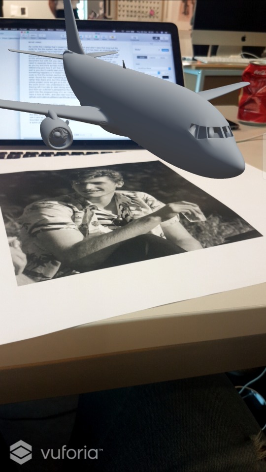
The Experience
The user holds the iPad over the large detectable image of black boxes and white figure outline, this relates to the whole area giving the sense of a crime scene with a chalk outline of a figure seemingly placed to match the aesthetic of the black boxes and white outline. The black boxes further hold an underlying theme of city blocks, as well as notifications on your phone. When holding the iPad over the image it is then augmented to show the scene of the Auckland library. Strengths of this was that the image was highly detectable by the AR system, this could be replicated again and cut vinyl to give a more clean effect. However the messy chalk look worked in our favour in the end as it almost could have been a real murder chalk outline.
The user experience plays out the scene in the Lorne Street area to provide a familiar location to peak their interest and garner commitment from the user. It is a well known area, having high foot traffic gives in to the idea that individuals are known to become victim to the bystander effect in the Auckland CBD. Locations such as Queen Street and Karangahape Road we believe have this same effect. We modeled using Fusion 360 to represent this location, so far with our play testing people do seem to see it as the library. The only thing about these buildings is that if over done it could diminish the effect as its hard to see the figure with so much else going on in the surrounding area.
The camera on the iPad picks up on the recognisable image and brings up the city scene in AR, along with a tap to start button. Using unity to create this scene, the reason being that Augmented Reality provided a real life context literally. Have the scene take place through a device further exaggerated our point of social media playing a role. Our approach was to display this connection to the public, as social media is now such a huge part of our lives. Through the lens of Augmented Reality, ARcde crosses between our own perception of the environment around us and what is perceived through technology to allow us to see a situation in a different perspective as we would in the real world.
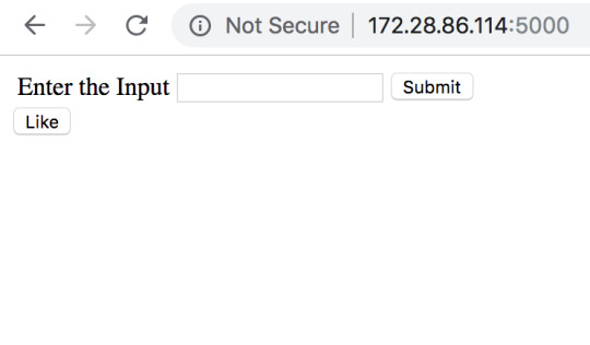
Once tapped it pops up with an enter your name where users can type their name and press enter. The buttons mentioned were a way to add an arcade aesthetic to the scene, as well as clear instruction for user. Done in a similar style of purple and red to match and compliment the AR environment. Using Unity brought about challenges along the way proving to be a timely process, time already being the biggest restraint definity was a risk. Overall the outcome is what we wanted, the use of AR technology turned out to be a great strength in making our point.
The scene starts playing out as small slightly grey transparent figures walk up and down the street imitating pedestrians and bystanders whilst a recognisable arcade wii song from the “mii channel music” plays emulating a light hearted take on the satirical construct that ARcde has created. The colour aesthetic is dual colour with two different shades of purple, the ground being a light purple and all buildings having a darker shade keeping the aesthetic theme of the presentation of the leaderboard. The grey figures are almost meant to blend in and be part of the scene, they actively are doing to help, further playing in our theory that people want to blend in.
A black silhouetted figure walks out of the library's front door and makes his way down the stairs. We wanted the main character to be distinctive amongst the many grey figures. As well as making the black figure specific to no gender or race, this can allow the user to put themselves in their shoes and identify the figure how they see fit. The figure then falls over in a dramatised, fake looking fashion, and cracks it’s head open on the pavement. This is all whilst people walk past the black figure lying on the ground. Approaching this through a satirical commentary helps create a conversation that moves towards a positive outcome. We aimed for it to be cheesy and a little silly. We didn’t want to condemn the audience for witnessing or being apart of such situations. Ensuring the outcome is a comedic take on the serious topic allows the talking points of this project to be lighthearted, helping individuals make conscious decisions to help this. Taking a comedic take on such a serious topic allows ARcde to breakthrough and curate conversation to individuals to promote their conscious decisions to prevent this.
An issue with this is that humor is completely subjective that a minority may not get the punch line when a statement of “#liketosavealife” pops up on screen, along with a like button. Mainly because the point being, that nothing happens at all when you like the scene. As a way to represent the fact that nothing actually happens when you like a good cause on Facebook or other social medias. While the blood is spreading out you have approximately 20 seconds to press the like button. The like symbol pops above his head when you press this button, showing again that you really have no effect.
After the alloted time plays out, a leaderboard pops up and a loser sounding arcade song plays, presenting the top six people who had the most likes. Having the loser sound play further emphasises our point of are you actually doing anything? Gets the user to ask themselves, “why am I losing?”. The board in large font says TOP KILLERS, above that in smaller font subtitled, did your likes really help? To further dramatise our message. We want it to come across as kind of silly take on this situation.
Sum up
Our approach to this idea was to be over dramatic, exaggerated and not take ourselves too seriously. We had an enormous amount of challenges, not only when coming up with the concept, but during the development stages. Not having any prior knowledge of the programs used (Fusion 360, Unity, Blender). We did however have some knowledge of Adobe software but this wasn’t the main aspect carrying our project. However throughout this project this turned into one of our strengths, as this gave us an outsider approach to how we could shape the outcome. The ability/motivation/drive to learn from what we are doing and constantly looking outside of our own work for existing models and iterations of what has been done within the realm of our project (AR technology, Bystander effect etc) was exceedingly more driving for the final outcome. Though this does mean that our final product was weak in the sense we couldn’t make it look as impressive as practitioners in the field of Augmented Reality do it, we did have a rich field of learning to do and ultimately that was more important to us. Taking this as an opportunity to branch beyond our normal approaches.
We were extremely iterative throughout the first stages of our project, this posed a major threat. We spent the first half of the semester rolling through ideas rather quickly. Deadlines were becoming increasingly crucial. This meant that we had a lack of iterations on our final idea. For us though, those first weeks of exploration proved more useful than initially thought. By the time we came to our final idea, the concept was formulated enough to be carried out rather smoothly. We learnt about what we as individuals didn’t want to focus and produce. This produced many restrictions, however this also allowed us to develop a rich idea that we were all on board with; essentially saving energy for the main event. Time being the biggest restriction, this further shaped the outcome of ARcde, prioritizing the necessities to meet the timeframe required.
Method
We started with an idea of annoyance and anti-design, from this we were thinking of how we could annoy individuals and what small things grind peoples gears. We moved on from this idea as we felt the concept was bleak and was lacking depth. We moved onto the concept of waves, sound and pollution. This was mainly drawn together with our common interest in mixing sounds, photography and the environment.
Through this process the development started with more ideas of how photos tend to pollute our social media feeds. More specifically how similar images are taken of popular areas with no originality (i.e paris Eiffel tower). Idea generation originally focused on the pollution of the ocean, contrasting between the pollution of the physical and virtual space became a point of interest to iterate upon. Furthering the exploration of both originality of sharing content such as photographs to how it relates physically of persons sharing similar photographs of their journey through countries and wonders of the world.
This had us stepping back to investigate about perspective, how one person sees the same thing as another. We thought about tourists taking photos of the same item or object and how this contributed to the idea of unoriginality. Especially in certain locations. We noticed trends on instagram as people in the same location tend to take photos in the exact composition. This lead us to thinking of infographics and peoples reaction to certain spaces.
All this thinking took longer than first anticipation, however it did lead us to our final idea. Not to look back on it as wasted time, reflecting on our journey as part of our process. The rapid iteration cultivated this bystander idea.
The similarities between the need to document your own life through social media and the way people react in different environments brought us to the conclusion of the bystander effect and how this contributes to the reactions of people in the public eye. Things in our society are developing so incredibly fast, we think it is important to address interesting trends and human nature as technology develops.
Technology and methodology
Adobe Photoshop and illustrator was used to prototype, creating textures, texts and stylistic components for the artefact. Fusion 360 to model the scene and blender to explore new processes. Unity was used for the main AR program and animation.
When we finally reached a final verdict, the roles started to form themselves. Gianni took on the responsibility of learning Unity to incorporate AR. Learning everything from scratch was a trial and error experience. Of course never having used this type of program before did limit the possibilities, however this allowed us to think outside of the box as we didn’t know exactly was achievable in the remaining time. It was an intense learning and exploration journey. The main responsibilities was learning Unity which involved, animation, creating buttons and responses of the AR development. Gianni was the main AR visualiser and co-ordinator, incorporating work from Eden and Daniel and combining all the components together.
Gianni also took on the role of developing the back end system of the Like button and leaderboard. This involved learning new skills in programming in both the Python language and C#. The biggest undertaking here was working through it to get the C# scripts to make requests to a Flask server hosted by a Python script. The incorporation of a network aspect elevated the complexity of the challenge as it was no longer a single device based system.
Eden took on the role of the stylistic components and design, as well as 3D modeling the buildings and co-ordinating back and forth with Gianni to get the overall visual aesthetic working to the best of their abilities. Learning Fusion 360, Blender and using previous knowledge of Adobe software. Eden was the main director of the visual outcome, making the design for the UI elements, 3D modeling buildings with detail and the layout of the environment to be cohesive with our theme.
Daniel further took on the role of modeling the roads and background structures for the scene. Learning Fusion 360 to coordinate with Eden on the layout of the environment. Creating main base structures allowed Eden to see some of the main buildings before designing the others. Also creating the final video of our project.
The work flow worked in an iterative circle. Daniel working on road bases, coordinating with Eden to create details and building structures, Eden then coordinating with Gianni on how it should come together, Gianni applying changes and functions. Then back to the beginning again, applying new feedback as we went along. It was interesting because first we envisioned our outcome to project a scene in a box, then we moved on to an approach more logical, the AR system. Without this circle of iteration, it would have taken much longer to reach our final outcome.
Relying on the completion of each other's work under a strict timeline gave us the learning experience of quality control between designing, modeling and visualising the Augmented Reality that ARcde wanted to project to the user at a high level in all elements.
ARcde presents its AR artefact using a square metre mdf board of a chalk outline at a crime scene backed with 2D squares representing the virtual environment created in Unity a 3D game engine. CAD programs such as Fusion 360 and Blender have been utilized to model life-like structures recreating a similar environment of Lorne Street in an effort to help provoke commitment due to the familiarities of the environment. All modeling and stylisation has been imported into Unity creating a platform that can be seen through the lens of an iPad displaying an Augmented Reality to displace the trigger image that is the painted mdf board.
References:
LISTVERSE STAFF (2009) Listverse : 10 Notorious Cases of the Bystander Effect
http://listverse.com/2009/11/02/10-notorious-cases-of-the-bystander-effect/
Nicolas Gueguen, Mickale Dupre, Patrice Georget, Cecile Senemeaud (2015) Phycology, Crime and Law: Commitment, crime, and the responsive bystander: effect of the commitment form and conformism
https://www.researchgate.net/publication/267875713_Commitment_crime_and_the_responsive_bystander_effect_of_the_commitment_form_and_conformism
PETER FISCHER, TOBIAS GREITEMEYER, FABIAN POLLOZEK AND DIETER FREY (2006) European Journal of Social Psychology: The unresponsive bystander: Are bystanders more responsive in
dangerous emergencies?
https://onlinelibrary.wiley.com/doi/epdf/10.1002/ejsp.297
Marcovan Bommel, Jan-Willemvan, Prooijen HenkElffers, Paul A.M.Van Lange (2012) Journal of Experimental Social Psychology : Be aware to care: Public self-awareness leads to a reversal of the bystander effect
https://www.sciencedirect.com/science/article/pii/S0022103112000236
Stephen M. Garcia, Kim Weaver, John M. Darley, Gordon B. Moskowitz (2002) Journal of Personality and Social Psychology: Crowded Minds: The Implicit Bystander Effect
http://www-personal.umich.edu/~smgarcia/pubs/crowded_minds.pdf
Schwartz, S. H., & Clausen, G. T. (1970). Responsibility, norms, and helping in an emergency. Journal of Personality and Social Psychology, 16, 299–310.
Latane´, B., & Rodin, J. (1969). A lady in distress: Inhibiting effects of friends and strangers on bystander intervention. Journal of Experimental Social Psychology, 5, 189–202.
Ken Brown (2015) TEDxUIowa: The bystander effect is complicated – here’s why | Ken Brown https://www.youtube.com/watch?v=Ufs8cKyzLvg
M.Heene, M.Wicher, M. Kainbacher, P.Fischer, J.I.Krueger, T.Greitemeyer, C.Vogrincic, A.Kastenmuller, D.Frey (2011) American Psychological Association: The Bystander-Effect: A Meta-Analytic Review on Bystander Intervention in Dangerous and Non-Dangerous Emergencies https://www.uni muenster.de/imperia/md/content/psyifp/aeechterhoff/sommersemester2012/schluesselstudiendersozialpsychologiea/fischerkruegergreitem_bystandermetaana_psybull2011.pdf
Kassin, S. M. (2017). The killing of Kitty Genovese: what else does this case tell us?. Perspectives on psychological science, 12(3), 374-381.
Maeve Shearlaw (2015) The guardian Did the #bringbackourgirls campaign make a difference in Nigeria? https://www.theguardian.com/world/2015/apr/14/nigeria-bringbackourgirls-campaign-one-year-on
Badalge, K. N. (2017) Our phones make us feel like social-media activists, but they’re actually turning us into bystanders [Article]. Retrieved from https://qz.com/991167/our-phones-make-us-feel-like-social-media-activists-but-theyre-actually-turning-us-into-bystander
0 notes
Text
One final thought
Throughout this semester I have been saying that we wasted the first half of the semester by not having an idea and continuously changing it (as you will read in the blogs). I’m not saying that statement is wrong because we totally could have a far more killer project now if we had hit the ground running at the start of the semester with this idea and started building it from the get go. However, those first six weeks were actually somewhat beneficial to our final project. We knew where each of our strengths lay and that made it a lot easier to not step on anyones toes and work more cohesively as a team in the end. Also knowing that you can rely on someone to get something done made the whole process a whole lot smoother and allowed us to make our project as well as we did in the limited time we had given ourselves. I remember at one point about 4 weeks into actually building it the progress we had made in one particular week was absolutely staggering considering we had worked the same amount of time as we had in previous weeks, it all just came together.
So to any one reading this trying to get some ideas or inspiration as I used to do in the first year (read 2nd and 3rd year blogs to figure out what I had to do or what to write about), firstly why are you here? There are blogs from other people who have far cooler projects (even though ours is pretty sick) and secondly, if you feel like you are wasting time by not having an idea for a project or are stuck, as long as you keep doing something that isn’t scrolling through Facebook or falling into Youtube holes then rest assured it will all play out nicely for you and something will sprout and you too will have a sick project. Also something else I have learned from this semester is to definitely step out of your comfort zone and challenge yourself to learn new things, but do it your way. Do it in a way that makes sense to you, adapt it to your current skill set so it is not as daunting as it will feel. You don’t need to do a 3 year computer science degree to learn how to code to be a web developer, you just have to give it a go and use the hell out of online tutorials and forums. That’s what Creative Technologies is all about in the end, using your knowledge from one particular field and applying it in another to produce something that could not be conceived from a single method of approach.
1 note
·
View note
Text
Finished product
On the absolutely odd chance that when people get to use our project it messes up on them or something that isn’t meant to happen does, here is a video of it working perfectly. I do have complete fait that it will be fine and this is actually more to show off what I have managed to achieve in a relatively short section of the semester (we didn’t have a project for the first 6 weeks) considering I had almost no experience in any of this at all until now, including coding.
vimeo
5 notes
·
View notes
Text
Morbid but fun...?
Since my previous blog about the concept (https://giannisbct.tumblr.com/post/177681307034/a-wild-ride) it hasn’t changed all that much, however we have moved our tone a little bit. Initially the idea was to make something that brings attention to the bystander effect apparent through social media but as we looked into the idea more we realised that one of the ways that it manifests itself is by people sharing things on social media (Facebook, Instagram, Youtube, etc…) in order to “bring attention to” or “raise awareness for”, so by making our project do exactly that it would be very hypocritical. That’s when I realised that the majority of “installation” pieces made at COLAB fit into this category and not many actually try and make an actual change or impact, not super related to our project but just an interesting observation and certainly motivation for next year. Having said that, we had to find a different angle to attack it from because realistically there is no way with one project that started halfway into the semester could we actually bring a stop to the bystander effect.
One of the things we had discussed earlier when we were looking into the idea of irritation and annoyingness was that every project that tries to bring about social change always comes from quite an aggressive stance to get its point across, with our project though we wanted it to be light hearted feel. Rather than have a super serious stance we felt having a bit of fun with the project would be beneficial for both ourselves but also for the user as a bit of humour tends to increase an audience’s attention and makes them more engaged as they can relate to you better (Walker & Goodson, 1977; Madden & Weinberger, 1982). From this we devised a more appropriate tag line for what we wanted our project to be: A satirical commentary of the bystander effect through the extension of social media. Poking fun at something that isn’t overtly present in people’s minds however is a bit tricky and has to be done right otherwise they might not pick up on it and thinks its just a slightly disjointed project.
Before we settled on the idea of using AR, I had been thinking about different ways in which we could make it seem more realistic as it will be easier to get our point across better and one of the ways I suggested is we could have staged an incident and filmed it then played it on a loop and made it look like it was a live stream. This idea was shot down by the group, however now that I think about it showing people someone getting hurt may not be the most ethical thing in the world. Once we had decided AR would be a cool way to present it, Eden said we should try and not make it look realistic and go for a stylised approach. With this I thought that it would then be easy to make it more light hearted by exaggerating the action that takes place in the scene as it already looks like a cartoon so why not really give it that cartoon aesthetic? From this sprouted the the excessive pool of blood that comes out of the character’s head and the fact that the other bystanders in the scene don’t even acknowledge that he is there. In real life sure, people might not help but they would at least take notice of him and look. When it came to making him fall, I certainly had difficulty in making it look somewhat natural as ideally we would have motion captured all the actions to make the scene more immersive but with the time we had left ourselves with, this was not a possibility. So yes, it does look very disjointed and odd when he falls but at the speed he falls I think it just adds a bit more comedy to it. The danger is though that it will be to comical and people either won’t take it seriously or it will go completely over their heads. If its the case of the latter then our project loses all its value because it becomes an animation with a like button that the only interaction you can have with it is hit a button.
On the other hand that may be a good thing for our concept. The whole styling of the scene and the UI elements is designed to give an old school arcade game. The font we used is an Atari font, the colours are very retro and 80’s and when you mix in the basic non realistic animations it really gives off that feeling. Because of this it may distract people from what is going on in the scene but they will feel compelled to interact with it as it will be fun. Almost like when someone watches a video of something bad happening to a person and they get enjoyment out of it or they like it and share it with their friends, the fact that they can engage with it makes it more enjoyable and they forget that an actual person got hurt for their enjoyment. People may get totally engrossed in the game part of it that when they are faced with the harsh reality “Did your likes really help?” on the leaderboard screen, they will be brought back and realise that yes maybe this is a artistic animation of someone dying but its still someone dying. To add more ‘fun’ to it, I included the Mii channel music as the background sound, which when people will hear it they will feel more relaxed as it is a genuinely nice song for those who don’t know it (as well as sounding like it is from a retro game) but for those who do know it which will be most of the people who grew up either owning or knowing people who owned a Nintendo Wii they will find it funny, completely detracting from the morbidity of the scene that is being presented before them. Which is also the point of the leaderboard as it presents the user with a target almost to hit which isn’t beneficial at all to the victim. In my eyes if someone has a turn with it then after wards wants to have another go, then the project is a success. Maybe that person hasn’t realised the point of the project but it has helped to highlight something that may be bigger than the bystander effect; the fact that a whole load of interactivity and bells and whistles can make someone’s morals go completely out the window, or maybe they were already psychopaths to begin with.
A major component of this project was the “game” part as it is what makes people want to interact with it and we definitely want people to interact with it to prove our point. To ensure that when they like it they will keep doing it and not just do it the once we put a couple of measures in place. First of all we wanted to make it feel familiar so we ensured that the terms such as “like” and using a hashtag in our prompt made it quite obvious that it was denoted from social media, which people understand the mechanics of more or less quite well in this day in age. We also needed to make sure that there was some sort of positive reinforcement provided when they like it as John Annett (1969) discusses that providing someone with feedback whether it be formal or not improves their engagement. As we were also incorporating sound into it, I figured it wouldn’t hurt if some of that instant feedback came in the form of a nice happy ding such as the one provided by Facebook Messenger when you get a new message, and oh boy don’t you get excited when you hear that sound because you are just dying to know what someone could possibly want to say to you. In particular that sound actually makes you feel more happy as its nature is very light, ‘happy’ and short, which induces positive emotions in your brain (Zentner, Grandjean, & Scherer, 2008). To go along with this I added a little thumbs up icon, very similar to Facebook’s very own like button as it would be familiar for the user but it also is stylised to our colour scheme to tie in nicely with the rest of our UI elements. This icon however appears once the Like button has been pushed and then moves up and fades away, like the little hearts do when you ‘heart’ someone’s Instagram live video (which then lets you do as many hearts as you want). The thumbs up symbol, which we all know as positive reinforcement, is then gone. So what does the user want? Well they want it back. They want that little icon to tell them they are doing a good job and that they are not doing anything wrong. And to top it all off to make sure the user knows the can like it multiple times, unlike Facebook once the Like button has been pressed, it doesn’t grey out or change colour to symbolise no more interactivity. It stays the same colour so it can be pushed again and again and again.
When we first came up with the idea of investigating the bystander effect, I immediately thought of the website liveleak.com which was started as a place where users could upload reality videos of war, politics and other world issues as an act of citizen journalism. The issue is that you get lots of videos of people getting in horrific accidents and a lot of the time being killed, and considering the only thing stopping someone going on it and watching these videos is the user’s own morals, people start to watch these videos for fun. I won’t name any names but I know people who when they are bored will go watch videos on Live Leak and actually laugh, they get emotional enjoyment out of them. Once again they may be psychopaths (I read a book recently by Jon Ronson called The Psychopath Test that seriously made me second guess what the reactions to our project might tell us about the people interacting with it) or they may be reacting out of shock to the trauma of seeing death (Newmark, 1995) or have some repressed feelings. Who knows, I’m not a psychologist.
Walker, R., & Goodson, I. (1977). Humour in the classroom. School experience. Explorations in the sociology of education, 196-227.
Madden, T. J., & Weinberger, M. G. (1982). The effects of humor on attention in magazine advertising. Journal of Advertising, 11(3), 8-14.
Annett, J. (1969). Feedback and human behaviour: The effects of knowledge of results, incentives and reinforcement on learning and performance.
Zentner, M., Grandjean, D., & Scherer, K. R. (2008). Emotions evoked by the sound of music: characterization, classification, and measurement. Emotion, 8(4), 494.
Ronson, J. (2012). The psychopath test: A journey through the madness industry. Riverhead Books (Hardcover).
Newmark, K. (1995). Traumatic poetry: Charles Baudelaire and the shock of laughter. Trauma: Explorations in memory, 236-55.
1 note
·
View note
Text
Bob the Builder
This semester has been very Unity heavy for me, between Studio and Synthetic Realities I have certainly had a good play of Unity, doesn’t mean that I like it though. When I first had the idea of using AR, I had a quick Google search into the best ways to implement it and use it and as it turns out there is a program called Vuforia which has a Unity plugin. This sounded ver attractive to me as I was already using Unity for my other paper. After having a quick play with it I realised that it was actually insanely simple to use, I just had to build the scene as normal and then place it in an image target and Bob’s your uncle… or so I thought. (Basic test to see how hard it is to use AR.)
Eden and Daniel would make the buildings and roads in the scene while I did the like script and as soon as I have enough of the scene to put a person in, I would start focusing on the animation of someone getting into an accident of some sort. After having a look online for some character models that I could use and some animations, it turns out the easiest way to get a dramatic, life threatening incident would be to have someone fall over and crack their head open. As it turns out though getting animations of people falling is very difficult and its even harder to get the character to fall over themselves. Developers tend to like their character staying upright rather than falling over and every single tutorial and forum I came across listed it as some version of “my character keeps falling, how can I fix it”. As I needed to get the animation state to change as well as have the character (who we will call Steve for arguments sake) physically fall over I thought I’d get something invisible to hit him in the back of the head which would then trigger the change in animation and thanks to physics would knock him over. This worked in my tests which were on a flat plane, however when I put it into the scene the problem was that couldn’t have him fall randomly on the flat ground because that isn’t really that believable so it would have to happen on the steps outside the library and he could trip up them by getting hit from behind.
vimeo
This worked great until I was trying to figure out how to do the blood. In one of the Synthetic Realities lectures Stefan had mentioned that liquids are normally done by a particle system, so I set about learning to make that and quickly discovered that it was going to require a) a fair amount of skill and b) be quite heavy for the processor. Alex suggested I simply just get a good pool of blood as a .png and then increase it over time as the person viewing it would be so far away they probably wouldn’t notice much difference. The only setback of doing it this way is that Steve needs to land on the flat after his fall as an image won’t be able to attach itself to the shape of steps. So in hindsight it definitely would make more sense to plan out how each thing is going to be done before launching into it all, but we started this project after 6 weeks of not having any direction I felt more inclined to stop faffing about and just dive straight in. Either way, a really good learning experience considering I have never done this sort of thing before.
Turning Steve around and making him fall down the stairs on to the flat ground at the bottom proved to be far more difficult than almost any part of the project. Because the ground behind Steve is higher when he reaches the bottom (because that’s how stairs work) the rotating thing that would hit him in he back of the head was getting caught on the steps themselves. On top of that with the angle he is moving at, he was out pacing the hitter and so the speed the hitter was rotating at had to be increased which resulted in him being flung across the scene (or as the kids say, yeeted) which looks super unbelievable and just a little too comical. In the end I managed to get it looking realistic enough by giving Steve a rigid body component and making the collider on the last couple of steps angled so as soon as he is on it he just tilts forward due to gravity. The animation is then scripted to change to the falling animation once he hits an angle of 35 degrees as it is arms up to break his fall. I say “realistic enough” as the idea is still to make it quite ridiculous so people engage with it more in the way we want them to but not an absolute mess. The downside of using a rigid body and physics is that sometimes the rigid body messes things up, quite badly sometimes.
I was having the problem that he would continue to move once he had fallen down (still translating in the z direction) although I had stopped all movement. To get around this I brought in a static version of Steve that was already in the fallen over position so that when Steve collides with the ground collider and hits 70 degrees, he becomes deactivated and his static clone is activated, thats the plan anyway. The rigid body seems to have other plans however. Sometimes Steve will fall down, hit the ground collider and I will see his x rotation surpass 70 degrees, but he will just keep bouncing and moving up with his bounces. There is no explanation as to why it does that, and it does it completely randomly. I asked Stefan about it and he said rigid bodies in Unity seem to have a mind of their own and sometimes will completely mess around, something Alex and I experienced in our Synthetic Realities project when turning off a rigid body at the end of our marble track would affect the movement of the first ball to roll at the start of the scene. Steve’s riding body also for some random reason likes to make him fall over randomly while he’s walking on the flat which was a bit of a problem but I managed to freeze the rotation until he is on the step above where he starts to fall, where he hits the collider and then that triggers the rotation to unfreeze. The third main way that the ridge body messes up the scene is in the like system. The python script is designed to add likes to usernames that have already been entered if the incoming one matches them. It then returns the top 6 names with the number of likes they have. However, sometimes after going through it, when the leader board shows up the name just used will be on the leader board in 3 different places with 3 different like amounts. It is designed specifically not to do that. Now I trawled through all the code to find where it is doing that and I wasn’t able to find anything, however after doing over 20 tests without Steve it didn’t show up, but when I repeated the tests with Steve it happened a couple of times. The worst thing is is that there is no pattern to it messing up. It’s not like it is every 10th one, no it could be the 1st then the 9th then the 17th then the 2nd, there is no pattern and it is literally down to the fact that there is a rigid body in the scene. So as it is virtually unfixable I just roll with it and hope that when it is being marked it doesn’t do it or that no one will notice.
The next major problem I have picked up on when doing various rounds of user testing is that if the scene is going (i.e Steve is walking) and the user loses the tracking of the target because they get too close or they don’t have enough of the target in frame, when they get the tracking back, Steve will not be there. The only explanation I can gather from this is that because he is the only thing in the scene that is affected by the physics engine and the whole scene is projected onto the image target, when the target is not found the physics engine turns into a void and all laws of gravity simply implode and Steve is sucked into the great nothingness. The good news is that when that round is finished when you restart it 99 times out of a hundred it works fine, however that small 1% of the time it will go weird again. I have seen him do the whole thing but never with the walking animation, just the falling one, I’ve even seen him do the whole thing invisible. Just nothing happens then all of a sudden his dead clone appears and the scene continues. The only way to avoid this is to not lose the tracking of the target then which will have to be written out on an instruction sheet for submission so there is no confusion. Various forums I have looked at have said that unfortunately using gravity with AR can either go really smoothly or not at all and we seem to have hit the sweet spot in the middle where it works most of the time. Regardless, the project still serves its purpose well and if i were to do it again with more time (e.g the whole semester) I would look into different ways of doing the AR rather than just settling on the first one I find and also learning Unity a bit more to make a ore convincing fall over.
As will be discussed in the concept blog post, the idea of our project is to be a satirical commentary on the bystander effect through the extension of social media so by having something pretty serious (a person dying from cracking their head open, albeit virtual person) we need to add a humorous aspect to it. Already the fall is a little bit disjointed so its a bit ridiculous but Eden also suggested that the amount of blood that comes out of him is excessive by anyone’s standards. Which is why for 20 seconds blood pours out of his head while the user can only sit there and hit a like button. But we wanted to take it to the next level so we made the whole UI look like an 80’s video game. We used the Atari font for all the writing, Eden chose a bold contrasting colour theme to bring some retro vibes into it and to cap it all off we added sound effects. This was to make it feel more like a game and so the user would really get into the liking aspect and then when presented wit the leaderboard would want to try harder to win. The three sounds we used are the Facebook messenger ding noise for the like button as it is a satisfying… well… ding. For the end of the game we got the second part of the Atari panther startup sound which sounds like a wind down finish but 8 bit so it works with our aesthetic, and then it seemed a little disjointed to not have another sounds so I added a running sound track behind it quite quietly so it all had a bit more atmosphere to it. What better song for it than the Mii Channel Music. Its non-intrusive and for anyone who knows it they will associate it to games and for those who don’t, it will feel like a light hearted backdrop that will make them feel better about the scene that is unfolding before their eyes which only elevates our point we are trying to make. Everyone so far who has had a turn with it since we added the sound has said that it makes it more fun, which is the idea because then the underlying theme is actually pretty morbid.
Originally we had intended to make the app available on the app store so users could use their own phones to do it and that way we could have multiple people at the same time going head to head, however the issue with this is that a) we need to ask people to download it on their phones which is a bit of an ask and b) people wouldn’t be able to see it at the same time unless they start at exactly the same time. If they don’t the leaderboard may be updating other people’s scores while the first one has finished and he just sees the other name’s like county increasing which is not how leaderboards work. We could get around this by running it every x amount of time and have it triggered by the server, however this then gives us the problems of if someone joins halfway through. Either Steve may not show up for them but hey see the rest of it so then its sort of ruined when they do it right, or if he does show up they may only catch the end. So we decided the best way was to have a device there already with it installed on and only have that one device. We figured an iPad would be best as the larger screen makes it easier to see than a phone, so Eden managed to source an iPad for us. The bonus of having the iPad is that if it turns out that it is too loud in the room to hear the sounds we can simply provide some headphones that plug in and then you are away. If I were to do it again though, on top of what I have already said, I would make it run off the server and have it as a simple looping animation where maybe you could bring up the leaderboard yourself so people could join it whenever and it would be more readily available. With that swell make it so its more than just the one guy falling over, maybe every 30 seconds something bad happens, make it a little more complex and not have it so limited to the basic version that it is at. For this one though I feel it is a great proof of concept and that if we wanted to continue it we would have plenty of avenues to explore.
Facebook Messenger Ding: https://www.youtube.com/watch?v=73M0CWSr36Q
Atari Panther startup: https://www.youtube.com/watch?v=RKl3TkUyyvI
Mii Channel Music: https://www.youtube.com/watch?v=E9s1ltPGQOo&t=20s
1 note
·
View note
Text
I “LIKE” programming
Well just like this blog, when it came to the like system, I wasn’t entirely sure where to start. I had started working on this before we had decided to go with AR built in Unity so I figured I would get the mechanics working and then be able to transfer them into Unity. Initially when we were thinking of building a physical model or projection mapping, I was going to have the like button on a webpage so that anyone could access it, an inherently thats where I started. I had the thought of using a python script to build the whole back end mechanic of the system and that data would be passed from the user via the webpage, and after quickly running this by Liam (who has done something similar before) he agreed that it would be the easiest way and we could have multiple users at once which is what we wanted. I built the most basic version of the “front end” part so that someone could input their name and then like it so the likes would be attributed to them, just like it is on social media.
Liam recommended using the flask module for Python to host the server (and webpage for testing). Once I had installed that I managed to get a connection between the two and even by complete fluke was getting it to receive data from multiple devices and be able to register that it was from different devices. I personally was stoked about this because it was 90% of the like system working but then Liam pointed out, as we don’t know why it worked, if it stopped working we also wouldn’t be able to pick out why. I figured it was in my best interests to learn the best practice for this rather than get the minimum working version as it would be great reference material for the future. In these early stages, Liam helped me a lot by explaining why one way was better than another and generally guiding me through which was super helpful as I was almost coming from no coding background. The main think I am super grateful for is him introducing me to JSON, which I’ll be honest was an absolute pain at first but I now realise it was definitely the best way to go as it was far more reliable and actually made sense. So essentially what was happening is that the HTML page was passing the name that was submitted by the user, to the python script every time the like button was clicked. The script would then add a new value to its own defined variable “like” and count them like that. The bonus of doing it like this is that if someone played once and then after a while came back too have another go, their “score” would compound and keep increasing. On that note though the downside is that if two users input the same name they will have a super score rather than two separate scores. While this would be a downside for an actual game where the score would need to be counted from just one game at a time and not an overall total, for our project it sort of just adds to it. The idea is that the more people “like” the disaster that happens, the more it proves our point that social media is building a screen which separates people from reality and that they can simply click a button to show their support, and the more they do that, the more they are helping? Or at least thats the theory.

In the past when it has come to doing small code projects I have looked up how to do something, found code that suited my need, copied it and then tweaked it to properly fit my programme. However, this doesn’t mean I necessarily understood it which is something I wanted to do differently this time. As this was basically my main role in the team, I wanted to make sure I would be able to explain to other people how it worked rather than have a piece that worked but just because it did. Which I guess relates to this whole degree itself, nothing is really taught to us (especially in studio) and its all self directed so we need to learn the skills ourselves and in this day in age when you don’t need a computer science degree to become a developer but simply be able to copy code from different places to suit your programme, I believe it is quite important to know what you are doing because I the future it will make me far more efficient. And its the learning by doing thing that works really well for me that I like. For example when it came to having to deal with GET requests from both the server and user side, I had done something similar before with the instagram location finder programme that I had had a play with earlier in the semester, and because I had used it before I sort of knew how it worked but then I had the code itself I could look through again and figure out why it worked and what parts I could omit for this different programme. I have to say, I think this semester I have learned more about programming from simply trial and error, Liam and online tutorials than I did in all of last year where I did both programming papers. It was also great to learn this in a group setting where the other team members also are not super coding savvy as trying to explain what I was doing or why I couldn’t do something that we wanted to do due to the nature of the system that I was writing in non technical terms helped clarify what I was doing for myself. I would certainly like to keep doing more programming projects in the future to further develop my skills and learn new things.
Transferring the user side to Unity was a whole different box of frogs though. First of all Unity is all scripted in C# which I have never used before (but luckily is similar to java which I had dabbled in with processing last year) but the whole mechanic of connecting to a server is made a lot more difficult as all requests need to be sent through a Coroutine. Which I’ll be honest, I had never heard of until I stumbled across a million Stack Overflow forums that explained that that is what you have to use. I think I have got my head around them mostly but there are still some things about them that elude me, for example everywhere (including the Unity manual) it says that they end when they hit a “return”, but I have coroutines that have functions or call new functions still enclosed in the coroutine but after the return type and it still calls them (see below).
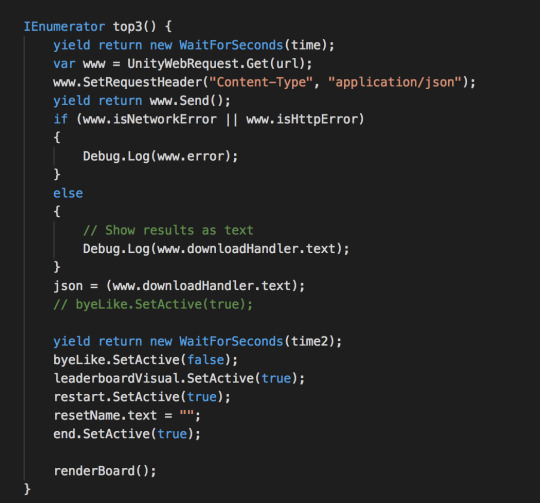
They also supposedly run for their specified length (of time) regardless where they are called, i.e will run for 6 seconds if told to after being called from the Update( ) function. However, I have found that in some of my code this works, in other parts it just sort of ignores that rule and sometimes it waits for a wee while longer than the instructed time. So its not totally something that I fully understand but I know it enough to be able to use it in the right places and the majority of the function of the Unity scene is run by coroutines so I am clearly doing something right. I like to think of it as a poorly trained animal, I know the commands and the animal knows what they mean but sometimes chooses to do its own thing.
Another major challenge I had was dealing with JSON, for starters sending the exact same data as I was from the webpage but through unity, it was as if it was parson the data into JSON and then parsing the JSON into more JSON even though the commands where almost the same, so on the python side I had to update it so that it decoded the incoming JSON properly so it was then actually processed logically. This brought in a whole world of problems in itself as then the data that was being sent back to the user was all jumbled and messed up which was less than ideal as it felt I had actually gone backwards rather than made progress. But as I have learned from this project, every new error you get means that you are making progress as you have made it past the previous error. After all of that though, I did get it working.
vimeo
Once I had done all of that, I realised that it was a perfectly functioning Like system that recorded multiple user’s scores and could compound them and it was perfect, but only once. There was no way to restart it without stopping the whole application and going again. So there was the next challenge which proved a lot more difficult that initially suspected mainly due to how referencing different Game Objects is from a script and even harder, referencing the scripts of those Game Objects which is what caused me many hours of strife. To make matters more difficult as well, Unity doesn’t appreciate all the things you could normally do in a C# script so you have to find ways around its very stubborn walls which in my case lead to many, many scripts. Doesn’t sound like such a terrible thing but to make sure each was working correctly I was logging things to the debug console from almost every script so then when I wanted to look for a specific message I was sending to try and get something working, it became a whole lot harder because there were 20+ scripts that were all printing to the console. But once again, I am a champion and figured it out.
vimeo
As I write this I realise that it doesn’t sound that difficult and didn’t take that long but the code for the like system has been haunting me at night and has been an ongoing saga for weeks . I certainly have learned heaps and am happy with my process that I undertook. However, if I was to do it again knowing what I know now, I would skip out the HTML part and just go straight for the C# scrips because I think that transition was the hardest part of this whole process. In HTML (with javascript) it is easy to do everything all in on document but with C#, you can’t send data and also receive it in the same script, you need to separate them into multiple scripts which is where confusion starts manifesting as you try and think across multiple scripts and have to remember what each one is referencing and how it will then affect the other one. The issue with backend systems as well is you don’t overtly see your mistake as you would with front end because either something happens or it doesn’t and if it doesn’t you then have to comb through your code to find the broken section and find out what is messing you up. Overall I think this is what I found the most frustrating as I have only really done mainly front end development rather than back end, but this project was certainly a great insight into it. Now as for this whole project once we got on a roll, I obviously stopped blogging as I got so engrossed in the work which I do understand is not the best practice but as we were pushed for time (having left it so late to start doing something) I focused solely on getting the work done and from an outsider’s perspective the final product doesn’t really show how much work went into the programming of it, so I have uploaded all my scripts to GitHub so you can have a look at them, and also see how things work if you are interested: https://github.com/JabronusMaximus/ARcde-Scripts
1 note
·
View note
Text
Guess who’s back
The last time we spoke our group had settled on our new idea which we were going to commit to regardless. Well the good news is that we definitely did commit to the idea and at this stage (the end of the semester) it has turned out really well. After showing the rest of the team how easy it was to do it in AR (and also how much more appealing it would be) we decided to go for it as it would be a great new skill to learn. But as always when going into a new area, we were quite naive in terms of he challenges we would face. As we were going to be building the scene into an AR platform there were various aspects that we were going to have to tackle and so we split the roles to what people wanted to do and so Daniel and Eden created the model of the scene with all the buildings and roads and were both in charge of concept development, as I had two major things to focus on; getting the like system working for multiple “users” and actually building everything into the scene (i.e people, UI elements and trying to get the “accident” that will happen).
As we settled on this idea late into the semester, we figured the best plan of action was to just dive head first into it and work our way through the obstacles we come across rather than try and develop a fool proof concept (which was why we took too long to settle on an idea) than make it. The general feeling was that the concept would develop and manifest throughout the building stages. Which brings me to the main part of this post, I had a huge job for this project considering the time I had to do it in and the previous experience I had on the subject (I hadn’t used unity at all prior to this semester, nor had I used Python) so I haven’t blogged regarding the progress at all. Now that it is finished and I have the time I am going to split it into 3 main parts: The concept, The “Like” system and programming and, Unity. These are the 3 main parts of the project that I was involved in so I feel it would be relatively pointless in me blogging about the other two’s parts. I do also understand that this is not the best way to blog and great way would be to stay on it every week, but in this way I will be less descriptive and more reflective as it will be more of an overall thing and not a play by play. Stay posted for the blogs to come.
0 notes
Text
A wild ride
Right so I am finally getting round to do this as I have been putting it off for a few weeks so if it doesn’t make sense or I miss things, oh bother. So far this semester we have had a new idea each week. We get tot the end of the week and then we hate it and want a new one. Since my last blog our idea moved to looking into something that used the location of instagram photos to show how the originality of photography (particularly travel photography) has started to die due to social media. We thought of maybe a camera that when you take a photo it actually gives you a photo someone else has taken in a similar area or an average of images taken in the same area. Another idea was to do an installation that did something with heat maps or geolocations on maps or just something of the likes but that went downhill. To develop this I wrote some code in Python (which was a very steep learning curve) to essentially map the locations of photos onto a google maps map. The issue is that Instagram didn’t want to give us access to any public data that wasn’t published by ourselves or by them so we were not going to be able to get the data that we wanted and all we had to go off was the instagram supplied geolocations. So I turned to twitter as I knew that with their API they would be able to give us access to the data we need, unfortunately they literally got back to me today granting me access and I applied for it 3 weeks ago so I am glad we have moved on.
Our next idea (which we have decided that regardless if we like it or hate it we have to roll with it because we are far to deep in the semester to change again) revolves still around social media but how the Bystander affect is amplified through social media. The Bystander Stander effect was first coined by Bibb Latane and John Darley after the 1964 Kitty Genovese murder in New York City in which it was reported in the New York Times that there were 38 witness and not a single one called the police or tried to intervene. The concept is that people are less likely to help someone or intervene in a situation if there are other around who are as capable as they are, so it acts as a diffusion of responsibility. They also went on to mention that individuals monitor the behaviour of those around them to determine how to act. So in the situation where no one is helping then someone is less likely going to help but as soon as someone helps, everyone else becomes more willing. This has been referred to as the ‘Helper Effect’ by Ken Brown in his TED talk, where he explains that the bystander effect can be a negative but as soon as it becomes the helper effect it becomes a positive.
In the age of social media, the bystander effect shows up in different forms. Firstly, there are the people who film events or situations instead of helping out or intervening. The classic example is when United Airlines dragged the passenger off the plane because they had over-booked it. In the videos posted online, there is a woman that can be heard screaming and telling them to stop but not a single person gets up and tries to intervene. These people want to capture these situation and then post them online in order to gain popularity and likes and don’t appear to care if the person is helped or not. On the other side is the people who watch these videos and don’t do anything except “like” and keep scrolling. By extension you are part of the bystander effect as you haven’t intervened but you have witnessed it. It is the same sort of thing as people who post things to “bring awareness to a problem”, you aren’t soling it or fixing the issue and chances are the people who see your content won’t either so you are all just sitting idly by watching. The same sort of thing I notice in the BCT, a lot of projects aim to “raise awareness” but how many set out to actually try and fix the issue. Ironic because that is sort of what our project is too. Back to social media though, the most common form of the bystander effect is posts that have the picture of a sick child and then it says ‘100,000 likes to save his life’. People like it and feel they are doing good but at the end of the day the person who posted the image isn’t waiting for that number to tick on over from 99,999 likes so he can get to work. There is even an entire website set up specifically for viewing horrible things like this called Live Leak and people will literally post videos of people getting killed and others will watch it
So what are we going to do? Well we initially thought of setting up a scene that people can look into and in the middle there is someone who has injured themselves or maybe even are dying. The audience would be able to view the situation but not be able to interact with it at all except that they can “like” it. We would then have a leaderboard that they could see who has liked it the most and therefore “sent more prayers and thoughts” or raised more awareness or helped more, but in reality the situation hasn’t changed. The idea that this is the only way they can interact reflects how removed we are from situations like this due to social media. Since then though I thought about the idea of making it an AR installation, so to have maybe only our project description of the floor and when someone views it through their camera the scene appears, so taking the physical completely out of it and only having the digital. I have looked into how to do it and even have some trials done, just need to run it by the team and get into it.
References:
Darley, J. M., & Latané, B. (1968). Bystander intervention in emergencies: diffusion of responsibility. Journal of personality and social psychology, 8(4p1), 377.
Ken Brown (2015) TEDxUIowa: The bystander effect is complicated – here’s why | Ken Brown https://www.youtube.com/watch?v=Ufs8cKyzLvg
Badalge, K. N. (2017) Our phones make us feel like social-media activists, but they’re actually turning us into bystanders [Article]. Retrieved from https://qz.com/991167/our-phones-make-us-feel-like-social-media-activists-but-theyre-actually-turning-us-into-bystanders
M.Heene, M.Wicher, M. Kainbacher, P.Fischer, J.I.Krueger, T.Greitemeyer, C.Vogrincic, A.Kastenmuller, D.Frey (2011) American Psychological Association: The Bystander-Effect: A Meta-Analytic Review on Bystander Intervention in Dangerous and Non-Dangerous Emergencies https://www.uni muenster.de/imperia/md/content/psyifp/aeechterhoff/sommersemester2012/schluesselstudiendersozialpsychologiea/fischerkruegergreitem_bystandermetaana_psybull2011.pdf
1 note
·
View note
Text
Close to the heart
Well here we are again, coming up with a new idea. I like this, it almost feels like rapid prototyping but we don’t actually really go anywhere, at least we eliminate what we don’t want to do. We had a conversation today regarding our current direction and how we didn’t totally vibe with it, it wasn’t something that we felt we could stay engaged with for a whole semester. So we decided to look into things that weren’t necessarily “studio projects” but more passion projects that we have wanted to do and then see if we can incorporate them into studio. What attracted me about this degree is that it was marketed to me by saying it I could essentially do anything as a project and back it up with a reason and research, but so far the projects I have done haven’t really been that inspiring to me and not really… well, me.
So we had a chat about what we all like and what we want to do and then Jacob came in and suggested an idea that got us really excited. Take the idea of useless design and make a camera that doesn’t work. We could make a camera that when you take a photo it presents you with a photo, that isn’t yours. But rather it scours the internet (mainly instagram) for photos geo-tagged in the same location and with visually similar components. This really resonated with me as Daniel and I had been talking earlier in the semester about how the majority of instagram (particularly the travel section) is photos of the same thing and or place and there isn’t too much distinction between them. So to act as a form of social commentary the image that is presented to you is not your image but could very well be, thus showing the lack of originality and raising the question, “why should we waste server space and therefore power that runs the server for your same-same image?”. While being quite harsh I think it is a valid point. Similar projects have been done before (such as Camera Ristricta and Trophy Camera), but with an emphasis on the photography rather than looking at it particularly from the social media side.
Talking to people around the studio the initial backlash was that taking those photos made it more personal and helped make memories. However, according to research carried out by Linda Henkel (2014) when we take a photo of something we rely on the technology to remember it for us and we are less likely to remember it. And I fully understand the idea that you taking a photo makes it more personal, which is why people have photo albums and prints of photos, however when all you do with that image is post it to your instagram, the chances of you going back to look at it and reminisce are very low. So essentially you have put it up to show other people where you have been, or what you have done. I am so guilty of it too, my most recent instagram posts are all from my trip to Thailand and are location tagged accordingly.
youtube
I found this particular video quite interesting as he talks about how people travel to take photos of particular places even though they have been photographed a million times. When you get so many photos and so many people being “inspired” to take photos in a style like a famous ‘instagrammer’ you start to get deja vu simply when scrolling down your instagram feed. I literally searched up #eiffeltower and these were the top 6 images.

Another feature that has aided in this complete over-saturation is smartphones with their ever improving cameras. With everyone having a half decent camera in their pocket or handbag at all times, the precision and patience required to get a ‘decent’ photo (that used to be a main feature when shooting on film) is lost and makes it really difficult for good work to stand out (https://www.theguardian.com/artanddesign/2013/dec/13/death-of-photography-camera-phones , https://www.techradar.com/au/news/has-social-media-ruined-photography). Simply showing people where you have been and what you are eating for breakfast is a form of vanity in itself, as Eden brought up today, and you wanting people to to see that and not keeping it as a personal memory is in a way seeking for social validation (Tifentale & Manovich, 2015). The fact that social media apps like instagram then allow you to see how many people ‘like’ your image or comment on it is only fuelling your search for validation pushes people to look at what is received well and copy that rather than trying something new and daring that produces a more original photograph (Keen, 2011).
Now I am not saying that all the photos on instagram are bad (hell if I could take a photo like the centre bottom Eiffel Tower one, I’d be stoked) or that instagram is terrible. But if our project inspired people to be more original with their photography then I would call it a success because the idea is, “not to try to be better but to be different.”
References:
Henkel, L. A. (2014). Point-and-shoot memories: The influence of taking photos on memory for a museum tour. Psychological science, 25(2), 396-402.
Keen, A. (2011). The Cult of the Amateur: How blogs, MySpace, YouTube and the rest of today's user-generated media are killing our culture and economy. Hachette UK.
Tifentale, A., & Manovich, L. (2015). Selfiecity: Exploring photography and self-fashioning in social media. In Postdigital Aesthetics (pp. 109-122). Palgrave Macmillan, London.
5 notes
·
View notes
Text
I am glad Eden and Daniel feel the same way about our direction as I do because I could see us burning out quite quickly in the next couple of weeks. This idea of useless design however is quite interesting, especially that useless design is perfect for highlighting design that would be useful, much in the same way that the word “impossible” serves to determine what is possible. When something is ‘impossible’ it is because the laws of physics do not allow for that particular thing (system, object, process, etc...) to exist. For example a perpetual motion machine is impossible because it is a system that continuously produces energy without the need for it to consume energy. This goes against the laws of thermo dynamics which state that energy can only be transferred and not created or destroyed, therefore it is impossible (Marletto, 2017). However, now that we know that it is impossible to achieve this, we know that it is physically possible to get close to 100% efficiency. Hence, designers and engineers are able to design new machines and systems that run on a minimal amount of resources to produce a maximum output. The concept of the impossible drives innovation to design things that are more efficient and essentially more ‘useful’.
By designing something that is functionally useless though you are bringing to light an idea or question that has not been answered and sure, your design may not be the thing that solves that but now you have raised the question, someone will look at it in a more useful approach. In her TED talk, Simone Giertz talks about how she designs useless contraptions with the intention for them to never be a marketable product and because they are useless they are actually successes.
youtube
All the designs she showcases in the talk, don’t fulfil the purpose they were
initially dreamt up with but they do start a conversation around the intent behind
them and that in a way is a useful design. Which again sparks an interesting
idea, one can argue that there is no such thing as useless design because if you
look at it in a different light, it is fulfilling a purpose (be it to highlight what bad
design looks like) so it actually comes down to context. Extreme examples
being a fork is completely useless when it comes to having your morning coffee
but a mug is much more fitting, however when you go to eat your steak you’re
going to have a bit of trouble if you only have a mug.
Trying to find a conjunction between problems however is an interesting
concept too, like whoever invented the knife/spoon cross over which is ideal for
eating kiwifruit is a genius and I really hope they have made a lot of money from
it because now instead of having to carry both a knife and a spoon around, I
can get away with just having a ‘spife’.
Multitools are also a decent example of that but they are more focused on a functional aspect. What if we were to mix the two ideas of useless design and ‘conjunctive design’ to explore the idea that two completely different and seperate tasks or things can be brought together through one process/object/system that when viewed as a whole makes sense and is ‘useful’.
And an after thought, something I do like about Giertz’s contraptions is that they are playful, they are not things that are totally meant to be taken seriously. The intention behind them yes, but the objects themselves not so much. We want our project this semester to be playful and intriguing which will also make it a lot more fun and engaging for ourselves.
References:
Marletto, C. (2017) Impossible. Retrieved from https://www.edge.org/response-detail/27052
https://www.ted.com/talks/simone_giertz_why_you_should_make_useless_things
Noseworthy, T. J., Murray, K. B., & Di Muro, F. (2017). When Two Wrongs Make a Right: Using Conjunctive Enablers to Enhance Evaluations for Extremely Incongruent New Products. Journal of Consumer Research, 44(6), 1379-1396.
Shoe Umbrellas
This concept of things being annoying, or under your skin has been an interesting start to the semester. I think the overall ideas around ‘the unexpected, the unsatisfactory, the subtle’ are key to what we are all wanting to do this semester. However, I think that the idea of ‘annoying people’ is a little in the air and isn’t a particularly grounded idea. I think we need more meat to it. So what we are going to do about that is continue exploring different works and approaches, both about the idea and not. I think this will give us more things to bring to the table and help us have a more grounded idea of what we could do with this concept.
I have found some interesting videos online to do with unsatisfactory results. They both have irritating endings that differ from your expected outcome. In result, it makes it annoying. To watch these shows me that the conclusion aspect of this kind of work is important when the ending is unfulfilling and unsatisfactory to what you expect. It all seems to link to the unexpected outcome, a disconnect between your minds solution and what actually happens.
youtube
This makes me think of design and the problem-solving aspect it entails. Overall design I think is meant to connect and/or be useful, it allows things to be functional and solves issues in our society. So this idea of usefulness vs unusefulness is brought to my mind, to make something irritating does it have to be useless? Impractical? Illogical? And what exactly do these things stand for? “When we today term a design artifact as being useless or useful, it seems evident that we make a value statement: why is one design artifact deemed useful and another useless?” (noun and verb), a concept so crucial for the design discipline.” (Rosenbak 2014) I think it’s interesting to look at the good design that isn’t particularly used to solve anything but more connect with its environment or with a person, not exactly useless, more so for a different purpose. Then again “Design serves a purpose. Design is motivated, not purely accidental. Design carries intention, to move from A to B, from a given situation to a preferred one, from one future to another. Design enables. Design is useful.”(Rosenbak 2014)
“useless” accordingly translates into being “less of use,” while in fact, it conveys being “of no use”(Rosenbak 2014)
“A useless artifact presents no use to us. It promises nothing. It has failed us.”(Rosenbak 2014)
youtube
Furthermore, this idea of the impossible, useless design that fails us I find is a cool concept, its dynamic, frustrating in a way but more so in a comical sense, allowing us to appreciate the design that does exist around us.
“What is Useless Design?
Useless design holds a potential in re-claiming the design artifact as a tool for valuation. Useless design resists the apathetic acceleration of economic growth for growth’s sake. Useless design is business-as-unusual. Useless design is a tabula rasa in the sense that it exists beyond the false dichotomy between the useless and the useful. Useless design is a fertile void that invites for new questions to be planted and nurtured.”
I think that overall this idea of useless design is mainly to start a conversation. To allow the person or the user to be the talker and the problem solver. It creates interactive problem solving, and it allows everything to look at design justly and try to define it.
“Why Do We Need Useless Design?
When a design artifact is useless it is equally useless to everyone, in the sense that it acts as an invitation to negotiate value and meaning beyond monetary gures. Thus, in essence, useless design is an invitation to make useful, here “useful” under- stood in reappropriated terms, beyond its currently one-dimensional, con ned state.”

Søren Rosenbak (2014) Umeå Institute of Design: Prototyping a Useless Design Practice: What, Why & How? https://www.ingentaconnect.com/contentone/intellect/ajdp/2015/00000003/00000004/art00010?crawler=true&mimetype=application/pdf
1 note
·
View note
Text
Discomfort
So the ideas behind what we want to achieve are pretty murky as it turns out. There isn’t much in the way of academic research that can tell us why things are annoying or cause discomfort but a recurring theme I have come across through research is that anything that triggers our fight or flight response is normally something that also causes discomfort (Zald & Pardo, 2002). Probably because the discomfort is what raises our attention to the source of what is triggering our response. For example, nails on a chalkboard is the classic sound that makes people feel uncomfortable but nails on a chalkboard are harmless right? Well the frequency of the sound produced by the action is the same as the frequency of a human scream (Reuter & Oehler, 2011), which we know from evolution normally means there is danger afoot.
Another situation in which a feeling of discomfort can be induced is one where the subject is reminded of a previous experience in which they felt a negative emotion and as a result they do not want to feel that emotion again so a feeling of discomfort creeps up on them in order to induce a fight or flight response to avoid the potential sadness, anger or whatever the negative emotion is (Höfle, Hauck, Engel, & Senkowski, 2012). This makes sense as when you bump into an ex partner, you tend to feel quite uncomfortable (even if you won’t admit it) all due to the negative emotions that you felt during the break up or after or at some point with that person. An interesting idea about the fight or flight response though is that if your senses are hindered by something (for example looking at an optical illusion), it kicks in as you would not be fully aware to any danger that might be around (Wilkins, et al. 1984). This is why when some people look at black and white stripes intently they feel discomfort or even headaches.
What does all of this mean for our project? Well if we want to induce a feeling of discomfort as well as slight irritation we need to try and form the fight or flight response in people, or at least present a situation in which they can draw a negative connotation from. The feeling of discomfort will be amplified by their helplessness to do anything to change the situation. An interesting visual representation of ‘the uncomfortable’ was done by an artist called Katerina Kamprani, in which she modelled everyday objects but rendered them useless with some changes to key elements of them. I didn’t find it uncomfortable at first but once i tried to picture myself using the objects, then my world fell apart.


References:
Zald, D. H., & Pardo, J. V. (2002). The neural correlates of aversive auditory stimulation. Neuroimage, 16(3), 746-753.
Reuter, C., & Oehler, M. (2011). Psychoacoustics of chalkboard squeaking. The Journal of the Acoustical Society of America, 130(4), 2545-2545.
Höfle, M., Hauck, M., Engel, A. K., & Senkowski, D. (2012). Viewing a needle pricking a hand that you perceive as yours enhances unpleasantness of pain. PAIN®, 153(5), 1074-1081.
Wilkins, A., Nimmo-Smith, I., Tait, A., McManus, C., Della, S. S., Tilley, A., ... & Scott, S. (1984). A neurological basis for visual discomfort. Brain: a journal of neurology, 107, 989-1017.
https://www.theuncomfortable.com/
0 notes
Text
Under your skin
Yesterday we had a brief chat with Pete about our project idea and he brought a new insight into it which I hadn’t really thought about. Firstly he suggested we think what we would like the desired outcome to be: Do we want to irritate people or do we want them to think about how ridiculous it is that they are annoyed by whatever it is in front of them? Personally I think the latter because then we can be far more playful with it but we do need to sit down and really discuss it. He also brought in the idea that things that annoy us can be things such as nails on a chalkboard but also things that don’t happen as we expect, minor inconveniences that could easily be avoided but are not drastically impacting. Such as if you re arranged the buttons in the elevator so when you pushed the 3rd floor it would take to you to the 4th, not going to dramatically change your life (in most situations) but will irritate you enough.
The concept of annoyances is certainly an interesting one and people tend to only look at the sound aspect of it. Beeps that are off time, someone’s voice and the most commonly referred to one is hearing someone else’s cell phone conversation on the bus. I like that there is not chatter about annoyances in a visual aspect because it means that our project will both be a challenge and quite fresh, making it more engaging. In terms of what we can do to annoy people, I think the idea of ‘the unexpected’ is the best direction to go down, as it will be easy to control from our perspective and we can really mess with people using situations they are familiar with. As it turns out, annoyances are a mixture of the unexpected and repetition, we expect something to happen but then something else happens. Fine, its surprising at most, but then it happens again, and again, each time a different outcome. Now its really getting on your nerves. Lauren Emberson explains, "our brains are always predicting what's going to happen next, based on our current state of knowledge — this is how we learn about the world, but it also reflects how we are in the world. When something is unexpected, it draws our attention in, our brains tune into it because we're this information-seeking, prediction-loving cognitive system — this is the idea." Hence why when you only hear half the phone conversation on the bus your brain is constantly trying to work out what will be said next but then you don’t get to hear the response so it irritates you. In terms of repetition though, think about when you are sitting in your room doing work and you hear a bird outside. Sure the first few times its sweet, but after 10 minutes you can’t help but get distracted by it, its constant repetition always draws your attention no matter what, eventually getting on your nerves. It’s a bit of an oxymoron I guess, ‘the repetition of the unexpected’ but its a non-uniform repetition. Also something that logically shouldn’t happen but still does really messes with us, which I guess when you realise that something so silly shouldn’t annoy you but it does, it annoys you even more.
Palca, J., & Lichtman, F. (2011). Annoying: The science of what bugs us. New York: John Wiley & sons.
Emberson, L. L., Lupyan, G., Goldstein, M. H., & Spivey, M. J. (2010). Overheard cell-phone conversations: When less speech is more distracting. Psychological science, 21(10), 1383-1388.
2 notes
·
View notes
Text
Once again the idea has moved and we really like this one.
Literally so annoying
Gianni, Daniel and I were talking about what we were thinking of doing for the studio, so far our idea generation has been lacking. So today we pulled out paper, closed out laptops and got to chatting. Brainstorming was a simple way to put everything down on paper what we want to incorporate into this semesters project. Our main ideas were…
-Overlooked topics
-Subtle annoyances people experience
-Lightheartedness
-Perspective
-Collection of things
-Local community
-Refined but not complex
-Juxtaposition/Contrast
-Frequency
-Layering
We want to look at topics that are typically overlooked to some degree, nothing too recognisable as a subtle approach seems to be an agreed tactic. We also want it to be lighthearted, in a way poking fun at a topic and finding a relationship in that. We want to also focus on perspective, and how context adds to the overall interpretation of the things around us. The topic we have all shown the most interest in so far is the subtle annoyances people experience. A commonly overlooked topic that we feel most people can relate about. Stepping into this idea though we need to consider a lot of the obstacles we could encounter. Of course, these are just broadened based ideas so most of our challenge is going to be around refining and iteration this idea into a final product.

I think that the little annoyances we all encounter are incredibly subjective and based on an individuals perspective. Which in a way could in our favour because if we manage to find similar trends this could bring people together who can relate to certain annoyances. I personally want to look more into an animation approach using illustration but I also know that Gianni and Daniel want to use photography in some way. I think it would be interesting to present a handful of scenarios people would find typically annoying and either allow the person to change what is happening to fix the problem or have it so they can fix it no matter what and every time they try to change it, it becomes more annoying in a different way. Perhaps focusing on just one object but different scenarios. Selling it as something that they can fix but make the controls near impossible to use. If that makes any sense. I am thinking kind of in the styles below. Using this idea of annoyance I think will create a lighthearted response or frustrating response.
We could even do it in a way like this, taking photos of the subjects or objects we are using, then illustrating the scenario in layers stylistically, using processing to animate and maybe incorporating a parallax effect.
The overall look and feel of the final outcome we want are for it to be refined and not too complex, perhaps incorporating systems of layering, frequency in sound and juxtaposition to represent a collection of approaches or results formed from the topic. Incorporating the local community around us as well. Focusing more on a visual aspect, or visual experience. So far some research shows that most things that are annoying are soundly based, so we kind of wants to challenge that and try to show the same things visually. I think we want it to be computerised.
3 notes
·
View notes