Last Seen Blogs

blumeteorpcc
Untitled
twofroggs
twofroggs

bazzamann-stg
BAZZAMANN

vnukovalexandr-blog
Без названия

alaasobhi
christmas collection
Text
My 20 Elements
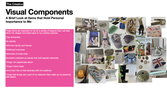
These are some of the quick observations I have gathered within my range of items that I have selected that have significance to me personally and creatively. As I have gone through and analysed each object, I have realised that many of them don't have deep enough meaning to me, and I was simply looking at what I looked most on the surface ( the visual appearance of the objects, and the immediate meaning). Due to this, I have decided to change many of my previously selected objects, and thought deeply about the objects I have chosen. I still need to take photos of my new items to then edit and assemble into the collage I am planning to create.
List of new objects I have selected:
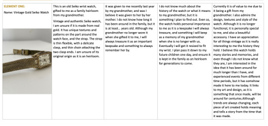
Vintage Seiko watch from my grandmother - looking at its historical and personal importance to me and my ancestry.
Pandora Charm Bracelet
Plant in Face Vase
Print of Girl on Phone
Salt Lamp
Teva ADHD Medication
Glasses
Childhood Travel Journal
Drivers License
032C Magazine
Green Sea Urchin Shell
Heart Ring
Amethyst Crystal
Post Stamp Paper Cache Heart
Union Jack Jewellery Box
Childhood Photo Album
Koala Stuffed Animal
Intermediate Arts Academy Badge
Black Converse High Top Sneakers
Macbook laptop
Why have I chosen them:
I have begun to write about my chose objects to create my inventory. Looking at my in-depth observations and thoughts about the objects which I will need to summarise when creating the poster inventory.


2 notes
·
View notes
Text
My 20 Elements
These are some of the quick observations I have gathered within my range of items that I have selected that have significance to me personally and creatively. As I have gone through and analysed each object, I have realised that many of them don't have deep enough meaning to me, and I was simply looking at what I looked most on the surface ( the visual appearance of the objects, and the immediate meaning). Due to this, I have decided to change many of my previously selected objects, and thought deeply about the objects I have chosen. I still need to take photos of my new items to then edit and assemble into the collage I am planning to create.
List of new objects I have selected:
Vintage Seiko watch from my grandmother - looking at its historical and personal importance to me and my ancestry.
Pandora Charm Bracelet
Plant in Face Vase
Print of Girl on Phone
Salt Lamp
Teva ADHD Medication
Glasses
Childhood Travel Journal
Drivers License
032C Magazine
Green Sea Urchin Shell
Heart Ring
Amethyst Crystal
Post Stamp Paper Cache Heart
Union Jack Jewellery Box
Childhood Photo Album
Koala Stuffed Animal
Intermediate Arts Academy Badge
Black Converse High Top Sneakers
Macbook laptop
Why have I chosen them:
I have begun to write about my chose objects to create my inventory. Looking at my in-depth observations and thoughts about the objects which I will need to summarise when creating the poster inventory.
2 notes
·
View notes
Text
MUSEUM MEMBERSHIP PACK - PACKAGING PROTOTYPE
A set of interactive boxes, connected together by a piece of card. They can be folded and placed in many ways. Aligns with my brand values; creativity, connection and interactive.
will include brand collateral:
- membership card
- card lanyard
- brochure
- t-shirt
- stickers
- tote bag
0 notes
Text
My final animation.
Imagery
After careful consideration and changes, I decided to incorporate very few simple images. I wanted the type to be the main focus and to effectively and appropriately portray the words spoken. The images I did use were subtle and relevant to the speech, without detracting from the type focus. That being said, the images have little or no movement, as I wanted to make the animation focus on the type itself, using the images as an additional aspect, to emphasise what is being said (eg. heart fading out for "loss of friends and loved ones", sliding doors for "opened their doors", and small figures holding hands to represent "a community".
I began with more images (eg. hospital bed, and broken heart), that more obviously portrayed the words spoken, but decided against using these, as I found them to be a bit too forward and perhaps inappropriate considering the gravity of the speech.
Colour Pallette


I decided to go with a simple colour palette of only two colours, a cream/ beige and a navy blue/indigo colour. The two colours, though contrasting light and dark tones, work well together, and in combination bring sophistication to the animation, and convey an appropriate tone in regards to the content of the speech. They create an earnest and serious mood to the animation, whilst still being compelling colours.
Font Choice
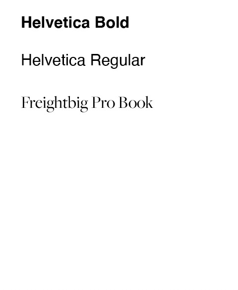
My font choice is a combination of two contrasting fonts; being the sans serif font Helvetica, and Freightbig Pro book, a more intricate and elegant serif font.
I think the combination of the two different fonts, works well together as they both convey a sense of importance/ seriousness, which is the tone conveyed through the speech.
I decided to use both Helvetica regular, and bold, switching between the two to create different moods (serious and sensitive/emotional), and make specific words and phrases stand out at certain times.
The use of Freightbig Pro Book is a timeless font that pairs nicely with my colour palette. I decided to use this font as it is a sans serif font, which I learnt during the week 8 lesson, conveys timelessness, formality, traditional, sophisticated, respectable - I found these all to be aspects relevant and would create an appropriate tone for my speech.
The use of Helvetica is due to its simplicity and practicality. It complements Freightbig Pro nicely, and it is a font the coheres well to nearly any sort of manner. It conveys tones of directness, neutrality, legibility, modernness, clean, objective and stable.
Composition and Animation of Text
My animations are simple, and often repeated throughout the animation as a whole.
I wanted the focus to be on the words themselves, using animation as a way to emphasise what is said. I also tried to keep it consistent and cohesive with my animation style, using simple yet effective techniques and repeating these throughout.
I used a lot of fading in and out animation for the text, as I thought this appropriately portrayed the solemnness and seriousness of the words. In the speech, Jacinda Ardern speaks quite fast and serious, hence the rapid change in words and the hasty speed of my animation. I wanted to ensure that viewers were still able to take in the animation without it being too overwhelming. Through the use of fading some of the words in and out, it allows the animation to slow down a bit and balance out the fast paced intense animations.
I played around with the source text feature to make it look as though some of the words were being typed as they appeared or changed from one phrase to another. I thought this effectively contributed to a serious mood.
I also made a lot of my phrases with the composition of one word placed onto of another, and coming in one at a time, to again portray seriousness, and create a different composition for viewers to follow.
I consistently and intently made some single words and phrases in all caps, to emphasise and portray the severeness of the words, and in some cases to build up a serious tone, before switching to a more sensitive mood. (eg. "Who witnessed the loss of their" in all caps, switching to "friends and loved ones" in lowercase.
Strong and heavy words such as "Hate and Violence" and "Anger", are also in all caps to create emotion and convey the severity and hurt that these words represent.
The regular change in point size depended on whether I wanted one word to be the main focus, or to emphasise certain phrases and their importance, whilst making other phrases and words smaller to convey emotion.
0 notes
Text
What words adequately express the pain and suffering of 50 men, women and children lost, and so many injured? What words capture the anguish of our Muslim community being the target of hatred and violence? What words express the grief of a city that has already known so much pain?
I thought there were none. And then I came here and was met with this simple greeting.
When finishing my animation and including music and credits, I would like to include this part of Jacinda Arderns Christchurch Memorial speech, which is what she says before the part of the speech included in my audio. To give context of the speech and acknowledge what happened, I could include this segment whilst the music is playing and before the audio begins.
0 notes
Text
Second Iteration
After beginning my first iteration of my kinetic type animation, I decided I want to take a different approach regarding the style, colours and fonts used.
I wanted to make it seem a bit more professional and elegant, considering the seriousness of the speech content. The rich colours and combination of fonts (Helvetica bold and Freightbig Pro Book), I believe effectively portrays the significance of the words spoken. I have tried to ensure the use of effects also somewhat portray what is being said, and decided to continue with my inclusion of simple vector imagery throughout parts of the animation.
This is what I have completed so far, with the exception of the last 10 seconds still to go, and refinements being needed throughout the animation as a whole. I need to also ensure that I have paced my words correctly and the timing is right, and that phrases don't come and go too fast.
0 notes
Text
Week 10 Notes
Disneys 12 Principles of Animation
4. Straight action and pose to pose.
5. Follow through and overlapping action, two motions occurring, at different speeds etc.
6. Slow in and slow out - thinking about gravity, something falling might drop slowly, speed up in the middle, and slow down towards the ends.
7. Arc - bounces, use of velocity, showcases momentum and direction.
8. Secondary Action - if you have a little asset/ character, what is the secondary object/ asset and how is it interacting with the main asset itself.
9. Timing - important - pacing of keyframes allows it to move at a certain speed, the less frames available makes it go faster, more frames cause it to speed up.
10. Exaggeration - squash, stretch, something small turns into something big due to movement/ distortion.
11. Solid drawing - 3D, mapping out dimensions manually so that it looks realistic when it sits in the animation.
12. Appeal - how do you make it aesthetically pleasing and dynamic as a whole (combining effects/ movement).
Polish/ blend out your work.
AE Tutorial
Proportional Grid to help centre/ place text proportionally.
Shortcut to trim layer (Option, left bracket) - to bring it to key frame you are on.
shortcuts: T- transparency (opacity),
adding motion blur polishes text especially if it moves fast.
1 note
·
View note
Text
There is no truth - Kinetic Type Practice Tutorial
Week 3 AE Tutorial
Learning how to:
use source text
change font of individual letters, one after the other in a word.
scale and fade
adding hand made type (from photoshop file)
work with a comp file.
Notes from Tutorial:
0 notes
Text
First Iteration/ Draft Kinetic Type Animation for my speech
I have started my kinetic type animation, using my assigned speech by Jacinda Ardern at the Christchurch Memorial. At the moment it's just a basic exploration of colour scheme, fonts, use of imagery, and the type of movements etc that I am looking too create.
I want to use a peaceful colour scheme that evokes calm emotions, to portray the idea that the speech is intended to bring people together at a sad time and comfort one another, as well as honouring those who we lost.
The use of simple vector imagery is relevant to the content of the speech/ what is being said, however it could be deemed inappropriate to included animated imagery considering the seriousness of the speech, which is something I'll have to think about.
0 notes
Text
vimeo
A kinetic animation shared by lecturer Raul on teams, a really interesting and captivating example of kinetic motion. I really like this as it creates the appearance of still objects drawn by diagonal lines, moving when another set of lines crosses over them. I really like the unique and trippy effect that this creates.
0 notes
Text
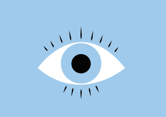
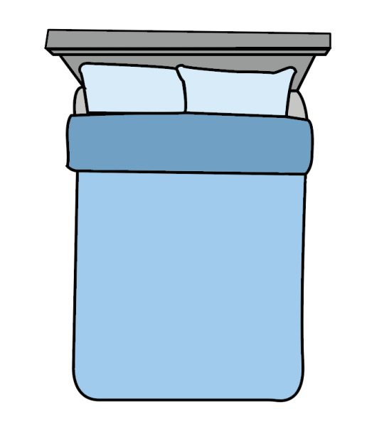
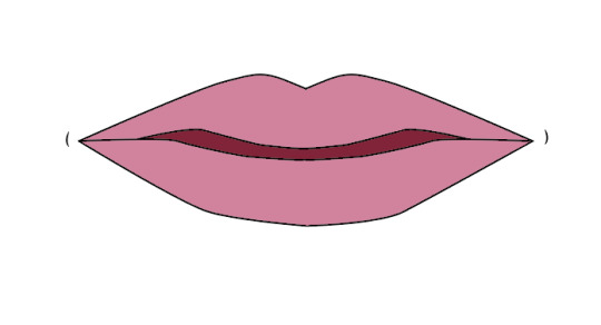
Images for Kinetic Type
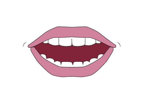
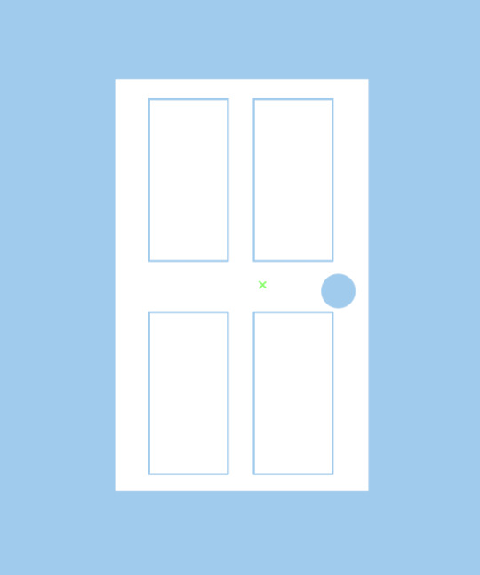
These are some vector-like images I made on Illustrator, that are relevant to my speech and the story board I have created, that I might like to animate and include in my project, along with type.


0 notes
Text
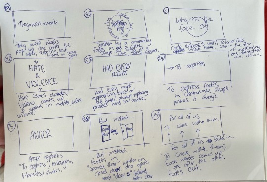
Story Board
Planning out my animation (effects, pacing, imagery, placement, movement, etc.)
Speech by Jacinda Ardern - Christchurch Memorial


0 notes
Text
Kinetic Type Practice - After Effects
"Gone too Soon"
In this tutorial, we incorporated type into our animation to get a better sense of creating type movement/animation which we will be doing for our final project.
We used shapes (rectangle, star, and hand drawn squiggles, and then moved them between keyframes (shift, arrow key), to make the word disappear/appear. We learnt that you can change the appearance of the word (whether it appears or disappears, by swapping the keyframes around to change the order.
I think this creates a really interesting effect that I will definitely use in my project.
0 notes
Text
Kinetic Type Practice
Gradient Ellipse
In this tutorial we used the shape tool to create an ellipse, and the colour fill tool to create a gradient of multiple colours inside the ellipse. We then added key frames to make the gradient move across to create a shiny effect.
0 notes