
grad604-catherinepascual
GRAD604/52 - Catherine Pascual
89 posts
Don't wanna be here? Send us removal request.
Last Seen Blogs

middayrunners
Kowittbubs !

lapseudosphere
La Pseudosphère

essns-world
💫💙

maezimage
Got Muscle!
itwas50yearsagotoday
It was 50 years ago today...
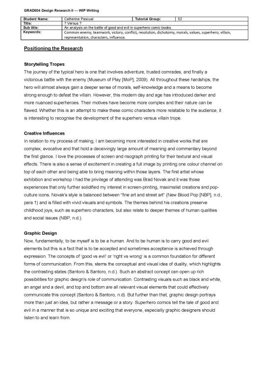
Text
Submitted and done!!!!
Done done done done woohoo! I would write a reflection/rationale but I think the conclusion of my essay pretty much does the job. Thank you to David and Ezra for being great teachers this sem! I really enjoyed this paper and I’m PUMPED for next year and what it will bring!!!!
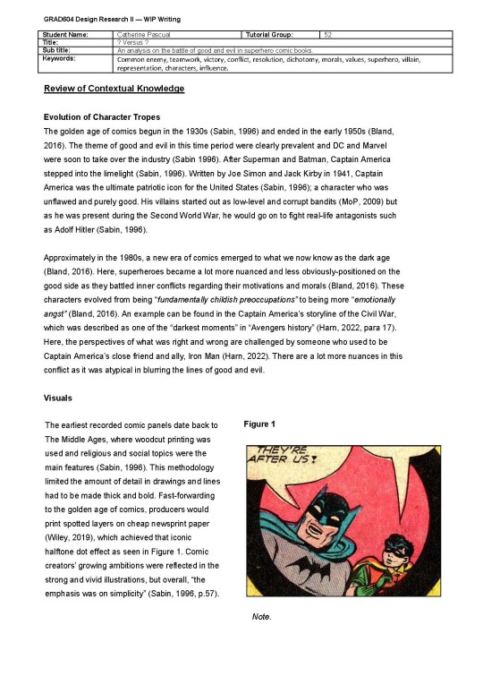
0 notes
Text
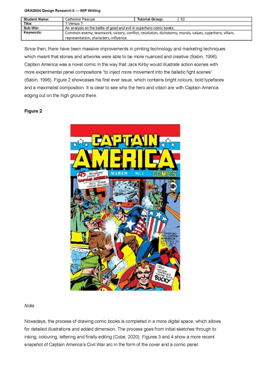
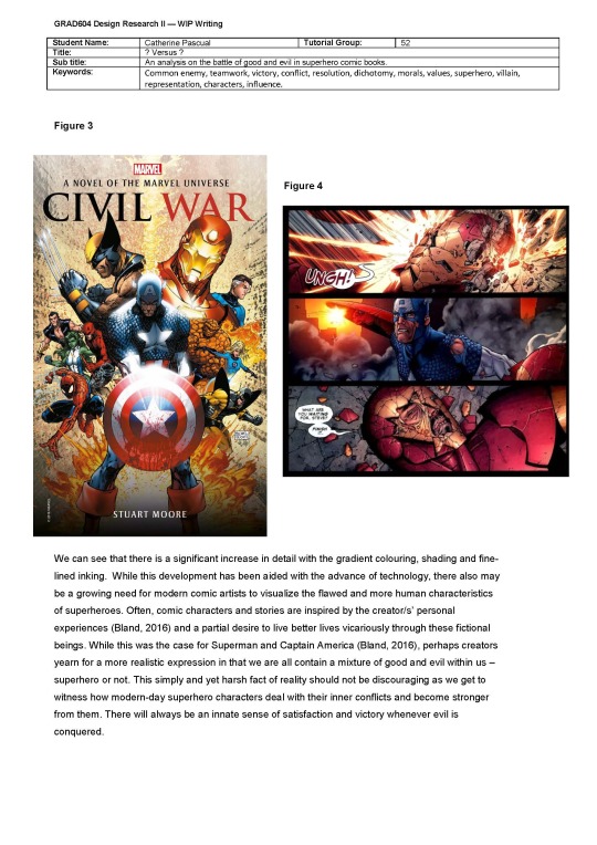
Essay Editing
Errghh my contextual knowledge section is waay too long - I need to cut it down by 100 words so like yikes, that’s gonna be a mission since it seemed like everything was important.
^got rid of this so we’re algggg - now I’m one word under the limit hehe
0 notes
Text
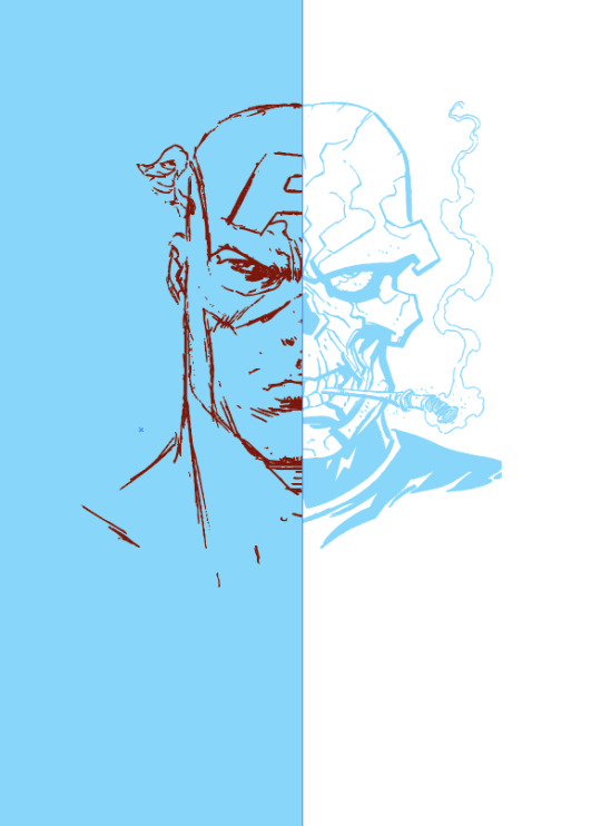
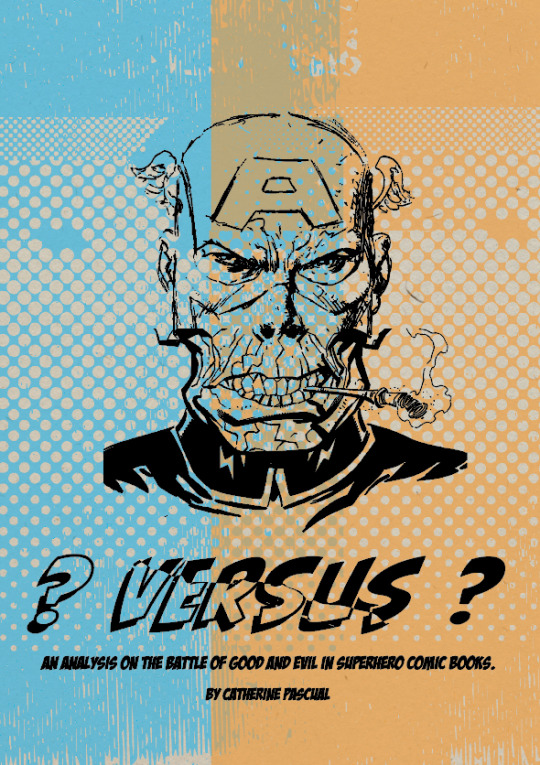
Final stretch!!

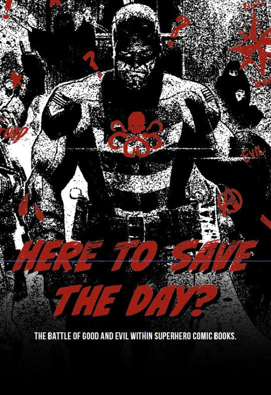
^chose to show half of the poster to further emphasise the dichotomy of good and evil
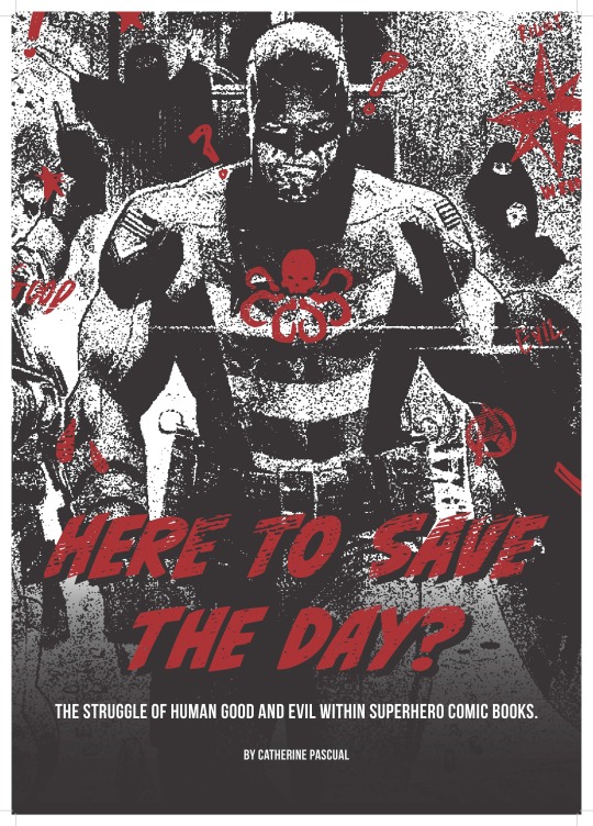
^woops colour looks scuffed but this is it :)
0 notes
Text
Week 12
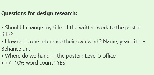
Today I edited the document in accordance to Ezra’s comments and now I just need to finish off some referencing and tie everything together.
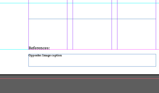
^delete references.

^image caption what to write.
0 notes
Text
To Do list
I’ve taken on David’s feedback, now I need to also go through Ezra’s feedback too - I’ll get started on this tomorrow!
0 notes
Text
Guest talk - Milk Studio + Sussudio
This was such a cool and insightful talk! Got lots out of it!!
0 notes
Text
Feedback


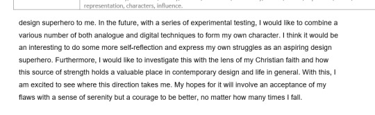
I wonder also if the investigation and navigation of your Christian Faith, and making connection with the faith of others might also have space to be explored in your future practice? The metaphor of design superhero works, but perhaps a tie into the real application and appreciation of acts of faith, or of in general the place and strength of faith in contemporary design and life could be a valuable project or strand of something else?
^ a real interesting point! I’ll add that into the conclusion!
0 notes
Text
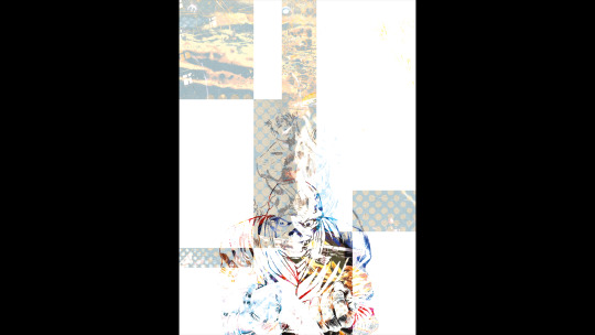
Poster Development

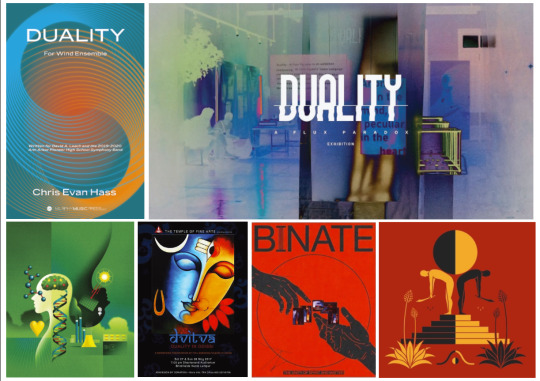
^inspo
^poster development!
0 notes
Text
Refined the abstract! final one
Picture this.
A teenager is fully engrossed in an issue of Captain America. He turns the final page and is chilled by what he sees next. Standing there menacingly, his favourite superhero says, "Hail Hydra." The phrase feels like a blow to the gut, and the boy is left thinking... Why and how did Captain America, a symbol of good morals and justice, become one of evil and corruption?'
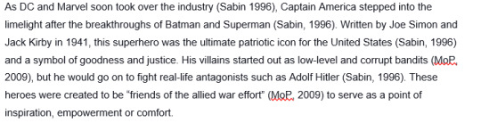
The above is an imaginative but probable reaction to the controversies surrounding Captain America's character pivot. Nevertheless, it perfectly introduces the fundamental dichotomy of good and evil within superhero comic books and its significant evolution since the 1930s. This medium started as simple and fun forms of entertainment for younger audiences. Characters such as Superman and Captain America were the original breakthroughs of a massive movement and fully encompassed good and righteous morals. Now, in this 21st century, superheroes have grown to become darker, more flawed and more nuanced. Through visual analysis of original work and artist models, a greater understanding of how and why good and evil co-exist aims to provide complete self-acceptance, stronger morals and a more grounded confidence in everything we create in and for this world.
^I also put all my writing in the final doc setup.
0 notes
Text
Refined and edited essay
- Spent a couple of hours editing it down and making sure all the references were there.

0 notes
Text
To Do
Watch David’s video and set up the final documents
Refine poster
Refine essay
0 notes
Text
I finally finished the essay (a real rough draft tho so :’))


0 notes
Text
Review of contextual knowledge
Less on the research of the topic
More on research methods.
Look in the future in accordance to other artist infuences/inspirations.
Methodology - how would I go about it next?
Review the brief for this third section as well!
0 notes
Text
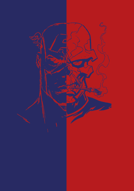
Ugh I changed my poster ideas AGAIN but this time I think one makes a lot of sense !

^I decided to steer away from opposite colour schemes just because I think it defeats aspects of my research analysis. My findings evolve to realise that as time goes on, the nuanced conflicts of superheroes and villains become more complex and the binary is less obvious. Therefore the colours black and red are chosen even tho I would have naturally chosen red and green or blue and orange (complementary colours). Next, the detailed grainy texture paired with large shadows adds a lot of depth to the character - who is supposed to be the hero but looks so sinister here. Next the little sketches on top are odes to the sketches comic artists would do first in the creation process but they also allude to different symbols of good and evil and moral compasses.
0 notes
Text
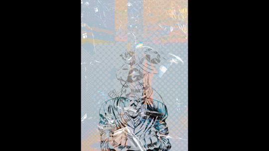
Poster Developments

^character colours

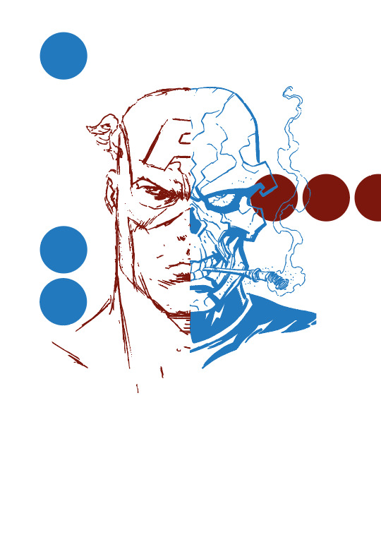
^dots to reference the classic halftone dot effect?
0 notes
Text
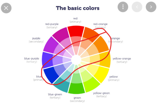
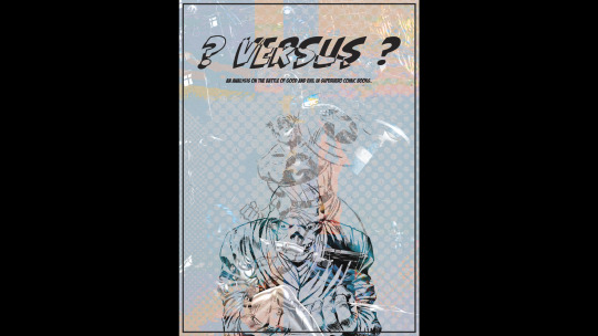
Poster Ideation - colours
^I want to use 2 colours to visually portray duality but I also want to add in the in-between colour to show how good and evil has become blurred in comics.

^okay so I think I’m going to stick with orange and blue actually because they are on opposite sides of the colour wheel.

^too colourful
^better contrast and visual effect. I want to screenprint this!
0 notes
Text
Digital version of the previous poster idea/Week 11
Development:


Clarification of the research:
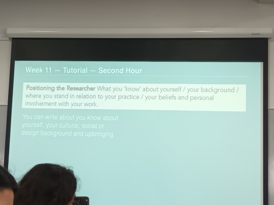
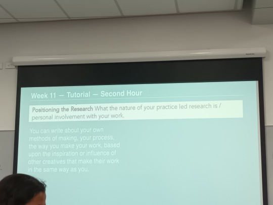

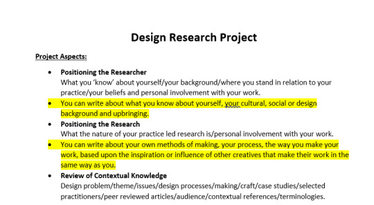
^updating the instructions.
Second section: Referencing personal/making/artist references
Third section: Referencing the topic that backs up what you’re doing.
Weave all three sections together.
Me
Me and the research
The research
0 notes