Last Seen Blogs
aurared
Strange?
chaos-mizer
Chaos!Chaos!Chaos!
ladyaj-13
LadyAJ-13
remnant-cain
Writing series blog
formula1blog
Lestappen
Text
Week 12 – Public Art
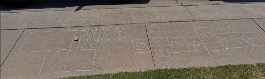
For our last art activity I decided to partake in public art in my neighborhood. Like one of our artists of the week, Marina Abramovic, I wanted my work to be interactive. I know that at least 10 people a day walk around my neighborhood, so I thought creating a “fill in the blank” and hopscotch game in chalk would be perfect. As you can see in the photos, I wrote “Hi! Leave a happy note for neighbors to read”. I even left a full box of chalk on the floor for people to use, but the next day most of it was gone. I am hoping with this project, we as a community can brighten up someone’s day. Just a simple message can mean a lot and give someone that extra push they need. I only got one message so far in one of the boxes. I am thinking that either they could not find the chalk or it was just too hot to be walking outside. I did however see a little boy in my neighborhood play hopscotch as I was coming home from work. I was happy to see that my art was being interacted with and appreciated.

0 notes
Text
Week 12 – Artist – Abramovic-Althamer
Marina Abramovic is a Serbian conceptual artist known for her sound pieces and performance art. She goes above and beyond to test the limits of her body and mind to create art. She uses extreme methods such as taking drugs to purposefully have a seizure, and cutting and beating herself. Much of her work was first documented in photos, she later switched to videos. She likes to create a relationship between the performance and the audience. To me, her work allows the audience to get in touch with themselves and humanity. She is all about testing the limits and this is honestly inspiring as it seems she has no fear or lets anything hold her back. I like how she includes the audience in her works of art as not many artists do so.
Pawel Althamer is a contemporary polish sculptor. Althamer is also a performer and creator of installations. Much of his work consists of sculptures of the human body. These sculptures though are not your average, perfect body sculptures, they almost have a deathly/haunting feel to them. His work combines the visual experience with suggestive social messages. To me, his work can have a profound impact that results in change.
Both artists are considered contemporary performance artists. What they have in common is their theme of the human body. Both explore this theme in different ways though. Abramovic includes her audience in her art, while Althamer creates art that focuses on societal problems for the audience to only view. I like Abramovic’s work more because I have never seen an artist push themself and put themself in such an uncomfortable situation for the sake of art.
0 notes
Text
Week 11 - Artists - Choice
I decided to discuss two influential VFX artists Dennis Mauren and Joe Letteri
Describe Dennis Muren’s work
Dennis Muren is a well known VFX artist who was self-taught. Mauren honed his skills by practicing stop-motion animation. He is the Senior Visual Effects Supervisor at Industrial Light & Magic. He has won nine academy awards for his work in movies such as Jurassic Park, Terminator 2: Judgment Day, and Innerspace. Mauren has played a vital role in the VFX field’s technical achievements in Star Wars.
Describe Joe Letteri’s work
Joe Letteri is a senior visual effects artist of Weta FX. His work has earned him four academy awards. Some movies he has majorly contributed to are Avatar, Dawn of the Planet of the Apes, and King Kong. He is known for creating compelling and realistic creatures in films. Letteri created the subsurface scattering technique that was used to create Gollum in Lord of The Rings.
Who do their work differ and how are they similar?
Both of these artists' work deals with visual effects. We can see different types of VFX in their work such as CGI and motion capture. Where they differ is how they got interested in this field. Mauren was fascinated in stop-motion animation and this led him to the VFX community. Letteri started his career with an interest in the science behind computer-generated graphics.
Do you think visual effects today are influenced by these two?
The Visual Effects Society views Mauren as an innovator and mentor. His work has opened doors for screenwriters and directors to tell stories that were impossible before without his skills in cinematic arts and advanced technologies. Letteri has created techniques that are now the standard for creating photorealistic digital effects.
0 notes
Text
Week 11 - art activity - choice
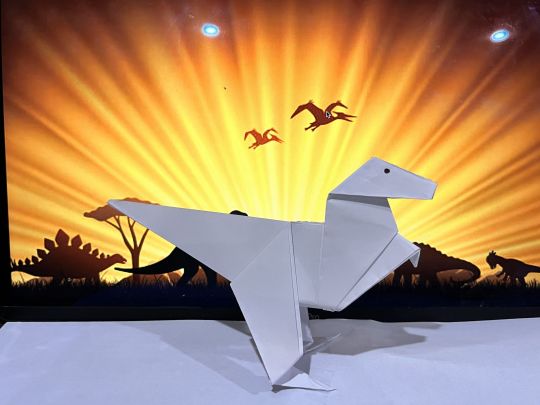
For this week I decided to go with origami. As you can see in the photo below I created a dinosaur origami (I named him Fitz).
(Questions)
Why did you go with this medium?
I opted for doing an origami because I used to be obsessed with them when I was younger. I remember having all of the different colored papers and books to follow. I used to do this with my sister and it meant a lot to me. I also wanted to see if I still had the skills to follow detailed instructions to create a piece of art. Doing this project brought back precious memories and forced me to think outside of the box when it came to choosing an art project
What inspired the theme?
I decided to do a dinosaur origami because 1) I love dinosaurs, and 2) I recently watched Jurassic World: Dominion and it was a great movie. I also wanted to challenge myself as I have never done a dinosaur origami before.
Was it hard to complete?
The video I watched was a bit tricky to follow, but eventually I was able to follow it to the tee. I did mess up the first time, so the origami you see in the photo is my second attempt. I was going to add other origami dinosaurs, but they were too hard to follow and I messed up more than 3 times. I also went with a dinosaur background theme to add to the effect. I think leaving the dinosaur origami plain white helps create a stark contrast with the background so it really pops.
0 notes
Text
Week 10 - Artisit - Joseph DeLappe & Micol Hebron
Joseph DeLappe is an American artist who is known for working with electronic and new media. Some of his works include online gaming performances, and sculpture and electromechanical installations. Much of DeLappe’s work explores contemporary issues of politics. Some of the media he has used are chalk, digital images, and old game consoles. More recently he has been known for “Killbox”, which is an interactive computer game about drone warfare and it was even nominated for a BAFTA Scotland for “best computer game”.
Micol Hebron is an interdisciplinary artist whose work includes curating, social media, studio work, crowdsourcing, and individual/collaborative projects. She is known for critically examining and employing modes of feminist activism in art. Some of the themes she frequently explores are gender equity, freedom of speech, and the relationship between the mind, body, and knowledge. Unlike most artists, Hebron’s media includes pictures of sexual human body parts, including her own in her work.
I believe they chose the media for certain works of art based on the theme / main idea of the art piece. For example, DeLappe uses computer mouses for an installation called “The Mouse Mandala” which is supposed to represent thoughts of contemporary cubicle work cultures. This was a media I have not thought of using previously. For Hebron, she uses her body as the medium for her series titled “(In) Decent Exposure” where she is nude in public places doing mundane things such as driving and watering the grass.
The only similarities in the two artists' work that I see is that it is technology based. I think the ideas they explore are relatively similar in terms of politics. A lot of Hebron’s themes can be paired with politics, which is what DeLappe focuses on. I think both artists can use social media platforms like Instagram or Tik Tok in their work to make it compelling as these apps already keep you entertained. I think adding their art to it will give them more exposure to a larger audience and bring about new and inventive ideas.
0 notes
Text
Week 10 - Art Activity - Intermedia
My idea for this week is based on The Pandemic. My three media choices are collage, video, and painting. I want to showcase the mandates we had to follow, specifically the mask mandate and social distancing mandate. The media I decided to go with is a collage. I believe a collage has a more profound impact as we can see various instances of the mandate. It shows the viewer all at once how the Pandemic has affected the world and what the two sides are of the situation. My piece would have been different if I used a video because I would have used short clips of people for or against the new mandates at rallies or protests. If I did paintings, I would have recreated rally signs that were against and for the mandates.


I think I did a fairly good job at representing the different emotions towards the mandates. I also think I did a good job at showing the signs put up in public places regarding these mandates. Even though I believe I did a good job, I am not totally satisfied with my collage. I would have liked to go out and take these pictures for myself. I cannot really do that now though as the mandates in California have been lifted. Overall, I do believe my finished piece conveys the idea I wanted.
0 notes
Text
Week 8 – Art Activity – Photo Story (Day in the life of Bella)
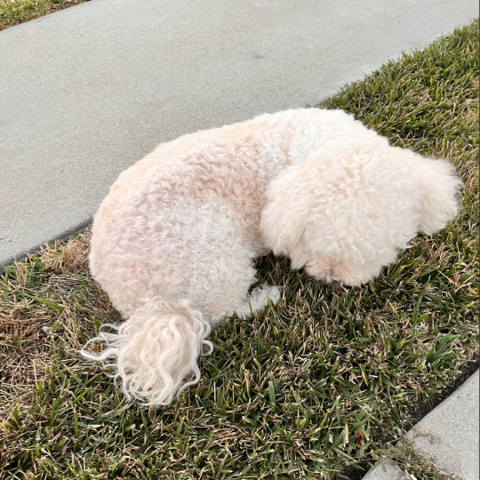
This is my maltipoo, Bella. This is a photo of her on her routine afternoon walk.

This Bella almost done with her 2 big scoops of food and water in the morning.

Here we have Bella waking up from one of her MANY naps throughout the day. She likes to only sleep on her back.
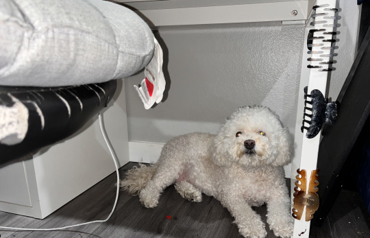
During the summer Bella likes to hide under my desk because it is cooler under there. Also, she hides under here when she knows she has to take a bath.

The other dog in the photo is Zara, my little sister's dog. They love to play fight together and zoom around the house.
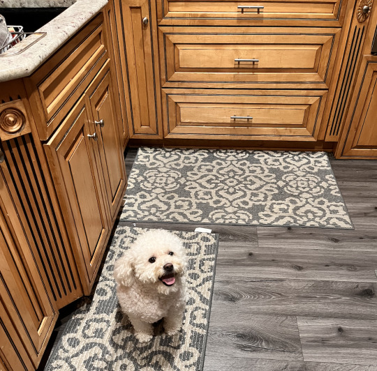
Here we have Bella in my kitchen waiting for someone to drop food scraps. She comes in here often looking for rice or chips that might have fallen on the floor. She is very quick to grab anything that falls so we have to make sure she does not get to the food before we do.

Bella absolutely loves to jump on top of our glass dinning table, looking for leftover food. Just recently on 4th of July she ate 2 barbecue ribs and some taco meat left on the table by a guest.
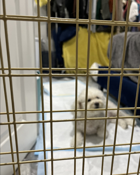
Lastly, we have Bella locked in my room for part of the day while I am work. This is the only gate that will keep her in because she has broken down others made out of either mesh or wood.
0 notes
Text
Week 8 – Artist – Addario-Cardiff-Miller
Lynsey Addario is an American photojournalist who is known for her work in The New York Times, National Geographic, and Time Magazine. Her work covers major conflict and humanitarian crises, such as Afghanistan, Iran, and Syria. In Addario’s more recent work called “Finding Home”, we follow her through a year-long documentary of Syrian refugee families as they await asylum in Europe. She has a reputation of being a war photographer as her photographic essays explore the lives of refugees and displaced children. Janet Cardiff and George Bures Miller are a Canadian photography duo. They are internationally recognized for their immersive sound installation and audio and video walks. These walks guide viewers through a short journey of a landscape. Their work tests the limits of sound and audience participation.
Their work is similar in the sense that they both tell stories. Addario, and Cardiff and Miller string a series of photos together that give us a better understanding of what we are looking at. Each photo is significant in their own way, yet they all work together to tell the story the artist is trying to get across. They are different in terms of content. Addario tells stories about real life events, while Cardiff and Miller tell fictional stories through their use of photos and sounds.
In my opinion, the gritty edge of real-world stories are not more important than whimsy and inner-monologues. Neither is more important than the other. We have to have the perfect balance between the two. We need the gritty edge of real-world stories to stay in touch with reality and to be aware of what is happening around the world. Whimsy and inner-monologues allow us to let go and be immersed in our fantasies. We do not have to worry nor think about much.
If I were to pick up cameras and microphones and pursue a career in storytelling, I would prefer a career like Cardiff and Miller’s. I like the whole fantasy and whimsical outlook on art. I think it would give me more freedom and test boundaries. Not to mention, sound would enhance the experience of viewing the art. I would like my work to allow the audience to feel serene and safe.
0 notes
Text
Week 7 – Art Activity – Headshots & Environmental Portraits

0 notes
Text
Week 7 - Artist - Nan Goldin & Annie Leibovitz
Nan Goldin is an American photographer who is known for her photography that focuses on the world of addictives and sexual activities. Much of the photos she has taken would be considered controversial topics as many include drug addiction, abusive couples, and sexual bodies. Many of her portraits are considered gritty and "in the moment". Her work is nontraditional as she challenges the usual images we see in art and everyday life. It helps push the public to understand that there are universal human experiences that are shared between everyone.
My favorite Nan Goldin is Picnic on the Esplanade. It is a part of her ‘Sirens’ solo exhibit located in London. We see a group of five friends having a picnic which seems to be by a pond. This whole series pays homage to her friends. I like this image the most because it brings back memories for me. I used to go on lunch dates with my girlfriends at the park and have so much fun just like the people in the photo. I can feel the joy and happiness coming from this candid photo.

Annie Leibovitz is a well-known American photographer who captures dramatic and iconic portraits of celebrities. Her style of photography is known as crisp and well lighted. Leibovitz spends time studying her subjects in order to create a unique and quirky portrait. You can find much of her work in entertainment magazines such as Vanity Fair and Rolling Stone.
My favorite photo by Annie Leibovitz is of Kim Kardashian and Kanye West’s selfie. It reminds me much of today’s society and how we are all attached to our phones even when we have family around us. I feel like everyone is so engrossed in the idea of capturing the moment instead of being in the moment. I do relate to the photo though because, like Kim, I would want to capture as many selfies with my child as possible.
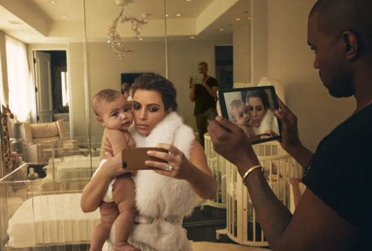
Annie Leibovitz’s photos are considered “manufactured” because she poses her clients and sets up the shot. She sets up lights and is particular about how the portrait comes across. Nan Goldin’s portraits are considered “documentary” because she captures candid photos. Much of Goldin’s work seems to be captured in the moment, making them feel more authentic. I feel like both are honest in terms of what they try to portray. Celebs are meant to stand out and be iconic just like Leibovitz’s photos capture. Goldin’s work is more gritty and raw. I do not think it matters if one portrait is more authentic than the other. As long as the photographer captures what they had in mind, then it all works out.
If I had to choose between the two, I would have Annie Leibovitz take my environmental portrait. I like how she sets up her shots and really brings out the best in you through the photo. I like having someone direct me in photos because I am awkward and would not know what to do. Also, I would love to have an iconic photo that represents me. I am not a person who looks great in candid photos, so I would not choose Goldin.
0 notes
Text
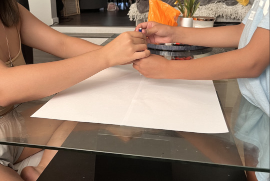
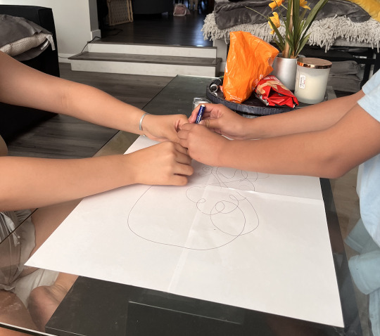
Week 6 - Art Activity - Drawing II
When I compare my map of CSULB to the actual map, I can definitely see how much I do not know about lower campus. I have only ever had classes in upper campus so I am well versed with the area and buildings. I knew what the general layout of our campus looked like because I used to stare at the map before each semester started just to familiarize myself with it again. Yet, I still focused on upper campus and I know that is where most of the science buildings are located. I also used to work at the bookstore, so I spent much of my time solely in this area. I was shocked to see how little I knew about lower campus. I could tell you where some of the dorms were and the pyramid, but that is pretty much it.
Automatic drawing was definitely something new to me. I was not aware of this type of drawing before this activity. I found it to be quite boring and weird. In my honest opinion I did not feel Flow, it felt more like I was scribbling around a page. My drawing was not cool whatsoever. The only part I was surprised about was I somehow ended up drawing a heart on it. I guess I can see my mood in the drawing. These past few weeks I feel like my brain has been all over the place, and one could say that is clear in my automatic drawing. I feel like drawing allows people creative freedom and to express themselves. Specifically, I believe automatic drawing lets people draw how they are feeling. Drawing in itself is a picture created from any drawing instrument like a pencil or charcoal.


0 notes
Text
Week 6 - Artist - Camille & Sarah Elgart
Sarah Elgart is a choreographer who is well known in the realm of dance in Los Angeles. Her work consists of large-scale, site specific productions that transform mundane areas with the use of music, movement, and media. Large areas like airports, museums, or bus terminals are where Elgart engages her audience. She strives to allow viewers to view “old places with new eyes”. Elgart has also choreographed for films, commercials, and television. She is very active in the community as she wants to democratize dance, meaning she wants to challenge the idea of what can and cannot be a stage.
Camille Dalmais is a well known French singer-songwriter. Her genre of music includes chanson and pop. Camille seems to want to connect to her music in the most raw way possible. On stage, every sound is created physically by her and her team. She even performs barefoot in order to feel the vibrations so she can digest the music in an organic way. More recently Camille has started to write more political songs. Her music is full of metaphors and clever hidden meanings.
I can definitely see Flow in Elgart’s choreography. A lot of the movements are fluid and blend into one another. It reminds me of contemporary dance, as many of the movements are expressive. The dancers seem to try to connect the mind and body through movements that come naturally. Camille’s music also contains Flow. We especially hear it in her album Le Fil where she incorporates an avant-garde concept of stringing her songs together through a single note. When I hear the song it feels like she did not have to put much effort into it as it is a continuous, soft medley.
These artists are similar because they are very passionate about their work. You can see and hear the Flow in their work from the amount of effort that is constructed into each dance or song. The automatic drawing connects to Elgart’s choreography and Camille’s music because they all contain flow. There is something so natural about the process and I perceive the same feelings from these artists’ works.
0 notes
Text
Wk 5 - art activity - graffiti painting
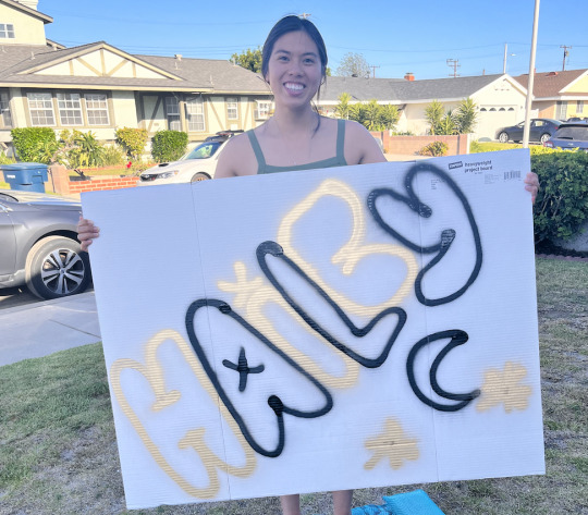
I really enjoyed the activity for the week! I have always wondered what it was like to use spray paint. It was a bit harder than I imagined as the distance from the board makes a difference in the intensity and fineness of the paint. I was honestly afraid to paint in my first letter because I wanted it to look good. It was a fun and different experience getting to use spray paint. Doing this activity brought back memories from when I was in high school. I used to do large sketches for rally and game posters, so sketching my name in bubble letters was a breeze. I decided to use these two colors because I thought they would go well together. The gold paint did spray a bit differently from the black, so the lines are not as defined. I did not want to do the classic shadow technique with the two colors because I felt like that was too basic. It would have been cool to do some type of ombre within the writing if I chose different colors.


0 notes
Text
Wk 5 - Artists OTW - Stephen Powers & Julie Mehretu
Stephen Powers is a contemporary graffiti artist, who also goes by the alias ESPO (Exterior Surface Painting Outreach). Powers is best known for his text-based conceptual works. Powers’ graphic lettering is incorporated into many of his murals around the world, which are like love letters to the cities they are in. His works are frequently displayed on large buildings, sides of storefronts, and gallery walls. He takes inspiration from graphic design and traditional sign painting. As a graffiti artist, his work dealt with issues of legality and disenfranchisement. He is well-known in the graffiti world for his book titled The Art of Getting Over: Graffiti at the Millennium. Powers was a key figure in graffiti writing transitioning into street art.
Julie Mehretu an influential contemporary artist. Her work is influenced by politics, literature, music, and social networks. She expresses the contemporary condition of society and individuals through her pieces. These large-scale paintings are made of layers of acrylic paint that is overlaid by penic, pens, ink, and paint. She hopes her work provokes the viewer’s thoughts and reflection. Mehretu’s work has been shown in the Museum of Modern Art in New York, the Walker Art Museum in Minneapolis, and The Broad Art Museum in Los Angeles.
Powers and Mehretu are similar as they are both contemporary artists. In my opinion, much of Mehretu’s work reminds me of graffiti that is seen in public. It almost has this feeling of chaos and uncertainty to it that I find in the random graffiti works of Los Angeles. For example, her work collection titled Six Bardos looks very similar to graffiti. Powers’ work is different as you can obviously tell what you are looking at and reading. As most of his works are writings, we can understand what he is trying to convey.
Street art is known as visual art created in public locations for public consumption. Street art tends to be image based and it can include murals, stencil art, reverse graffiti, and mosaic tiling. These works of art are figurative and abstract, and bring vibrancy and energy to that location. Fine art is art created mainly for aesthetic value and beauty, rather than functional value. Fine art can include paintings, prints, and sculptures. Viewing street art is different from viewing fine art. Usually street art has much to do with the location and architecture of what is being painted on. In museums, curators decide what is shown through the fine art pieces. The strengths of gallery art are they are depositories of history and they can increase an artist’s public recognition. I believe the biggest weaknesses of gallery art is that many pieces lack written explanations. We have to be able to interpret what we are viewing, and this is sometimes frustrating. Strengths of street art include freedom to paint what you want, can positively transform the environment, and it brings art to the public. The weakness of street art is it can be viewed as vandalism and it can cause damage to some surfaces.
If I were to choose between becoming a Street Artist or a Gallery Artist, I would be a Street Artist. I like the freedom that street artists have to express themselves. Because street art is usually image based, I would like to create murals near park areas to make the environment seem bright and lively. I would say I am good at replicating cartoons and other characters, so I would paint the more popular ones around kid areas for their enjoyment. As a Street Artist I would also paint over the negative street art / graffiti. Overall, I would like to better public spaces so people can enjoy them.
0 notes
Text
Week 4 - Artists OTW - Tom Sachs & Johanna Fateman
Tom Sachs is an American sculptor. He is best known for his recreations of Modern icons that incorporate engineering and other designs. It seems like Sachs uses a lot of foamcore and other basic items to create his projects. His works are remixes of original icon ideas, then he dubs and transforms it in a different way. When his work is completed, he likes to leave every single detail exposed. This includes any screws, seams, or joints that are holding the sculpture together. This also connects to his idea of leaving his works unfinished as anything engineered can be stripped down and redesigned. Tom has created a few zines such as Ten Bullets, Satan Ceramics, and Mars Rock Report. Sachs is a sculptor, so based on his work I can envision him using old zines to create a sculpture of some kind.
I like Sachs’ projects because he leaves his work raw. It seems like he does not care for perfecting it as he lets everything be exposed. I like this concept because it brings back the idea that nothing is perfect. I also like how his works are major icons, so it is easy to recognize what I am looking at. I do not like how he leaves his work “unfinished”, as I personally could never do that. Once I start something, I like to finish it. One of his works is called the Sandcrawler. It is a replica of the Sandcrawler from Star Wars and it is made from wood. There is a big opening in it filled with various objects. I believe this art piece is a cluster of all the things Sachs has been interested in. Inside include Mexican libations, magazines, smaller pieces of other other projects he has worked on.
Johanna Fateman is an American writer, songwriter, musician, and record producer. She has written and published influential fanzines such as Snarla and Artaud-mania. Snarla is a feminist punk zine that Fateman co-wrote with Miranda July. This zine allowed both women to show their unfiltered feminist analyses. I think this zine is trying to show us how fed up Fateman and July feel. They want to freely say what is on their mind and they do that through this zine. Fateman regularly writes for Artforum and is known as a feminist art writer. When looking at her published zines, Fateman seems to have a very punk rock, gothic style. Since she is mainly known for her writing pieces, zines fit perfectly into her line of work. Zines often explore the subculture of punk and art, and Fateman nails that on the head with hers. I personally do not relate to her work or zines. I am not a fan of punk rock nor the whole gothic style. Also, her zines seem a bit too dark for my taste.
0 notes
Text
week 4 - art activity - zines
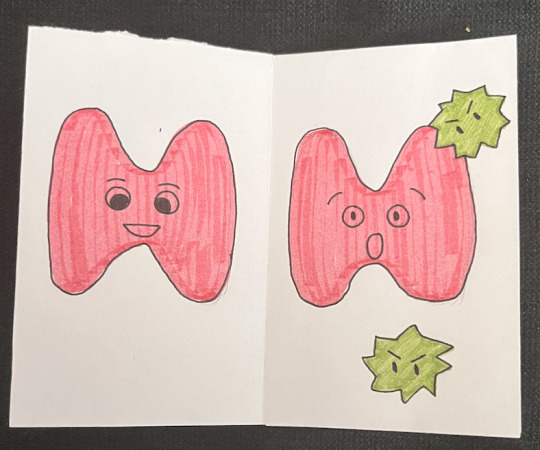
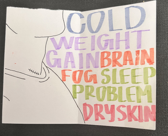
For my zine I wanted to create something personal to me. Last year I was diagnosed with thyroid cancer, but was able to receive treatment for it. Just recently I had some blood work done and my results showed that my tumor marker is going back up. This has frustrated me as I now have to go through an intense diet and more examinations and procedures. I thought this activity would be the perfect way for me to get out my frustration. I think I was pretty successful with my zine. I titled it “Not the Good Cancer” because every doctor I have met with referred to it as the “best cancer to get”, but that is not how I feel about it. I wanted to make my zine basic enough to get my point straight across. On the first two pages you see a happy thyroid and then a shocked thyroid with cancer cells attacking it. This represents exactly how I felt when I found out I had cancer. I also included a picture of a large visual lump in one’s throat, which is the only symptom I had. Next to it are the procedures I had to go through to get “rid” of the cancer, which were radioactive iodine and a total thyroidectomy. The next page shows a scar and a list of all the symptoms I experience since I now have no thyroid. I believe my zine works because it gets all my points straight across. My favorite aspect of it is the last page where the thyroid is dead and gone, but there is a small cancer cell saying “Or am I?”. I think this helps push my idea more as every cancer patient has to fear having the cancer come back even though they did everything they could to get rid of it. If I were to do this again I would add more symptoms to the zine. There are countless symptoms a person faces once their thyroid is removed and I want to be able to represent all of them. I think it would be fun to make a zine about memes. I think those would gain traction as they always go viral on social media.


0 notes
Text
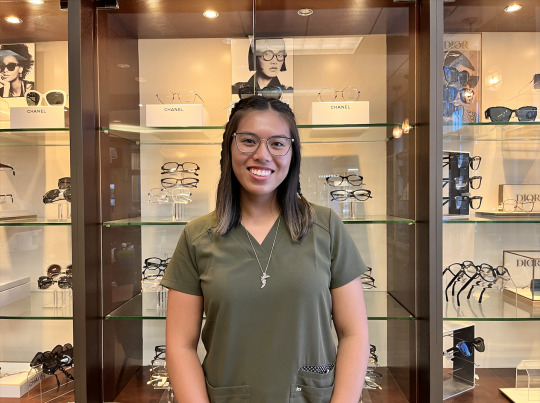
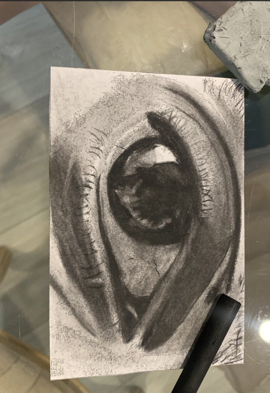
Wk 3 - Art & My Major
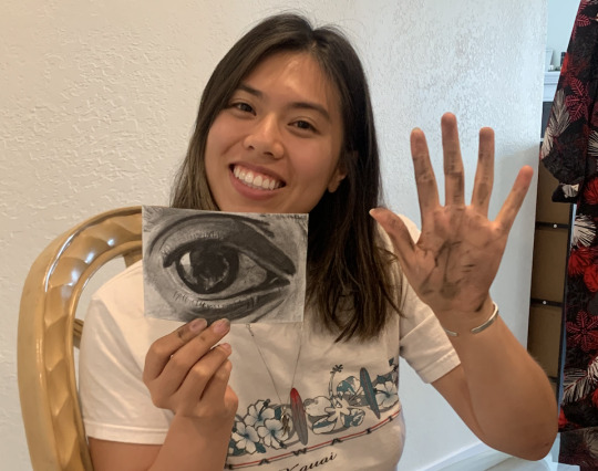
When I think of my major, I think of the application of science to different aspects of health such as medicine, nutrition, and humanity. As someone who is using my Health Science degree to get into an optometry program, my idea for this project is to do a charcoal drawing of an eye. The eye is arguably the most symbolic sensory organ. It allows us to see the beauty in the world and learn visually. They give us a glimpse into our health as changes in the eye can mean many things. For example, cataracts point to aging or jaundice points to liver failure. Eyes are also symbolized as the gateway to the soul. This idea connects to the humanities that we learn as a Health Science major.
Starting this project I decided to print a reference image. I wanted to make sure it would look as realistic as possible. I wanted to use charcoal as a medium because it was different from the usual pencil or paint. The charcoal allowed me to add depth and shade to the artwork that I would not be able to achieve as well with other mediums. When it came to researching, I watched a couple of videos on using charcoal for art. I wanted to make sure I used all of the right techniques for this project. Though I did have previous experience in high school using charcoal for one of my classes. The process overall went smoothly. I felt confident in my ability to finish it and have it turn out how I wanted it to look. I used to doodle realistic eyes in class, so I was fairly versed about the little details I needed to pay attention to. I would consider my project to be a success.
If I were to do this project again I think I would add some color to the iris. I would still use charcoal, but I would have to buy a specific charcoal pencil set. I think adding color to the eye would give the artwork a different meaning based on the color. For example, if I used blue I would get sad or lonely vibes. I think the field of health science can be enhanced with the use of art. Art allows us to convey so many different things in so many ways. For example, contemporary dance or abstract paintings can be used to interpret emotions of cancer patients. Art can also act as a learning tool when looking at biology and chemistry. Medical illustrators, such as Cynthia Turner, use art for biotech and pharmaceutical companies. There are so many forms of art that can be used to advance the field of Health Science.


0 notes