
Last Seen Blogs
jcbbby
Really Down Bad For Jamie Campbell Bower
sm-baby
🩷🌸How about a little makeover?✨💕

logansend
LOGAN

johnconnell0
John Connell

orangeartxolotl
main is @deepinthedirt
Text
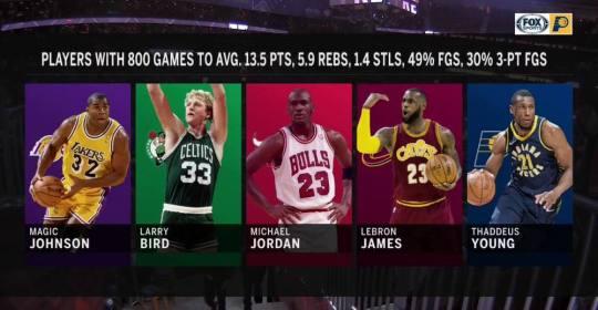
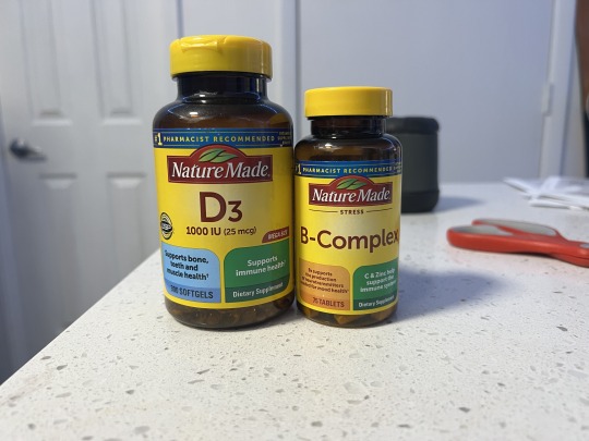
Image One: The underlying agenda shown here is trying to portray the player Thaddeus Young as one of the greatest players by cherry picking very specific data that he was able to acieve that other players who many considers the greatest achieved as well. This is clearly propoganda as the people who created this graphic are apart of the Fox sports broadcasting team for the team Thaddeus Young played for. To summarize, the team that Thaddeus Young played for put out a graphic that paints him to be one of the greatest of all time, even though the statistics shown are very specific and not indicitave of his whole career.
Image Two: I put two items from the same brand here to give my example a bit more visual context. Here I have vitamins from the Nature Made brand. The identity system that sets them apart from other brands is their dark colored bottles with a contrasting yellow lid and label. This is present on all of their products, and exists to set the brand apart from others, and to catch the eye of the viewer. The text is also quite consistent and easy to read. They make it quite large and directly in the center of the label, with adequate spacing around the name of the vitamin to ensure there is no confusion as to what vitamin it is.
0 notes
Text
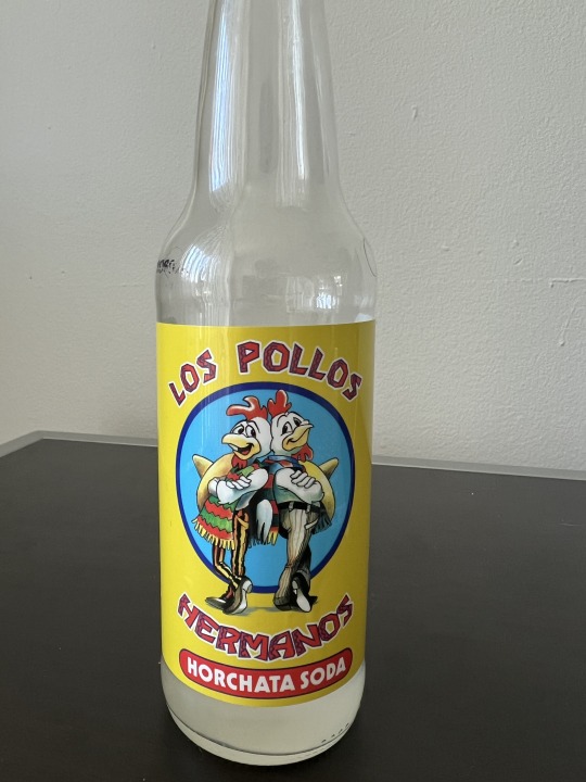
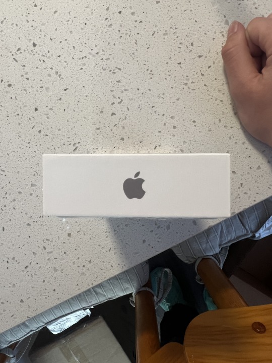
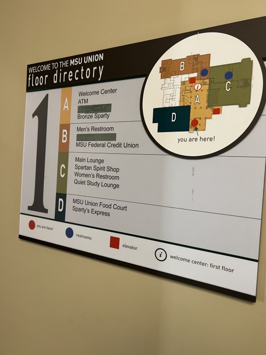
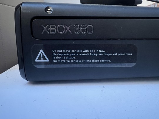
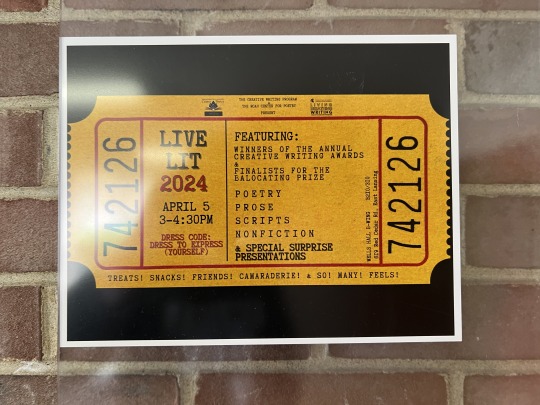
Image One, Denotative Meaning: The quite simple denotative meaning show on the glass bottle is the contextual descriptors shown on the bottle. There is the text that says, "Los Pollos Hermanos" Which means the chicken brothers in Spanish. There is an image that matches this text descriptor in between the words as well. Finally, there is the descriptor of what the product is, Horchata flavored soda.
Image One, Connotative Meaning: The complex connotative meaning on this piece of design is the background of the usage of the brand name, Los Pollos Hermanos. This drink is a themed drink based on the popular TV series, "Breaking Bad". Consumers who are fans of the show will also interpret the logo as signifying characters from the TV show. There is some more connotative messages unrelated to its TV show roots, such as the font in "Los Pollos Hermanos" typically being used in Hispanic culture.
Image Two: The iconic function in this image resides in the Apple logo. The Apple logo has become iconic in media as it represents innovation and high tech products that Apple as a company produces. If an individual sees the Apple logo, it is most often related to usability, simplicity, and trendiness. It has become so iconic that TV shows have made fictional parodies of the Apple logo such as the Pear Phone in 'Victorious'. This shows how iconic the simple bite out of an apple has become.
Image Three: The indexical function of this image is its utilization of shapes and their classifications for the purpose of assisting with wayfinding. For example, There is quite large blue circles that represent the locations of bathrooms in the building. Those are classified below the map to give context to the viewer. Also, utilizing a, 'You are here' mark allows for easier time navigating to these points of interest. For specially important information, such as the floor number, it uses quite large text. It also categorizes points of interest into letter categories and lists what attractions are in those areas.
Image Four: The symbolic function shown in this image is the triangle with an exclamation mark on the inside. This symbol is synonymous with 'Caution', or 'Warning'. Even though those two words are not mentioned on the design, it is implied that is what the design is intended for. That symbol is utilized worldwide for varying uses and is distinctly recognizable as a warning sign.
Image Five: This piece seems to be referencing a past style of classic movies or shows that would be seen in an old theater. I came to this thought process as the poster utilized the shape of an old ticket stub that is classically used in old theaters for upcoming shows. The typeface used also resembles fonts that were seen on typewriters or other various older printing styles.
0 notes
Text
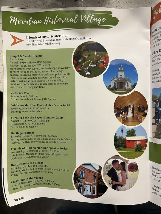
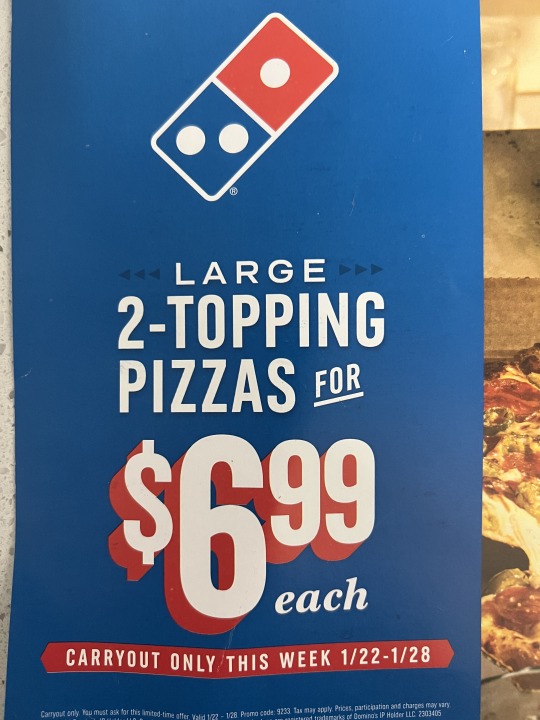
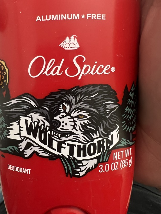
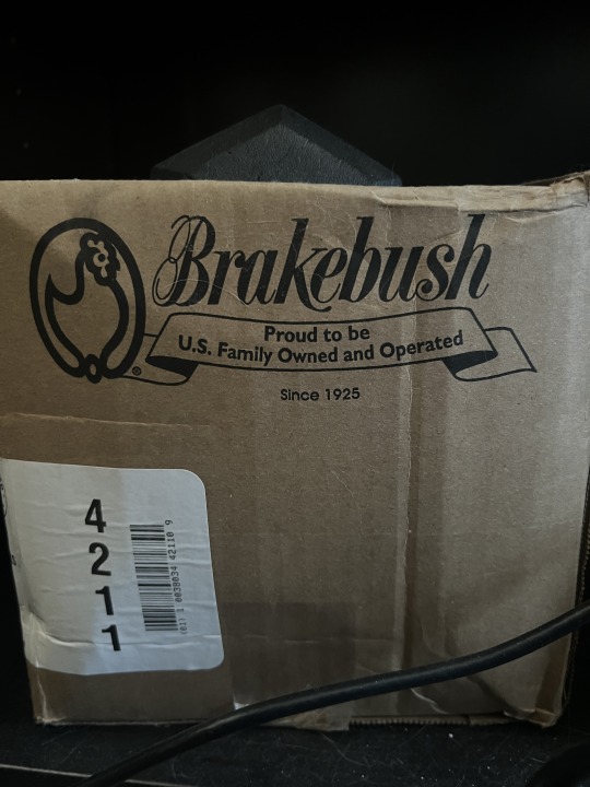
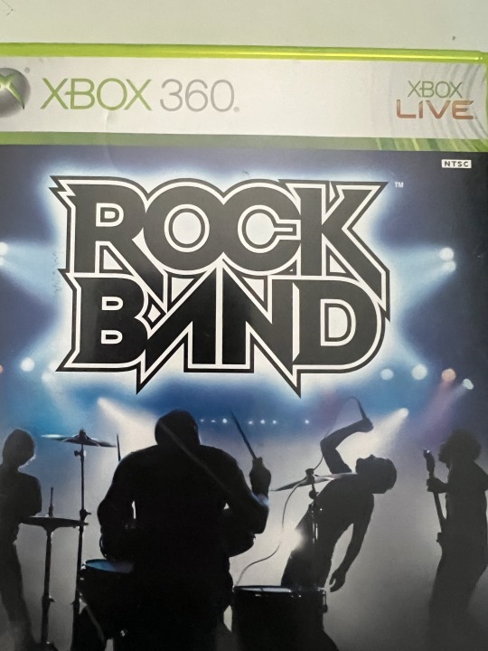
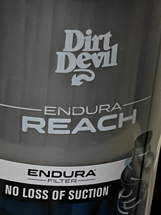
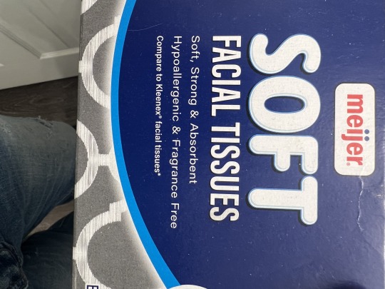

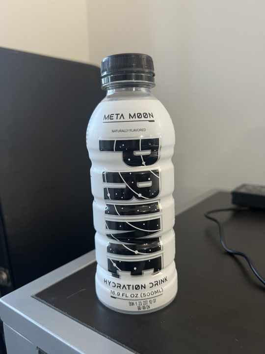
Image One: In the first image, there is rhythm in the publication as there is a repeated use of circles in an arc shape to guide the viewers eyes through the different bits of content shown.
Image Two: The image hierarchy shown here resides in different parts of the text portrayed larger than others, along with some getting a focal point with a different color. For example, the '6.99' is red and alone on its own line and takes up a large amount of visual weight to catch the attention of the viewer.
Image Three: The example of an ascender in this image is in the 'O' and the 'S' in the Old Spice logo, as they go above the line of lowercase text.
Image Four: The example of a descender in this image is the 'K' in the Brakebush logo, as it goes below the line of lower case letters.
Image Five: The example of a counter is shown in the 'O' and 'D' of the Rock Band logo as it is the space within the letter.
Image Six: The crossbar shown in this image reside in the 'H' in the word 'Reach'. The crossbar connects two strokes in a letter.
Image Seven: There is a large x-height in this image as the distance from the ascenders/descenders to the lowercase letters is quite small. This is seen in the text below 'Facial tissues'.
Image Eight: This image showcases a small x-height as some of the ascenders/descenders such as 'G' or 'R' extend quite far below, and contrast heavily with other letters.
Image Nine: The example of modernism shown in this logo is the abstract design of the logo above the text. It is abstract as it resembles the shape of a mountain but also features a trail that flows through it. By abstracting the design, it makes the piece more modernist.
Image Ten: The text shown that connotes another meaning besides the words that are portrayed is 'Meta Moon', and 'Hydration Drink'. The alternate feeling it is trying to instill in viewers is a sci-fi space feeling with the abstract shapes for some of the letters. This is done to follow the theming of the packaging.
0 notes
Text
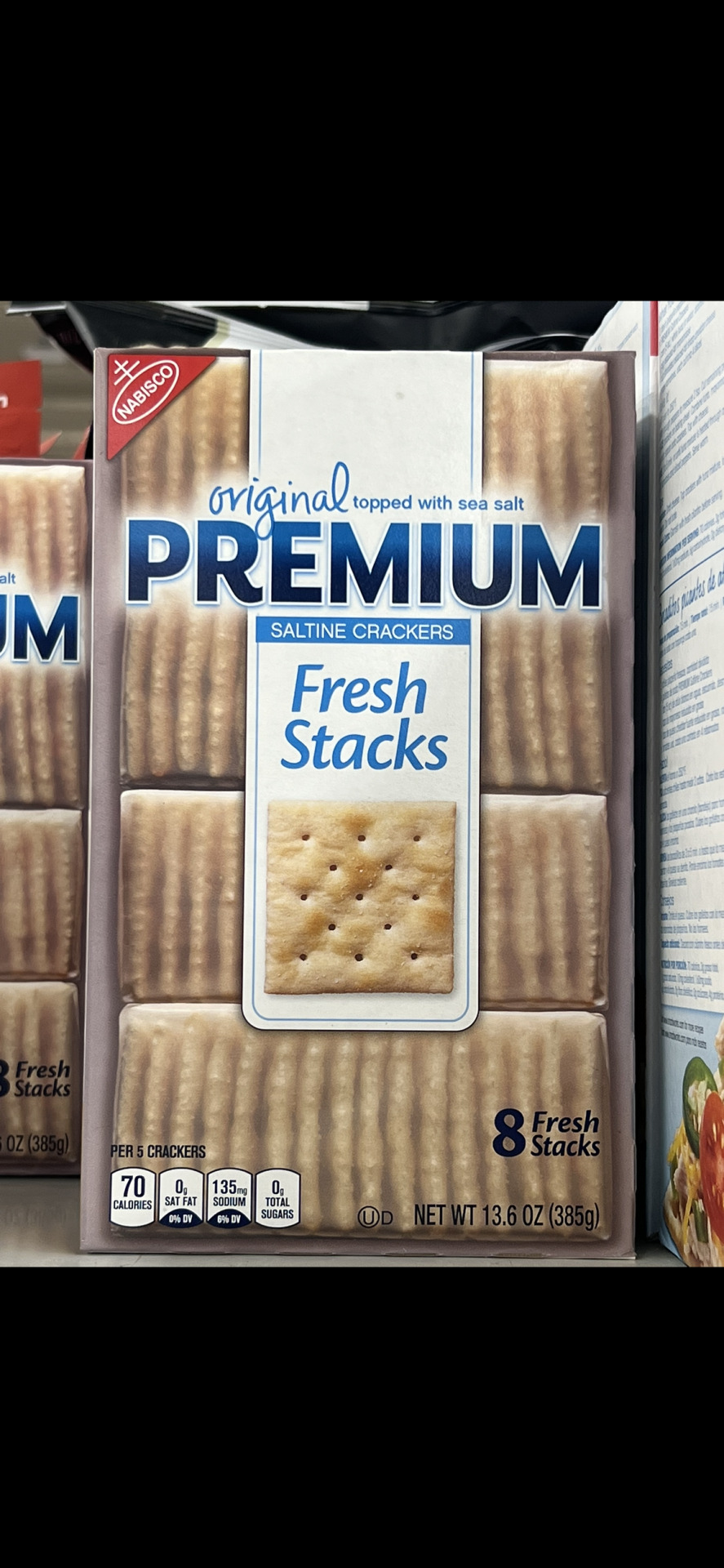
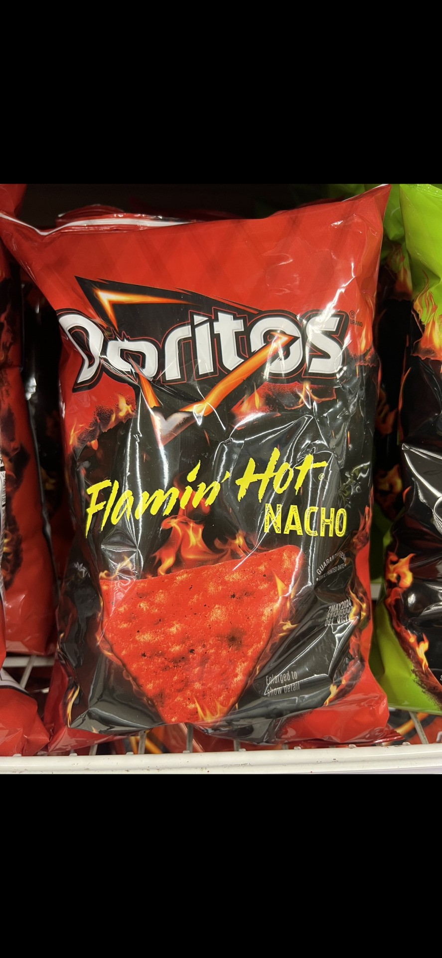
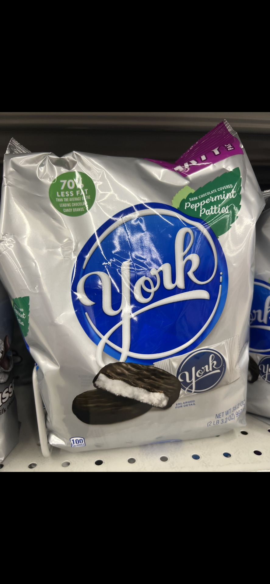
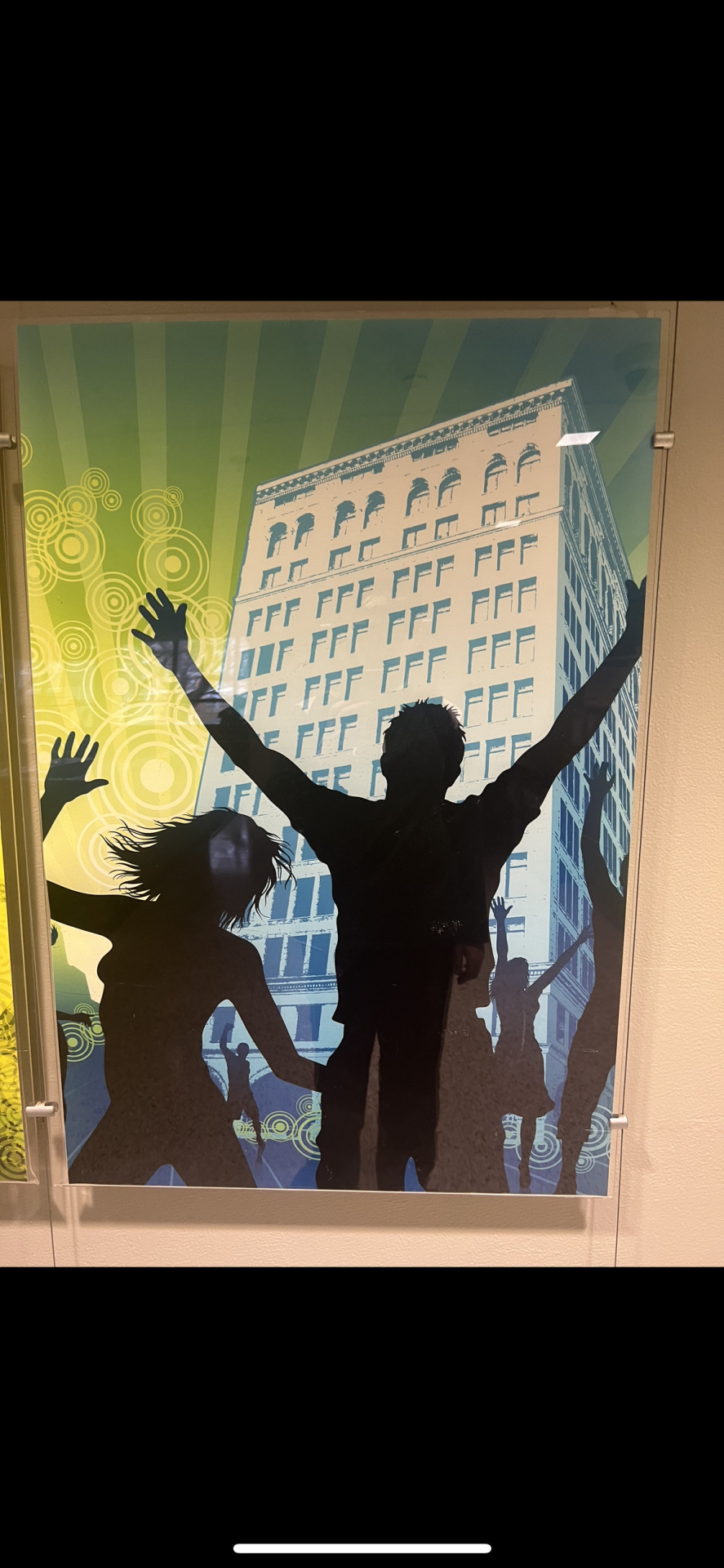
Image one: In this picture, the complementary colors used are Blue and yellow. The message likely attempting to be sent is a cheerful and personable message, which is why the yellow is used alongside a playful font. Also the blue gives a bit of a focal view to the logo of the product to promote the brand.
Image two: In this picture, yellows and reds are used for analogous color contrast. The yellows and reds are used to give the feeling of the desert or a bit more of an old western feel. Yellow and red have famously been used in restaurant and general food settings to promote hunger as well.
Image three: This picture using cool colors is attempting to portray simplicity. A saltine is quite a simple cracker, so using simple packaging is effective as to not seem gimmicky.
Image four: The item in this picture is using warm colors primarily as it is giving the impression of spiciness and fire. It is trying to present itself as containing a lot of heat, possibly excitement as well.
Image five: The image here contrasts blue and pink, two colors quite far away from each other on the color wheel. Through some research into the brand, I found that the goal of the business owner was to rebrand into something energetic and eye catching, which is why they use two heavily contrasted colors for the packaging.
Image six: The principal shown here is the gestalt principle of closure. The 'York' logo is surrounded by a circle that is not quite completed, but the human eye completes the circle. This gives the logo a flow that is quite satisfying to view.
Image seven: The image shown has an active figure-ground relationship as it shows silhouetted figures contrasted against a colorful background. This is done to feature the poses/emotions the figures are presenting that could be lost in a piece that does not have as drastic of a contrast.
Image eight: The image shown utilizes history in its design by showcasing the original building the business started in on the logo. By doing this, it gives the impression the business is quite humble and has not forgot its own roots. This in turn will strengthen customer loyalty as people like to support businesses that seem modest and true to its self.
0 notes
Text
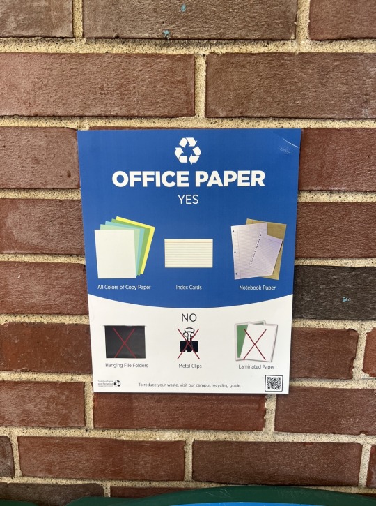
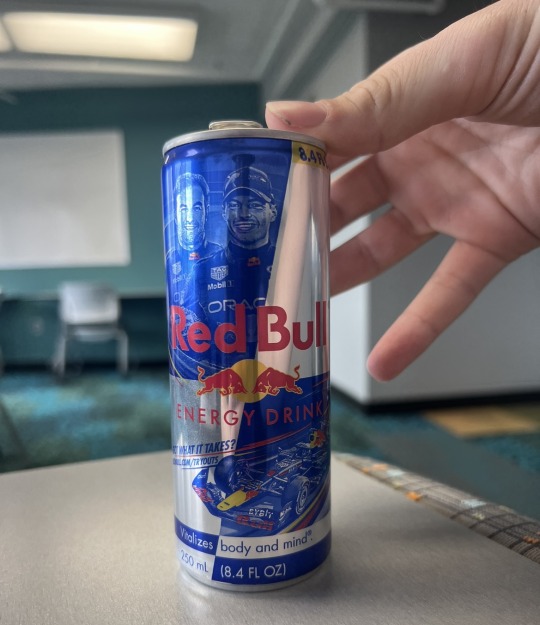
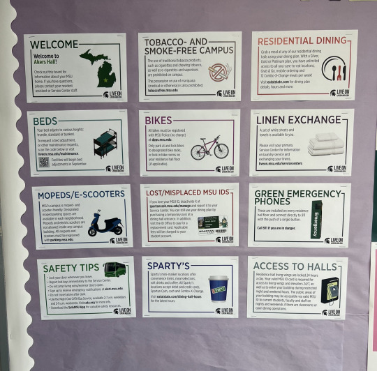
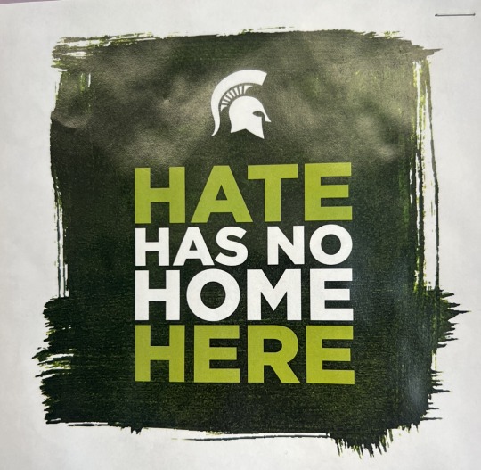
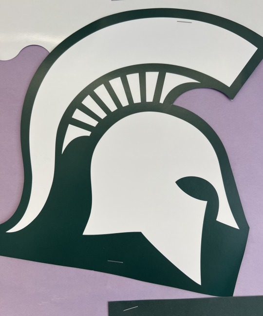
Image One: The contrast shown here in an informational poster regarding what items are able to be recycled lies in the sizing of the specific items. More specifically, the items that are encouraged to be recycled in this place are larger compared to the items that are not allowed.
Image Two: The contrast shown on this Red Bull can resides in the repetition of the skewed squares that is focalized by the Red Bull logo. This is done to give the impression of a checkered flag as the can design features F1 vehicles and race car drivers, which are synonomous with racing and checkered flags.
Image Three: The contrast shown here is the repetition of the grid layout with equal spacing of the common helpful info students may need. There is also repetition shown with the 'LiveOn' logo being present in the bottom right corner of each picture. Within the pictures themselves, there is sizing contrast as well. This is shown with the general concepts such as 'Sparty's' being larger than the explanatory text to effectively clarify what each image is speaking about.
Image Four: There is textured contrast shown here, with the flat colored, bolded letters contrasted against a rough paint stroke background. This is done to come across as serious and gruff, implying that the strength of the community does not tolerate hateful individuals.
Image Five: Shown here is the MSU logo, and what I noticed as aesthetically pleasing was the equal space between each one of the four sided shapes that separates the plume of the helmet and the helmet itself. The end pieces also seem to go with the curve of the plume to keep a consistent visual weight even though they are different sizes compared to the others.
0 notes
Text
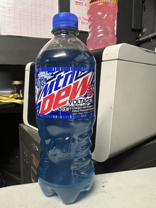
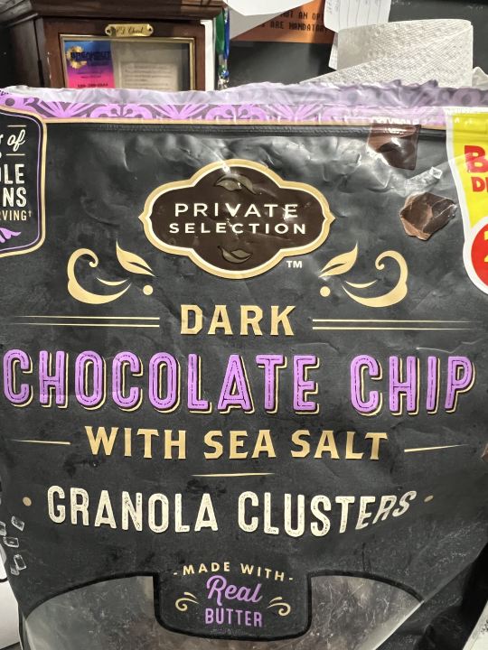
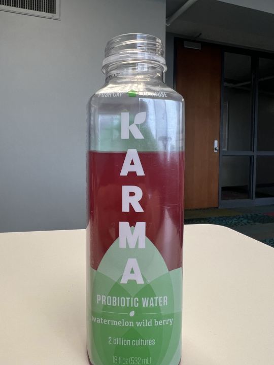
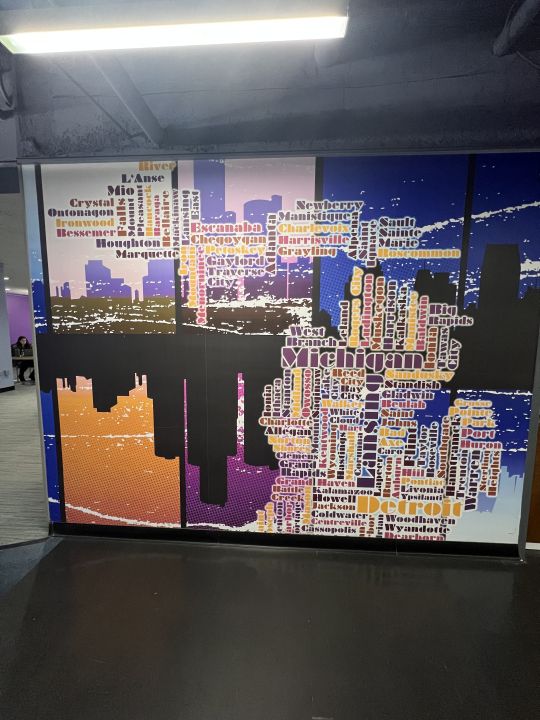
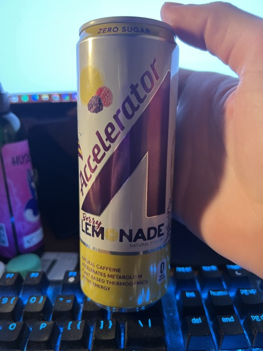
Image One: In the first image, we have a bottle of Mtn Dew Voltage. The graphic design shown in the logo where it says voltage shows sharp edges reminiscent of lightning or electricity. Sharp diagonal edges also are used in the font of the text, along with bold lettering to give a electric feel.
Image Two: The graphic design in this image is shown in the flowing lines of the logo to give off elegant and luxury energies to fit the brand name of, "Private Selection". It also uses flowing lines reminiscent of Art Deco design which is commonly used in high luxury applications.
Image Three: In this image, part of the logo of Karma is the spreading leaf at the bottom to give the message of health, as greenery and plants on packaging is used to insinuate a natural or healthy product. Another fun fact is once the flavor is added in, the liquid turns red and the contrast between the green logo and the red liquid signifies a watermelon's colors.
Image Four: In this image, the cities of Michigan are sized and placed in their general geographic locations to create the shape of the state of Michigan.
Image Five: As mentioned prior, sharp diagonal lines signify movement which is characteristic of the message energy drinks want to show. Another very interesting detail about the image is the main logo is shaped like a car gas pedal which is where the name, "Accelerator" fits. It also looks like an abstract version of a capital A.
1 note
·
View note