Last Seen Blogs

miltonexcutivecars
MILTON EXECUTIVE CARS


paradiseskintagremover
Paradise Skin Tag Remover

acomaflove
ACOTAR SERIES OBSESSION

dvviight
dwight k. schrute
Text
how red and green should be seen
http://blog.frieze.com/interview-william-e.-jones/
0 notes
Text
Dots
Dots. I have chosen to make these a feature within my work. For me they are referencing their use by other artist, but also a magnification of the medium I am working with.
Three of the main artist I have noticed that have enrolled dots into there visual language, Roy Lichtenstein, Yayoi Kusama and Damien Hirst. Each of these artists has used dots in very different styles yet each immerses their work with them.
Lichtenstein’s paintings use the ben-day dots of the print making methods of the time. These small dots create the illusion of tone within printed images. He recreates this meticulously in his paintings. Purposely leaving his image with no trace of an artist hand having been present, yet still they are hand created paintings. His exploration over his career as an artist in later works they form sculpture made of the same visual language.
For Kusama it’s the never-ending, repeating pattern. The dots engulf any surface she approaches. She links that pack to her personal life of mental illness. Seeing patterns repeat them selves. She explores this through her art. Her dots take form on canvas and spherical sculptures. Both are explorations in the space they occupy.
Hirst’s uses of dots are most famous in his continuous spot paintings. He started these as a endless series of work. A task with no completion or end. There are two simple rules within the series. Each spot is the same size, and the distance between each spot is the same as the spot. For me I feel his work with spots started out as a brave and strange new form of painting, but have no become relevant and background. This was epitomised in his Tate retrospective, each room seemed to have spot painting lining the rooms like wall paper.
0 notes
Text
research article
http://www.vam.ac.uk/content/articles/p/prints-21st-century/
0 notes
Text
Notes on Leaf
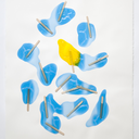
The Leaf
The leaf has become a foundation symbol within my work. I have be come obsessive over it use. It is in my drawings, t-shirts, screen prints and digital piece. With commissions for table clothes and curtain to follow soon.
It originated from a photo of Henri Matisse’s studio. In the middle of the frame stood a large Monstera deliciosa plant (also known as a Swiss cheese plant). I was drawn to the shape of the leaves, form which I started to sketch. From ten or so images I chose the two shapes that I liked the best. But shortly this just became one.

Henri Matisse's studio, hotel Regina, Nice, 1948
Its constant repetition is down to my process of creating stencils to draw from. After originally sketching and tweaking I drew a neat copy on tracing paper. This was cut out and drawn around on to thin sheet plastic (no thinner than paper). Once I had it on this it could be drawn again and again. Inverted scanned in and enlarged. Used within digital programs such as photoshop, illustrator and InDesign. I feel this stems from a lecture in first year by Michel Craig Martin. He spoke about only having one of each object. The same coffee table is used for everything, there is no need for variation in the drawing only in the colours and size. His archetype approach to documenting objects has stuck with me. I’m not sure why, but I know I like it and it feels right.
0 notes
Text
research article
kitsch- "art, objects or design considered to be in poor taste because of excessive garishness or sentimentality, but sometimes appreciated in an ironic or knowing way"
as this article describes, this does seem a very submissive word. and relevant to my own practice. in conversation with friends and family this has been used to describe my work, and i word i have used to describe other work.
http://www.guardian.co.uk/artanddesign/jonathanjonesblog/2013/jan/28/kitsch-art-love-loathe-jonathan-jones
0 notes
Text
very intresting ending statement. but one i think is ture
http://www.guardian.co.uk/artanddesign/jonathanjonesblog/2013/may/30/modern-art-how-subversive-is-it
0 notes
Text
Sigmar Polke
The works of the German artist Sigmar Polke plays with the ideas of print through paint. His work mixes abstract marks with highly detailed density bot styled marks.
From a far these marks look photographic, yet as you view them closer they transform to a much more abstract shape.
The contrast in his content I what really draws me to these pieces. They have a strange collective mix. We look at background patterns that resemble wallpaper you would rather remove, on top of this sits strange images. Tension is created by the titles.
I Don’t Really Think About Anything Too Much 2002
This painting above has a sense of menace, the idea of this character not really thinking too much as they hold a gun. The narrative is left open. Nothing tells us that the image and the title are even related, we assume and they are placed together.
his work carry a strange sense of vintage or retro culture. the combination of old photography and dated fabric patterns strengthen this idea. the use of fabric rather than plan canvas is refreshing. adding another layer to the image
this multiple build up of layer, images on top of pattern is what i wish to introduce into my drawings. rather than just the image on the page, i want the paper around it to be involved as well.
Me and My Buddies Would Vote for You 2002
0 notes
Text
Greg Eason
Greg’s work is very minimal pencil drawings. They have an incredibly odd sense of space. The drawing its self takes up very little of the page, yet fills the composition. Other works have more surface covered but still with the same near photographic use of detail.
Monolith 2009 Pencil on paper. 16 x 20"
Skull 2010 Pencil on paper. 8 x 8"
His work “skull” is the one that most interreges me. It plays with the theme of death. The skull is alone in a void space; perhaps an atheist’s view of death, or the skull can be seen to be forgotten. As if death is just throw away if you believe in a further spiritual place. Another angle to this could be the comment on popular culture. Many fashion out let have used the skull as a motif and design element. A very notable example would be the extensive use by designer Alexander McQueen. Their designs now hold (post his death in February 2010) a strange courting relationship with the subject. After the death of the main designer can the use of skulls been seen as just an aesthetic motif or do they now stand as a memento mori.
I also feel it plays of Damien Hirst Diamond skull For the love of God, which is an object of pure value. The image comes to mind when I view this drawing. I fee the drawing is more real, and something I can relate to. Hirst skull is covered with objects that scream affluence, lavish life style, decadence and wealth. From this I as the viewer am left separated from it, and it becomes an object out of my reach.
0 notes
Text
Alan Herbert
The series of his work I have been drawn to is called “the body”. It is composed of his photos of various figures overlaid with anatomical drawings. Created by transferring tracings to acetate then exposing them over his photos (creating a photogram)
I like the fading of the drawing and its slight mismatch to the figure. They tracing is not a complete image, its only looms over part of the image like a ghostly mark. I also like how it fades graciously where it stops. The mismatching is more visible in the top image of the hand. It reminds me of when screenprinting and having terrible alignment, yet strangely a new image is created in that chance slip of the layers, I feel the same is also happening here. A completely perfect overlay would not have the same appeal to myself.
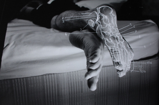
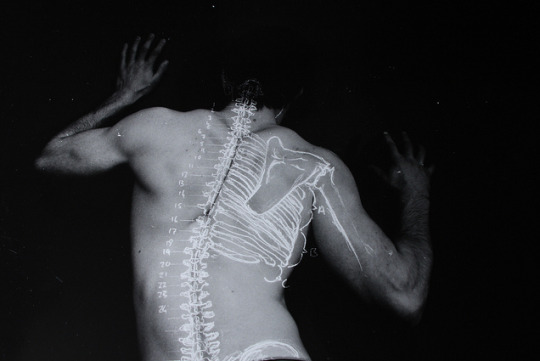
Another detail to these images I find of interest is a phantom numbering/annotation system. Parts are label with numbers and letters, yet there is no key to decipher what these mean or stand for.
They create a false sense of authority in the image. These marks look like they have been added meaningfully, they are not just random they are placed with intent. Yet we are kept blind to this intent.
With this in mind questions to how have I come to see this image but not the accompanying annotation arise and start creating infinite backstory’s?
They also have a nice contrast of tone; the deep engulfing black background creeping over the figure. In the top image there is a nice grainy section reminiscent to the black and white film of Fritz Lang. The whites of the flesh have a nice glow to it.
1 note
·
View note
Text
Jeff Koons
Jeff Koon’s Paintings
Olive Oil 2003
Oil on canvas
Jeff Koons’s paintings are a very interesting side to his work. Unlike his sculpture, which normally consist of few or singular topics or objects his paintings they carry multiple referencing. Through photo collage and Photoshop manipulation strange and varying complex narratives are created. Both by the images presented on the canvas and the mix of the connotations they hold.
In Olive Oil the use of supper man is played against the words “puff”. One is considers to be super in every aspect and action the other is a slight or feeble gesture, thus directly contrasting super man and the line (which would indicated to large amounts of force) coming out of his mouth.
Hook 2003
Oil on canvas
The process to which these images are created is very interesting to my practice and me. Koons collects large amounts of images constantly, places them together in Photoshop. Then starts to remove parts of each image and alter their appearance. This opens up the composition from a stack of images (or layers) to a strange optical view where perspective is dis-considered, content is not all there, and a sense that the images are melting or moulding into one another
Each piece of the final printed out image is cut up and given to a member of his very large team of technicians, who colour match and enlarge each part into a painting. To give a sense of scale the image above (Hook) is 259.1 x 350.5 cm. this large scale create a impressive and immersive feel to the viewer and allows for multiple parts of the painting to be worked on at once.
The selective editing of the wide rang of appropriated images creates strange associations. The uneasy relation between the heavy use of children’s inflatables against the bejewelled underwear with the two chain like a detached leg, draws on the darker connotations of sexual fetishes or youth wanting the adult life style and its unknown undersides. All this is floated on a mix of snippets of images (possible photos) wire fences and a fake sea/bubbles texture to which offer no confirmation to any narrative or theme.
Popeye 2003
Oil on canvas
Popeye I find the most interesting painting in one of the more resent exhibition at Gagosian gallery. Firstly the elements of the composition, they are all very signature to Koons work (many have been used in previous works). A sense of familiarity with subjects and components of this painting make it visually appealing (at least some parts) to every body, nothing in this image is excluding to the viewer.
The nicest detail in the painting is viewable on how Popeye has been painted. He is a enlarged piece of comic book, yet Koons has chosen to keep him as an object by keeping the density dots and the miss-aligned colours in the hat. In doing this he keeps his source of reference true. He has only produced an exact enlargement not altered the object. Thus showing a very small detail we probably would have missed in viewing the original.
1 note
·
View note