Last Seen Blogs


Photo
Final submission and rationale:
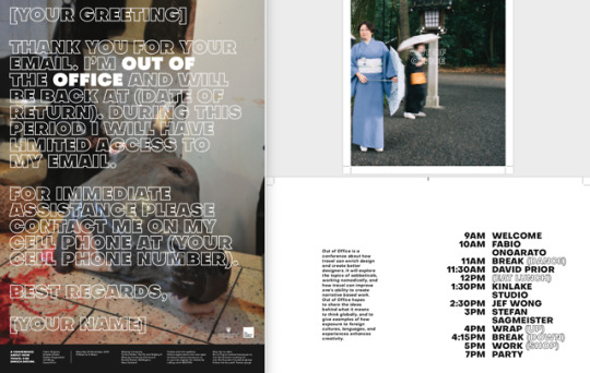
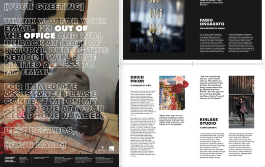
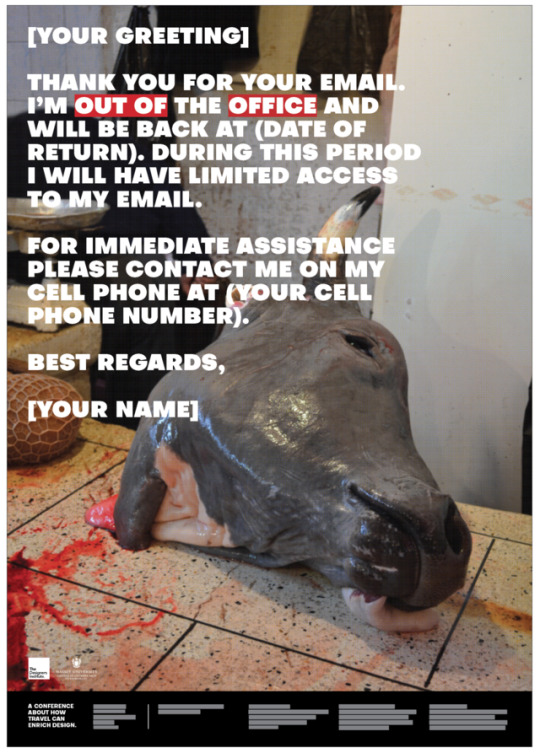
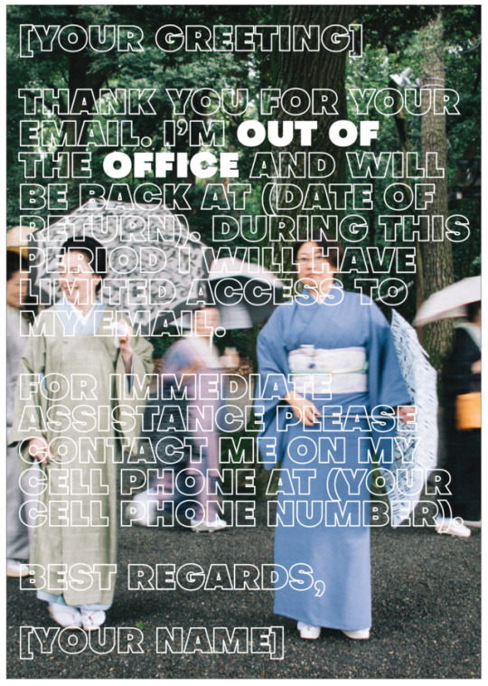
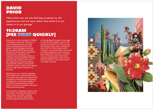
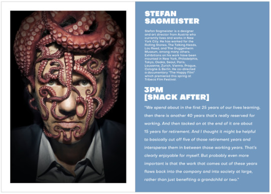
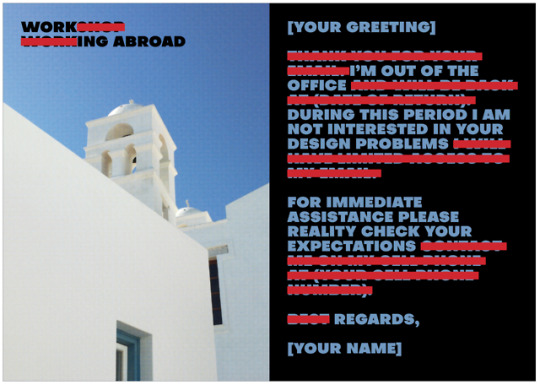
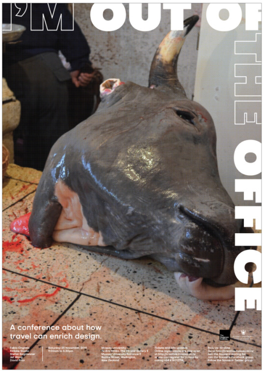
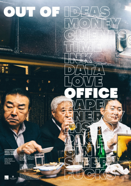
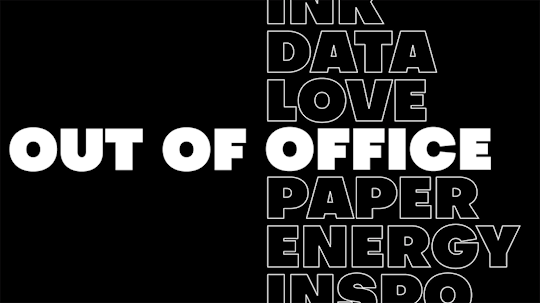
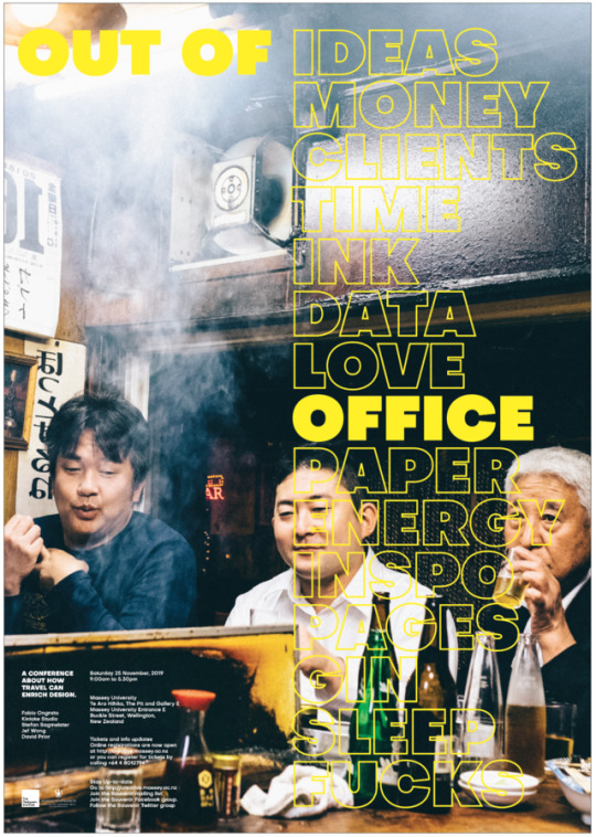
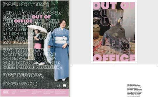
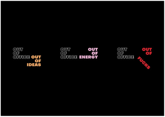
Out of Office encourages designers to travel. It emphasises that exposure to different cultures and thinking more globally makes better designers.
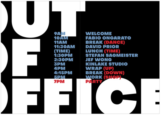
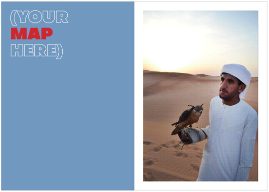
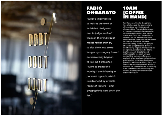
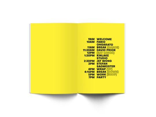
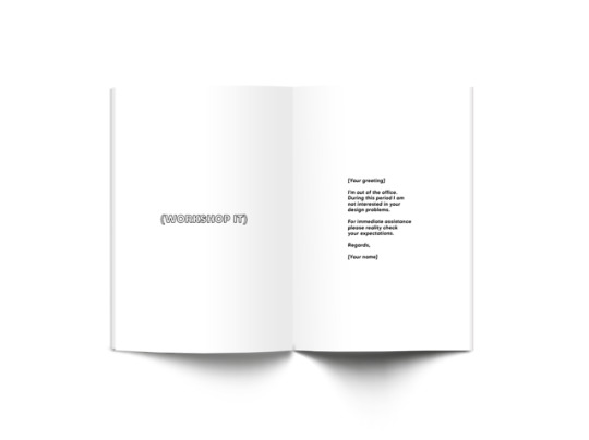
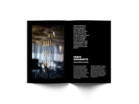
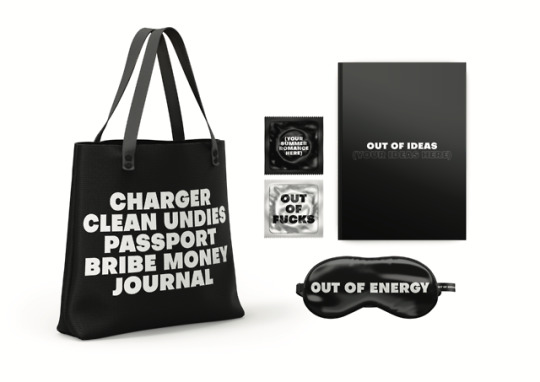
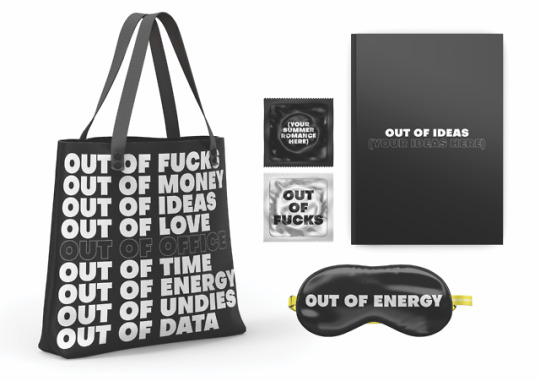
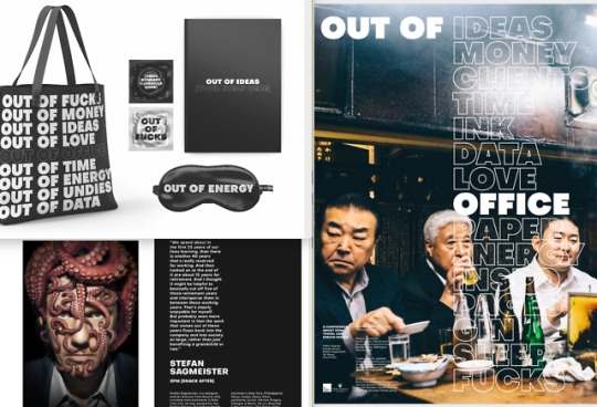
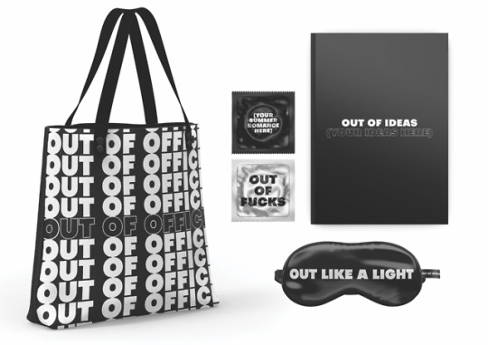
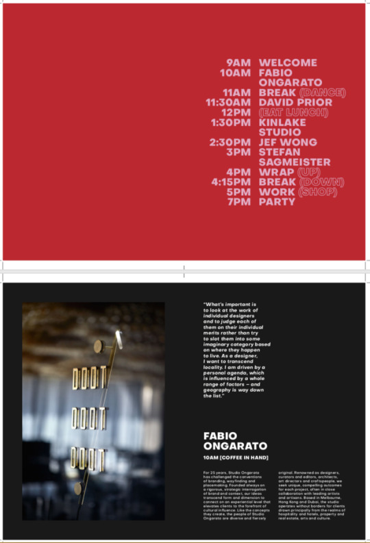
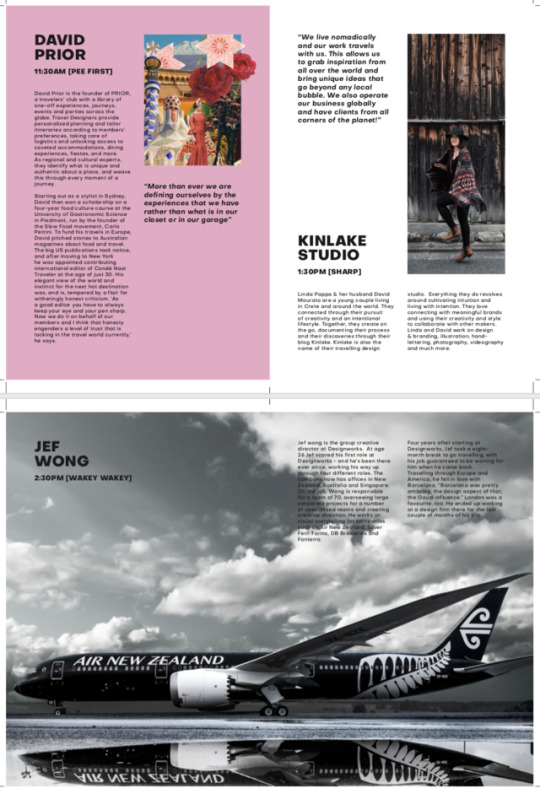
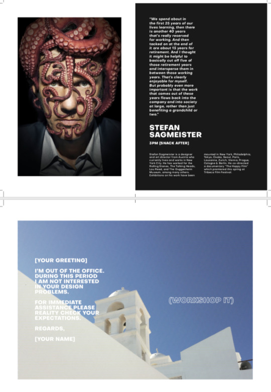
The title of my conference influenced the three touchpoints. The poster lists what designers might run ‘out of’ before deciding to travel and depicts a travel scene. The brochure uses an out of office template as the cover. The use of brackets from the template continues throughout the brochure. The third touchpoint is a bag for use during travel which features a joke template of what not to forget. The other items are useful travel items linked again to things designers run ‘out of’.
The bold text, and restriction to black and white, gives the touchpoints an unapologetic tongue-in-cheek feel. It should make designers think ‘fuck it’ and book a one way ticket somewhere!
I did a lot of iterations in this project. They pushed me to constantly refine.
0 notes
Photo
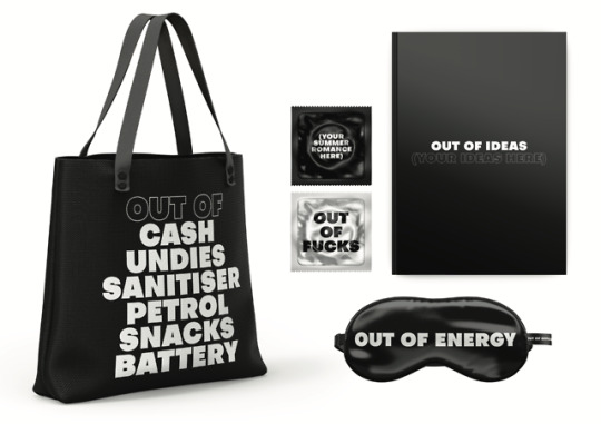
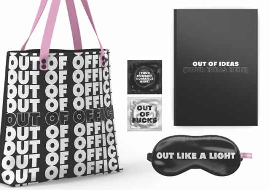
Three bag options - I like the bottom one best as it is bold, funny and simple. I think the top one looks a bit too busy and the middle one may make people not want to travel (hah!).
0 notes
Photo
This is a still of the gif I created to use as a projection at the conference. Probably in the lecture theatre on the screen in between talks. It could also be used in promotional material - such as on instagram. If I continued with this project and created a website I would likely use this there too.
0 notes
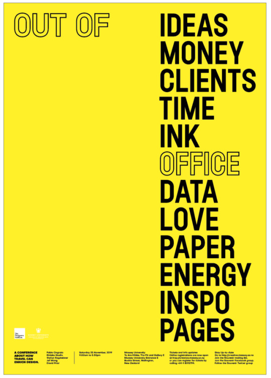
Photo
Trialling introducing a touch of yellow as there is one yellow spread in my brochure. I don’t really think the yellow adds anything to the concept or aesthetic - if anything it might just be trying a bit too hard to get your attention...
0 notes
Photo
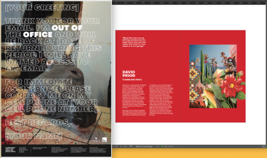
Trying another image in the poster. I think this one works much better because the text is still legible, it shows a travel scene and the colour palette is complementary to the rest of my touch points (ie. dark).
0 notes
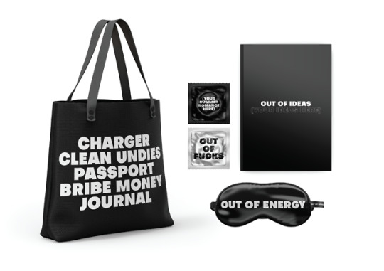
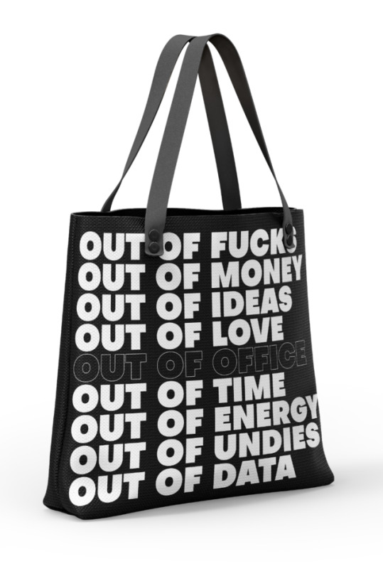
Photo


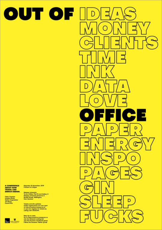
Spanner in the works. After making the bag yesterday I felt like the copyrighting was so good I wanted to try a poster of it... Too late to change all my touchpoints?!!!?
I’m using just a simple yellow background here in order to determine layout and figure out what the poster is saying. The yellow could work for a final too as it doesn't distract from what the poster is saying.
0 notes
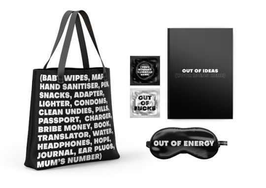
Photo

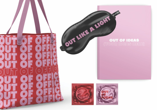
Mock ups! Third touchpoint. I think I like the all black and white best... Meaning I may reduce my use of pink in the other touch points - for the sake of continuity. I associate the red and pink too much with love / romance / sex to use in these objects.
0 notes
Photo
Third touchpoint typography trial.
1 x sleep mask
1 x travel journal
1 x vodka bottle / condom
Souvenirs!
0 notes