im-a-tired
I’m-a-tired
They/Them | Ao3 is AmazingAroAce
27861 posts
Don't wanna be here? Send us removal request.
Last Seen Blogs

semibreve-s
Semibreve-s

arghawp-blog
agerr
waterscreen
Don't stop until my head is clear

justcallmemaria2
Just call me maria

waytogomc17
Untitled
Photo
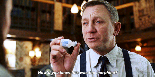
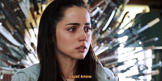
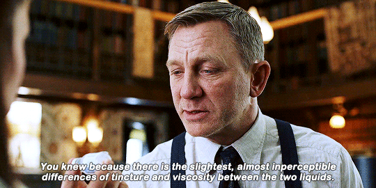
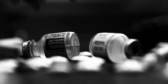
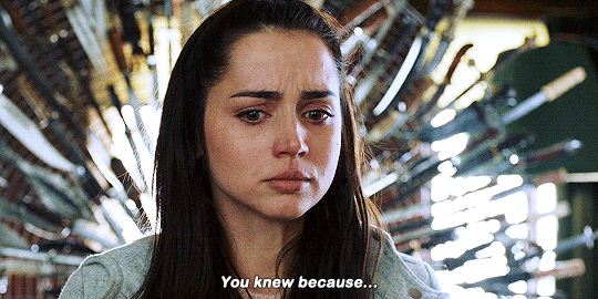
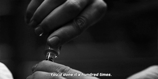
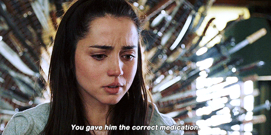
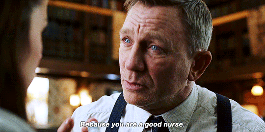
— If the meds were switched, then when I got them mixed up, I… I accidentally switched them back, so… I gave Harlan…
— The correct doses, yes. But not accidentally.
KNIVES OUT (2019) dir. Rian Johnson
148K notes
·
View notes
Text
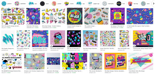
Everyone gets “The 90s” look wrong so let’s fix it
If you weren’t here for part one, lemme sum it up real fast:

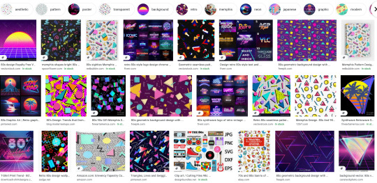
Okay, all up to speed? We’re being served 80s throwback stuff with the serial numbers scratched off, re-labeled as yo totally 90s. What we’ve got now isn’t completely wrong, but I’m telling you, there’s so much gold left unmined.
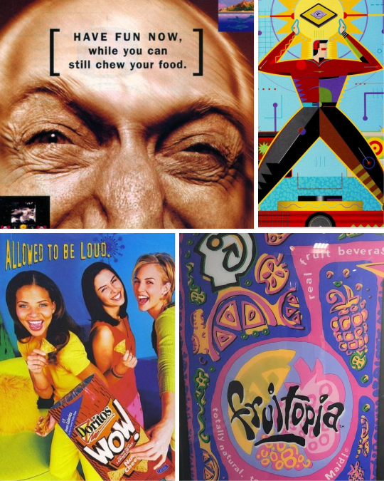
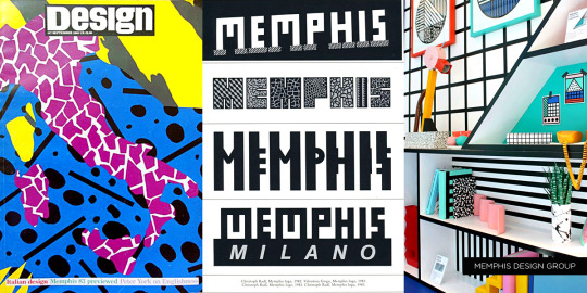
As we saw in part one with Memphis Milano, these things get messy. Trends don’t start and end neatly every ten years. The first wave of 90s throwback attempts focused on the early part of the decade, and nobody since really pushed to represent the other seven years. Well, if you really wanna do something, I guess you gotta do it yourself.
I have suggestions. Get your flannel ready, we’ve got a lot of ground to cover.

Analog Grunge
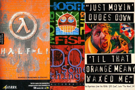
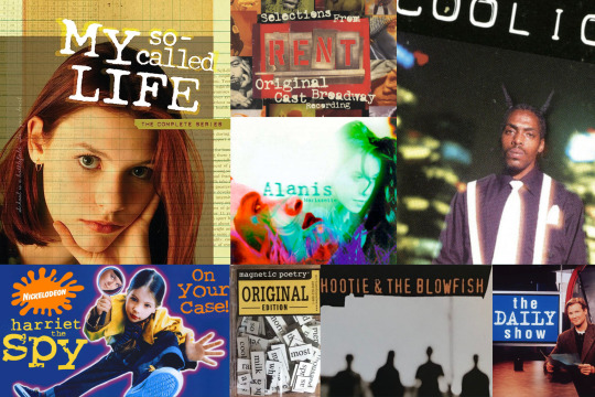
SURRRRRRRGE or uh, Grunge, is probably the look that defines the decade best. The big kickoff point here is Nirvana - after a shiny pop-dominated music scene in the 80s, Nevermind was like a breath of fresh smog.
Your design has to look like it survived a nuclear blast, then was run over by your parents’ Buick a couple of times.
Rust. Dirt. Scuffs and scrapes. Signs of distress.
Handwritten or scribbled illustrations.
Low-rent aesthetics. Torn paper shapes, label maker or typewriter fonts.
If there’s a Comic Sans for the 90s, it’s “distressed typewriter font.” Seriously, it’s mandatory. When I pulled images for this post I could not escape typewriter fonts. I don’t think you couldn’t call yourself a respectable designer without it. Just look at how much mileage old-timey typewriters and label makers got:
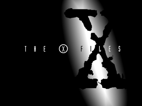
Hell, it’s the giant X in The X Files!
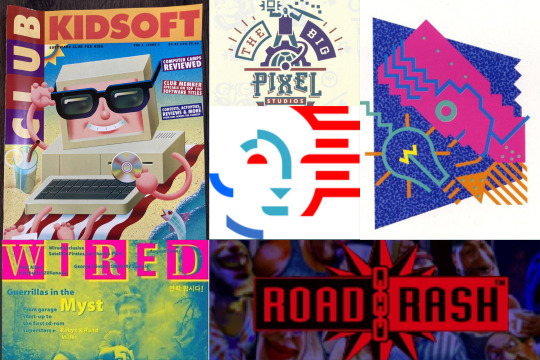
I think another component to Grunge is sort of an anti-digital, pro-analog message. My pet theory is home computers went from being a semi-common novelty in 1990 to an essential gotta-have-it purchase in every American home by ‘99. Desktop publishing apps made it almost too easy to make pixel-perfect, clean, uniform designs. Digital photography and scanners meant you could now publish full color photographs with ease.
But digital perfection is the enemy of Grunge. Analog means authenticity.
So you had a whole gaggle of designers running in the other direction. Sure you could use a computer, but your work absolutely had to look like it didn’t come from one. As much as possible, incorporate hand-drawn artwork, scribbles, dust and splotches. Write text with chicken scratch if you have to. As much as you could make your multimillion dollar ad campaign look like it came from the margins of some high schoolers’ math homework, the better.
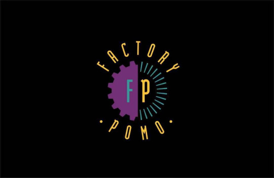
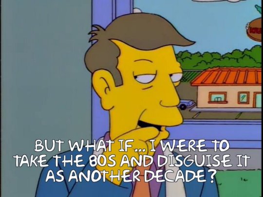
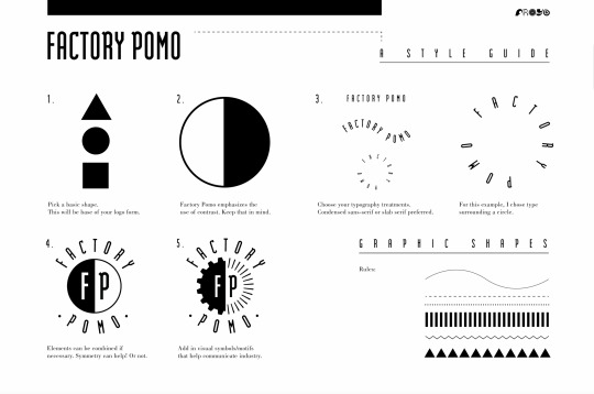
Factory Pomo
Not everyone was running away from digital, though. Many designers were embracing computer apps - and I think that’s where Factory Pomo first came into being. Coined by designer Froyo Tam (that’s their logo up above!) Factory Pomo is one of those things that once you see an example, you can’t stop seeing it.
Strong, basic geometric primitives with inverted, contrasting colors
Tall typography
Art Deco style rivets and spikes
Want your logo to look futuristic and modern? Stick it in a circle and put some triangles around. Invert half the colors, then another half.
Max Krieger has a great writeup on the probable inflection point: Tomorrowland. As the story goes, Tomorrowland at Disney - the part of the park meant to look like it’s from the future - would very quickly look very outdated each time they tried to update it. Instead, in 1994 they decided to own being outdated. They came up with a ridiculously fun “timeless” futuristic look, mixing industrial design with Jules Verne. Factory Pomo’s signature was all over the blueprints.

The look quickly escaped the theme park and was especially prevalent in the booming mid 90s home computer market. It’s the Packard Bell cyborg, it’s the logo in Video Toaster. If you caught that The X Files logo earlier is both Factory Pomo with the tall type and X in a ring AND Grunge with the typewriter X in the background, you win 5 bonus Pogs.


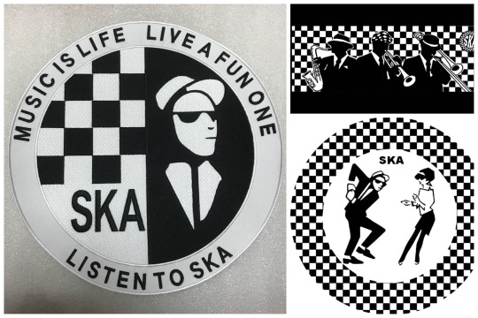
And it’s a stretch, but one could draw a line between Factory Pomo’s inverted black and whites and the Ska movement’s two-tone checkerboards. Maybe. Possibly. I’d have to call Tony Hawk to double check.
Back to Froyo Tam for a second, but that bit about them coining the term? That was in 2017. “Factory Pomo” didn’t have a name for like… 25 years. How’s that possible, you may wonder? Weren’t designers following a defined style? Well, yes and no. I think people were designing stuff to look a certain way, but it’s less a game of “this is what the aesthetic looks like” and more like a game of telephone.
If you do an architecture tour in a major city, you’ll learn that every building and skyscraper is classified to a specific architectural movement. Every building that is but ones built in the last 20-30 years. Newer buildings have to wait a few decades for official classification. Historians need time and perspective to figure out what emerging trends in architecture are going on, whose work influenced who, that sort of thing.
Designing a logo for Slim Jims or Cherry Coke takes considerably less time than constructing a skyscraper, but I think the same principle holds true. It’s really difficult to tell what’s a trend and what’s a fad when you’re living in the moment. I couldn’t tell you what’s the defining aesthetic for the 2020s right now. It’ll be obvious in 2053, but right now, no clue.
Enough time has passed between the nineties and today that we can pick this stuff apart easily. Maybe if you’re lucky, you can be the first to classify these design movements, too.
Working on a part three! I’ll look into a few other trends and address the big question– Is the Y2K aesthetic actually a 90s thing? More to come.
*A ton of these examples above are from the CARI Institute, which you should totally check out, they’ve been cataloging this stuff for years.
47K notes
·
View notes
Text
Everyone gets “The 90s” look wrong and I hate it
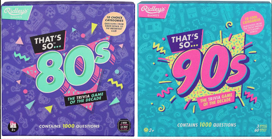
Couple years ago I saw these two board games at the store back to back. Well, not saw them per se, but ya know. Spied them out of the corner of my eye. And for a moment without reading the text, I couldn’t tell you which was which decade at first. Funny. Either they were in a rush to get these out the door or they wanted their throwback trivia game boxes to look uniform. I didn’t think too much of it.
Only, from then on I started seeing it MORE. Every time someone markets a 90s or 80s throwback…
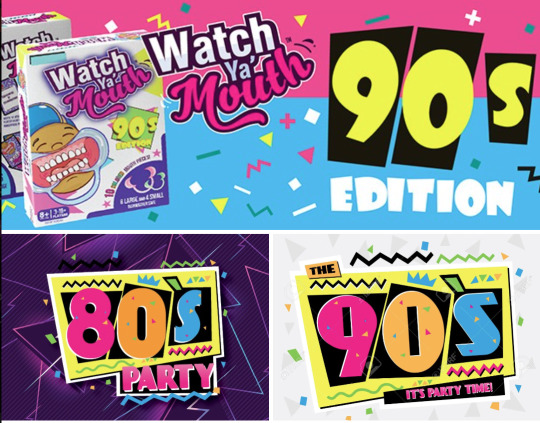
Goddammit they’re identical! What??! How did we let this happen? As a 90s survivor and a designer, this drives me up a wall.
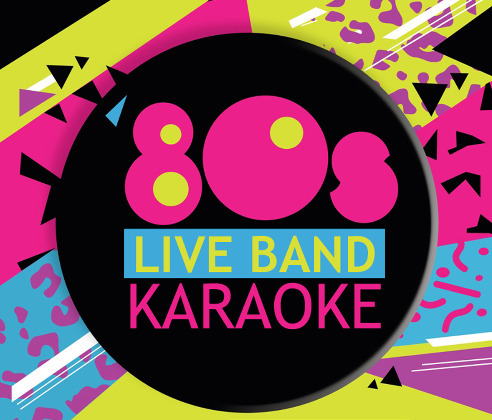
Look, I know I’m late to the party to complain about “the 90s look” when we’re just starting to get sick of the Y2K nostalgia train. But c’mon, the 90s were not The 80s: Part Two™
Trust me when I say that we weren’t all wearing neon trapezoids up until the year 2000. The 90s look being peddled is so specific to the tail end of the 80s and an early early part of the 90s - a part of the 90s when it wouldn’t stop being the 80s. This is Memphis design being conflated with the wrong decade.

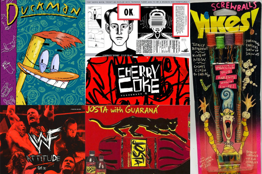
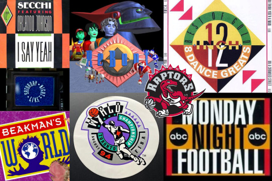
Keep reading for a long ass graphic design history lesson and pictures of old soda and fast food.
Keep reading
16K notes
·
View notes


Text
Character whose suffering is treated as a joke they could never make me hate you
9 notes
·
View notes
Text
It’s always funny when an algorithm notices that I’m liking a lot of posts about a character, completely misunderstands why, and starts recommending thirsty (or god forbid x reader) posts about them.
Like, I don’t find them the slightest bit attractive, I just want to study them. Don’t call me pet names, you glorified lab rat. Stop gazing at me lovingly and complete this maze. I’m going to dissect you later and figure out what’s wrong with you.
3 notes
·
View notes
Text
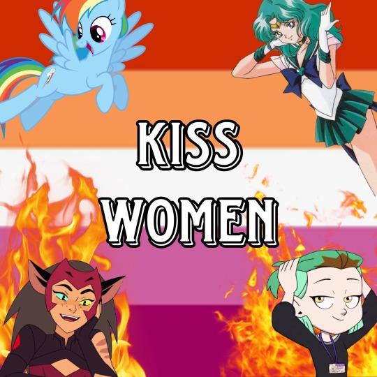
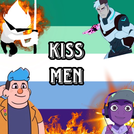
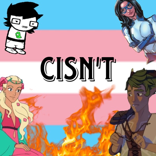
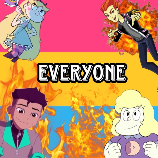
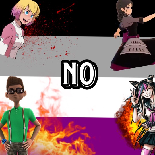
Venus Pride Flag Doodles

I’m thinking of drawing the rest of my OCs with their pride flags too.
3 notes
·
View notes
Text
So I got called into jury duty…
And I was put in the seat instantly, of course. I said, “your honor, I can’t be a juror on a two week trial, I have opera rehearsal.” And she said, “opera huh, well, sing something for us.”
And I did. In a federal court of law, in front of the judge, 75 jurors, the lawyers and the fucking DEFENDANT, I sang o mio babbino caro.
And the judge excused me.
178K notes
·
View notes
Text
hand torture part 2 but this time i didn't do it all in one sitting.
can you even call this hand torture then?
5K notes
·
View notes

Text
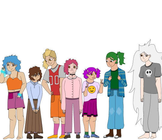
@askeinofsheepsyarn as a thank you for digging up my nearly two year old Elle(s) art, I present to you the third iteration of this drawing!!! (There was a redraw in between the original and this one lol)
My Elle(s) fanart
not me drawing fanart for a series no one knows about lol
so basically these are my designs for the characters. i tried to stick with their canon personalities, hair color and stuff, but the clothes were made up by me.
also, the grey one is my OC for the series lol
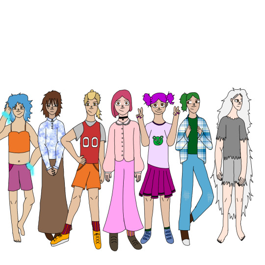
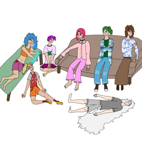
put in the order i drew them in
also im pretty sure Elle(s) is only digital if you want to read it (which i highly recommend)
6 notes
·
View notes


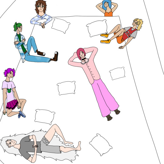
Photo
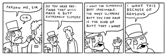
*Married life playing in the background
This idea was probably funnier in my head
87K notes
·
View notes
Text
In memes where text or panels are edited the originals are always the funniest, case in point:
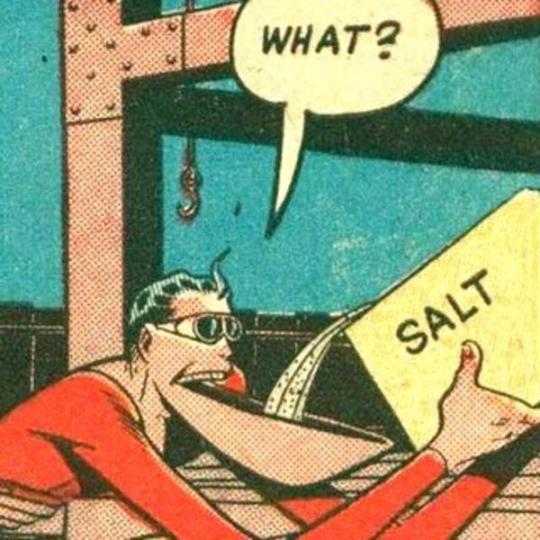
269K notes
·
View notes