
Last Seen Blogs
melodicness
Moonversed 蘭藍☆
dichthuatonlinehcm
Dịch thuật online giá rẻ

fitnesshacksforlife-blog
Fitness Hacks For Life

glitterarygetsit
GLITTERARY GETS IT

badladys
girls icons
Text
Reflection
Main takeaways:
Overall I am quite happy with the final product that I have created. In the initial stages, I spent a lot of time just thinking, purely envisioning what I wanted my project to look like in the end. I didn’t write or draw anything but I just imagined it for two weeks and I think that was what really helped me materialise my design ideas into the project successfully. I feel I have made a vast improvement from my last project regarding time management and workflow. I have consistently put in effort over the 6 weeks rather than saving all the work to be done in a short amount of time. Because of this, I was able to create something I wanted and thoroughly enjoyed the full process of animating and researching ideas for my IFE.
Enjoyed:
Micro-animations
Having had a background in animation, I was quite excited for this project because I got to utilise the skills I’ve learnt in the past. However, the difference was that I used to do hand drawn animation, which is done frame by frame and is an extremely tedious task. I was pleasantly surprised with the smart animation feature of figma, which saved so much time yet gave very pleasing results, so this was even more enjoyable than I expected. It was very satisfying for me to see everything come together at the end.
Least enjoyed:
The research at the beginning of the project wasn’t exactly unenjoyable, but just the least enjoyable experience in relation to this project. I actually found it interesting to learn these theory principles and also found it nice to research lots of micro animation techniques and ideas.
What would I do differently next time?
I would probably try to plan more of my work, do more sketching, wireframing, information architecture and brainstorming. Since the creative process had to be finished quite fast, I didn’t end up doing much planning and just started making the IFE, as per the advice I was given. This had its pros and cons, as sometimes I was a little lost in the direction I was going. However, it was also good because this allowed me to have a more iterative process - I was constantly changing designs and having new ideas that branched off the old ones, and overall, expanded my design process more than usual.
0 notes
Video
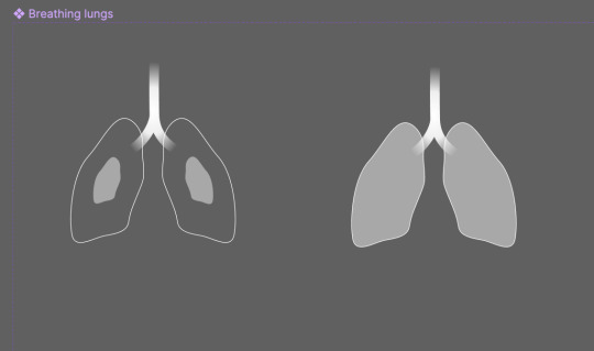
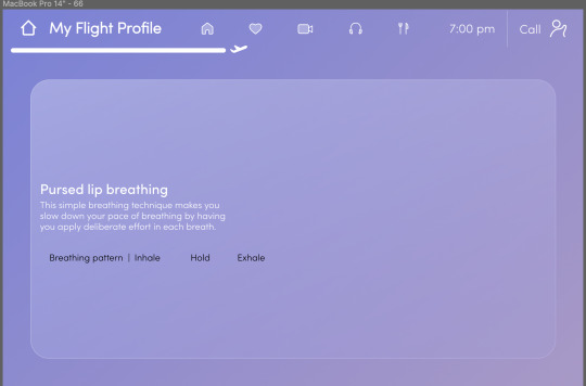
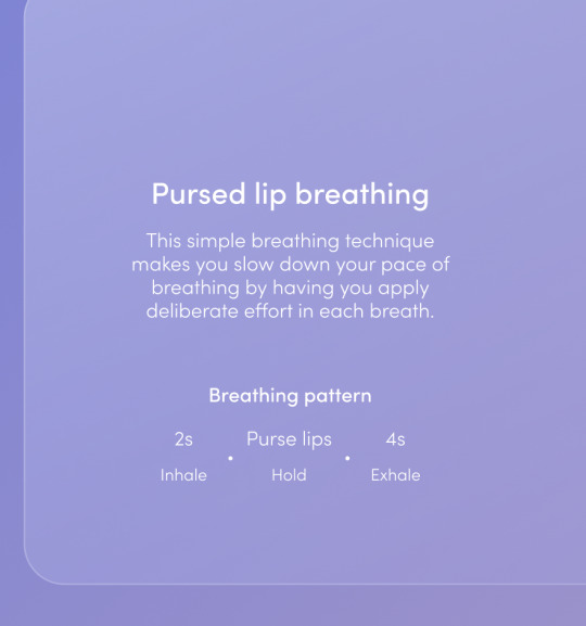
The final design of the breathing page. I took a look at anatomical lungs and followed the shape of that instead.
0 notes
Video
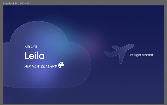
Final sequence of my intro. I changed the intro design again, added a cloud, because all the other designs weren’t looking right. This way it looks more like my desired glass-morphism look and fits the overall aesthetic.
0 notes
Video
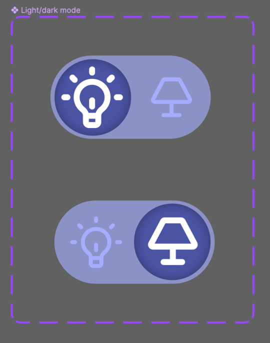

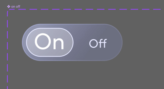
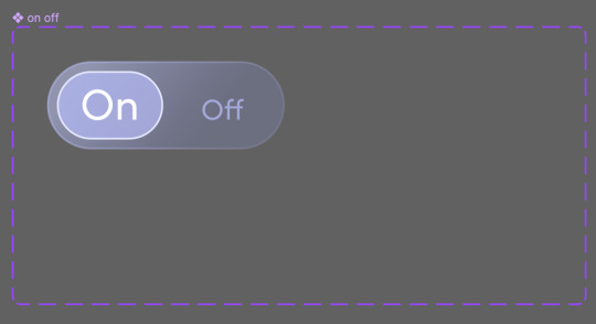
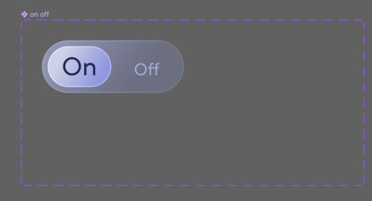
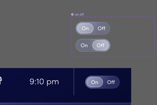
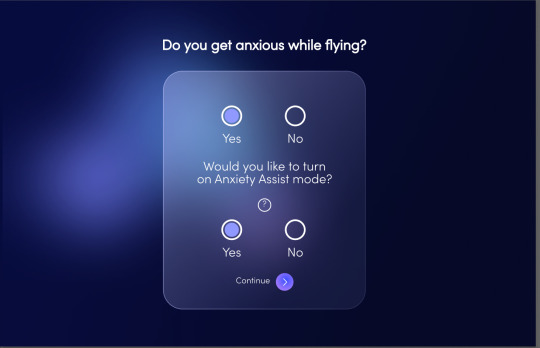
You can access the health page from the menu via the heart icon. I changed the old light mode/dark mode toggle into an on/off toggle with a new design that matches my IFE. This is to switch anxiety assist mode on and off.
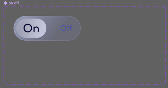
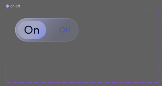
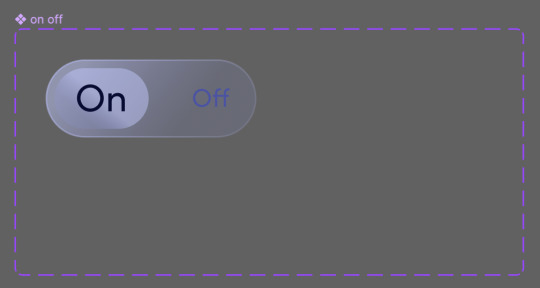
I went through many colour and design changes to get the right look.
This is the anxiety assist mode panel, which is supposed to appear when you first setup your IFE.
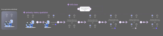
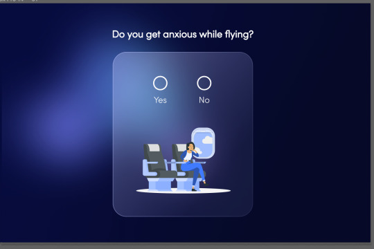
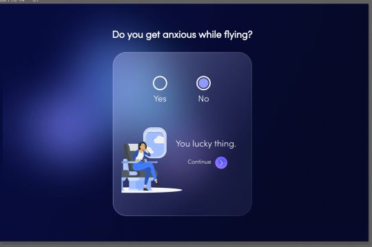
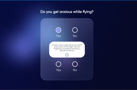
Since I was on a time crunch, I didn’t get to do many iterations of this and so I just tried to design the best I could on the first go. Even so, I’m pretty happy with what I ended up with.
0 notes
Photo
Prototype of the movie screen page.
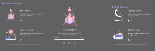
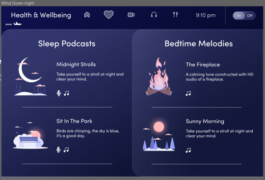
I made a component for the “sleep audio” section of the health page. It comprises of HD sleep podcasts on the left, and relaxing music/asmr on the right.
0 notes
Video
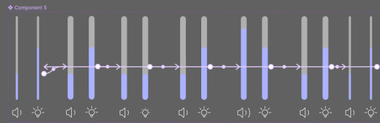
I finished all the animation for the actual movie play screen. There is a speed scrubbing demo and the volume and brightness slider. The sliders expand when you tap and drag on them, so I showcased that with the animation.
0 notes
Video
The full, and probably the final sequence of the movies page.
0 notes
Video
You can also favourite the movie and add it to watch later. I made it an animation sequence rather than something you click on individually so my mouse cursor won’t be in view as much when I record it.
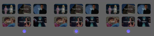
Then, I made a movie genre selection screen that is supposed to play before you go to the movies page.
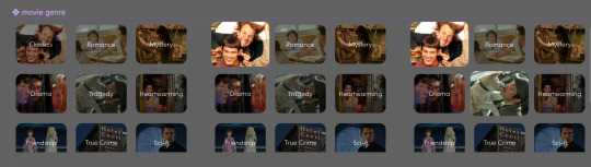
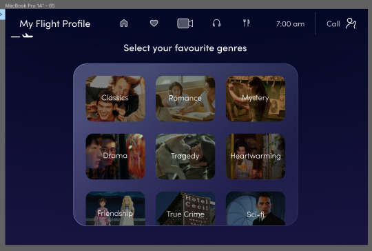
Again, I used the pulse button effect and made it self animating so I don’t have to run through the prototype manually.
0 notes
Video
I connected the second trailer slide at the bottom of the page to the movie screen.
0 notes
Video
I added a pulse button effect to the movies trailer slide. I used the same component I previously made so that it is consistency.
0 notes
Video
The latest draft of the whole sequence of animation in the “morning breathing alert” using the new designs.
My peers said they liked the design and illustration choices.
0 notes
Video
I changed the design of the menu. After getting feedback, I was told the semi circle that hovered above the icon was unnecessary.
0 notes
Video
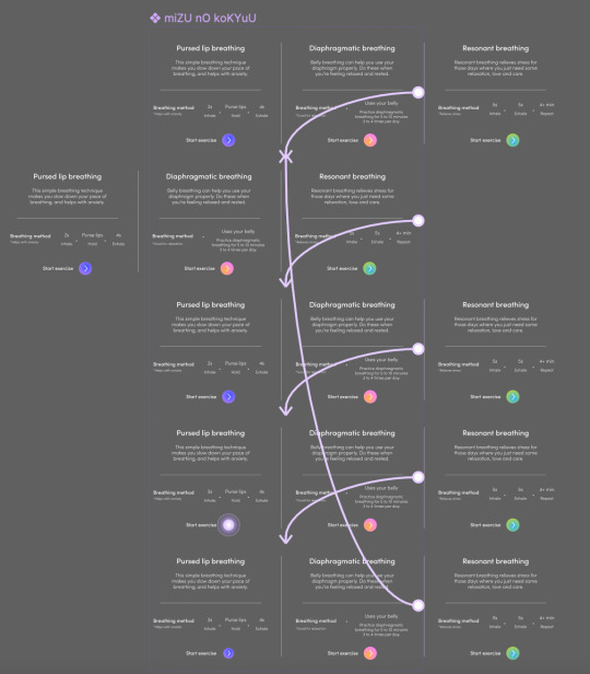
this is the prototyping for the breathing slides. There is a pulse when the button is clicked so I tried to prototype that.
0 notes
Photo
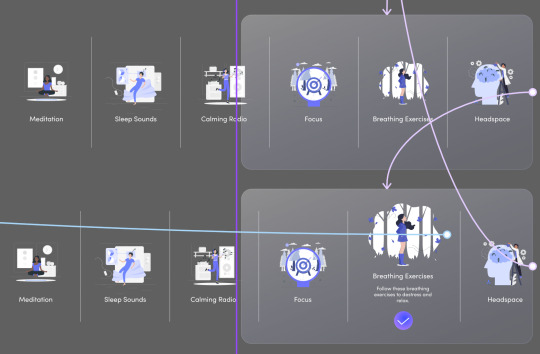
I changed the icons for the health and wellbeing page to include images. All the svg files are from storyset.com and are free to use.
0 notes
Photo

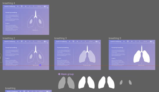
Here I’m trying to figure out the sliding animations, and the design for the breathing page.
0 notes
Photo
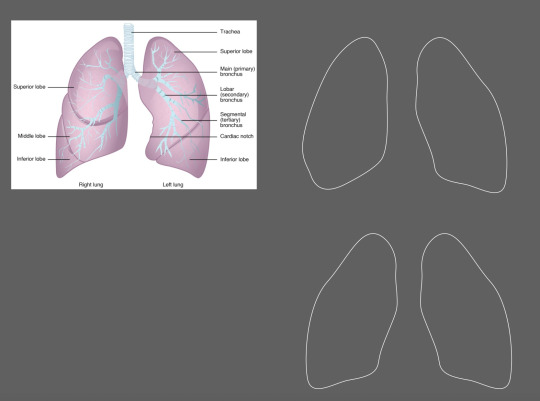
My peers said my previous design looked like something else, not lungs. So I redesigned it to look more anatomical. :((
0 notes