
jgphotography
JG Photography
Photography in London Blog | A collection of photos I really like :)
15 posts
Don't wanna be here? Send us removal request.
Last Seen Blogs

kayjayne22
Kayleighjayne

cuteasamuntin
Incompatible Infill

feireina
Fei Makes Art


opboysturnsmeon
Bachira & Hiori
Text
Week 11 / Photo Series Progress Report
Personally, I feel a bit discouraged about my photographic series. I didn't get the chance to go to Greece or Italy before the due date, and after the first presentation I felt like I had to completely rebuild my idea from the ground-up. I also feel like I picked a somewhat hard theme for my series, since I have to go to so many high-up areas which cost money to go to. I'm going to do my best, but I am a bit worried about the final product.
0 notes
Text
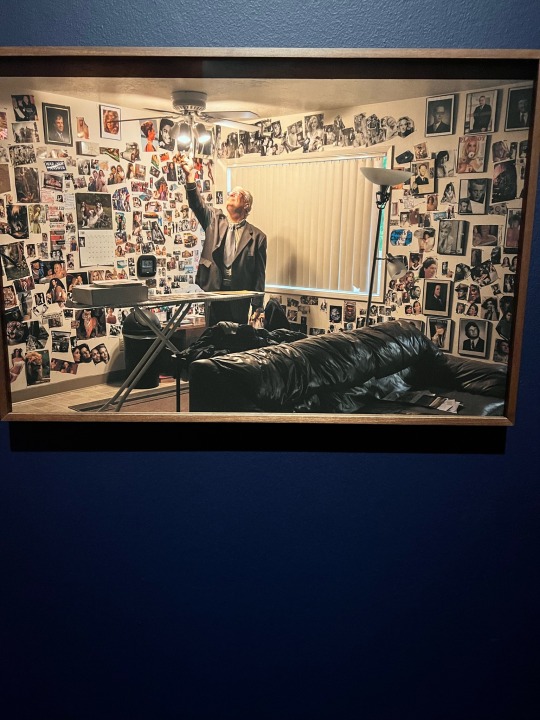
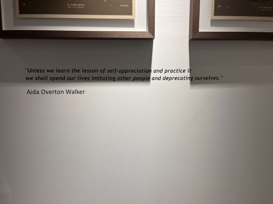
Week 10 / Exhibition Analysis
In my view, Bieke Depoorter should win the competition because I feel like their exhibition used the widest variety of mediums of art, and I also really liked the video included in the exhibition. I feel like it provided a lot of context to the story included in their exhibition.
The main message in the exhibition is that photographers have a responsibility to the truth when producing pictures, and that they must take care when publishing these photos.
This is conveyed through their many different mediums of art as well as the use of existing photographs within their photography.
This was my favorite photo in the exhibition. One of the compositional aspects is the lighting, which is overhead lighting in the middle of the shot; it Illuminates the closest pictures to it very brightly and it fades as you get further to the edges of the picture. I believe this shows the nature of "truth" in photography, and how it can become easily skewed as you get further from the source image.
This compositional aspect makes me see the photo differently because it really highlights the amount of images within the image, and how it can be really hard to uncover the truth under so much evidence.
The style of photo doesn't remind me of anything, mainly because of how chaotic it is. There's so much going on, but there's also a clear subject in the detective looking at the photos.
0 notes
Text

Week 9 / Imperial War Museum Exhibition:
- The exhibition makes me feel very sad and hopeless for these people, because they’ve been forced into such horrible positions due to the war in their country. An obvious example of this is the amount of death that they’ve all had to face, shown by photos such as the woman bringing flowers to her loved one’s grave, or the protester in army fatigues that has a cast and looks like he’s been crying. It’s also shown, however, through people being separated from their loved ones while trying to cross the border to a new and safer life. Overall, I think the exhibit was effective in portraying the difficulty of experiencing war and being torn from your home and loved ones, as well as the difficulty of protesting against a government that doesn’t protect or care about you. I also think these images and the message they portray are very poignant for today’s society, as people of color feel similarly about their government not protecting or caring about them.
- I chose this photo to convey the series’ message because I felt the man in the photo perfectly exemplifies the hardships of war. He's a soldier with a hand injury and a tired, sad face, and he's also a protester against the war.

- I felt that this image was ineffective because it just showed people living their lives in spite of the war going on. I this that this point of view is valid as there are many people who have to do just the same thing, and I'm not trying to be dismissive towards their experience. I just feel as if it stood out when compared to the other photos.
0 notes
Text
Photography Group Presentation: Analysis of a Photographic Series
We did a brief slideshow on Karen Knorr's "Fables", and the photographic attributes that made the series effective. We also went over the deeper meaning of the title and the sequencing of the photos. Overall I believe this was an effective group project, and I really enjoyed doing it with my partners.
0 notes
Text
Week 5: Ugly photos of something beautiful

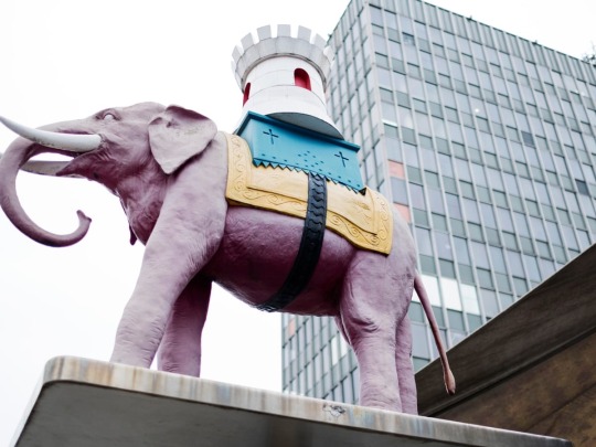
These are my three ugly photos of something beautiful. They’re each from trips within Britain, but all in different places. The first picture is from Cambridge, and I feel like the colors and the weather made the picture look very drab and made certain aspects blend together. I thought the view was beautiful, but when I looked closer at the picture I didn’t like it. My second picture is of an elephant statue I saw in Camden with my boyfriend. I thought the colors on it looked really nice and I wanted to take a picture, but I feel like the angle of it was really awkward and I don’t like how much of the grey sky is in it. My third picture is from Covent Garden, which is a beautiful place. It’s clear to see that the sunlight got in the way of this shot, which is the opposite of what happened in the other two pictures. Overall, most of these “ugly” photos were accidents, but they worked pretty well in showing how weather and natural events can affect the outcome of your photos.
0 notes
Text


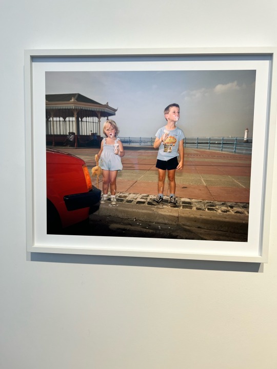
Week 3 Exhibition analysis
- I think the curators brought these two sets of photos together because of the similar nature that they have to one another, as well as the fact that one is from a famous photographer while the other is from an anonymous, most likely amateur photographer. It shows how photography is accessible to anyone with a camera, and anyone can have an incredible eye whether they see themselves as photographers or not.
- I chose these works because I felt that they embodies the previously mentioned message the most; the pictures are very similar to one another, and it was hard to decipher which photographer would be credited with each.
- The photographers have made choices in regards to cropping and positioning of the subjects, as well as POV. in the top-left photo, it’s taken from a somewhat bottom-up angle, while the others are from an eye level angle. This makes the muscular men look even more muscular due to the shadows cast on their bodies.
- I think the choice in cropping influences the meaning of the photo in the bottom-left because of the choice to keep the wooden structure in the background in. I think that by just keeping the two kids, it wouldn’t provide context of where they are, or that they’re having a beach day. I also think the use of lighting in the top-left picture makes you focus a lot on the muscles of the men in the picture, making it seem like a bodybuilder photo shoot.
-I feel like the photos on the right were taken by Martin Parr, while the ones on the left were taken by the anonymous photographer. I just feel as if the ones on the left have a higher production value and a more clear message/intent. In the end I was right about this.
- the effect of seeing the pairs of photos was that even though I could see a difference in production value, I also could see that both sets of photos were well done, and that there weren’t many clear differences between a professional and amateur photographer’s work.
- I could see that Parr’s photos used a bit more color, which I know from seeing some of his other work in class.
0 notes
Text
Week 10 Cropping In-Class
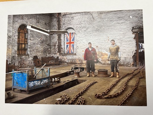
Before cropping: The picture is clearly of two factory workers or laborers working on-site. This is clear because of the chains on the ground, the blue bin with poles in it, and the metal objects around them. I think it's about the conditions of factory workers in the UK, or rather just the daily experience that they have.
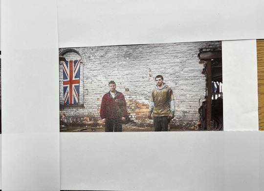
After cropping: The picture is of two men with a UK flag behind them. By cropping out the objects that show us it's a factory setting, it could be anywhere. The cropping makes the focus all on the two men. The picture could be about UK nationalism, or about the bonds of men within the UK.
0 notes
Text


Week 5 / Exhibition Analysis
What is the artist trying to do/say with this work?
Heather Agyepong Is trying to show how African American culture is under-appreciated and over-ridiculed in a society that doesn't understand their art. She does this by photographing African American subjects taking part in their culture, using displays such as dance or vaudevillian performance. I think she's trying to challenge what art is seen as "beautiful" in a society (in the 1900s) that doesn't understand their art.
2. What technique is she using to convey this message?
Agyepong definitely uses framing and zoom in order to convey her message. In all the pictures, the subject (who is always a Black woman performing) is framed at the exact center. She also uses zoom in an interesting way. The subject in all the images is zoomed in to a point where you can't really see a foreground, and the background is so bland that it forces you to focus on the subject. This connects to the message because it forces the audience to acknowledge the performer, in a time and society where they would normally be ignored by the general public
3. Do you consider these "good" photographs? Why/why not, and what is your criteria?
I do very much consider these "good" photographs. By technical standards, aspects such as the lighting, framing, etc., however I think that what makes them great photographs is the subject matter and how effective Agyepong's technique is at capturing the message she's trying to get across, which is that African American culture is beautiful yet under-appreciated.
4. Do they convey the artist’s intended message? (How does your answer to this question relate to your answer to the previous question?)
I kind of mentioned it in the last point, but I do believe that these photographs convey the artist's message. The framing and the zoom force the audience to focus on art that is underappreciated and really ask themselves "what is beautiful"? I really liked this series personally, and I think the message is still applicable in our society today.
5. What is the effect of seeing several of her images together (as a series)?
Seeing the images together as a series shows the dynamic nature of African American dance and performance. If only one of the images were shown I believe the fact that the subject is performing would still get across to the audience, but I believe that by having them in a sequence it better shows the beauty of African American culture & performance.
6. How does the written information change your understanding of the photographs?
The written info adds context into the time period that the photos are taken in, which helps the audience to understand the context of why African American culture is under-appreciated. Without the context, the message would still get across, however I think it would've been changed slightly. In today's world, African American culture is appreciated, but African American people are ridiculed when taking part in it. Instead, people in the racial majority tend to use and appropriate their culture, then ridicule them for taking part in their own culture.
1 note
·
View note
Text
Week 4 / Photography in London
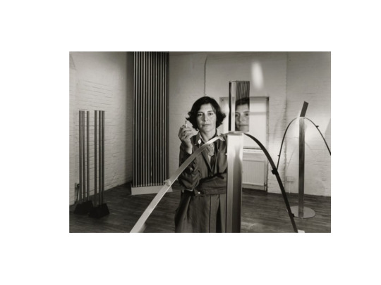
Describe the composition of the image.
The person is the main subject of the image, and they’re in the mid ground, as well as their reflection in the mirror. The metal arch is in the foreground, and the background consists of the curtain and the window of light
How have light and tone been used and what effect does this have?
There are multiple light sources in the room, the objects with mirrors appear to have light coming from them, there’s light coming from the window, and there’s light shining from overhead. Because of this, there are a lot of shadows being catt in the photo. It also really emphasizes the darker parts of the image, such as parts of the subject’s dress and the shadow being cast by the curtain
How has focus been used and what effect does this have?
The focus is on the person in the midground, showinf that the arch in the foreground and the curtain/window in the background aren’t as important
What does the pose/posture of the person depicted convey about him or her?
The portrait conveys that the preson is kind of emotionless and detatched, especially considering the cigarette. It seems like they’re just trying to “get through it” in the image.
What Is the most interesting aspect of the photo?
The most interesting aspect of the photo to me is the multiple light sources in the image, since they create so many shadows in the image.
What is the mood of the photograph? What makes this mood?
The mood of this photograph is somewhat neutral and emotionless in my opinion, since the subject has no expression on their face. The pose with the cigarette also almost makes it seem like she’s “coping” with something, or trying to ignore the emotions she has.


This first picture was perfect in terms of ISO and shutter speed for the most part, so I made sure to include that one. I liked her pose in it, as well as the perspective shown because of the stone pot in the foreground and the stone structure in the background. I was inspired by the Mayonette Magnus picture's use of composition and perspective, since there were so many objects in the foreground and the background.
This second picture was very overexposed, but I liked it because of the context it provides to the image. My partner, Nori, had a wide smile in that picture, and she looks really happy. I think the overexposed nature of the picture makes it look really "angelic" in a sense, like the lighting has changed based on her mood. I also think it pairs well with the final picture.
This final picture is the opposite of the second one. In this one, Nori isn't smiling at all, and the image is much darker than normal due to having a higher shutter speed. Because of this, it gives the image a much more "depressed" and almost "sinister" feeling. I think the trees with the squiggly branches also convey this idea, making the park look a bit like a haunted forest in a sense.
0 notes
Text


Week 2 Perspective Exercise
The main 2 ways that different points of view can affect the way we relate to a photo that I noticed are the shadows that are cast and the “feeling” that the subject seemingly displays. In terms of the shadows, they can completely change the way someone’s face looks, especially in the eyes and the jaw. In terms of the perceived “feeling”, in my opinion people look more confident the higher up the picture is from. The pov can also affect the things in the picture you can see (obviously), like for example you can see the subject’s hair more clearly in the second picture, whereas you can see his beard much better in the third. Finally, the pov of becoming the subject is completely different, because rather than capturing the subject itself, you’re capturing the experiences of the subject and you get to see what they see.
0 notes
Text
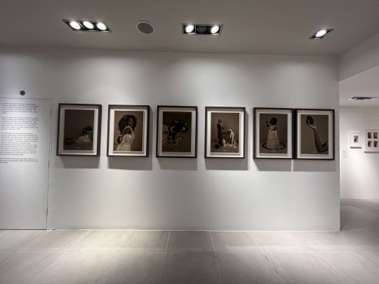
Maurice Broomfield/Known & Strange Exhibition Questions
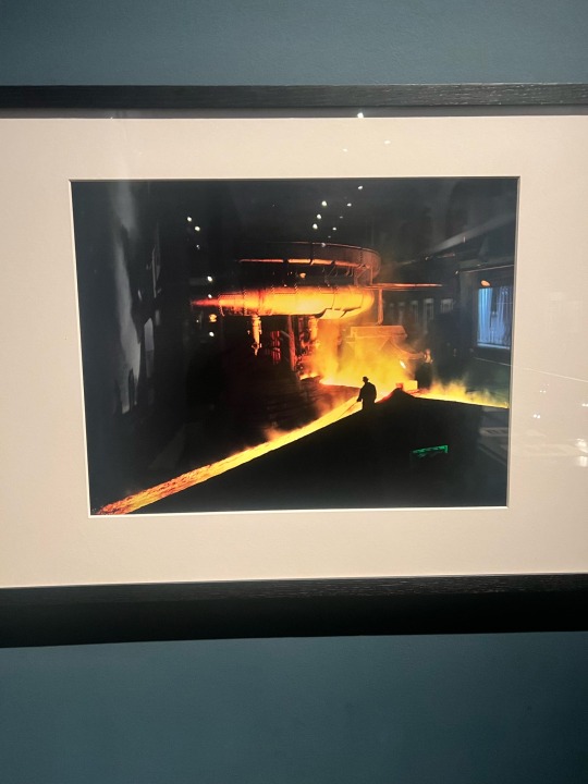
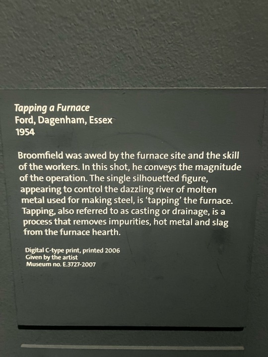
For me personally, this was the most interesting photograph in the first part of the exhibit. In my opinion, the most noticeable compositional aspect in this picture is definitely the use of light and tone. The center of the image, where all the sparks are coming from, is definitely the largest focus, whereas all the darker parts are in the background. This contrast was so eye-catching for me, and I just had to pick this one as my example. This aspect influences the meaning of the photo because rather than focus on the welder(?) himself, we instead focus on his incredible work in the furnace. Leaving them as a silhouette was definitely a stylistic choice, and it was most likely made to show that the work itself is the most important, not the artist making it.


This photographic series is of multiple female performers doing stripteases at local carnivals.
This photographic series, to me, is about empowering women and their bodies during a time where women weren’t particularly celebrated for doing so. These women also don’t have “perfect” bodies by today’s standards, but rather are depictions of actual women who performed during that time.
In terms of technical choices, the photographer chose to keep the subjects at eye level, showing off most of their upper body but not much of their lower body. I think that was a stylistic choice, to show these women as actual people and not just objects of desire or something similar. The images are also in black-and-white, a choice that could’ve been avoided during the time period. Still, I don’t think having the images in color would change much of the story of the photos. Finally, all of the subjects are framed as the center of the image, with a mostly plain backdrop. This is to keep the audience’s focus on the women, rather than the setting they’re in. Realistically, the setting doesn’t matter too much; it’s the fact that women are out performing, showing their bodies off, in public.
What unites this photographic series is that they all consist of different female performers doing stripteases at a carnival. This through-line of sorts says a lot about women’s empowerment and different body types, during a time where women weren’t allowed to own their bodies in this way. These images are kind of reminiscent to me of modern-day beach pictures that many women take today, which shows how far we’ve come in terms of women being able to own and show off their bodies.
0 notes
Text

This was the last picture I actually took on my date at Canary Wharf on the 28th of January. It was getting pretty late into the night, so all of the lights in the area were really prominent and I knew I had to snap a photo of the area. I specifically like how busy the photo looks, although some people might think it's too much, I actually think the "busy-ness" of the photo really encompasses London and the way it feels to walk around sometimes, experiencing constant sensory input. I took this photo from a few perspectives (I was at the top of a staircase), and I settled on this one being the best one. I think it's because of the balcony on the left side, which adds an interesting touch to the photo.
0 notes
Text

This photo was by far my favorite one I took on this day. This one was also taken on the 28th of January at Canary Wharf. When I walked by this ledge, with this incredible view of the sunset, I just knew I had to take the photo. My favorite part is the amount of vivid colors in the photo, more specifically how the colors of the sky look so different when reflected in the water. I also like how the light shines on the tall building in the background, illuminating just one side of it. I'm really proud of this photo, personally.
2 notes
·
View notes
Text
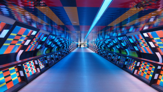
I took this picture at Canary Wharf on the 28th of January. I decided to post this picture mainly because of the colors in the photo, but also because of the perspective. The colors in the tunnel were very striking, and that's immediately what made me want to take the picture. After I downloaded them to my computer though, I realized that the best part of the image was the perspective, how you can see the tunnel get smaller and smaller as you go further. Overall, this was one of my favorite photos from that day.
0 notes
Text
Chris Killip Exhibition Assignment
I would describe Killip's approach to photography as very "candid" and "real". Although the photographs seem to be somewhat staged in my opinion, he isn't trying to create something artificial with them. It seems like he's trying to take pictures of everyday occurrences, rather than transient sights that are somewhat fleeting.
I noticed that he typically doesn't like for people to look directly at the camera. Also, like I touched on in question 1, he likes to depict people taking part in their daily, natural life, doing activities such as farming, riding a horse, or even sitting on a ledge in the city.
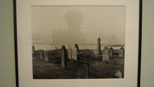
I see a bunch of tombstones in the photo, not in a particular order or formation, as well as a body of water behind the gravestones, and the sky above it. Due to the picture being black-and-white, I couldn't tell what color the sky is, but to me it seemed like a somewhat dreary day, though that may be because of the gravestones in the picture.
I don't notice much in terms of the focus of the picture; the only thing I could say is that the focus is definitely on the gravestones. There's a small piece of land far in the background that's out of focus, but it's definitely not the main focal point of the image. The image is also in black-and-white rather than color. In terms of composition, the picture was taken at an angle so that all of the gravestones could be in the shot, and that for the most part they weren't blocking one another.
The focus being on the gravestones makes it so that they're the only thing I really noticed about the picture at first glance. It really stresses the importance of them in the picture, as opposed to the tall structures on the horizon or the small piece of land in the background. The choice to shoot in black-and-white was also really good for the "vibe" that I believe Killip was trying to create with the picture, making it look very dreary and somber. It really embodies the feeling of being in a graveyard, and I believe that if the sky was blue and clear behind the gravestones then it would've completely changed the way I viewed the image. The composition of the photo emphasizes the somewhat haphazard nature of this graveyard. The gravestones aren't in any specific pattern, and they're also of different styles, sizes, colors, etc. It emphasizes a disparity between those buried (e.g. nicer gravestones for richer people), and to me this also shows how death is indiscriminate.
I don't think you need additional info to understand the message. It seems like Killip was trying to get the idea across that death is indiscriminate and comes for us all.
The style of photo somewhat reminds me of pictures in history books of battlefields after the fact, where you see a bunch of things left behind (e.g. weapons, clothing, etc) from people who died. While the only thing symbolizing death in this picture is the gravestones, they're somewhat scattered and very different from one another, so that may be why it reminds me of that.
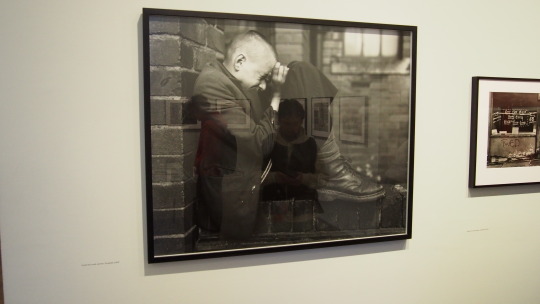
I see what appears to be a young person, sitting on a ledge. I can't tell if they're crying, but they definitely appears to be having a hard time, whether it be for physical or emotional reasons. The ledge they're sitting on is all brick, and you can see a window behind them out of focus.
In this picture, the person is in focus while the wall and window behind them is out of focus. This makes the viewer of the image focus on them, rather than any of the background details such as the window. Realistically, the setting is important; the subject of the photo is the person, and the emotion they're displaying. This image is also in black-and-white, but I don't feel as if the image would've changed much if it was in color. Finally, the composition makes the viewer focus only on the person, since they take up so much of the shot. The choice to take the picture from their side also allows us to see their face and expression, as if it was from the front their face would've been covered.
The choice to take the picture in black-and-white didn't affect the way I saw the picture that much, and neither did the focus. I suppose if the person was out of focus, while the wall behind them was in focus, it would've affected the way I view the image, so I guess having the person be in focus was a good idea. The composition helps by allowing us to see their facial expression, and also the choice to make them take up so much of the frame makes it so that you have no choice but to focus on the person. That's why I don't think the image would've worked if the background were the focus point because so little of it is showing.
I think I do need a little bit of additional information. The time period it was taken in as well as the location may help me understand why the person is going through a hard time. For example, if this picture took place during an economic depression, it may be due to lack of funds or money in the family, for example.
The style of photo doesn't remind me of any other style, but rather of a specific time period. Like I said before, it reminds me of pictures during the Great Depression, where people were going through a really turbulent time. I feel like photography like this brought people together in their sentiments of pain and hard times.
1 note
·
View note