
Last Seen Blogs

pfpanimes
animes icons.

illegallymale
holey trannie

imsorryyoudidntmakeit
❝I think I’ve found hell.❞

ab4ddon
ABADDON™
Text
Final Reflection
When preparing for the second review session for my photographic series I prepared a slideshow with a number of photos I was thinking about using for my final photographic series, which were placed in no specific sequence. I tied the photos together with similarity in natural lighting and trees surrounding a path. The title of the series was “The Mysterious Journey”, based on no one knows what life will bring you and it is a blind walk down a path. But during the reflection presentation it was brought to my attention that a couple of photos were not fitting together based on content within each photo. Also that the title was miss leading and did not necessarily say what I wanted, and that it was also misleading. I looked into those issues in depth and decided to go out around London and take a couple more photos to replace some of the current ones. I was able to find some photos to replace and while I was taking these photos I thought of a new title, and a storyline to go with it. I chose to change the story to everyones life is different, as the paths in my series were all visually different but were all consisting of a long path just as life is a long journey. This reflection session was very helpful for me as I would not have noticed the changes that were necessary, and my series would not have been as put together as it is now.
0 notes
Text
Vishniac Photos
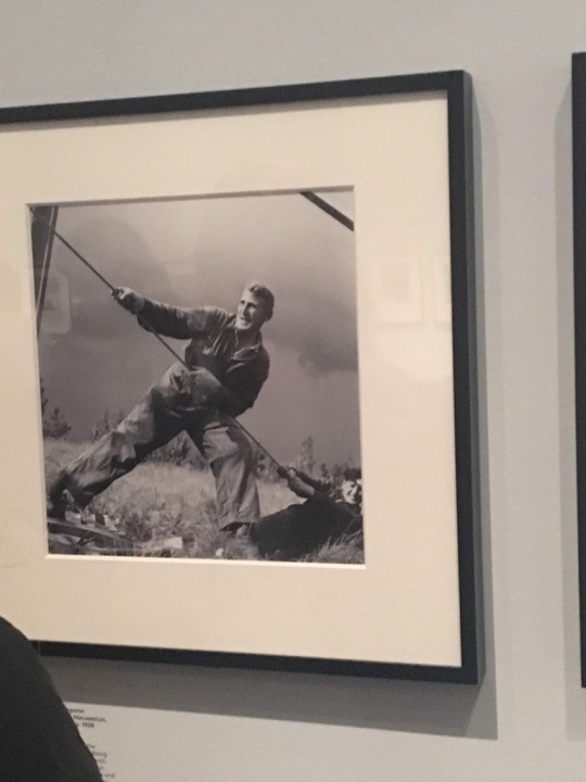
Vishniac was working as a freelance photographer for the National Refugee Service (NRS) and the Hebrew Immigrant Aid Society (HIAS). His photos were used in Newspapers, annual reports and brochures for use of raising funds and awareness of Jewish families after the Holocaust.
By looking at the phots I can understand that Jewish people in Eastern Europe in the first half of the 20thcentury were struggling to adapt to their new lives. The majority of Jewish families were working class working to build their lives from the ground up.
Vishniac highlighted children in his photos to show empathy for the lives they were living at such a young age. Also he showed both adults at work and in leisure while adapting to their new lives as well.
The information panels provide a detailed background of the group of photos nearby. This information helps show what families and working adults were actually doing in the photos. Without the texts it is a general picture of someone working in rubble or putting up a building.
I do not see anything problematic with the photos, even though some of the pictures are showing people struggling the photographer is there to document the lives of the people. There is not much he would be able to do in terms of helping the people either way. I think the photography is a clear depiction of working-class individuals and the historical context they provide.
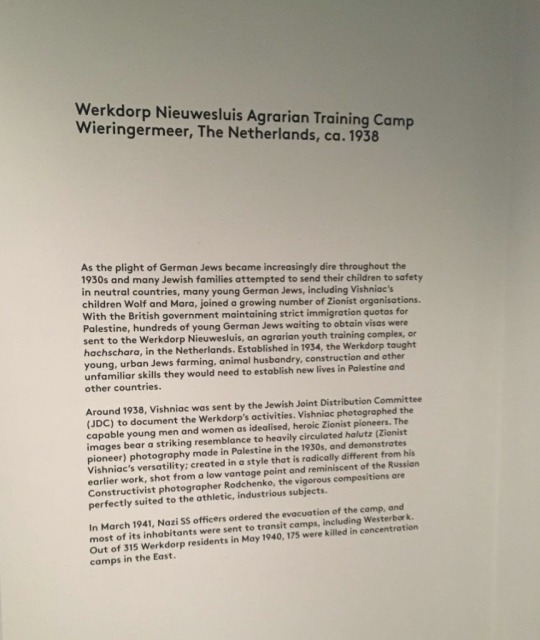
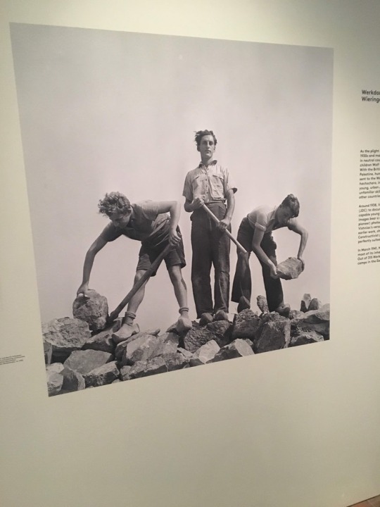
I chose the collection of photos from the “Werkdorp Nieuwesluis Agrarian Training Camp Wieringermeer, The Netherlands, ca. 1938” this is a group of photos presenting working people who are enduring manual labor, the photos seem very plain and exclude the actual harshness of the conditions in which they worked. But he did include the strength and hard work the people have to complete. The lighting is natural and in a candid form which accurately portrays the people working, by not having the people posing for pictures.
The photographer is taking the photos from the outside looking in, as if he were just watching. He is not interfering with the work of the people, simply standing by watching.
0 notes
Text
The Telegraph
This image helps depict the malnutrition in North East Kenya and the child refuges that are dying. During the barefoot journey through the drought time, children have no food or water. The image is very useful in visualizing this section of the article.
The image creates an empathic connection for a viewer because the child looks the age of a toddler and he is starving. Malnutrition is affecting children due to a drought and it is a very sad scene for viewers to look at.
The image creates a visual to engage with along with the written text. Without the image the mind could think of any representative of malnutrition but it is not an actual physical image so it is hard to make an emotional connection, but with the image it emphasizes the pain the child is in.
0 notes
Text
“Londoners”-On the Go
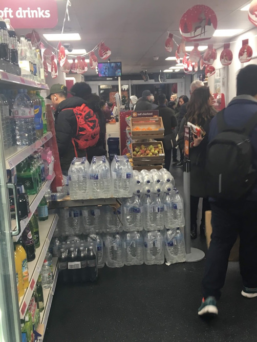
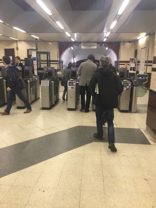
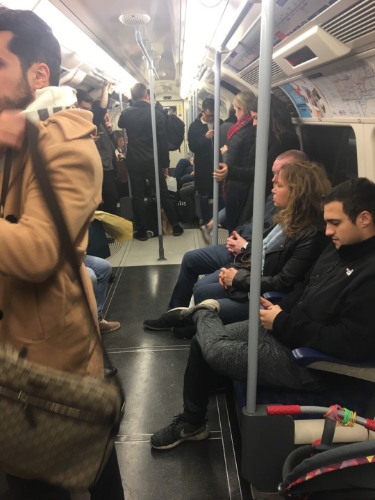
I chose to take the above photos because London is always on the go. One of the first things I noticed was that London is a fast-paced city, everyone is either rushing to the bus, the tube, work, or through a grocery store. As I walk around London I see commuters running to get on the tube and the sides of the tracks to board are always so packed. There are people lining up at the gates to tap their oyster card because they need to ride the tube to central London for work or to get home after a long stressful day. There are always parents and their strollers taking up room during rush hour. So, I decided to capture a cart that was filling up at the next stop, with travelling Londoners. I also chose to take a photo of the nearest Sainsburys as the line fills the storefront, all the self-checkout stations in use and a majority of the cashiers rushing through customers. From 5-7 the stores fill with people buying food for their dinners, including myself. I thought there was no other way to show how fast-paced London is than to show the tube stations and a store around dinner time when workers are rushing home. The experience of taking these photos was normal to me because I am always rushing around just like a Londoner is. I think that is the best way to show how fast-paced London is, by being a part of the rush hour itself.
0 notes
Text
Caption and Crop
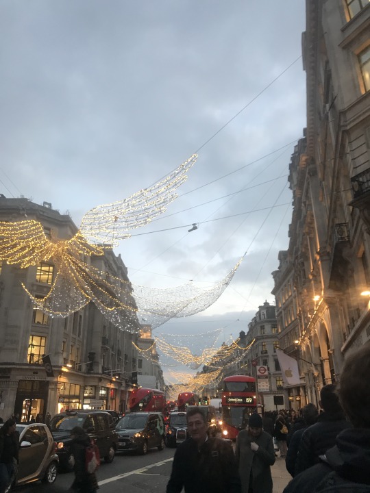
Captions:
Christmas is here
No matter what London keeps rolling
Let me brighten your day
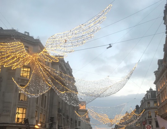
The way that I cropped this photo takes all of the people out of it, allowing for the angels to be the main point of the image. With the angels being the main point a viewer can enjoy the brightness of the most wonderful time of the year. Christmas is about happiness but in the original picture all the people are wearing dark clothing taking away from the happiness the festivities should bring. Of the colors in the original I think that the golden lights is what really stood out most because the red buses are a natural part of everyday life in London, but only in this time of year can you find the angels throughout Oxford Circus and many surrounding areas of London. As I look at this image I notice the angels first then all the buildings afterwords, this is interesting because many buildings in London are quite plain in color. It is necessary to have a bright color in the image to bring up the mood into a more positive theme than the original bland coloring of the street. The brightness also represents the busy atmosphere of Oxford Circus on a daily basis. The view in this picture allows the viewer to believe they are the ones looking up into the sky on the street, without any people to take away from the picture, and even though the sky is not completely dark the wings of the angel still light up the view in the photography.
0 notes
Text
Coal Mine #1 By: Edward Burtynsky and #7851, 2008 By: Todd Hido
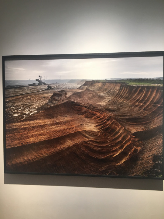
1. This photo uses color to show depth of the mines, and the contrast between the dirt, grass and the sky. The brown of the dirt is the main color in the photo and each part of the image has a different shade of brown, creating the depth of the coal mine. This photos colors are not a warm or bright set of colors, relating to the message that the excavation of the land is a bad thing. Bright colors are often related to happiness and darker more bland colors have a negative connotation. Without reading the text I can understand that the message is highlighting the destruction that humans impact land with. The title does help, instead of a simple construction site I know this is a mine which is more destructive. This photo does not remind me of any other pictures I have seen.
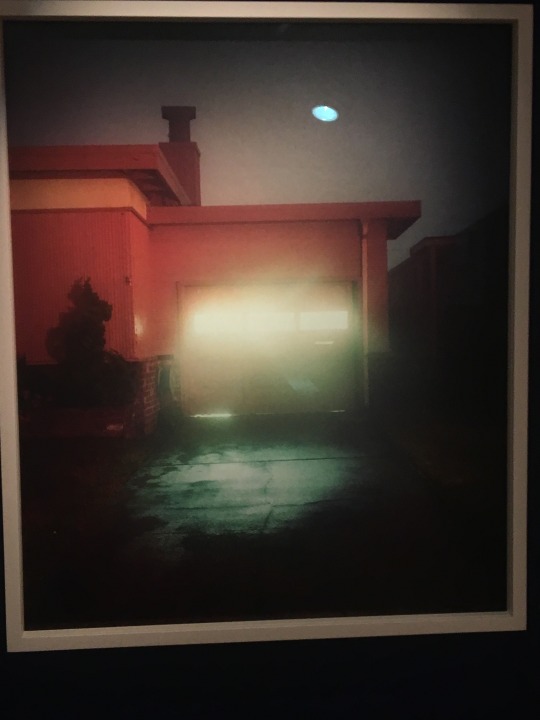
Color is used in this photo based on the light shining out of the garage in the center of the photo. The photo is blurred because of the amount of light shining in, but this creates a focus point in the center of the image. The photo and the message are similar because the message could portray there is light even in the darkest of times. There is no text provided for this photo and there is no title either. I have never analyzed a photo like this.
0 notes
Text
Brainstorm Session Reflection
After reflecting on the progress of my project I have realized what it is exactly that I want to do for the series. I have 2-3 photos that I am going to definitely use in my final series and that was made definite after hearing feedback from fellow classmates. The 2 photos that I want to be my main point of my series are tied together with other photos that I have taken recently, which makes me more confident in the progress I have made even since meeting for the brainstorming session. I was complimented on the lines that my photos created, also with focal points in the center back of my picture which are met by the lines. This is exactly what I would like to create with all my images. To further my progress I need to visit more places in London to fully engage in the escape to parks, this will allow me to bring together a strong and appealing series.
0 notes
Text
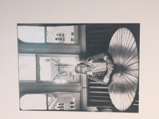
Daido Moriyama Farewell Photography Series
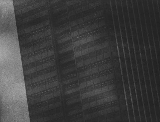
A) The composition of the image is different from what I am used to, in past classes I noticed specific critique on images that were photographed on a diagonal angle. But this photo is taken with a building leaning towards the left side, as if it is falling. At this angle, my eyes are drawn towards the bottom of the image then follow up towards the top left. In addition to the angle, the lines also are what draw my eyes upward, the center of the left side of the building is a focal point in the image.
B) The use of light in the image seems to be natural, but it is a dark day so the image is very dark and the building even darker. The light leads to a darker theme about the image, a mysterious cloudy feeling.
C) As mentioned before the mood is a very mysterious mood because the photo is taken in a way that is not understood. The focus is on the middle of the picture which creates confusion, just looking at this image, it is assumed but not a definite that this building is standing up straight. I am wondering why the image was taken this way. Other than mysterious it is a dark picture because of the lighting plus the clouds behind that block any other light from getting in.
D) The photograph is of a tall skyscraper building, that seems to be alone in the sky above all other buildings. Behind the lone building is dark clouds that block out the sun and maybe other buildings.
E) I interpret this picture as a strong base building which seems like it can never fall. Like the titanic could not sink it sunk. But the building is taken on an angle as if it is falling so the abstract subject is that nothing is certain in life, even the most set of plans can fall through.
In recreating the photograph, I was able to deeply analyze the details of the photo I chose. It was necessary to analyze every detail and technique used in order to take a photo that accurately recreated the chosen image. I learned to analyze the lines, color, lighting all together and how it creates the photo, this was especially interesting on a black and white photo.

0 notes
Link
As I viewed this series, I first noticed the natural lighting of each image. The brightness of the photos draws my eyes towards the many details throughout the images. My eyes are able to focus on the image due to the fast shutter speed and aperture allowing for each detail to be shown, once I am focused on the image my eyes follow the many lines of each photo which are created by the buildings and trees. As a viewer gazes through each photo there are similarities, each photo has buildings, trees, and humans. Creating a narrative of the coexistence between modern buildings and natural settings. Parks are an important part of people’s lives, they provide a place for people to get away and relax. The creation of parks is a very important part of city life, due to the overwhelming number of buildings in a city it is nice to walk through a green field or under a canopy of trees. The series is tied by its titles and captions, the parks are labeled by the name, location, year established and year that the photo was taken. This is important because it allows viewers to learn about a history of parks and also how they are being developed in a more modern way.
0 notes
Text
Taylor Wessing Prize
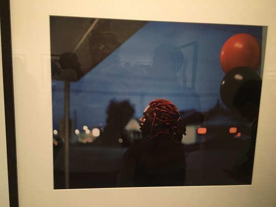
As a judge of the Taylor Wessing prize our group judged based on color, storytelling and background. Looking at the photos based on this criterion the colors pop initially when viewing, my eyes first looked at the balloons and made me curious as to why they were there then my eyes travelled to the subject’s hair, which matches the color of the balloon. After initially looking at the coloring, I notice the background and how the subject is looking away from both the camera and the street. The background is a mainstream urban neighborhood. What was most interesting is the description which told the story and brought so much meaning to the photo. The text described the subject as an emerging artist who just wanted to get out of his hometown, a very common theme among young adults. After reading the detailed text I understood who he really was and how he is looking away from the background which is his neighborhood. Then adding in balloons representing a celebration, he made it he was about to leave. With all of the above criteria and details adding together the photo adds a story to a blurry background neighborhood, and a colorful foreground representing a darkness and the orange hair and balloon popping out of the darkness.
0 notes
Text
Portrait and Inspirations
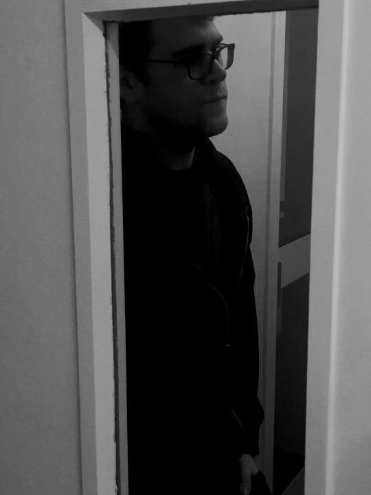
I chose to take the portrait through a frame because of the photos I chose at the Mayotte Magnus portrait exhibit. The first of the two was taken in black and white and with frames behind the woman, also lines across the picture made by tables and walls. Next, the second photo included a woman behind a window with the window frame infant of her, I liked the way this made my eyes focus on the subject. So, for my photo I chose to have the subject behind a door, so the frame was allowing the viewers eye to focus on the subject. I also thought this showed his character in a way because as his friend he is more outgoing and humorous around me but when I first met him he was quieter and to new people he seems a bit shy. This is recreated by the photo taken from the outside looking in and black and white reflecting a quieter more mysterious side. The way the camera was angled the top of his head is cut off allowing for a viewer’s eyes to focus mostly on his facial expression which gives the idea he is thinking deeply, by looking away from the camera at something the photo does not display. Another sense of character is the way he is standing, in a leaned back stance, showing he is a very laid-back person, which is one of his better characteristics in my opinion.
0 notes
Text
Photographic Portrait Analysis
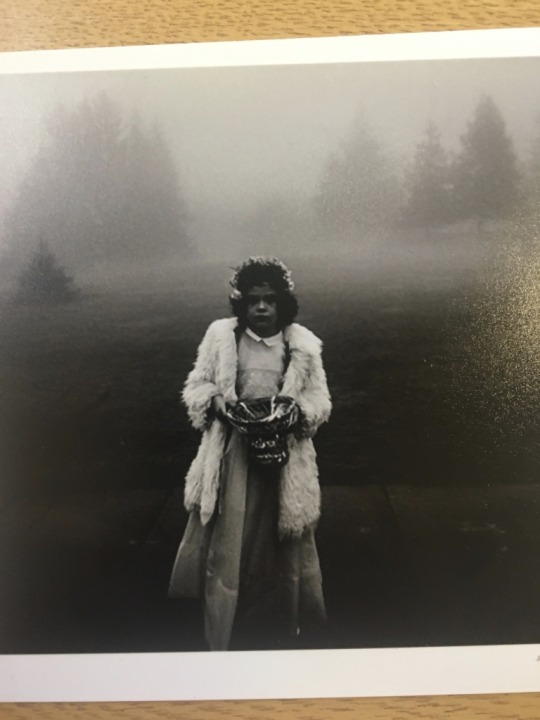
Looking at this picture I do believe that it is a portrait being taken of the girl in a natural location. She is facing forward looking at the camera in a still setting. Adding to that, because she is centered she is the subject of the photo, which I believe makes this a portrait of her.
The photo is of a girl who is holding a basket, because of the season we are in it may be a halloween basket and she could have a costume on. The dark and gloomy background made up of fog and trees adds to this effect. Along with the background the girl seems to be upset about something or perhaps frustrated, this all adds to the darkness of the photo.
The lighting used in this photo is low lighting seems like a natural lighting created by the sun through clouds. Because of the natural lighting dimmed by clouds the photo gives a gloomy darker theme maybe taken at night or in the early morning. In addition, the photo is in black and white so no color usually makes a photo seem darker and also allows a viewer to focus on mood.
There is a focus on the girl creating a blurry background which keeps a viewers eye on the girl directly, also because she is in the middle she is a focal point. The blurred background is also dark and faded due to clouds or at least the focus creates that illusion. The bottom corners are also dark and empty focusing eyes back to the girl.
The girls posture and facial expressions lead me to believe that she is younger and because of the background she seems lost. Her height and pose she is in also point to her being in a place where she does not belong.
The background is filled with trees and fog covered land and air. The ground is covered in fog so there is nothing really specific to focus on. The middle distance is a field of grass that is barely visible, but the foreground is the girl which is the main focus because of the only light color in the photo.
The mood is dark and mysterious, this is based on darkness of the land behind her with barely visible trees and land. Anytime a place is filled with fog the setting seems mysterious. This may be because a viewer may not know where the girl is so it is a mystery. Her facial expression also allows curiosity as to why she looks like that.
0 notes
Text
Beautiful Pictures of something ugly


I chose these photos for my series because each of them is of something that carries no sense of beauty, but the way they are taken brings a sense of beauty to them. The first being a plank of wood, but what is nice about the photo is the detail when focused in on the side, I think the texture shown is what makes the photo pop. The second one is of a tree that has leaves that are dying and about to fall off, each leaf is crumbling and ugly but it is the sun shining through that completes picture and brings a sense of beauty to it. The third is of a tunnel that is all grey and muggy but when adding the graffiti and the angle of which the photo is taken adding the sun shining through. This brings brightness to a dark tunnel under a bridge. Each photo is looking through another object to the other side. The story told by the sequence is that there is always light at the end, even though in the first photo you hit an obstacle, represented by the wall. In the next two photos you can see the light shining through the branches and the tunnel in the next. These photos are taken in the east of London which took major damage during World War II, so I think this story also has correlation to that as well because the people of east London endured the bombings on their homes and kept looking forward which can be represented as an obstacle of life, but there is always light at the end of the tunnel.
0 notes
Text
British Food 1995, Martin Parr
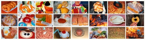
The photographer was trying to orchestrate all the types of food found around England and parts of the human body to represent what connects people and food. He was attempting to get close ups of food as if looking further into it as if it is under a microscope.
When viewing all of the photos together it develops a full view of all of the foods he is presenting. If the photos were individual they would simply be pieces of food with no meaning. But together it represents how he is looking into all the types of foods and also adding in the human body showing how it is transformed into healthy fuel.
The images are all focused on foods which is the subject of each photo and the series as a whole. Each photo is of a different food item showing a wide range of foods that can be found around England.
The photos are all taken at a higher angle showing the whole item of food. This helps to show all of the plate and gives the point of view as if the viewer is about to eat the meal. I like this because the viewer takes the role of the photographs view, it is more intriguing looking at the image.
The sequencing is not relevant because the foods do not need to be in a specific order for the effect the photographer is attempting to show. He just wanted to show a focused picture of the food and represent multiple cultures of food. This does not change depending on if they are in a certain sequence or not.
The text helps to describe exactly what it is that the photographer wanted the viewers to see. Without the description a viewer would not know why they were looking at all the pictures of foods. But the paragraph explains the focus of each picture and the relevance of the random humans displayed throughout the series.
0 notes
Text
Reading a Photographic Series Index as Still Life, Saron Hughes
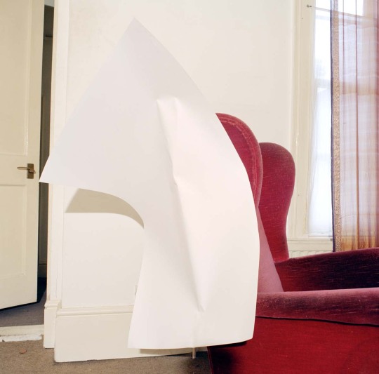
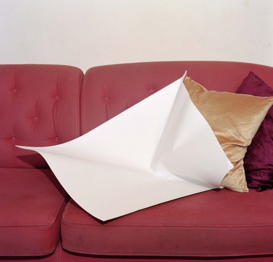
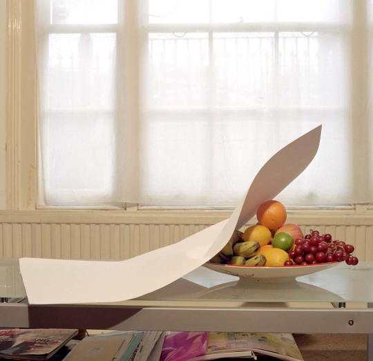
First Impression
My first impression of the series was that the colorful contrast is what pops out to me as a viewer. The first thing you see is the white paper which would not belong if this was a normal living room picture but, in this picture, it is the main focus. Initially after noticing the paper the red chair is the next thing I noticed because of the color contrasting with the white paper. I initially liked this picture because of the way that the colors bounce off of each other and it makes a normal photo look more interesting just by placing a piece of paper in the middle.
Themes
The photos are a representation of a series rather than just a collection of pictures because the photos have the same subject. Each picture contains the white sheet of paper that contrasts with the colors of an object adjacent to the paper. Each picture is taken in what seems to be the same room and contains the same paper in each photo, this shows a continuation throughout the photos creating the series. The photos are all taken at eye level showing the same point of view in the photos.
Title
The title connects to the photos because they each represent a still life of everyday things in a home. The photos measure the paper in comparison to everything around it for example the colors of the fruits are brought out based against the paper.
Sequencing
I think the author chose the sequence because of the location of the items in the room they are in. Going from the chair to the food in order of which they are in the room. This is just a representation of how a living room is set up.
Last Impression
As I went on in the analysis the title brought more meaning than originally anticipated. At first I was more focused on the paper contrasting with the colors but after a while I understood the representation of the stillness in each photo.
0 notes
Text
Creating Patterns


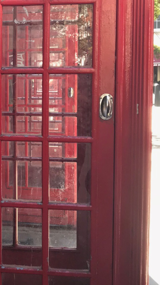
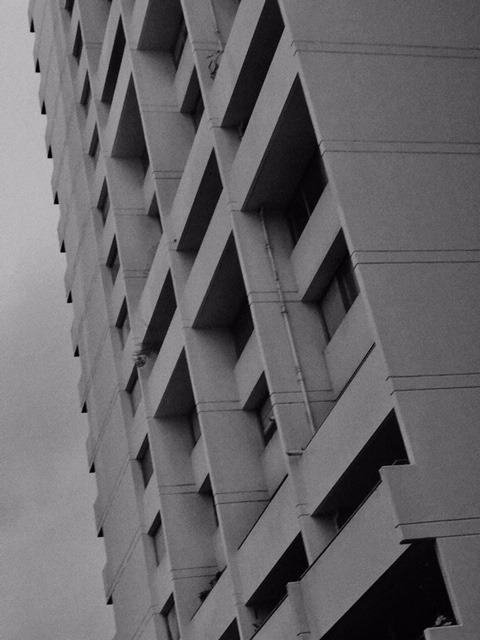
When I took the photos, I noticed the patterns and how they appear as if they are different objects than they actually are. Each one has a different representation than the actual object. The object presented in a way that creates an abstract shape looks like a small glass pane from a door but this is actually a wired gate, it is different than originally perceived. But once you look at it for longer than a quick glance you begin to tell what it is. The photo of the multiple phone booths has what seems to be a never-ending pattern of crossing panes of glass, but it is simply 3 phone booths lined up next to each other. This is my favorite of the 3 photos because the continuous pattern is what draws my eye, creating an illusion. I was inspired by the photos I chose from the art gallery to choose this photo because of the illusion created. I also chose the photo of the pattern created by shadow and light because of the way the shadow is presented on different surfaces remains the same as if it were on flat ground. The overall meaning of these photos is that there is more to them than meets the eye at a quick glance.
0 notes
Text
Photo n. 145, 1940, printed 1970s Luigi Veronesi
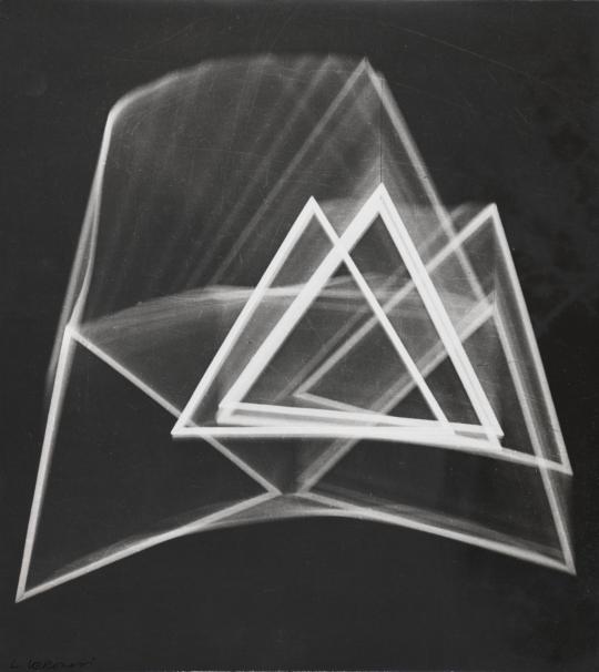
This photo uses contrast between black and white to make it really pop out to a viewer’s eyes, this is exactly what drew me to this photo. The photo is showing motion in a still frame. This is possible with the combination of the lines drawing a viewer’s eyes towards different parts of the photo. Combining with strong points of the picture being brighter than the motion lines.
I believe that the photographers use of light and dark and the lines represents the bright parts and darker parts of life. But everyone goes through each of them, the photo has the main part be the highlights, the parts of life most important, then the rest of the phot represents the cycle of life and how it is important to just keeping moving through life to just bring you to more highlights right back to the brightest triangle in the photo.
I believe the photo was taken with a big aperture because of the brightness in the triangles being pure white. The larger amount of light let in allows this photo to become the contrast between the black and white parts of the photo.
0 notes