Last Seen Blogs

input-command
Input_Command
lovefatbellies122
Getting Bigger

krasaviza5
Untitled

boobearlarry
Just A Little Bit Of Your Heart

pokitos-world
Tachi
Photo


https://www.pinterest.co.uk/josephinekinged/beano/
2 notes
·
View notes
Text
COMPETITION
For my animation I am left feeling pretty despondent and miserable but that’s fine it’s my own fault. I decided to do stop motion animation which I started as soon as I got the brief and have spent a lot time putting together all the different elements which I found really complex. However when I finished with my initial idea the animation came to 15 seconds which was really depressing. I wish I knew how to work a computer or at least tried to learn rather than toiling over something that looks just as good as everyone else’s that they did in literally 2 days. I feel like I waste a lot of my own time and I don’t understand why I do it. If I take myself so seriously and have to be so sincere in my approach all the time I should find easier ways to bashing out ideas in a more expressive way rather than taking the long way around because I am technically incompetent and scared to learn. Ignorance is comfortable because if I don’t try then I can’t get it wrong.
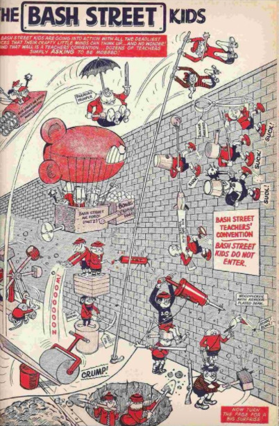
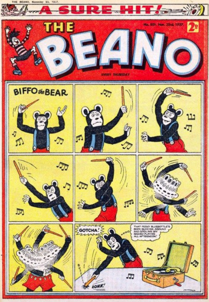
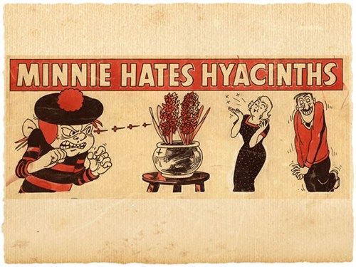
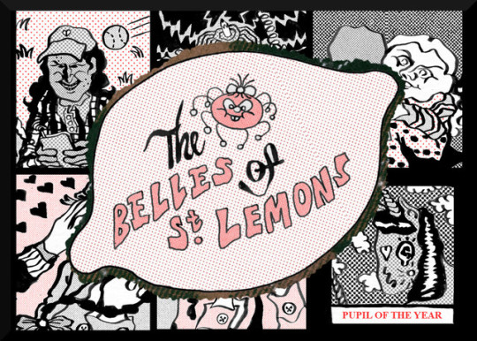
Anyway I decided to do The Belles of St Lemons which is a gender flipped version of the bash street kids that ran for a year. I wanted to focus on friendship between diverse characters and I remember that identifying with stereotypes and identities as a child at school very important, so I wanted to make interesting characters. My characters were as follows..
- Prune - The ‘leader’, vapid, popular and superficial, big smile! starbucks cup and mobile phone, pretty, tall and skinny with spots and braces.
- Swotty - Head Girl and the smart one - Evil genius, science nerd, anxiety, fidget spinner.
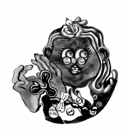
- Angel - Younger, looks innocent but is very evil, prankster, silent, gets away with everything, big hypnotising eyes, very gross and crude.
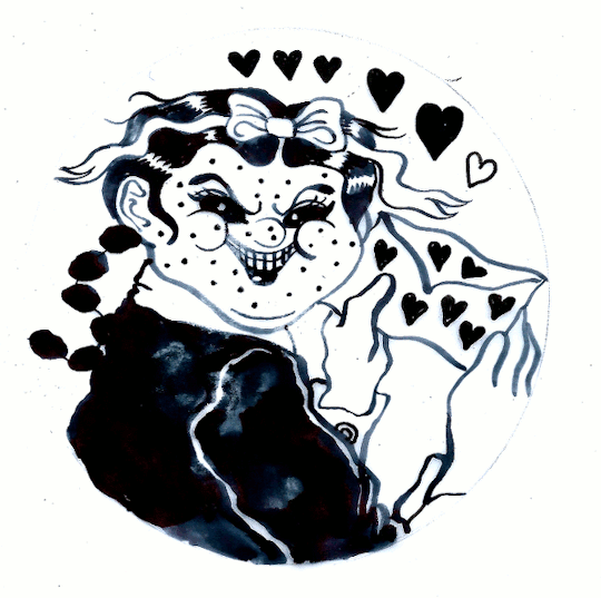
- Piggy - Fan Girl, love sick and boy crazy, cute, chubby and goth with lots of spots and long braids.
- Horse Girl - The horse, the calm reasonable one and pupil of the year. Teachers pet.
- Pony - Ditzy, humble, farm girl, loves her horsey and wishes she was also a horse. She’s more of the horse and horse girl is more of the girl.
I wanted to create the opening to an animation rather than trying to do a stop motion 30 second story, so I scanned in my scarf to use as a background and used circular character introductions to display interactions between the characters. Having 2 characters on screen at once was stupid because that took up even less time.
I like how it looks but again I can’t tell if it’s actually any good or not.
0 notes
Text
FACT
For my film I decided to focus on nuclear mutations in plants. It was my first time making a video and I wanted to experiment with umm.. trippy warped effects and music and bizarre compositions and contrasting elements to portray a kind of general warped aesthetic rather than being obviously literal and informative. I found still images of mutated vegetables, flowers and plants, my initial inspiration being from the faciated daisies that were all around my house in Leeds where there used to be a nuclear power plant, and then contrasted it with footage of smoking, forest fires and power plants. As it was my first time making a video I kind of wanted to see what I was able to work out on Premiere rather than having specific influences, I wanted to just see what I was happy with and work it out as I went.
I really enjoyed how my funny film turned out and I used audio from a circuit bent childs toy for the audio. I’m not sure what people really thought about my film I got a bit of feedback saying that it was funny and Geoff said sometimes he likes a nice song and sometimes he likes free jazz so.. I don’t really know if people thought it was good or bad but I thought it was really cool.
For the poster I used images and stills from my film and experimented with the photocopier, moving the image around and warping it with the laser and then ripping and gluing and layering the images and text.
0 notes
Photo
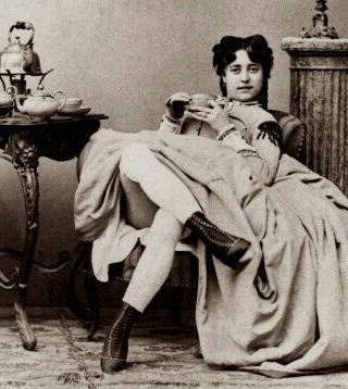
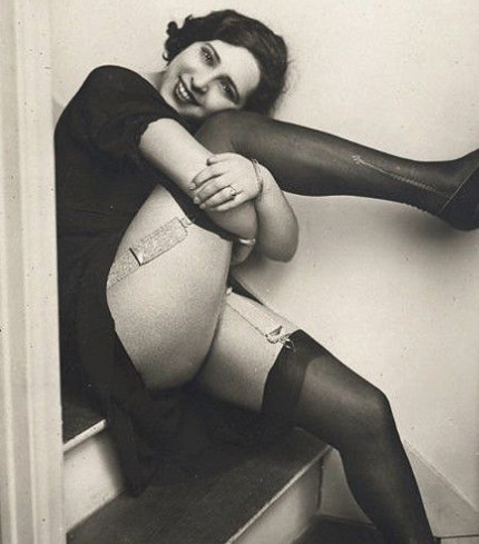

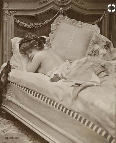
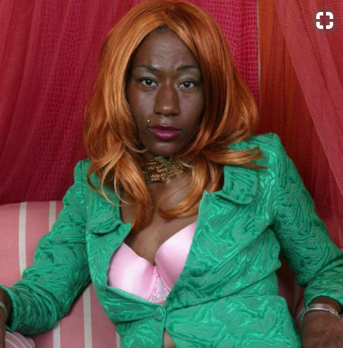
Merging portraits from the 1920s of women working in adult entertainment / sex work with modern portrayals of femininity
https://www.pinterest.co.uk/josephinekinged/sex-representation/
0 notes
Text
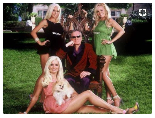
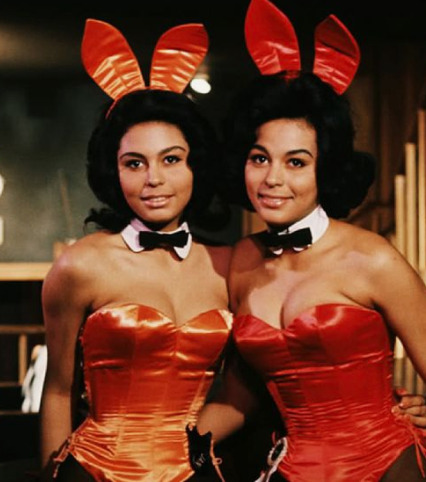
GHOST POST
My initial inspiration for my stamp was from an alternate history task, where I imagined the playmates taking over the playboy mansion once hugh hefner died and turning it into a commune for sex workers. I have given myself a pretty difficult task as it was quite a difficult thing to portray.
I initially experimented with paper cut outs but it was difficult to make it not look like it was about rabbits. I researched playmates of the past and read about the disgusting conditions and the boring lives they led inside the mansion, being forced to watch hugh’s favourite films, getting sick from the water in the jacuzzi and there being dog shit all over the floor, as well as aesthetic inspiration from the personal style of the playmates.
I wanted to be considerate of them as people and I didn’t want me stamp to portray women who had, you know, thrown off the shackles of patriarchal sex work and were now scruffy women who didn't care because that’s just not who these women are. I think women should be respected for wanting to be pretty and looking however they like and shouldn’t be shamed for working in adult entertainment. This is what made me choose to draw overtly feminine and girly scenes in my developmental work.
I decided to go for a more abstract painting of the hot tub as a signifier with three women and a baby signifying community. I really like how my stamp turned out but it didn’t really look like an actual stamp... I would’ve liked to have experimented more with colour separation and photoshop like some of the other people in my class and that’s just my own fault for not putting enough time aside to develop my skills and learn some new things.
0 notes


Text
FICTION

Concept
For my fiction project I wanted to focus primarily on the world in which the story is set, rather than focusing on representing characters on the cover. As Octavia Butler uses minimal world building in her story I wanted to create an environment using the minimal details provided such as the pasture, and the animals which are readily available for the T’gataoi to use to harvest the eggs, and the human and alien integrated community within the pasture. The story is very atmospheric and sensitive and I think the readers interpretation of the characters is important as details are revealed throughout the story, progressing from the cage like legs of the T’gatoi and the tapping on the floor as T’goi moves and the four limbs on each section of the body. These sensory descriptions of the characters I believe is more important than how they physically look, so I didn’t really want to detract from that with a representational illustration, and instead perhaps view the landscape seen from the lense of one of the characters themselves.
I wanted to focus on farming and agriculture for the book cover which represents a lot of the important central themes of the story, such as species co-dependence, the ethics of farming, and domesticating animals to the extent where they would not be able to exist outside of the constructed conditions which the species higher in the social hierarchy needs to enforce in order to manipulate the lower species to meet their own necessary ends.
Aesthetics + Process
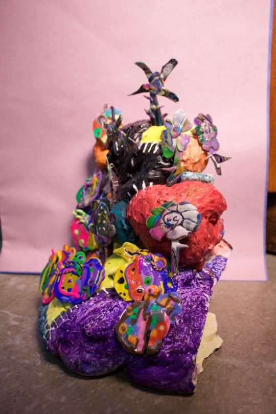
I was interested in how I could create a 3D set using shadow, light and colour to portray an organic alien countryside landscape. I chose to use insulation foam in order to create rolling hills and horizons, and using the organic irregularities in the expanding foam to represent how land is raised and changed over time, due to the routine and patterns of livestock. I used spray paint in a similar way where there is limited control and unavoidable mark making and movement of the paint due to the irregular surface of the insulation foam and gravity. I also experimented with wetting the surface between layers, scrubbing off the paint while it was still wet and using acrylic paint, using spotting and brush strokes, to represent natural growing structures of the fields and for surface pattern.
In contrast to other students I viewed the farm as being productive and lively and ultimately successful as the structure seems to be so heavily ingrained into the characters, accepting their conditions as being lower on the power structure in contrast to the hierarchy on Earth where humans are undoubtedly at the top, and the one instance in which a character rebels they ultimately give up as it seems their running around a locked cage, showing how deeply ingrained the conditions are. Or perhaps the environmental conditions just aren’t suitable for humans, which I want to represent in a surreal looking landscape.
I had a few ideas for how I would want to represent the countryside. As the human community is agriculture I was thinking about the societal structure in a more medieval or peasant like environment, which I wanted to represent using a kind of patchwork style field design. The different growing pattern on each hill representing a piece of fabric and the fences between them representing stitching. Perhaps using cord or shoe string laced between the fields. Then using a barn, farmhouse, or perhaps estate style housing dotted across the landscape, showing one of the alien livestock chained to one of the structures. Then experiment with lighting - gels, refraction, smoke (clouds or mist?) and shadow to represent different times of day and the different universe or planet and colour of the sunlight.
Typography, Layout and Composition
As I’ll be using many different bright neon colours in my photograph I would like to use a layout where I am able to choose many complimentary colours for the text. The colours I’ve used reminds me of the comics anthology Spider’s Pee Paw, the Skunk Trunk collective, and Char Esme who makes Queasys, where their mixed media and digitally manipulated images verge on sensory overload.
0 notes