
k00279452
Sophia Ball
First year LSAD .Graphic Design - Glastonbury Festival poster
170 posts
Don't wanna be here? Send us removal request.
Last Seen Blogs

scanexesver
Untitled

seths-art-suffers
Commissions Open!
lovesugar714
Love's Photo in Tokyo


gatewaypaving
Gateway Paving
Text
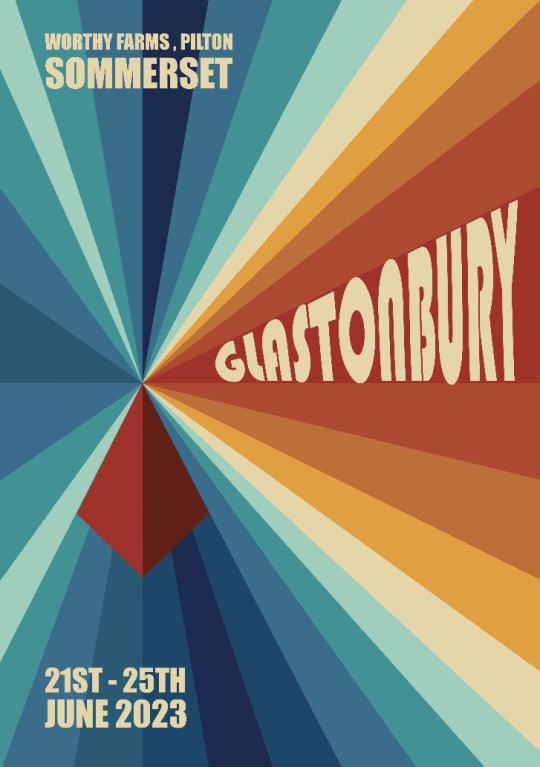
Printed Poster

Before I went to print the poster , I adjusted the text ‘Sommerset’ . I added an outer glow to make the letter stand out against the beige .
I printed it in A2 , on matte rather than the proper poster paper , as that is what we had available to us this morning.
I cut off the bleed with the guillotiné and stuck it on the wall.
17 notes
·
View notes
Text
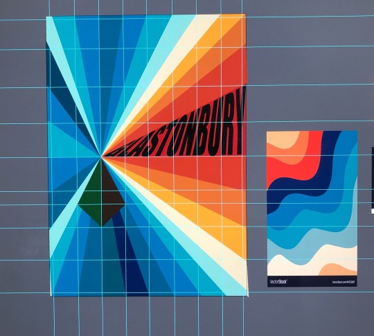
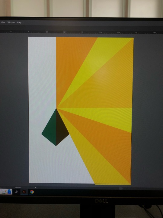
Finished poster design on Ai
I changed the colour of the blues (second darkest) as I felt they were too grey before . I adjusted the layout of the information text , aligning them evenly . I brought the ‘Glastonbury’ text more towards the center to bring the eye towards the rest of the text .
I darkened the shadow of the pyramid, matching it more toward the tone of the darkest blue ray , creating a cohesive colour scheme.
I am not fully happy with the ‘Glastonbury’ text , as I feel the ‘bury’ is too stretched .
12 notes
·
View notes
Text
Progress of design

I worked the type so it is more legible for ‘Glastonbury’ .
I am happy with the colour scheme. Im not sure about the pyramid colour I think it detracts from the name of the festival , however it sort of balances the components of the texts .
6 notes
·
View notes
Text
Edited design

On reflection , i felt that my previous design was too simple and lacked colour.
So today I decided to add in more rays to give it more detail , bring in a blue and orange gradient. I feel like these too colours are complimentary and give a sense of the festival being set during the summer. - blue skys /rain - orange sun .
I mariginalised the page so that the rays would align from the pryramid into the corners evenly .
The light accents reflect the idea of the ley lines energy .
‘ Glastonbury ‘ font is a trial , I enveloped distorted it onto the shape of the rays but it distorted the text to much , so I will need to find another way of creating the type .
This is a proposal of my new design . I need to work on the colour pattern, the pyramid and the text before it’s ready .
4 notes
·
View notes
Text
Anthony Burrill

This morning we did a workshop with adobe illustrator using icons from Anthony Burrill’s archive. We messed up the image , using the tools on illustrator, preparing us to do our own takes on Anthony Burrills icons .

This is my end piece (printed). Using the fragile type icon and incorporating ‘Anthropocene’. My idea behind this is to shine a light on the technological impact caused by humans on the world in a negative way , with waste and pollution through mining , discarding material and power used in the manufacture of technology.
7 notes
·
View notes
Text
Final poster layout


Here are the final layouts of the poster, however i feel colour blocking for the text will take away from the design . I will bring in the colour and font in illustrator. I want the sun rays to have a 70s feel such as these colour pallets, the pyramid will be a mix of greens .I will experiment with font in ai as I have to distort it and see how legible each font is ( thinking of -lazy bones ) when placed into the ray.
I have to measure the page in 1/8ths and put the triangle in one of the 1/8ths and see that the leylines come from from it to match with each corner .
Hère i started in illustrator to get a feel of what it will look like and how to use the tools. I want more of a variation in oranges/yellow .
3 notes
·
View notes
Text
Anthony Burril
After group crits today , I was advised to adjust the image but , using the actual image of the type in the adobe version , add in white outlines on the screen to make it pop and put the Anthropocene in a different format to make it more legible.
1 note
·
View note
Text
Anthony Burrill


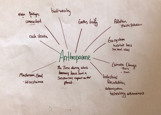
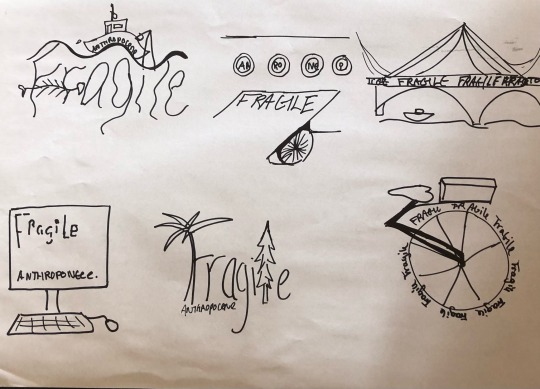
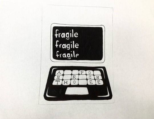
We were given a brief to work with images from Anthony Burrils archive . We got an image and are meant to incorporate it with the work ‘Anthropocene’ which means basically means what effect the human race has on the world . So I research it with a Mind-map and word dump .
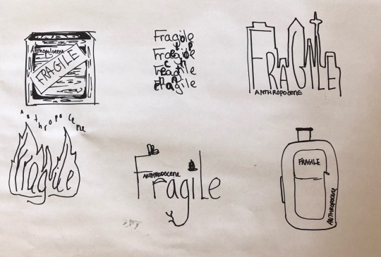
I then went to create two sheets of visuals relating to my research . I looked at it in a positive and negative light , however my image being the text of ‘fragile’ I am leaning towards the negative effect of humans on the world .
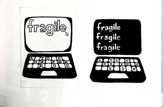
So these are my two final thumbnails, incorporating both aspect onto a laptop screen and keyboard. I think this may be an obvious choice , but technology is probably a main positive that came from humans so this is the result but put in a negative twist as ‘fragile’ is a negative word , so here I’m alluding to the pollution of technology on the earth and society.
10 notes
·
View notes
Text
Max Löffler


Max Löffler is a freelance illustrator . He created poster illustrations in photoshop and adobe illustrator as seen above . He is a current day designer who I found on behance.
I love his work as it’s a modernised retro style, so they are still aspect of the past such as his illustrations style , but modernised with his layout . Once again the font is reminiscent of 60/70 psychedelic posters, fitting informative into small spaces and warping the letters.
What drew me to the last poster was the use of ol bright yellows pinks and oranges against this beautiful pastel sage. The waves sun rays appear in this , which I would associate with a hippie Aesthetic.
4 notes
·
View notes
Text
Alphonse Mucha
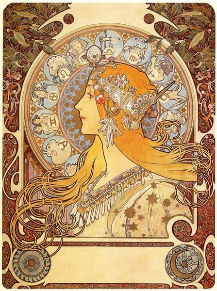


Alphonse mucha is a Czech born artist who is an art nouveau painter , graphic designer and illustrator. He gained popularity for his stylized and decorative work .
‘His work and artistic vision shifted the concept of poster from just advertising to an art form in its own right, producing legendary images that would define an era.’ - https://magazine.artland.com/alphonse-mucha-bio-art-nouveau-posters/
He got a chance to make illustrations for an art nouveau magazine - art et decoration , which strongly influenced his artistic expression.
His works feature beautiful women with long tendrils of hair and flowing garments surrounded by decorative botanical motifs in delicate shades of peach, gold and ochre . The ‘egalitarian nature of the poster’ helped in popularising the style known as ‘le style Mucha’.
Art Nouveau was an ornamental style of art that from 1890 to 1910. Characterised as ‘long, sinuous organic line’.
I like his work as it reminds me of illustrations from fairy tales , so for me it offers a nostalgic value , but style wise I enjoy the whimsical lines as seen in the illustrations long of the hair . It’s almost baroque like with swirling lines , curves and diagonals . I like the use of botanical in the border design .
4 notes
·
View notes
Text
Font Research

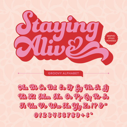


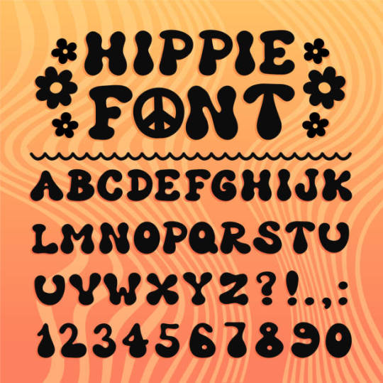
After looking at older posters from the 70s I researched fonts from this time . I wanted a font that wouldn’t be too much and would be legible and concise.
Whichever poster I make from the thumbnails I will be incorporating perspective in some way, whether is diagonal or wavy , like what is seen in Wes Wilson’s posters for bill graham presents .
4 notes
·
View notes
Text
Final thumbnails
After group crits today with Lorraine , I made 3 more thumbnails with an idea of where the text will be . I am looking at text as a large part of the design , especially for the 2nd image. The three main aspects I want conveying through this poster is the 70s retro feel , ideas of the pyramid stage and leylines which resemble sun rays and sound waves so it ties in together.

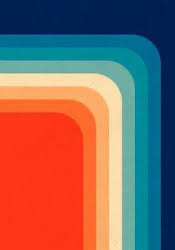
I would like more muted oranges/yellow colours like this picture of the throw in our sitting room .
4 notes
·
View notes
Text
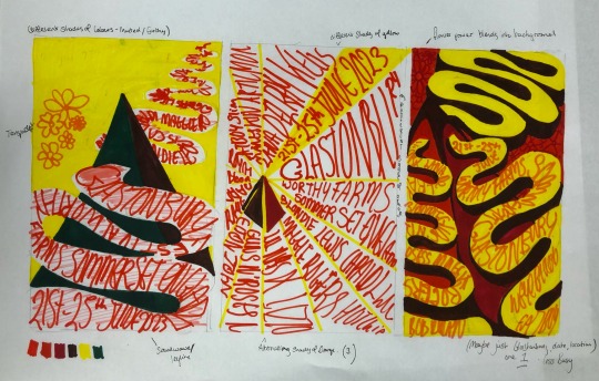
Glastonbury- final visuals and thumbnails

After the crits of the last visuals , I took on the advice to let go of the folk design and look at the more 70s designs , creating flocks of the patterns like wall paper .
The pyramid and the lines coming from it show the ley line aspect of the festival and contain a sense of 70s retro.

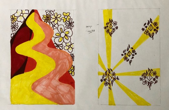

I then created thumbnails from the visuals , thinking about the colours I want - more muted then the colours above ( working with sharpies) .
I looked at the wallpaper flocks of the pyramid design and flower power , using one line to represent the ley line to cut through .
I tried it out with multiple lines , which looks more like the sun rays but can relate to the festivals time of year (summer solstice) and tie back in with the environmental conscious and spiritual part of things.
I would change the colour of the pyramid to muted dark green rather then the blues , as it looks too Lego -ish with the primary colours, rather than retro 70’s. I like the wavy line as it’s reminiscent of Wes Wilson’s wavy typography.
10 notes
·
View notes
Text
Glastonbury Mood board - Digital
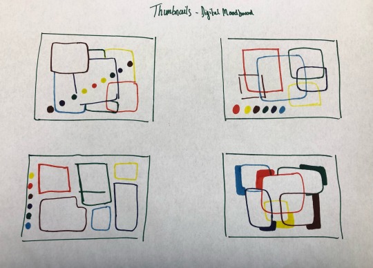

I began by creating thumbnails for my mood board. Looking back at my analogue mood board I saw I needed more images of 70s retro pattern .
I took a some primary research of 70s clothing and added it to my mood board. I brought in the image of the pyramid as it is a big part of the festival , I want to bring in more of the ley line imagery into my actual poster .
I put in an old picture of people at the Glastonbury festival, it shows the unity and natural part of it , and thought of the Matisse dance painting . I think I have too much colour going on here and will narrow it down to oranges , browns and yellows as it’s very 70s and relates to the summer season and the summer solstice in which it falls on .
I like the folk part of it but I think it’s too Scandinavian and will keep in mind the pattern but use a more 70s flower ensemble instead.
3 notes
·
View notes
Text
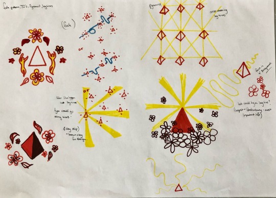
Glastonbury Research and conceptualising
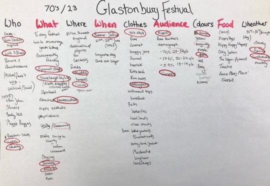

I began with research of the actual festival, by creating a list of words relating to what I knew and thought about the festival . I then narrowed it down into a mind map, using some visuals to highlight my ideas.

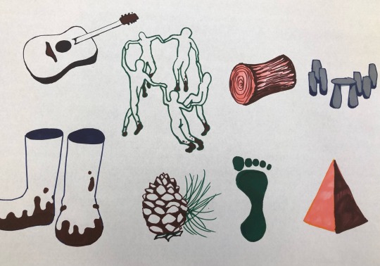
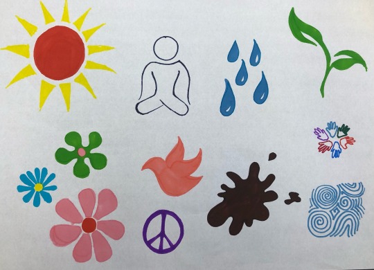
I then went on to create 24 visuals of a direct translation of the words , where after we choose which worked best through group crits . With these visuals the pyramid , folk pattern , dancing people and raincoat where the favored .
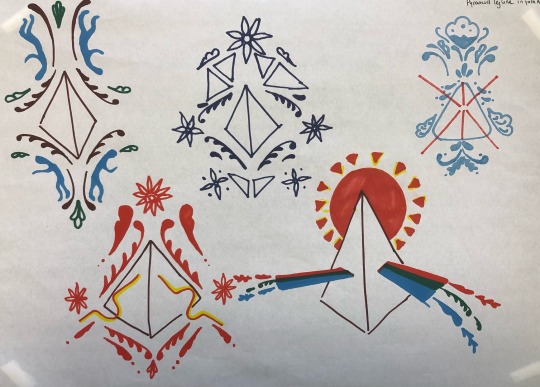

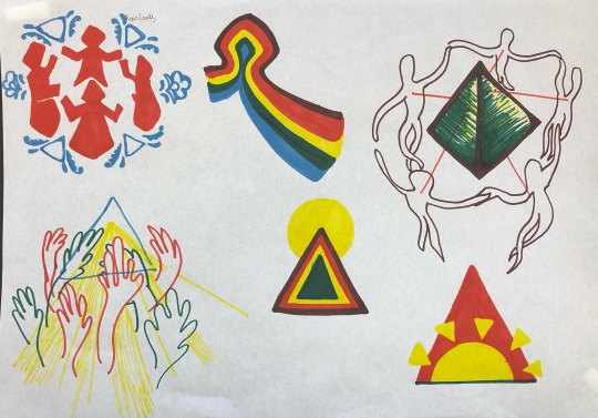
After crits of the images created , I zoned in on the pyramid , folk pattern and dancing people imagery which I found this aspect of the festival to be interesting and unique. I researched more about the pyramid stage and ley lines and earth energies were related to the pyramid shape so i incorporated this into the design , trying to keep a sort of 70s colour pattern.


I then went on to create an analogue mood board, cutting and pasting from old magazines . I made a thumbnail in preparation.
8 notes
·
View notes
Text
Wes Wilson
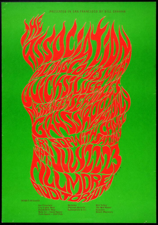


Wilson is generally acknowledged as the father of the 60s rock concert poster. In 1968, he received an award from the National Endowment for the Arts for “his contributions to American Art.” He established what is now known as the psychedelic poster.
He created a visual discussion between fine art and commercial art.
His style of filling all available space with freehand style lettering, melting together lines and letters, and using flowing letters to create shapes, clashing together colours , became the standard that most artists followed in order to put “psychedelic” in the art.
Use of colours came from experiences of lsd, and his previous knowledge of colour from painting .
I like his style, his letters show a lot of movement , i think this psychedelic aesthetic would look interesting in relation the Glastonbury Festival . I think it's reminiscent to the late 60's early 70's ,which was the time in which Glastonbury was formed . I really like the text layout of it being squashed together creating an image or pattern.
Wes Wilson - Classic Posters
15 notes
·
View notes
Text
Glastonbury - old posters

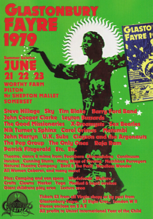


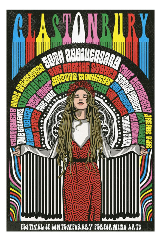

I researched previous Glastonbury festival posters to get a feel of the festival . i can see that the imagery in the older posters are primarily hippie aesthetic .The pyramid imagery comes across most of them .
I would like to bring it back to its origin , as it began in the 70s as a folk and blues festival , I want to bring 70s and folk patterns into my poster, along with imagery of the main pyramid stage. The psychedelic feel of the older hippy like poster reminds me of Wes Wilson' work.
11 notes
·
View notes