k00299935
Holly O'Rahilly
First year student ~
Painting
57 posts
Don't wanna be here? Send us removal request.
Last Seen Blogs
teru-kurihara
Teruyuki Kurihara
barz404
BARZ
audreyrose313
♓️✝️☪️
jayofthefalloutassassins
Who plans these things?
theunderestimator-3
THE UNDERESTIMATOR
Text
PAINTING ELECTIVE
Brief One- "Portrait"
Anselm Kiefer Powerpoint
Due to some technical difficulties I unfortunatley was not able to present my powerpoint on my selected date. Thankfully Eoin was very understanding and instructed me to simply post my powerpoint onto tumblr.
I chose my artist somewhat randomly, so I was surprised at how much I related to his artistic process, particularily how he is inspired by poetry and incorporates it heavily into his work. I enjoyed researching this artist from various websites and from the books I took out of the library, and this has definitely made me take an interest in this artist outside of this project.
With that, here is my powerpoint. Trigger warning for themes of war and the Holocaust.
I wrote a script to read while I presented each slide, so each page will be written under its assigned slide.
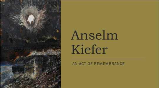
Anselm Kiefer is a German painter and sculptor, best known for his works depicting the horrors of the Holocaust. His works often incorporate unconventional materials such as straw, clay, ash lead, and shellac.
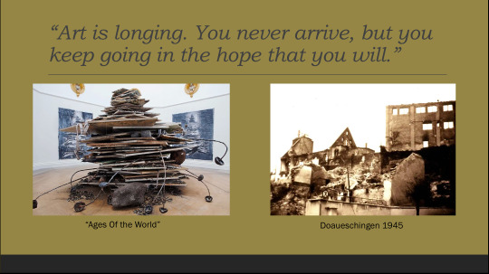
Kiefer was born to a Jewish family amongst ruins on 8 March 1945 in the German town of Donaueschingen. As the town came under intense bombing, Kiefer was born in the cellar of the family home that served as their improvised bomb shelter. In the first few weeks of his life his mother would take him during the day into the surrounding forest to shelter from the bombing. The house next door was blown to pieces.
The ruin next door became Kiefer’s playground. Before the age of six, when his family moved, he would spend his days playing in the rubble, prising loose bricks to build ambitious structures. Hitler’s ruins have haunted his work. Rubble piles up relentlessly in Kiefer’s work, and he deliberately portrays such imagery in his sculptures and paintings.

The past plays an important part in Kiefer’s work. His works are characterised by an unflinching willingness to confront his culture's dark past, and unrealised potential, in works that are often done on a large, confrontational scale well suited to the subjects.

This made him a very controversial artist when he first began his career as Germany and the German people were not ready to face and acknowledge the countries past.

Kiefer often credited the poetry of Paul Celan to have had a key role in developing his interest in Germanys past and the cruelty of the Holocaust, and frequently dedicated paintings to him.
Paul Celan was born in 1920 Romania to a German-speaking Jewish family. His surname was later spelled Ancel, and he eventually adopted the anagram Celan as his pen name.
In 1938 Celan went to Paris to study medicine, but returned to Romania before the outbreak of World War II.
During the war Celan was apprehended by Nazi soldiers and forced to work in labor camp for 18 months, while his parents were deported to a Nazi concentration camp where they were both killed.
After escaping the labor camp, Celan lived in Bucharest and Vienna before settling in Paris. Due to his radical poetic and linguistic innovations, Celan is regarded as one of the most important figures in German language literature the post World War 2 era. His poetry is characterised by a complicated and cryptic style that deviates from typical poetic conventions.
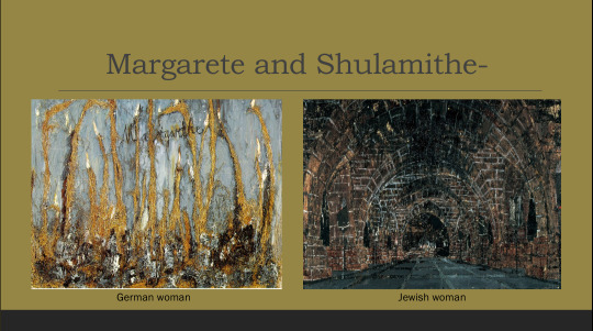
Two of Kiefers his most renowned paintings, Your Golden Hair, Margarete and Sulamith, are drawn directly from Celans most famous poem, 'Death Fugue' or 'Todesfuge'.
Widely read in postwar Germany, the poem is set in a concentration camp and narrated by the Jewish inmates, who suffer under the camps blue eyed commandant. Singing "your golden hair, Margarete/ your ashen hair, Shulamith," they contrast German womanhood, personified by Margarete, and Jewish womanhood personified by Shulamithe.
In Kiefers paintings titled Mararethe and Sulamithe he depicts this contrast visually, depicting Margaret with strands of straw amidst light blue paint, and depicting Shulamithe using dark colours and harsh brush strokes. One artwork out of hundreds that Kiefer has been inspired to create because of Paul Celans poetry.
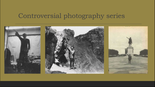
Aswell as painting and sculpting, Kiefer has also dabbled in the world of photography and performance art.
In fact, he was one of the first German artists to address the Nazi crimes in a series of photographs and performances called Occupations and Heroic Symbols. Dressed in his father's Wehrmacht uniform, Kiefer mimicked the Nazi salute in various locations in France, Switzerland and Italy. Naturally these pieces caused much controversy among critics and the general public. The meaning of this photography series was to remind Germans to remember and to acknowledge the loss to their culture from the xenophobia of the Nazi occupation.

At 79 years old Anselm Kiefer is still quite active in the art world and is still sought after by collectors and museums for his captivating artwork. These are some of his most recent works from the past 5 years.
2 notes
·
View notes
Text
PAINTING ELECTIVE
Brief One- Portrait
Life drawing
After two weeks of sleeping and.....sleeping, I started off my return to college with life drawing with Eoin. This was my first class with him so I was curious to see how it would go and what kind of things we would do.
The class itself was quite laid back which was nice since I felt a bit rusty after not doing much art during easter. We could draw the model with any material we wanted to use. But instead of one continous pose like with the life painting, the model changed his pose every 20 minutes which added more time constraint.
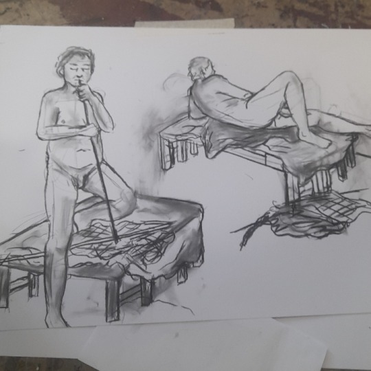
Pose 1 and 2
I decided to use charcole to challenge to myself a bit, as I hardly ever use charcole and dont like how easily it smudges. For these first two sketches i really struggled with drawing the table the model was on, and I probably spent too long trying to get it right. Resulting in a less detailed drawing of the model, I think the anatomy came out well though.
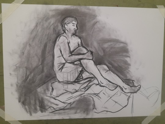
Pose 3
I started drawing the table again, but ended up getting frustrated and just smudging over it. I decided to just focus mostly on the model for this drawing. The pose took me awhile to figure out, but I really like how it came out. I also really enjoy the energy of this drawing, as you can tell from the background smudges that I was frustrated and scribbling a lot.
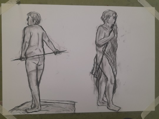
Pose 4 and 5
Theres not much to say about these drawings but I love how they turned out, especilly drawing 5. I decided to only focus on the model in order to get more detail in, and to just forget about the very annoying table. This resulted in more shading and detail.
Overal I enjoyed this class a lot. It took me out of my comfort zone while also being a relaxing activity, as I've always found sketching quite calming. I look forward to doing more life drawing in the future.
2 notes
·
View notes
Text
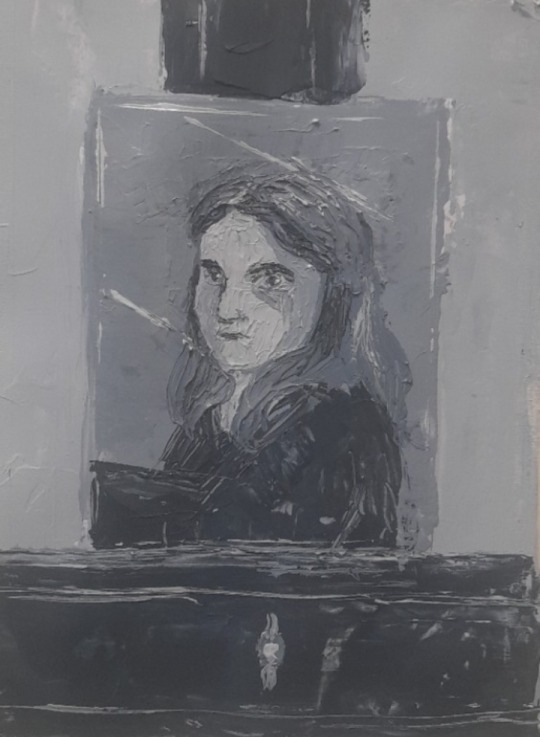
PAINTING ELECTIVE
Brief One- "Portrait"
Pallet Knife Painting
For Tuesday we were first informed about a powepoint presentation that we had to present after easter on an artist of our choosing. However we can only pick an artist from a list on the wall, and only one person is allowed per artist.
I decided to look into my options for an artist after class as I was a bit late arriving that morning and wanted to jump right in. We were going to be painting portraits of ourselves using a mirror and a pallet knife.
This is what our mirror setup looked like (featuring me and eve) and we were encouraged to include the mirror outline and easel in our paintings.
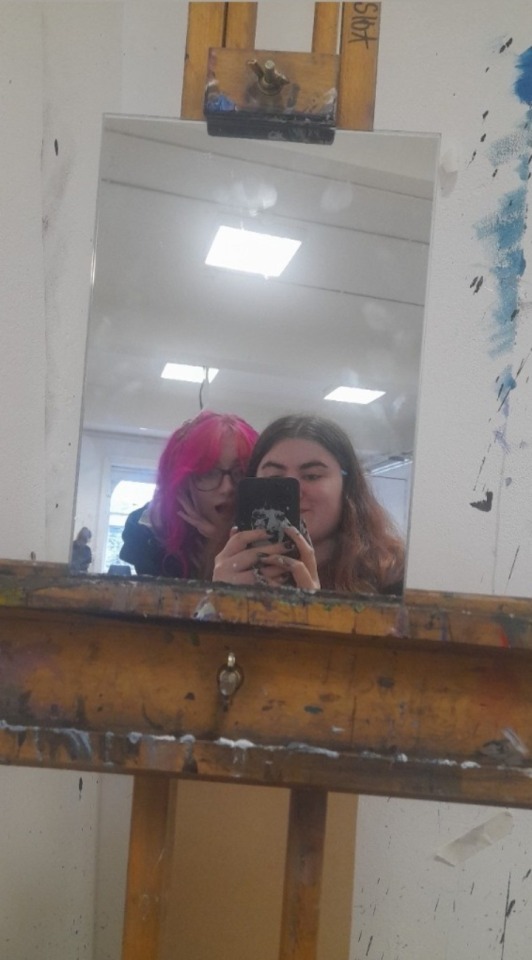
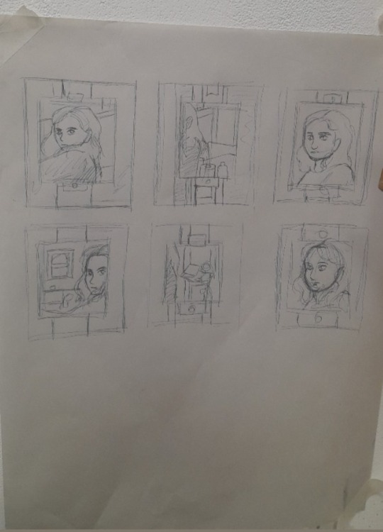
First we had to draw thumbnails to plan our paintings. I decided I liked the composition of my first thumbnail design the most, so thats the position I took when painting myself.
Painting with the actual pallet knife and not a brush was a challenge. For the bigger parts of the painting such as the mirror and easel it was fine, but when it came to those small details such as my face and hair, it was quite hard. Im not completley satisfied with how the finished painting came out as I feel the face looks off, but for a challenge I dont think I did too badly.
5 notes
·
View notes
Text
PAINTING ELECTIVE
Brief One- "Portrait"
Life painting
I got my first choice of painting, hurray! Monday was our first official day of the painting elective. We were given our brief that we will be working on for the next few weeks. Our brief is "portrait". Im quite excited about this brief and cant wait to start working on it.
We would not be working on this brief right away though, for our first day we would be doing various exercices to get us out of our comfort zones. The class was seperated into two groups with either Eoin or Sylvia. I decided to join Sylvias group as I knew we would be life painting that morning and I was eager to give life painting another go, and hopefully do better this time. The pose in which the model was in was quite different to last time. He was sitting down with a light shining onto him from the right, causing a big shadow to cast onto the wall. It was an interesting composition.
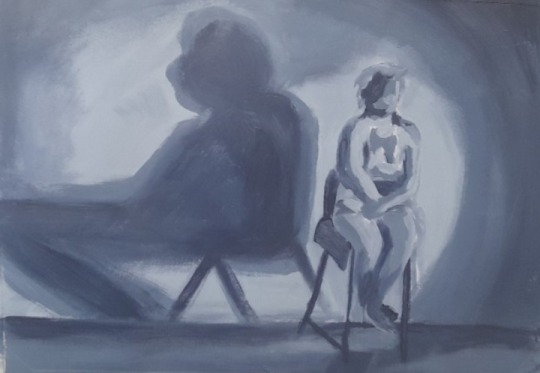
I think this is a big improvment from my last life painting. I was able to finish the painting and I think I captured what was infront of me quite well. I wasnt embarresed to display this painting on the wall with the others, and I think we all did a good job.
6 notes
·
View notes
Text
BRIEF THREE- MOVEMENT
Week Seven- Final statment
What does movement mean to me?
We often see artworks depicting ones movement through life. From childhood, to adulthood, to old age. We dont tend to see beyond that when we talk about moving through life, so with this project that was what I wanted to explore.
My Movement project was about moving from death, to the afterlife, to rebirth. The things we may encounter, the emotions and memories that we will relive, aspects of our personalities we will realize, and the beauty that we will see as we move through this journey.
I explored this idea with my three selected disiplins. Painting, Graphic design and Ceramics.
Painting- I focused a lot on identity in painting. Exploring the concept of memories about earthly pain and joys. And the things that make a person who they are. While I struggled with the more down to earth side of this disiplin (the life painting in particular), I absolutley loved exploring my ideas creativley with paint. Painting truly is my passion and I learnt so much during the two weeks I focused on it.
Graphic design- For graphics I focused on the actual journey through the afterlife. The things you will see and expirience. I wasnt sure what to expect in graphic design in terms of work, but it pushed me out of my comfort zone and as a result I produced work that I have never really made before but am quite proud of. Im especially proud of the digital collages and the animation I made, as I feel they really captured the mood of this project thay I was trying to convey.
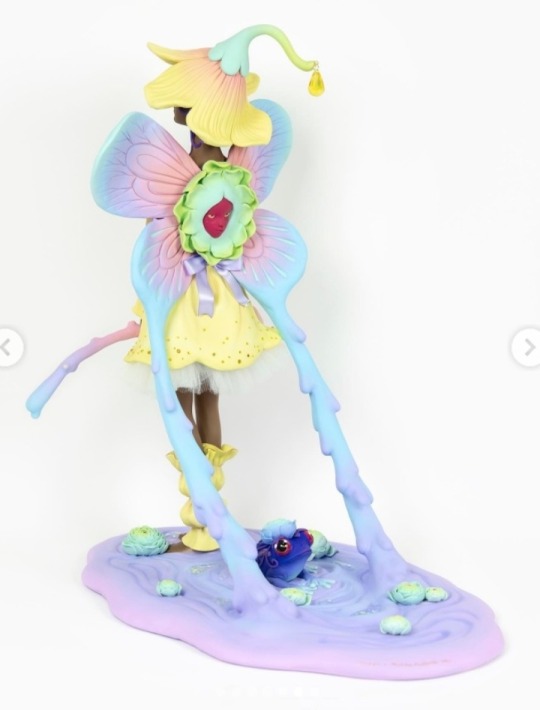
Ceramics- In ceramics I explored a combination of identity and the afterlife. I explored the aspects of a persons spirit with the ornaments, from pets we love, to moral beliefs, vices and emotions. I also explored the spiritual state of being with my flat ceramic sculpture, and I then looked at reincarnation in a more literal sense with my cat sculpture. I regret not starting ceramics earlier as it would have allowed for more glazing to be done, however I am still quite happy with the work that I produced. I think I could have done better with the cat sculpture, but overall Im satisfied with what I have.
2 notes
·
View notes
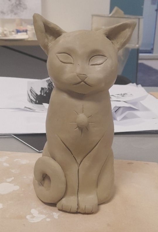
Text
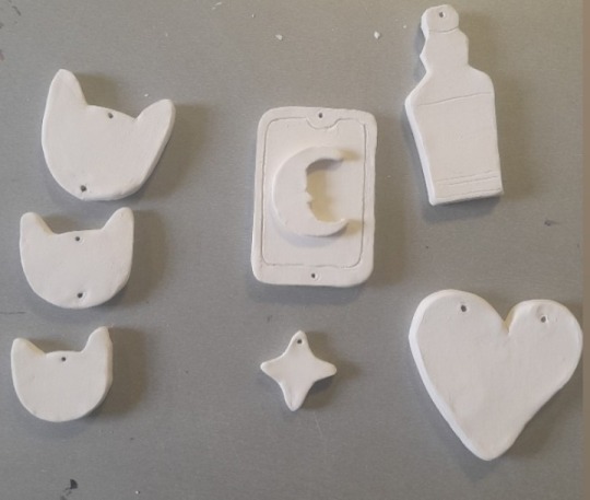
BRIEF THREE- MOVEMENT
Ceramics- Week Six
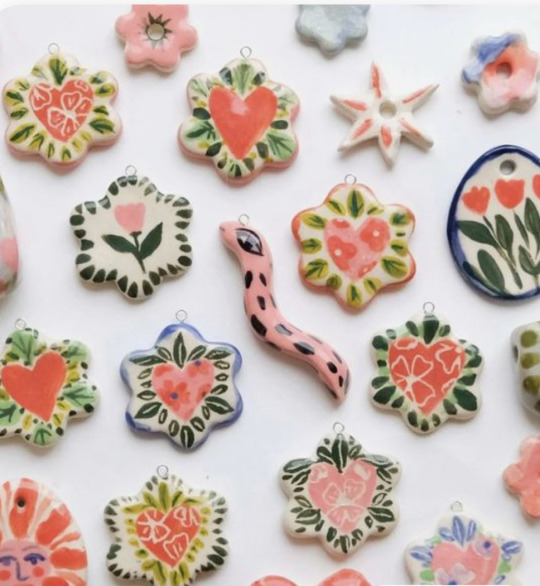
Ceramic Ornaments
Like the cat sculpture, there was unfortunatley no time to glaze these ornaments in time to take pictures of them so I cad to paint them. But unlike the cat scuplture I actually love how these turned out and I think the paint really added a lot more charm to them than glaze would have.
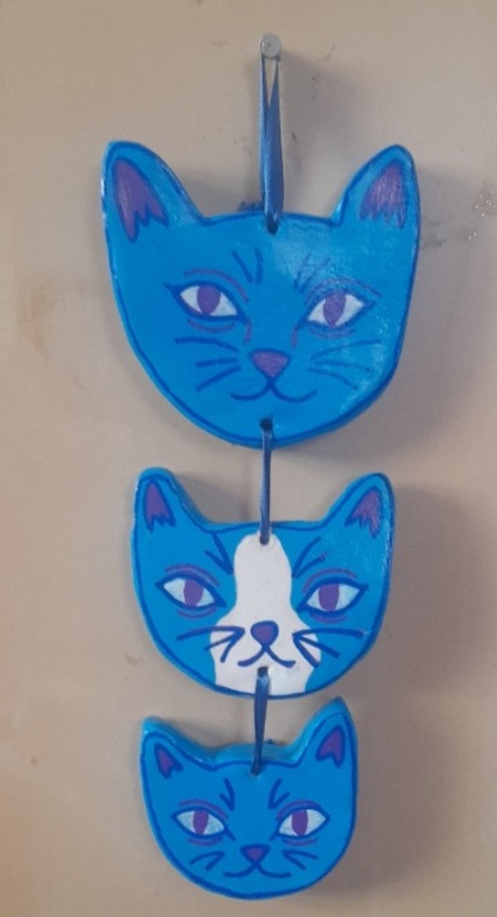
" My loves, Yami, Yuki and Kiki"
Of course this ornament represents my beloved cats. I assembled them with blue ribbon, and although I was afraid the ribbon would hurt the overall look I think its actually quite nice.
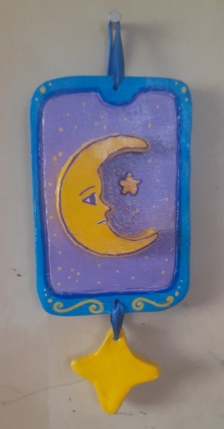
"The card knows"
Representing my love of tarot reading. I love how this ornament came out,and the vibrancy of the yellow.
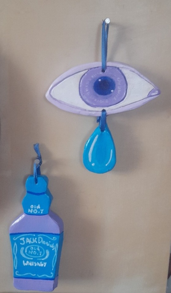
"I cry easily" and "Vice"
The titles of these ornaments speak for themselves. I think out of all of them these two are probably my favourite, especially the tiny jack daniels bottle. I think its so cute.
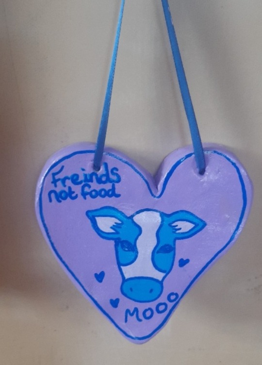
"Oat milk tastes better anyway"
Of course I couldnt make ornaments representing my spirit without speaking on veganism. Im still working towards going completley plant based and its certainley not easy, but when I need motivation it all comes back to a simple philosophy. Animals are freinds, not food.
2 notes
·
View notes
Text
BRIEF THREE- MOVEMENT
Ceramics- week 6
Painting
The problem I have learnt, with waiting until week 5 to do ceramics is there wont be time to glaze everything before week 6. My cat was ready but I wouldnt be able to take pictures of it completed in time if I decided to glaze it. So I decided to paint it with acrylics instead.
I first sanded it down and tried to make it as smooth as I could. I then got to painting. I wanted to connect the cat with my spirit sculpture from week 5 as much as I could, so I used similar colours such as blue, purple and yellow, to reay tie the two pieces together and convey that its the same spirit just in a new body.
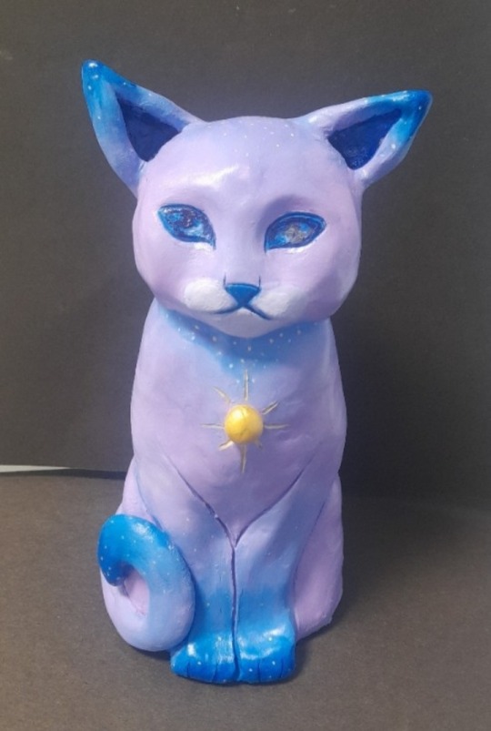
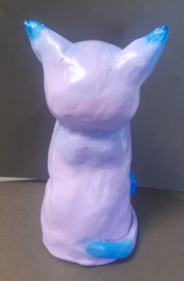
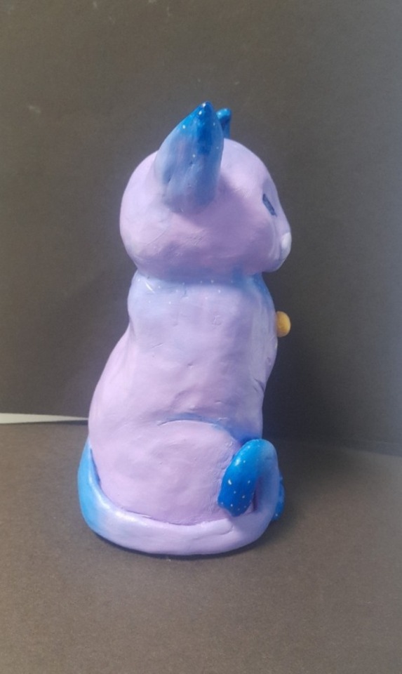
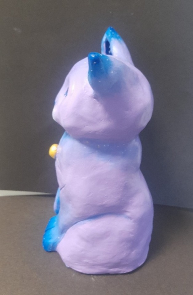
Im not really satisfied how the finished result came out and I feel that I could have done much better. I think it would have looked better glazed to be honest.
4 notes
·
View notes
Text
BRIEF THREE- MOVEMENT
Week Six- Ceramics
Glazing
With my ceramic peice out of the kiln It was ready to be glazed. After pondering for a bit I ultimetley decided to keep the colour scheme simple and Im glad I did.
I used purple, blue and yellow. I love how the blue and yellow came out but as you can see the purple.....yah. Apparently purple undergalze is one of the more difficult underglazes to show up once fired. Unfortunatley I didnt know this before working with it so I didnt use enough and it didnt show up.
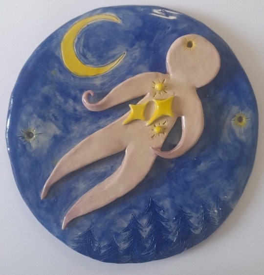
I still really like how it came out though, I think with the subject matter the white works just aswell as the purple would.
2 notes
·
View notes
Text
BRIEF THREE- MOVEMENT
Ceramics- Week Five
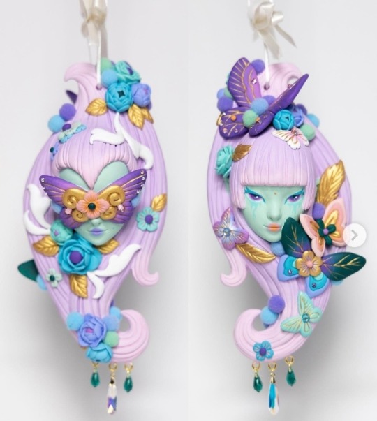
Ornaments
I knew I wanted to make something else, but I just wasnt sure what. So I had a browse on pinterest for some inspiration, in which I saw all these images of ceramic ornaments~
I found these ornaments absolutely adorable, and knew immediately that I wanted to make a few in relation to my project. So I thought in it for awhile and designed these
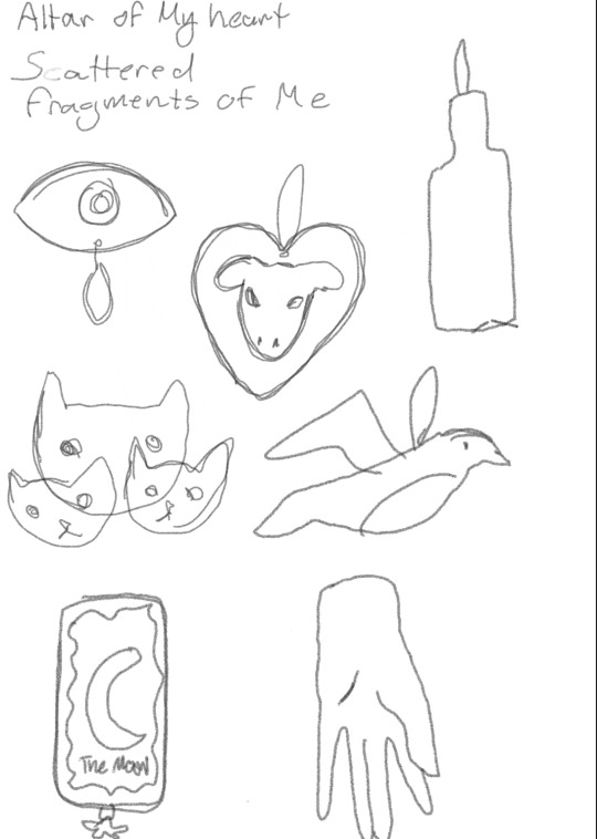
I wanted these ornaments to represent fragments of me, and my spirit. These drawings are very very basic, but I just wanted a baseline for what I was going to make.
In the end I went with the cats, (representing my own cats) the cow, (representing my vegan beliefs) the bottle, (representing my vices) and the crying eye (representing how sensitive I am) the tarot card (representing my love for witchcraft). The sculpting process of these ornaments was very relaxing and I enjoyed it a lot. Some of the ceramic design will rely a lot on paint for their meaning to come through, but for now I'm happy with how they look.
2 notes
·
View notes
Text
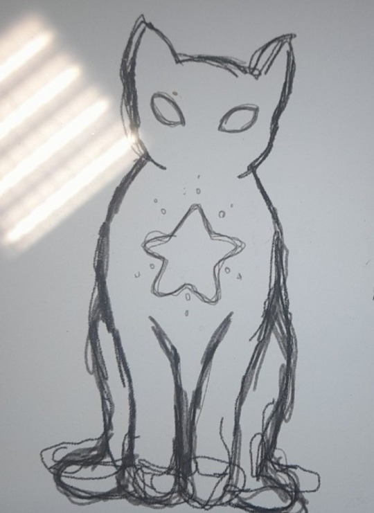
BRIEF THREE- MOVEMENT
Ceramics- Week Five
Cat
I came to the realization that I had not really protrayed rebirth all that much, so I decided to make a more literal representation of rebirth. To add more balance to my project and also just to switch things up a bit for myself.
I decided I wanted to make a cat that the spirit has been reborn as. Since personally I eould love to be a cat in my next life belonging to a cat lover. Warm naps all day, food whenever I like, no work, no stress, what a life....
To start I designed a very basic design of what I wanted the sculpture to look like. I decided to add some celestial elements to the cat similar to what the spirit in my other ceramic peice has, just to show a connection there and to protray that they are the same entity.
I then got to sculpting. I decided to roll out my clay and make a cylinder type shape to work iff from.
From this pount on it was a matter of adding and taking away clay in order to get the shape and design I wanted.
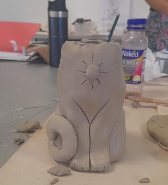
I forgot to take pictures of the process of sculpting the head, but I basically made a pinch pot and stuck it to the neck with slip. I then just added and took away clay once again, then added details with tools.
I think it came out so cute! It was a really nice change of pace and although the scupting process was hard, I also really enjoyed it. Bringing it down to the kiln was nerve wracking as theres never a 100% guantee that your ceramics peice will leave the kiln unharmed. I hope that it gets out in one peice as Im really happy with how it turned out.
1 note
·
View note
Text
BRIEF THREE- MOVEMENT
Ceramics- Week Five
Artist research- Tina Yu
Tina Yu is a Chinese-raised, New York-based sculptor and artist whom I discoveted on youtube many years ago. Her artwork has been a sotlrce if inspiration to me for many years, and she inspired me to start sculpting my own work.
After developing an interest in sculpting in college, she decided to pursue her passion after graduating from Pratt Institute. Drawing inspiration from movies, animals, nature, Chinese culture, family and childhood memories, Tina brings her imaginary characters to life through sculpture.
Working primarily with epoxy clay, Tina has developed an incredible level of technical skill, with the ability to sculpt even the most intricate details of human and animal anatomy. Over the years her fantastical artwork has attracted a huge following on Instagram, YouTube and Patreon, where she shares her skills via tutorials and time-lapse work in progress videos. "
Recurring aspects of Tinas work include signs and symbols of Chinese culture alongside feminine sensuality, metamorphosis, and mysticism. According to BeautifulBizarre mmagazine in a 2021 edition of Tinas work "Her artwork could be described as a spiritual successor to the famous Roman poet Ovid, whose poetry charted the transformation of humans, animals and objects into other forms."

What I find most striking about Tinas work is her use of colour. The vibrancy, the combinations, she has truly mastered the art of colour. This is the aspect of her work that I find the most beautiful and the most inspiring.

2 notes
·
View notes
Text
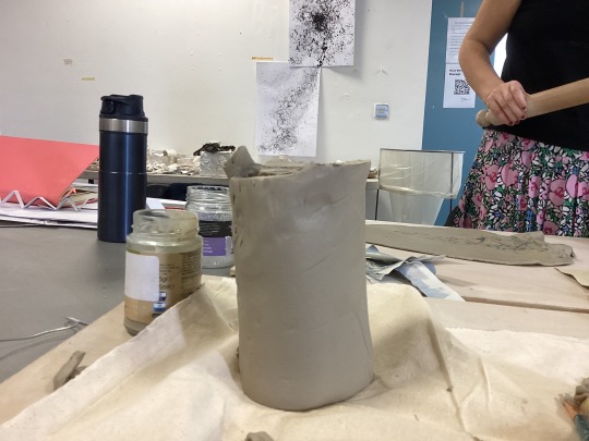
BRIEF THREE- MOVEMENT
Ceramics- Week 5
Clay work
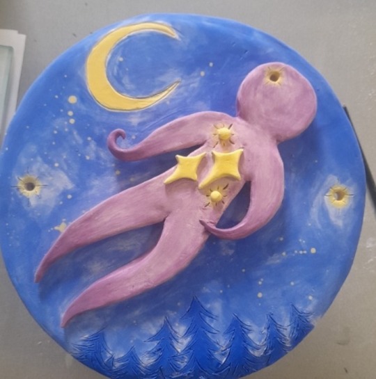
We were instructed to create clay works inspired by our abstract paintings, however I got a bit carried away with mine and it ended up more literal than abstract.
I felt inspired by my graphic design drawing, aswell as an image from the Ghibli movie "Kiki's delivery service". I had recently rewatched this movie, and felt very inspired by the painting a character created in the movie.
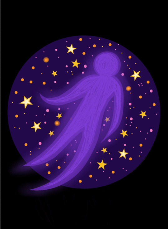
I really like how the spirit in this drawing came out, and was curious to see how it could translate into clay.
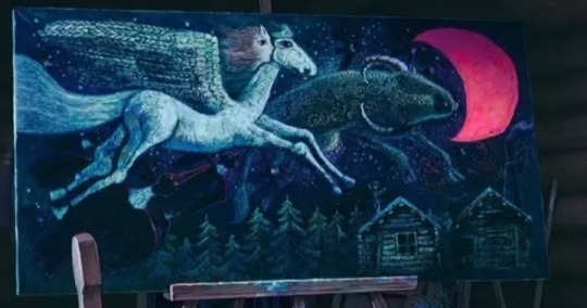
I love how much movement this painting has, and the forest imagery is so beautiful. I wanted to incorporate these elements into my ceramic peice.
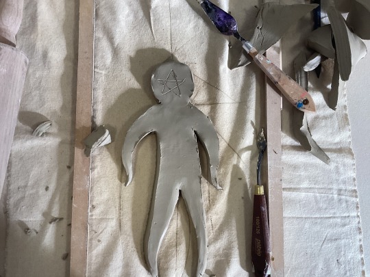

As you can see when making the spirit I thought cutting out a star in its face would look good but I was wrong...so I had to start over again and make a new spirit which was a bit annoying.
Once I finished the spirit I stuck it onto my dinner plate piece of clay with slip, and started designing the background. I wanted to incorporate some of the forest imagery from the 'Kiki delivery service' movie, so I tried to replicate the vibe of those trees onto my clay.

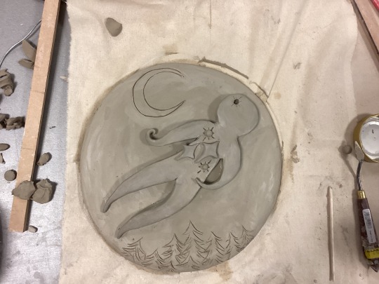
I wanted it to look as if the spirit was flying through the air, becoming one with the cosmos. So I decided to add some stars to the spirit to reinforce this idea of connection with the universe.
Im satisfied with how this ceramic piece came out, and If it hopefully survives the kiln I'm excited to glaze it and make it look even more dreamy.
1 note
·
View note
Text
BRIEF THREE- MOVEMENT
Ceramics- Week Five
Mark Making
This workshop was quite similar to Eoins workshop that I missed, so I was happy to be able to engage in something similar in a classroom setting rather than at home. We were first instructed to write out words we associate with our projects, I wrote down a few on my iPad.
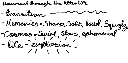
I felt inspired from the work I made during graphic design, so I was excited to explore abstractions a bit more as I quite enjoyed that aspect of my graphics work.
We were then instructed to use various different tools and materials, such as cardboard, ink brushes, sponges, knifes etc, to convey our words.
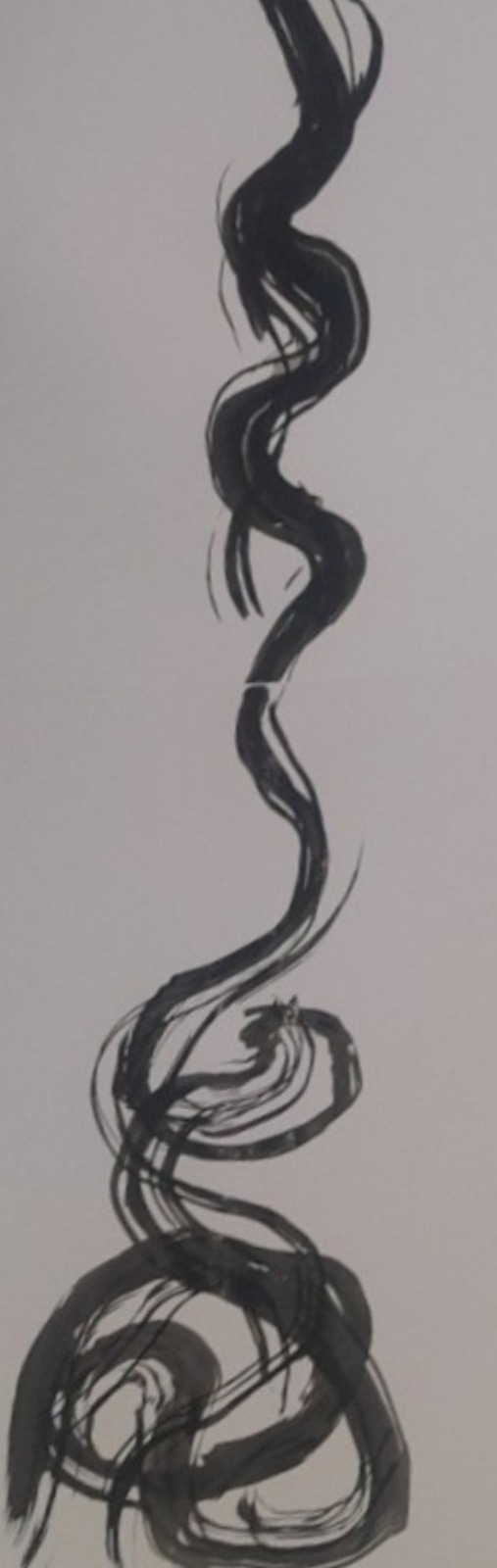
I used a large inkbrush to covey the word "transition", representing ones transition from a physical being into a spirit.
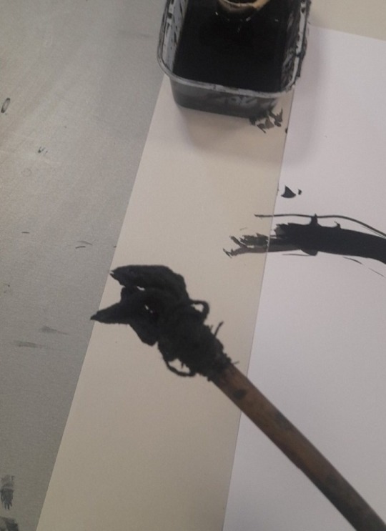
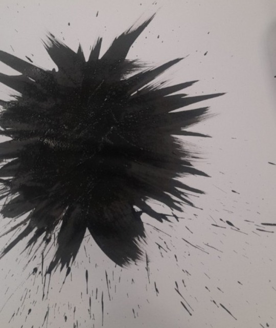
I used the same brush to convey the word 'Sharp'
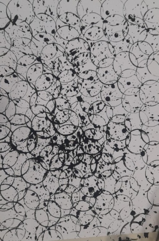
I then used a lid to create an image for 'Cosmos'
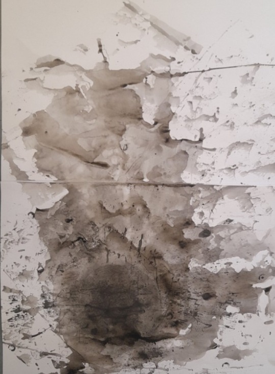
Using the side of a stick, I drenched tge page in water and ink, and rolled the stick around the page. This was for the term "Slipping away" representing dying.
That was all tbe work I created for this workshop as I had to leave a bit early. Overall I really enjoyed it, creating abstractions is something I have learnt to appreaciate a lot more with this project. This workshop was the perfect oppourtunity to take abstract even further.
1 note
·
View note
Text
BRIEF THREE- MOVEMENT
Graphic Design- week 4
This simple, short animation took a very long time to make. Im not an animator at heart, so figuring out the actual mechanics of animating on Procreate was not a smooth process at all...
Writing the script came naturally enough to me as I already had a good idea of what I wanted this spirit guide to say to the viewer, but adding the text to the animation and figuring out the frames and such for an easy reading process was challenging. Honestly Im not even sure if I accomplished it very well as I still think its a bit fast for how much I wrote.
Adding the music, oh man...that was hard. You cant add music to procreate animations (as far as I know anyway) so I had to figure out how to export this rather large file onto an editing app which took a few tries. The app I used to add music is called Vixen and no, I couldnt find any free editing platforms so I paid actual money to use this apps features and add music. Not much but still, twas a but annoying that my editing skills are not polished enough that I can figure out how to do this stuff for free as Im sure theres a way.
Trials and errors aside, Im really proud of how this animation came out. I think it has the exact mood and atmosphere that Im trying to protray with this project.
2 notes
·
View notes
Text
BRIEF THREE- MOVEMENT
Graphic Design- Week Four
Game research- Dinner with an owl
The imagery of the digital collages I made reminded me a lot of point and click games, and I decided that I wanted to make a short animation inspired by that idea. The game that initially came to mind when I thought of this idea was an indie phycological horfor game titled "Dinner with an owl"
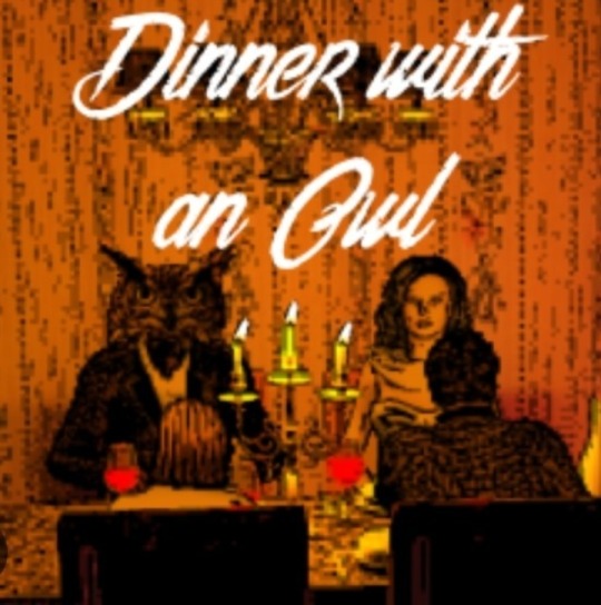
This game was released in 2017 by indie developer BoringSuburbanDad on Steam. Its game description is~
'Dinner with an Owl is a creepy yet funny point and click adventure. It's about the eccentric, not unconditionally human host Franz Brown and his involuntary guests. Help them to leave the sinister mansion! And brace yourselves for some serious surprises!"
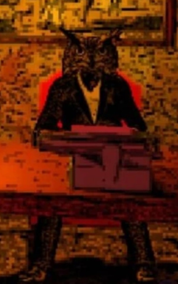
The Owl Entity is the main antagonist in the game, and upon playing it myself I was both creeped out and delighted by its strange design.
It's an unknown entity that looks like an owl, actively possessing multiple house owners while keeping many people under its control in the Owl Entity's mansion.
This game has amazing atmosphere and worldbuilding, despite it taking place entirely inside a house. The human characters express a lot of personality, despite being minimally animated and somewhat distorted by their pixel designs.

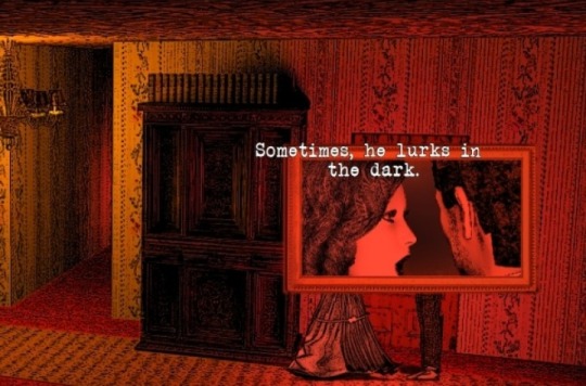
The script and background music provide a lot of this games personality and atmosphere. It has provided a lot of inspiration for my own point and click inspired project.
1 note
·
View note
Text
BRIEF THREE- MOVEMENT
Graphic design- Week Four
Procreate designs
Continuing what I started on Adobe Illustrate, I imported the images into Procreate and worked on them even more.
I enjoy using Procreate although Im still a bit new to it. I decided to go a bit crazy with these pieces and use them as a way to experiment even more with the app. I used various brushes and effects to convey different meaning and emotions into each image, and overall Im very happy with how they came out.
I took inspiration from the two thumbnail peices I didnt get a chance to make last week and incorporated similar imagery into these images.
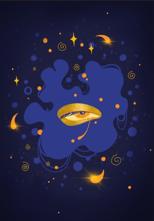
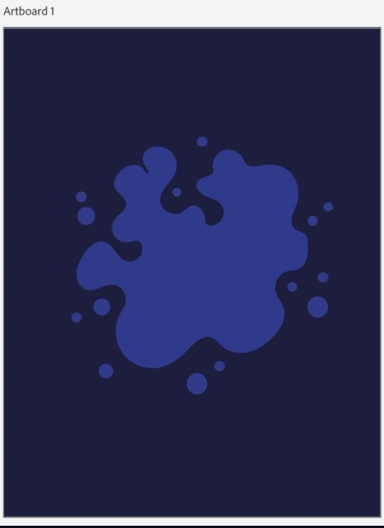
"Death"
I tried to convey the feeling of slipping away, how ones essense begins to dissolve and float away while dying. The memories, feelings, personality, it all turns into stardust.

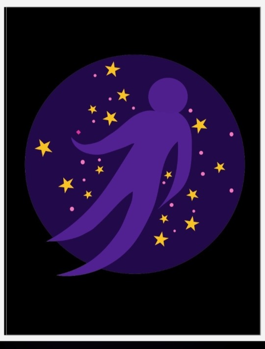
"Spirit"
Meant to convey ones spirit flying through the cosmos, confronting past memories and traumas along the way. They say a spirit cannot move on with unfished buisness, so you must revisit all the pains and joys of your time on earth before you can be reborn. The stars and circles represent just that, the memories.
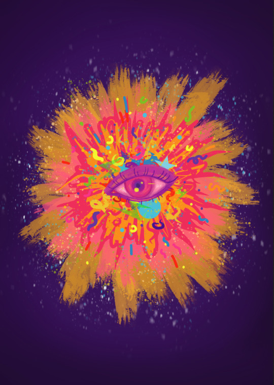
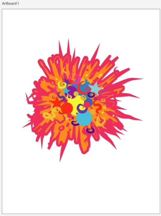
"Rebirth (life)"
Representing life. The whirlwind of emotions one expiriences during their time on earth, and how crazy, confusing and amazing it can be. But it can also feel loud and scary aswell. But its life, thats what I wanted to convey with this peice.
2 notes
·
View notes
Text
BRIEF THREE- MOVEMENT
Graphic Design- Week Four
Adobe designs
We focused a lot on abstractions last week, and since spirits and the afterlife are quite abstract things in my opinion, I wanted to graphically explore shapes and colours a bit more for this week.
I decided that I wanted to explore a more.....storylike approach to this idea. To actually show a spirits journey from death, through the afterlife, to rebirth. But using shapes and symbols rather than literal pictures.
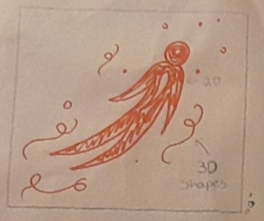
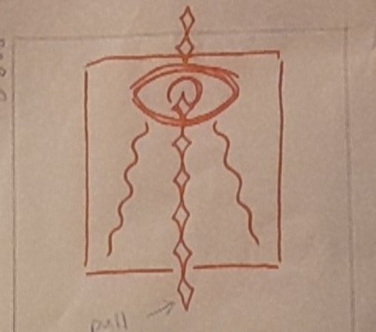
So using Procreate I made some very very basic thumbnails like we had done last week to get an idea of what I wanted to convey in each picture.
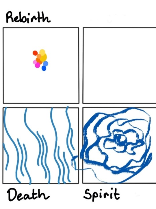
Since we are encouraged to use Adobe Illustrate for graphic design I decided to use it to create parts of these images that I will then refine in procreate. Since I was introduced to Adobe ladt year during a plc course I took, it didnt take me too long to get the hang of it once again.
The beginning illustration of 'Death'
The begining illustration of "Spirit"
The beginning illustration of "Rebirth"
I like Adobe Illustrate but I prefer Procreate, so Im excited to further work on these images in Procreate.
2 notes
·
View notes