
Last Seen Blogs
sunny-bunnyyyy
Sunny!

infrsr
HEARTEU
sumireweek
Sumire Weekdays 2020
soulofannabelle-blog
Annabelle

ted23
Toy Box
Text
April 11th
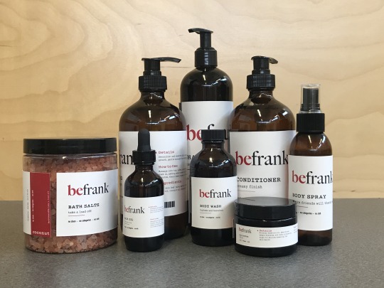
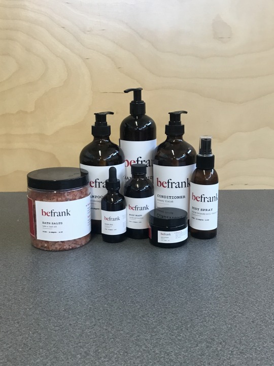
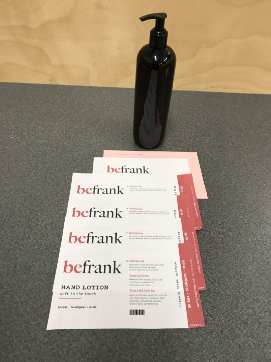
For my final touches on my project, I took them to get printed. I took them to staples and ended up printing the labels on a heavier shiny cardstock and fit them true to the size that I designed them as. I am definitely very happy with the outcome as I had no printing errors this time around which was great. If I were to print the labels again I would print them and fix the sizing slightly by designing them to be printed on 11x17 paper instead of 8.5x11, which gave me more limitations. I think this product overall looks very put together in my eyes, and I am extremely happy with the turnout. This is by far one of my favorite projects I’ve done in my three years at Medicine Hat College, and I feel that looking back on this project overall I definitely accomplished to some extent of stepping out of my comfort zone and letting the content drive the design for once instead of the other way around. I can’t wait to continue designing!
0 notes
Text
April 10th
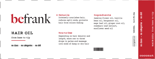
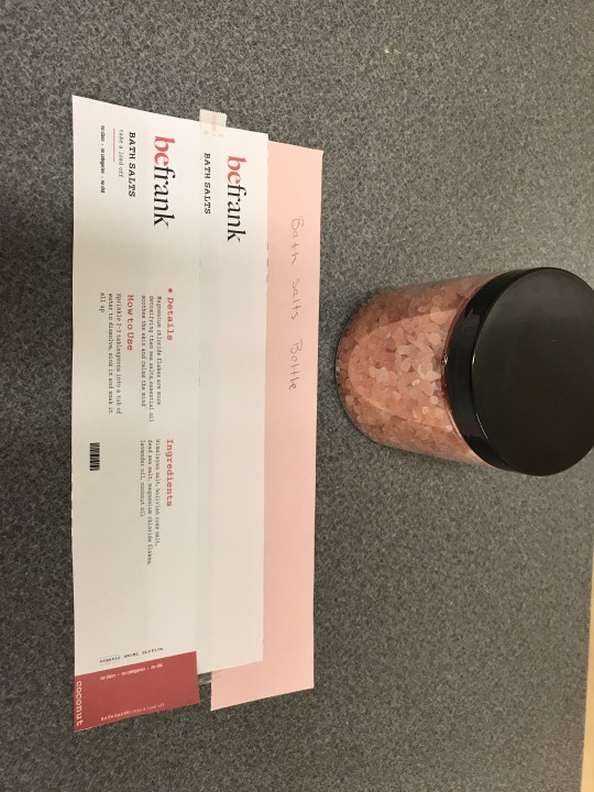
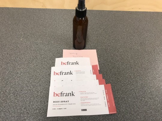
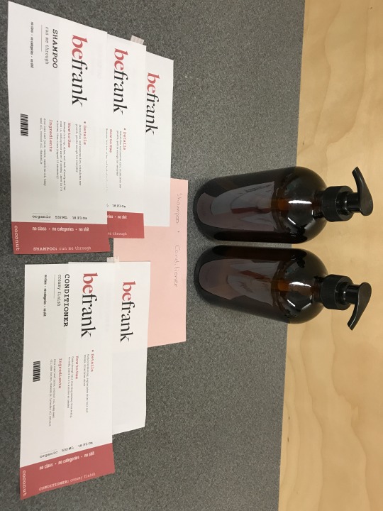
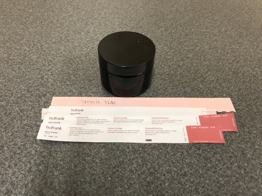
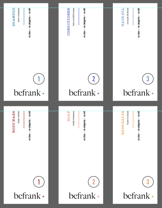
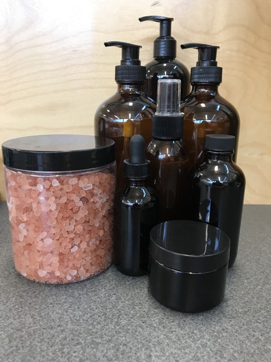
In the time frame from my last post to this one, I started furthering the logo and laying out the content on the labels using some kind of grid structure. I also focused on what other little details I could add on the labels to make them feel more authentic. That consisted of how much product were in each of the bottles in fluid ounces as well as milliliters. I also added the fact that the products all smell like coconut and a fake barcode for an added extra. Below is an example of what the finished label looks like. As you can see on the right-hand side, I added some more red to slightly balance out the label and I also added a repetition of what the motto or slogan is as well as what type of product it is with each individual saying attached like “from base to tip”. After that, I started the rough printing process of seeing what some of the labels would look like true to size. I added photos of how each label kind of progressed in size from the length of what fit while keeping a similar gap between the start and the end of the label once it was wrapped around the bottles, this resulted in making tweaks and adjustments as I went along without compromising the size of the text on the label too much. I also added what the first test run of labels looked like on the products so you can get an idea of where the design has come from.

0 notes
Text
March 28th
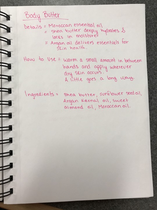
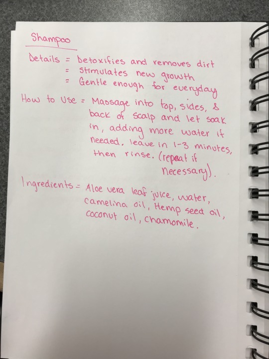
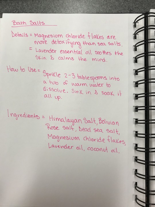
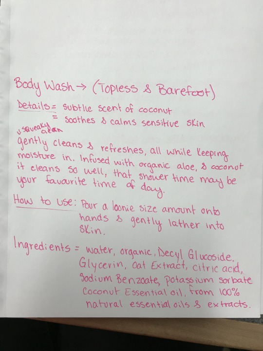
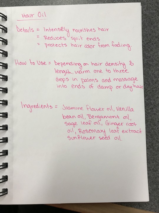
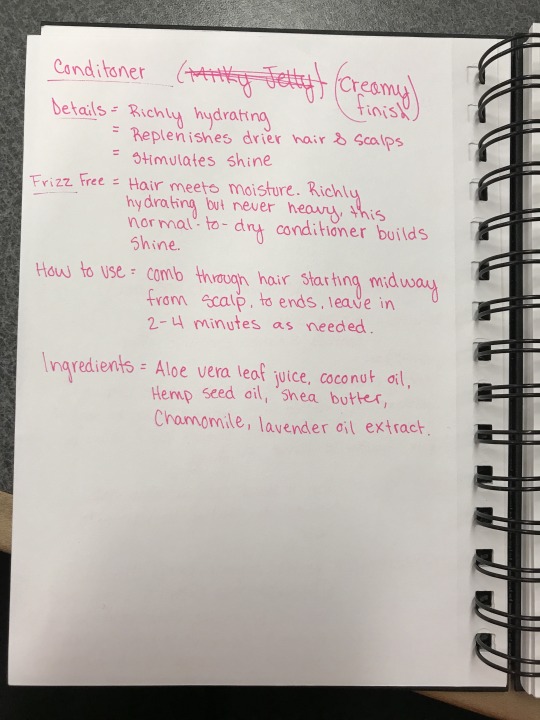
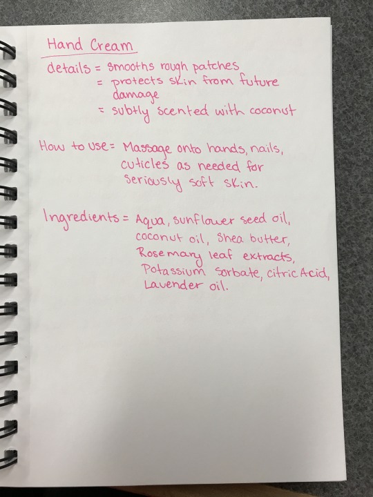
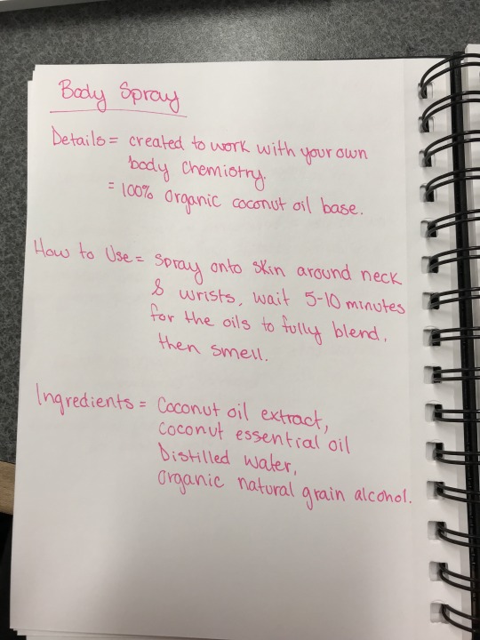
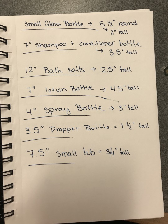
This was the day I started furthering the research about what the products could have been made out of. I wanted for theoretical purposes to keep a good chunk of the ingredients organic so that they aren’t harmful to the body in any way whether that's short term or long term. Below are some notes I had taken regarding the ingredients, and details about what I would imagine the product to be. Now because I'm not familiar with ingredients that go into a lot of hygiene products, I pulled some information from some ingredients on bottles of shampoo and conditioner that I had in my house and then altered it to fit the type of ingredients I would imagine to be in these products. This was helpful as well because then I could see how the products were described, and the how to use section was based on how I would use the products myself. This was helpful in making a personal connection and a bit of a preference as to how someone might use these products.
0 notes
Text
March 26th
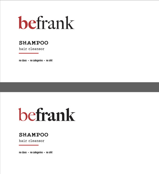
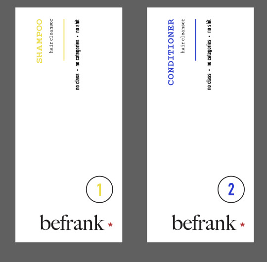
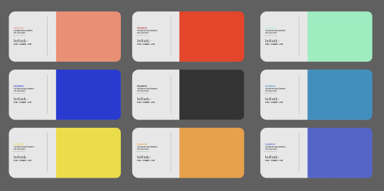
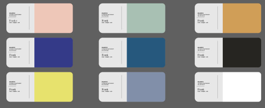
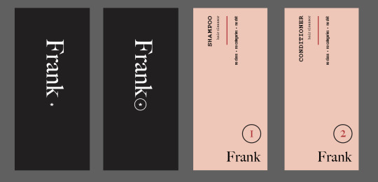
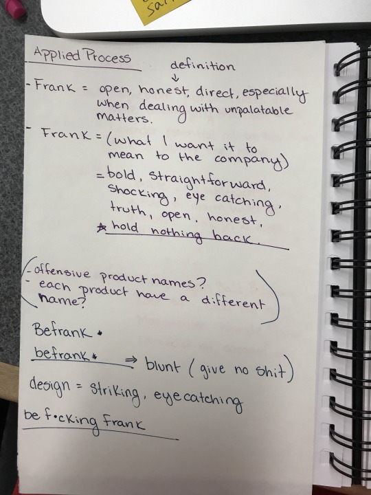
Although this is not the date that I came up with the design and the name, this was something that was more developed over the last few days leading up to the 26h. As you can see from some of my process images below, each one has some variation and difference to it. I was constantly trying to push different ideas as I went along. One of the images listed below consisted of two different logos being that of BEfrank being highlighted and beFRANK being highlighted. I ended up choosing BEfrank, for the reason that I wanted to high the BE in the word encouraging those to be whatever you wanted to be but most importantly be straightforward about it and own it. Some of the other designs I went through below consisted of color choices like using more muted colors with a general range of colors and shades and then taking those colors and making them bolder and more eye-catching to push myself out of my comfort zone and away from subtle colors. Although I didn’t stick with any of the super bright colors, I was glad that I had experimented with them. Further along in my process, I attempted using the star (*) symbol within the logo. Sometimes when you see something in writing or on the internet and something is bleeped or censored out they may use something like the star symbol which is where this idea came from. After consulting with my instructor, we came to the conclusion that it was not a necessary asset. When I was still playing around with some of the colors below I considered using the colors to distinguish between products and product types. For example like one of the images listed below, Shampoo would be step 1, Conditioner would be step 2, and hair oil would be step 3, and each of those products could have been color coordinated with blues but in different shades of the color, and the same idea came to mind with body products.
0 notes
Text
March 19th
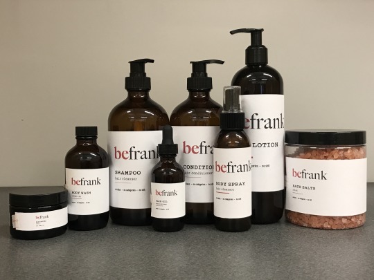
The following few times I picked up this assignment again, I focused on things like label layouts, content, type, grid structure, and I started measuring out the size of the bottles so that I could get an accurate label size. Below are some of the rough results of what I test printed so that I could see how the label would roughly layout for size on the bottles. The point I wanted to bring across with the labels was that when I would read the packaging I would be able to know exactly what the product was. Also in coming up with the brand and the statement I wanted to demonstrate with this branding project were sayings that would be different for each product but also displayed on the packaging to reinforce the idea of being very straightforward and blunt. Some of these sayings consisted of “take a load off”, “lather up”, “you’re friends will thank you”, “creamy finish”, “topless and barefoot”, “from base to tip”, “soft to the touch”, and “run me through”. These sayings are meant to be eye-catching, and shocking in some ways, but subtle in others to grab your attention or make you do a double take. I wanted this to be something out of the ordinary that you wouldn’t normally think to see on a shampoo bottle. Each phrase is slightly catered to the product it's being displayed on which gave me more freedom in the humor department. Which brings me to the audience I wanted to reach with this product would range from ages 18 to 30 or even 50 for those who can laugh at some of the little quirky things that appear in life. Seriousness is not a goal with this assignment.

0 notes
Text
March 14th
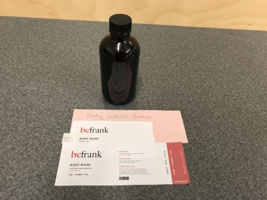
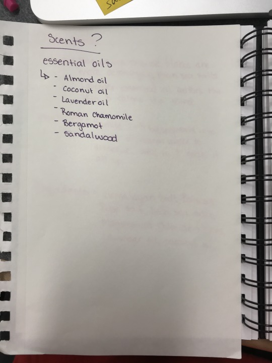
After I had somewhat figured out a name, I started doing a few things at this point, I had started playing with the font and style of how I wanted this logo to display, and I also went on a bit of a hunt to find bottles for the labels to be displayed on. Although I did have some bottles at home with a product in them, I just kept the product inside and removed the label so that I could use them for display purposes. I knew that in order to make this feel like a line of products I had to take into consideration as to what types of products I wanted, and what products could be gender neutral. Within this process, I had to do a lot of research as to what scents might feel gender neutral just to be as thorough as possible with this assignment, I wanted to carry it through as much as I could even with the descriptions that were on most shampoo and conditioner bottles today. The list of products I ended up using resulted in Shampoo, Conditioner, Hair Oil, Body Wash, Body Spray, Body Butter, Hand Lotion, and Bath Saltz. Through my research, I also found that there were a few scents that could work for both sexes and yet not be found too harsh or overpowering. Those were scents like almond oil, lavender oil, bergamot, chamomile, and coconut. I ended up choosing coconut mostly because its a common scent and can be used sparingly without being a scent that you can smell from a mile away.
0 notes
Text
March 15th
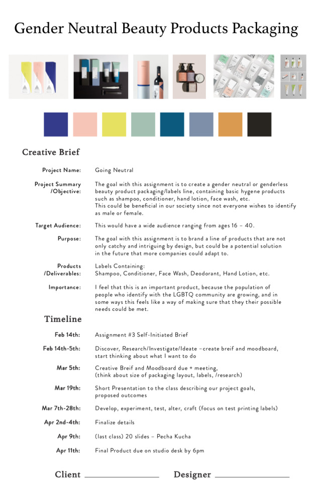
After having given our final assignment in Applied and one of my final assignments as a Visual Communications student at Medicine Hat College, this project really stumped me for a long time after receiving the information that it was a self-initiated project. It definitely took me over two weeks to come up with some that could at least have some sort of impact in society. LGBTQ community is slowly starting to grow more and more in Medicine Hat and surrounding areas that I felt it would be neat to do something that was more inclusive with everyone in society. I chose to do a Gender Neutral Beauty Product/hygiene product line where I focused on what the labels and the packaging looked like and how it would appeal to everyone and not lean more towards a male or female gender. As you can see in my Project Brief and Mood Board below, I started out, in the beginning, wanting to do something with color that was bold. Especially since with this assignment I really wanted to push past what was normal for myself in terms of letting the content drive the design this time around. I knew that from that goal that I wanted to pick a name that served the motto or tagline I had in my head, which is “No Class, No Categories, No Shit”. Hearing myself say that multiple made me think of a few names and ideas of what I wanted this brand to represent. That of which I played around with things like, straightforward, blunt, frank, and after receiving feedback from a classmate, came to the conclusion of BeFrank.
0 notes
Text
March 1st (Part 2)
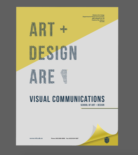
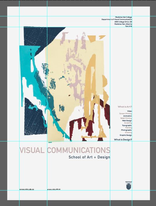
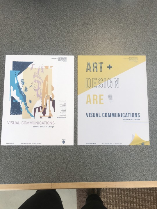
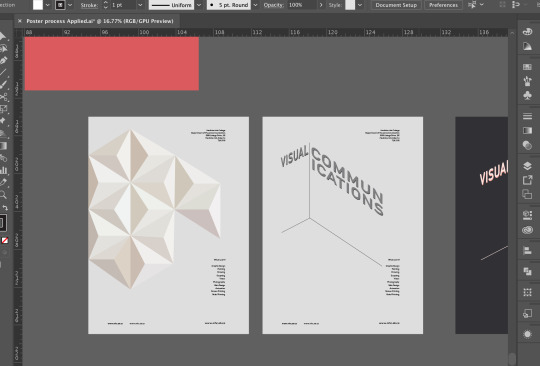
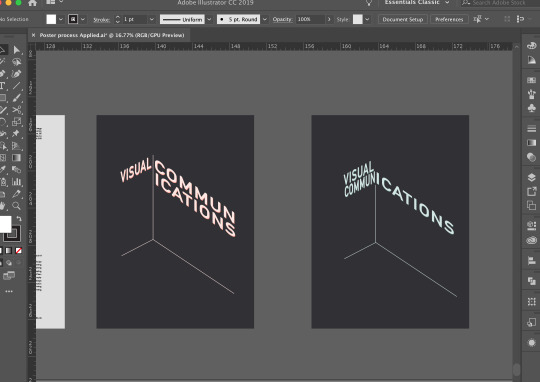
Overall I really enjoyed this project. The final prints turned out really well and I can’t say I had many technical problems or issues with this assignment. It was definitely difficult to think more about how a high school student would view a poster and what might draw them in. I think that’s why I included the poster on the left-hand side in the image below because maybe a high school student might not appreciate to the same extreme something a bit more designed, but could potentially appreciate a work of art included in a poster to grab their attention a bit more. Although I do like both of the posters I captured below, I think the one I would be leaning more towards would be the poster on the right-hand side because of the more designed elements involved, like the page curl, variation in the design of the type, as well as some of the classes listed below in the shape of Alberta. This was such a great assignment because it allowed me to not only think a little more from a high school students point of view, but allowed me to play around with design and grid structure which I ultimately love.
0 notes
Text
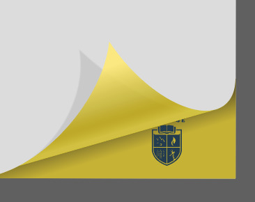
March 1st
After finalizing the designs a little bit further, they are finally ready to test print to see what they will look like laid out on a page. Although the full sizes of my actual posters will be 17x23″, I will test print them on 8.5x11″. The test prints came out really well in terms of color, line ups, and legibility. My Favourite one out of the two is the yellow one because of how the page curl turned out printed. I feel that it makes it more visually intriguing and the colors came out well on paper so that it draws my attention in a bit more. I do enjoy how the screen printed element on the poster turned out because it printed very well and still looks very appealing.

0 notes
Text
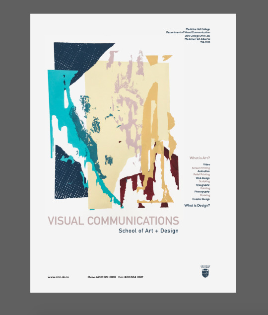
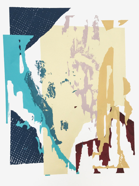
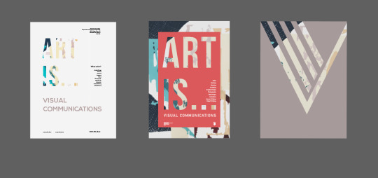
February 28th
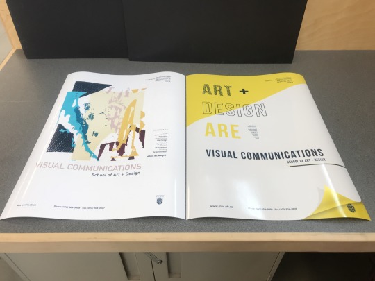
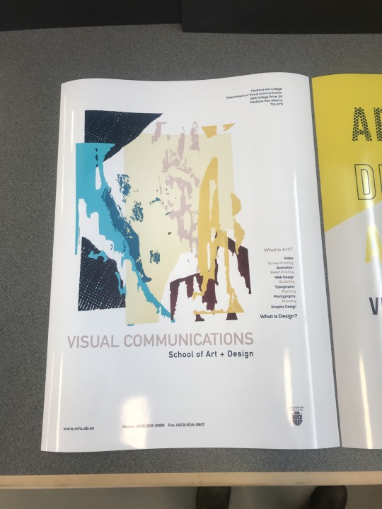
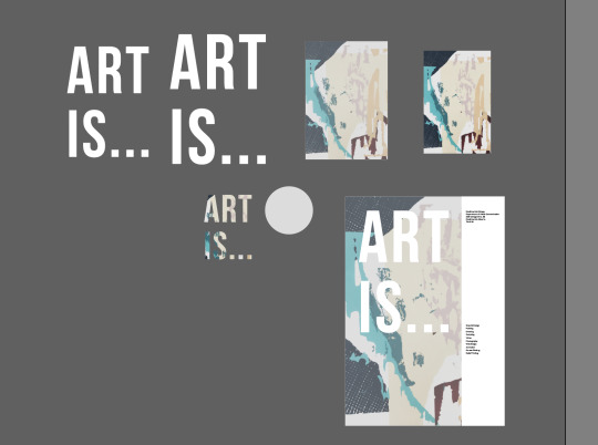
Two of the ideas I had played with a little in my previous posts were the mixture of using design and fine arts, with my own screen printing image laid within the poster to display the fine arts side of things, and the 3D element of having a page curl, with further developing I decided to use it to expose the Medicine Hat College logo within the bottom right corner. With the Poster that is laid out on the bottom right of the image below, I gave the variation of whether or not I wanted to have a difference in the main text of the image using a solid color, outlines, and a dot pattern to show diversity. An element I added into the yellow poster was having some of the classes listed in the program within the shape of Alberta as a neat element. It makes you almost take a double look in a sense because you notice the shape but need to look a bit closer to see what's in the shape. The next poster to the left I used my screen print for continuing with the same layout for the secondary content since it flowed well. With this poster after talking with my instructor, I wanted to display a way that fine arts and design were combined in the program and that they go hand in hand in the art world. I used two of the colors that are within the poster itself to highlight art and design and laid them out so that they were alternating to show that in a sense they are one and the same not just in art and design but in the everyday life.
0 notes
Text
February 23rd & 24th
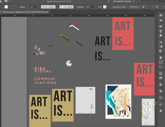
These days I focused on playing around with layouts, colors, and themes I wanted to display. I went from seeing what basic 3D elements looked like, where I created text in the shape of a box and worked with perspective and color. I focused a lot on a layout of secondary content and working with some sort of grid to make sure that everything was lined up. I used rulers in Adobe Illustrator to make sure that it looked visually appealing not just from close up, but from a distance as well. Although the images below of what I played with in this process, I didn’t actually go with any of them for a final product, but this really helped me with narrowing down what worked and what didn't.
0 notes
Text
February 14th
Once I had narrowed down as to a style I wanted to portray in this poster I went about looking further into colors and how to lay out the main message of being more than just a fine art program. I thought about the idea of combining an element of fine art in the poster as well as the design of the poster being digital. As a person, I have always been drawn to 3D elements within posters because I feel that they grab your attention a little bit quicker than maybe a regular poster would. At the beginning of playing around with designs for the posters, I thought about making the major element of the poster 3D but decided that I would use a 3D element as more of an accent. Which is where I decided to play with the idea of a page curl. In part of the image below, I played with the idea of having the letters peel off the page but struggled to get the letters to display the way I wanted them which was why I went with the page curl instead. While figuring out a style that I wanted in the poster I looked at a few different fonts but the main fonts I decided to go with was Nexa Bold, DIN Alternate Bold, and Bebas Neue which will be shown in the final products.

0 notes
Text
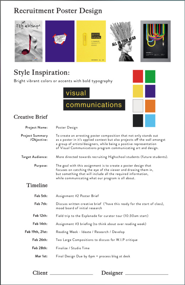
February 7th
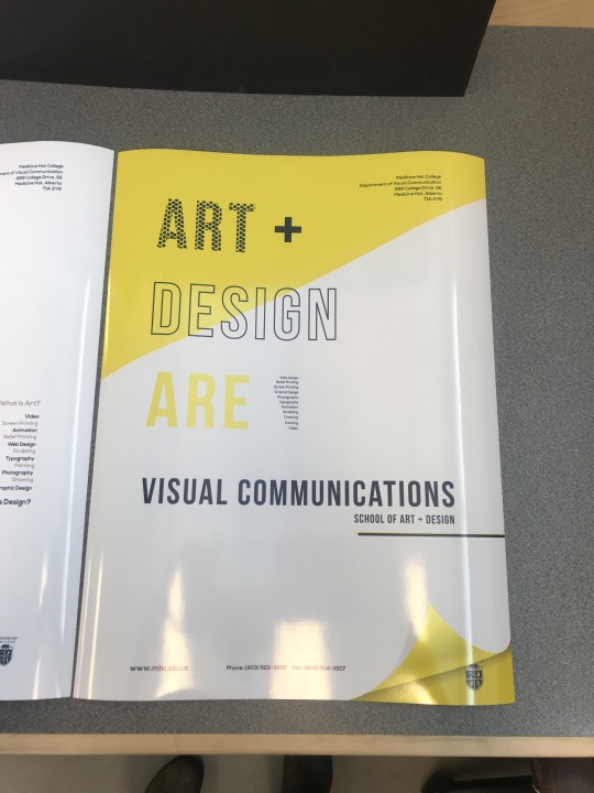
Our Assignment for the next project in our Applied class was to create a recruitment poster for the Visual Communications program at the Medicine Hat College. Our target audience for these posters were mainly high school art students that may think about pursuing art and design as a career. One of the main issues I wanted to address on this poster was that when I was in high school I had no idea that I could pursue a career in an art field and actually be able to find a real-time job, the way I tried to communicate this was with the question “What is art?” and “What is design?”. The other thing I had no idea about within this program was that there are so many different mediums and classes you could take part in, that really helped with skill building. This program teaches you both fine arts and design based work to give you enough knowledge to be very versatile. To start this project off I came up with a creative brief and mood board to give me some sort of idea as the direction I wanted to take this poster in, along with a timeline to follow.
0 notes
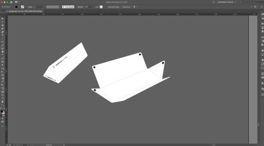
Text
January 29th
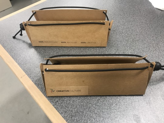
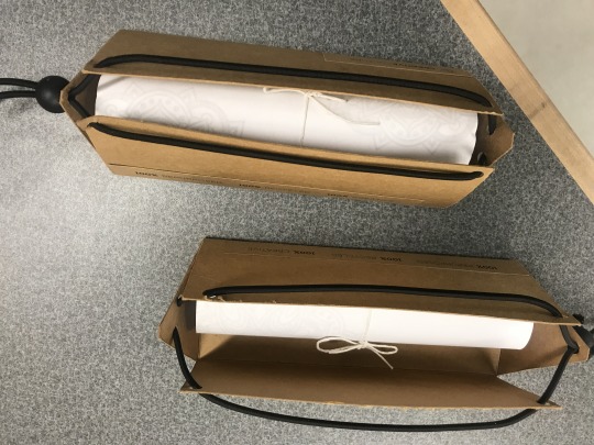
Finalization: Part of the finalization process was attaching labels, adding the drawstring and toggle, and attaching the pencil crayons, as well the rolled up coloring sheets within the package. This was a great learning process because it really taught me to focus on a more Eco-friendly way of producing everyday packaging and turning it into something that doesn’t have to be thrown away and if it isn’t wanted, it can just be recycled.

0 notes
Text
January 24th
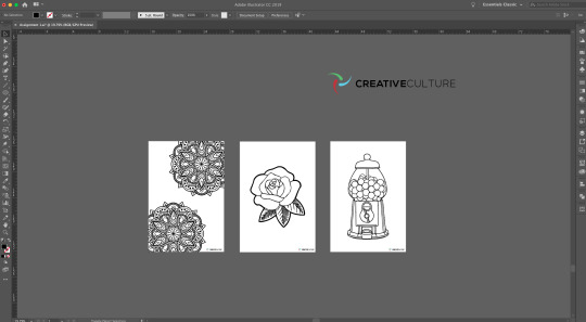
Once I had narrowed down a logo I focused more solely of what the contents were going to be specifically inside. Therefore, this was how I included my coloring pages. Since this is a more compact pencil case but can still fit most pencils and pens, I wanted to make it a tad bit smaller because it would reduce the amount of wasted paper that could come from coloring pages. Even though I didn’t print them out this way, the idea is that the coloring pages would be printed on a heavier recycled paper that would make it easy to recycle after and yet still be easy to color on for traveling. The major thought process and idea behind this pencil case, is this could be the kind of thing that's handed out at airports or other places similar. This was because not only is compact and easy for on the go use, but everything inside the pencil case, including the case itself can be reused, repurposed, or recycled. Which is a major goal in the world right now by reducing our waste.
0 notes
Text
January 22nd
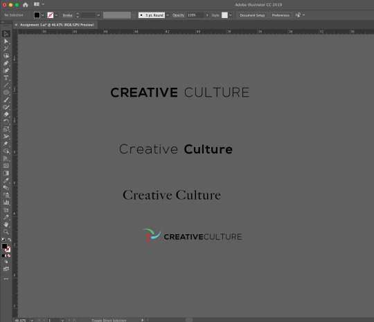
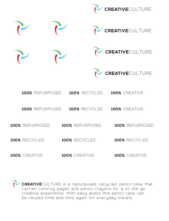
After I came to the conclusion of how I wanted my design to look, I decided from this point further that I wanted to focus on branding or creating a logo for the repurposed pencil case I created. I wanted it to be an accurate representation and reflection of what the product embodies. Below I included the process for the logo, and brand name Creative Culture. I more so wanted to focus on the idea of it being a creative brand, and the 3 colored icon I have included in the logo is my own version of a creative recycling logo. This was because it emphasizes the fact that it is not only something that focuses on creativity, but focuses on the environment too. On the package I included 3 labels. One was the name or brand of pencil case. Second was the motto or purpose of it being: 110% Repurposed, 100% Recycled, 100% Creative, and finally, I included a small description on the bottom of the package of what it’s purpose is for, and why it’s effective.
0 notes
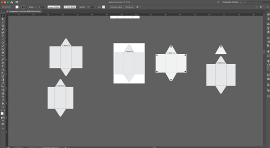
Text
January 17th
Below is the finalized template for the package design. After I figured out how I wanted the package to fold up and be opened, I focused on the template for the package. From that point, I researched ways that I could close up the pencil case so that it didn't involve any sewing or gluing that could possibly prevent the package from being easily recycled. I came to the conclusion of using a thick elastic cable tie, with a toggle to open and close the pencil case. This makes it easily accessible because when opened, the pencils will all be revealed so that you can easily grab them without trying to fit your hand into the case, or without trying to ruffle about the colors to find which one you may need. Once I had focused on a design, I started thinking about minor branding for the package itself.
0 notes