kelseywood94
design diary
exploration of design theories & workings of a student in graphic & interior design
164 posts
Don't wanna be here? Send us removal request.
Last Seen Blogs

gwainegwainegwainegwainegwai
✨🧝🏽♀️✨
femmemonologue
faux 𓆩⚝𓆪
morlibertarianism
Libertarianism [Moribund Institute]

kosnush
Kosnush
mochinyi
Jason Todd Enthusiast
Text
Design Domain 01: Survey
MATERIALITY
Colour & Emotion
Interested in the train of thought between emotions applied to colours, I carried out a small survey on a mixed group of 11 individuals of mixed ages, backgrounds and job roles. The survey was simple, participants were given 10 colours to look at and were asked to write how the colour made them feel in one word where possible. The responses are below:
1. Yellow
Happy x3, happiness x3, cheerful, anxious, uneasy, bright, optimistic, sunny, springtime, hopeful, optimistic
2. Green
Calm x3, earthy, sick, positive/correct, relaxed, grounded, off-putting, calm, peaceful, intuitive, focus, connected to nature
3. Light Blue
Cold, calm x3, fresh, comfortable & clean, peaceful, relaxed, sorrow, ecstatic, cute blue skies (sunny feels)
4. Pink
Happy x2, youthful, uncomfortable/synthetic, excited, exotic, outgoing, fun x3, eye-catching, feminine x2, playful, romantic
5. Red
Sinister, love x2, creative, bold x2, sexy, nervous, romantic, warm, hot fun, anger, passion, fiery
6. Purple
Youthful, horny, unorganised, scatty, neutral/nothing x2, tired, majestic, nice & calming, loyalty, trust, moody, mysterious, luxurious, confident, contentment
7. Black
Cold, calm, organised, clean, motivated, neutral/nothing x2, comfortable, eye-catching, mysterious, political (Black Lives Matter), depressed x2, low, stylish
8. Orange
Warmth x2, sad, commercial, fake happiness, on-edge, mellow, uncomfortable, harsh (after looking at black), impulsive, playful, comforted, want to be seen, excited
9. White
Nothing/neutral x5, cold, collected, zen, purity, bored, heavenly, safe, innocent, focused
10. Dark Blue
Cold & dreary, relaxed, cool, traditional, lonely, serious, calm x2, proud, bold, vibrant, inspired, formal, moody, strong
The results were not as expected, every answer was so different in each question although some had similar connotations person-to-person.
This leads my line of thought down the route of how many feelings different people can feel looking at the same colour.
Can we alter how people feel by exposing them to colour or are their feelings on colours already predetermined?
Would participants feelings change based on the order of the colours?
Which feelings would be opposite each other on a feelings colour wheel if one were to be created similar to a colour wheel?
Could the negative colours be balanced by the positive colours?
8 notes
·
View notes
Text
Design Domain 01: Experiment 3
MATERIALITY
Colour Exploration
This time I wanted to go more ‘primal’ with the colour and used markers to create colours on the bulbs to see how this affected the light.

Using a green pen, I marked a line on the bulb to see how it would work with the light. Looking at it straight forward, you can see through the line and onto the strong filament of the bulb. As you move the line around you can clearly see the green projected onto the white background, including the pen marks. The glow is light and adds a fun element.

The red line had the same affect on the background as the green, projecting orange and red tones onto the stark white.
After having so many strong, warm results I wanted to look into creating a cool effect - could I make the space feel colder through colour?
Blue was the obvious option for a cooler hue so I painted the bulb. At this point I thought how easy it was to affect the colour of the light by using a simple paint on the glass - this could mean it would be easy to affect the colours emitted from a light.
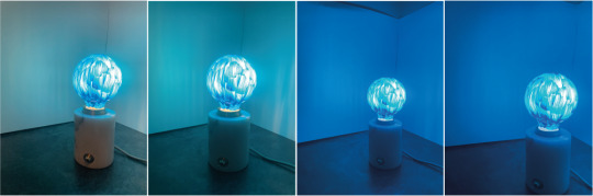
The effect of the blue on the bulb was exactly what I had wanted! The blue paint gave off a lovely, strong glow throughout the room. The space instantly felt cold. The paint job looked smooth before the bulb was turned on so it’s interesting to see the brush marks shine through the bulb and against the wall in the lighter pictures.
From these experiments it seems changing the tone of a light through the use of colour could be a good way to affect the mood of the room. If colours could be applied to feelings, these feelings could be communicated through the use of coloured lighting.
0 notes
Text
Design Domain 01: Experiment 2
MATERIALITY
Fabric Experiments
From there, I felt the sense of warmth given off by the bronze bulb and the soft white bulb and decided to explore how colours could affect the light and emotions given off by the light.
Using a selection of coloured fabrics, I looked further into this theory of colour affecting emotion. I chose to keep the white background for this stage of experimenting as it had given the strongest contrast in the first round of experiments.

As can be seen, the orange silk over the top of the clear light bulb gave off an incredibly strong red and warming glow. The darker tones in the fabric meant the brightness of the bulb was dulled slightly, reducing the spread of the colour glow. As can be seen in the last photo, the main light being on reduces the spread of the red glow to just a small mark on the white background however the fabric itself lit up red. NB as silk is being woven, generally two strands are interlaced tightly at two different angles - it looks like in this case there is a heavy amount of red woven in to create the orange fabric and that is why the light is predominantly red over orange that could have been expected.
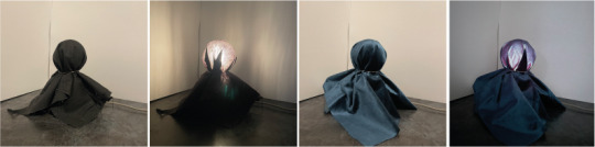
On the next two fabrics the results were completely different. On a black cotton we can see the form of the material start to show through as the light shines. The glow on the wall is duller than bare bulb and we can see the texture of the material in the glow on the wall - the results in a stripey appearance and the shadows are strong. You can also see the filaments of the bulb through the fabric. On the right we see a blue velvet which creates a soft blue hue throughout the space. The spread of the glow isn't as strong through a thicker fabric but the bulb can still be seen. The texture of the fabric can be seen and an iridescent rainbow of colours glows from the fabric that is lit up.

The next set of fabrics tested features a textured red cotton and a stone coloured cotton that has a woven pattern. The red fabric shines a lovely red glow and allows the pattern of the fabric to show against the bulb. In comparison to the other red glow we had on the orange silk, it is not as bright or strong a red glow - this may be because the weave on the silk is tighter than that of the second red fabric. The glow does have a purple-ish tint to it suggesting there are some cooler dyes in the process of making this fabric. The filament in the bulb can also be seen through the fabric suggesting it is thinner than a velvet. It does also mean there is a cooler feel to the space with this fabric over the light. For the second fabric, there is a warm glow emitting from the build, casting a yellower tone onto the white background. There are no shadows or filament showing with this giving a smoother feel.
This line of experiment has confirmed my thoughts about colours on lights affecting the feel of the space around. Moving forward I will look further at colour and lighting together as a sensory tool.
0 notes
Text
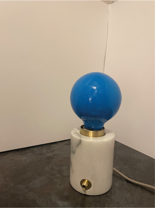
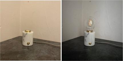
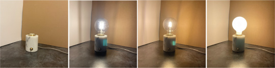
Design Domain 01: Experiment 1
MATERIALITY
Light Experiments
I decided to experiment with light and material in different settings. Choosing 3 different bulbs, against varying backgrounds to see how light interacts with the materials around. The bulbs are filament style clear, filament style vintage bronze tinted and a white bulb and in the first experiment against a matt black background.

LIGHTS ON MATTE BLACK

All of the lights create a reflection on the shiny surface they are sitting on. The first clear bulb is blinding & bright. It is almost uneasy on the eye to look directly at the bulb. The clear bulb provides a strong white glow against the black background however shadows are strongly cast, particularly the filaments of the bulbs inside. The bronze bulb has similar traits however is easier on the eye with a warmer glow. A golden pinky/orange glare is projected onto the black background and the bulb gives off a feeling of warmth. The light itself is not as strong or stark on the eye as the clear bulb. The white of the third bulb acts as a diffuser on the light emitted which means there are no shadows cast from the filaments of the bulb. The light from this bulb is diffused further than the others and highlights the room around. Its interesting to see that if another light is on in the room, a clear bulb above and behind the camera, it affects the colours the white bulbs diffuses in the room. I.E in the first picture of this bulb, the main light is on and the glow appears white but in the second picture, a warmer glow is given off in the dark. It is also interesting to note that on the first two bulbs, the camera picks up a green reflection of the filaments within, whereas on the white bulb the filaments are diffused and appear on the camera as a green circle.
LIGHTS ON MATTE WHITE

With the bulbs on against a white background, the properties of the shadows cast, warmth of glow and colours emitted do not change much. The white background however makes the lights a bit easier to look at and less blinding to the human eye. The camera still picks up the green filament on the clear & bronze bulb however it is not as strong. The green is almost completely gone on the white bulb. The glow given off of each bulb is softer against the white rather than the black and in all three cases, the light seems less strong. The white bulb glows warmer than against black. The light cast also seems a bit stripier against white whereas on the black, it seemed to give off a circular light. The reflection on the shiny surface is softer and appears as one reflection to the forefront instead of three given off against the black background.
LIGHTS ON TEXTURED WALL
For the third background, I decided to use the wall in the room I was sitting in, as you can see from the second picture where the main light is off, the wall is pretty old and bashed. The plaster is painted white which is slightly discoloured. The main light currently in the room makes the wall (and the surface the light is sitting on) look warmer, with an orange glow whereas with just the camera’s night vision photo the scene looks slightly cooler.

The reflections, shadows and glow of each bulb have the same properties on the bare wall as they do against white however in this case the light itself highlights the texture and dents/dinks on the wall behind. The shadows on the clear & bronze bulb are far more defined in this instance where there is a lack of matte white to absorb to light. The light bounces around the room better too. The clear bulb doesn't seem as stark in this scenario and almost has a more orange glow. The bronze bulb gives off a clear pinky/orange glow and gives off a lot of warmth. The white bulb almost diffuses the marks of the wall away.
LIGHTS ON CARDBOARD
Using cardboard in this instance did not bring any different results from either on the lights except the white - the white glow appears warmer, taking on a lot of the tonal value of the brown cardboard.
OVERALL THOUGHTS
It seems that adding a diffuser to the light makes it a lot softer, carries the light further and makes it manageable to look at. The bronze light gives off a real warmth in all settings. The clear bulb is bright, strong and almost painful to look at at times.
I need to look further into materials with the bulbs and how it can affect the feelings a light can give off.
0 notes
Text
Design Domain 01: Research
MATERIALITY
Research & Initial Thoughts
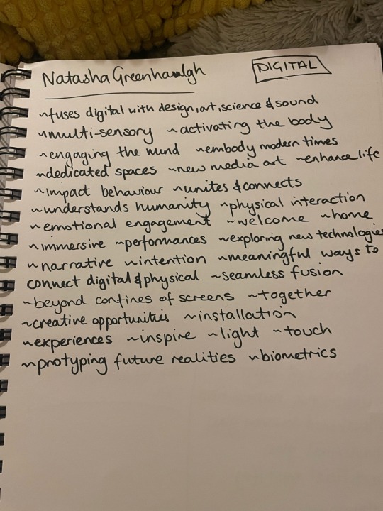
Considering a digital approach to the brief, I decided to look into some immersive design experiences using digital media and digital art in the world right now.
TEAM LAB
Team Lab is an international art collective that works collaboratively in their practice to navigate art, science, technology and the natural world.
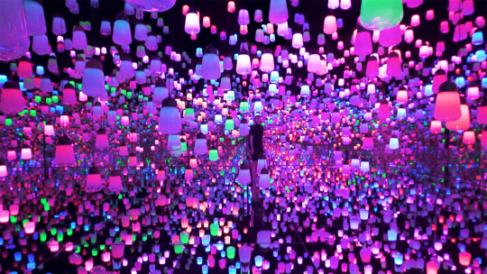
I took some notes after observing their work online. I paid attention to the digital materials used to create this experiences.

NXT MUSEUM
NXT Museum is a dedicated to new media art, using modern tools to embody modern times. The space is designed to explore digital art in the form of large scale environments with the use of many technologies.
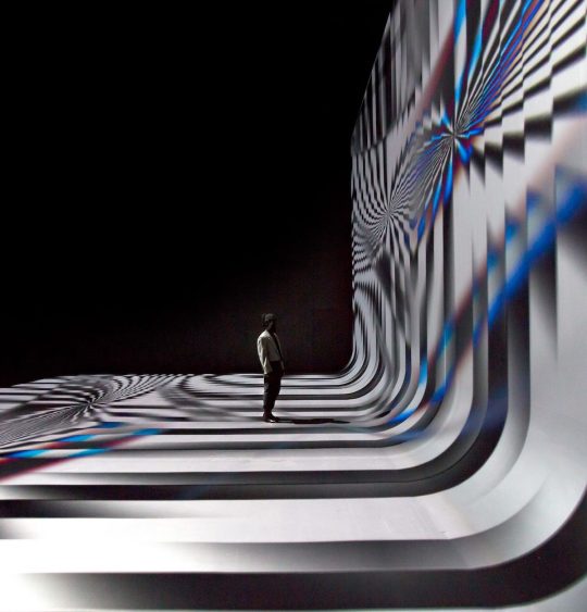
Again, I took some notes on the work and the engagement it has with the viewer.
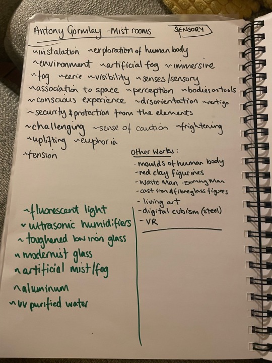
ANTONY GORMLEY - BLIND LIGHT
Antony Gormley’s 2007 Blind Light exhibition looks at how architecture is supposed to be a location of certainty and security. Blind Light exists to through caution to this notion and undermines architectures purpose which is to provide shelter and safety from the weather, darkness or uncertainty.
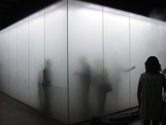
I found this work fascinating - as the users enter the space, all of their senses are rendered numb - I took further notes on the project below.
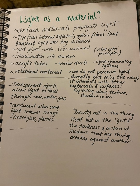
It was at this point I thought it would be useful to look into one of the main sources of technologies used in each of these projects: LIGHT.
Could light be seen as a sensory material? How could I look into using light as a material to create or influence a human experience? How would that look?
I took some notes on this notion before experimenting with light.
1 note
·
View note
Text
Design Domain 01: The Brief
MATERIALITY
“Materiality is the medium through which ideas, imagined or real can be articulated in being. We interact and are affected by materials due to their weight, colour, texture, pattern or form. Materials can be tangible or ephemeral.”
DIGITAL
Responding to an imagined scenario, I should develop a new material which looks to enhance, reflect, distort, accommodate or engulf the participant.
Speculate on a context for new made materials through digital visualisation.
AIMS
- form a critical opinion on the use of a new material
- develop appropriate ways to communicate and contextualise this new material
INITIAL RESPONSE
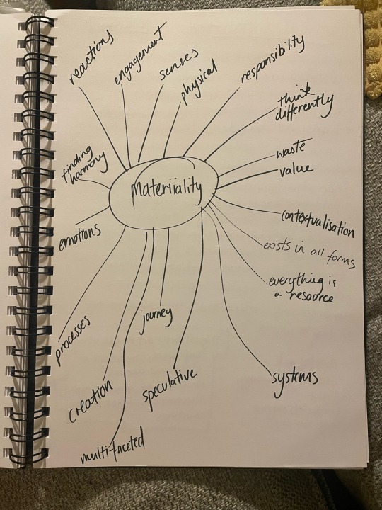
When considering materiality, I must remember as a designer we have a responsibility to think differently. I must also remember materials need context, materials can be sensory, emotional and are often a set of composite materials created through the use of multiple processes.
This brief encourages a speculative approach. I do not know how people are going to use a material at the point of its creation. This brief is about the journey to a point or theory, not necessarily the deliverables.
Being within the digital group of this brief, the creation of a NEW material within this time frame is not the aim.
0 notes
Text
Social Reach
What is Viral Marketing??
“You’ll see your marketing budget up for review once again and the best way to get effective results with minimum expenditure is to have a viral social media marketing campaign. The goals should be simple – evaluating the successes of strategies used the last year and modifying them accordingly for this year.”
- Hanson Cheng, Ladderblog
Viral marketing is essentially the word of mouth selling of a brand through the use of online popularity. Going viral is often a thing of luck and good timing however it is a highly desirable way to market a brand. Going viral is the quickest way to grow in popularity quickly, with lots of your target market talking about you. A lot of vitality can be linked to the meme culture. Engagement on the most popular of posts has increased sales of certain products. Viral marketing can often be more successful than paid promotional ads as the decision to purchase is made by the popularity of a trend over the push to click and pay.
Viral marketing helps to build an international reputation as well as memorable experience, creating brand awareness. Some of the most popular viral marketing techniques for audience engagement include:
- Influencer Marketing - using people known as ‘content creators’ with a big following to promote to their followers and hopefully encourage the sale of products as people see these glamorous influencers using the products - a perfect example of this local to me is the team at Naf Salon (127K followers), a nail salon in Glasgow who have a paid partnership with Jamie Genevieve (1.4million followers). They collaborate with her via instagram by doing her nails for free in exchange for her posting video and photo content on her page, tagging them.
- Augmented/Virtual Reality - some video platforms such as TikTok and Snapchat use immersive experiences, this works well on these platforms that have a dominance of video content and provide the users with a realistic experience that is unique to the brand and gives a taste of high tech, futuristic tech
- Live Video Marketing - again, in a video content dominated world, going live on platforms is considered a better way to market a product as you can see live footage of the product in use with live product reviews and reactions selling the product better. With the surge of popularity of Youtube reviews over the years, Instagrams live feature allows a real time event that viewers can interact with, comment on and sometimes join in. Some of the more popular ones I have seen are from fake tan brands such as Isle of Paradise or GHD. It is also a really good way to do a live giveaway to gain more popularity and build brand loyalty.
Jada Pinkett Smith was the first to host a talk show on a live stream on social media (here) with Red Table Talk and it was something that really broke the internet and lead the way for the above mentioned ways to use live viral marketing.
Some recent participation strategies in viral marketing by big companies include:
- Uber Launch - targeting the right people at the right time is so important so when Uber announced free rides for attendees of South by South West Festival, it caused a viral sensation and built a lot of popularity for Uber. Uber have since used this popular marketing technique across the world for many other events.
- Dropbox Referral - dropbox is an online cloud based storage platform that is usually paid per storage. They had great success with an affiliate programme where they offered free storage of upto 500MB for people who referred others to the website. By offering a reward such as this, Dropbox formed a loyal customer base
- ALS Ice Bucket Challenge - this campaign was started to increase awareness of ALS and very quickly went globally viral, with social media users all over the world being nominated by friends to dump a bucket of ice on their heads, have it filmed and shared on their social media and to make a donation after doing so. This campaign was so successful in raising awareness and increased annual funding by 187% in it’s peak year.
One of my favourite viral marketing trends at the moment is a video circulating TikTok at the moment is the ‘Drinking Sprite without burping’ challenge - it’s very good marketing as it’s easy for users to engage with, its funny and gets people talking and it is a very very subtle way to market Sprite that is sure to have business success.
Viral marketing is very clever and connects globally with you people however making something go viral is very difficult. It’s a subtle type of marketing and any business that can pull it off is definitely likely to see a boom in sales of their products over the short period of time it is viral. The problem with this is how to measure its success and how long will the success last? When the next viral trend happens, people often move on to this next one. Brands need to be quick to capitalise on the viral popularity when it is in full swing.
0 notes
Text
A social media post on a social media platform about social media posts
The world’s a crazy place and social media add’s to that, amplifies the crazy and allows businesses to promote in a way that advances daily, has a global reach and can cost very little (or at least it used to). Here’s the lowdown on my understanding of it and some examples...
I have chosen two platforms to do a wee case study on:
TUMBLR (got to start with the OG)
Tumblr is a global microblogging and social media posting platform. Tumblr allows it’s users to post many different types of media in the form of short blog posts. Media includes texts, quotes, images, videos, website links, music, artwork and is available on mobile, dekstop and via email. Blogs can be private or public and bloggers can follow each other’s blogs and send messages, links, videos photos and so on both publicly by sharing or privately by message. Bloggers can like, comment and share each others work privately or reblog onto their own blogs. It’s somewhere between a social media platform (such as instagram or Facebook) and a personal blog website.
PINTEREST
Pinterest is an image sharing social platform that allows the users to post images and links. The idea is to allow users to share information on the website through the use of photos, animated gifs and small videos in the form of ‘pinboards’. Users can create collection of related pins and ‘pin’ them to a named collection (think of a digital image collation or mood-boarding activity). Users can access Pinterest via the web and on an app and can start pinning by searching a subject. Recently, Pinterest Lens has been added which is camera based feature, choosing images you may like based on whatever you are pointing your camera at. Users can follow each other, like each others pin and comment on pins like other social media platforms, as well as repinning items to their own boards (a similar concept to Tumblr’s reflagging feature or Facebook’s share to wall)
SOCIAL MEDIA ETIQUETTE
Of course, with an platform that gives users the right to freedom of speech, a lot of wrong doings happen on the internet and naturally there is a list of do’s and don’ts to keep yourself safe online. Here are some big don’t as a business:
- Don't be over-promtional - sure we want to use the platform for self promotion but you don't want to overdo it and become white noise on a global platform
- Don't be over automated - automated posts are great for time saving in a busy world however you can lose your voice or the personal touch you have tried to create with your brand image
- Don’t badmouth your competition - must like in the ‘real’ world, you wouldn’t want to be seen in a negative light and openly bad mouthing other businesses is the first way to harm your reputation. Not all press is good press, believe it or not.
- Don’t try to be something your not - in simple terms, keep it real - be the business you set out to be and remember to carry yourself that way online too.
In a world where things can go viral in a click, one single social media post can make or break an entire business. It’s really important to take social media etiquette in and use it to promote your business in all the right ways, attracting the right kind of people and encouraging brand loyalty.
Social media etiquette is often worked in the social media policy that you agree to when signing up to each platform. These policies work with you to protect against legal action and defend your brand.
As the age old saying goes, don’t be a d*ck!
0 notes
Text
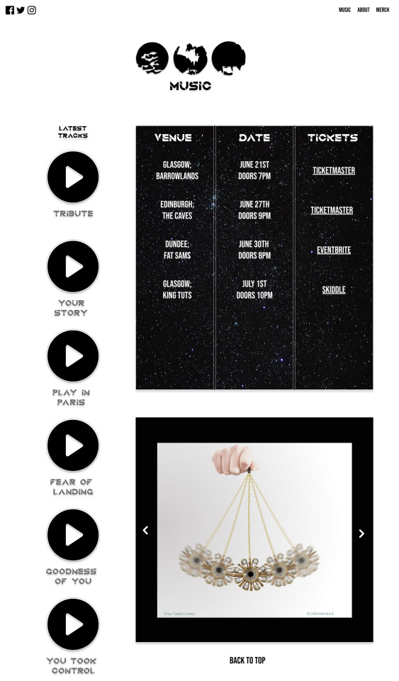
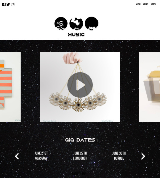
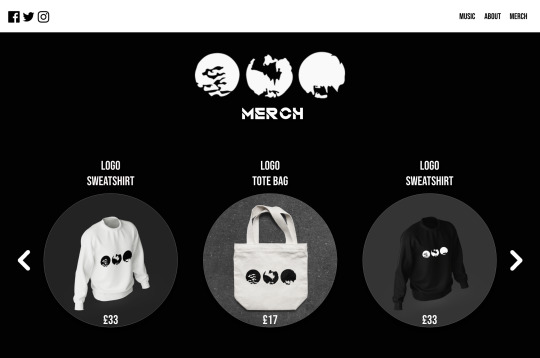
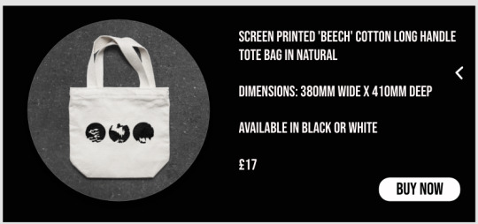
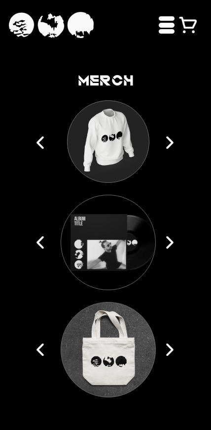
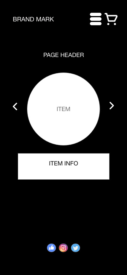
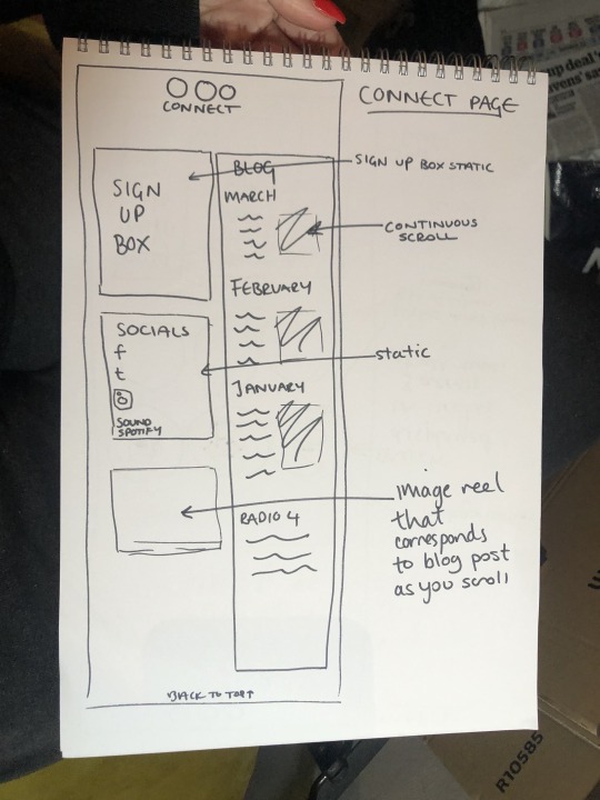
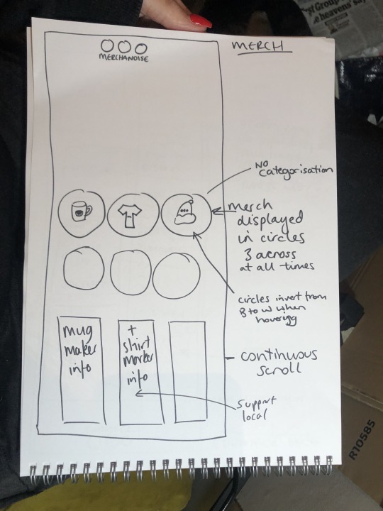
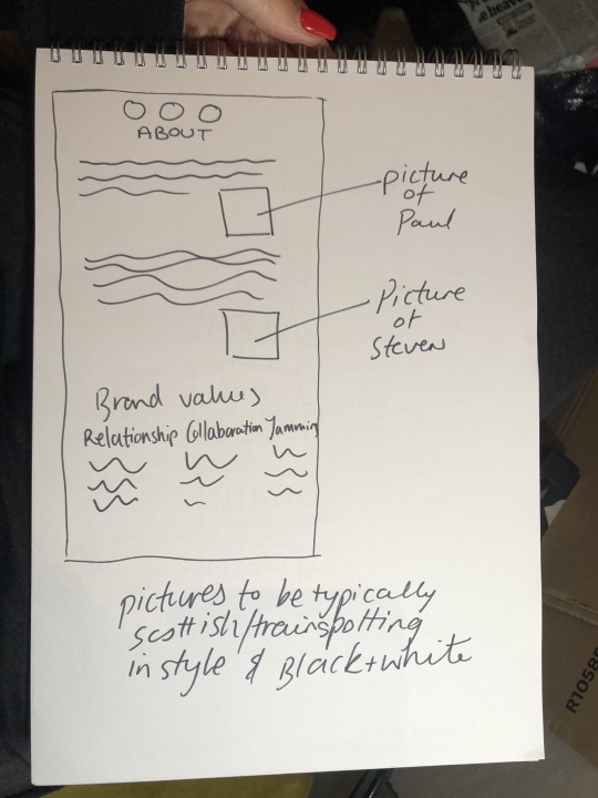
Application 2.0 - The Website Design
Here you can see the wireframe with the design on it - it’s really coming together!
Desktop Landing Page


Desktop Music Page - Option 1
Desktop Music Page - Option 2
Desktop About Page - excuse the typo in the header!

Desktop Merch Page
Desktop Merch Pop Up
Mobile Landing Page

Mobile Music Page

Mobile About Page

Mobile Merch Page
Mobile Merch Pop Up

I think I have some wee bits to do before this design is finalised - the font size needs looked at (download on my phone to check), the play buttons are questionable and I think I need to make the website look more like the mobile version.
Then on to prototyping....
1 note
·
View note
Text
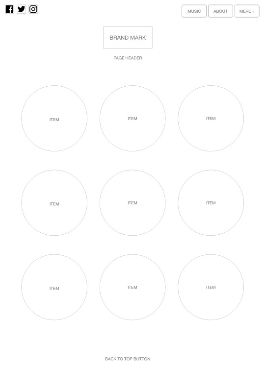
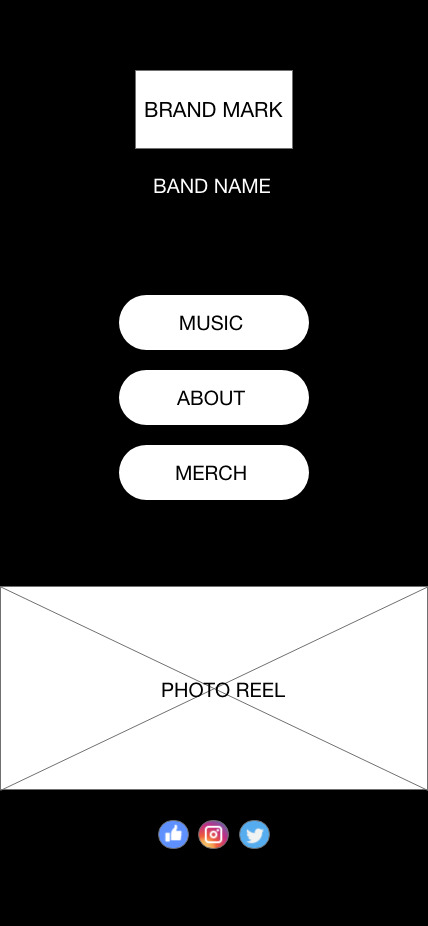
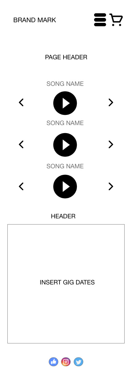
Application 2.0 - The Wireframe
Here is the bare bones of the website wireframe.
Landing Page

Music Page

About Page

Merch Page
And the mobile version:
Landing Page
Music Page
About Page

Merch Page

Merch Item Pop Up
Now onto the design...
0 notes
Text
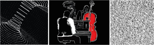
Application 2.0 - Reference Points
It’s important to highlight sources of inspiration and points of reference that have influenced my design process for Scaramanaga logo/website.
LOGO DESIGN
I was stuck on three main ideas that came from a short meet up with the client - minimalism, furturism/sci fi and cubism.
MINIMALISM


SCI FI/FTURISM


CUBISM

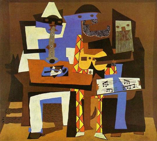
In the end, my logo design was simply developed from a need to make and get stuck in - I wanted to recreate the texture of the music, I wasn't getting this recreating the above themes. In the end, minimalism won in my own way. You can see more on the process of this in previous posts. The images below were my final three inspirations for the logo, I listened to the music with my eyes closed and wrote down what I felt, these images are a representation of this and formed the basis for my making.
WEB DESIGN
https://www.mister.studio - a great design website with a unique and simple format. Stong use of a black & white pallette and bold typographic decisions.
https://estudiopiedras.com - another strong typographic website. I love the use of simple shapes throughout the photography, really making this architecture website pop even though it consists of a monochromatic colour scheme. This allows the quality of the photographs (and the work they display) to shine through.
https://antinomy.studio - this website scrolls beautifully and has a really modern feel with again, bold typographic choices and simple colours.
https://artworld.agency - This website is simple at first but bold in typographic choices. It is focused on the purpose - to highlight the work of designers. These pages really jump out at you as you scroll.
https://rider404.com - This website is really cool, ultra modern and full of really interesting graphic elements.
0 notes
Text
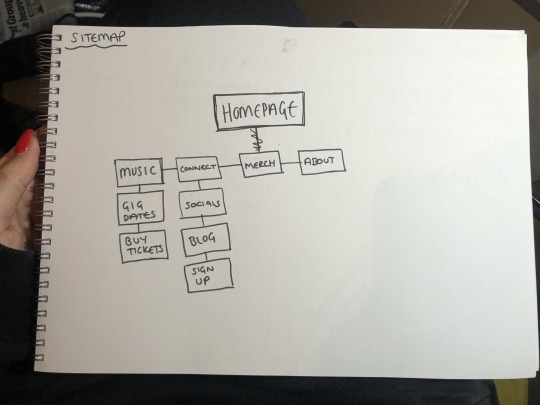
Designing a Website Presence
Workshop 004
The Sitemap


0 notes
Text
Designing a Web Presence
Workshop 003
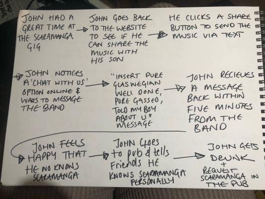
The User Journey

0 notes


Text
Designing a Web Presence
Workshop 001
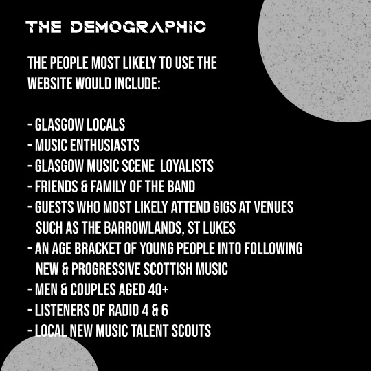
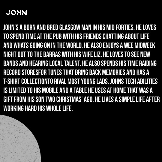
Website Analysis


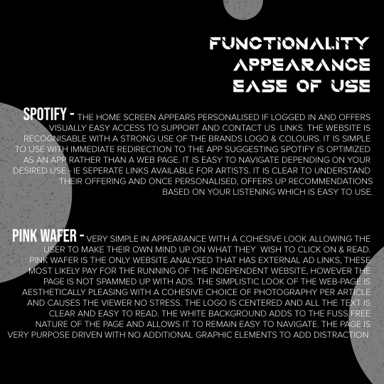
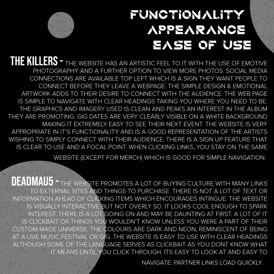

0 notes
Text
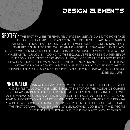
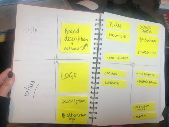
Application 2.0
It was time to develop a set of brand guidelines to issue the client with to ensure the brand stayed cohesive with it’s look and logo uses throughout. This meant there was a lot to sit and think about in terms of where the band should be present, how they should be present, what they value, what they want to achieve and of course how the band is perceived by it’s look.
A lot of research was carried out to understand the need for a brand guidelines doc and of course, some examples to understand the information required to display. This led me to start my plan for my guidelines.
My first stop was to develop WHY. How is the band and why do they do this? What are their values? I poured over notes from out meetings again and again, pulling words out the appeared more than once or resounded in my head as something that stood out about them. This is where I landed:
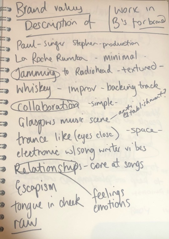
I felt it was important to capture the essence of the Stephen and Paul and the brand values of Relationships, Collaboration & Jamming seemed fitting.
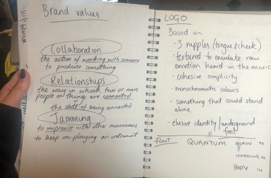
I also knew I had to include a description of how and why the logo was what it was.
0 notes
Text
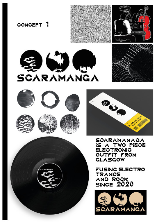
Application 2.0
My first concept ready to present to the client.
0 notes