
Last Seen Blogs
stuckinsideacloud
Spinster & Lunatic

amenghee-blog
describe anything

mydarksesires
For The Love Of Asian Pussy

simplycolettemariee
SimplyColetteMarie

culospeludos
c u l o s peludos
Text
Audio
Next time, i'll experiment with audio more. i think this piece worked best with less audio since it fits an "inspirational" or "hype' audio scape that I don't like much, but it could still be experimented with. Still i'm happy with it as is
0 notes
Text
Timing Retrospective
I learned a lot about timing during this project. Ease ease was a real life saver. I think I could definatly use a lot of improvement with parts feeling jankier than i'd like. But It's better than it was before.
Mostly, the large amounts of effects ment that preview rendering was annoyingly long so it stopped extensive subtlke nreadjestments. i'll go through the hassle of more compositions next time.
Personal fave animation pieces

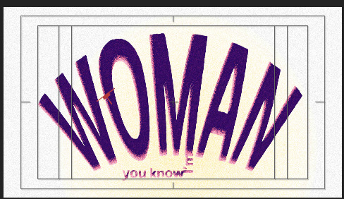
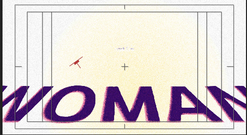
squash, stretch and exxaduration of the "woman" "strong bouncing animation.

the lazy, calming eyes here to fade out the end of the animation. I like the secondary mjotion of the gradient and pupils shifting
0 notes
Text
Color Retrospective
Overall, I really like my color scheme, and i preffer it to the more flag accurate version. the yellow, blue, cerulean and pinkish red all matched really well together and made every composition look good with minimal effort

0 notes

Text
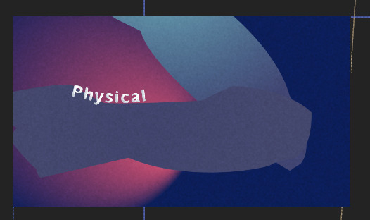
Old unposted Testing:
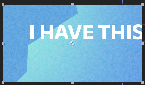
working out a color pallet, text ideas.
Need a rounded edge sans serif blocky font. friendly and solid, bold, reliable, physical
0 notes
Text
Symbology retrospective
If i could go back, I'd add more nz and tongan imagrey into the animation, since theyre all paarts of the groups shes trying to inspire as well.
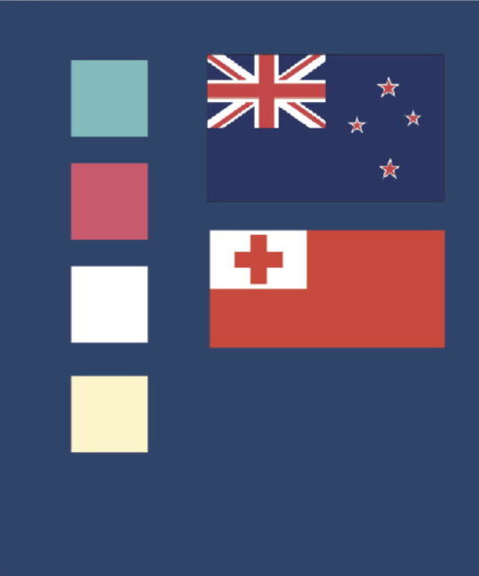
I like the colors on their own and as a referance to the flags, however it could escape unnoticed. i have no problems with more subtle symbology but the tongan cross and nzs stars could've been great visual elements. Still, I'm happy with the piece without them
0 notes
Text
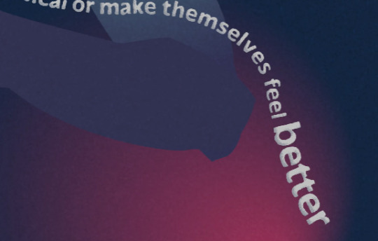
Typography Retrospective
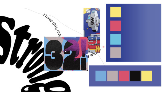
I really like the rounded but blocky text with the gardient dropshadow. It's solid and secure but the rounded courners and subtle unevenness bring a sense of warmth I assossiate with the strength Valarie Adams is imparting

As a side note: the filters make smaller text more rounded than large text. I like this effect since it makes the bolder text more impactful, but it's worth nothing the inconsistancy. However the text is still very readable.

the frazzled edges also adds to the noise filled fuzziness of it all
0 notes
Text
Nitpicking changes
Fixed spacing issue on "i know" at 4 secs in
Fixed bouncing "woman" and "strong" text by shrinking so it was in the clipping safe zone
fixed source text popin with the "amazing amazing" soure text
Fixed the 'make themselves feel better timing on the arm animation
Rememered to import credits
0 notes
Text
Adding more text animations

journey slides, like it itself if travling along the path

capitalised text on new work entry for emphisis
big to small size emphsis on better text

ocacity fade for dreamlike quality as video fades out
0 notes
Text
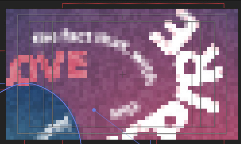
image for redone arm
new arm. Much mroe cluncky, but the isse couldnt be solved by finding the original file. i have no clue where it went
Blaze
0 notes
0 notes
Text
feedback
things to improve in the animation
mnm
have longer pauses in opening text movement and in latter one
-move further in frame
add at least 2 adobe bridge effecst
-add at least 2 text effects
-more lightness to credits
0 notes
Text
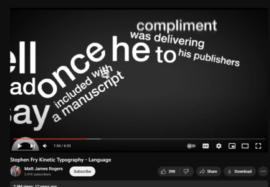
Here, finally, the stephen fry animation inspiration clicks in
all text of varing sized and properties mixing around eachother
0 notes
Text
Animated eyes
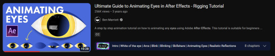
My own:

remember what video said about eyes closing quicker than opening

need to eye dip anticipation less janky by extending the pause
0 notes
Text
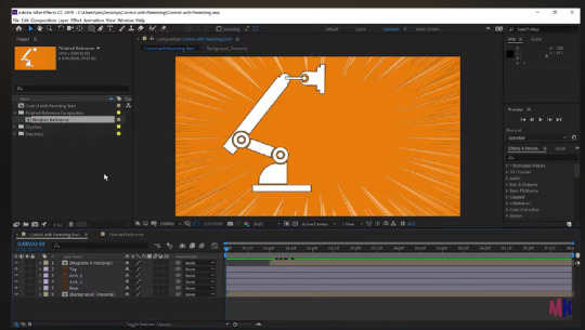
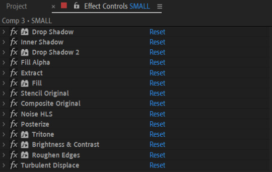
Using Compositions
all the effect layers i have really tanks the preview feature so I need to use the composition feature a reasonable amount

It took me a while to figure out when to use them and to unitilise them for organisation and lag reduction
Example of effect usage : the drop shadow
0 notes
Text
struggling with importing illustator assets. Moving it to a new file and reimported it solved the issue, so its no longer a problem but not answered.

The color of the arm sill change after importing, probably because of the heavy amount of effects on my work. But I liked the deep blue so color picked the background to it and think it works well.
I justify breaking from the pallet in that the noise filters and gradients already add plenty of color variation
0 notes