Last Seen Blogs
boy-w-tits
pretty boy

techho-blog
Untitled
butter-egg-toast
Free! toast
nyxofdemons
fizzablitz childhood sweethearts rights
stubermania
stubermania


Photo

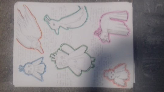
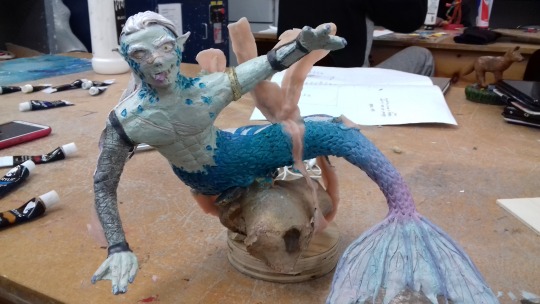
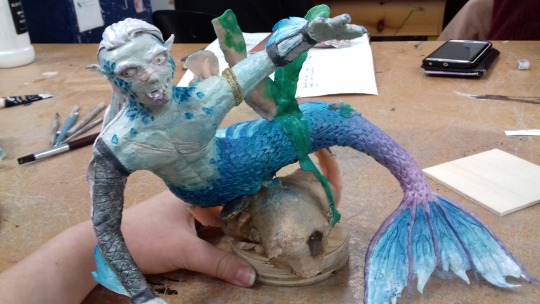
A page to go into my portfolio showcasing my siren model.
4 notes
·
View notes
Photo

“Nomak from "Blade II"The idea behind this makeup, is making high detailed makeup with the lower cost possible. So, I made the entire makeup with, liquid latex and EVA foam, and tried to mimic my mouth with this hand made open jaw prosthetic as good as possible”
I think this model works for what it is but it’s nothing outstanding compared to the other things I looked at, the paint looks really unprofessional again going for a pure red instead of a darker one with brighter vibrant highlights, and the model itself is really weird and looks rushed with the human teeth just poking out as if they were just remade plastic teeth badly glued onto the rest of the sculpt. On the other hand I really like how well the sculpture blends in with the make up and theres almost no telling the difference between the two.

“Faun inspired by Guillermo del ToroHello, my name is Laura Linares Font and im from Argentina.I made this makeup inspired by Guillermo del Toro movies.The prosthesis are made with Foam Latex, the ears with eva rubber, the fangs and horns with acrylic, and the crown with aluminum and ... a lot of patience jajaja.I made all these with the little things i had, there are not much materials here in Argentina.Really the makeup and the creation of creatures is something that I love, i would like to have this opportunity to learn as much as I can.Since here in Argentina, there are not many opportunities.Thank you very much for letting me be part of something so beautiful.”
I like the design of this model, it looks really fantastical mostly to the deer aesthetic and the flowers at the back. It gives a whole different vibe as compared to all the other models I looked at so far today where this one is trying to be pretty while all the other ones I seen today were pretty much ugly and unpleasing to look at. I feel the face could use some more work because it looks pretty rough mostly the textures around the nose and eyebrows that I believe are supposed to represent horns of the deer. other than that I really like the choice for the contacts that make the model in the picture look blind, it really suits the style they went for and works to complement the whole model.
“2019 Halloween Costume contest - Death KnightHello there!
I am happy to show you my Death Knight costume from World of Warcraft.
Almost all of it is made with EVA foam: the tusks are made with Worbla, the gems with epoxy resin, and somes others parts are made with plastic (axe handle and flat part of the blade)
This costume took me about 350 hours to make - with lights and axe's smoke.
This is my second personnal costume, and the Youtube link is the video of my first cosplay contest”
I really love this model because unlike the previous 2 this is a full body model which definitely took way more time than the smaller ones, and it even mentions that it took 350h to make which is very impressive because it must have been a massive commitment to make this thing and it really shows in the final product, because its really easy to tell its very high quality with tons of detail. I like the additional lights included in this model because none of the other models did that and I think it makes the whole aesthetic between modern and medieval work. It also sets this costume aside from all the other ones making it much more original and probably higher value.
https://forums.stanwinstonschool.com/bestof/everything
1 note
·
View note
Video
youtube
In the video they explain that the easies way to soothe out the sculpt especially on fine little details (like the face in the example they give) is to use alcohol. This allows for the details u spent a lot of time on to not get interrupted or removed by the smoothing tools like the ones he uses on larger parts of the sculpture. in the video he applies the alcohol with a brush in bigger areas and soft tissue in tiny hard to get areas and, applies it by either gently tapping or rubbing on the sculpture. The alcohol apparently also hardens the first thin layer of sculpt making for an easier surface to work on without affecting the things you already made before. It also gives a nice shine to the sculpture and makes it look much more clean and professional. In my case I had to smooth out the sculpture with either my fingers on the big parts or a small round tool as well as a rubber tool under a magnifying glass which wasn't the best for me because the glass was giving me a headache after some time using it, making me rush the smoothing process.
youtube
I really like how some of these look, most of them don’t feel realistic as in something that could actually exist in the real world but as characters and models go, the sculptures are pretty amazing. Most of them look like game characters and it really suits the aesthetic they were made in. I also really like how the video shows the progression and the making of the models, it’s quite interesting to see the people behind these sculptures. The only down side I find in these sculptures as well as the ones from the previous video is the fact that none of them are painted. I feel painting them would another level of realism to the sculptures because you can add so much more extra detail and texture through colour and shading it’s quite a shame these sculptures don’t have that. But I guess not painting them on the other hand allows for the actual details within the sculpture to show up, and they wouldn’t be as visible with the paint on top that would be the centre of attention.
1 note
·
View note
Photo

https://petercooperstudio.com/sculpture/
I really like the quality of their models, the finished products look way better and more detailed then the initial sketches. I especially like the top merge between a gorilla and some kind of parasite on its face, it’s a very clean merge between the two and makes it look so realistic for what it is. This is definitely the opposite of what I’d do because in my case the sketch is much more detailed than the model I ended up with but I assume thats due to the fact that I draw way more often than I sculpt. As for their other models I also really like the green dinosaur with the body of a chameleon. I think the dinosaur head is extremely detailed and you wouldn’t even be able to tell its body doesn’t match the head because they are merged well.


http://www.caseylovestudio.com
I’m impressed by the scale of their models. Some of them are even 3m tall which is really quite fascinating, especially that it took me so long to make such a tiny model I cannot imagine how long it takes to make big ones like the ones produced in this studio. Although I’m not quite a fan of how the sculptures look, they are really going for making more creatures rather than characters and most of their models although they are really cool, they look ugly. They have that aesthetic of making everything slimy and wrinkly making their models look really unpleasing, but the fact they add so many details like that, that make their work look disturbing makes their work so much original and one of a kind rather than having a perfectly pretty model, it also creates a realistic feel for their models. And this again is something I haven’t done because for me my model I made a clean and pretty drawing of a character and I wanted to reflect that as much as possible in my actual sculpture making my character look unrealistic while here all the wrinkles and imperfections make these characters come to life.


Im not really a fan of this sculpture, it looks both cartoony and realistic at the same time and it makes it look overall pretty average and unnatural. I find the pose of the head, especially the fangs and the wrinkles very well made. On the other hand I really hate how the paint looks on it, there is clearly way too much paint and it makes all the details on the sculpture disappear as well as make the sculpture overall look really shiny which is really not desirable for the fur texture on the model. The eyes look really weird as well, the yellow paint is clearly spreading onto the fur leading me to believe the painting of this sculpture was really rushed which is a shame. I especially don't like the tongue, it has no texture or realistic colour choice to it, its just pure red which is not helping on the realism spectrum at all, although I like how there is red on the teeth suggesting blood, that’s a cool detail but otherwise even if there is blood on the tongue it wouldn’t be this red.
1 note
·
View note
Text
The final picture of my plushy, it didn’t take me long to finish it off because like I said before I only needed to attach the tail and create the wing texture on the right wing. I’m quite pleased with how it turned out although on my original design its head was way bigger, it was the first piece of the plushy that I made so it obviously turned out off, of what I initially intended but it still looks alright in the proportion to the other body parts. I’m not quite fond of the tail though because I wanted it to have navy blue ends but when I tried to stitch them on the stitchings were very noticeable so I needed to go with the alternative of glueing it onto the cyan part of the tail, which was something I initially wanted to avoid as much as I could, I wanted everything on my design to be either stitched or appliquéd on but I guess there’s nothing I can do about it now, it doesn’t even look bad it just bothers me.
1 note
·
View note
Text
My inspiration
youtube
Recently when I was at the cinema they showed off this trailer and I felt it was a good thing to base my own trailer of off, not the trailer itself but the story I felt was interesting. Basically in their world within the film there is an app that tells you when will you die, kind of like in an older movie In Time, except at the start everyone disbeliefs this but after the app turns out to be right about every single death millions of people install it to find out when will they die. The main character appears to be hesitant but also downloads the app and finds out she will die in 2 days. I don’t know how the story goes from there as I have never seen this movie, I don’t think it came out yet being honest. I assume the character will try to prevent her death from happening and ultimately fail considering it’s a horror film. I took that idea of suspecting your death will come and interpreted it for my trailer where instead the curse comes with a chain necklace endnote an app.
1 note
·
View note
Text
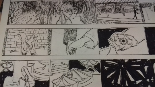


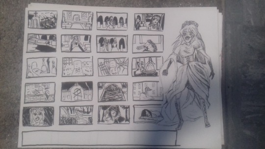
This is my second story board that is much more accurate to what my trailer actually turned out like. I feel I kind if rushed making this story board but thats because I wanted to finish this before I actually finished my trailer, but as I was making both in the same time span I made some scenes in the story board exactly like how they ended up in the trailer.
2 notes
·
View notes
Photo


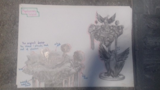
My evaluation, I’ve decided to separate it onto two pages because the first project we did was much more themed around the same thing: Mysterious Island while the second projects a bit scattered because we did a different thing in every class. I couldn’t include a lot of my work for the second sheet though because most of it was the trailer that we did and obviously I cannot get that onto paper as well as multiple gifs of my animation or other clips that I took but I feel this is enough to show my progress.
3 notes
·
View notes
Photo
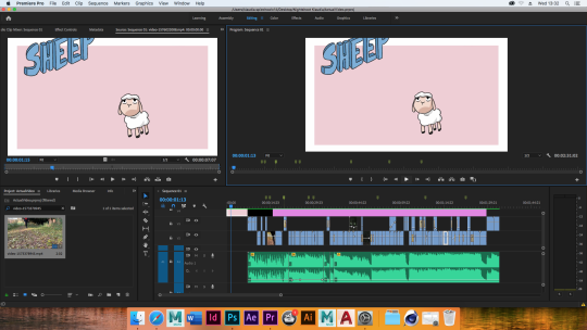

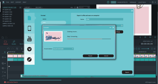
The final timeline of my trailer, including all the additional writing clips that I made at home that I imported into the trailer as well as the title and my animated opening. I had to do some adjusting on the writing clips because some of them were too long and I also added a fade into black effect on them so that they would look more like as if they belong in the trailer. The last thing I did was export the entire video which took some time, especially that I had to do it twice because the first time I didn’t change where I wanted to get it exported into so I lost the file.
1 note
·
View note
Photo


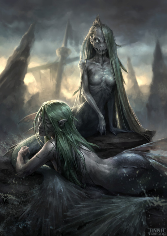


“ In Greek mythology, the Sirens were dangerous creatures, who lured nearby sailors with their enchanting music and singing voices to shipwreck on the rocky coast of their island.”
Originally sirens were represented as a hybrid between women and birds but with time they became known for being the mixture between fish and humans. Furthermore now they are represented as the evil alternative version to mermaids and this is what I based my character design on. Although you canot really see it through the colour scheme that I used for my character as mostly sirens are presented in navy blues, dark greens and shades of grey and black with glowing eyes and sharp teeth. I have kept the features that I just mentioned but instead of a dark colour scheme I made it much more positive and welcoming to act as a disguise, as sirens are known to lure people to trust them and then in most stories end up killing them for some reason, probably food, guess we’ll never know. So my thinking process boiled down to lets make him look friendly so people trust him and then he can show his ‘true colours’ of being a siren.
Originally I thought about making it into a female siren but I almost instantly changed my mind because there’s a lot of female mermaids and female sirens that people have designed and made before and I wanted my model to stand out and feel original so my first thought was “how about a merman?” but in the end I went with a siren because I made the initial sketch of the model that I wanted to make and really liked how rough the tail and all the armour pieces looked, and personally when I think of a mermaid I think of a very positive Little Mermaid pretty mermaids, but my design was giving me the opposite, so I simply thought to myself well nowadays sirens are the opposite of mermaids so why not at this point.
“In Medieval Europe, mermen were sometimes held responsible for causing violent storms and sinking ships. “
“Triton (mythology) of Greek mythology was depicted as a half-man, half-fish merman in ancient Greek art. Triton was son of the sea-God Poseidon and sea-goddess Amphitrite. Neither Poseidon nor Amphitrite were merfolk, although both were able to live under water as easily as on land. Tritons later became generic mermen, so that multiple numbers of them were depicted in art. “
"The siren sings so sweetly that she lulls the mariners to sleep; then she climbs upon the ships and kills the sleeping mariners."
https://en.wikipedia.org/wiki/Siren_(mythology)
https://en.wikipedia.org/wiki/Merman
1 note
·
View note
Video
The finished outcome of my animation. I am still really bothered by the volume of the glitching but there isn’t really anything I can do at this point. Although I really like how the animation itself turned out especially the writing because I’m not really good at creating dimension in geometrical shapes so I’m happy I was able to animate this 3d object and it doesn’t look awful if I say so myself. Also I cropped the last scene of the animation because originally, I made every scene have this white ring around the pink recktangle, but the last scene a lot of the colours are way darker and the white simply bothered me because of the contrast to everything else in the shot. Now that I think about it I could’ve just made it black or dark grey to match everything else but I don’t mind the zoomed version I finished with so it doesn’t really matter. The shot is there only for a split second anyway so it’s not a problem either way.
5 notes
·
View notes
Photo

The finished timeline of my animation. It lasts around 7 seconds and has around 30 frames and some repeats at the end for a still effect. I also greenscreened some glitching at the end to reflect the thriller vibe that the trailer has. I also had a big play around with the audio because the original was really deep and slow, making it hard to align with the animation so I had to speed it up and pitch it up, I still wanted it to be in a deep voice just not as much as it originally was. I really struggled with adjusting the volume of the glitching efect though because for some reason the volume settings on that specific clip were broken and muting it or turning the volume up and down would do absolutely nothing so after struggling with it for around 15 minutes I decided to just let it be loud, because I didn’t have the patience to figure out whats causing the volume problems.
2 notes
·
View notes
Text


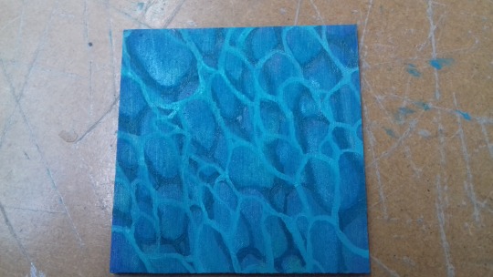
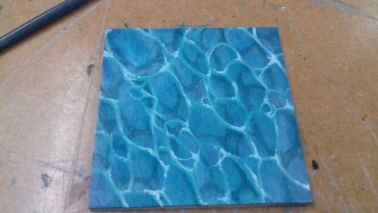
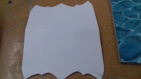
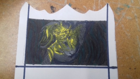


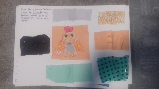
My tile and card to go along with my model. I really like how the tile turned out, it was a big change to go back to painting a 2d surface after struggling with the model for so long. For my tile design I went with a smimple shallow water texture. I painted the tile with cyan blue colour with a darker shade of blue on the corners. Then I made the circle pattern with teal green and another white with the same colour after adding a lot of white paint to it, with the second pattern being shifted to the side to create a feeling of height.I also used some eyeshadows, mostly greens blues but also reds to create reflections on the water and then I painted in the foam on top of the white rings.
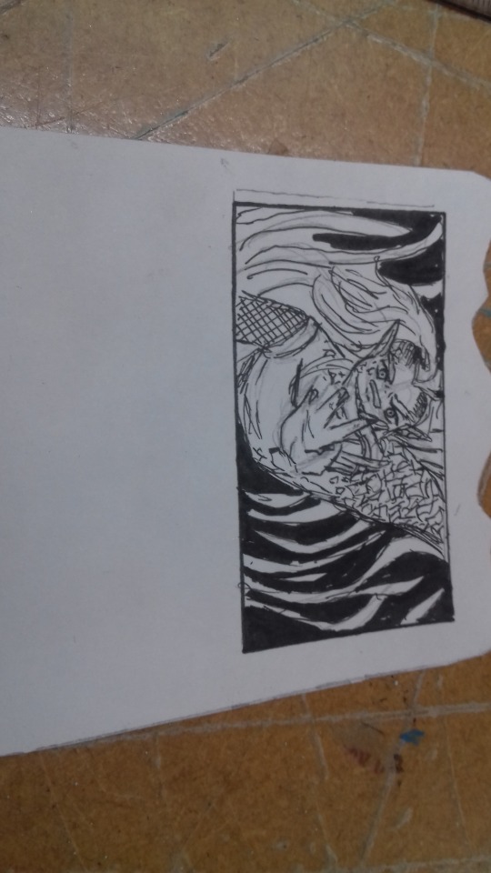
After finishing that i made the game card from a template that was being passed around the class, but I only used it for size measurement, then I marked that out and designed my own card shape to better match my character. I made a design on the top of the card and initially I wanted the bottom to be flat but in the end I’ve decided to make it a relfection of the top so I bent the card in half and drew a shape with both sides having the same pattern, and then cut out the final crd from that. I drew a little rectangle on my card and then within that I drew my siren character with fine liners and coloured it in with sharpie markers because that was the only thing I had with me, but I don’t think it turned out that bad. I really struggled with the writting machine. Originally I wanted to write “The Sirens Call” and better explain what the card does to you but I ended up simplifying it as much as possible because I wasn’t confident typing on the machine and I didn’t realise you had to type fast for it to work properly.
2 notes
·
View notes
Text
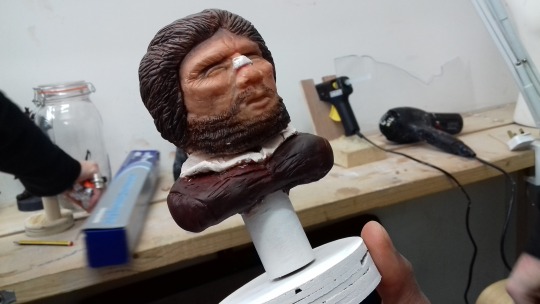


I really loved other people’s work, everyone came up with such a different design and they all stand out so much from each other on many different levels. Some are more cartoony and imaginery while others like mine for example attempt to push for realism. I also found it interesting how quite a lot of people went for a portrait like sculpture only showing off their characters head and arms. I feel doing it that way makes your sculpture much more limited because you can’t really express your characters personality through body language like in the full body sculptures other people have done. But doing this has plus and minus sides to it because although you can’t make your character expressive you definitely cant make the sculpture itself very detailed, as you only have so much to do on such a specific area, you can see the portrait sculptures are way more detailed than the full body ones mine included. I feel painting is what most people struggled with, including me because it’s very different to paint a 3D surface as compared to a 2D piece of paper or anything like that, you have to consider dimension and shadows much more and it gets complicated if you aren’t used to doing it but I believe most people did a great job painting their game pieces and they all have done it in different styles, colour schemes and textures making their work look really personalised and original.
1 note
·
View note
Text


I’m quite good at painting using acrylics but I found this process really hard, painting flat surfaces is way different to this especially that I wanted to maintain all the features and textures that I took so long to make in the first place. I especially found it hard to shade in my sculpture because that’s a thing I would normally do with an illustration without thinking but here I had the dilemma of should I let it just have natural shadows or shade it like I would with a drawing, and came to the conclusion that I’ll just let it have natural shadows as I didn’t think I would have the time to paint everything by the end of the day. I just wanted to get the base colours done and ready so it at least looked a little finished.
2 notes
·
View notes
Text
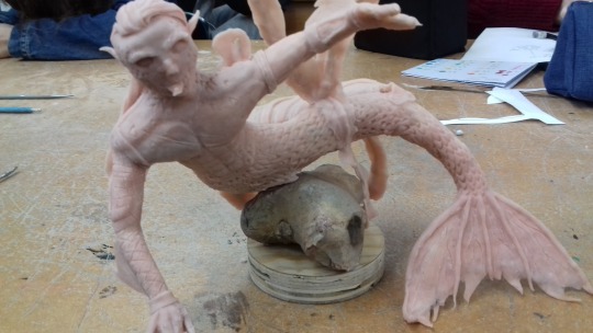
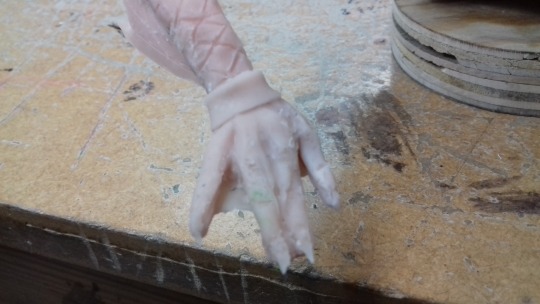

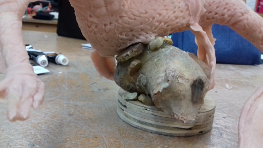
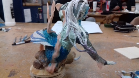
I baked my model for around ten minutes but on the way out of the oven he managed to loose a finger. I really hated how it came out of the oven because the back fin was completely flopped over and now instead of being up right in a specific shape I took a lot of time to put it in, it was just sat there horizontally, some of the parts of the main tail also bent up or to the side making the tail movement look really stiff which I hated because I couldn’t do anything about it. As for the finger I just made a new one out of super sculpt and attached it to the sculpture, I couldn't bake it but if instead of posing it like it was before, I attached it to the hand making basically all the fingers on it lined up. It looks pretty bad but there wasn’t anything else I could do, and nobody will be able to tell the difference between baked and unbaked after I paint it.
Then I moved on to attaching the model to the base, I used got glue for this and first attached the seaweed. The sculpture turned out to be really of centre because when I took off the rock from the actual sculpt part I forgot where the vines originally went so I stuck it in the middle instead of to the side like it was originally. Then I glued the rock onto the vines connected to the base as well as gluing the rock itself to the base for extra security. The glue was really visible so I added quite a few smaller rocks to cover it up.
2 notes
·
View notes