
lelizas
Communication Design
portfolio of progression
12 posts
Don't wanna be here? Send us removal request.
Last Seen Blogs
miracles-alaa
Miracles

coffretskinhelp
Requests are closed! 🐱On Hiatus🐱
johnkatsmc5
return to the underground,the other side of music
exarchicsims
sims 3 cc finds
kajishin
Untitled
Photo

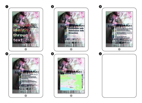

Final Products Inspired by Poster
Consistently, I utilised elements from my final poster in forming these accessaries. Carried throughout, is the theme of texture and the photography image of my model. I wanted to stress equal importance onto each element of the poster, (typography, texture, tone, image) rather than one deciding feature, as this would relate back to Grunge and the explosion of creative idea rather than plan and order.
Each final expresses elements of Grunge through the un-finished and textural outcome. Many of the designs appear cut-off in a non-tradiational way, disregarding photography framing rules (rule of thirds, hotspot) to consistently circulate back to this rebelious style.
The challenge was to express importance and purpose into each feature, without the composition appearing to orderly. Moreover, achieving balance between this, and supplying mass of texture and overlap, common to the style.
I have been heavily inspired by the work of David Carson and the message he highlights; that a direct emotional response can occur through the visual features within artwork, rather than relying on script and its typeface.
Through utilising mundane colours and everyday textures into an intriguing new piece, I represent the uprise of Pop culture during the 1900s. By contrasting these elements with highly saturated un-natural tones, enhanced by filter, I express the emotion of the Grunge generation in countering the mundane sophistication of Pop, and encouraging complete artistic freedom.
‘From Making is Connecting, chapter 8: Web 2.0 not all rosy?’ - The idea that dealing with computer based systems and its ability to shift and organise information, alienates the human element in expression. This is physically represented in my work as the mass of disorderly typography, presented in varying opacities and tones- expresses code, or computer element. Enhanced by the idea, that this piece has been constructed through the advances of technology. This therefore combined with my own photography and overall composition urges the question, has technology removed us from the personal process of art?
When posting, some elements of colour and texture have been distorted within the Web Design Page layouts. This distortion remains effective in encapsulating the Grunge style.
0 notes
Photo
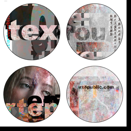
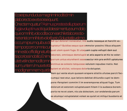
Session 6 Task
Here, I created five justified squares of text, each with its own visual texture. By experimenting with different typographies I was able to produce variations of value, density, and transparency. The outcome is effective due to the contrasting character of each, combining together elegantly to create this final design. Differing the use of capitalised lettering and lowercase, creates depth between emotion presented, furthering this consistent contrast throughout.
Being constricted to a 25cm square, meant tension was created due to the compact design and use of overlap. However, the careful placement of text overpowers this tension and created feelings of harmony and compositional balance.
The idea of overlapping elements which contain opposing features, compliments the Grunge style and informs the direction of my final piece.
0 notes
Photo


Experimentation of Final Poster
Poster 1 is oversimplified and ineffective. From here, I realised I would need to provide a higher mass of layer, both typography and texture. The second attempts displayed a much more effective composition, the mass of background surface was successfully encompassed by the duplication of photography. The deeper more rich toned photograph, compliments the low-saturation and opacity of the lower. Overall, the composition was still too basic and flat through maintaining a similar degree of shadow to highlight throughout. After overcoming this, I applied further layers to bring out depth to the textured title and provide further context: date and location.
The concluded final poster, intended to supply a last element of disorder through texture and typeface. The composition now defined, successfully utilises Grunge and its qualities, whilst appearing engaging through depth of tonality and texture. The alternating directions and contrast of un-natural saturation and mundane created a conflicting harmony.
0 notes
Photo
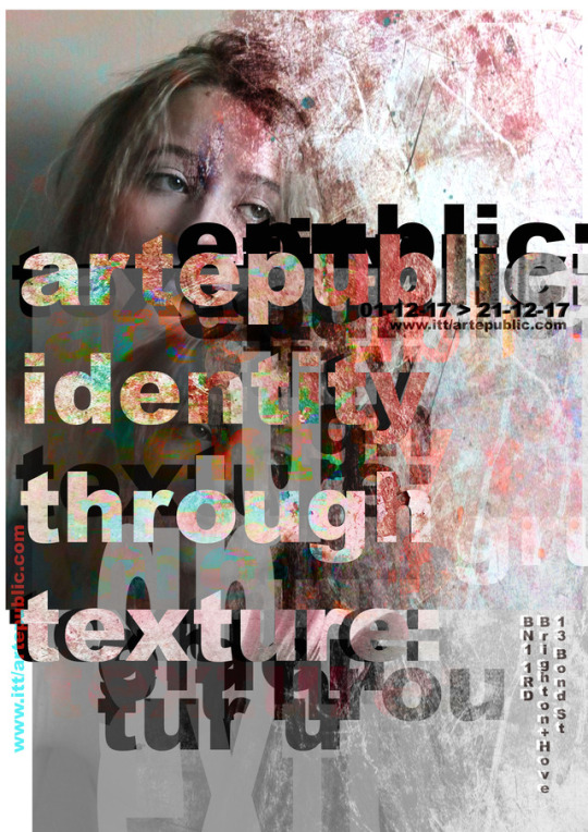
Final Poster Design
Inspired by the work of David Carson and Grunge scene of the 1900s.
0 notes
Photo

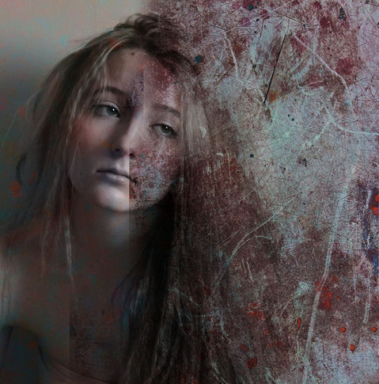

Informal Presentation: Draft Version of Poster Designs
Rather than 3 decided poster designs, I created separate montages, which possessed vital features to include within my finals.
The first was created on InDesign and looks into typography and the effect of combining this with shape. Neutral tones against the vivid red, was effective and features within my final whereby the majority consists of rustic tones, complimenting the use of texture. However, interlinked are segments of saturated, un-natural colour, through applying filter.
I then looked into layering various textures, gathered online and within my own photography. I adapted: opacities, filters, hue and saturation to achieve this finish.
Lastly, using my own photography I placed texture overtop and used the ‘Clone’ tool to capture the edge of the layered texture and duplicate onto areas over the face. This created an effective contrast between soft pattern and straight-edged direction.
Feedback
Overall, the designs were effective in relation to the Grunge style, but all appear too shadowed. Levels with the layers should be experimented with further to brighten the overall composition.
The final image shows the development, taking into account the brighter finish. I applied a different filter to the texture, blending the model more subtly against it- as this overlapping merge of layers is common within Grunge. I experimented with cut-off lettering of the word ‘Grunge’, and think the effect compliments the imagery.
0 notes
Photo
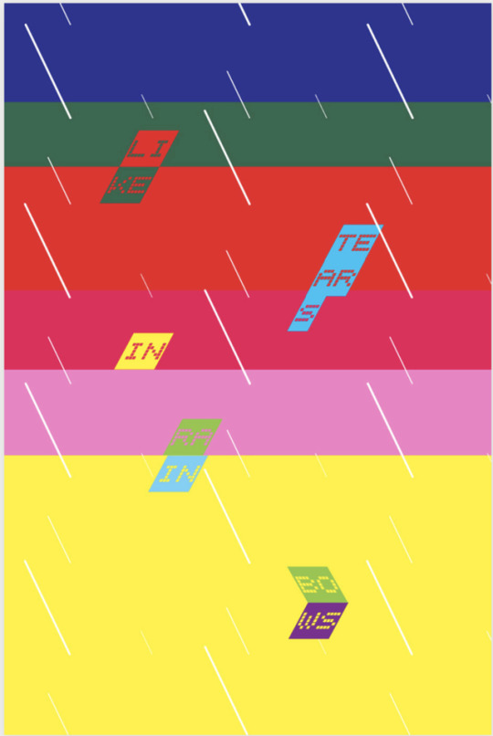


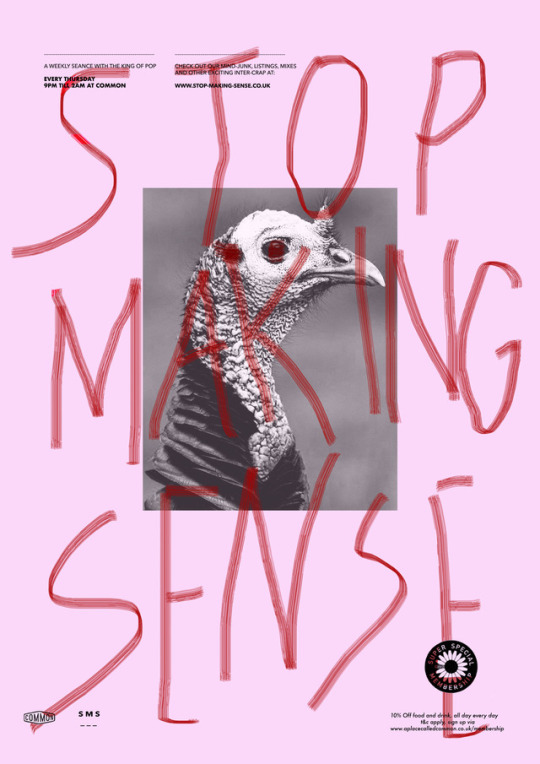
Session 4 Task 9
Expanding on Task 2, whereby I gathered inspirational poster designs, this task asked for me to re-create some.
‘Like Tears in Rainbows’ was recreated as its vibrancy and attention to layering flat objects in forming depth, inspired my final piece. The separate rectangles were traced, the colour was matched then pasted onto a separate document. This aspect was straight forward, however I duplicated the shapes containing context onto the separate document through their complex form. I then applied my variation of the colour into the sections using ‘Fill’. To improve, the overall colour block background could have lower saturation to achieve a finish closer to that of the original.
The outcome of ‘Stop Making Sense’ is more personal due to featuring a different photograph of a Turkey. This was transformed into black and white, before setting a high exposure and contrast using ‘Levels’, between shadowed and highlighted tones. This loss of detail through high exposure, leaving a blotched/abstract finish, relates to the Grunge style through disobeying the mundane order of society. The paintbrush tool was used to create the wording over top and distortion to the photograph centrally placed. The overall effect of this and the small areas of writing and image scattered around the top and bottom third, are successfully similar to that of the original.
0 notes
Photo


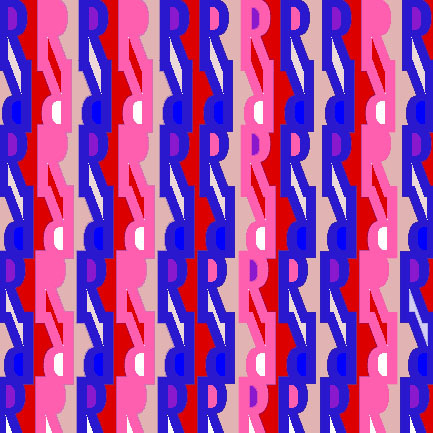
Session 4 Task 8
This task, inspired by ‘GRAPHIC DESIGN THE NEW BASICS: Selective Emphasis’ entitled me to repeat and rotate one/more letterform to create an engaging black and white pattern.
Originally, I attempted this task using the letter ‘Y’, this proved unsuccessful as the pattern could not completely fill the frame and meant filling with various colour was more challenging. After deciding I was unhappy with this effect, I moved onto the capital letter ‘R’ where I consistently reversed every other row to create rhythm and fluency within the design.
I then looked into adjusting the saturation of the similar colour red to create depth. I applied its contrasting colour blue, in small amounts throughout the design. This becomes effective as the tone appears to stand forward, out of the design, leaving the red as a background tone. Therefore, the opposing colours harmonise within this final. I purposely chose to leave areas white for a more abstract and unfinished effect- encouraged by the Grunge and 90s club culture style.
I furthered the idea of similar yet opposing tones in the third final. By applying the neon blue tone, onto the actual letters themselves, a more modern effect was achieved. Despite the vivid tone standing out, the overall effect is more interweaved and flattened due to the higher mass of this blue being provided.
Lastly, I chose to explore similar tones, manipulating the Hue and Saturation. The letterforms were turned sideways to explore the effect. The finish is more rustic and mundane, effectively contrasting the abstractness of the piece.
0 notes
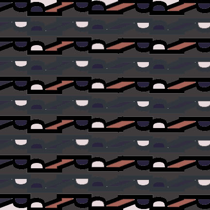
Photo


Presentation: 90s Club Culture, The Designers Republic
This topic enhanced my previous like for intercepting layers, colours and textures. The 90s pushed boundaries, creating advertisements that would completely encapsulate a viewers attention. The contrasting directions and overall abstract composition is intriguing.
Despite admiring the use of vibrant colour, reflecting the heightened drug industry and arise of the rave scene, the focus on texture is what will be carried forward into my project. I will explore varying saturation and opacities, along with layering different types of texture to create something new. Filters can also be applied to heighten and vary these effects- encouraged by the vibrancy of 90s Club Culture.
0 notes
Photo
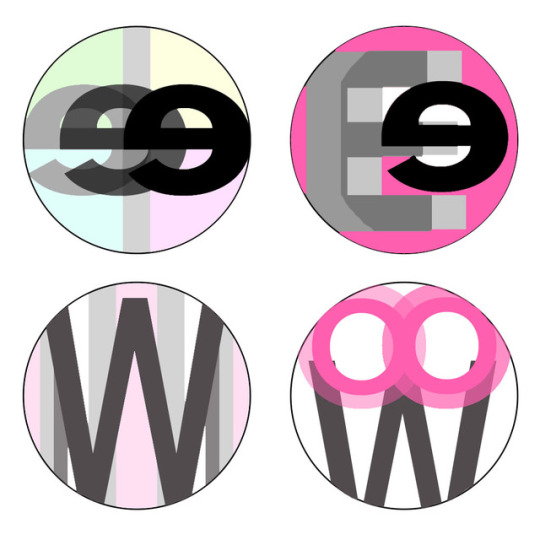
Session 3 Task 6
This task was to create a set of four logo designs, containing contrasting letter forms.
I first chose the upper and lower case ‘E’ as this would provide both straight and curved edges. I duplicated the upper case ‘E’ and lowered its saturation for further depth. After experimenting with various other letter forms, it became clear that overlapping and altering opacities and saturation- created a more intriguing composition. This exercise led to my later discovery of the grunge style and intercepting forms. Layering, also provided texture within the finals, this along with cropped edges or turned around/upside down letterforms, was effective.
I dislike the overall colour combinations within the badges, and prefer to rely on the varying opacities of black to create more tonality and levels, encompassing this grunge feature.
0 notes
Photo
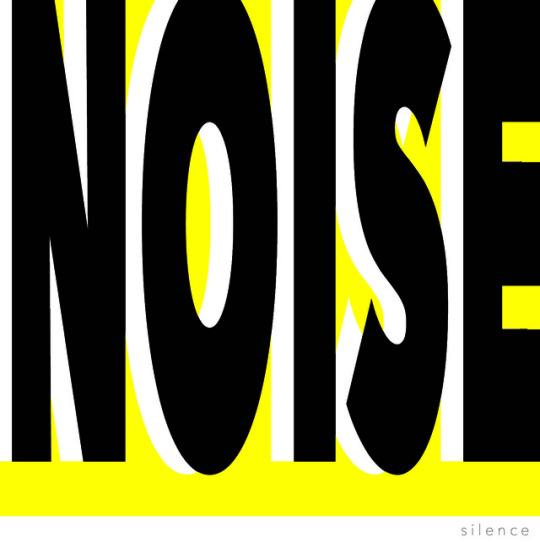
Session 3
After creating word lists with opposing meanings, I decided to focus on the contrast between ‘Noise’ and ‘Silence’ due to its potential.
Instinctively; when picturing this comparison, I saw ‘Noise’ as the overriding feature, encompassing a higher proportion of the frame. I used typeface Futura Bold, filled with a plain black tone. Stretching the word physically represented the height of ‘Noise’ and its blatancy. I placed a yellow ‘Rectangle’ behind this layer and increased its ‘Brightness and Contrast’ along with ‘Levels’ to achieve this contrast between bold lettering in the foreground and bright background. I chose the leave the lower bottom third of the frame white, choosing a smaller font size and thickness, I wrote ‘Silence’. The clear yet subtle effect highlights the power of silence yet its lower authority to noise. Duplicating the word ‘Noise’ I repositioned and made the font white, this provided further depth and elongated its physical placement on the frame. This effectively contrasts how the word ‘Silence’ blends into its surroundings. The overall effect has a pop-art feel due to the simplicity and clear purpose expressed.
This contrast of scale and thickness, exaggerated the depth between the two effects. By representing complete opposites, the other appears more intense.
0 notes
Photo


Session 2
Using the basic forms supplied, i experimented with the manipulation of their placement in creating geometric logo designs. I utilised this weeks reading from Graphic Design: The New Basics, to explore the effects of: symmetry, balance, rhythm.
The first two logo’s featured were my original attempts at the task. Despite the engaging effect of maintaining a single complimentary colour, the designs appeared flat and over-simplified.
I then experimented with alternating opacities and colour saturation. This worked to create deeper tonality and complexity within the blending of individual shapes. From completing this task, I realised I was intrigued by the use of layering to create unique textures and levels. This idea will be carried forward within my project- exploring the effects filters supply.
The use of similar tone or colour works to create balance and harmony within the overall composition. This more complete outcome, is enhanced by constant direction or flow throughout the objects/shapes used. When working entirely with ‘Ellipses’, and then a single straight-edged object, a new level of sophistication was formed.
0 notes
Photo

Session 1
Inspirational Poster Design:
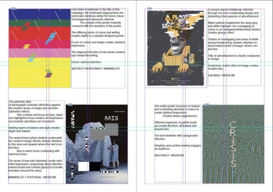
Originality combined with relevance to modern trends proved to create the most inspiring posters. I enjoy the use of texture and tone along with the combination of photograph and sketch within a poster. This mix of mediums creates a more personal outcome which engaged my interest. Meaningful design that directly links to a poster’s context, conveys its message without requiring much attention from an audience. This impression is visually effective and practical in real life- as shown in image 3: ‘Tears in rainbows’.
I am most intrigued by the grunge or alternative style, along with combined media’s in poster design.
Organising Form and Content:
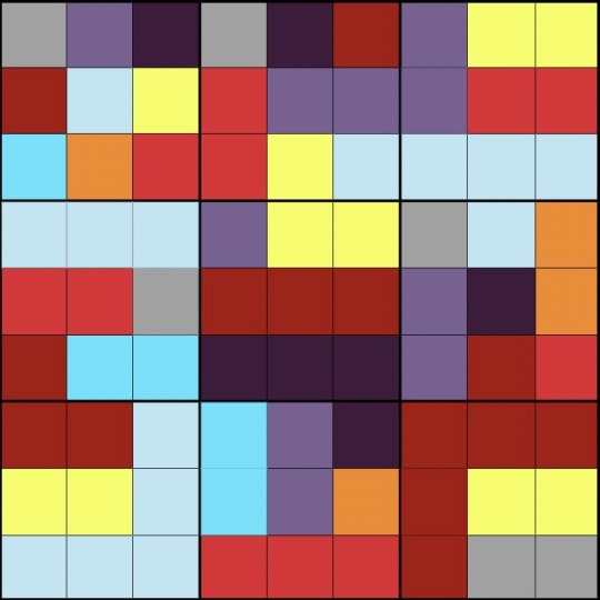
I used Photoshop to create my work for organising form and content. I used similar deep-toned colours to encourage the appearance of intercepting forms. Yellow was used to create depth and contrast.
I then repeated this exercise using a 9x9 square gird. The darker squares represent image, and mid tones representing text. White areas are empty spaces.
0 notes