Last Seen Blogs
theabysss
The Starry Abyss

elvestoneanzelote1
H𝗲𝗹𝗹𝗼!!
needscreen-blog
Needscreen

drlessy
Lessy 💕

cashcarrybridgwater-blog
Cash & Carry Bridgwater
Photo
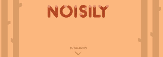
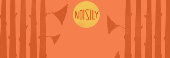
Noisily Website
My website has come together quite nicely with Parallax implemented. The site scrolls down and links with each section, I have themed it to appear as if you were going down and deeper into the Noisily woods and I have coloured each section to be different from the last. The graphics have been updated from my last design, I have kept it cleaner by removing the grunge texture and updated the logo, this design is of much high resolution and looks nicer full screen than my last design. I shouldn't have much left to complete, possibly adding in some social media links and to also include my groups unsung music festival banner.
2 notes
·
View notes
Text
Parallax Scrolling
So I have recently come across a cool way to display a website which many companies have been using for their own websites with nice visual effects. Parallax scrolling allows background images to move more slowly that images in the foreground creating the illusion of depth. Instead of making a complex website with numerous links to other pages, being the website is already simple, I thought it better to have a website that streams continuously down the page, requiring someone to simply scroll their mouse instead of clicking many links.
0 notes
Text
HTML
So I'm currently exploring options for my website in terms of coding, I have learnt through in class tutorials and through online methods basic html. This includes tables made up using code such as this:
<table width="1000" border="0">
<tr>
<td width="200"></td>
<td width="200"></td>
</tr>
</table>
I found code like this not too difficult, other coding I have learnt includes linking images and text to other pages and websites which can be simply made with this code: <a href="www.tumblr.com">tumblr</a>.
I have been able to put together the basic structure of my website with some images, text and css.
0 notes
Text
Word of the week: Future
When I think of the future I think about my career as a designer. I was passionate since a young age about all things art, I started with web design and that lead to the use of design software such as Photoshop. In a career perspective I would like to work for a company, and as well freelance if possible. In regards to my skills and knowledge I plan to expand my current skill set with software, branching to web design html skills and animation. I hope to develop my own unique style, distinguishable from other designers, I love the minimal design and so I will develop my style on this idea. Overall, I hope to be a successful designer in the future, meet people with the same interests and goals, I also wouldn't mind travelling a bit.
0 notes
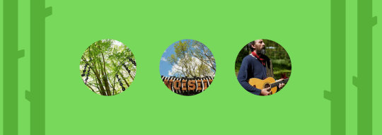
Photo

Noisily Festival Website
For my individual task to create a website for my given festival, I chose to explore unique possibilities of presenting information as apposed to a more modern approach involving a traditional layout. I found out about a fairly new website technology named 'Parralax Scrolling'. Parallax scrolling involves user scrolling which effects the page graphics. Scrolling makes background images move by the camera slower than foreground images, creating an illusion which appears as if an animation is taking place. This clever technique I hope to understand more and then include within my sites code to create an immerse and interesting experience. My idea involving the background images is to make it appear as if you are going down the long trees, making sense as Noisily is based in a woody area.
0 notes
Photo


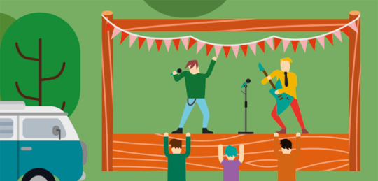
Unsung Music Festival Website
As part of our group work we are to produce variety of media for the unsung music festivals. This includes a website for UMF that advertises the various festivals throughout the year and allows people to access each festival from this site, acting like a hub. For my design I went for a design that uses characters with a colourful theme, similar to that of my poster. My idea was to make the website my interactive, to achieve this I created buttons in flash so upon mouse over an animated sequence would play and stop on mouse off. The website is still in progress so I plan to add additional features to make the site more user friendly and interesting.
0 notes
Photo


Re-Design an Album Cover
For the past few weeks we were given the task to re-design an existing album cover in whatever style we wanted. I chose the group Ylvis and created an album based on their most popular hit, "The Fox", as they did not currently have an album featuring more than one song, I added some of their songs and my personal favorites of theirs to the album cover back. For the design I created the animals featured and mentioned at the start of their song "The Fox".
0 notes
Photo


Looking at the Letter Press...
So today I had an induction into the metal workshop, it gave me a good insight into the creation of printed type with ink and the many possible ways this design process could be used within my work. The printing of the type was not as complicated as I had thought, all you need is a metal frame, the letters and the metal pieces used to hold the type fixed to the frame, from there an ink is rolled onto the face of the letters and it is ready to press. This process also gave me the idea of embossing type into material rather than using ink. I was told illustrator designs can be created and cut and used in the letter press, giving me further ideas of how I could implement my vector designs on a poster in a unique and more visually interesting way.
0 notes
Photo
148DVA - Festival Project
This brief involves working in groups and individually to create a range of media for our given festival, including a calander, website and poster. My initial research involved looking at existing imagery of calendars and festival posters, I noticed the most fun and appealing posters are the ones which use vector art and character/scenery design, to illustrate the festival as a whole instead of using limited imagery to give people a vague idea of what the festival is about. I immediately chose to use vector art and minimalism to create an entire scene for my festival. My festival I chose to be Noisily, not much information was available on their site but from what I can see in pictures, it is quite a friendly and social event with allot of fun stuff to see/do. So far I have managed to produce a part of the poster and calendar but still a work in progress.
0 notes
Text
Typography
So the typography project is done, I managed to work hard in the last week to complete it. Overall I think the project turned out well, I was able to devise a typeface through the range of ideas I gained through the initial life drawing, as minimal style is my most preferred, I chose to not over-complicate the appearance of my type-face but at the same time keep it unique and fresh. I've particularly enjoyed this project as I have never before attempted to create a type-face from scratch, I even went the extra mile by vectorising my type to see what it would appear as a type-able font. This project has inspired me to create other fonts using a similar process.
0 notes
Photo
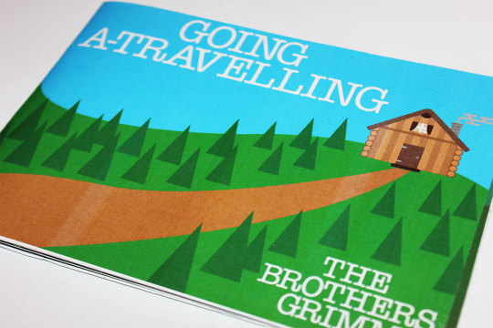


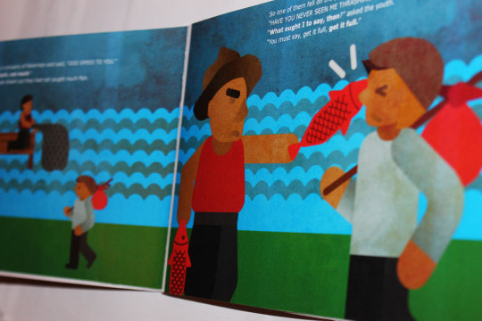

Brothers Grimm - Book Design
We were given a short brief before the Christmas period to design and illustrate a book in groups. The story we were given to illustrate was by the Brothers Grimm and entitled 'Going A-Travelling'. The story itself was about a boy who decides to leave his mother for a while to go travelling, his journey he would find to be not as he expected, by getting repeatedly abused for the words he would repeat. My input into the book was the background and character designs, I went with a minimal style with simple shapes to create detail, this style I felt comfortably with and with this project I explored a different approach to my minimal style and overall I was pleased with the look. For finishing touches, I added a texture over each page to give it a grungy / more natural appearance, giving the book was fairly dark it was appropriate to stylise it as such.
0 notes
Photo
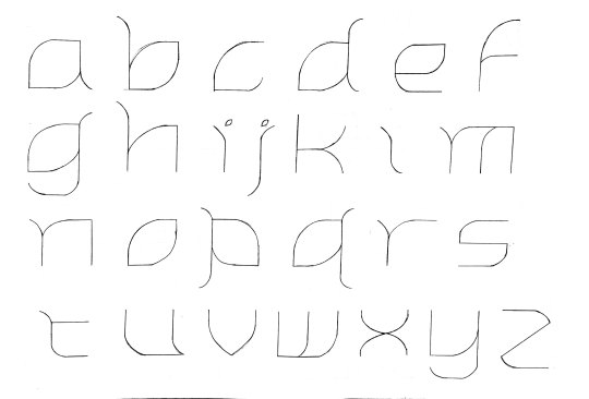


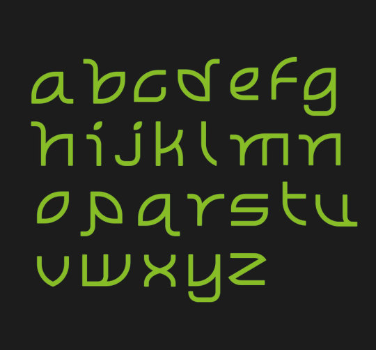
149DVA - Typography Project
Our second project and the task given was to design a type face by only own hand drawn means. The initial start to this project involved life-drawing, sketching different people and each sketch had a time limit so the work produced ranged from detailed to incredibly simple. From there I used the life drawings to gain inspiration, I found the most simple sketch to be the most useful, it used only a few lines and appeared to be as if a man was meditating, this almost instantly inspired me to look into nature as the calmness and peace element from the life drawing lead me to the outdoors. I looked at plants from here and their form. I found the stem and leaf of plants and flowers could be used for a type face. From constant experimentation, I created this 'leaf' font. Although not part of the brief, I decided to convert my created font into a vector form using illustrator.
0 notes
Photo


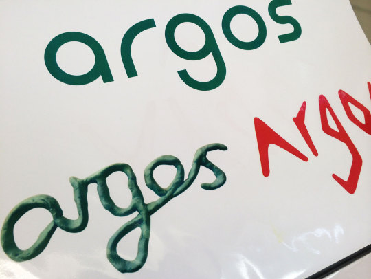
150DVA - 4 Week Projects
For this project we were given 4 separate briefs over 4 weeks to produce different designs. Firstly, our task was to re-create our university time table. My approach was to completely restructure the conventional time table layout. The result was using a variety of simple icons and a horizontal table. This idea was inspired by the organisation and appearance of subway station maps. My second task involved typography, I had to design a poster using only type which gave the appropriate feel of the movie I had chosen. For my third project, I had to create a billboard poster to advertise a classic model for a old time scooter, I went with a retro style, incorporating colours from the companies logo and also giving it a vintage look. My fourth and final project was to redesign the Argos logo as a vector, a craft medium and hand drawn. Overall I think each project turned out nicely.
0 notes
Photo
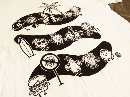
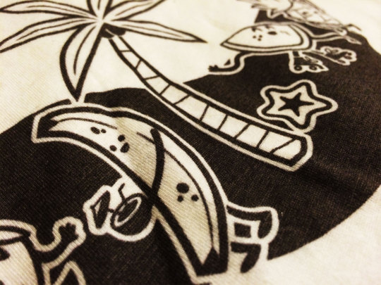
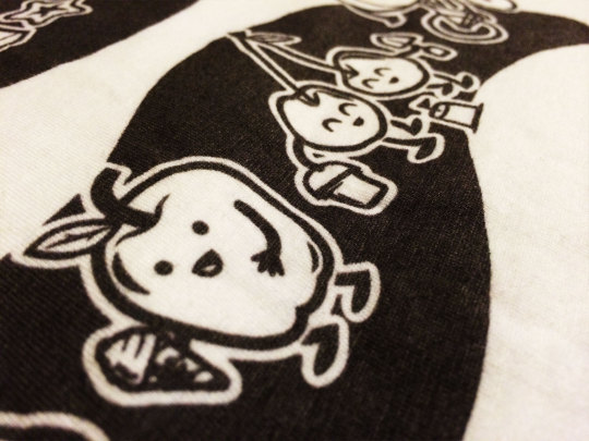

First year summer project
The brief was to create a t shirt promoting healthy eating for university students, I went with a fun and minimal style, I would have preferred to use colour however the task stated we must use only black and white. the reverse side of the t-shirt reads "fruit not fat".
1 note
·
View note
Photo


Foundation Final Project
This project involved branding of a new beer. Including the packaging and anything additional such as as limited edition bottle. The name Kina refers to the Japanese words 'Kin' and 'Ha' which translates to 'gold leaf'. This idea is influenced by Japanese autumn time. Overall I think this project turned out well, the minimal design presents a clear image giving the appearance of being fresh and premium.
0 notes