
Last Seen Blogs
slowtownweekes
livet er nå

truu-wordz
Truu.Wordz💚

xblueblossom
Positive vibes my dudes

dosafar-blog
We Make Your Safar Easy!
peterkourtellaris
Peter Kourtellaris
Text
Week 11 reflection
Before I start doing the final series, I was so confused because I got plenty of ideas, such as London Underground, museums, and wild lives in the city. After I looked for other examples and made a consideration, I chose London Underground as my topic. Since I missed the first brainstorm sections, I just email Kitty seek for her advice and thoughts and she replied me that it is a nice topic. So I started doing it. However, I found that it is better for me to doing another one, which is the animals in London as I got more interested in it. After that, I seek for Kitty's advice again and she said it also good as well. Therefore, I took some photos and tried to made them as a series. In the second brainstorm section, I decided to present my photos as I think they are able to use for this assignment. And Kitty commented that they are really good photos. I am really appreciate that and feeling grateful. Therefore, I will keep working on it and tried to do better in my report.
0 notes

Text
Week 10 Exhibition Analysis

Untitled, 2019, Nadine Uewere
I think this photo is interesting and special. It is taken from a bottom angle which is very unusual since most of the photos in the exhibition are taken from the front. Also it is a colourful photo. Many sharp colours such as red and yellow are there and the dresses and gestures made a checkered, which is also a frame in a frame. Besides that, this photograph also used composition aspect as well, which is shoot from below. It brings another point of view to look at the people. We usually looking people at their eyes and this photograph shows us a different perspective.
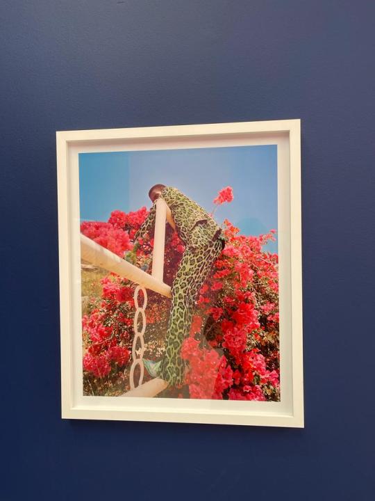
Untitled, 2018, Nadine Uewere
I think is also another interesting photograph. The main character in this photo is in the middle, wearing green shirts, which makes a big contrast of colours with the back as there are all red flowers and blue sky in the back. Particular colour combinations is used in this photos, which is red and green, the use of it created attractive and striking compositions and eye-catching adverts. In this case, it makes the person in the photo more eye-catching.
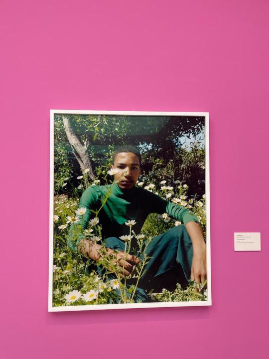
Boy in the Garden, Tyler Mitchell, 2018
I think this photograph is very different from the two above. In this photo, the people is in the middle, but part of his face is covered by the flower. The man is also in a green outfit which makes him be the part of the green planets. Besides that, fill the frame is used in this photo, as we can see that the man contains most of the space in the photograph. This allow us to explore the details of the subject and lead to a very original and interesting composition.
0 notes
Text
Week 5 Activity 1
Candida Hofer
Another Place, Another Space
Susan Butler


First impression
The pictures of the series look simple and clear when I was first looking at the the series. It makes me feel quiet and makes me notice that I didn’t realise that those places in the series are looking like that because it used to be people there. It makes me have another view on the places.
Theme
I think the unite of the photos makes it a series rather than just a collection of pictures. In this series, the pictures are look like similar. They are all taken in an indoor area, where it usually have a lot of people, but there are no people there.
Title
I think it is a really great title. It is called “Another Place, Another Space”. It inspired me before I start looking at the title. When I first looking at the photos, it is hard for me to figure what is the message the photographer want to tell the audiences. After I looking at it, it makes me understand what he is trying to tell us and it makes the series have a stronger meaning.
Sequencing
I think the author have chosen a spatial arrangement for the photographic series. All the photos in the series are taken in different indoor areas with lots of spaces. Even though the correlations between the photos are not that strong enough, it still makes connections between them which makes it look like a series.
Last impressions
After the discussion and looking at the text, I feel like I have a better understanding on the series. However, I still got the feeling, which is simple and clear.
0 notes
Text
Week 9 Blog
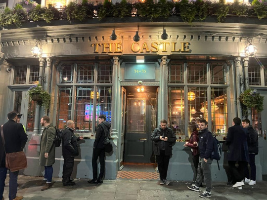


In my observation, people in London really like to go to bar and enjoy the night after a day of busy work. No matter they are going there alone or with friends. Even though it is cold outside, they will still choose to have a drink outside the bar in order to smoke as well. For them, it is a culture and they are really enjoying it. Besides, it is during world cup, and some of them are going bars for watching matches and supporting their favourite team, which makes the vibe even better.
0 notes
Text
Week 9 Exhibition Analysis


Explain why you chose these photos
I think these photos are interesting because it is a group photo which is rare in the exhibition and it shows different emotions on different people.
Describe how focus, contrast and composition are used in the photo,and what effect each of these attributes has
This first photo focuses on the people in the front, sitting on the bench and standing beside it. The contrast is not really big but the composition is great. There are houses, factory and a river behind the people which makes it better than focus on the people themselves.
The second photo focuses on the people sitting on the street. There is a big contrast on the people's emotions as we can see that the lady in the bottom right corner is crying and the children around them are just standing there, which shows a big contrast. The composition is on a street the there is a door on the wall.
The third one also focuses on the people who are fixing cars. But at the same time it also focuses on the dogs surrounding by them. In this photo, the two people are working so hard but the dogs are just chilling which makes a big contrast. The composition is in a outdoor area which gives a open feeling.
Analyse the relationship between what you see in the photo and its message.
I think the picture wants to show us the lives of people in the 80s and it makes me have a clear understanding on it.
Do you need to read the exhibition text to understand the message of the photo?
Yes. I can only make a guess on what the photo is trying to tell us but with the exhibition text, I can have a better understanding.
Do you need to see the photo in the context of a series, or does this one photo convey the intended message on its own?
I think it is better to see the photo in the context of a series as sometimes it is hard to get a better feeling by see the photos individually.
Does the title help?
Not really. It is because the titles are just explaining what the people are doing in the photo.
Does the style of the photo remind you of anything you have seen before?
It does. They are similar to the exhibition last few weeks as they are both black and white and they are focusing on the people's life.
0 notes
Text
Week 7 Presentation links and analysis
https://docs.google.com/presentation/d/1JUMSAx6_B5ExlvV_JqnINlA3S_mQD5ReaYtl7v8gWJ4/edit?usp=sharing
Before I start doing the presentation, I think the most important element of a series is unite. However, there are other important elements as well. For example, the reason why the photographer creates the series and what is the message the photographer is trying to tell the viewers. Therefore, texts is also important when we are looking at the series as sometimes it is hard to understand the message of the series. It will get easier when we look at the texts.
Besides that, I noticed that everyone has their own thoughts on the same photos. Even though we are look at at the same series and there’s another group who are doing the same topic, the result we giving out is very different. This makes me realise that it is complicated to let everyone have the same thoughts on a photo.
The feedback from Kitty is positive. We did a really good job and made the time (12 minutes). And she told us that our presentation is clear and great. I am glad for her feedback and I really appreciate my group mates as we cooperated it very well.
0 notes
Text
Week 5's blog
In this week's blog, I chose the topics of "Beautiful pictures of something ugly". The reason why I choose this topic is that I find it is really interesting to look for those beautiful things but you got to find something ugly on it. My standard of ugly is that the things which is not supposed to be there. However, those parts of the stuffs will not completely ruin the whole thing. So I started looking on it during my trip to Spain, which is an amazing country.

The first picture is taken by a church in Barcelona. I really like the design of this architecture which I think it is beautiful. However, there is a big advertisement of Samsung's new smart phone on the top of the church, which I think it's kind of ugly.
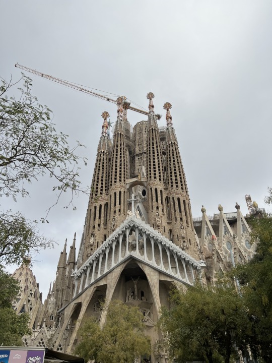
The second photo is taken by the Sagrada Familia, which is one of the famous architecture created by Antoni Gaudi. It looks really amazing and impressive from the outside of the building. However, it is still unfinished and people are still working on it. Therefore, there are some construction machines on the top of the church which makes the "ugly" part of the photo.
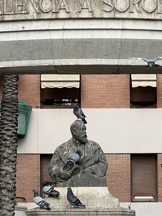
The third photo of the series is a statue of someone I don't really know who he is. In this picture, there are pigeons around it. However, the white "thing" on the statue (which I think probably is the poops of the pigeons) is the ugly part of the photo.
0 notes
Text
Week 5 Exhibition Analysis


What is the artist trying to do/show/say with this work?
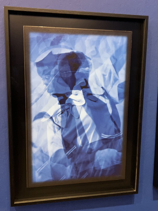
I think the artist is trying to show herself and her thoughts and feelings with this week. In the pictures above, we can see that there are shapes and faces of a girl in the photo even though we cannot see it clearly. I guess what she is trying to say is that it is hard to really know a people if you are not trying to understand him/her.
2. What techniques is she using to convey this message?
I think she used multiple techniques. First, in the pictures above, Heather Agyepong, who is the artist tried to create the pictures by using multiple layers. Also by using different colours of blue, in order to create the feelings of mysterious and uncertainty. Besides, she also used different colours of cottons to create a works to describe her inside feelings.
3. Do you consider these "good" photographs? Why/why not and what are your criteria?
Since I am not a big fan of spending may time to understanding the meanings or messages behind the photographs, my criteria of a good photo needs to be eye-catching with simple and clear meanings. Therefore, I don't consider these are "good" photographs.
4. Do they convey the artist's intended message?
I think the artist do convey her intended message, even it is hard to understand when I fist see the photographs, I can get her feelings after I read the descriptions and information, which really makes me feel easier to understand her message.
5. What is the effect of seeing several of her images together (as a series)?
I think it enforce the messages the artists want to tell us though the series. As she is using not only one method to express her feelings, the messages can be shown and described in different ways, which is also can be seen and understand in different ways.
6. How does the written information change your understanding for the photographs?
As mentioned, it really helps me and people who is not sensitive on arts to have a better understanding towards the exhibition. Besides, it did change my understanding for the photos. At first, I was thinking that the people in the photographs are describing others, however, after I read the written information, I finally know that she is talking about herself though the pictures.
0 notes
Text
Week 4 Class Activity 3

This is the photo that we randomly walk around the campus, and we found a stair which we think is a great spot to make portraits. I really like the light and the use of colour of this photo. The natural light outside the window creates the shadow of my partner. Also although it is not a black and white photo, the colours in this photo is simple and clean which I really like it.

In this picture, I told my partner to sit on the platform which is next to the window. I like the composition of the photo which is the frame in a frame. Also, as mentioned, the use of colour is very simple and clean which is also my favourite part of the photo. Besides, the stairs outside brings more layer to the photo as well.

We took this photo in the top level of the campus. I really like the light coming inside the indoor area, which brings a big contrast in the part of light in the photo. Also, we can't see the face of my partner which brings mysterious to her as well. The only bright colour in the photo is her hair and under the black and white, it emphasizes the colour which becomes a of the signature colours in this photo.
0 notes
Text
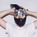
Week 4 Activity 2

1. Describe the composition of the image
There is a woman and a giant mask next to her. The mask is on a table and the woman is leaning her arm on the table while sitting. The woman is making a similar facial expression to the mask next to her.
2. How have light and tone been used and what effect does this have?
It’s a bright picture with a lot of white. It is in black and white so there is a lot of contrast between her shirt and the rest of that is all white, including her pants. Her hair and ring also appears in black which stands out in the picture. The eyes in the mask have a shadow making them appear darker than the rest of the picture.
3. How has focus been used and what effect does this have?
The focus are both faces which draws you into their faces and to see them both first.
4. What does the pose/posture of the person depicted convey about him/her?
The woman is leaning and making a face that suggests she is confident, but also bored or tired possibly. She is not sitting up straight she is leaning over.
5. What is the most interesting part of the photo?
The mask is the most interesting aspect because it looks like there are two people or portraits happening at one time. Their faces are similar, so it creates an interesting dynamic.
6. What is the mood of the photograph? What creates this mood?
The mood of the photograph is lazy, simple, and casual. Her posture and emotion on her face creates the mood of the picture.
0 notes
Text
Week 3's Blog

The main object of this week's blog is the tube. Being a student who live in Harrow, it is quite common to hear the noise when the underground or national express pass through outside the hall. It gives me inspirations of this blog: what if I take some photos of the tube in different times in the day. This is the first one which I took in the morning outside my window. With the big sunshine , the colour of the tube and surroundings look brighter than it really looks. Also, the sky with few clouds only gives me a clean feeling of the photo.

The time I took the second photograph is in the afternoon. In this photo, the sun is blocked by the cloud so the overall view looks less brighter than the last picture. However, the light itself and the cloud on the top left part of the photo really matches the whole picture which gives a relaxing feeling to me.

The third photo is taken in the evening of the day. The sky is in orange and blue in this photo, which really matches the colour of the tube as well, also the light inside. It gives a feeling that it's the end of the day and people are backing home by taking the train. Also it makes me really chill when looking at the photo.

The fourth photo is also taken in the evening, but in another day. It is dimmer than the last picture even though they are taken in the similar time since there is lack of sunlight in this picture and the light in the train and from the lamp post. It gives a cooler feeling in this photo.
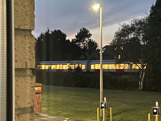
The fifth photograph is taken in the early night of the day. We can see that the camera takes a longer time on capturing the image so there is a afterimage in the train. As the sky gets darker, the afterimage gives a creepy feeling to me when I looking at this picture.

The last photo is taken in the late night of the day. It is harder for us to see train itself than the rest of the photos. We can barely see the afterimages of the train. Also, it is hard to see the trees behind and the human lights looks even brighter than the photos because there is no sunlight in this photo. It looks kind of terrifying when I looking at this picture.
0 notes
Text
Week 3's Exhibition Analysis

"Painting" by Warrington, Cheshire (1958)
I think this photograph is taken with a median or small aperture around f5.6 - f8. This is because a large aperture results in a large amount of both foreground and background blur which is often desirable for portraits, or general photos of objects where you want to isolate the subject. However, in this photo, we can clearly see the whole architecture and the people on there as there is only a small amount of background blur.
On the other hand, I think this photograph is capture in a parallel structure. If we use the line in the middle as a reflection line, we can clearly see that the image in the left and right are vertically reflected. Besides, the photo contains of many horizontal lines which can be divided by many parts by it. It is really interesting and it gives a feeling of looking the sky from the jail. Also, the photo is taken in black and white can we can see the contrast between the building and the sky.
0 notes
Text
Week 2's blog
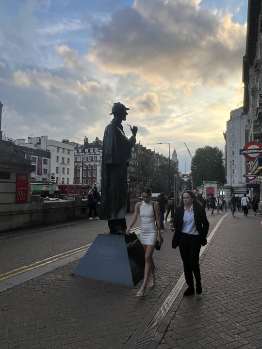
I chose Sherlock Holmes" statue outside the Becker Street Underground Station as the object to take photos. The first photo is letting the statue becoming the subject of the photo. I took this photo in the evening, which is the peak hour and there are a lot of people crossing the statue. I really like the proportion of this picture as we can see the beautiful sky, busy transportation, also the people. It was very lucky that there are two ladies walking pass the statue which really fits the photo. By using the statue as the subject, we can focus on the object itself and other elements nearby.

This is the photo I took from the eye level of the statue. It is very tall so I tried a long time to lift up my phone to reach the eye level of the statue. The photo is also taken in the evening when the sun is almost gone. In its eye level, we can see a different view of the street. We can see that it keeps looking at the people who are enter of exit from the tube station, which is hard to recognize if we are not looking from its eye level.

The third photo above is taken from below. In this angle, we can see that the statue seems bigger and taller than those above, and we can see the details of the statue in a more clear way. Besides that, the statue looks more serious as we are looking it from the below, also the foil provided by the building. And the people are looking smaller as well which emphasize the feeling as well.

The last photo is taken from above. It was hard to find somewhere tall around the statue so I sit on the barrier which is outside the tube station and took the photo (which is also the place where people smoke). In this photo, we can see that the statue looks smaller than other shooting angles. Also, we can see what is around the object. For example, in this picture, we can see the building and people walking across the statue.
0 notes
Text
Week 2's exhibition analysis

Whistle of the wind (2021)
The first picture is named as "Whistle of the wind". In this photo, we can see that there's a black lady in a white dress, standing near the river and gazing somewhere far away. I thought it is a black and white photo when I saw it until I realize the river is in colour, which means the use of colour in the photo is very simple. Besides, the composition of the photo is simple as well, with only 3 main elements: mountains, the black lady, and the river. I think the message in this photo is that the woman gazing beyond because she wants to leave the place where she is now staying. However, there's a natural barrier (the river) which stops her from escaping her homeland. Also there's no any boats or ships around the area. This shows her helplessness and lonely.
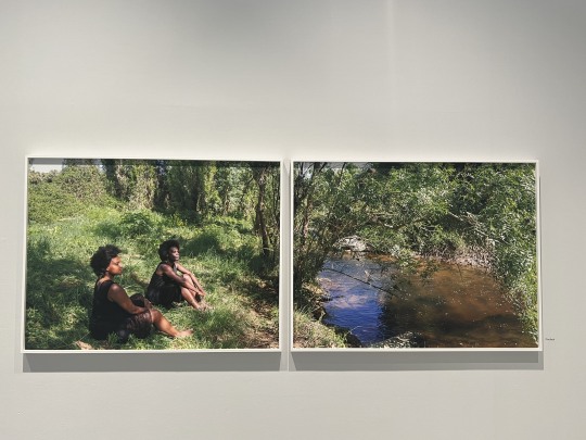
2. "The bath" (2021)
The second photo is named as "The bath". It is a photo compared by 2 individual photos. There's 2 black ladies in picture in the left, who are sitting on grass and looking somewhere beyond. It is hard to know what they are looking without the picture in the right, which has a river with plenty of trees and green plants nearby. In the left photo, we can clearly see that the main character is the black ladies as they are in quite a large part in this photo. Besides, the green plants around makes a big contrast between it and the people. On the other hand, the elements of the picture in the right is simple, including the river and the green plants. The top of the photo contains of tree and shape of the tree looks like the river is in the cave. The most interesting part of this photo is that it can be explained both separately or completely with different meanings.
1 note
·
View note