
loguefoundationportfolio-blog
EVIE LOGUE
My digital portfolio consisting of design based work with an inclusion of work in other areas such as photography
25 posts
Don't wanna be here? Send us removal request.
Last Seen Blogs

baricolbh
Untitled

shotfromthegut
SHOT FROM THE GUT

sphinxnumberone1
Эхо Террора❤️

theultimatemastermind1
that magical girl fan!

wishes-n-regards
Jay
Text
Dictionary of Obscure Sorrows Project
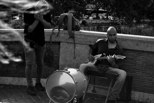
Within this project I had to choose at least four words from the Dictionary of Obscure Sorrows and visually express their meanings. I used some of my photography from my trip to Rome to establish a starting point for these words.
0 notes
Photo
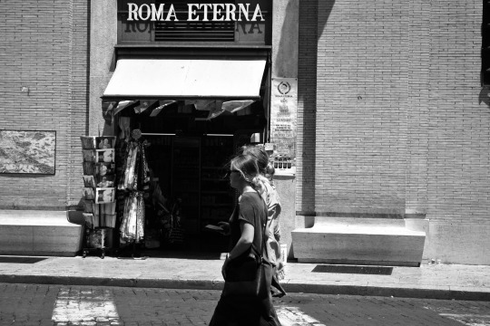
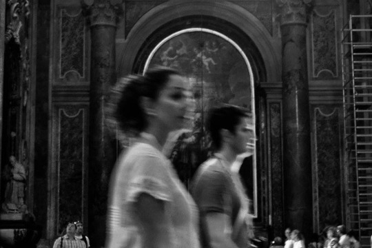
Sonder:
“The realization that each random passerby is living a life as vivid and complex as your own [..] an epic story that continues invisibly around you like an anthill sprawling deep underground, with elaborate passageways to thousands of other lives that you’ll never know existed, in which you might appear only once, [..] as a blur of traffic passing on the highway, as a lighted window at dusk.”
0 notes
Photo
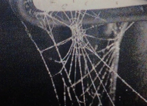
Dictionary of Obscure Sorrows:
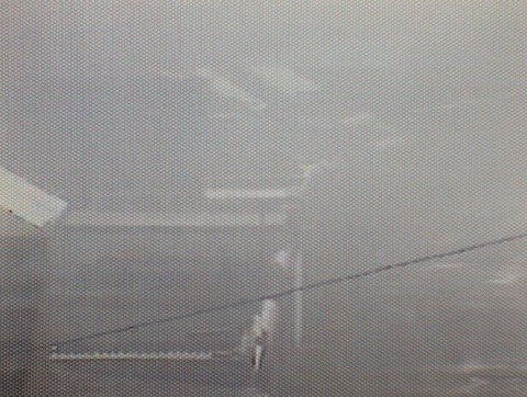
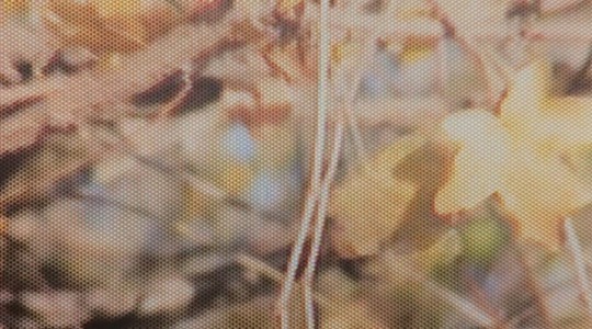
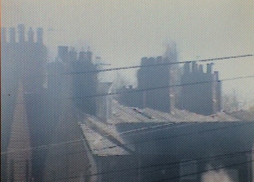
Film Outcome Screenshots (above)
I decided to create a short film inspired from my photography and the research about the words I had chose. Using an old camcorder, I achieved a certain type of aesthetic that, ultimately, was used to create a nostalgic feel.
I chose the words ‘Daguerreologue’, ‘Sonder’, ‘Kenopsia’ and ‘Chrysalism’ and the main focus in the film was detail in nature, empty places that are usually busy, family, memories and nostalgia.
I made a backing track to this piece that was made up of voice recorded conversations of my friends, about places that are attached to memories.
0 notes
Photo
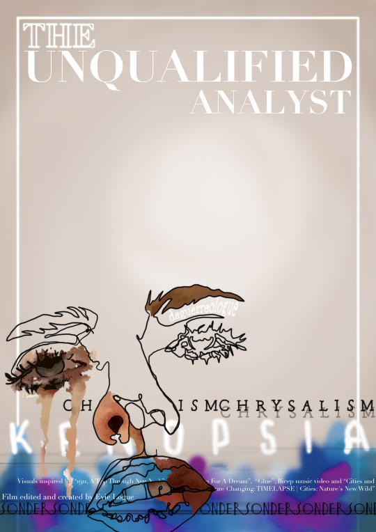
Finished Film Poster Design
Film poster outcome to advertise for my short film
I treated this project professionally, creating advertising for it as it if were to be screened as I thought it was important to work on this professionalism as well as creating as many different outcomes as possible in a short space of time.
0 notes
Text
Keswick Film Festival Project
This project was all about developing and creating alternate film posters for films being screened at the Keswick Film Festival, to then be exhibited.
I created three main posters for the films ‘So Long, My Son’, ‘The Tobacconist’ and ‘The Grand Budapest Hotel’.
I got a lot of my inspiration from the film storylines, for example ‘So Long, My Son’ is about China’s One-Child Policy and how a couple adjust to these political changes in society. That is why they are the main focal point in the poster.
I also tried to take inspiration from artists who were either involved in the films somehow, or had an interesting style I wanted to incorporate into my work. Annie Atkins being the designer who created the look of ‘The Grand Budapest Hotel’, as well as the set designer, was a huge influence on my work. I loved her use of colour and this look of complicated against simplistic which I took from her work. In my work it was the poster itself vs. the tags of the characters.
0 notes
Photo
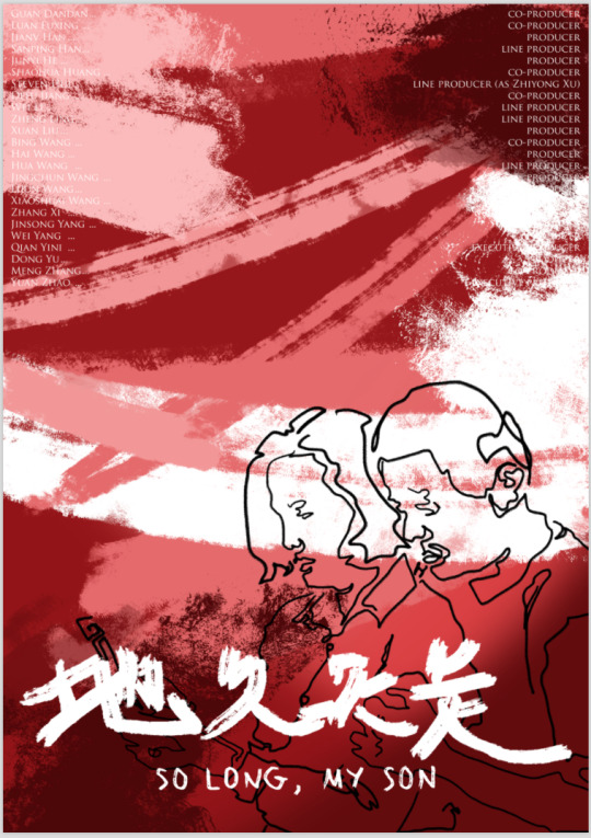
So Long, My Son Alternate poster for the Keswick Film Festival
This poster was very close to original film posters, however, I developed it in my own style and keeping the background and writing influenced by the Chinese aesthetic to make it fit for the film.
0 notes
Photo

The Tobacconist Alternative film poster for the Keswick Film Festival
Created and inspired by Brian Grimwood and Gitanes Cigarette Advertisements:
I liked the design of the Gitanes Cigarette adverts because they are unique and, in my opinion, elegant. The hand smoking the cigarette was highly influenced by those ad posters. I came across Grimwood, unintentionally realising his style of art had a similar look to what I had created so, I invested more time into researching his work and looked at developing my work to achieve a more graphic version of his technique.
0 notes
Photo
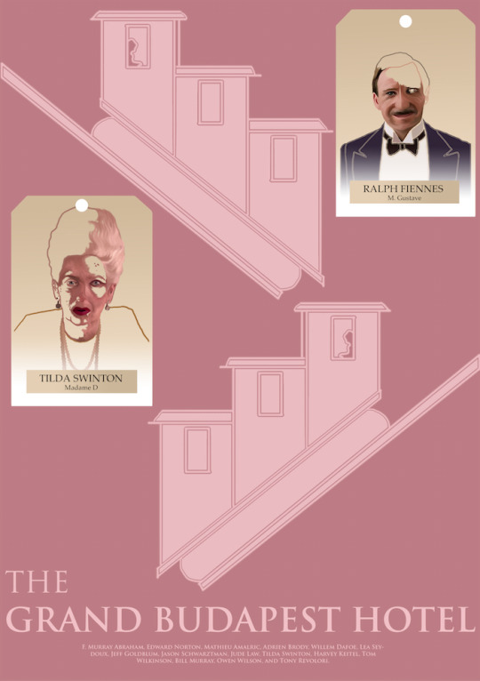
The Grand Budapest Hotel Alternate film poster for the Keswick Film Festival
Inspired by Annie Atkins and the original film poster and then developed in my own style. The final piece, printed off was created and designed to be 3D. The tags of Tilda Swinton and Ralph Fiennes were created separately so that I could cut them out and a hang them off the poster.
I did this to give the poster something extra as, by itself, it looked bland and boring, which does not accurately represent the film.
0 notes
Text
Buy Nothing Day Project
In an attempt to try and get people to resist temptation on Black Friday, I created my first ever animations on Photoshop. The idea for these animations to be something that could be displayed on our screens because that is the best way to advertise in society as we are all very invested in social media and our devices.
0 notes
Video
First attempt at creating an animation on Photoshop for this project
I had trouble with the speed of the animation in this product, nevertheless, the idea of using big brands advertising strategies to create the animation worked. I replicated the look of the ‘Boohoo’ website when it was advertising for Black Friday, and created an animation within it. The end outcome idea, was to have this animation on social media platforms, interrupting the constant consumerist adverts, making you stop and think about what you are buying and why.
0 notes
Video
My final product for my animation for this project
The background to the animation is a repetition of the words “Charity Shops Against Fast Fashion”, which was a title from a sign created in another project about consumerism and lack of consideration for the process of fast fashion. So, I felt it was a fitting phrase to involve in this outcome. I drew the stick man into the animation and kept the so-called ‘slogan’ of the animation simple. However, I feel like the animation lacks the impact needed for this project.
0 notes
Text
Typography Project
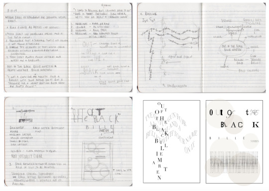
This project was about developing a knowledge of type fonts and how they are a necessity. The type you use dictates the look of the outcome and it is important to learn what kind fonts to use and when. The brief for this project was to break the “rules” of typography, for instance, having a title at the top of the page, and the kerning of the type face being equal and so on. I created 4 initial ideas that broke 4 different rules, as exhibited in my initial ideas and research pages, however, I chose only a couple to create.
We had to choose a song to use the lyrics to create this project, I chose the song: ‘Out of the Black’ by Billie Marten.
0 notes
Photo
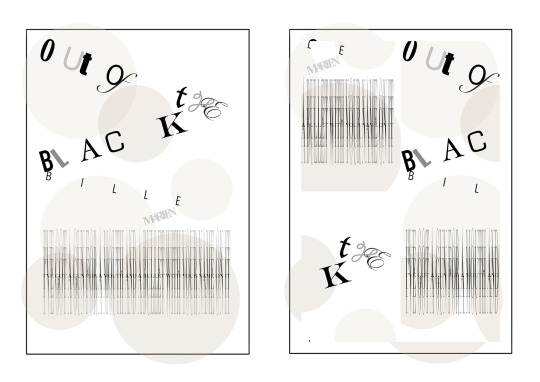
Primary Typography Designs
These were some of the initial designs for this project, exaggerating the kerning and developing pieces where the typeface isn’t legible. The outcome on the right was created by taking the outcome on the left, separating it into four sections and moving it around to see how I could elaborate on my original idea.
0 notes
Photo
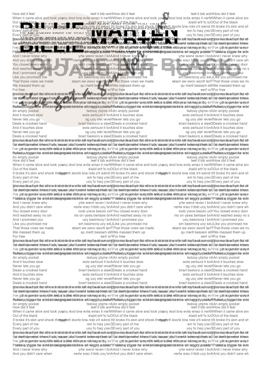
Initial Final Outcome
For this initial outcome I put my primary design ideas together and I created this piece. In doing so, I learnt how to layer in a way that was not excessive, and how to create an outcome that fit the criteria of the brief for the project accurately.
There was a lot of designing and then re-designing before completion of this piece, nevertheless, I feel the final product achieved what I wanted and the composition was strong.
0 notes
Photo
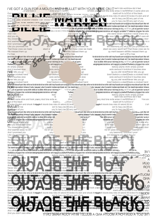
Final Typography Project Design
After initial ideas and designs, this piece was the final construct that I created. I developed the primary ideas by way of trial and error to end up with something that I believe to be aesthetically pleasing.
I would say that the layering of lines from the song lyrics used in this piece was effective and the slight hint of colour completes the look of the piece.
0 notes
Text
Typography Development
After I completed the typography project, I decided I wanted to use what I had designed and take aspects from it to create a lyric book that would go into the front of a CD case. I put together the colour scheme from using already existing Billie Marten album covers.
The four outcomes shown are: A cover design for the front of the lyric book and three different song lyrics with designs that are based on my initial outcomes from my project.
0 notes