
lrthedirectorscut
The Directors Cut
Larry Rouse
18 posts
Don't wanna be here? Send us removal request.
Last Seen Blogs
darkeyes01
DarkEyes
bcbybats
WE -- BITE
origami-kn1fe
origami arts

ringhost-sims
ringhost ✩ sims 4 cc
fandomloveer
What If We're All Actually In A Story?
Text
Evaluation
What new skills have you learnt in this project?
In this project, I have developed new skills such as magazine interior design, more in-depth illustration processes, title sequence making with text effects in After Effects, and screen printing with printed designs (rather than hand-cut stencilled). In addition, one of the researched processes was to hand-rip paper and digitally alter this, which I certainly had never thought to do before this.
With the magazine design, I had never used InDesign for anything other than writing documents, so it was interesting to use it for this, and a learning experience. But designing the interiors in Photoshop was certainly more involved learning, as I had to base the designs on real magazines and learn formatting techniques, as well as having to try to keep a consistent design style throughout.
With screen printing, I had done this process before but it was a completely different experience when doing it with digitally designed stencils rather than hand-cut ones; and I had never had to alter designs to export them for this either. Thus doing so I learnt how to use an acetate sheet with the second layer printed over it to match up the paper below, which I had never done before.
Name at least 3 artists that had a big influence on you and
discuss why
I was particularly inspired for the screen print designs by the style foundations laid by Saul Bass, my designs as a silhouette also a white secondary colour had been inspired by his notable work. The magazine works were definitely inspired by the art of Little White Lies, even if this is not a single artist, but many. They had led me to be motivated to make the magazine art and gave me a clear direction to go with the designing.
Even if at the end of the project, I think Karan Singh was a rather inspiring artist to me, after I had made outcomes based on his work. I was pleased with my work and found myself more magnetically attracted to his appealing style, and I had felt inspired to base work on his at the time.
Explain how you designed your work to fit your audience
With my work, I was tasked to keep target audience in mind. My three films had three different target audiences: The Fifth Element was a PG/general audience, Shaun of the Dead was a 15/teen or young adult audience, and Fight Club was 18+. So to keep this in mind, I tried to assign clear colour themes and showed blood effects frequently for Shaun of the Dead, to portray it for the gore-y zombie film that it is, but I attempted to keep it fun-looking and comedy-like with the actors’ posture and expressions. I kept Fight Club rather bland and only using portrayal of the actors’ faces to avoid the wrong demographic, as it was a strictly adult film with dark undertones and mature themes. And with The Fifth Element, I tried using nice, bright colours to appeal to everyone, and I tried to portray it as sci-fi-like as I could, with a suited typeface and respective imagery. I additionally think that the titles of my films helped to convey who the target audience was meant to be, though this was not my doing.
What would you have changed in your work if given more time?
Unlike previous projects, I very much felt that I had enough practical time for this project. Thus, most of my changes would be to further develop the written side of this. However, things I feel I could have put more effort into with more time include working harder on the effects in the After Effects title sequence, as well as spending more time on the Fifth Element design in my magazine, as that one was rather rushed out, and my Shaun of the Dead magazine interior design was rather basic and could have been more creative. My most rushed works, however, were the processes based on Andreea Robescu and Karan Singh, as I did not allocate myself much time to do them. I was not too pleased with my Robescu designs so I could perhaps have redesigned them with more care, as opposed to having them done for the sake of it.
With my magazine, I was often stressed with not understanding what I was meant to be doing, but once I had eventually learnt by the end that the magazine was a front and back cover, as well as three double-page designs for each film, and I had adapted to this well once I knew.
Overall, how successful do you feel this project was for you?
To conclude, I think that this project has been very successful overall. I am very pleased with my outcomes, and I also feel like I maintained a relatively healthy balance between the practical and written work throughout, and I have learnt things on this project, both from researching things such as the world audience study, and from the practical skills that I have learnt as well.
0 notes
Text
Film Type Manipulation and Hand-Stencilling
I researched into some film posters, from Craig’s poster board and from Mubi. The sources have a mix of official posters and fan reworks.
What I like about all four of these posters is that they utilise a clear and mostly empty background to allow the foreground elements to stand out. I very much like the minimalism of the top two posters and the text they use, from the size to the contents. I think the target audience is made pretty clear in these posters too - the top two seldom use any bright colours, mostly keeping everything dark, to attract a more mature audience. The Shining’s poster uses clear horror elements like the red-hue in contrast to black and white, and blood effects, to attract its target audience instead. And as for the Ant-Man poster, it is clearly geared towards a younger/general audience with the clear comic-book character portrayal, bright yellow, and superhero logo. Not much is left about this poster to be a mystery, other than what this superhero does in the film - as opposed to the much more ambiguous other three.

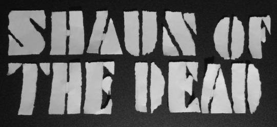
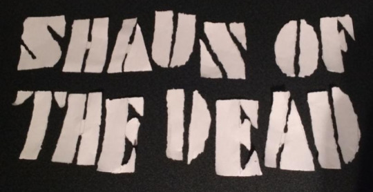
In our first round of typography experimentation, I used fineliners and torn paper to create experimental representation of individual letters, confined to roughly 5x5cm squares. I wasn’t too pleased with the results of these at all, because I just didn’t really know what I was doing and just tried to experiment with legibility, and ended up only really using the black pen as my medium. It ended up as more of an illustration experiment than anything. My attempts, if not obvious, were of the titles “Fight Club” and then “Shaun of the Dead”.
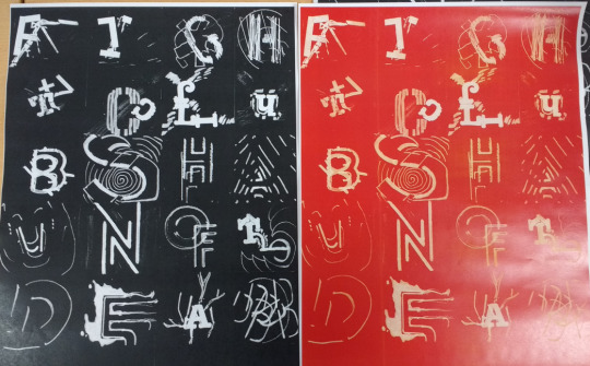
To attempt to save these messy titles, I ran them through the photocopier to get an inverted print and a red print to perhaps go with the colours representing the films, and I must say I quite preferred the black print.
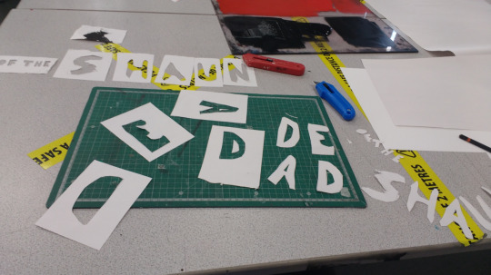
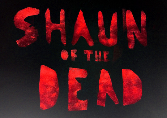
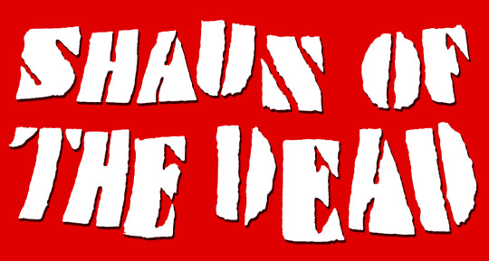
The second experiment involved using stencils and paints with sponges. I was much more aware of what was going on this time round and happier to be making the outcomes. The only two paints we had were black and red, conveniently, so I made use of this where I could. I thought that the most expressive film title I could make with these colours and the “ripped stencil” aesthetic would be Shaun of the Dead, so I did so.
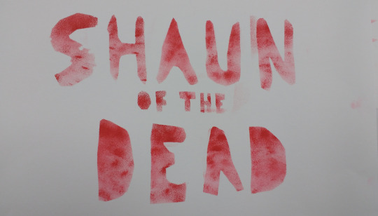
I went for a rather loose and hand-drawn typeface, and once the stencils were cut, I tried to make the letters get more richly red from top to bottom. I was very pleased with the minimalism of this one, and tried another.
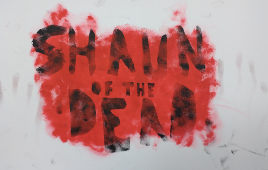
With the second one, i attempted to make a blood splattered background, but it turned out that spreading that much paint across that much space was not viable, so I ended up with this. I also attempted to use my handprints down the sides but that didn’t go so well.
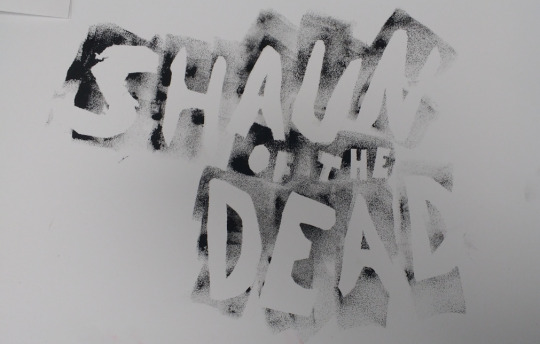
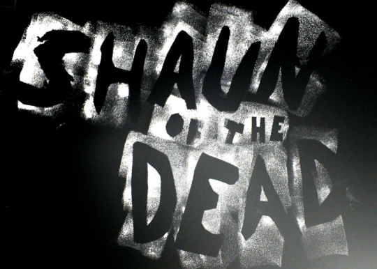
I then tried using the inverse, the insides of the cut out stencils, making the letters white and surrounded by smeary black. I wasn’t too sure about this one, mostly because of the wonky lettering which I’d thought would have looked good but just didn’t really.
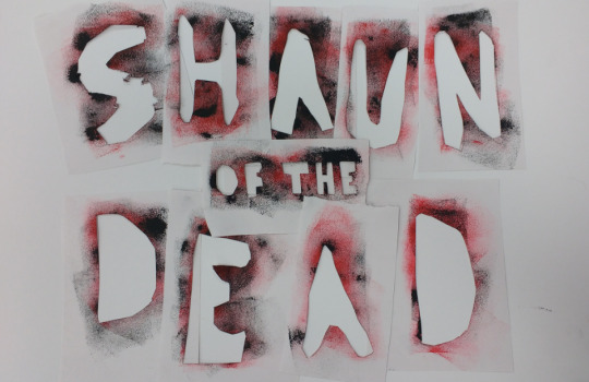
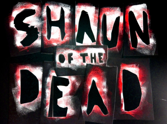
And finally, I arranged what was left of the stencils themselves and took a photograph.

After this, I imported the photographs into Photoshop. The first thing I thought to do was to invert the image. I used this tool to do so but I thought that the blue didn’t fit, and that I should preserve the original red. So I turned the hue slider all the way to get the inverted tones but same hue, and this is what it looked like. I was extremely happy with this and thought it to be my proudest outcome.
I did the same for another one, except that it did not have any colour in it, so no colour was hued. I thought it looked reminiscent of a Bon Jovi album cover. Unfortunately, I couldn’t really think of anything else to do to it though, so it looks rather bare.
And finally, I replicated the effect of the first digital experiment with the photographs, which I think looks really scary and effective here, given how dark the letters themselves are.
0 notes
Text
Karan Singh
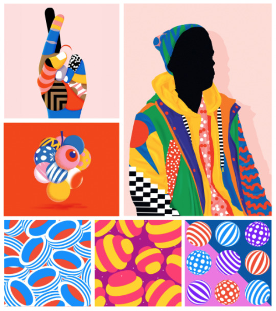
Karan Singh is an illustrator known for a lineless smooth style with bright-ish-pastelly colours and fitting textures on his works, with one of his pieces currently on the Illustrator load screen. I like his style a lot as the minimalism has a very pleasing aesthetic to it. Though works such as the top right one go into quite a lot of detail with the textures which I quite like too. I think the simple colour backgrounds help to unify the works a lot, so I take inspiration from this. The exception to this is are the works that effectively are a background, with repeating textures, such as the bottom three. From these, I instead take heavy inspiration from the textures on these parts. My favourite of these works, however, are the simpler ones at the top, which feel most representative of his style to me, so I take most general inspiration from these ones.
To then base a work from this research, I tried finding a key object from one of my three films. The first thing that came to mind was to use a weapon, so I chose the Winchester from Shaun of the Dead (the shotgun, not the pub).
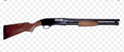
I loaded in an online image of a Winchester shotgun, and although low-resolution, I thought that it would suffice as a tracing basis.
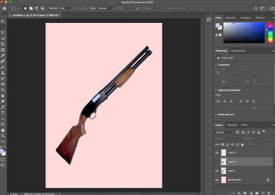
I angled it on the canvas to how it would finally look, choosing to rotate it at a near 45-degree angle, spreading it diagonally. And additionally, I made the background colour the typical pale red tone of Singh’s works.
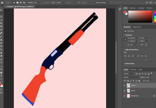
I used the polygonal lasso tool to draw shapes around the gun, picking key elements to make different colours, and also picking bright (or dark) colours for each of the sections to fit with the works.
I added some highlights to the barrel, as it looked rather flat, and then the true magic came into the piece once I added texturing to the parts. I added black stripes (imported from an online image with the “multiply” effect on) onto the red parts, and a dotted texture on the middle part.

I’d thought this effort alone had fulfilled enough for a piece based on Singh’s style, so I did not attempt to complicate it further, happy with this work. I then moved onto the next one.
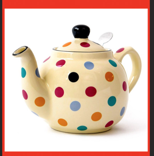
As we were told we could make one unrelated to our films, I sourced a basis image of the first thing that came to my head - a teapot. Although this image already came with a lovely dotted texture, I chose not to use it and to make my own one instead, choosing key sections of the pot to trace and recolour.
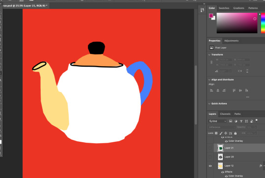
Since Singh does not exclusively use the pale red background, I tried going for the deep red background used in two of his works that I’d researched. I overlaid black outlines on some parts that I’d felt needed it, and then I moved onto texturing.
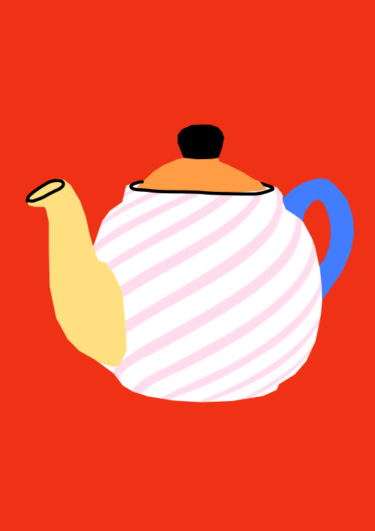
I kept it simple with one large texture on the core white part of the teapot, and gave it a nice pale pink colour. I used the magic wand tool to select that texture, and made a layer via copy from an online image of this texture. This was inspired by the curved line textures that go along with the curvature on the balls in the bottom right piece in my researched works of Singh. I decided to call this piece finished after that, satisfied with the result.
0 notes
Text
Andreea Robescu
An artist for inspiring posters that we were tasked to research is “multidisciplinary artist” Andreea Robescu. Her work is known for bright vibrant colours, illustration overlay atop photography, and unusual shapes (often filled with colour) atop the images too.
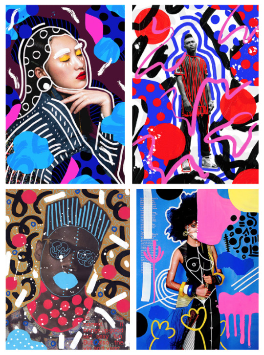
My favourite part about these is the outlines around the people, like the face and hair outlines in the first one and the outlines around the body in the last. I think due to the randomness of the illustrations over the photographs, the piece must be held together with a strong and well-thought out colour palette. There also seems to be a theme of semi-large dots throughout.
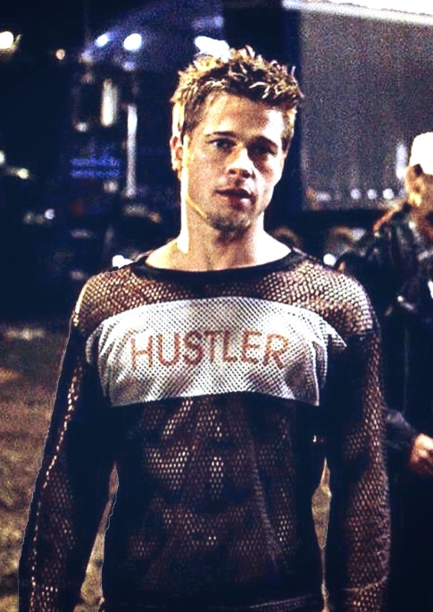
For my first project in Robescu’s style, I sourced an image from Fight Club of the protagonist standing in unusual dress. It seemed rather high quality, so in accordance with many of Robescu’s works I removed the background.
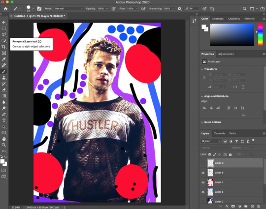
After doing so, I used the brush tool to draw lines and circles, using the cool colour palette that Robescu seems to exclusively work with. I made the shapes and lines both behind and in front of the figure. Additionally, to make the brush strokes appear less mouse-drawn, I turned up the “smoothing” slider decently high.

To make the piece seem more cohesive and less like a funky background for the guy, I took inspiration from the artist’s overlaid lines on her figures, so I used a white brush and drew a set of lines over the man, I felt this worked better than without so I called it finished here.
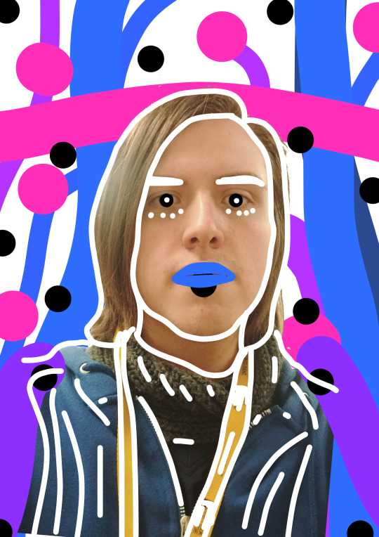
Since we had to use original photography for the other one, I took a photo of my face.

I remade similar background elements to my last experiment, opting for more blues and magentas this time. I, once again, removed the background from the source image.
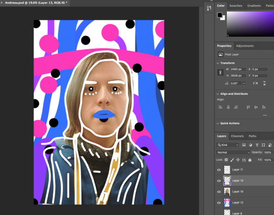
After adding black spots inspired by Robescu’s consistent use of black spots between pieces, I decided to repeat the process of the white brush over the photograph to unify the piece. This time round I took note of the artist’s exaggerated lip drawing and decided to implement that into mine too. After that, I once again, called it there.
0 notes
Text
Magazine Processes and Research
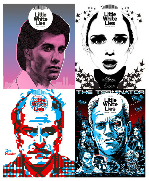
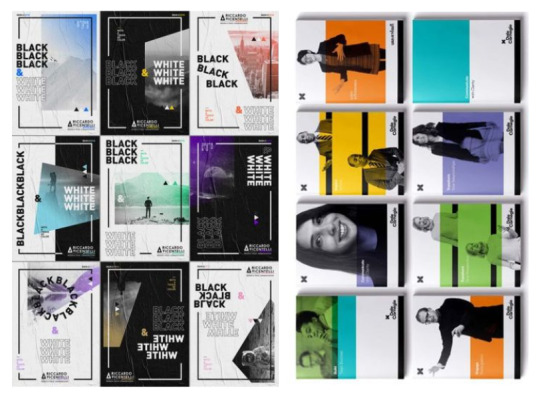
I will be analysing ten covers of the film magazine Little White Lies.
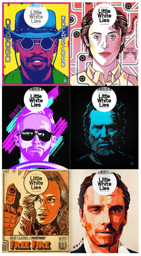
I really like all of these processes and they all inspire me to a degree. The top two are really cool looking and look achievable, with the outlined cartoony style of the top right cover with shading down the middle of the face and excellently chosen highlights in the hair. I think the colour palette of the top left one is just fantastic and it works so well. Both of these points apply to the bottom left cover which I think is just fantastic, the way all of the colours work so well together but none of them are straight-up white. and the figure blends into the background too. The middle right art is absolutely excellent, using only two colours, but it looks like the most difficult to recreate, with its intricate patterns making up the face. The bottom right has an effective effect with it, the outline-less “painted” texture look, could be achievable in a digital style. And, finally, the middle left design is just beautiful with its colour palette, outline-less design and smooth, bold shapes.
In summary, I’d attempt to find a middle ground style between and inspired by the top two covers, as well as an attempt at utilising the middle left cover and attempting to digitally paint like the bottom right one.
These four covers are also great to look at. I really love the gradient and all-pink tone of the face in the top-left one, the uniformity is stellar. The technique of the greyscale face with pink layered on top, as well as the detailed shading contrasting with the flat colour shirt and the pink and white outlines around the face, really brings the picture out as an effective piece. I don’t really like the top right one as it looks odd and poorly drawn to me, but I do like how only the essential facial features are really shaded here, and everything else is near enough left to be pure white. It presents itself as an interesting effect. The bottom left design is akin to the middle-left cover of the previous lot - very impressive and aesthetically pleasing, but would be difficult to replicate. I do like the simple colour palette though. And, of course, the Terminator cover is just impressive. I would be amazed to see myself pulling something like this off, but I think it’s beyond doable. So I will take inspiration from appropriate pieces and use it to make pieces of my own.
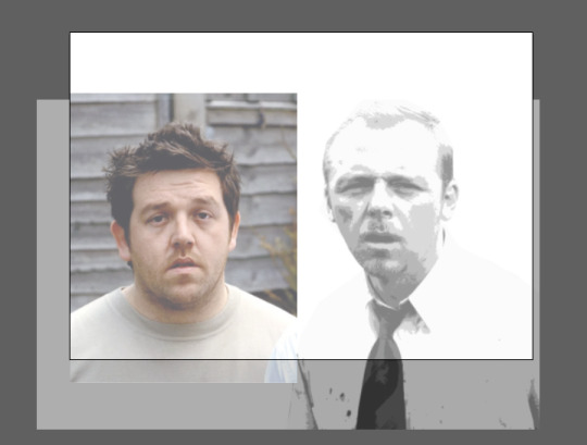
I sourced images of the protagonists of Shaun of the Dead, including the experiment I attempted with Shaun earlier. As I had tried a process with Shaun before, I thought I should try something with Ed first. So, in Adobe Illustrator I used the pen tool to outline all of the facial features I could, and the head itself. I thought it looked rather odd on top of the original image, but I had faith that it may look good once everything was filled in. Afterwards, I attempted Shaun, but I thought it had gone so horrendously badly that I needn’t attempt it, Ed alone would be enough.
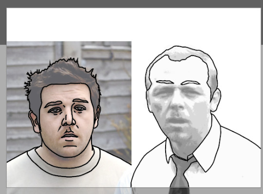
I then isolated the outline layer and began filling in all of the colour, choosing cartoony block colours for the skin, shirt, and hair. I thought it was starting to look good.
Although the process was meant to comprise original work, I took it into Photoshop and decided to try elevating the piece by layering a transparent copy of the original on top (with the background removed). I think the subtlety of it helped to add some shading and not make it look too strange. To make the hair look less flat, I used the magic wand tool to select the highlights from the original shot, and I then filled them with a lighter brown.
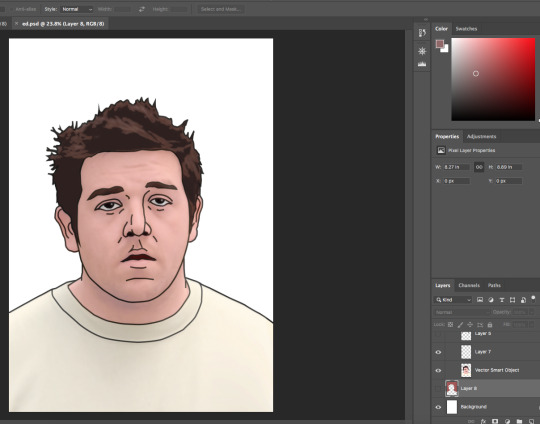
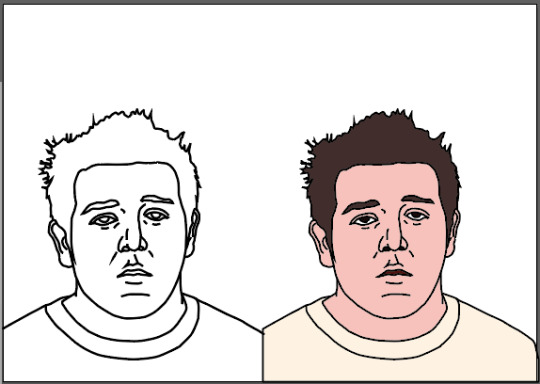
I added a temporary background that I thought looked better than the block white previously, and I also added a stroke around all of him, and made it transparent. I left it here for that day, with no plan for what to do with this.
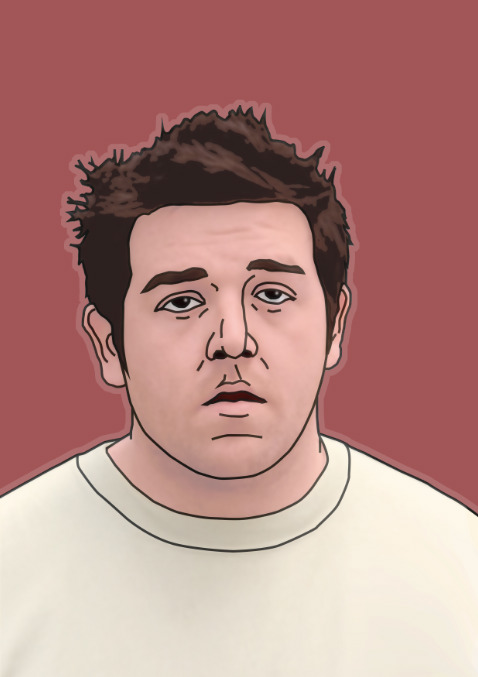
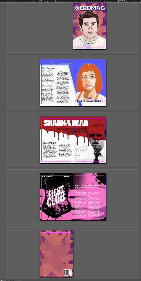
Once I returned with a clearer idea of what to do with my magazine, I decided that this Little White Lies-based work was ideal to use for a front cover, as everything else I had was intended for the inside, as opposed to this. So, I decided to make the background more interesting to prepare myself for adding on the logo.

I used the polygonal lasso tool and just went nuts, drawing and adding random shapes to make this strange edge outline. I overlaid it onto my design and I could see that I had work to do.
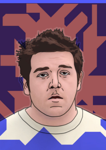
The one shape seemed basic, so I duplicated it and mirrored it on both axes. I added overlay effects and played around with them until I got something interesting.
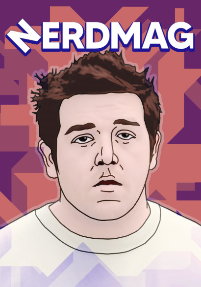
Then, I felt that it was time to add the logo. I added the Nerdmag logo above Ed’s head, and added a duplicate layer of it below to make it stand out from the background.
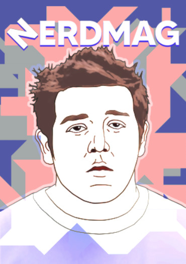
However, I felt that the cover was much too exposed and bright, and the text was rather illegible and blended in. I decided to try giving the blue text layer a stroke and I was very pleased with the result, as it gave it a bubble/bevel effect.
With the background/shape overlays, I experimented further, finding a saturation level that I was happy with, but the colours seemed rather ugly, particularly the diarrhoea brown at the bottom.

After adjusting the colours I ended up with this lovely purple and peach combo. I tried changing the text outline colour as well, but the blue seemed to just work best. I was very pleased with this look and adopted it as the font cover of my magazine.
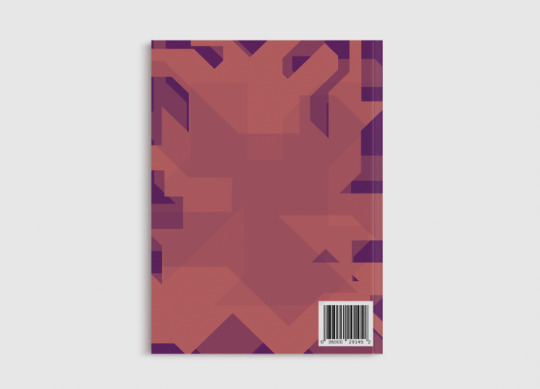
For the back cover, I altered the shapes in the background and zoomed it in a bit more, as well as adding some shapes in the middle to make it more interesting than the blank peach-coloured area.
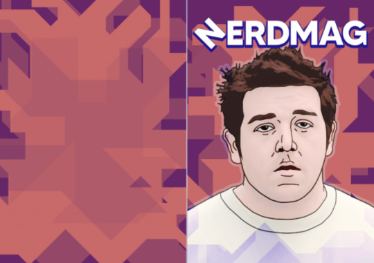
I added a fake barcode in the corner to help sell the illusion of the back cover. and after this I considered it finished.

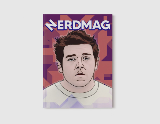
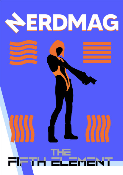
For my Fifth Element page spread, I could not keep my previous design because it was my unaltered screen print before printing, so I had to make a new outcome. I found myself most inspired by the middle left piece in the first lot of Little White Lies covers, so I decided to remake Leeloo’s face with blocks of shading. I sourced an image of three of the film’s characters and isolated her face in Illustrator.
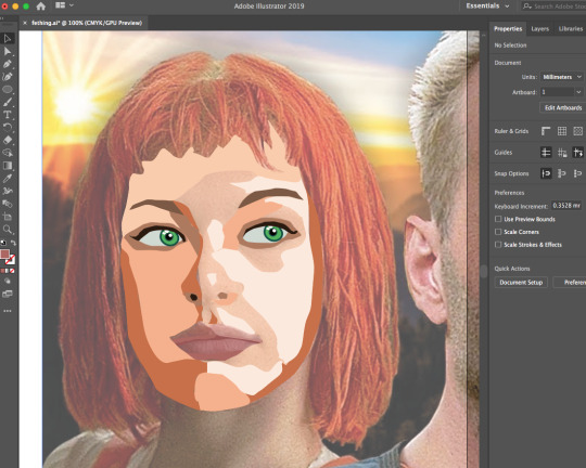
I worked my way around the face, trying hard to adapt and keep faithful to the facial features so that she does not look weird. I did not try as hard on the hair though.
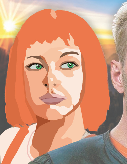
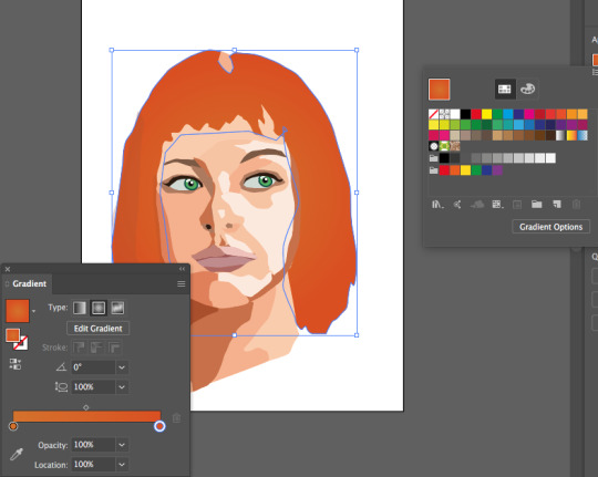
To make the hair look less plain, I added a gradient over the top of it, which I was really happy with. It certainly seemed to give the hair depth. Once I felt done with the design, after I finished the shoulders as well, I exported the image as an asset with a transparent background.
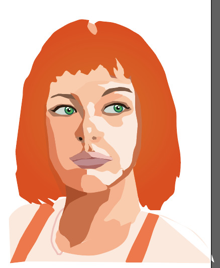
I replaced the screen print design with this design and I decided to replicate the Ed effect by doing a transparent stroke around Leeloo. I also altered the text overlay to make it blue instead of grey, to make it cool-looking but still legible.
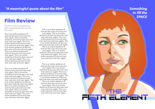
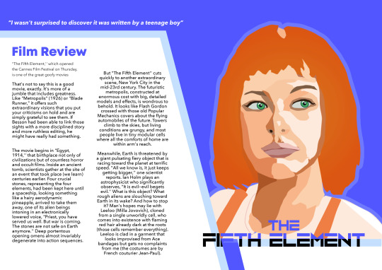
After this, I started adapting the text boxes to contain actual reviews and meaningful content. I sourced a review of The Fifth Element, and swapped out the text boxes, then exported the final page spread.
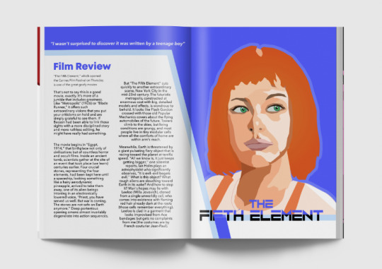
I replaced my Shaun of the Dead screen print asset with my experiment of Shaun. I used an overlay to blend him into the background, and I rearranged the text to better match this, also swapping out the contents for more meaningful text, a review.

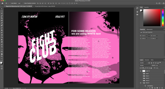
And as I had not used my Fight Club screen print, I could use it as a page for this magazine after all. Once again, I adapted it to swap out the contents with a review, not needing to change much of the text positioning this time round.

After all of the pages were exported, I imported them into InDesign and exported the final PDF.
I additionally rendered mock-ups of the exports, very pleased with the final designs, and how they looked this way.
0 notes
Text
World Audience Case Study

We were given a country at random to produce a case study for, looking at the film industry of said country. The country I got was Cuba, which I had not known created any films until now.
What intrigued me most about studying Cuba’s films is the following - the best renowned films made in Cuba seem to be strongly linked to Cuba itself, telling a story linked to the country and its controversial history and politics. For instance, Lucia (1968) tells a story about three women with the same name living in different periods of Cuba’s history.
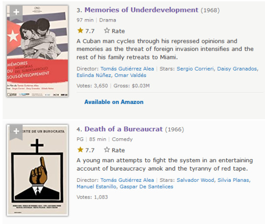
Some of Cuba’s greatest exports include the above films and were critically acclaimed and screened internationally.
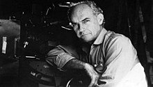
Best-known Cuban directors include Humberto Solás, Jorge Luis Sánchez (who founded the national cinema club federation), Sara Gómez (the country’s only female director during her lifetime) and Tomás Gutiérrez Alea (director of both above films, about post-revolutionary Cuba, pictured below).
In 1979, Havana (Cuba’s capital city) founded Havana Film Festival which has taken place every December since.
Cuban movie posers
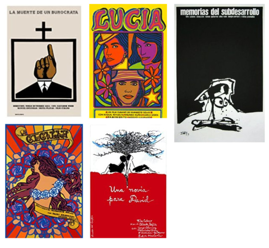
These are some posters of particularly great films from the country. They all intrigue me as not one of them simply uses a photograph of an actor or actress from the film - they all attempt to artistically portray the film, in many cases with artistic processes, cartoon-ish looks, and in many cases bright colours (in contrast to most of these being black-and-white films in reality).
I think that the creators of the posters for these films thought a lot about target audience. It is clearly visible on the first poster from its portrayed imagery and title (Death of a Bureaucrat) that it will be politically charged and mature. Lucia (1968) and Cecilia (1982) have lovely bright and colourful imagery of the female protagonists to draw attention to the films, and the minimalistic two-tone imagery of the top right film poster would intrigue the audience into finding out what it is about. I think it utilises the empty, negative space well.
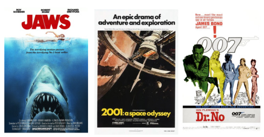
Comparing these to western blockbusters from roughly the same time period is interesting. The Cuban films seem to use less direct language that tells the audience to watch the film, like the paragraph of text about James Bond being in his first film, the huge tagline of “An epic drama of adventure and exploration” for 2001, and Jaws’s poster telling you it’s a terrifying horror based on a no. 1 bestseller. It feels as though western films tried to be more up-front and attention-grabbing for its audience with text, whereas the Cubans liked to keep it simple with imagery (and perhaps the film title) doing the work instead, which I find very intriguing to see
0 notes
Text
Experimental Typography - Willem Sandberg
Willem Sandberg was a Dutch typographer, known for his “ripped-edge” style text typography with bold stencil-like fonts.
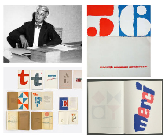
His pieces seem to use the colours blue and red exclusively, atop a white background with negative space sometimes implemented. As well as, of course, the aforementioned bold stencil-like fonts.
For this task, I searched for and downloaded fonts that looked like his style of text, including the following:

With these fonts downloaded, I picked an appropriate font for each of the titles of my three films.

After I made my choices, I drew them out on paper.
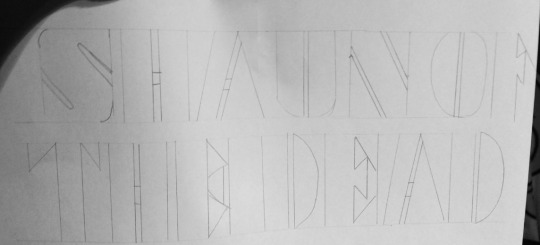
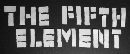
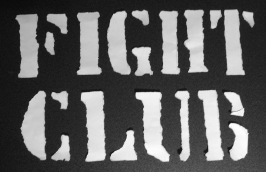
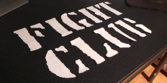
The first title looked much better once it had been ripped out as I could neatly arrange the letters properly.
I took a photograph of the cutouts but they just looked unintentionally uneven, and unprofessionally so. So, I chose to sporadically arrange them unevenly, which I think looked better and more menacing.
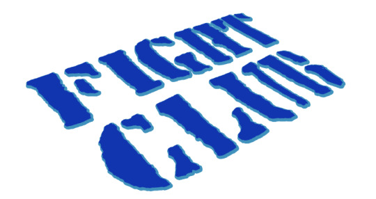
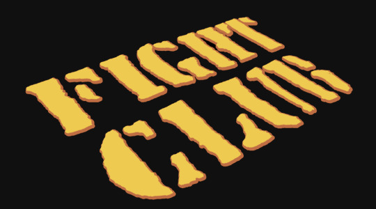
I took this image into photoshop and used the magic wand to bring out the letters and recolour them on a new layer.

I applied colour effects to keep the film title logo in theme with the film as discussed in earlier works, and additionally using Sandberg’s inverted colour effects and red, one of his colours to use.

I made two versions with the two rendered images, and became much more pleased with the second, it feeling much more uniform with the stroke around it.
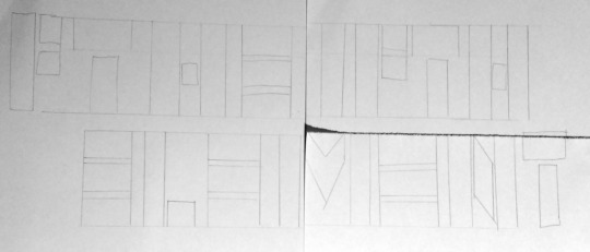
The next one I drew out was The Fifth Element. I’d messed up the order of the letters but having learnt from last time, I’d realised that the letters did not have to be in any order on the paper at first as they could be rearranged once ripped.
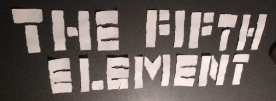
Once I’d taken photos I imported them into Photoshop and began experimenting with them. I repeated the process from last time to remove the text from the background onto its own layer.

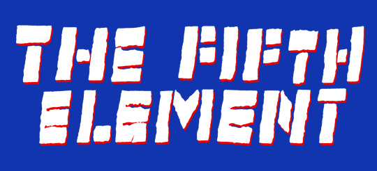
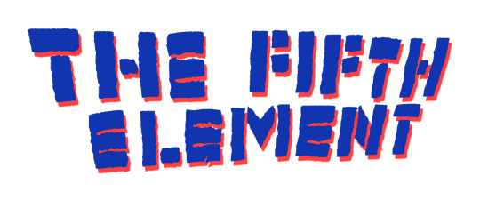
I then decided to use Sandberg’s white/blue/red combination for this film title, allocating the third colour to a stroke/drop shadow. I experimented and ended up with two versions, varying in palette and photograph angle. I was pretty pleased with both of these logos.
For my final logo I learnt from my last ones and decided to upscale the text. I drew out the outlines and was grateful for my decision during the ripping.

After I tore out all of the text, I got some photographs, which I was pleased with the angles of.

I then repeated the last processes and Photoshopped the photographs.

I trialled it on my first photo but I then quickly decided to switch to the more angled photos. I coloured it blue and added a drop shadow with full size, as I wanted to keep the colour in theme with the artist researching. But as I added this off-blue, and noticed the contrast with the white background, the colours struck me as the kind that you’d see on a colour-inverted picture. So I decided to invert the colours of the image.
I was so pleased with the colour combination from this that I didn’t attempt a different one and allowed this to be final. Though, I decided to change the background to a very dark grey, as I thought this looked rather effective and allowed for a slight shadowy effect
I repeated the process for another image as part of the experimentation but I just left it as white and grey.
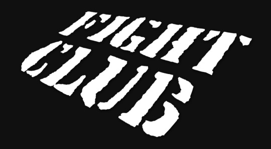
I think that my final fight club pieces were my favourite of the three, either by the colour combinations or the clarity, uniformity, legibility and size of the text in comparison to the others. It felt the least messy and I’m rather pleased with it.
0 notes
Text
Title Sequence
Now that I had my plan to make the title sequence, I started compiling the necessary assets to do so for After Effects before using the software.

To achieve the screen wipe effect I wanted (at least with the manual method I was planning to do) I would need a shape that’s larger than the 1080p resolution of the screen. So I set up a Photoshop file at the resolution of 1920x2060 (double 1080, the height). I designed a suitable shape for this effect, colouring it red to go with the title sequence’s colour theme. I made sure that at the centre of a document, a 1920x1080 oblong would be completely covered in red. Said oblong is portrayed with white in the centre of the above screenshot.
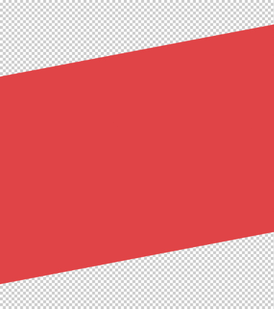
Thus, I had a screen wipe asset, I tinkered with the exact shade of red for a bit, and I made an alternative version of the asset with a horizontal flip.
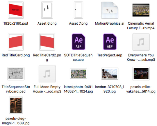
Once I had done so, I decided to move these and also the other collected music files, stock images, AEP files and storyboard into an assets folder for this specific part of the project.
I imported the song file for the music that I had decided to use and I got ready to sync everything to it. I used the stock video I found to set up the new project.
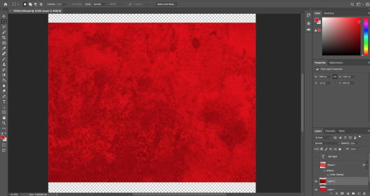
After this I realised that the red screen wipes were far too pale and bland to represent the theme and target audience of this film, as it needed to be gore-y and bloody rather than smart and corporate. So, I found, made and added the above texture to the screen wipe assets and became much more happy with them.
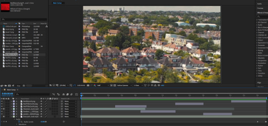
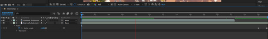
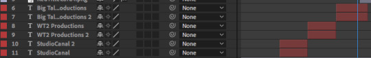
I then got to work with placing all of the necessary background assets into the project file, noting when the key changes in music were so that I could time every background transition on-beat. The layers are visible, and as this was the first step, I just left them as crude hard-cuts.
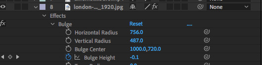
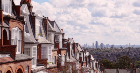
To make the London shot fit in with the moving imagery more, I had it slightly zoom and move right. This felt rather fake though, truly like a 2D image just being moved. So, to give slight illusion to this movement, I used a touch of the bulge tool automated to shrink the centre of the image slightly, making it appear further away. Additionally, I tinted the shot ever so slightly red, to make it blend in a bit better with the rest of the video, instead of appearing garishly contrasting.
After the shots were lined up, I later used automated transform tools on the sequence to make them move around and wipe in between each other with the assets made in Photoshop.
Following this, I felt it was time for me to add the text. I typed in the first film studio’s name and chose to use one of the altered impact fonts from an earlier part of this project and deemed it fitting. I trialled both black and white typefaces, but both seemed to be somewhat conflicting with the background, with white less so.
I decided to solve this by duplicating the text to give the white text a black backdrop, I shrunk the bottom text layer and positioned it slightly underneath to give it this illusion
Afterwards, I decided that making the backdrop a very dark red instead of black made it feel much livelier and in-theme with the rest of the video, as well as representing the type of film to its audience.
I did the same for the three film studios and had them switch between each other to introduce the film text.
After this, I copied over the text to do the same with the two lead actors of the film. I also dragged in the assets I’d made for this, and decided to use the same effect that I’d done for the text with them to make them pop out of the background. I also applied transform effects to keyframe the movement of them, making the silhouettes appear and then move out across the screen. I did this for both slides.


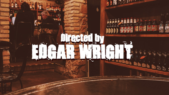
I duplicated the text effects for the director’s name, adding a small subtitle to say “directed by”. I was very happy with my decision to do this, with the contrast of the text on the background.
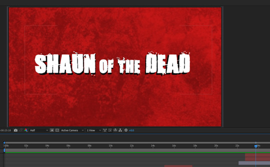
And finally, I played with alternating text size to make the final title card at the end of the film’s name. I even made it gradually become larger to emphasise it, and I allowed it to play out until the end.
I was pleased with the result of this, only making small tweaks to it after the initial draft, so after this I exported it.
0 notes
Text
Magazine Design
To inspire the internal page design of my magazine, I looked at Pinterest for inspiration.
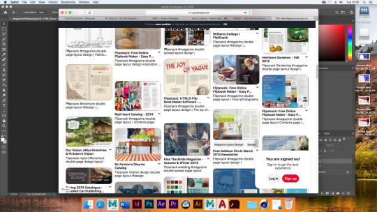
I was particularly inspired here by the designs that went across numerous pages, like the top left and bottom right designs in the above screenshot. I like that the text is able to be just on one page and that, in particular, an image can bleed diagonally across the two. I thought this was a good design choice and I tried recreating it.
I used the polygonal lasso tool to draw a funky shape to make the pages bleed and stand out. I then added text onto the left side.
I then decided to do a similar double page spread for Shaun of the Dead, deciding to use the red background theme to represent blood, and for blood to drip down onto the text. I think this effect worked really nicely, and allowed room for some logos and additional text at the top.
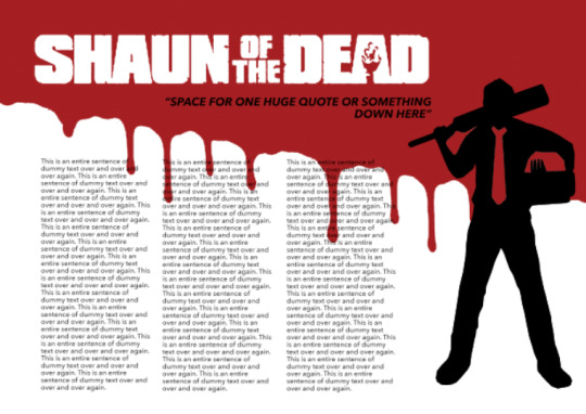
I expanded upon the quote below the film logo, and I neatened up the column text.

I then thought I ought to experiment with my logo, so I used the screen print poster of the fifth element as a placeholder test. I pasted in my Nerdmag logo and decided the white text alone looked boring, so I added a drop shadow at 100% opacity, and used the orange colour that I had as a secondary colour on the poster
I thought that this perhaps looked too bare as well, so I experimented further with recolouring the initial N. I decided to leave it there after this and come back to it later with the final cover.
I then decided to experiment with the Fight Club screen print poster, using gradient effects and various brushes to make it appear to be stretching over to the other page. To make the right page feel less barren, I applied some black paint splotches and transparent brush effects too, I think this texturing was very effective and made for an interesting spread of this magazine page.
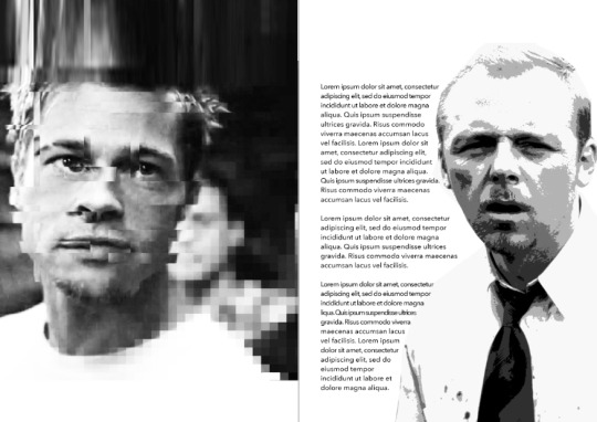
I knew I needed some other processes to be created for this magazine, so I sourced a high quality image of Shaun from Shaun of the Dead, and I used the posterise effect and switched it to greyscale.

I wasn’t very inspired to make any processes for Fight Club, so I took an image of the protagonist’s face and applied some glitchy effects inspired by processes we learnt last year.

After more stretching, I found ways to implement these quick experiments into my work. I was pleased with the effect of the text following Shaun, inspired by interiors of magazines I looked at in research.
The final experimental process I attempted was of Leeloo from The Fifth Element. I once again tried the posterise effect used on Shaun, except that I did not greyscale it, instead making experimental shapes with colour overlays.
I then decided to experiment further and remove the background, sampling two colours from the colour overlays and making one on each side.
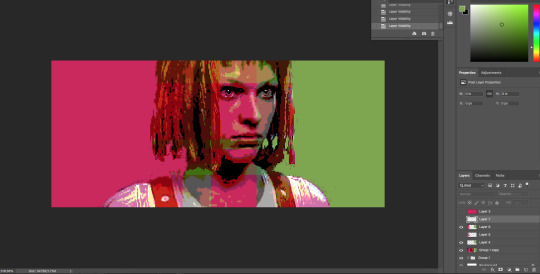

However, this attempt to me just felt far too rushed and lazy to be used anywhere, so it rightfully went to waste.
0 notes
Text
Screen Printing
A presentation was done for screen printing. As we would be screen printing two weeks from the day, I took notes to keep the process fresh in my mind once the day came.
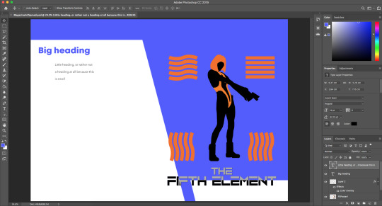
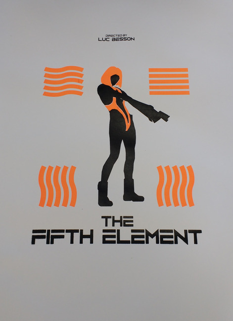
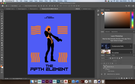
My task was then to prepare my poster designs for screen printing. for my poster of “The Fifth Element”, I experimented with changing the colours, as I had too many on the design.

After experimentation, I decided to use a lighter blue as a background wash, because I could then just print the above design on top, as orange and black would be darker.


I then made exports of the designs for orange and black screen printing, as the blue wouldn’t need a design.
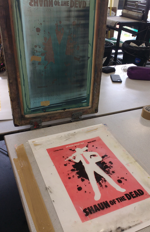
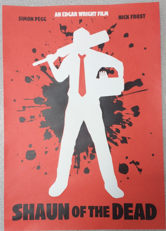
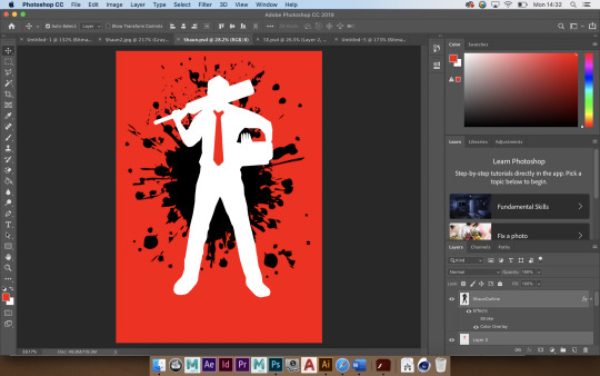
I did not have an such an issue with the Shaun of the Dead poster, as I’d used black, white, and red; appropriate colours for screen printing with white being the unpainted paper. So I just split the red colour and black into layers for printing stencils.
On the first day of screen printing, I was prepared and my screen was ready in advance. I had the notes for me to remember the screen printing process from earlier, so that I didn’t forget what I was doing and had it fresh in my head.

After printing the first layer of the Shaun of the Dead poster, with a mixed red paint a few times, I learnt to only print once and not pull the squeegee back on myself, as it smeared some red across the edges of the white in some of the outcomes below, but nonetheless I thought they came out okay, and I learnt from my mistakes and moved on.

Next, it was time for me to print the second, black layer. I had the screen printed for me later that same day.

Initially, I had just winged the prints of these onto the red prints from earlier. I did not use acetate, and I instead just stared through the screen to match them up. Honestly, considering this, I am surprised about how close I got it. But either way, I was doing it incorrectly and getting the prints slightly off every time. I had entirely forgotten to print onto acetate to line up the background prints underneath, and learnt how to do so straight away.
After I printed the black ink onto a sheet of acetate, I had three or so prints left to line up properly. These were my most proud prints for sure, I am happy to have solved my mistake as soon as I did.
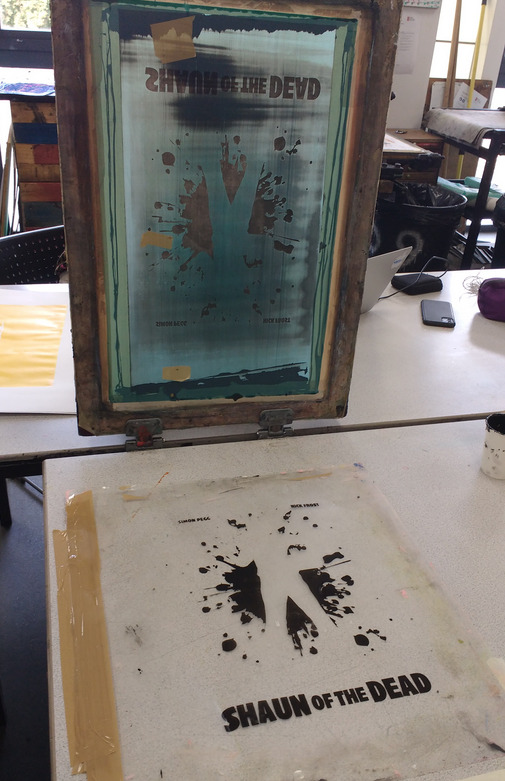

I picked one of my outcomes and decided it as my most proud one of the lot. All in all, I am happy with how this screen printing went, and I am especially happy with how the design came out looking in this physical form.

On a later day, I began my second screen print. This one was, of course, The Fifth Element. As I had discussed earlier, my plan was to use three colours, with one of the colours being just a spread for the background. To fulfil this role, the colour had to be lighter than the orange I would be using, but I did not want it to be too pale a blue. So I worked hard to mix a good shade for this poster background and used it on a blank screen.
Unfortunately, due to the large surface I was printing on, and the small squeegee I was using, I could not get the paint to spread all the way to the edges cleanly. I attempted many times to start getting clean prints, and even requested teacher assistance, but I still had very rough background edges. I thought this would make the prints look rough until I could crop them, which was unfortunately something I had to accept.
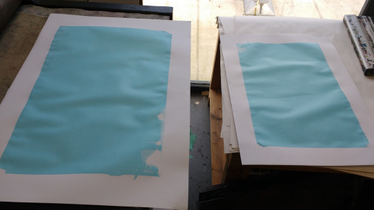
However, I had a couple of prints that turned out fairly decent, so I reserved these to hopefully become the best prints overall.

Later that day, I started the next layer, patching the screen for orange paint printing. I tried using a very bright orange to hopefully blend in with the blue well, as I thought that a dark orange may appear brown over the top. I initially tested this on just a plain sheet, as I was suggested to just make a background-less version of the piece as well. The orange had indeed come out very bright and I was pleased with it.
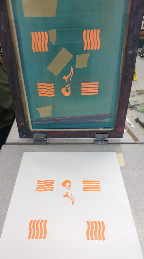
I was then especially pleased when I tried using the orange paint on top of the blue, because it came out vivid and bright rather than dark at all, looking very clean and effective. I was especially pleased with this colour choice after this.

I noted how bright the orange was on the white, and when I printed on this messy background, I’d thought that perhaps this may look effective as a final poster after all.
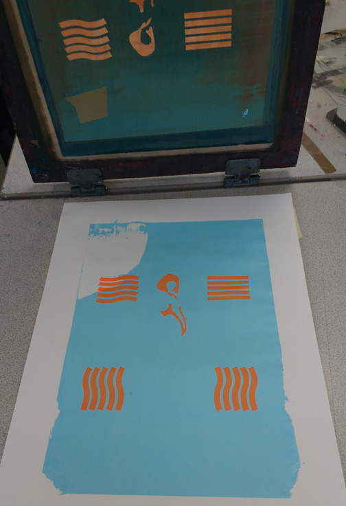
When it came to printing the black onto the poster at a later date, I made sure to learn from the last prints and print to acetate straight away.
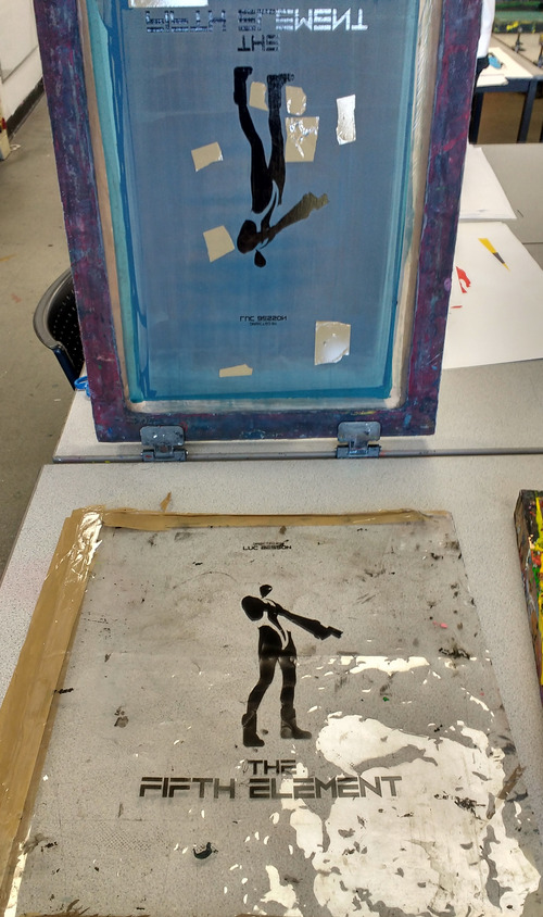
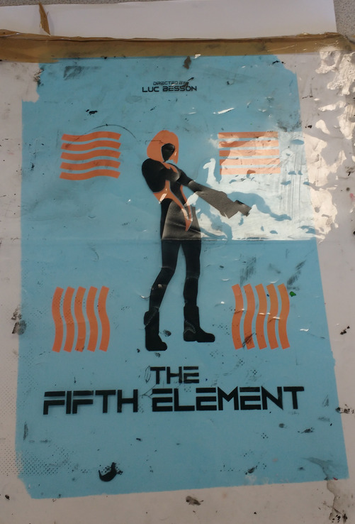
Once I printed the black onto some of my background outcomes, I was very pleased with how the piece looked overall. To my surprise, I really liked the slight off-print of the black, as it made the figure seem as though she had highlights on her hair and clothing.
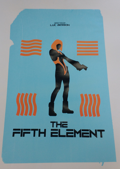
The above piece came out as my most proud one of this print, but I did quite like the white background version of the piece below, especially without a mis-printed background so it looks very clean.
Once I had cropped the outcomes physically, I selected my best ones for my portfolio.

0 notes
Text
Magazine Logo and Target Audience
For my magazine, I must come up with a name, design a logo, and come up with my suited target audience. For general logo design, I looked at the logos for the five magazines I had researched earlier: Empire, SFX, Entertainment Weekly, Total Film, and Little White Lies.
I personally really like the design and aesthetic of Empire’s logo. The tall, bold, simple but quirky and unique font really sells the look of the magazine. From the stylisation of the R to the unique and angular M, the name really pops out in the form of this font. I like the italicisation of SFX’s logo, and it’s fond it quite styled and curved too, but I think it goes too far for me personally, particularly with the over-the-top 3D effect. Though, it definitely makes the logo stand out and look different.


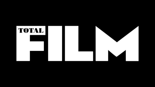
Whilst I like the boldness of Entertainment Weekly and Total Film’s logos, I think one word being inside another makes the smaller work easy to miss, I only noticed on looking back on the logo that “weekly” is even in the logo. And I think, other than this, Entertainment Weekly’s font is rather generic and easy to glance past, It doesn’t really stand out. I think this is not the case for Total Film’s logo, but there is a problem when the only word you can really initially see is “Film”. Little White Lies’ logo is good but I think it is really excelled by the white circle it is in, and it would look rather generic otherwise.
Keeping this research in mind, I started working on drafts for my logo.
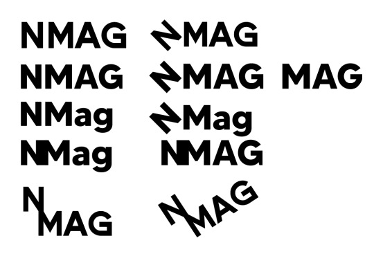
The name I’d come up with was “NMag”, short for “Nerd Magazine”, to humourously belittle people who read film magazines. I trialled two fonts to display this name; Dance Regular and Made Tommy. I thought the font looked good, but it needed something more to make it “pop”. So I kept SFX’s italic font in mind and decided to highlight the N, so I rotated it at a 45-degree angle. I had originally rotated it the other way, but oddly it looked more like a “Z” in that version. I was pleased with this rendition and trialled it in both fonts and with alternative capitalisation. However, it was said to me that the name “NMag” may come with unintended racial connotations, so it would be best for me to change the name. I opted for the more full name “NerdMag” to avoid ambiguity.
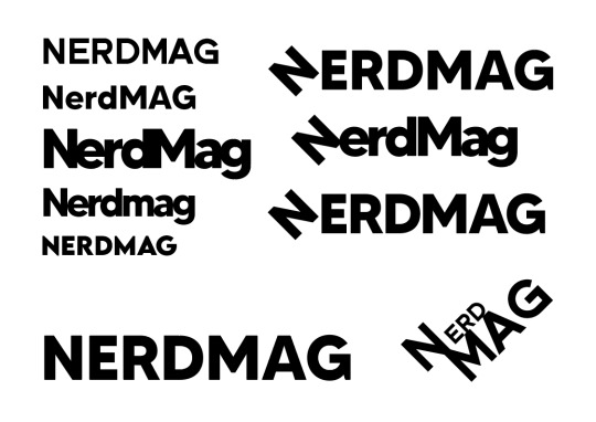
I’d initially tried different fonts and non-allcaps type for this new name, until I decided to bring back the rotated N from the old logos, and I thought this had indeed looked good. I was pleased with this look and took the final design into the colouring stage.
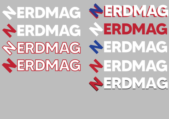
Seeing as most magazine logos are laid atop images, I thought it’d make sense to colour the logo white, so I applied a grey background. I experimented with colouring the N a different colour to accentuate it more, and I also played around with strokes. I think where I applied too many colours it seemed to fail, so I balanced it and arrived at a result I was happy with.

I then did a target audience study profile, picking a young-ish local man with money to spare as an example of who I’d be selling the magazine to.
0 notes
Text
Poster Design
As I’ll be designing a screen-print film poster, I will research Saul Bass and Sister Corita Kent.
Saul Bass
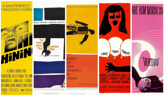

Saul Bass is a renowned graphic designer for film posters, with a particularly unique screen-printed style, quite ideal for researching in this project. The best-known and most representative examples of his work are the posters for Vertigo and The Shining. I particularly love the simple imagery of the Vertigo poster, with it portraying the title in an illustrated form, with simple geometric imgagery, and doing it with the three colours of deep orangey-red, black and white. I additionally like the text logo at the bottom and how it stands out down there. The whole piece weirdly reminds me of a book cover. I also like the poster of the Shining, and its two colour/tone restraint, but I think I prefer the three colours of Vertigo, and how it portrays the imagery much more literally and better.
Sister Corita Kent
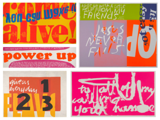
Sister Corita Kent is an unusual artist to say the least, her screen printing is very different to that of Bass’s. They are text and type-based and without a theme as direct as the films Bass had to work with. Additionally, her fonts tend to be less hand-drawn and more digital/printed. My favourite of her pieces was the bottom-left one. It uses four colours, but two of them are complimentary, and the other two black and white, and It think this works very well, as well as with the white frame around it all to unify the piece.
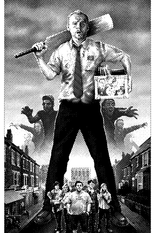
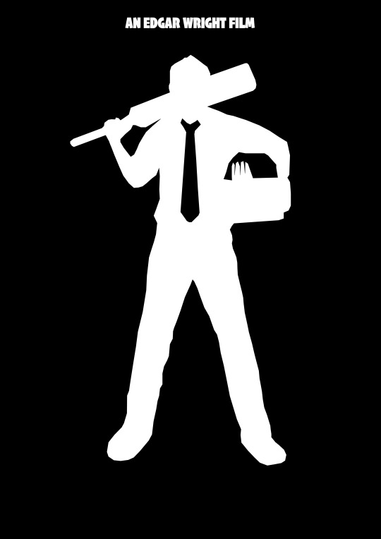
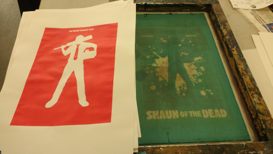
I used one of the fan Shaun of the Dead posters and created the half-tone effect to make the image entirely comprise black and white. I was not sure where to take this, so I decided to make a silhouette of just Shaun on his own in Adobe Illustrator.

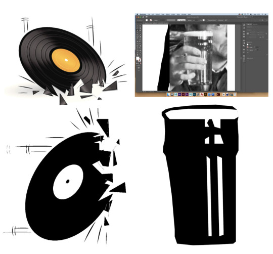
I was very pleased with this stylised vector trace around Shaun that I’d made. I went over the tie and gap around his arms with white to make a very recognisable silhouette. Although I was happy with this result, I again did not know where to take this. So, I decided to just throw more film elements in from my sheet. I found a stock image of a vinyl record smashing, so I rotated it and made a silhouette trace of it, and I also did the same for the pint of drink Shaun held in the Winchester pub.
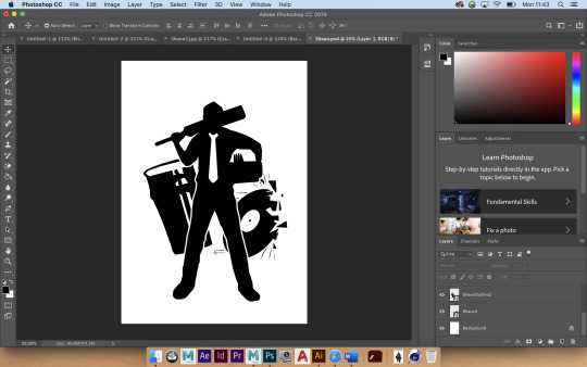
I layered these elements underneath the first silhouette, and then decided that it just looked far too crowded. So, after being stumped on this design for a while, I decided to just come back to it later.
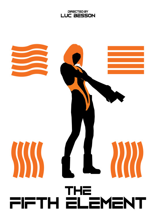
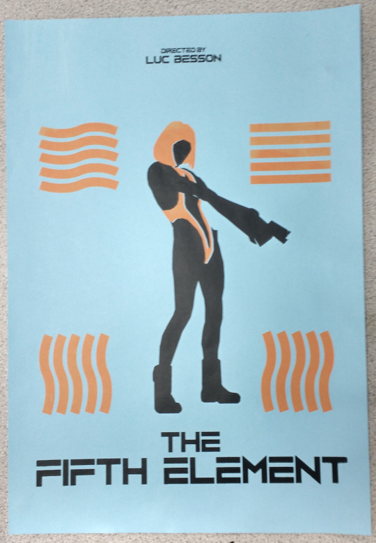
I then started on a poster for The Fifth Element. I found this screenshot, seemingly but rather unbelievably from the film, and since the last idea had worked well I decided to just repeat the process of tracing a silhouette.

I thought this was going well, but it perhaps needed more definition like on Shaun’s design. So, I decided to highlight the orange parts of Leeloo, in particular, her hair and the orange elements of her outfit.
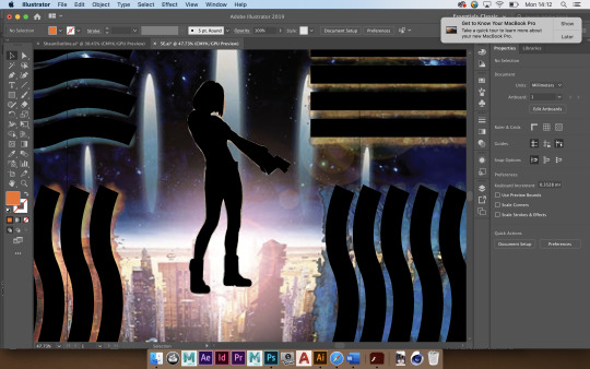
Once I had done this, I decided to move the design from illustrator to Photoshop for further designing.
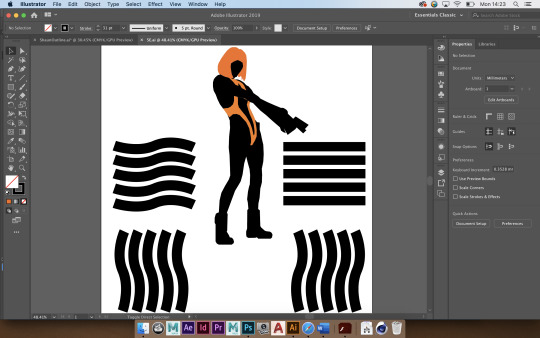
I found a highly contrasting colour that I was happy with and filled the background with it, as well as properly scaling my illustrator design to A3, and resizing the background elements.
I was then told that using type had been permitted for these designs. I then went to dafont to search for fonts more suited for this film.
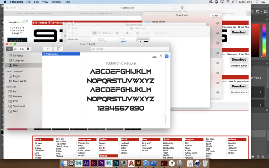
The first font I found and thought to be suitable was the logo font for the video game series Counter-Strike. I thought it looked suitable, but I couldn’t shake the connotation of the game series out of my head, so I looked for an alternative.
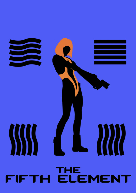
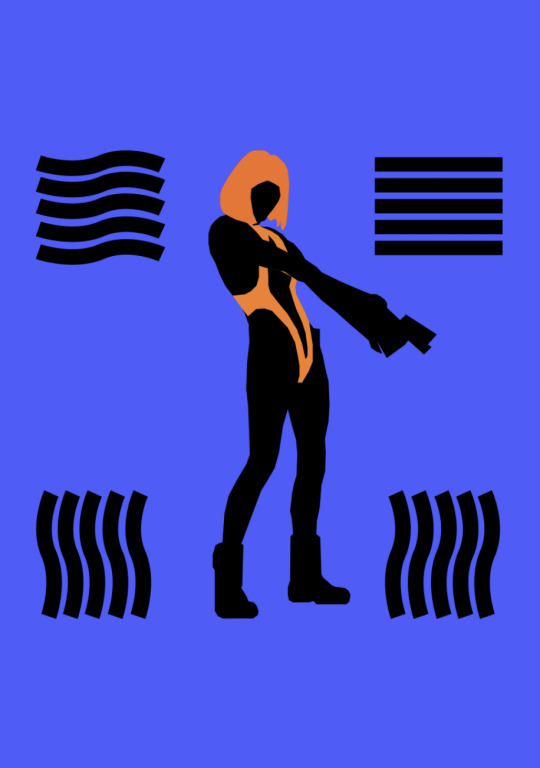
I then tried Voodootronic and thought it fit perfectly, not to mention the fact that it’d work well with screen printing. I then tried using orange elsewhere and thought it’d worked.
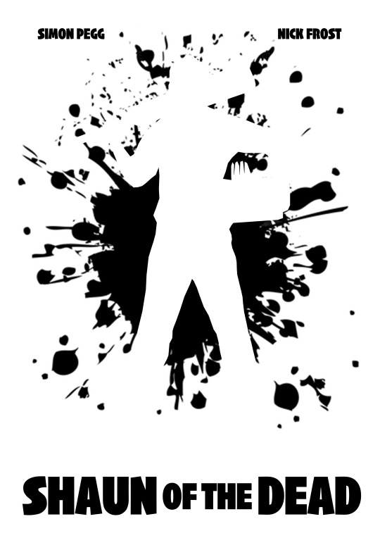
After this design, I went back to the Shaun of the Dead poster and decided to do something similar. I picked the red from the original poster as the background colour, and decided to make Shaun white to match his shirt, and I used black in the background for a blood splat. I had found and inserted this blood splat vector from online.
I was very pleased with this result, and I think it was especially solidified by the addition of text type of the film’s title and key people. I used an impact variant I had found for this very film prior to this and I thought it worked ideally. I think that using red/white/black to represent this film from my research was an excellent choice too.
For a final poster design, to potentially be screen printed (or if not then to just be an outcome), is for my third film, Fight Club. I sourced a high-resolution image of the film’s protagonist(s) and chose to attempt the silhouette technique once again.
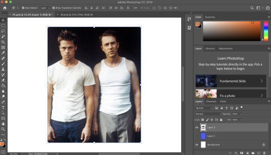
I outlined the narrator’s head shape (and shoulders) in Photoshop, and initially filled the entire shape with black.
I did the same with Tyler’s head, although his silhouette is less iconic or adventurous. I initially placed them next to one another, and attempted to portray imagery of the split personality theme of the film, with the two characters actually being one person. However due to their somewhat similar silhouettes, this didn’t seem at all obvious, rather it seeming as though I had just drawn a white strike down the middle of one figure.
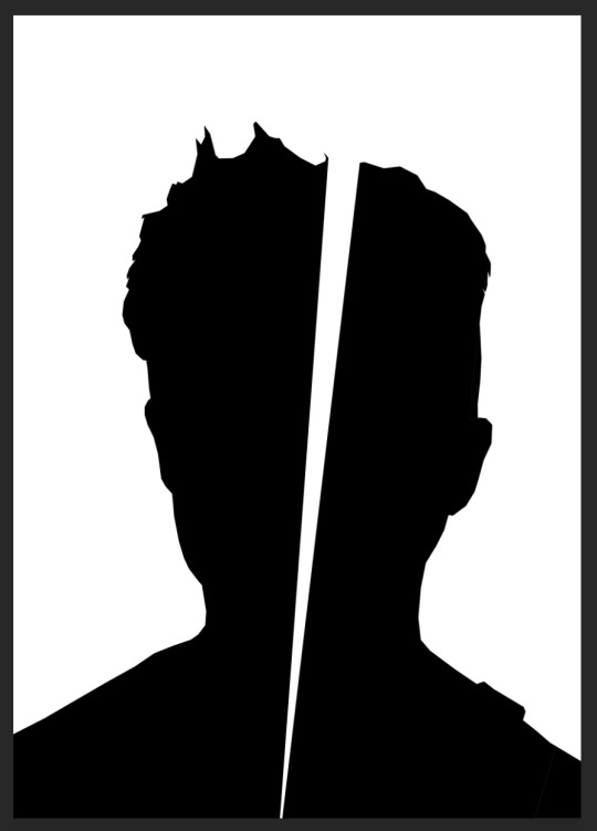
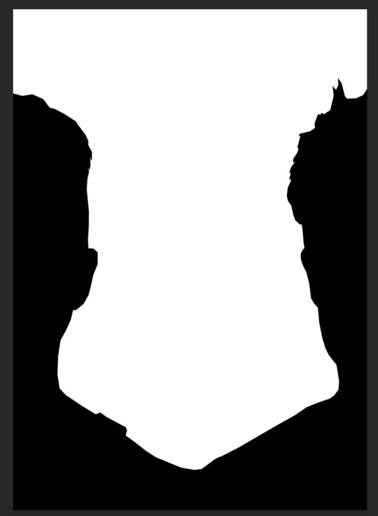
So, with this attempt deemed a failure, I split them apart and had their heads half down the sides of the page, with shoulders overlapping. Although no cool deeper meaning is really portrayed here, I think it is more effective for at least showing that they are intended to be seen as to portrated characters.
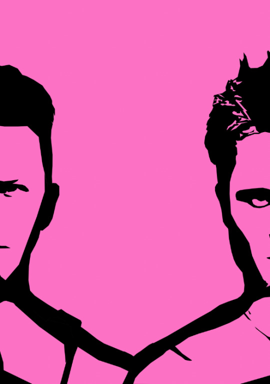
I decided that the silhouettes looked rather plain, so I traced some imagery of the characters to give them some facial features. I was generally quite pleased with the result of this.
With this in place, I then moved onto doing a background and implementing the film’s title, as the intent is for this to be a film poster. I initially tried using a bar of soap, which is thematic in the film and also portrayed on the official film poster itself. I tried finding some soap bubbles online, and I thought the image below would do. I used the half-tone technique to make the image only hard black and white with dots.
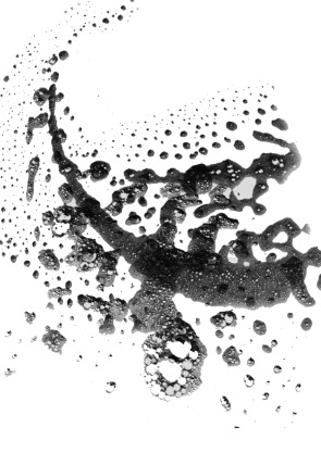
Once I did this, I pasted it onto the bright pink background, and added the film logo as well as a silhouette of the bar of soap. It quickly came to my attention that the shape may not have been immediately recognisable as a bar of soap, but I thought that the white text was effective. And additionally, all of that in the middle just seemed to clutter the poster, so I chose to adapt this design.
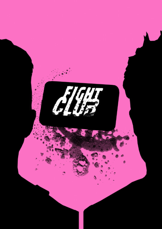
I removed the soap shape, instead opting to keep in the bubbles to retain the soap imagery, and I enlarged the text logo to be immediately visible and central.
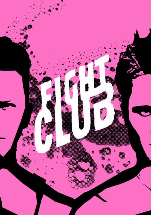
After this, I experimented with the background, and upon using the “divide” effect instead of “multiply” with the soap bubbles, it inverted the background colours. I was left with pink soap and a black base, which I personally thought looked really effective.
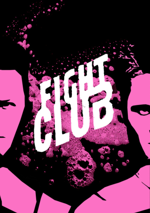
Before settling on this background in the end, I decided to examine further options. I used a half-tone background to make a dark pink in the background rather than full black, mostly to retain the head shapes rather than have them blend into the background. I thought it looked okay, but it just looked rather busy as opposed to the simple black.
I additionally added the two lead actors to the top, in the film logo’s font (matching them up to their respective characters as well), and I was very pleased with my final design after this.
1 note
·
View note
Text
Title Sequence/After Effects Research
We were tasked to plan and create an unofficial title sequence in After Effects. I started theorising base concepts of what any film title sequence should have and what I should use.
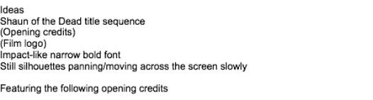
The ideas I’d noted down were to have text with opening credits and to eventually reveal the film’s logo, using a fitting font for all of it, and to use silhouette imagery of the characters to avoid copyright infringement too.
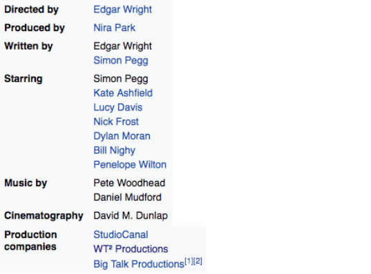
I then assembled a list of information I could use, including the “starring” cast of characters, director and producer, musicians, and the production companies, the latter of which I think ends up getting forgotten by a lot of people.
A resource we were given for research was Artofthetitle (artofthetitle.com)
We were shown a selection of film title sequences for inspiration and I noted them down for inspiration, writing details about them that I’d thought was interesting or particularly noteworthy.

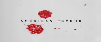
I very much loved the cleverness of American Psycho’s intro, with blood visuals on a white background to set the tone for horror with chilling, and then transitioning into food imagery to settle it into the following restaurant scene.
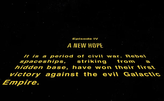
The Star Wars opening sequence is, of course, iconic, but I did note the interesting fact of which only George Lucas was mentioned in it, none of the cast were shown in the opening credits, only the information about backstory explaining the plot was shown and deemed more important.
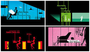
The intro to Catch Me If You Can was extremely clever and inspiring, it was entirely animated and elements of the text shown on-screen were used to take the audience through the story before the film had even started, and many elements were synced up to the intriguing music in the background.
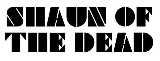
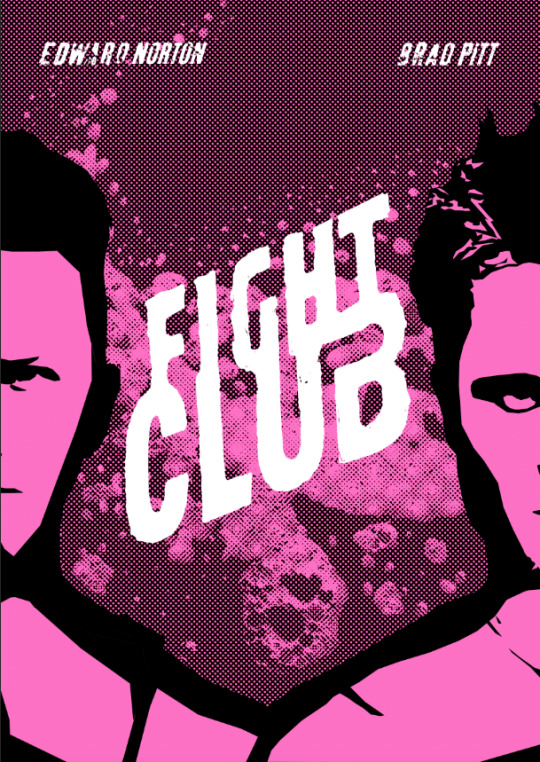
Shaun of the Dead title sequence
https://www.youtube.com/watch?v=cnZGdC-vTCo
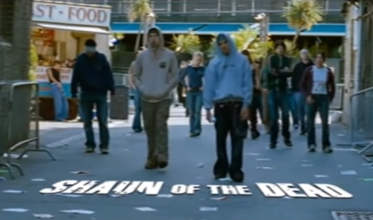
This title sequence is one that I think is very clever. The opening shots seem to be all unified with the camera scrolling to the right consistently in all of them, with slide transitions used and an element of text on every “slide”, exposing the zombies in the world for three slides before the film’s title appears, tracked to the bottom of the screen as if it is on the floor, all while jolly music plays in the background.
I think this is a very clever sequence and very concise/to the point. It is entirely live-action but it provides exposition to the film’s setting and tone with the visuals, as well as telling the audience that it is a comedy more than a horror, with its semi-upbeat background music. But at the same time, it makes it clear of the contents of the film by showing zombies to its target audience from the beginning.
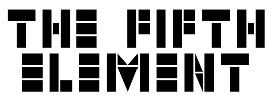
The Fifth Element title sequence
https://youtu.be/hXfoUGhKx0c
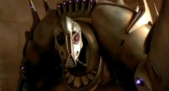
I can’t seem to find a proper title sequence for this film, but the opening of it sets a dark, strongly sci-fi tone, establishing large alien robots, other-worldly weaponry and spacecraft, which makes a good exposition to the audience for a film like this, setting the tone as said. It shows clear sci-fi traits front and centre for its sci-fi oriented target audience.
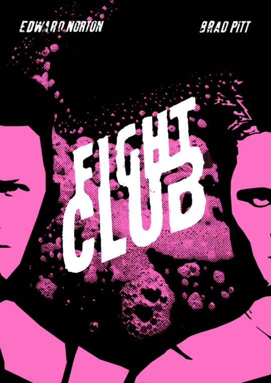
Fight Club title sequence
https://www.youtube.com/watch?v=5XSqI-iw8sI

The opening sequence of Fight Club is entirely VFX and no live action. It is acclaimed as an excellent opening and it pictures simulated imagery of the narrator’s brain at microscopic level, representing its neural network. The film’s information zooms into the screen in a light blue font of the film’s logo on the poster.
I think the design of this is seriously cool and holds up today, and the dark drone-y music sets the edgy tone of the film, as well as its title. I truly think it’s amazing how well a sequence of text and visuals can preview a film without showing anything actually in it. It appeals to its target audience by seeming dark and damp rather than bright and flashy like something for children.

Here, I examined DaFont for an alternative font to Impact, which in my opinion is an excellent font for film, but is rather overused in its original form. So, I instead found two variant edits that looked similar but were different enough and suited the feel of a horror comedy to me.
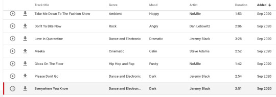
I assembled assets for my video, particularly looking for music to use. I signed into my YouTube account to browse the YouTube music site for creators, as it is all royalty-free and therefore suited to this project, and it turns out that there are hundreds of pretty good songs on there for various projects. I eventually landed on “Everywhere You Know” and deemed it ideal for my opening sequence, so I downloaded it.
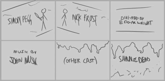
I drew up the first draft of the storyboard, the concept in my head. I used a drawing tablet and Photoshop to conjure this concept.
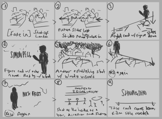
Second and final draft of the storyboard, what I added and what I adapted from the first draft.
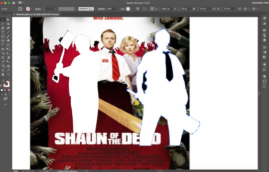
I used Illustrator to generate assets for the video, outlining the poster photographs of the main characters Shaun and Ed.
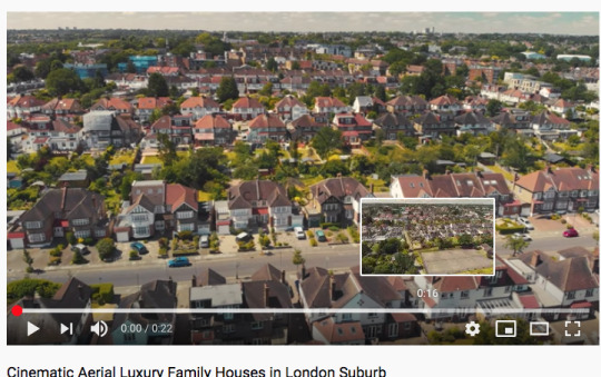
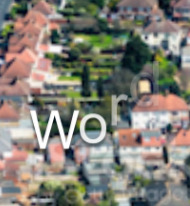
I gathered the above royalty-free stock images for use in an After Effects project. I wanted to capture the setting of Shaun of the Dead as best as I could, so I found photographs and footage of north London suburbs.
Learning Adobe After Effects
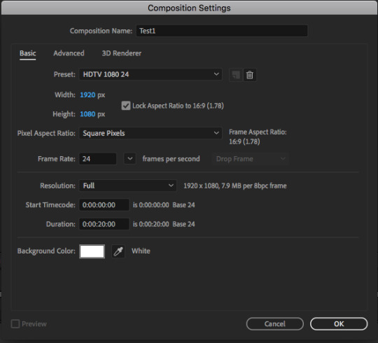
Creating the composition involved hitting the “New Composition” button, adjusting it to 1080p 24fps, and giving it a white background on the following screen.
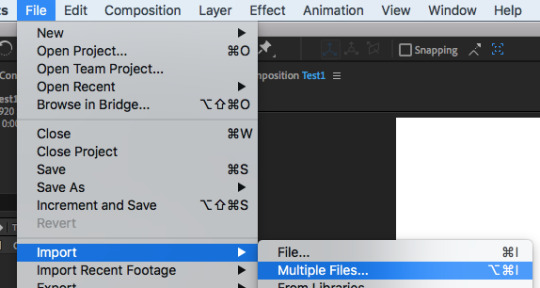
Upon using Import>Multiple Files, I opened the folder in which the files were saved and imported two of my images.
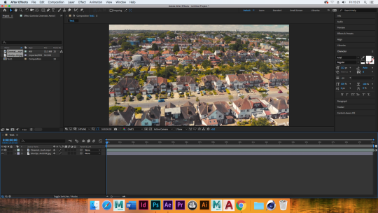
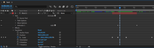
I introduced new layers into the timeline, including instances of the images I was using for later, as well as multiple layers of text and a white square. I rearranged the orders so that they would follow each other in order.
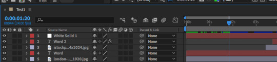
And, using the transform tools, I experimented with and (with keyframes) automated the scale, position, rotation, and opacity. Not all of the effects were used on each layer, but I’d used all of these tools by the end of my experiment.

Using Window>Effects & Presets to open the following section on the window, I found the following 3D text animation effects. I ended up trialling “Z Cascade” and dragged it onto the text layer I had
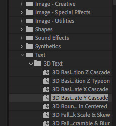
The effect did the following with the word, cascading each letter down from the end until the beginning, I then found the animate effect in the timeline and I have indeed learnt how to apply text effect animations at will.
0 notes
Text
Film Magazine/Research
In InDesign, we will be making magazines relating to film and the films that we have been given. For inspiration, I started by glancing at peoples’ designs for magazines in general, on Pinterest.

It became apparent fairly quickly that I was appealed by magazine designs with strong colour or tone themes, where a strong palette of around three colours has been used, such as the turquoise/white/greyscale and red/white/greyscale above. Additionally, I liked the artsy designs below, particularly the “black and white” one for its experimentalism.
After this, we had to research five actual film magazines. The ones I’d heard of and chosen were Empire, SFX, Entertainment Weekly, Total Film, and Little White Lies.
Empire, SFX, and Entertainment Weekly


A theme I notice with the magazine is that it’s very cool to obscure the logo slightly with whoever it is that appears on the cover. I particularly like Empire and SFX’s cool and unique logos, with Entertainment’s seeming rather bland in comparison. In terms of the interiors, however, I like how in the sample of the Empire issue, the images carry on over, bleeding past the text box, and making an outline. I think this is very effective compared to just having a white background with images placed on top standardly - however the text boxes themselves are very neat and not swerving around anything. I also noticed that Entertainment was the only one of these three to format the text to be “justified”. In terms of the other two, I liked the orange colour block in the background of Empire’s sample, and the blood effect in SFX’s.
Total Film and Little White Lies


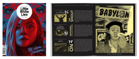
These two film magazines seem rather neatly laid out, with Total Film using its blank spaces effectively and keeping its colour theme in check, I think the sample page looked very neat indeed. Little White Lies’ interior sample looks just excellent in my opinion, the dark grey background and consistent colours and justified text, I think that the neat layout is most effective and “cool”-looking of them all.
InDesign Setup

After the research it was time to begin my document. I started with an A4 portrait 8-page InDesign document and got setting up. I didn’t have a clear direction with the magazine at this point, so I started with throwing in my already-made pieces, as well as some of the script from my films as text.

I experimented with inverting colours and placing cool shapes in the document for the effect displayed on the double page spread here. To be honest, I had no idea what I was doing at this point.
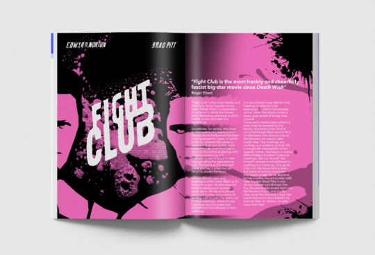
I then imported some imagery of a specific film, Fight Club, and tried arranging a page with coloured blocks inspired by my research, as well as using the scripts from earlier. I played around with shapes and colours and got this unusual effect of the pink bars going across the page, and the black part of the magazine diagonally crossing the right side.

After adding in some more elements, I started to be happy with the most effortful page design I’d made, and where I had taken the research that had preceded this.
0 notes
Text
Movie Quotes Typography
Our task here was to create typographical artwork out of quotes from our given films. The first thing I decided to do was to look up the best quotes from each film I had.

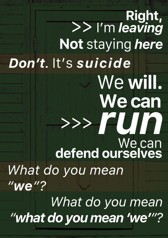
As Shaun of the Dead is a comedy, it was not easy to find particularly serious quotes, so I found a memorable funny one from the film instead. My favourite of my choices was the Fight Club one, which portrays the anti-consumerism edge the film has perfectly.
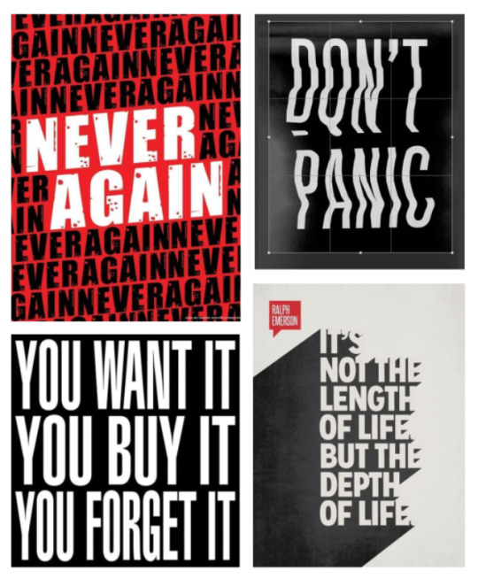
We looked at examples of typographic art. I particularly noted the tendency for these works to use tall, bold fonts, and I like the threatening aura of the very stretched text in the bottom left one. I also like the simple but effective use of negative text in these pieces, and kept them in mind as inspiration for my own works.
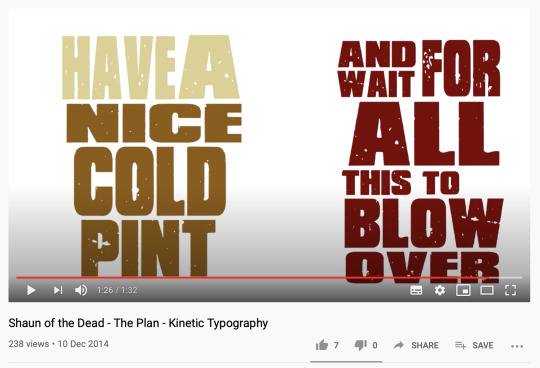
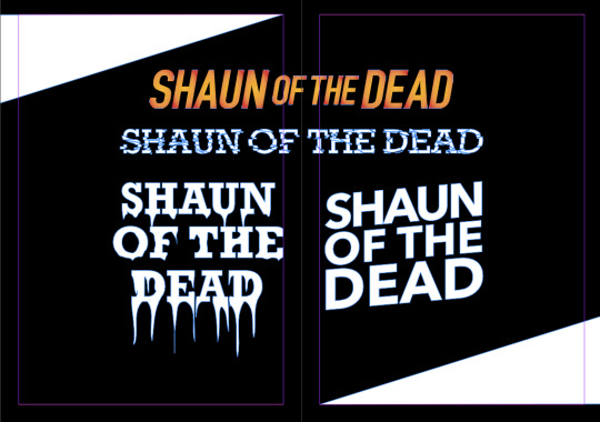
We then looked at something called kinetic typography, animating text to a quote as it is said. I found one of the very quote I was using for Shaun of the Dead, and I liked its imagery of what it was portraying, as well as using the font of the film’s logo.
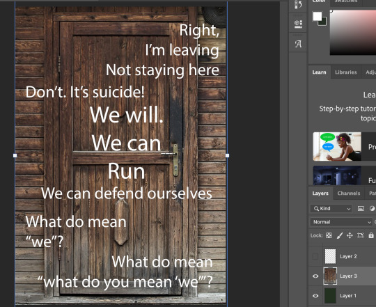
In the end, I chose the Fight Club quote and sketched out some rough typography designs.
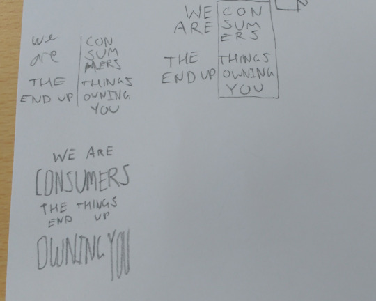
I was most happy with the bottom-most design. I then wrote up the words and looked for a suitable sans-serif font that could be stretched.
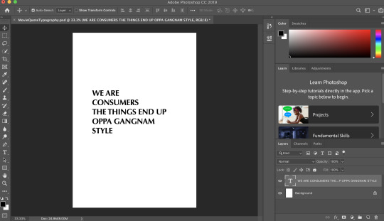
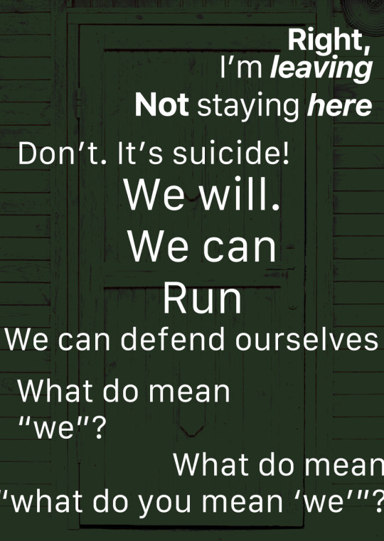
I then recreated my sketched design with minor adjustments, and I used the move tool to stretch the middle part of the word “you”. I played with scale between the words to enunciate certain words, here with “consumers” “owning” and “you”. I was pleased with this design.
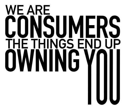
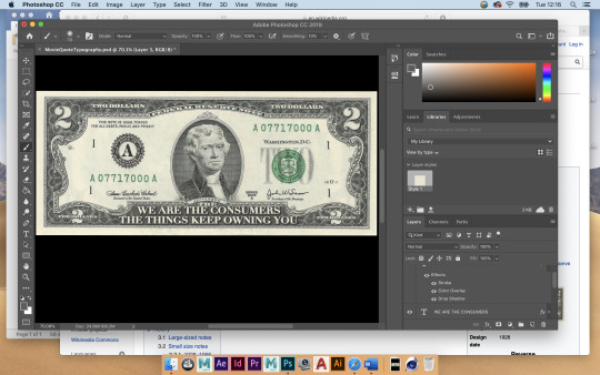
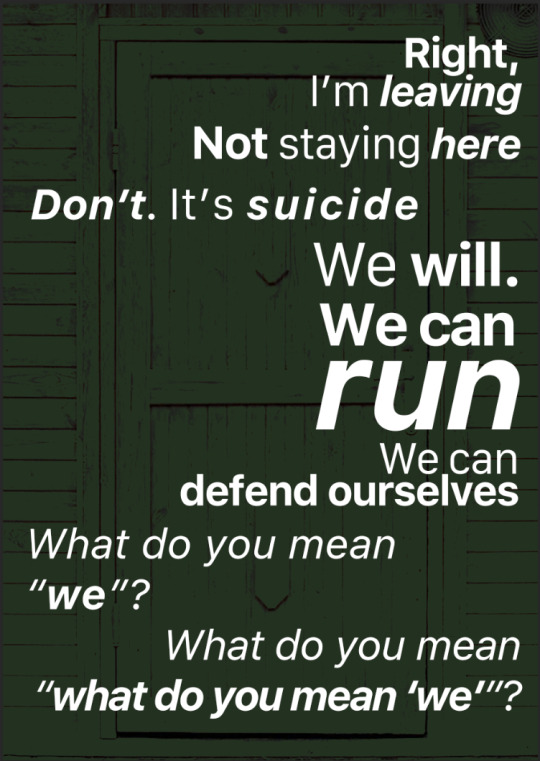
I chose to invert the colours and make the text a middle grey, to give the whole piece a dark tone. I thought it may have been a clever idea to add imagery to this art, so I filled in the empty space with the outline of a dollar bill, a symbol of consumerism.

Although we were not meant to use imagery in our typographic art, I thought this was rather effective and I was pleased with this.

I then additionally decided to do another design with the same quote, using the dollar bill as the base of the piece.
I then found the quote “We buy things we don’t need with money we don’t have to impress people we don’t like” and thought it to be very powerful. I used a combination of two different fonts to emphasise the repetition of the “don’t”s, and to also make the whole quote in all-caps.
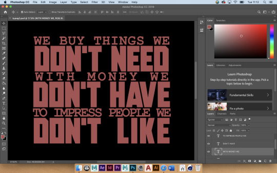
I was pleased with this and the type looked good, but I thought it looked too “wide” and not imposing enough. So I adjusted the perspective to stretch it upwards, and give it the sense of towering over you to reflect on how imposing the words are.
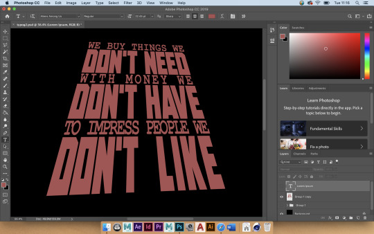
I then changed the colours to be more pleasing to look at, but still going for the harsh, dark/red atmosphere. I duplicated the type and added it as a reflection to make it seem yet more towering and imposing, exaggerating the type to reflect its intent.

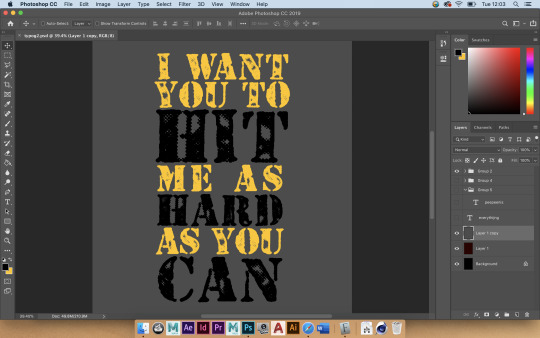
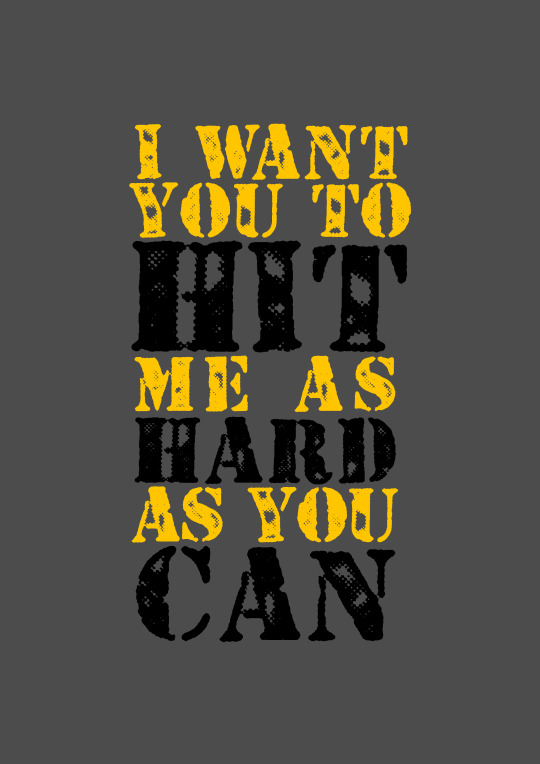
I then worked on another quote, “I want you to hit me as hard as you can”. working with the pink aesthetic of the Fight Club poster, using similar type technique as the last one.
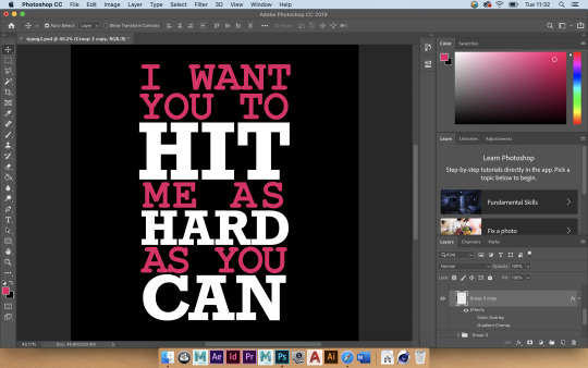
I wasn’t pleased with the contrast of the pink and the white, so I tried to balance it with a gradient.
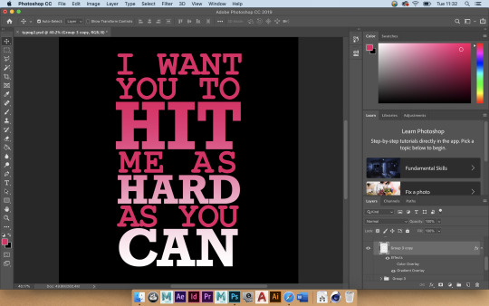
I didn’t like the way this looked either. After a break and some re-evaluation, I decided it looked far too clean for its contents, and needed to look more rough. I started with a completely different colour palette, going with grey and yellow and black, very industrial colours.
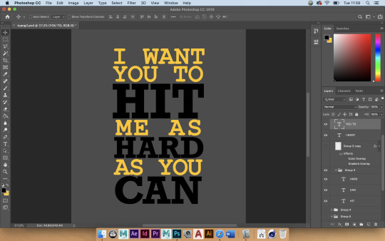
I then found a stencil font and used it, and I became infinitely happier with the design.
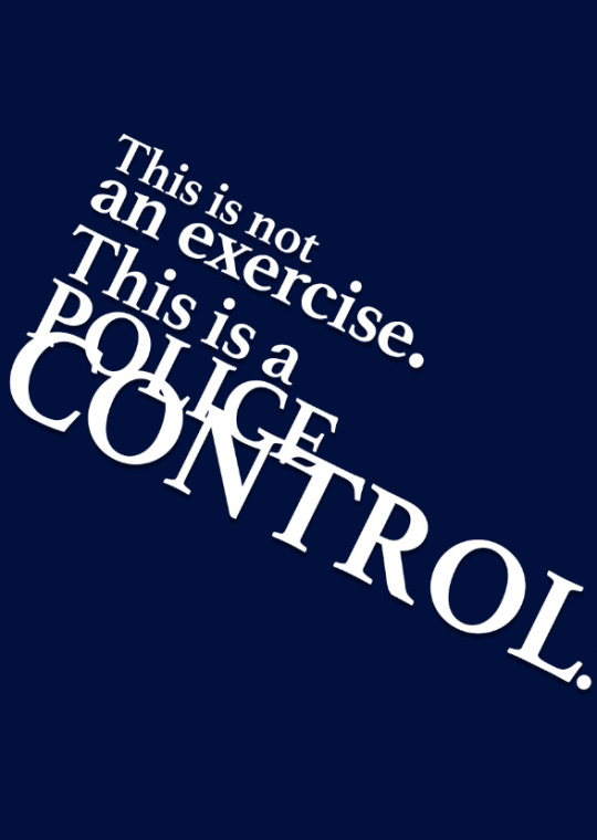
For my last design, I picked a quote from The Fifth Element, “this is not an exercise, this is a police control”. I didn’t have many ideas for this, so I decided to just use blue to thematically represent the police.
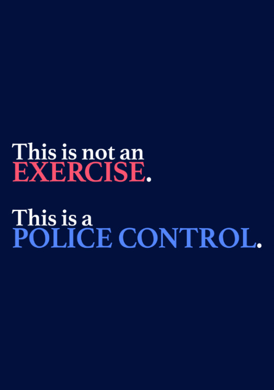
This design stood rather flat, so I decided to remove the colour theme and just focus on the impending movement and “taking over” of the word “control”, to show that it has the most power and control over the other words. I allowed for some overlap and for some rotation of the whole body of text to fit the frame for “control” to appear biggest. I thought this design would do, so it became one of my final designs.


0 notes
Text
Film Research
Shaun of the Dead (2004)
Shaun of the Dead is a 2004 horror comedy film directed by Edgar Wright. Bizarrely, rated 15.
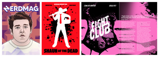
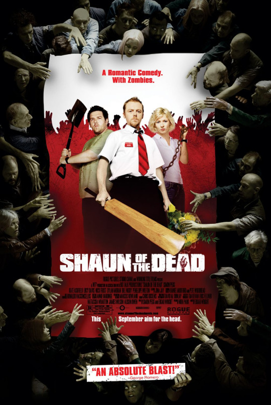
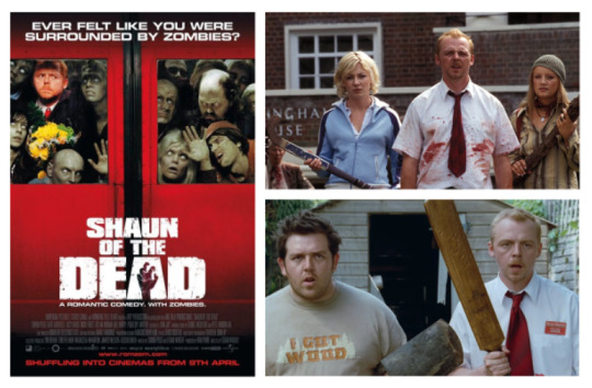
The official poster for the film features three protagonists in the centre on a poster for the film containing all of the information, using mostly black, white, and red - the three typical colours associated with horror posters. The “poster within the poster” is surrounded by the zombies featured in the film, symbolising events in the film in which the characters, of course, get surrounded by zombies. I think this aesthetic of the poster works really well of giving a “preview” of the film without showing zombies surrounding the actual characters as it could not give a very presentable view of them, yet it still indirectly previews the film, as a film poster should do. I think it is very well designed, coloured, and thought through.
Cast
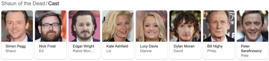
The film stars (and theatrically debuts) the duo of Simon Pegg and Nick Frost, as well as Kate Ashfield, Lucy Davis, Dylan Moran, Bill Nighy and Peter Serafinowicz.
Synopsis
The story of the film entails a zombie apocalypse in London from the perspective of the title character Shaun and his fellow underachiever best friend, Ed. Shaun was recently dumped by his girlfriend Liz and survival, romance and comedy dictate the rest of the film.
When I first watched the film, I did not like it at all because I was overwhelmed by its horror elements and not expecting them at all. Retrospectively, however, knowing what to expect, the film seems much more comedic and clever to me.
Key Scenes/Elements
The scenes and elements that stick out to me as key or otherwise memorable are the scenes revolving round the Winchester, the pub that the two main characters frequent.
On some posters for the film, it has the tagline “A Romantic Comedy. With Zombies”, which I think is amusing.
I genuinely found the alternative posters to be impressive that I could find of the film. I very much liked that they consistently used the film’s logo as well as entirely sticking to the same colour theme.

The Fifth Element (1997)

The Fifth Element is a 1997 French science-fiction film (in English), directed by Luc Besson. Rated PG.
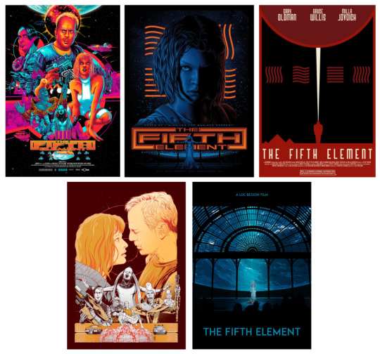
I think the real poster is very inspiring and well-designed. It uses a pleasant combination of darkness, blues, and reds. A cool sci-fi laser effect is stretched across the poster vertically, with a light at the bottom middle of the poster, showing the title under it. Although it uses the “floating heads” trait here, I think it is effective and presents the cast with an aura of mystery. The subtitle “There is no future without it” provides the audience with unanswered questions of mystery too, and I think it is effective.
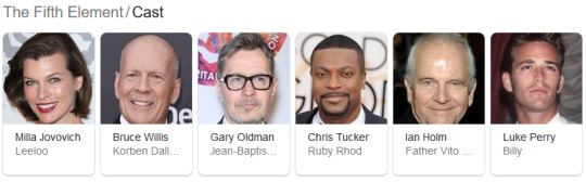
The film entails a New York taxi driver, Korben, who meets Leeloo falls into his cab in the 23rd century. As the embodiment of the fifth element, Leeloo needs to combine with the other four to keep the approaching Great Evil from destroying the world. Together with Father Vito Cornelius and Ruby Rhod, Dallas must race against time and the wicked industrialist Zorg to save humanity. Pretty standard Sci-Fi stuff.
Key elements of the film seem to be just Leeloo, who has bright orange hair, because that’s all I can see in image results for the film.

As part of the sci-fi theme, fan alternative posters have used blue-hue themes in conjunction with the orange theme presented by Leeloo’s hair, which I think is a very effective choice.
Fight Club (1999)
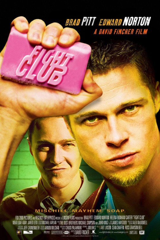
Fight Club is an American 1999 film directed by David Flincher. It is rated 18.
The poster design is quite iconic and I love the balance of the two characters on the poster, and the film’s title being engraved on a bar of soap, a central element of the movie. I also like the contrast of the green in the background with the bright pink soap, the latter of which is a strong part of the film’s visual identity. It is mentioned in the film’s tagline “Mischief. Mayhem. Soap.”

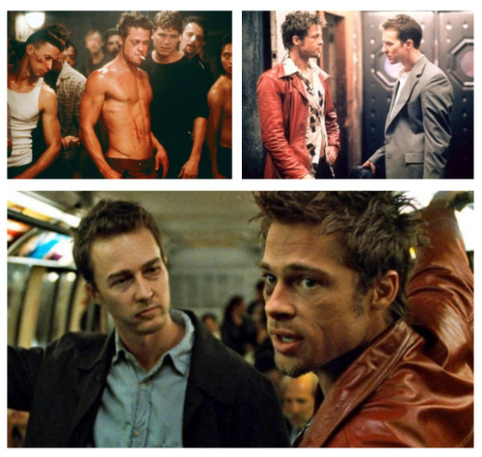
The film is about an unnamed narrator who suffers from insomnia and is unsatisfied with his job and attends support groups as an imposter where he meets Marla Singer. The narrator meets a soap salesman, Tyler Durden, whom he starts a fight club with, and is actually the same person in the same body.
Key elements include, of course, the fight club itself, and the soap.
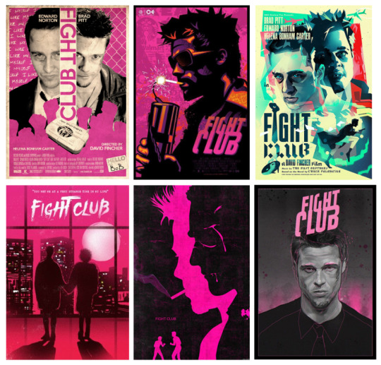
My favourite alternative posters were for this film. Much like with Shaun of the Dead, I liked that people really seemed to stick with the colour pink unanimously. I also really like the works that hint towards the two main characters being a split personality of one another. The aesthetic of each one of these is strong in its own way to me, from use of minimal colours, to minimal imagery, to just clever concepts.
After researching all of my films, I assembled spider diagrams for each one with elements that I could use for designs of them.

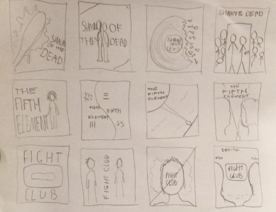
I then created twelve sketch designs of alternate posters, four for each film. I thought about various elements such as where the title appears, making sure for it to be a different place on each poster, as well as including different elements in every design. I was pleased with several of the designs.
4 notes
·
View notes