
Last Seen Blogs


Text

These are the zines that I have printed out. I have printed them out in different sizes to see which size works out better, I have printed one in A5 and one in A4. I feel the A5 works better as it is more compact and it’s better to have as travel guide, as it is easier to carry round. When printing out the A5 copy the text is really small and hard to read so I have gone back and made the writing just abit bigger. I have also moved the image on a page as it had a white gap one side and didn’t the other this meant it was getting cut off when printing and also looked off on the page.
1 note
·
View note
Text
poster
I have now added my logo and a QR code, i have also moved all of it up so i don’t that much negative space, i now want to add social media images so it shows to the viewers that you can look at social media for more information.
1 note
·
View note
Text
Zine

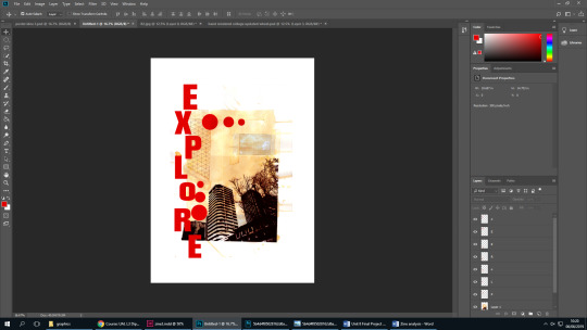
I added letters to this page of my zine, as i felt there wasn’t enough letters in my zine compared to the layout i was looking at. I firstly had it as the blue as the other letters but then i thought it looked like it was a continuation of that page. So i used the colour of the heading of the article ‘getting around’, i now feel it looks more presentable and goes with that page.
1 note
·
View note
Text
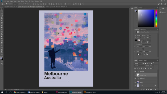
Poster 2
I have tried make a second poster,I have tried different colours on the text, I have used the colour off the coloured dots on the poster as I want it to all to tie in together. I feel like it is too much red so i might change the opacity to make it more shuttle.
I now need to add a website address, social media names and another QR code like the other poster.
1 note
·
View note
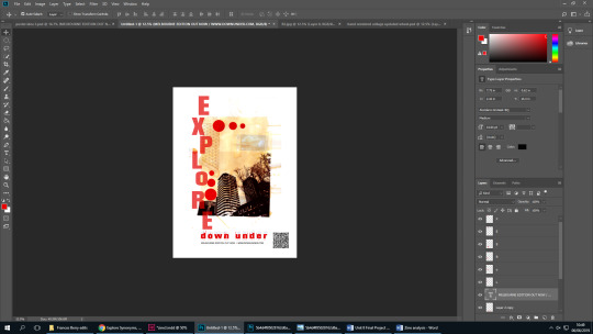
Text
Poster

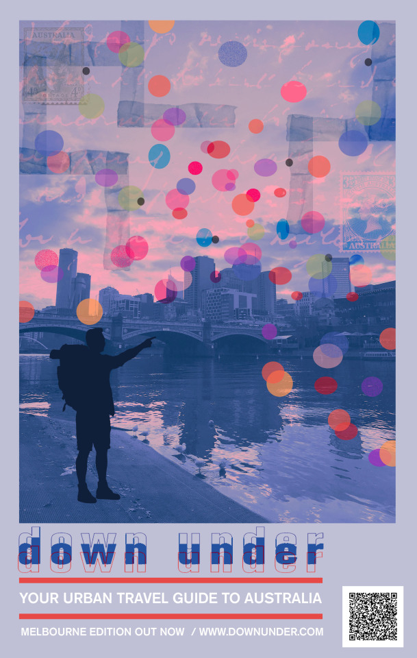
I have now updated my poster to look more like the one I am responding to. I have now added my logo and edited it to tie in with the image, I have used the eye dropping tool to pick a colour from the image to add to the logo. I have also added some information about the zine and the website. I have also added a QR code, so when the poster is up people can scan it and they get a digital version of my Zine. When I added the two lines into my poster to make it look like I was responding to the poster above, I also used the eye dropper tool but this time I used the colour from my logo.
1 note
·
View note
Text
Poster Ideas
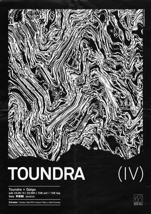
This is one of my poster ideas that I have created. I have tried to respond to the image as I like the big image in the center of the poster and text underneath, I feel it is very effective when it is left simple and not much going on. I feel like I should add some more text to tell the viewers more information and also contact details. I also feel that I should add a logo or some sort of branding identity to make it complete.
1 note
·
View note
Text
Last page of Zine.

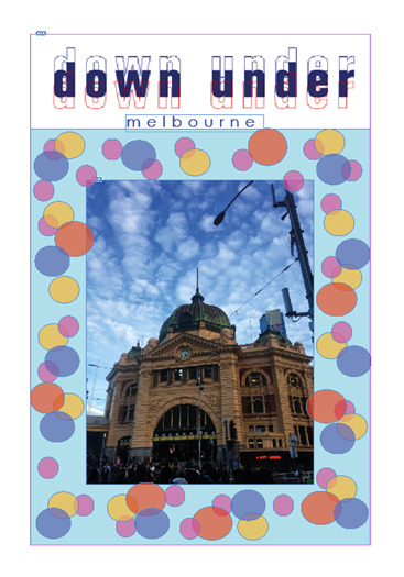
This is my last page of my zine, that i have created. I feel like the colour scheme works well with the image i have chosen. I have picked the colours from the image as I wanted it to all tie in together. I have also kept the fonts the same throughout the whole of the zine. I have added a website name and a social media name at the bottom of the page. I have also added a bar code to make it look like a realistic. I was going to use my Michelle Thompson collage that I had made of Sydney but I had already used the other one that i had created and I didn’t want to started repeating myself. Another reason why I did’t use it, is because I didn’t want my audience getting board of seeing the same style of work, it would look better if I had a variety in my work.
2 notes
·
View notes
Text
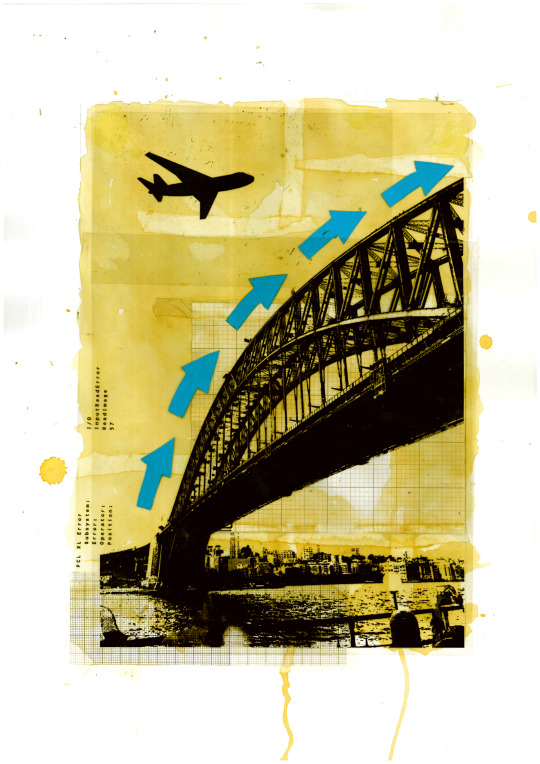
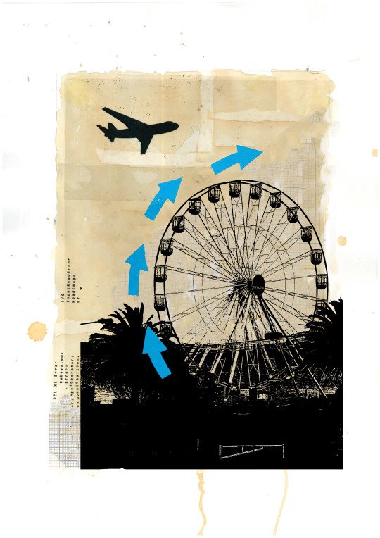
The first collage is the hand rendered collage I created in response to Michelle Thompson. I used my own image of Sydney Harbour Bridge, but as my zine is about Melbourne I couldn’t use it. So I did some editing on Photoshop to place another image on the collage background but now this picture of the wheel is in Melbourne so now it can go in my zine and it will fit in with the theme better.
2 notes
·
View notes
Text
Zine Design
This is my first attempt of designing my Zine, I have had feedback from it and I feel it doesn’t work with the rest of my theme. Although I wanted to to add features of one of my Martin O’Neill responses into it, I feel it is too bubbly and too strong for my theme as my theme has a grungy feel to it, and I feel this is too bright for it. I also picked out a design off pinterest that I like the style of and this design that I have created doesn’t really go with it.
Now I will go back and make my design more simple, and more of a design that will go with my theme better.
2 notes
·
View notes
Text
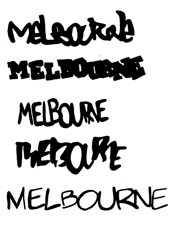
Zine.
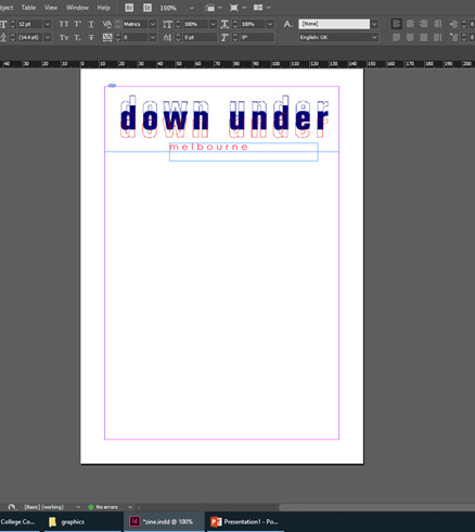
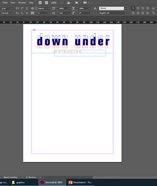
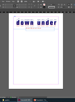


I have been trying different colours and text with ‘Melbourne’. this is for my Zine that I have started to create, i only made the ‘Melbourne’ text simple as my title was big enough and I didn’t want them fighting against each other. I have tried many different colours and I think the dark/navy blue goes best as it is in the main title.
I also tried the lettering in capital letters but I thought it was to over powering and took more of the centre than the bigger title. I have also made the lettering slightly bigger.
1 note
·
View note
Text

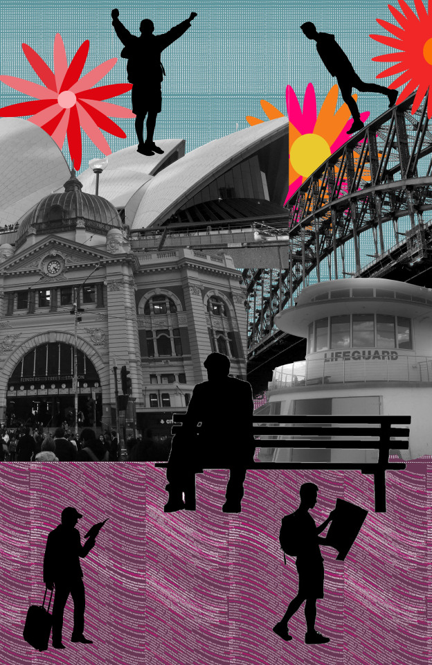

I have created responses to Martin O’Neill but realized that I needed more objects in the background rather than just people, so I added a bench silhouette in and took some of the people away. the black silhouettes were to sharp for the background. I then tried different colours on the silhouettes, to see if they didn’t stick out as much as the black and so your eyes weren’t drawn to the people and more to the buildings and the background. I chose the colours of the silhouettes by picking colours from the background so they are associated with the response.
2 notes
·
View notes
Text
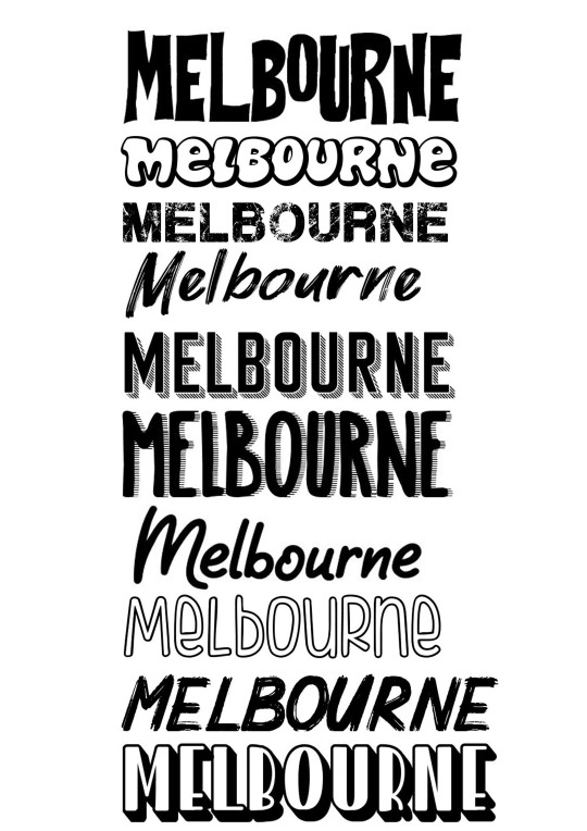
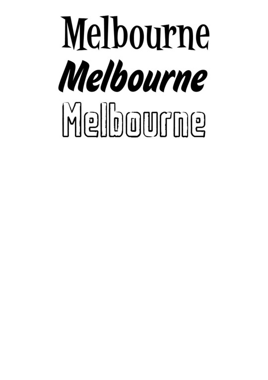
I have also produced digital typefaces of the world ‘Melbourne’ to see if they are more effective than the hand rendered ones. I am still yet to decide on what typeface i want to move forward and develop further.
1 note
·
View note
Text
Hand Rendered typefaces

I have been working on hand rendered type, i have just started with the word ‘Melbourne’ as i just wanted to test out the typefaces to see which one worked best. i have imaged traced these typefaces, i am now working on digital typefaces and producing more typefaces hand rendered and digitally.
2 notes
·
View notes
Text
Kate’s Lesson
This lesson I have started to response to Michelle Thompson’s work. I have started with a water colour background, and now I will be collecting images to put on it, to make it into a collage.
3 notes
·
View notes
Text
What I have done in Kate’s Lesson - 5th March 2019
In this lesson I have been making an edit influenced by Martin O’Neill, i have also been editing my photographs in the style of Stephanie Jung.
2 notes
·
View notes
Text
Action Plan For Kate’s Lesson
in this lesson i am going to be continuing with my first project proposal. I will also be finishing presenting my gallery images in my rough book.
4 notes
·
View notes
Text
Action Plan
Over the half term, i will be visiting Art Gallery's and museums i will also we looking at newspaper and magazine articles, to collect information about other artists. i will be taking images of the work i like, to learn new techniques and skills.
6 notes
·
View notes