mariazarcos
Maria Zarcos
Hello! I'm a year thirteen A level student working on their short film production called "Cake".
Please directly use the menu bar to navigate.
13 posts
Don't wanna be here? Send us removal request.
Last Seen Blogs

geminifilledwithlove
Fell in Love with a Libra man
srilankanwillbyers
ryan's blog

xehopdonghatrung
Xe Hợp Đồng Hà Trung

alailarest
Untitled

momentarysatisfaction
Untitled
Text
POSTPRODUCTION
In this page I will include any piece of work I’ve created mostly with marketing or brand design purposes during the process.
EDITING SOUND
For sound I made sure to use professionally made sound effects to enhance the quality and veracity of the situation, so from the sound made when grabbing the knife even to the birds chirping, these were all taken from sound effect specialized YouTube accounts such as
- Sound Library
- ProSound Effects
- Music & Sounds Effect Library
- All Sounds
- SOUND and IMAGE FX
- Sound Effect Database
- Isolation Music
For my non-diegetic background music, I used tracks free of Copyright by the author Sunshant Sonawale (used during the fighting scenes) and a piano piece by Valerio Velardo (who himself expressed that he had made this tune with the purpose of depicting an obsessive mind state, perfectly according with my main character’s paranoid state of mind).
BRAND LOGO
I’ts important that I acknowledge that I have to make this coursework with the idea that it will then be demonstrated on an official fake company web page. Thus, I decided to come up with a company logo that would fit the standards of the project.
Firstly, I believed it’d be appropriate to make this company niche, since I believe my film contains elements that aren’t exactly part of a mainstream audience, which would be big special effects, extravagant editing or use of high end technological for example. Thus, I believe a logo has to exactly reflect this idea too. Furthermore, my target audience would average around the group of teenagers and young adults. This is so since I believe the concept portrayed in my short film may be more understood by the younger generation who seems to be more in touch with naturally analysing a piece of media, and take out the important social messages attached (which, as I explained in the research + analysis tab, in my case would be the protest against the expectation of women to stay in the house and attend to everything their partner puts them through).
After knowing the nature of my company as well as my target audience, I analysed such group of people through social media to understand their tastes and interests at the moment.
I noticed that animal videos or pictures where very prone to acquire a very big amount of viewing and likes, such as these videos from TikTok (the most used platform by teens and young adults worldwide)
PIC
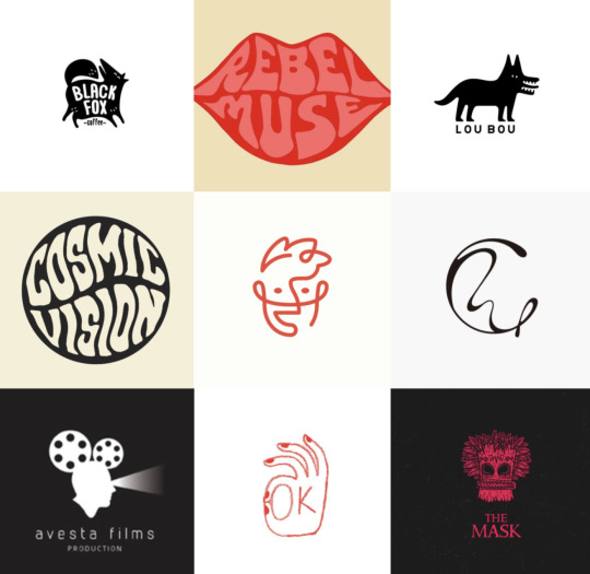
Therefore, I decided to focus on making a logo that’d include an animal, mainly inspired by the film company Metro Goodwin Mayer, with it’s iconic roaring golden lion.

These are some of the logos in the industries that represent an animal. However, I noticed that most of the companies which have their target audience as adults or older showcase a variety of big and strong animals, like, for example, Jaguar, Lamborghini, Lacoste, Polo Ralph Lauren, etc. Thus, I believe that using a smaller and gentler animal will mean that my target audience which meet those criteria will relate more to my company (such as for example, Twitter’s logo is a bird, a social media platform that harbours most of my target audience too). After being sure of this, I went to TikTok, Pinterest and Instagram to see what’s trending right now among my target audience. Many of the multi-million liked videos included nature themes and thus, animals, which accorded perfectly with the research I had already made. My target audience seemed to also like artsy and creative pieces made by unknown creators in the app.
The majority of these videos in TikTok have millions of likes, and even more views, by taking this path I ended up coming to the conclusion that one of the most famous animal among young people is the frog. I believe it also relates to my conclusion that animals that may seem smaller or more innocent tend to relate more to my target audience in comparison with older audiences, who seem to be more attracted to much more opposite types of animal representations.
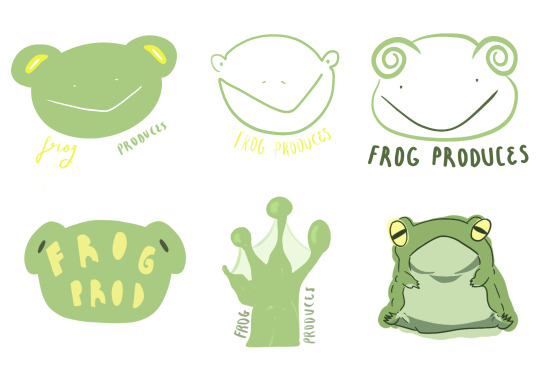
Now, I started planning the actual logo. Firstly I had to come up with the name of my company, which I believed would be fitting as Frog Produces since I believe its fun and young. Here are some inspirations and ideas I had researched before starting:
I wanted it to be simple and look doodle-y, since I believe it’s what fit best with my initial idea. I used procreate to make various logos until I got the one I wanted, which is the bottom right one.
FINAL LOGO:

MOODBOARDS + ART
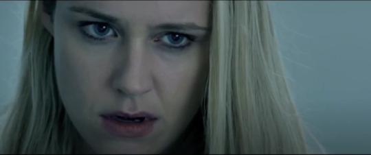
For further characterisation of my character, I had decided to create two moodboards to represent the two moods or personalities that the main character shows before and after the incident, as well as visual representations of herself to contrast how she feels through sketches made by myself. I use the two contrasting colours, blue and red. Blue represented her state before going crazy. “Feeling blue” fit perfectly with her feelings at that moment. There was never really a moment of true happiness when she was in the presence of her partner, but felt too fragile to do anything about it until she turned completely crazy. She bottled up her emotions and felt as if she was drowning. In contrast, red represented her severe mental instability. On the inside she’s still herself, confused about the person she’s become (we can see those mood swings at the end of the killing scene), but she’s now out of control. Her rage taints her sight in red, and although she couldn’t dare look at herself in the mirror, time has made her admit her state (something we see in the first and last scene, in the interrogation room), and she’s completely lost her mind.

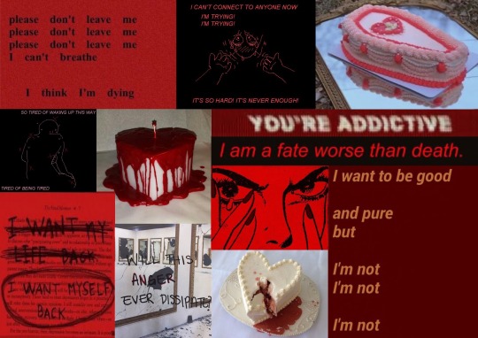

In this piece made by me, we can see that she’s martyrised, copying the pose of a virgin, suffering the death of her child, looking up into the sky asking for help. We see that she’s bathed in blue, light, which although representing her mood, also seems to be pure. However, she’s covered in a red background, meaning that everything around her is dangerous and negative. It seems as if she’s drowning in it.

This is the piece that pairs with the one before. It’s a complete contrast. She’s now looking straight at the audience, as if challenging them in a way. The light surrounding her is red, one of wrath and power. Even though before it seemed as if she was drowning in the red environment, here it almost feels as if she’s rising from it. Getting out of it, rising from the dead and the pain as a new, changed person.
4 notes
·
View notes
Text
MINOR TASK
As for my minor task, I had to make a film postcard to go with my short film.
ANALYSIS

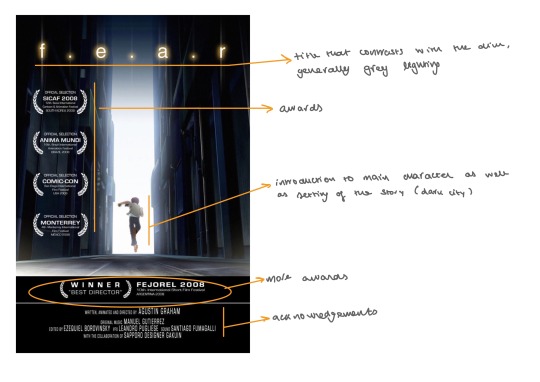

After analysing all these, I came up with the conclusion of what elements that were conventional to postcards:
- Awards
- Acknowledgements/name of the actors
- Title that makes sense to the story
- Logo
- Date of release
- Opinions of various sources
I did a rough sketch of how I wanted the finished postcard to look, and where I should place all of the required elements:
youtube
I wanted to take the picture in the grocery store where we filmed the second scene, in the same place where she takes a cake with her for the first time. Furthermore, even though I had a clear idea of what kind of picture I wanted to take, I decided to take some more just in case I liked another one better:
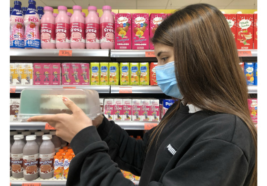

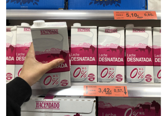
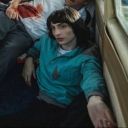
I chose my second picture, where we see Loreley leaning onto the cake refrigerator from the store. We can0t see her face so it creates the enigma of her emotions. We don’t know if she’s acting so nonchalant because she’s planning the murder, or if she's come back from prison. However, we can definitely sense an evil aura coming from the picture. Thus, I edited it and especially lowered the temperature to give the image a bluer, colder feel. This informed the idea that this image doesn’t carry any good, but it resembles Loreley’s feelings at least during the time she’s starting to turn crazy and lack emotion. Furthermore, I previously increased the quality of the image using an app called Remind, which helped smooth everything out and even the lighting contrasts too. Here is how I edited it:

and this is the finished image:

Now I just had to integrate all of the elements I had previously listed at the start, which would make it look like a real professional movie postcard.
FINISHED PRODUCT

For the title, I first used a random letter text generator from google, and then I changed the colours, shapes and position to make it fit better with the darker nature of the story as well as the color palette of the image. The letters are lopsided and vary in shape since I wanted to represent the story, where nothing seems to be in order and their relationship is progressively falling down.
Moreover, I made sure that all of the awards were real film festival titles as well as being British as well as featuring opinions from important magazines such as TIME and The Guardian. Both too these points mentioned would give more credibility and prestige to the film.
Lastly, the byline of the short film would be “Want to try?”, which sound daring and menacing. Thus, the audience would not only be persuaded to watch the film since its directly addressing them to do so, but it also hints at the plot of the film.
WEBSITE
CLICK HERE TO GO TO THE WEBSITE

As for my website, I decided to take a more company-like approach to its design. I based the color palette on my logo, using a variety of greens, and my fonts where simple and easy to read. By doing this, I believe that my website appears more professional and inviting to the public. The idea is that the company is known to make intricate, smart, extravagant stories, but at the same time appear like an official, serious company that’s determined to work hard and properly.
0 notes
Text
FEEDBACK
The tasks I had received for improvement had all to do with the fist draft of my short film.
For the first one, I had been told by my teacher that I needed to re-film the first scene, since the detective talks too fast, and its lack of clarity could confuse the reader. Thus, I re-filmed it, and made sure to teach my actor how to speak slower.
The next aim I’d been given had to do with some issues in relation to sound and it’s loudness, especially in relation to the dialogue. Loreley’s narrative speeches were sometimes overshadowed by the non- diegetic music, so I ensured to increase the loudness of the dialogue, and lower the background music. For this, I learnt a new technique. To increase the loudness of an audio even though it’s already been heightened to the maximum level, all I have to do is copy and past that same audio, and put them one under the other. This way, the loudness of the sound would be multiplied, but they’d sound normally and with no overlapping.
Similarly, I was also advised to re-film the last part of Loreley’s dialogue, when she sees her partner cheating on her. She was speaking too fast and it was too difficult for the audience to follow the story. Therefore, we re-filmed it (using the Power De Wise microphones in a small enclosed room to avoid echo).
Furthermore, I had been advised to delete a small shot where Loreley’s organising the croissants in the tray in the scene where her partner crashed the kitchen after a night out. Since they were store bought, they didn’t benefit the overall mise-en-scene, and they seemed too artificial. Thus, I decided to delete that shot, since it wasn’t that meaningful for the story.
Lastly, I was reminded to add the main title and insert the final credits at the end. I used the same title as the one used in the postcard, this way keeping the same aesthetic and brand all throughout (which would therefore make all of the pieces more recognisable and homogeneous). The final credits were added just before the last video sequence, where Loreley admits to having killed him. I believed it would seem playful to keep it after the credits, since it would spike interest in the public as well as highlight the unexpected persona Loreley has morphed into.
It should also be noted that there are some slight differences between the dialogue and storyboard in relation to the final draft. This happened because during the filming, it seemed more natural to make some changes to these, and thus make them fit better with the story.
0 notes
Text
CREATIVE CRITICAL REFLECTION
How does your product use or challenge conventions and how do they represent social groups or issues?
I challenged the convention of the thriller genre by not showing any violent scenes, and let the audience solve the enigma of the death of the male character by themselves. By doing this, I’d also include a plot twist as well as a surreal element to the story, which would keep the audience engaged up until the very end of the film.
This idea of surrrealism that we see in the murder scene also challenges the conventional thrillers where an obsessive and toxic relationship is the center of the plot, like for example Fatal Attraction or The Housemaid
A common convention of thriller films I did use was the music. Dark and ominous, it increased in pitch and loudness the closer the climaxing scene of the murder came. This increased the tension and made the audience nervous about what Loreley would do. Furthermore, the soft sad choir playing during the fighting scenes further connects the audience with the emotions Loreley’s feeling.
I wanted to represent a story about love between two young adults, and how people that age seem to rush or force a relationship because of society’s expectations of being settled once you reach an age. However, this new society also seems to normalize toxic relationships and abuse, and with this exaggerated plot I wanted to make a critic of just that.
How do your products engage with the audience?
My website contains character sheets and introductions so the audience can learn more about them and their story, deepening the plot too. By doing this, the viewers can get more information about them, and thus, analyse the story on a deeper level. These introductions don’t contain any spoilers so it also builds anticipation about how these seemingly opposite characters are going to interact with each other in the story.
The web also contains a page with information about the director (me). I believe this is essential to engage with your audience and hopefully end up constructing a cult following that will keep up with my works as I release more films. Furthermore, by mentioning that I’ve worked in shows like Euphoria, Money Heist and K12, I’m further relating to my target audience, since those shows also target the same demographic of people as my film does. They’ll believe my work will fit their taste immediately, and they won’t hesitate to start watching the film.
I have an instagram account for Loreley (before she was convicted), which can serve as further character development, as well as engage the audience with the main character. By choosing Instagram as her main platform I’m also effectively reaching my target audience in terms of promotion, since social media marketing has become so famous over the years. An example of similar instagram accounts may be the fictional characters from the show Skam or from the film After.
There’s a contact page in my website which allows the audience to connect with the company personally, allowing them to express any queries they have directly to the team. This way respect and credibility is given to the company.
How did your research inform your products and the way they use or challenge conventions?
During the research for my logo I came to the conclusion of what I wanted my target audience to be like. I studied the current trends in TikTok, Instagram and Pinterest mainly. There, I found out that animal videos were many of the viral posts in all of the social media platforms.
I realised that my target audience of teenagers and young adults tended to enjoy more niche, or in other words, less manufactured, more honest products. For example, the new trend of buying thrifted clothes; listening to a much wider variety of artists (that tend to be more alternative or underground, such as Cage the Elephant, Declan McKenna); or consuming more eco-friendly products (vegan or ethical hygiene products, reusable straws, phone cases or other products made from recycled materials). Therefore, I wanted to make sure that my brand had influence from the new trends and activist goals of today. This convention challenges traditional media, since I wanted my short film to contain a hidden message against toxic relationships and the expectations that have been dawned on women to be submissive and dependent on their boyfriend. Of course my short film challenges this view in a way, since I exaggerate it so that the main character kills the man, but it’s meant to show how much a woman’s mental health can decay from putting up with their partner’s problems. The clearest examples where we can see old views of women and submission being the popular theme in old films would be all of the old Disney Princess movies.
After analysing various short films I believe I acquired knowledge about continuity shots and angles that would fit better with the action to movement my character is making. Thus, the audience would feel as if they’re following Loreley around, and thus, understanding her side of the story better. This way, the audience feels surprised that she’d act the way she does in the ending scene, since they've built a deeper relation of trust with her instead of with the male character.
How do the elements of your production work together to create a sense of branding?
I make sure that my brand connects with the audience, so most of my work apart from my short film tends to include interactions with them, such as the many features in my webpage, or Loreley’s instagram, where the public can interact with her as if her character were real.
My website and my logo both follow the same color palette, therefore creating a sense of continuity and style. This way, everytime my audience sees elements like these outside of the company, such as in social media, they’ll be reminded of us.
There are many elements from niche companies, like the closeness to the audience which isn’t only seen in the webpage, but also on the instagram account and on the postcard, which features a simple mise-en-scene and not too extravagant editing.
The postcard doesn’t show Loreley’s face, meaning that she’s hiding or undercover. This creates a sense of branding since it follows the story, and the audience will be left with the enigma of why Loreley is back in the supermarket, hinting that there would maybe be a second part.
Word count (not including titles): 1029
0 notes
Text
RESEARCH + ANALYSIS
I chose to analyze two student short films and two independent short films. Thus, I’d get an idea of the difference between a proper professionally created short film and one made by someone at my stage. I was able to decipher what I needed to improve from the student films, ad what I had to follow from the professional ones.
One of the big steps I had to take in order to create an engaging film was sound. Not only does the music have to be used and chosen according to the right moment, but the smallest sound effects make an important difference too. Thus, I used mostly professionally created sound effects taken from YouTube to enhance the quality and credibility of the film, and make it seem more professional.
INSOMNIA - CELESTE KIARA

https://youtu.be/j5pmMCuiKTc
Genre - Drama/documentary
Purpose - Inform and bring awareness about insomnia, visually highlighting the problems that come with it. It’s important to point out she’s using a younger cast for this film (she’s also portrayed to have a second job, so it could also be deduced that she’s a university student), since the target audience are teenagers and young adults.
Big messages
The use of a variety of settings to show how strained her life is, which worsens her insomnia.
Physical and mental consequences of insomnia can be appreciated through the use of editing, camera, sound, etc.
The already stressing and hectic lifestyle the main character has to go through influences the severity of her condition.
As seen in the text, Rocio doesn’t seem to take a rest all throughout the day, and when she’s finally in bed, her tired body can’t pair up with her hectic mind (product of her stressing lifestyle full of responsibilities). A big factor is the already straining lifestyle the main character has to go through on a daily to be able to sustain herself and follow her obligations (working a part time job and going to school, dealing with all the homework she has to do too).
She seems to be contrasted with other people and their normal lives. Long shots are repeatedly used throughout to establish the various different settings the character has to navigate through during her day. We see the school, her house and her office, all of these settings being very contrasting from each other, which is made deliberately to overwhelm the reader when thinking about how much she has to move around every day of her life. There’s no direct dialogue, the main character expressing all of her feelings through her expressions. This is why we also can point out the vast use of close ups used to properly show the facial expressions of her constant distress (since she doesn’t look genuinely comfortable or happy at all throughout the short film). Furthermore, we also get continuity shots from when she moves from one space into another, which imply that she’s quickly moving from one place to another. We can appreciate this in the scene where she’s running towards her office.
The producer has been able to make the audience feel like an omnipresent entity, following the character’s life and spying on her throughout the entirety of the short film; this seems to be something the character also notices, since the actress has been able to act as if she knows someone's watching her, but choosing to not interact, avoiding us. We can feel as if we're looking at her through the use of long shots from unusual angles, or the scene where the camera gyrates around her after she’s come out of the shower. Thus, we can guess that the audience is made to act as a metaphor of her lingering anxiety that follows her everywhere.
Sound is extremely important to figure out her mental stability; There’s a mix of diegetic and non-diegetic audio that helps the producer achieve this objective. The extremely loud screeching noises during her anxiety attacks at night not only portray her detrimental mental state in the moment, but also serves to irritate and stress the audience as much as the character is, thus, engaging the viewers with the story and the feelings the main character is experiencing. Another moment of unexpected distasteful round is the moment when all goes black, and we suddenly hear the shouting of the teacher calling Rocio out in the middle of class. The loud voice of the teacher paired with the black screen creates a contrast, and interrupts the only moment of peace Rocio has been getting (samewith the audience). It’s startling, and the loud echo that comes with it serves to make the audience feel like we were inside the main character’s head, as if the distance between the real world and dream world had been separated by a tunnel up until now. The loud ticking of the clock along with the dialogue on top of it creates a pandemonium of sounds that’s clearly made to stress out the audience and immerse them into Rocio’s head, which is swimming in hallucinations.
Lighting also plays a big part in creating a certain mood through coloured lighting and colour grading.
The purple lighting before she goes to sleep doesn’t only highlight the great shadows that hide her expression (making it feel as if she’s extremely down and tired), but it makes the main character feel as if she’s a mother dimension, ruled by paranoia and the loud sounds of stress. This serves to imitate her mental state in the moment, but the technique is also pleasingly cinematic.
CRAZY LOVE - HELENA MARIE
https://youtu.be/ad_LKkj6R_A
Genre
Thriller
Purpose
To show how mind destroying an abusive relationship is, and the consequences of it. We can see that the main character’s mental health and the way she acts changes very harshly. It shows how overwhelmed and angry she was, and though we don’t see many scenes of the abuse, we get the idea that this has been happening for a while thanks to the acting and the structure of the narrative.
Big messages
The gradual process of her losing her mind completely
The abuse and how scared she is of it
The moment before and shortly after she hits him is crucial to understand really, how bipolar. Her mind has become.
There’s a drastic change in atmosphere from the scenes of the friend’s house and the scenes in her house, showing that she’s extremely scared and tense in her own home. The color in the friends house is warm and familiar, meaning that she feels comfortable there, since it's obvious that her friends care about her and want to know what’s wrong with her. However, her house is bathed in a blue, cold light that seems to be seering into her bones. This contrast has been deliberately made so that the audience understands from the start that the main problem resides in her house, hinting since the beginning that the main problem may be her partner who she lives with.
There’s a progressive journey made from the beginning to the end, where we can see that the main character’s mental stability is decaying more and more with time. At the start, we’d mainly see her from a medium close up point of view, meaning that her guard is down and she’s more connected to her surroundings. However, as the story progresses, we get to see more close ups of her disturbingly pained expressions, and moreover, we can see that the background behind her starts to blur out, meaning that she’s losing control of her environment. It feels as if she starts seeing in tunnel vision before she’s about to kill her partner, her mind not seeming to worry about anything else. However, after she’s killed him, we see an extreme long shot from a bird’s eye view that indicates that she’s starting to regain control; and she suddenly feels very lonely. Reality dawns on her, and the bird’s eye view may allude to some sort of correlation to someone watching her from above, like a higher being that’s omnipresently following.
The use of sound is very important in this short film. It serves to tell us about the different moods of our main character, as well as hint at what may happen in a few seconds. Like for example, when the non-diegetic sound of drums and ominous computer generated music suddenly starts after a while of silence, after the woman looks up into the mirror; this use of audio tells us that something’s about to happen, and she’s made a promise to herself that she’ll do it now. Another use of sound which tells us about feelings is the ominous background music that starts when her partner comes into view, as if he’s preying on her, and she feels extremely threatened and anxious. Furthermore, some sound effects are increased in loudness to exaggerate the aggressive scenes, like the one where she’s stepping on glass.
I THINK I HAVE A CRUSH ON YOU - AKTIV SKOLA

https://youtu.be/lRQlMriBqiQ
Genre - Drama
Purpose - To teach the audience about how easy it may be to get involved with a dangerous child groomer, and how difficult it may be to get away from such a situation. The main actress has been chosen meticulously because of her young age, and face that also matches it. Thus, we know that this is a child, and there’s no way to not see it or try and think otherwise. The voice of the male actor is characteristic of an adult, creating a stark contrast when they both engage in conversation.
Big messages
She is young and oblivious to the danger she’s getting herself into.
Her personal life seems to not be too ideal. Her parents seemingly have fights often, and she doesn’t confide in her mother.
The escalation in danger, which influences her state of mind.
This short film deals with a very serious topic, and defenitñy doesn't stray away from being real and crude with the audience. Nothing is sugar coated or more or less exaggerated, thus, the techniques used are scarce in extravagance or surrality.
Most of the time we see the main character from the computer cameras point of view to make us engage in the situation as if we were taking part in it. This way, the audience may feel specially guilty or anxious once the actions from the predator start to get more aggressive. Other times, we feel as if we're in the presence of the girl’s house, standing next to her thanks to the medium close ups. This way we can feel as if we’re trying our hardest to help her, but can’t do anything about it. Once she starts getting scared there is a zoom of the camera, as it emulates the moment where she starts feeling alone in front of the danger. She feels as though the world is turning in against her, and reality is dawning on her. Furthermore, there are extreme close ups used to show the expression in her eyes, how she’s given up and thinks there’s nothing more that she can do. She feels alone, and we can sense this too in the scene where she’s having breakfast with her mother. There is nothing to make it seem tense, but the fact that we know that her parents tend to have serious fights tells us that she has little strength to confide in her. However, we still feel melancholic when we see the girl be so alone, and ending up being abducted, because we know that her mother actually does care for her, and that she’s lost all of her family, and her family now will feel the same.
The yellow light of her room is contrasted with the one of her having breakfast outside, which is colder than the yellow one in her room. This tells us that the only place where she feels comfortable is in her room, however, at the end of the story that’s changed, and nowhere feels secure for her anymore.
The fact that we can only hear the static voice of the man is even scarier than if we were to see his face. It evokes a fear of the unknown, emulating the one the main character is also feeling. The dark screen that appears while the predator is saying to hse sexually harrasing phrases is even scarier, it feels as if we're inside her head, which has turned blank, and can only see the dark, and only focus on it. It feels as if this scene recreates the moment when the person who’s harassed will remember those types of words for the rest of their life.
ALONE - ALEJANDRO RUIZ

https://youtu.be/znVah1f_0NM
Genre
Thriller/crime
Purpose
To entertain the audience with a story about a robbery. This is specially relatable to the audience since it’s something that could happen to anyone, thus, the topic chosen was smart in relation to the possible connection with the audience. The two main characters differ in age, thus, it not only serves the purpose of making the audience want to protect the smaller boy, but it also makes them relate to the older brother.
Big messages
The increase of tension throughout the film.
There is an enigma created at the end when we realise that the camera was something much more important than what we initially thought.
The use of one single setting makes the audience feel trapped.
The use of sound is essential to understand the intended atmosphere created in the story. The fact that there’s a lack of it during the majority of the start part of the story tells us that the fact that there has been an interruption in atmosphere is something that none of the main characters expected. They’re used to being independent and alone in their house, but this time, they’re facing a real unfamiliar problem at their hands, and this is why the slow and strained music building up as the action increases also increases the tension. After all, this short film is mainly made with the idea of inflicting anxious feelings to the audience, scaring them of what’s going to happen, and how they’re going to solve the problem. The sound also stops abruptly when a fake sense of security comes in; however, it immediately comes suddenly once the danger’s come back again.
Editing is also important to point out. Throughout the entirety of the film, the light is dim and cold. Sometimes there are moments when you can’t see all the shapes properly. This increased tensions because of the unknown, of not knowing what may happen or what the characters are doing.
There’s a good use of continuity between shots. This way we can track down every move the characters make, and therefore we can see the whole scene as if the audience was present in that moment with them, thus, engaging them more into the story. There are also point of view shots as well as shaky camera movements that immerse the audience into the story too, as if we were the ones running away from the robbers too
The close interaction between both of the boys throughout the whole film makes us feel sympathy for them. We feel as if the bigborhter’s properly doing his job at protecting the smaller brother, and we can also sense that they both have confidence in each other to follow each other’s steps and ideas without hesitating.
0 notes
Text
PLANNING
BRAINSTORM OF PLOT IDEAS:

As can be seen on the brainstorm, I had five principal ideas, but I chose the second one from the right, since it had an interesting plot twist and I believed it would be easier to cast characters as well as finding the places to film.
MORE DEVELOPED DESCRIPTION:
The story of how a girl with a fragile and quiet personality discovers her partner’s cheating on her, but she decides to ignore it and find a new hobby, it being baking.
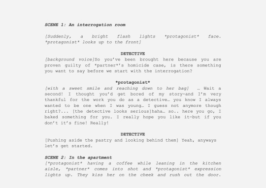
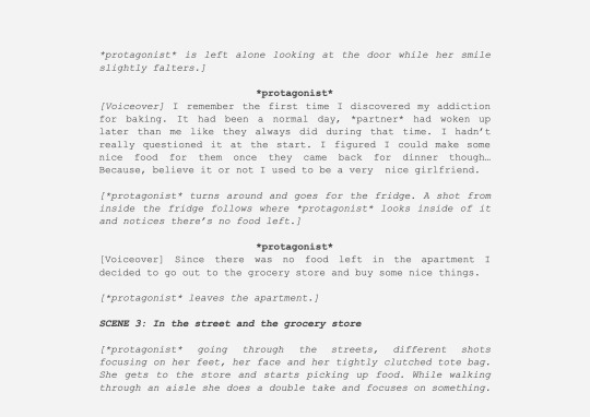
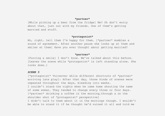
*protagonist* is brought in by the detectives to be interrogated after being concluded that she killed her partner in their shared apartment one night. When asked if she wanted to say something, she offered the detective some homemade cake, hurriedly apologizing if he didn’t like it. She now starts telling the story of how the story built up, her voiceover being more present rather than real diegetic speech. One day her partner comes home drunk in the morning, hugging *protagonist*, who can see some hickeys on their neck. *protagonist* tries to ignore it and goes on to make breakfast. She thinks about making a nice dinner for them and hurries to the grocery store, where she sees a very nice cake and decides to buy it. When she comes back to the apartment, she eats it and realizes that it’s delicious, and she decides to start baking. The story keeps the same track of her relationship falling apart while she also becomes more and more obsessed with baking, forgetting about any other priority and other interests. She snaps after she sees her partner on the door of a bar/club flirting with another person. This makes her furious, since she now holds no pity or love for them anymore, and it marks the point in which she turns completely crazy. She goes back to the apartment and starts destroying all of the cakes. In the midst of doing this, her partner has come home, but her hallucinations stop her from seeing them, and instead of stabbing a cake she stabs them. She throws it to the floor and suddenly, we see the same shot of the eyeline view where she looked at the cake on the floor, but now we can see their partner lying in that same spot with stab wounds on them. A silence fills the room, only being able to hear her loud breaths from so much exertion. Now there’s a cut to her in the detective room laughing while having some of the cake she brought, she stops and says while smiling: “Soo… in conclusion, yeah I did kill him”.
SCRIPT:
FOR A CLEARER DOCUMENT OF THE SCRIPT PLEASE CLICK HERE


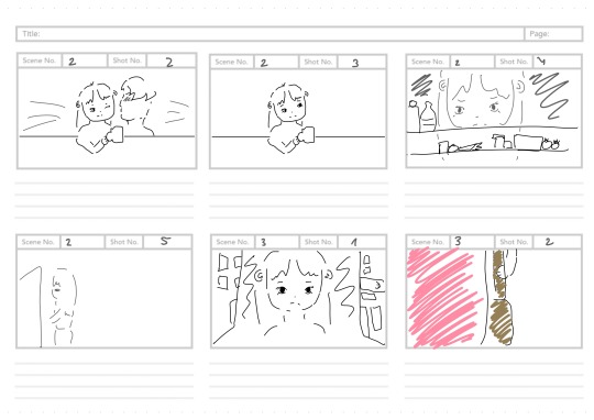
STORYBOARD:

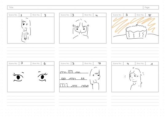


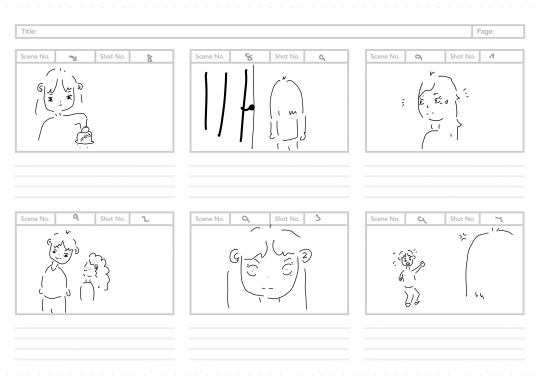
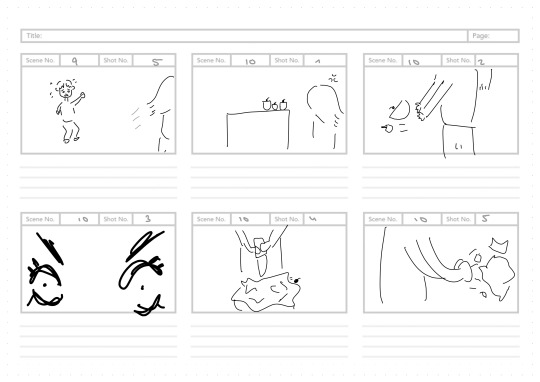

I also made a list of very specific props i had to use for each scene so that I’d have everything organised and filming could be easier.

0 notes
Text
Research + Analysis + Planning
RESEARCH + ANALYSIS
https://mariazarcos.tumblr.com/post/644097245902487552/research-analysis
PLANNING
https://mariazarcos.tumblr.com/post/644097135502147584/planning
0 notes
Text
Media in quarantine
CLICK HERE TO WATCH THE VIDEO

In this project I had been asked to create a project where I talked about the influence the media has had over my life during quarantine.
After some thinking, I inspired myself off of YouTubers like Emma Chamberlain or Antonio Garza, who became famous thanks to their funny and casual editing skills. Comedy is the main element in their videos even though they are doing something else, so I got to work and acted as though I had to go out to study and I was getting ready to do so.
Though it may seem simple enough, there was a lot of editing behind the scenes. I got to experiment with different effects and cuts, which would later help me be more skilled when editing my A2 portfolio short film.
0 notes
Text
Quarantine work
This section quickly showcases some works about how media influenced my life in quarantine, before I started working in my A2 portfolio. I feel like these projects pushed me out of my comfort zone, and I tried new styles of filming, editing and acting. This new learned knowledge would later help with my confidence in filming and post-production as well as coming up with a creative idea.
Project Links
❧ 1 Minute video
❧ How media influenced our quarantine experience
0 notes
Text
Quarantine 1 minute video
CLICK HERE TO WATCH THE VIDEO
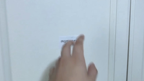
Since our lives have been struck with this unexpected event of a global pandemic, I have learnt and developed as a person during the time. When coming back to school we have been given some projects in relation to showing our self growth and experience in general. This one consisted in coming up with a one minute video that showed our quarantine life.
I focused on showing how difficult it was to gain motivation during quarantine through a short skit. In it, you can see how since the moment I wake up, I get ideas of how I could gain motivation, but constantly failed to do so. I finally get my energy through working out, but by the time I do so, the day has ended and I have to go to sleep. The video could go in a loop if you consider that the start and the end happen in the same place, meaning that life in quarantine feels like living the same day over and over.
I experimented with many angles and camera movements. For example:
Extreme closeups
Eyeline shots
High angle back shots

Low angle shots

0 notes
Text
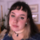
About me
What’s up! My name’s Maria Zarcos and I’m a seventeen year old Spanish girl with too many ideas and too little time that happens to study Media A level.
I’m currently living away from home on a different city by myself, and i plan on moving to the UK for uni, so I guess you can say I’m quite the free spirit.
I love to watch anime on my spare time and I listen to all kinds of music. Like every other teen nowadays, I also love browsing the internet. I am quite interested in recent affairs and culture in society, so I like to keep up with what’s going on and contribute in whatever I can to achieve a better world.
I am avid fashion enthusiast, I love statement pieces and changing my appereance more often than not. Color coding and giving everything an aesthetic is something eveyone should already expect from me to do in all aspects of my life. From decorating every corner of my room, to creating -sometimes overbearing- colourful notes or even organising my many Spotify playlists inthrough pictures, my life always follows a specific visual. Thus, how I ended wanting to make a music video for my portfolio.
My hobbies (if I can even call them that) are mainly reading, visiting art museums and singing in the shower. I also really enjoy going on picnics with my friends.
I hope you’ve gotten to know me better and enjoy the extravagant ride that is my blog!
1 note
·
View note