
mariecaeciliablog
by Marie Preuss for the Massey Spatial Design Course
21 posts
Don't wanna be here? Send us removal request.
Last Seen Blogs
sweetpaintedladie
you’re far too kind, don’t ever let it show
bl1mby
Bababoey
anaisdraw
Anaisdraw
vinceaddams
Approximately 23 Unfinished Sewing Projects
deyzan14
Deyzan 14
Text
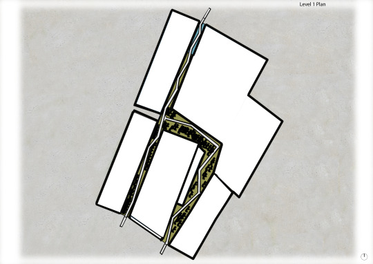
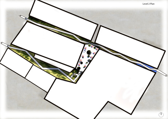
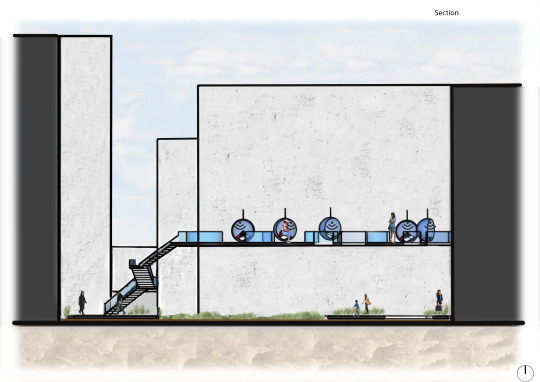
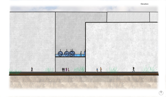
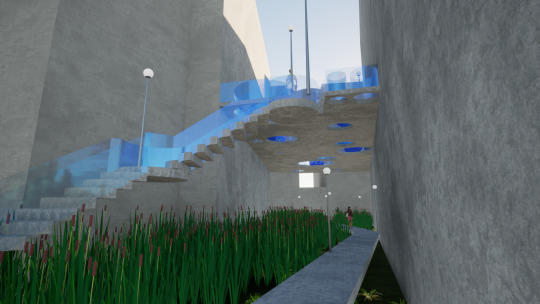
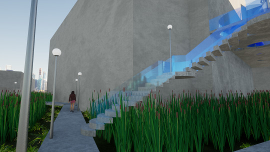
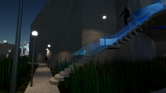
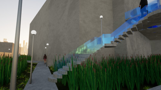
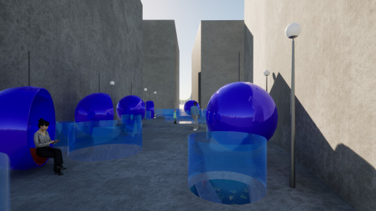
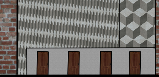
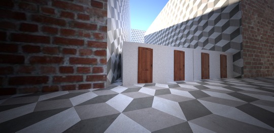
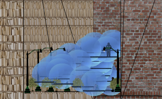
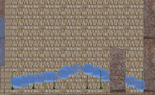
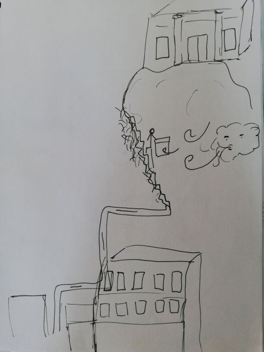
Week 6: Hand-in Take #4 Adaptation on Opera House Lane
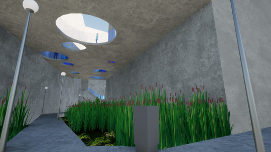
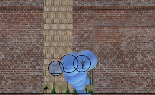
The Opera House Lane has experience with adaptation. Once part of Wellingtons original shoreline, a rich wetland and home to Maori culture. Today, a busy inner-city connection bordering one of Wellington's centers of art, the Opera House. The new outdoor library is the latest adaptation of the site. Through audiobooks, we learn about our past, present, and our future. This site enables all cultures through education while providing the individual with a comforting atmosphere. A blend of restored wetland and futuristic glass and concrete creates a contemporary atmosphere.
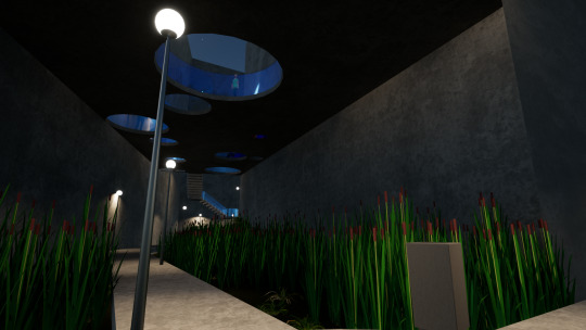
Please note that Skindigo stopped working, which is the main reason I created my perspective images through Twin motion. I decided to provide a range of Perspective Images because of two reasons: My time function in Twin motion doesn't work in the video mode, which is why I thought providing night images is useful, and the feedback from my presentation suggested it. The other is that I realized that by using the whole site, the drawing images seem small and don't show a lot of detail. But when in perspective, my design creates the most significant impact.
Final Video:
https://www.youtube.com/watch?v=SKiw8Hx6wa8&feature=youtu.be
In reality the following native wetland plants are used:
Toetoe
Oioi
Harakeke
Hukihuki
Pūrei
Isolepis
Toetoe upoko-tangata
Swamp kiokio
Raupō
Wīwī
(” Common native wetland plants”, Greater Wellington Regional Council, 19 June 2014, http://www.gw.govt.nz/Common-native-wetland-plants/)
0 notes
Text
Week 6: Feedback https://www.youtube.com/watch?v=C15J3_F-2hk&t=2s
I presented my Design with the video which I linked here.
Copy of Presentation feedback and questions
How does the space transition from day to night: considering atmosphere and light?
Answer: I need to provide Images at night time because this function doesn't work in my Twin motion version.
What materials and textures have you used? And why?
Answer: Unruly natural wetland and clean, modern concrete paired glas.This choice of material difference gives my design a deeper context to the site. Not only visualizing the historical context but also how our society evolved from that state to now.
Who is the space for? How is it used?
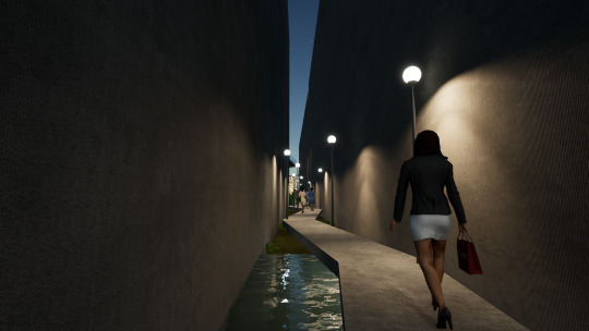
Answer: The space is a pathway between two busy streets but also provides the option of going to the second level to experience the audio library. It is up to the user if they only want as a connection way or if they want to find out more about the site.
How accessible and practical is your design for the site and users?
Answer: My design is not accessible for people in wheelchairs because the pathways are to narrow and because of the stair set. Unfortunately, I can't change that. The site itself is narrow and doesn't allow space for the changes I would have to make for that to change.The design is practical for all other users because the original use of the site isn't lost. It is up to the user if they only want as a connection way or if they want to find out more about the place.
How does the design relate to the site? E.g.: historical context, physical characteristics of the site, cultural context…
Answer: I provided historical context by recreating the wetland and indicating where the shoreline used to be. By playing audiobooks with materials from the different ages in the audio library and the material contrast, I am visualizing how we evolve through literature as a person and then as a society.
How do you want people to feel in your space? (reminder - mihimihi + site + programme (passage)
Answer: The curved pathway stops the people who are just passing through from looking directly to the other end of the site. Instead of looking at where they are arriving, they are made to look at the wetland around them. This creates a relaxing effect. The possibility of them experiencing the space further is getting higher through this. The second level provides interest through Elevation. The bubble chairs paired with the audio library are supposed to soak people up n to the material they are listing to, which when creates a dreamy, interesting, and relaxing feeling.
What are you communicating through this drawing? What techniques have you used to do that?
Feedback about technical elements of the drawing?
Answer: I haven't created those yet
How does your design relate to your chosen mihimihi aspect?
Since my Mihimihi aspect is library/Books and how they can take over my mind and ‘soak me up into a bubble/Dreamworld, it is represented through the audio library, which is accessible in the bubble chairs.
What speed do people move through the space?
The pace is slowed down due to the curved, narrow pathway. This supports the relaxing Atmosphere.
Feedback:
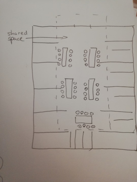
Show in your drawing where the audio library is
provide a list of native plants which you want to use since they might be hard to represent in images or Twinmotion
add sound to video
provide night images
slower the pace down at the staircase because we couldn't see the stair rail
tidy up the planting, it seems a bit overwhelming
0 notes
Text
Week 5: Take #4: Design Development
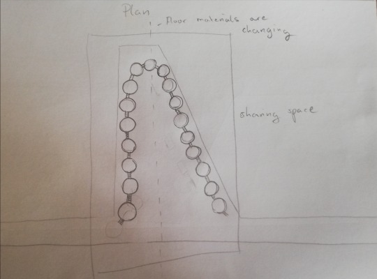
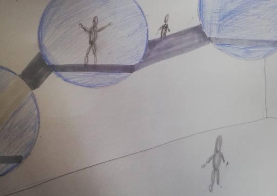
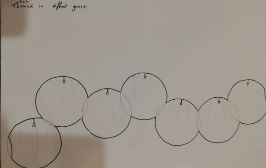
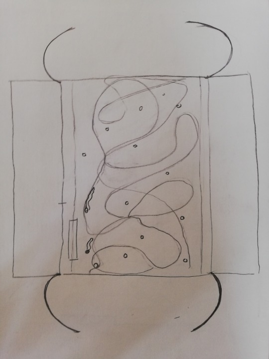
In Take #2, I visualized my Mihimihi aspect (Books, Library) by designing a passage made of bubbles. Each bubble was themed in a different genre. They symbolized the various dream worlds you can enter while reading a book. I wanted people to feel encapsulated by a publication or type when coming through each bubble. When walking through one of the bubbles, a different audiobook was played. The words and language used in every book are what make us feel encapsulated or in a dream world in each bubble. Each bubble or text was unique to cater to every individual. Every experience was unique, like our society.
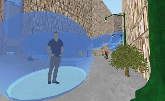
What I didn't like when reviewing Take #2 was that to reach the next, you have to walk through each of them. Which means the audience would get disturbed continuously by others. This Atmosphere is not suitable for listing to a reading and doesn't match the planned outcome.
So I tried to design a passage where you could enter each bubble separately.
Sketches:
Modeling it in to the site:
I fast realized that this concept doesn't fit very well into the site and that it would not communicate what I am trying to achieve. In this Take #4, it is important to me that my audience is not only getting "soaked up" by the bubbles. I want to draw attention to the evolution of the site. Because like mentioned before, my conclusion is that books do"soak" the reader up and influence thoughts, mindsets, and opinions. But by doing so, they are also helping our society to evolve. The Opera House Lane is a perfect example of how our community is changing over time too. Different public art styles, various construction materials, building alterations, altered land use, and the historic antique Opera house are examples of the changes that happened over time.
The evolution of once being part of a shoreline and playing a vital role in the Maori life to hosting the Opera House and being a busy alleyway and a connection to two busy streets is significant.
I want create a site which balances the past and present and find a harmonious way to represent the colorful identity of our society.
I started the design progress again by reinforcing my main aspects:
Mihimihi aspect: Library/Books
Relation to the site: Evolution of site
To find a way to communicate that I thought about the typical layout of a Library. All libraries have a quiet shared space where we can indulge ourselves with the found materials.
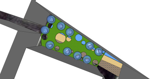
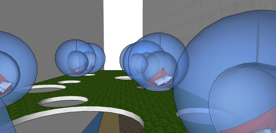
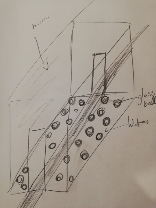
I designed a space where you can do so, but the material is provided through audio in each bubble. This area is located on a second level to give the site more space. I cut circular forms into the floor of the second level to let light in to the first level. In the glass bubbles are hanging bubble chairs to create a cozy atmosphere, which is necessary to indulge the listener into the audio material. The round form of the chair compliments the circular theme. By hanging above the ground, they support the idea of being soaked up into the world of the audiobook. On the first level, I recreated a shoreline by using materials that represent this. The recreated shoreline reminds us of what the site used to be. The water acts as a reflection pool with the shadows from above. To deepen the idea of evolution, I am thinking of using audiobooks that describe the diverse history.
Based on Feedback which I was given on Friday, I rethought the following aspects of my design and made changes based on them:
Revisit the form of the bubbles surrounding the bubble chair: Are they necessary to communicate your design? Also, consider the material of these (they are currently made of glass). Because how do you ventilate them? (glass heats up fast so it would get quiet moist in there)
My conclusion is that I don't need the glass bubbles because the chair inside already has the same form. That solves the ventilation problem.
Find out where the original shoreline used to be rather than making it up.
I did some research which looked like this:
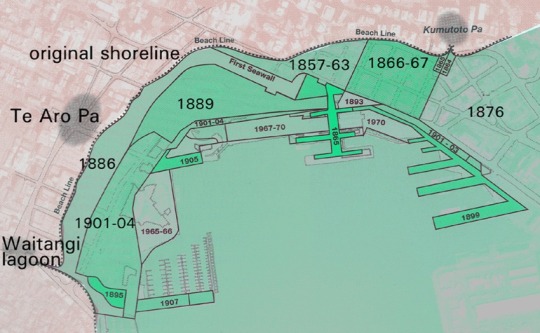
(”waterfront reclamation”, Wellington City Council, https://wellington.govt.nz/about-wellington/history/history-of-wellington-waterfront/waterfront-reclamation)
I took that map and put it over a google map image of the site:
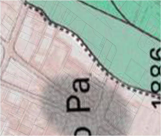
I then uploaded that image into Sketchup to draw in the water. I then researched how the vegetation around that area might have looked back then.
I found out that New Zealand used to be covered in wetlands to that time.which is why I decided to recreate one in my site.
( Mitchell Charlie, ”New Zealand's disappearing wetlands continue to be destroyed “, stuff environment, 12:42, Feb 02 2019, https://www.stuff.co.nz/environment/110263799/muddy-damp-and-disappearing-wetlands-continue-to-be-destroyed)
When thinking about visualizing a wetland in an urban space, I took inspiration from the image below.
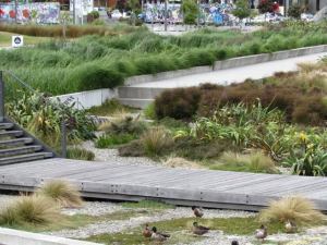
( BFF editorial team, Waitangi Park – an urban wetland recreated, ENVIROHISTORY NZ, 12.Dec 2010,https://envirohistorynz.com/2010/12/12/waitangi-park-an-urban-wetland-recreated/ )
The concrete used in the Waitangi Park inspired my Materials. Because I like the contrast, it creates between the unruly natural wetland and the clean, modern concrete. This choice of material difference gives my design a deeper context to the site. Not only visualizing the historical context but also how our society evolved from that state to now.
My Design looked like this after making the namend changes:
https://www.youtube.com/wathttps://www.youtube.com/watch?v=C15J3_F-2hkch?v=C15J3_F-2hk
Note: My Twinmotion version is not allowing me to change the time of the day while video recording.
0 notes
Text
Week 5: Class exercises
TASK: Draw a plan, section, elevation, perspective of your design as you know it to be now. 20 mins to complete this task - things to remember you are showing through these drawings include; planning, layout, materials, use, experience and atmosphere.
This is a an opportunity to understand what you do and don't know about your design so far - what areas you need to develop further and in more detail.
Conclusion: Think further about Materials for the ground and walls, also consider the atmosphere more.
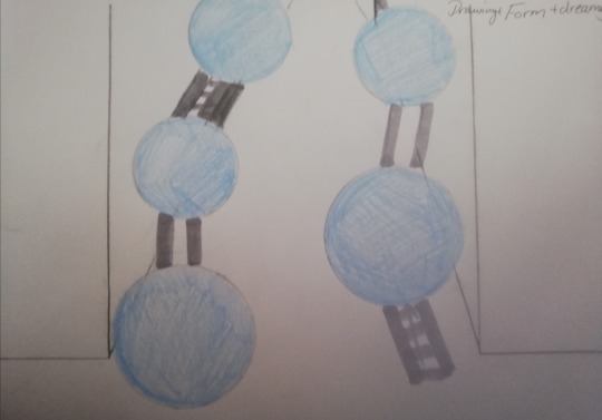
Recreate a drawing of your design using one word from each column as a guide: e.g. Painting - Light quality - Cluttered
-Do this 3x times 3 diff ways. The idea is to quickly test different ideas. So depending how quickly you work don't spend too long on a single drawing. A strategy could be apply the technique to enough of the drawing that you can test the effectiveness of it.(30min)
sketch+sound+historic context
drawing+encapsulating+intimate
drawing+form+dreamy
0 notes
Text
Week 5: Take #4 Brainstorming
I decided to base Take #4 on my Take #2: Books/Library.
In Take #2, I focused on capturing how books soak the reader into its world. To Take this Idea further and relate deeper to the site, I thought about the same questions about my Mihimihi aspect and the site again: What are the physical, emotional, and spatial qualities? Which looked like this:
Aspect of Mihimihi: Books/Library
Physical qualities:
new & old - Literature, paper, book covers
home Libraries
public library
ebooks
book shops - second hand, vintage & modern, new
words, language, writing style - millions of variations
Spatial qualities:
space to walkthrough filled with books sorted in a specific order
places to sit and read, think
quiet
sharing experience - lots of different people walking using the same space
Emotional qualities:
learning
transporting the reader from the present to the past, future, storyline
changing thoughts/opinions = influencing your identity = evolving mindset
Site: Opera House Lane
alleyway
long, narrow
dark
various wall art
connects to busy streets
mixed materials
cultural history: used to be part of the shoreline that bordered Wellington and where Maori gathered food = Meeting point
historical building: Opera House
= evolving society
I made the text bold of the points which stand out to me and show similarities between my chosen element and the site.
My conclusion is that books do"soak" the reader up and influence thoughts, mindsets, and opinions as visualized in Take #2. But by doing so, they are also helping our society to evolve. The Opera House Lane is a perfect example of how our community is changing over time too. Different public art styles, multiple construction materials, building alterations, altered land use, and the historic antique Opera house are examples of the changes that happened over time.
The evolution of once being part of a shoreline and playing a vital role in the Maori life to hosting the Opera House and being a busy alleyway and a connection to two busy streets is significant.
It seems to me that this space is trying to balance its past and present. It also appears to struggle to find a harmonious way to represent the colorful identity of our society.
0 notes
Text
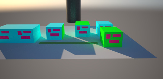
Take #3
Take #3 is inspired by idea 5 - Labyrinth from the last blog post
Rows of cubes building a labyrinth
I changed the height to one level so that I don't add another towering shadow to the site
Some of the doors are locked to create a maze = makes it seem impossible at the start of the journey
it represents the journey of people who struggle with their mental health issues and the path they have to navigate
Only a few cubes have an open roof to let in some sunshine which represents the positive experiences made on the journey
Materials:
Cladding: plaster ultra-fine grey
Floor/walls of the site: regular concrete block pattern= concrete block pattern also announces the passage because they use very similar shapes
Atmosphere:
The regular, repetitive concrete black pattern creates an overwhelming feeling
the massive amount of grey plaster and concrete in combination with the limited light gives it a cold and dark atmosphere
on the other hand: The use of the same colors and materials make the original and existing site look tidier
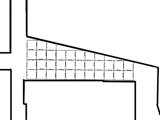
Plan
Section
Elevation
Perspektive
Note: I just realized how unnormal huge the brick walls are.
Video
https://www.youtube.com/watch?v=5BtOzsq2UQ0&feature=youtu.be
Review your design in twinmotion, how does it feel?
Is it communicating the qualities of your design?
Update your design
Export another video
Update your design in response to your experience with Twinmotion.
Does it need to be simpler? More complex? Maybe a different texture or some lighting added?
Please note that i could not ad this part anymore because I saved that file on the University Computer.
Video drawings
https://www.youtube.com/watch?v=pjUknQD0I-E&feature=youtu.be
focus on repetitive pattern and its overwhelming effect
https://www.youtube.com/watch?v=ah2olVs3nYM&feature=youtu.be
light situation located in a cube with an open roof
symbolizes the positive events in the journey
https://www.youtube.com/watch?v=SGjcjWiPoWo&feature=youtu.be
testing how you possible experience the site with other people being in the same cube since it is a very compact space
https://www.youtube.com/watch?v=zfEGmbrEk34&feature=youtu.be
demonstrates how confined and restricted the space is in a closed up cube
https://www.youtube.com/watch?v=pEG9AoiCl8s&feature=youtu.be
testing the site with bad weather and larger shadowing
0 notes
Text
Starting Take #3
Brief: New/reinvented /new design output with aspect of your Mihimihi
Brainstorming design element of mihimihi aspect
Research 5x examples/precedents at least one video in architecture/sculpture/stages/illustration/theater stages/music videos/concerts/retail spaces- focus on experience- narrative in space- how is The form/ what is the context and how is form with context related? Provide in depth notes and analysis
5x possible concepts representing the essence of the idea
Brainstorming:
Mihimihi aspect: Mental Health
Emotional qualities:
overwhelming
dwelling in past
obsessive
desire to escape
longing for peace
desire to control/plan in order to take over
anger/frustration/sorrow
finding coping mechanism- healthy ones- unhealthy ones
lacking understanding- from people or yourself
Physical qualities:
accumulation
perspektive is blurry
a moment of overwhelming infinity
creating a space which seems endless
repetitive
Spatial qualities:
overwhelming space and pace
repetitive elements
loud and quiet parts
no ability to focus/ mind is obsessed
illogical
in relation to the site:
plenty of people moving through the site
Conclusion: I want to design a site where I recreate the emotions/thoughts of people who struggle with mental health issues. So that the people who pass through the site experience and gain an understanding
5x examples/precedents:
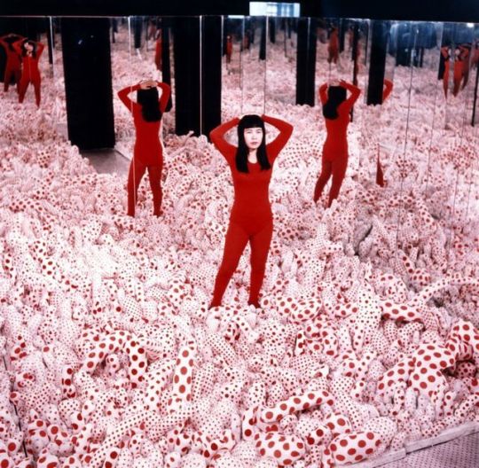
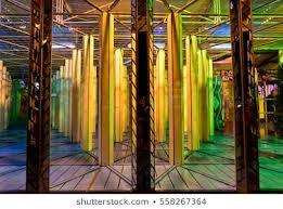
Yayoi Kusama
Infinity Mirror Room - Phalli’s Field
(“ Yayoi Kusama - Louisiana Museum of Modern Art” ARTSY, 2018, https://www.artsy.net/artwork/yayoi-kusama-infinity-mirror-room-phallis-field-floor-show)
Infinity Mirror Room - Phalli’s Field is a room in a room= atmosphere: enclosure, containment
stuffed sack covered in polka dots are covering the floor, the walls are lined in in mirrors= repetitive form, ceaselessly
flooring provides three-dimensional surface=Atmosphere: miraculous
the infinite way and has a hallucinatory effect, notions of infinity = unsettling, challenging experience
familiar boundaries (social, physical, psychological) are disabled
spectatorship is becoming one with eternity and is participating/active mode
= contemplations of complexity thematic concerns of similar/not natural defined images
youtube
(“Kusama's Self-Obliteration (Jud Yalkut, 1967)” YouTube, Jujyfruits, May 6, 2013, https://www.youtube.com/watch?v=n6wnhLqJqVE&feature=emb_title)
1967, Yayoi Kusama and Jud Yalkut, film/performance art piece
we watch how Kusama paints everything around her with dots: cats, humans, horses, water, herself,etc.= every conceivable surface
the dot is a universal device and can stand for many things(e.g., the world, community, the whole, the individual, all of us floating becoming one)
using intercuts and superimpositions = hallucinatory effect
extensive use of dissolves
dissolves of still photographs to create the illusion of movement and time-lapse
Kusama becomes one with her surroundings in the process of painting everything e.g., watch scenes 2.10 - 4.17 = metaphor of giving up identity, abolishing uniqueness, and becoming one with the universe- or “self-obliteration.”
lighting= dim = hard to tell the difference between people, objects, and the environment
people seem entwined with the background of polka dots
Non-narrative film
fast- and slow-motion sequences, often free-moving camera, zoom-ins and -outs = dreamlike atmosphere
= everything fuses together, to a whole
vimeo
(” Adidas - Floria Sigismondi, vimeo, Special Inc Ops, 2013, https://vimeo.com/58136896)
creepy whispering in the dark, different volumes = certain sound make you feel a certain way
dim light
merged, blurred images
slow and fast sequence
atmosphere = sinister,spooky
the fast visual language is creating an emotional impact
youtube
(” Marilyn Manson - Tourniquet (Official Music Video), YouTube, Manson, Marilyn, Oct 7, 2009, https://www.youtube.com/watch?v=MmfQ7gSaJgM&feature=emb_title)
dim light with parts of bright light
multiple storylines becoming one/fast switching = overwhelming atmosphere= in a way we all have the same rooted fears and dreams – part of that ‘collective unconscious’
blurred out images
unreal images awaken fears
sound is intense/confronting
fast scenery stimulating unconsciousness
(”The secretive siblings creating beautiful, defaced artwork, Portraits of a life” huck, Flynn, Niall, 18th October 2017, https://www.huckmag.com/art-and-culture/art-2/secretive-siblings-creating-beautiful-defaced-artwork/)
individual portrait with the face blanked out
unconventional norms and forms
breaking rules of form/colour = breaking physical qualities = typical physical experience changes
bright,various colours
atmosphere: confusing, overwhelming, intense
communicating design through various sections
5x possible concepts representing the essence of this idea: I want to design a site where I recreate the emotions/thoughts of people who struggle with mental health issues. So that the people who pass through the site experience and gain an understanding for it.
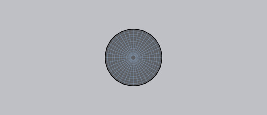
Idea 1 - Mirror Room
round room made of mirrors (inside/outside/roof) = seeing your yourself infinitely is overwhelming
hallucinatory drawn pattern on floor= soaking you up
represents people who struggle with their own identity
pattern example:
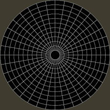
Mirrors rooms like you can find in a Fair are the inspiration:
Exterior

Plan
Idea 2: Multiple rooms in one
Multiple rooms in one create the feeling of enclosure/containment
I thought of covering the first room completely with mirrors to confront people with their own reflection.
The second room could be covered in pattern which create a hallucinatory effect.
The last room would be painted completely black but the roof would have a small opening. Light in relation to darkness. The darkness is overwhelming and the light is far away/small
represents the program of of mental health decline


Idea 3
Attaching this simple but uneven linear design on the walls and also hanging in the air achieving a hallucinatory effect
it makes the space feel very long/narrow and mentally exhausting
represents people who struggle with anxiety and how mentally exhausting it is

Idea 4 - Passage
The round balls are made of mirrors hanging in a painted black room.
The floor is partly made of water which provides another reflection.
The walkway is covered in an illusionary pattern to create an overwhelming effect.
There is lighting below the water.
No reflection from the walls but the mirror balls reflect light on to the the pattern floor and in to the space
These mirror balls, reflecting light in to the dark room make it a very busy and overwhelming environment
it represent people who struggle with panic attacks


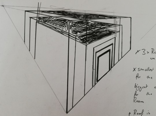
Idea 5 - Labyrinth
Rows of cubes building a labyrinth.
The central cube is the only one with an open roof. This means that the complicated way to get there is very dark. It seems impossible at the start of the journey.
it represent the journey of people who struggle with their mental health issues and the path they have to navigate


0 notes
Text
Week 4: Experience – moving through time
Atmosphere- feeling of materials and Light
Technical conversations -code showing/representing spaces in 2D- how the space/design is used/organized/planned
Site: physical qualities- how this informs your design-what you design/how it is designed- provide context/social/historical/physical
Time/Experience
sun travel, history, decade, generation, transform, dissolve, fade, decay, slow, fast, day, night, year, months, minutes, seconds, epochs, century, geological
= describe different durations/ how long something is/ what time feels like/ how long something feels
Duration
Time Lapse- change through time
Light- shadows depending on time of the day
sequence- 1,2,3+ data chowing change
repetition - even, speed up, slow down, random
How does time work in your design?- how do we experience it in your site
Methods:
Journey Map- what people are doing/feeling/seeing/smelling
Storyboard- chain of images
Quality of time
frantic
slow
fast
leisurely
stagnant
take time
languid
steady
take time
reflective
rush
How to capture the quality of time/ The way the movie is made?
Vidio example for quality of time: rushed
https://www.youtube.com/watch?v=OtCCY61oAzg
0 notes
Text
Take #2
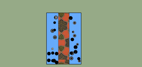
I decided to work with Idea five from the last Blogpost, the passage made out of bubbles. Each bubble is themed in a different genre. They symbolize the various dream worlds you can enter while reading a book. I want people to feel encapsulated by a book or genre when coming through each bubble. When walking through one of the bubbles, a different audiobook will be played. The words and language used in every book are what make us feel encapsulated or in a dream world in each bubble. Each bubble or text is unique to cater to every individual. Every experience is unique, like our society.
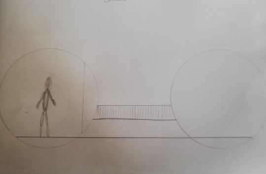
The bubble is meant to take the person out of reality by going up into the air and looking down through the glass, giving perspective and a changing view. Elevation provides interest.
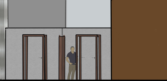
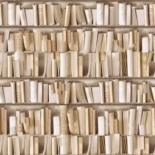
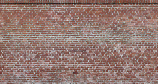
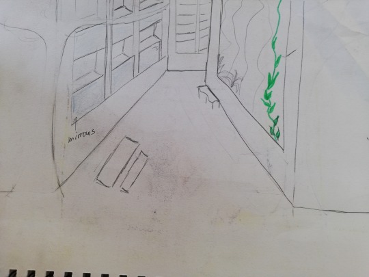
The site I designed also displays historic street lighting, which is in relation to the opera house. Some of the walls are covered in motives of library shelves, which indicates the passage. Others are made of old bricks, which imitates the ones we can find on the exterior of the opera house.
Note: I had issues to visualize the technical elements of the drawings at this state. (No perspective, section cut - darker, people in the sections, perspectives and elevations)
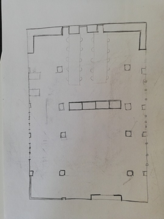
Plan

Section
Elevation one and two
Perspektive

Materials:
0 notes
Text
Starting Take #2
Aspect of my Mihimihi: Books/Library
Brainstorming
Emotional qualities:
being ‘soaked up’ in the world of a book/in a ‘bubble’
books can take over your thoughts
influence you/change your thoughts/options/language
emotional relationship to topic or characters of the book
Physical qualities:
paper ((new paper = white, fresh), (old paper = yellow, stained, there is a certain smell to old library books)
hardcovers,soft covers with endless variations of titles, generes and motives
words, language
public libraries
used bookshops like Pegasus Books Wellington, New Zealand https://www.facebook.com/pegasusbooksnz/videos/1389386271096503/
reading at home
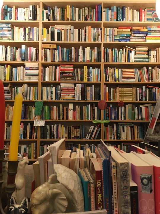
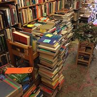
source: https://www.facebook.com/pg/pegasusbooksnz/photos/?ref=page_internal
Spatial qualities:
quiet
dream world
inventions to different worlds
enormes amount of books
Site similarities:
historic
cultural
shared experience
spacious
Ideas in sketches:
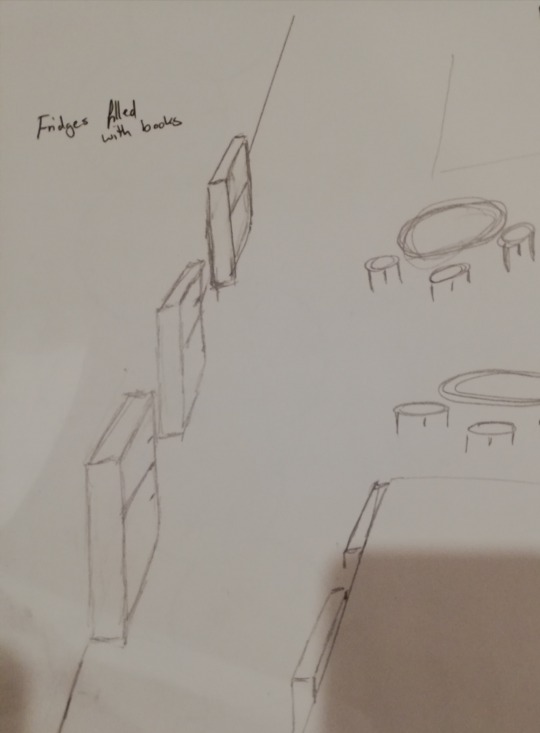
This sketch displays fridges along the site. Seating options are provided too and inspired by the fridges you sometimes see on the side of a road which is filled with books. Next to them is usually a sign saying to help yourself.
Shared experience aspect:
You can share your favorite books with others
take a book and keep it as long you need to when eventually bring it back
read quiet side by side
Conclusion:
I don't like the aesthetic appearance of the fridges, but I like the shared experience aspect of it.
Idea 2:
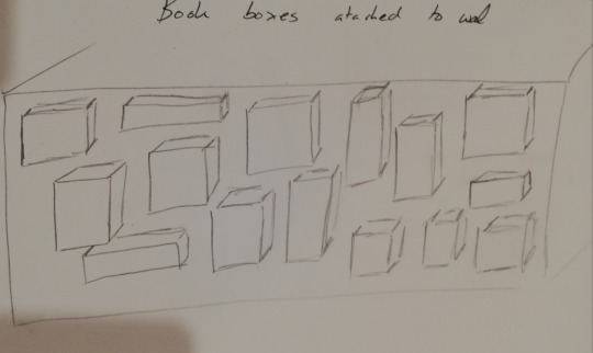
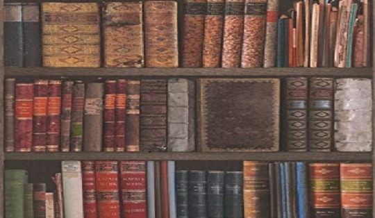
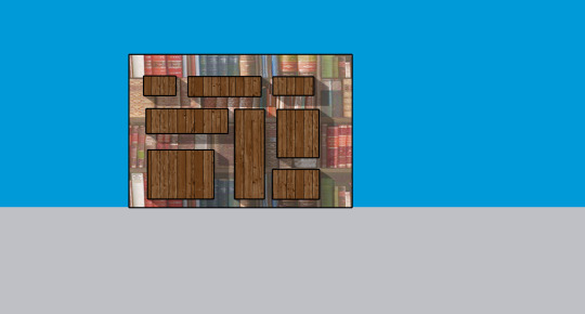
Wooden boxes are attached to the walls of the site. Bookshelf wallpaper underneath. Inspired by the same sharing aspects of Idea 1, but it is a more aesthetically appealing version of it. The materials are inspired by the pictures of the Bookstore I shared in my Brainstorming.
Idea 3:
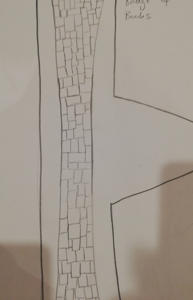
Sketch for a Plan which shows a bridge. The bridge is covered in book covers. The idea here is to give reading inspiration and to show how individual books change or influence your identity. It would start with famous children books to then slowly evolve into teenage genres. Scientifiction, thriller, horror, and later maybe philosophical and poetry?
Conclusion: I discarded this idea because the books you read in what stage of your life is very diverse and personal. There is no ‘right’ order; therefore, there is no right order for the bridge, covered in book covers.
idea 4:
I am turning the site into an actual library by providing tall shelving along the sides and glass roofing to provide protection from the weather and to utilize space and light. Inspired by Kyoto's City museum of Art in Japan. See previous blog post
Idea 5:
Idea 5 is a passage made out of bubbles. Each bubble is themed in a different genre. It symbolizes the various dream worlds you can enter while reading a book. I want people to feel ‘soaked up’ by a publication or genre when entering each bubble.
0 notes
Text
Images from Art and Design practices that utilise light or resonate with me
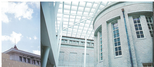
Kyoto City Museum of Art is Japans oldest public museum (founded in 1933). It has been recently renovated. In this image, we only see a part of the renovation. It displays the country yard, which now utilizes space and light through the new glass roof. The main entrance of the museum also received a glass facade which creates a new plaza. The original Japan imperial crown style has been preserved. The dense exterior walls completed with the modern materials, glass, and steel, create a contrasting design. Both styles enhance each other in this space and creates an airy and spacious feel. The sense of newness has been generated in its inherited history.
(photos: Kazumi Nakumura; Architekt: Juan Aoki; Source: Axis Journal 2/February 2020/vol 203/page: 6-8)
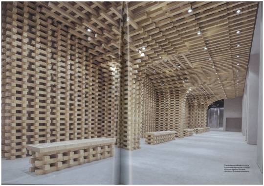
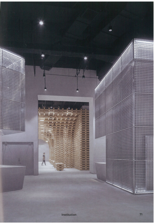
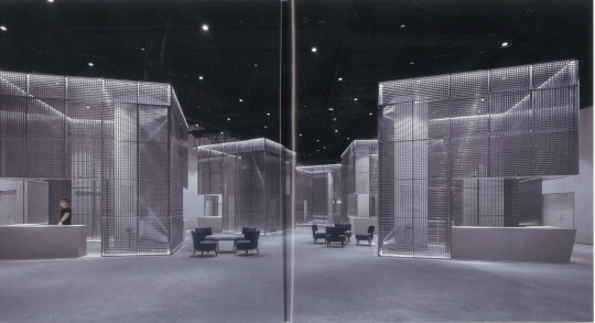
This space is called the Green Monster Lab and is located in the sub-district Chaoyang in the CBD of Wanging. The population of the CBD in Wanging struggles with an extreme case of urban dwelling. The architects from BANDe used spatial organizing to provide the audience with a visual rest where they can flee from the immense stress in urban life. They used tidying orders, which relaxes the mind to create a multifunctional space where the pace is slowed down. It includes an exhibition center, a traditional culture hall, a bookstore, and a brand exhibition space. The architects are trying to foster interpersonal connection by controlling the environment.
In my opinion, the design is successful in the sense that when I am looking at these photographs, I instantly feel inner calm and serenity. This design resonated with me be because of that reason.
(Journal: Frame- the next space/Issue 132/Jan-Feb 2020/page 66-73)
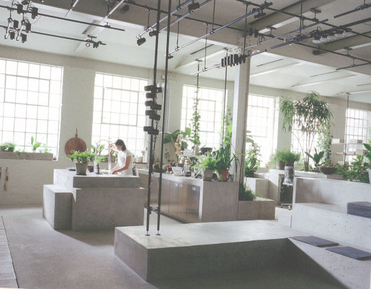
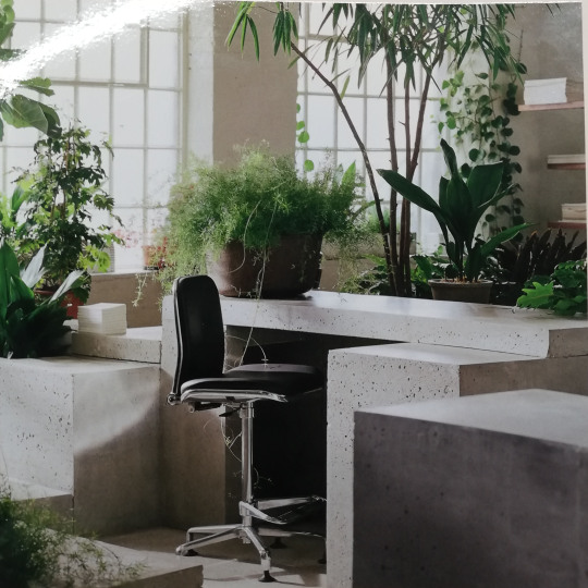
These images resonate with me because of the contrast of the plants against the undulating concrete scape. The plants soften the hard but clean and tidy surface. It creates the atmosphere of a constructive, positive, fresh, and energizing working space. The architect James Russell of James Plumb created this office.
(Journal: Frame- the next space/Issue 132/Jan-Feb 2020/ front page and page: 135,125)
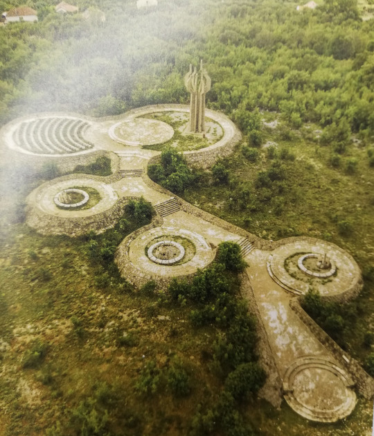
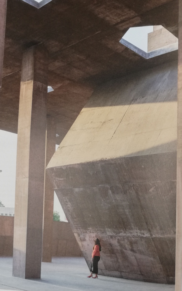
This Photograph displays the monument to the hanged patriots by Svetlana kana Radevic. This image reached my interest immediately. I am still unsure about exactly why, but I defiantly haven't seen anything like this before. It might be the form of the monument. It seems to be a monument, as well as a passage that you can walk through and experience.
(Journal: The Architectural Review/March 2020/page: 29)
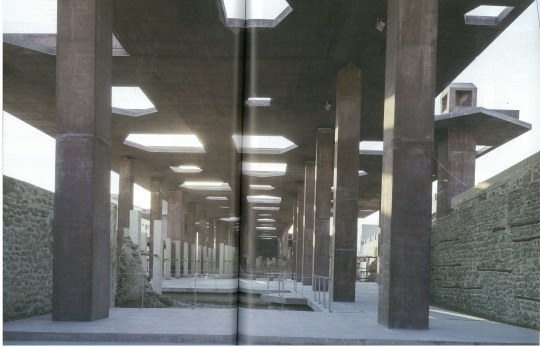
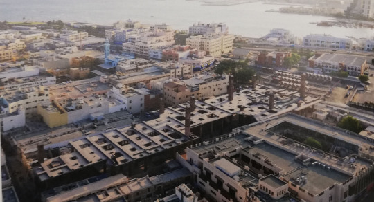
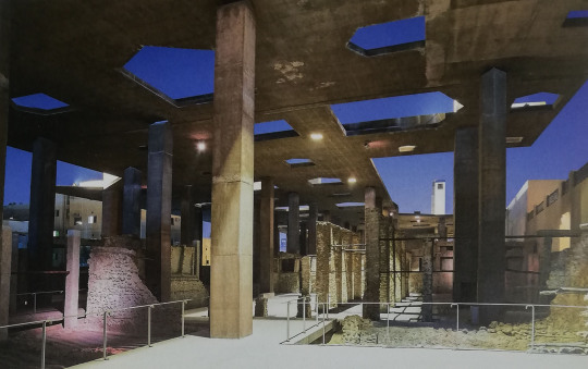
To see is the Pearling Path (Testimony of an Island Economy), located in the capital Muharram, Bahrein. This passage, designed by the architect Valerio Olgiah is utilizing and engaging with light in enormous amounts.
(Journal: Domus 1042 Planning /January 2020/page: 48-60)
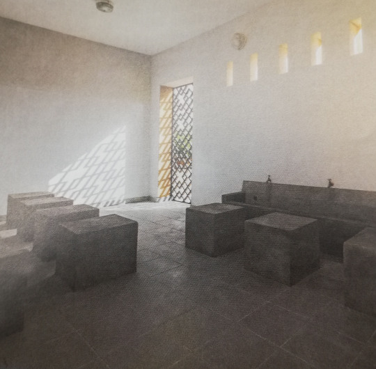
The three following images are all sourced from the Journal: The Architectural Review /March 2020.
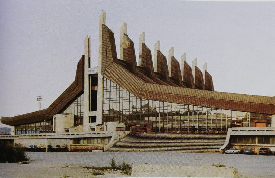
p.: 57
Russian gym 1973, photo: Roman Bezjak
Glass walls and massive wall openings in the entrance area letting in the a maximum amount of daylight.
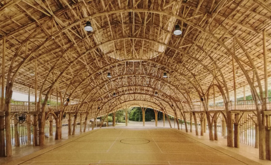
p.: 60
Chiang May Sports Hall/Chiangmai Life Architects 2017
Light is entering from all directions due to the open walls.

p.: 58
School gymnasium extension, Wetthingen, Switzerland/architects: mlzd/2016
Daylight is entering freely through the window hangings in the sunken passageway which also functions as access.
The three images above are showing gyms in very different places in this world. Their optical appearance is also very diverse. The main design element they have in common is their engagement with light. It is noticeable that they all try to absorb as much light as possible in their spaces. Gyms are social institutions that are designed for the body but for the mind too. That light is essential for a healthy mind is well known.
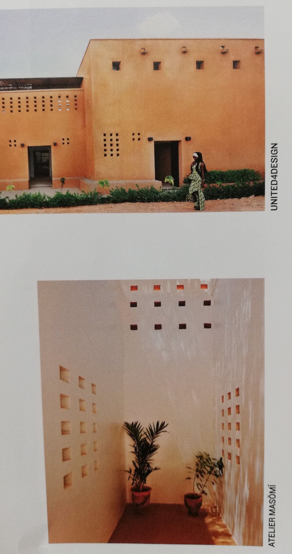
Niamey housing project architect/ architect Mariam Kamara from the firm Atelier Masom in cooperation with united4design
(Journal:The Architectural Review /March 2020.p.: 118)
Mosque in Niger, Niamey/architect Mariam Kamara from the firm Atelier Masom
(Journal: The Architectural Review /March 2020.p.: 115)
What I find interesting in both of these images is how Mariam Kamara is tunneling the light. She is letting the daylight enter the spaces but in a very controlled way. The main reason for that concept has properly something to do with the high temperatures in Niger.

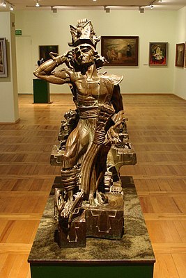
(” Bolesław II the Generous”, Wikipedia, Tync, Adrian, 9 July 2017, https://en.wikipedia.org/wiki/Stanisław_Szukalski)
Stanisław Szukalski (13 December 1893 – 19 May 1987) was a Polish sculptor and painter. All his works, practices, techniques impress and inspire me because I find his creations are one-time individual.
3 notes
·
View notes
Text
Week 3: Light and Atmosphere
Atmosphere is getting influenced by the following:
Feelings- what it makes you feel
Influences how you feel/emotional response
Senses- touch, smell,hear,taste- how we name/perceive
Atmosphere is mediated by
your own mindset/mood
your experiences
history connection
cultural and social factors
light
programe/people/who is there
materials- what is the space made of
5 photograph examples of atmosphere:
1. Walkway- friendly, creative, welcoming
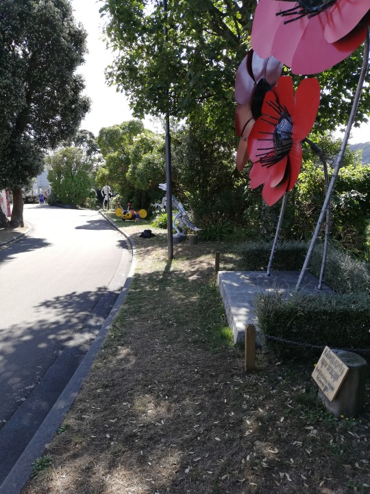
Parts of this walkway are very sunny with plenty of planting on the side. Large sculptures of different motives are placed which indicates that you are entering a creative space. The brightness and the plants make it feel welcoming. The generous width of the walkway creates the feeling of freedom.
2. Seating Area- bare, cold, uninviting
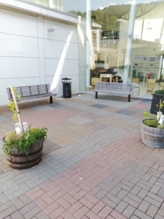
The light in this area is barely existing. A big shadow is towering over the space. This creates a cold and uninviting atmosphere. The space also seems bare due to the proportions of the park benches and the planter boxes.
3. Stone facade- safe, strong, imposing
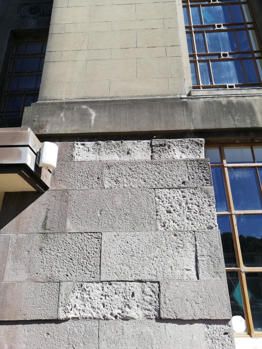
The uneven structured grey stones paired with the even greystones built a solid, strong structure which makes you feel safe. Due to the long livity of the material it also appears strong. The width of the walls and the heavy material have an imposing effect.
4. Access way- massy, unorganized, stressful
The disorderly range of different items make it seem messy and unorganized. It creates a stressful atmosphere.
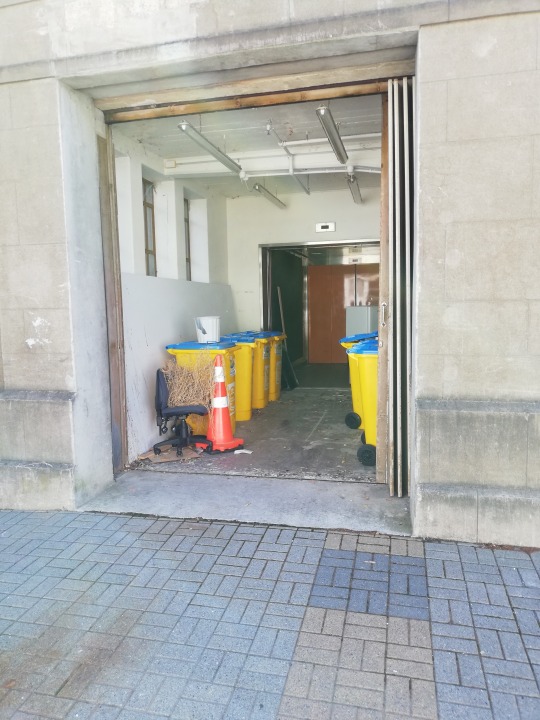
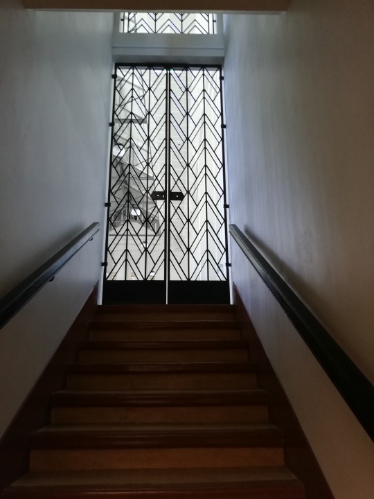
5. Staircase- inviting, bright
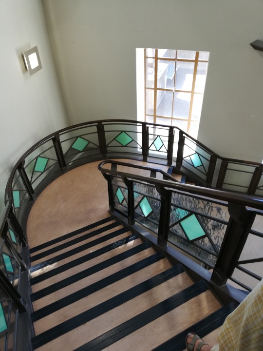
The large windows,the curved layout of the stairs, the see through frame work combined with the light green colour accent is creating a bright and inviting atmosphere.
0 notes
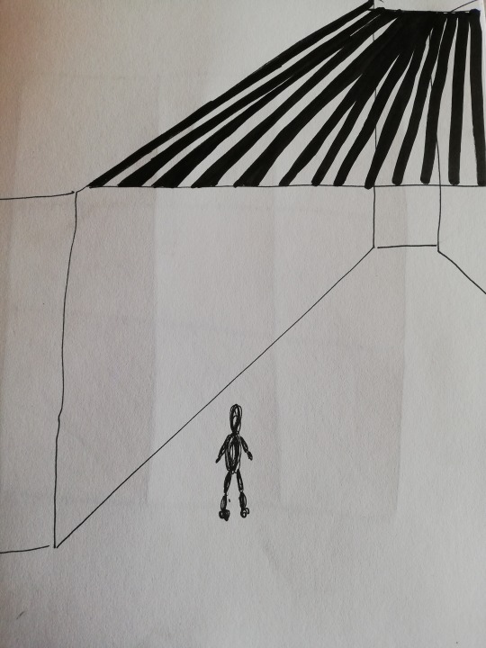
Text
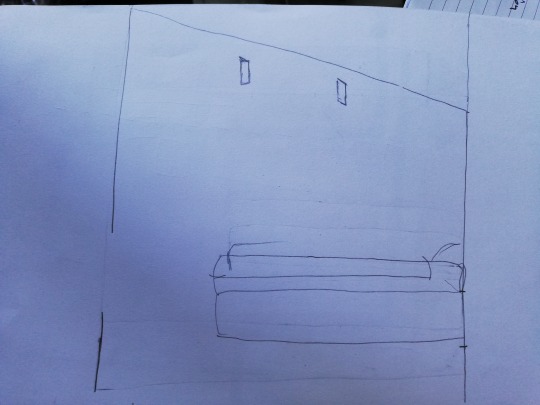
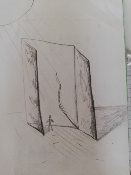
Week 2: Take #1
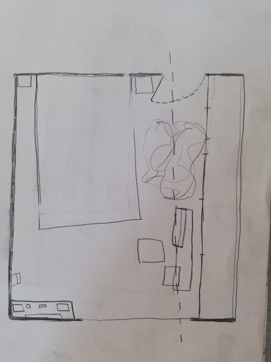
Plan
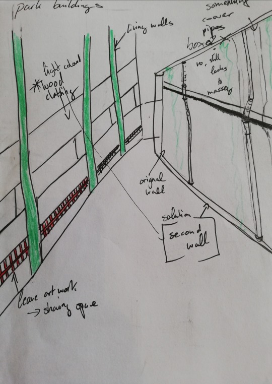
The cut for the section is marked in the plan. So is is the standing point for the perspektive and the chosen wall for the elevation.
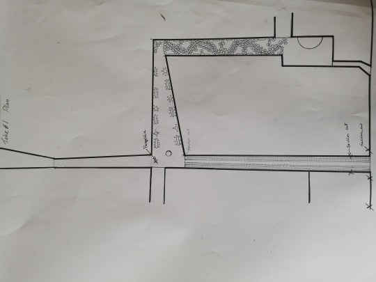
Section
In this section I made the mistake of drawing the background in Perspektive.
Elevation
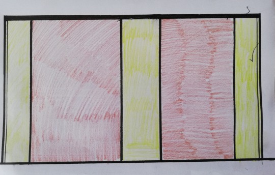
The elevation displays the original wall and the second new wall in front of it.
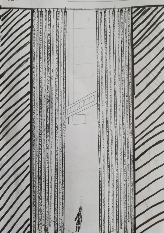
Perspektive
Sketches and Brainstorming:
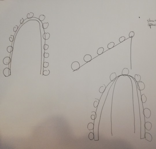
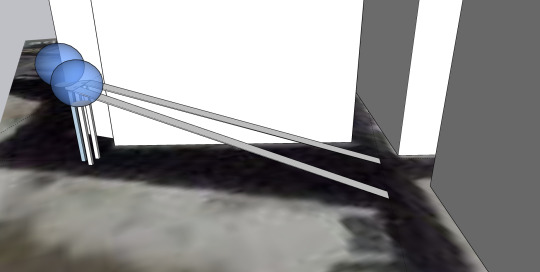
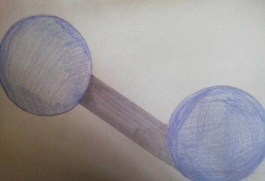
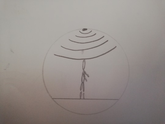
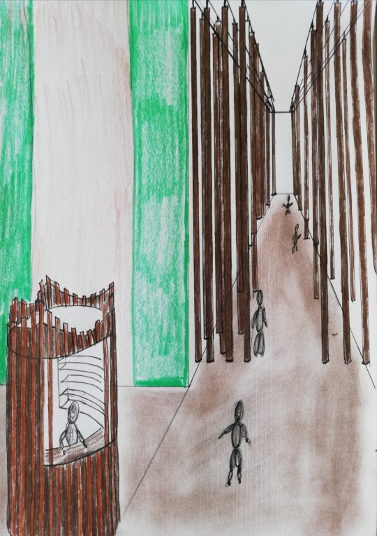
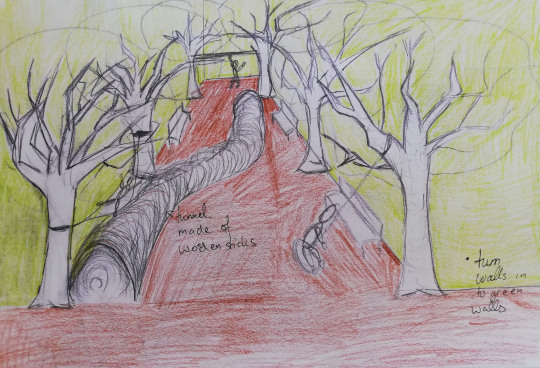
This was the first sketch I made for Take #1. I sketched it in class after deciding that the wind chime idea was the best way to visualize a forest. If you look at my previous blog post, you will notice that I combined a couple of my ideas here.
I decided to design three spaces in to my passage. All are connected with each other. I wanted three spaces because I think, it is the best way to combine my mihimihi element with the site.
Wind chime installation - The introduction to the passage, attracts people to explore the passage further- the “highlight” of passage
A space to create, think, relax, organize, meet - the forest always helps me to to breathe, think and create but this space is also in relation to the cultural history of the site. (The iwis used to gather food here)
Performance space- in relation to the opera house
This is the sketch where I tried to figure out where each space is going to be located and why. The following sketches show my thinking process, to the different parts of the passage, in more detail.
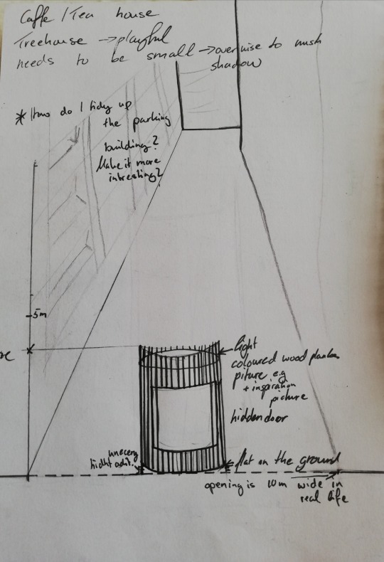
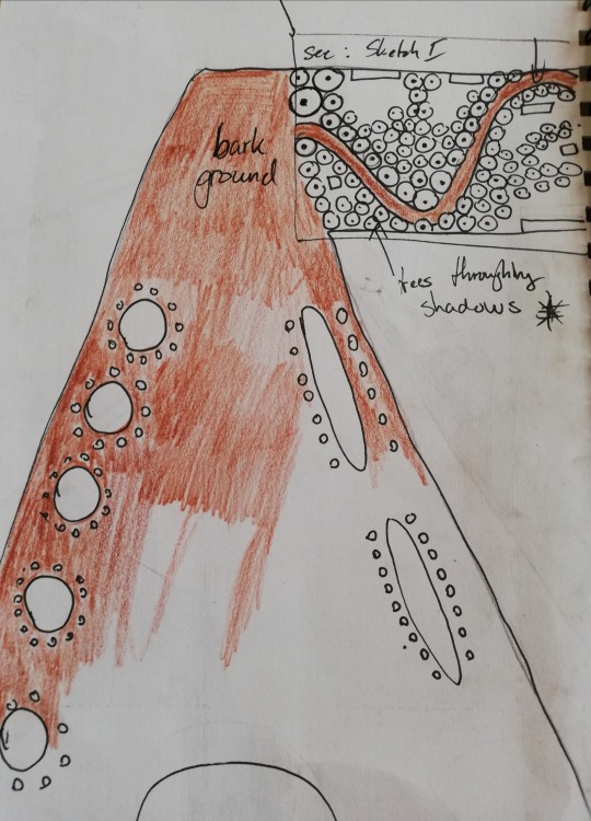
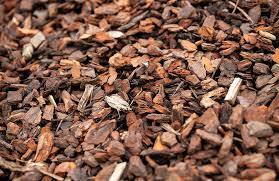
--Bark to create uneven flooring
Following pictures also inspired my passage:
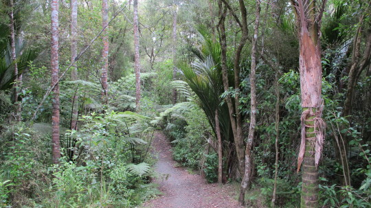
This photograph was the inspiration for the curved walkway. The Plants and the form itself stops the user to see the whole way down at this part of the passage. Creates the emotion of walking through a forest rather than a small park. It is also relaxing because instead of focusing on the end of the pathway and where you arrive, you are made to look at the plants and your surrounding.
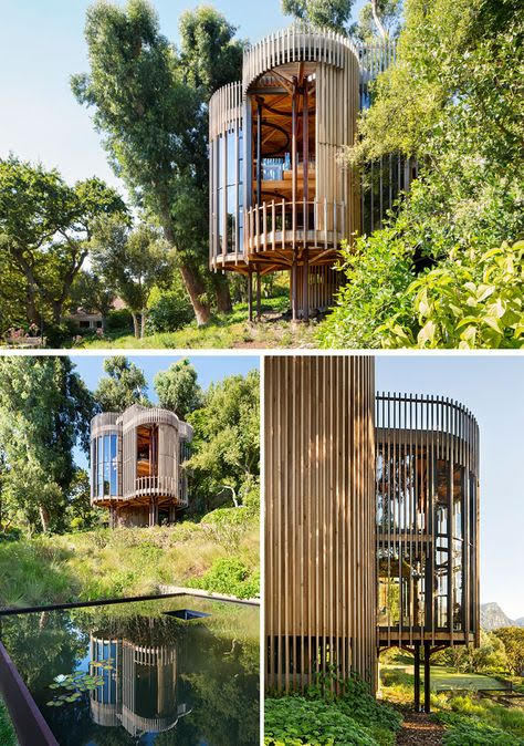
Inspiration for the Coffee house
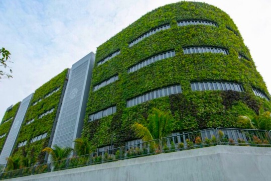
Green Wall inspiration
0 notes
Text
Week 2: Starting Take #1
Generate 5x possible ideas for passages that explore your chosen (single) aspect of your Mihimihi this week.
– Each concept idea will be as different as possible.
– Use a wide range of drawing techniques, collage, models, quick sketching, BUT at least one will be a SketchUp model.
– These designs are located in and should respond to our site; the Opera House Lane.
Chosen aspect of my Mihimihi:
Trees/Forest
Why:
my family owns a tree nursery in the second generation
my parents home is located in the middle of a field of trees which is part of the tree nursery
parents education: both studied landscape architecture
Family of hunters, gardeners
Physical qualities:
open/wide space
tall green trees
wide range of tones (greens and browns)
dying parts and growing parts of trees = old and young trees
changing colours with the seasons
producing oxygen which we breath
earthy ground
wood
Emotional qualities:
decreases stress/anxiety
better breathing = better thinking
witness of history
freedom
time to recharge
Childhood memories: using the the field of trees as a playground(tree nursery=nursery for children)
= creative space
Spatial qualties:
open, quiet, repetitive, sound of wind, uneven/dirty ground
Conceptional qualties:
urban forest
recharge space (breath, think)followed by action=space to create
a moment to ground
unwind
Site:
in the middle of the heart of Wellington
Opera = performance space, antique, historic theatre, 100-year-old venue, hosts variety of events (from ballet, theatre, Wellington’s home of comedy and is available for private functions)
hostel: multicultural guests
liquor shop
parking buildings
spatial qualities: long, dark alleyway, central location connection way between to busy roads
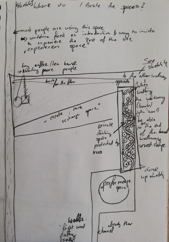
Idea 1:
This Sketch in “Birds eye view”, showing coloured glass with different greens which represents the different tones of green in a forest. The yellow represents the sun shining through leaves. The sketch also displays green roofs. I thought that this design would bring more light and colour in to the space.
Idea 2: Playground
Idea 3:
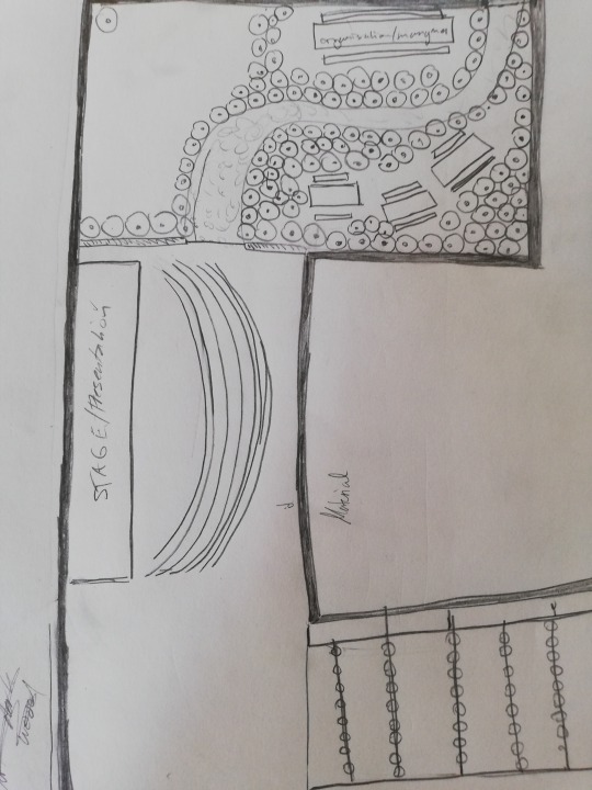
This is the start of a design for a plan: To see are round tables in different sizes which are separated by trees to accommodate different kinds of gathering. You could go there by yourself to eat, work and relax or with a bigger group. The plan displayed below shows the same idea but different executed. In this second take it also shows part of a stage which I designed in relation to the opera house. This means that if you would experience the space, you would start from the a busy, central located street. You would access the seating area (“recharge, think, create space”) through the small tunnel which connects these spaces. From there you could reach the “performance space”. The problem in this sketch is that I lost track of the scale of the site which means it wouldn't fit.
Idea 4:
This sketch shows a green wall on the right and on the opposite side you can see mirrors attached to the parking building. This was an attempt to make the site optically bigger and to show plants in a repetitive way without them actually being everywhere in the space.
Idea 5:
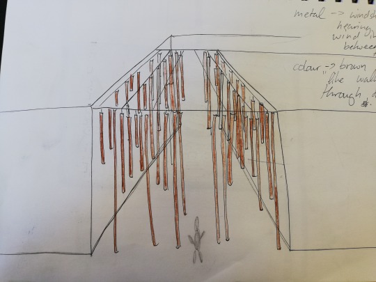
This sketch displays a thin metal frame on which metal pipes are hanging down. The idea is that they function like a wind chime. The noise created by them represents the sound of the wind going through trees. I painted the metal pipes brown so when standing in front of this installation, they look like tree trunks. I wanted to visually create a forest without actually using trees.
Material associations
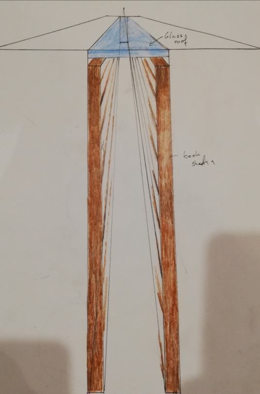
These two pictures were my inspiration the sketch for idea 5. The repetitive forms paired with the dark wood reminded me that there are different ways to symbolise a tree or a forest.
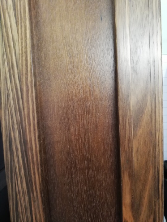
I wanted the material for the tables and parking benches in my designs to be simular to these material examples. The dark wood symbolises warmth to me which recreates the feeling of home. The grain of the wood we can see in both of these photographs is prove of the life the tree once lived. It is like an open book to read which leans on my thought about them being a witness of history. It also provides different tones of browns like there's are in an actual forest too. On the other hand this material is very dark and would not work in such a narrow, dark site like the opera house lane. I think the following example might work better.
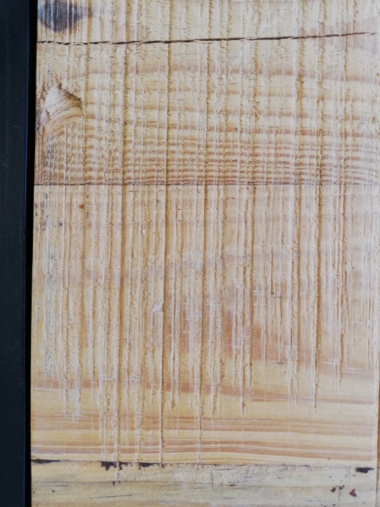
When I looked at theese photographs, I realised that even though this material is a lot lighter than the examples before, it still makes me feel warm and grounded. I believe that wood itself creates this emotion for me. It also seems to be more inviting due to the colour which is a better fit since it is a social space which is also supposed to invite people to use and experience the space.
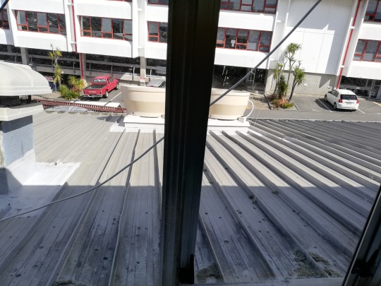
This picture reminded me of the light in the opera house lane. The conrast of light and shadow made it clear that I need to somehow make use of the limited light we have in in the site. The large shadows of the buildings is what makes the site it cold and dark. My conclusion was not wanting to add to this in any case.
0 notes
Text
Week 2: Plan, Section, Elevation, Perspective
Plan, Section, Elevation and Perspective are the fundamental ways of drawing a “spatial” design.
A Plan is the top down down view like a map with the exaction that we can see the inside of the buildings and design. To achieve this inside view, a horizontal plane cuts through the “shell” of the design with the top part of the “shell” being hidden from view.
Drawing a Plan:
-the lines which are the closest to us are the darkest ones which would be the point where the horizontal cut happens
-the lighter coloured things are, the further away they are
-exposes structure
-shows scale
-two dimensional
-shows permanent and moveable things
-no perspektive
-shows the organisation of the site and the lay out
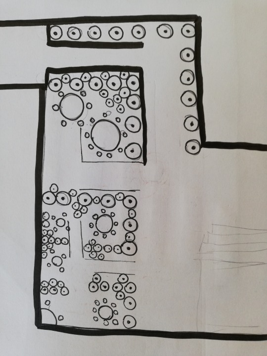
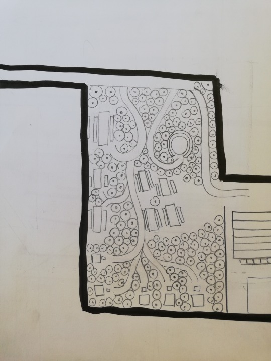
Example sketches for a plan:
This last one shows a broken cut line which marks the cut for the section sketch which is associated with this plan.
Drawing a Section:
-no perspective
-like a plan but this time we cut vertical Example: slicing through a cake and seeing all the layers
-shows the use of a design and why
-people are being used to show the use of space
-while drawing a section we are looking straight at the section
Drawing an Elevation:
-drawing the exterior of the building
-like a section but without the cutting
Drawing a Perspective:
-drawn from a human perspective = like a photograph
-standing with in, looking at it
-it shows a foreground, middle ground and background
0 notes