mask-project-bcu-film
Mask Project
Film and animation, second year project, tests RVJ
22 posts
Don't wanna be here? Send us removal request.
Last Seen Blogs

videotron1970
Sans titre

rsfornovel
無標題

thaimomdenmark
Untitled

meowmeowmage
*kisses Anders on the forehead*

smartypie1
Smart Pie

Text
Evaluation -
Over all review of what I have learned.
Through out this project I have developed my overall knowledge in filming and editing.
Research - I looked in to a number of people. I couldn’t decide who I wanted to look at specifically, I started out with one film maker Rachel Mclean who was a great starting point for this project but after research more inspiration came. Through out the work that I made for this project I still related back to to the original source.
Creating masks and prosthetics was a good idea, I didn’t use most in my micro projects as I want them to be better quality before I do so, I would however prefer to do this technique rather then digitally do it or animate it, as this gives a more handmade feel.
Working with c100 cameras was good, it was easier then I thought. After spending time figuring it out for myself I quickly understood what the basics were. I booked them out with another person on my course but I feel more confident with the equipment now and think I could use the quite well be my self.
I learned about blocking out characters and how to film a live performance, how to keep up with the actor and work around what they are doing.
Coming up with story ideas was fun, it was interesting to put them down and work out how they would develop as I continued thinking creatively, then turning them in to animations was weird seeing them actually happen.
Software: I’m relatively now to using a lot of these, as I previously only worked illustratively.
Premier pro was easy enough to use and the most simple. It was time consuming when I was trying to edit the sound for my first micro project. It was a good way of finishing of a film.
After effects was what i used mostly, I learned how to rig and how to edit green screen which was a big theme for most of my micro projects. I had a tutorial in Toon boom and learned the basics, I didn’t have a go at it my self but if i wanted to in the future projects i feel more confident using it.
What worked well and what i enjoyed- my green screen experiments worked the best, combining the real and and the animated together looked really good. I think I relied heavily on animation and i think it would look better if thing looked more hand made. The dolls that i made as characters worked well and i thought the theory behind why I did it made sense to me and that’s something I want to improve on more. I need to get better at rigging characters. I need to work out what combination of animation and reality works best and the production for reality needs to be better.
Where i want to take this forward - for the next project i want to test working on a larger scale and have more elements to it, a bigger story and more things ie props and masks made rather then digitally created.
0 notes
Text
Evaluating collaborative work on other projects.
Martial arts project - I recently participated in a project where i was required the be an actress.
I found it fun being the performer, it was a new perspective of what happens in the production of filming. it was interesting listening to direction and interpreting what they wanted. It was clear and the tasks were simple and the communication was good. I really liked working in studio b, I have been doing a lot of green screen work in my own projects, In the future I would like to do work in there as I want to work on a larger scale. This was good experience for what i would eventually like to do. pretending there were props was interesting, imagining what would be there and treat it as if it were there. A lot of the things were going to be recreated via animation, so i had tom imagine what i would actually be doing for the scene.
Stop motion work-
I heard about an opportunity to build a set for a stop motion animation, so i contacted the person making it and asked to get involved. There were a few other students helping to make the set from tpe so it was nice to work with them again. I have worked previously with stop motion animation and making sets, but i never thought about making things proportionally correct. We used scale rulers to make and exact model size smaller. We then split the work between us and went away and made a card model of what is would look like. That’s all we’ve done so far next we will create the set using foam board and mdf.
0 notes
Text
Tutorials
I booked out a series of tutorials as I wanted to learn more about the cameras I wanted to work with and softwares i wanted to learn about. Unfortunately my tutorials for the C100 camera, divinichi and the tv studio fell through do to lack of interest from other student and a series of other things going wrong. However I did have tutorials in after effects and toon boom.
Toon boom- I had a tutorial in Toon boom with Kelvin Wong, which was a basic run though of what I could do with that, he mentioned that I could create characters using this and showed us how nodes worked, which was different to how to rigging stuff in after effects and in some ways easier. I wanted to create characters in a different way with collages pieces and he said I should use after effects for what I wanted.
After effects-
When beginning this module i had no idea what rigging was, I thought all animations where hand drawn. I had an idea about combining some of my collage work with this technique of rigging. I watched some tutorials about how to rig and the first thing that came up was about DUIK so I downloaded this and found things to hard. I had specific questions and it was taking to long to find out what I needed to know which for the most part where just easy thing. I booked out a tutorial with William Marler who was then able to go over the specific questions and I found a much easier way to rig then using DUIK.
I learned about parenting layers and putting a timer on things to make them animate. I learned all the basics of rigging then found it was mostly just problem solving, watching stuff and figuring out how I could do that myself.
I applied what I learned to a lot of green screen stuff that I was making, also real characters I had created that I then photographed and adapted. Because the character I created was very basic and didn't have realistic limbs, DUIK was unnecessary as that would have made a smoother transition and the blocky effect works for my character
0 notes
Text
David Firth - Salad fingers
This is a series of 10 episodes about a person cartoon thing and the seemingly random adventures that he goes on. There are a few other characters in this plot but Salad fingers is the only one who can talk.
Sound has a very big part to play in this, there is a creepy song that is playing in the back ground and a rustling noise. However the atmosphere is still quiet despite this. The voice of salad is a creepy low quiet one that is one of someone you wouldn’t want to meet. I like the crunchy sound that is used when characters are walking.
Questions?
What is going on?
Why is it so creepy?
Why is it so interesting?
Interpretation-
It seems like he has a mental condition and he has trouble communicating with people, this could be based on a real person and a fictitious version of realist that have created as a coping mechanism. I think what makes this piece so interesting is because of all the questions people have and because its so open to interpretation. Salad fingers himself even gives hints in to what his story is, which has lead a lot of people theorise.
Evaluation-
The creepiness of the imagery and music ties well with the story, if is were a clearer story or have a different mood to it I don’t think it would be as popular. The sound is terrifying but it keeps attention even though its simplistic.
Reflection-
Personally, the sound is what i take away the most and the eeriness it creates. I think the simplicity of it makes it stand out more. In some of my work I have tried to recreate similar sounds like the walking sound. I like the lack of characters and the loneliness that is created which makes sense to relate it to mental health and an inner struggle.
0 notes
Text
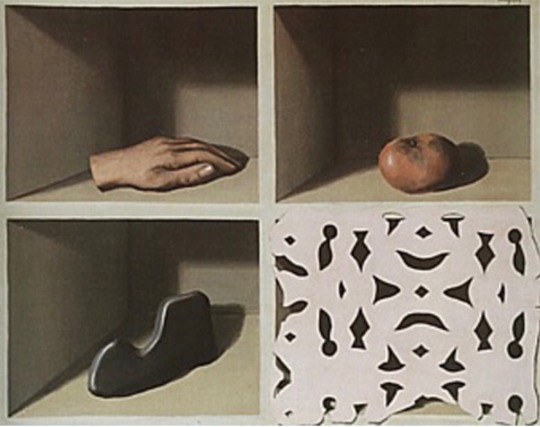
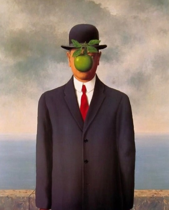
Rene Magritte
“Everything we see hides another thing, we always want to see what is hidden by what we see”
Describe-
Magritte is a Belgian surrealist painter, and part of the surrealist movement along with Spanish painter Salvador Dali. Born in 1898 and died in 1967 Magritte’s work was ahead of its time and even now looks modern and cartoon like. He creates witty paintings about ordinary objects used in an extraordinary way. His work makes you think about what is correct, why it is that way and how it can be used other ways. It’s completely conceptual, pop inspired and minimalistic. His paintings are very clear but the more you look the harder they are to understand.
Questions-
What materials does he use? Oil painting
Why are the backgrounds so bare? The outside world is an open place
Why doesn’t he show faces? Keeping things in order of how they’re supposed to be would defeat the purpose, the face draws attention first getting rid of this creates a question.
Interpretation-
There’s not a lot of record about Magritte’s early years but I learned that his mother committed suicide when he was just 13 years old. This was probably a mental health condition that she had for a long time, I read theory about how this effected him and his work. With his father out at work he would have spent a lot of time with just his mother around. Thinking around this it could show the reason behind the use of space in his work; in some of his work when the viewer is indoors the room is often very claustrophobic. Where as when looking outside the space becomes a lot more free, however the viewer only ever sees this from a distance or while abstractly positioned in something else.
Evaluation -
The minimalistic style brings out more details then not. The brought colours are very attractive without the piece looking overly happy. His work is definitely funny and thought provoking while being visually appealing
Reflection-
With in my own work sometimes there can be a lot going on to it would be interesting to slow it down. I love the colour scheme of his work and what to incorporate that within my own. I love the clearness of this picture and the use of faces never being what they’re supposed to. The use of space and framing to make the viewer appear to be in one place is interesting and I will think about that compositionally

0 notes
Video
Collage that i created, doll inspired and back ground inspired by Rene Magritte, old fashion war time feel. Done using adobe sketch for ipad on time lapse
0 notes
Video
Practising drawing with adobe sketch for iPad, timelapse
0 notes
Text
Matts analysis lecture
These are notes I made about Matts analysis lecture, we were put in to groups and given a movie to analyse and discuss, we were given full metal jacket. Using Matts guideline of describe, identify, interperate, evaluate and reflect.
Go to library book out how to read film
DIIIR
Philosopher Neecher
Describe-
Full metal jacket
Type bold, hard and to the point. Quick like a shot
Head bold
Loosing identity
No emotion, glazed over
Music American -county patriotic
Goodbye America
Cheery music
Soldiers becoming pawns
lots of men having their head shaved, quick shots, clean and stereo The black barbers had julery on, but the white barbers didnt, the song it upbeat and the lyrics say good bye to the soldiers going to war. Colours are saturated. Third person perspective. The front cover for the movie shows a helmet that says, born to kill next to a piece symbol
Lyrics
Good bye,
Hello Vietnam
Main person, higher in rank made to look taller, stands centre stage
One point perspective
In charge of a lot of people all depending behind him
He’s dressed more contrasting to the other characters making them look plainer.
Vertical & linear motif
Identify -
What questions do we have about the specific scene
Information
Emotion
Stanly Cubrick
what when where why who
Based on the veatnam war, before they leave, they are pawns
Who is the audience?
Why did they choose the song
Why that the typography
Why didnt the barber clean up after each person
What is the significance of race?
Where are they?
What’s the importance of the whole scene
What is the verlevence to the reset of the movie
Why are they being shaved from the middle
What emotions is he trying to convay
Why are they all close up
Is it personal or impersonal
Why did it come out 12 tears after the film?
Equality
Interpret -
What message is the film trying to communicate
With outside knowledge about the creator period etc
How does in make you feel
Who do you connect with
Where is the director placing us as the audience
I cant work out weather i think he’s a good or bad person theres arguments to both.
If i changed any elements would it be different?
Would it impact less
Answers lead to more questions
Saturation = life
One point perspective - deep space
Does the scene fit in to the whole of the film
Who’s the audience
How well does it target them
Lyrics ‘we must save our freedom now’ while they are CURRENTLY giving up their identity.
Older people, involved in the war, people interested in politics, anyone interested in the state of the world. People that Kubrick disagreed with
People were in a state of worry about poverty and hunger, because of Reaganism I’m the 80s, wanting equality for the people in their country
The music cheery represents the peoples washed over views in the 80’s
Evaluation- what i think was successful and not,
At creating lots of questions
Representing what’s happening in America in the 80s and in the 60s and the change that was being created.
The combination of music and sound gives both a different meaning
Reflection- what i have learned from this analysis
As a composition it works successfully in some areas, it highlights key themes about the war, and shows a different angle to other war films.
0 notes
Link
I made this piece the same way I make the painting of a dolls head piece, I was testing out different story lines and this was a really easy way for me to do this. I used the same background and the same character both of which I created. Both of the storylines have the same theme of decapitation, not on purpose, I didn't even realise at first. Much like the painting project it involves a cycle in which the person eats the fruit the fruit grows in to a plant then the trees fruit eats the plants head, it could then be made in to a loop. It’s weird but thats what i wanted it to be. For this project I learned about rigging and about how to make something grow. To create the growth I created a photoshop document and repeated the same layer 5-6 times erasing parts of it to make the sequence. As this was one of my fist times rigging i thought it would be a lot harder and take a lot longer to create the piece then what it was, it just involved a lot of problem solving and with tutorials and watching videos online learned how. How could I make the animation higher quality? The same as the other project it need to be bigger and less confined to just an animation and needs more live action and props. The use of animation for this was to visualise the story, I am still planning to use this but on a smaller scale. Is the animation too fast? I think I need to learn more about timing and watch through my work a few times to work out where they should be, but I think it would have more impact if it was slower. I think it Would it look better if the background more realistic because the contrast between the background and the character clashed, the character wasn’t animated enough for the background to be the same nor was it real enough for the contrast to work and be noticed. What does the doll mean? I didn't want to use a person because i didn't want it to be a real think. Thinking along the lines of Pinocchio always wanting to be real. I thought about childhood and imaginary friends and how the doll could represent that, but i wanted to create the feeling of loneliness which i think this character could represent. Why swap and eat the head? Given that it is a doll it’s easy to remove the head without pain or feeling, shown by the dolls lack of reaction to this. The music is there to give the feeling that i wanted of creepiness, inspired by salad fingers, the sound of wind and lack of other things going on around creates the feeling of loneliness. Over all as a test this works really well. It’s short and to the point, its inspiring other ideas with similar features. I need to experiment more with background, rigging and timing, which could all increase how well this works, the sound works really well and i intent to continue in the same direction with this
0 notes
Link
0 notes
Text
Painting of a dolls head - Micro project
Very simply idea, the doll is in a open field like area, its difficult to say what time it would be. It has surrealist elements and a creepy feel to it. The storyline is abstract and the main character is a doll who removes her head and replaces it with her painting.
What is the meaning behind it?
Originally i was thinking along the lines of people wanting to become more face and put paint on their faces to make them look how they wanted to look. But after discussing the idea with my tutor they got the impression that it was about breaking down the 4th wall and including myself as part of the piece. I made the doll the doll made the art then the doll became the art that she made. This is something that i will have to look at in more detail when moving forward with the storyline.
How can i recreate this with real imagery?
If i were to use a real actress to recreate the part of the doll i would have to figure out a way for her head to be removed in editing, which i will have to research in to.
Who was this inspired by?
There are elements of Rachel Mcclean ean’s style within the characters, but i was thinking about DAvid Firths salad fingers for the storyline and music.
Why do I want it to be creepy?
I think it makes the piece more interesting, and it creates and atmosphere that both Rachel Mcclean and david firth have in they’re work, which is off putting in a good way and you know that something is out of place.
I think the storyline works well for this short project, its easy to understand and doesn’t need a lot to make it interesting. I could spent longer working on timing and figure out the best places to pause, as i think it was too fast and the character should drag more. The sound is perfect for what I wanted it worked well with the theme and brought the whole thing together.
The rigging could have been better and i need to look in to walk cycles to learn more about what it should actually look like. This didnt let down the piece however, the quality of the rigging wasn’t as important because none of her limbs were realistic as they were made in paint brushes.
In reflection, I think the production value could be increased be recreating this on a larger scale with live action elements. I intend to create similar storylines like this, as this one worked very well
https://youtu.be/O8dc98opcl4
0 notes
Text
The Science of Sleep
Filmed in France, by Michel Gondry, who is a creative film maker who relies heavily on the aesthetic of his work. The movie begins with a dream sequence, straight away showing its a fantasy film. The entire room it completely made of cardboard it just looks fun and very child like and is very psychedelic with the paint. The cardboard room is a tv studio, that represents his brain and thoughts. The main character Stephan plays every part of the crew and the star of the show, and a way that shows the character feels lonely and that he has to do everything for himself. The character is talking nonsensical very hyper like a child with a very big imagination. He starts out by playing the drums, which is a talent that Gondry had himself, so i think he was trying to draw similarities and breaking down the forth wall.
In reality the scenery is very similar to the dreamed cardboard room, I think this is the characters makes efforts to blur the lines between the two. However you can still tell the difference. The film starts with the main characters parent dying and him reconnecting with his mothers side by going to France, he stays in his childhood bedroom, which I think is a representation of going back to a childlike state as a way of coping.
I wanted to know- technically
How he made the cardboard room and how would I do it, lots of cardboard, a large space lots of crafting stuff, scaling things up to size, a large empty room ect.
How does he create the buildings in the background of the office, the technique looks like lots of drawings or photos of buildings all collaged together to form a city, everything is in rows to create depth, Gondry doesn’t use a lot of digital manipulation so I imagine he made all of this as part of the set and illusions with paper.
Gondry uses a lot of optical illusions.
What i wanted to know about the story-
Why do the main characters hands grow? Like playing the drums this is another thing that Gondry has as his own fear, which has appeared in a few pieces of is work and breaking the forth wall again.
Why is the cardboard room a tv studio? The main characters ego, everyone is the star of their own show, Its a game, the narration is just thoughts in the mind. There are a few different reasons, but its clear to understand what it represents.
Is Stephen in control of his life? His dream? Both tend to overlap and in some scenes, Stephen is sleep walking and out of control. He thinks about things that he doesn’t want to think about but never about the loss of his father which could mean he is in control and creating other problems as a distraction.
Who is Stephany what does she represent? She’s a coping mechanism and someone Stephan has a lot in common with. Stephan says that he sees his father in her, and she equity treats him like a child. When he finally moves on from that faze he throws a tantrum like a child would and then he’s leaves assuming he carry’s on the rest of his life and has moved on.
The style that Gondry has really compliments the plot for the film. Its very creative in its methods and a lot different to the majority of films when presented with the same problems. This film it unique and playful, the storyline was good but the best element was visual. I love the general asthetic and the recycled materials used and think that would be a cheap and easy direction for me to start.

0 notes
Text
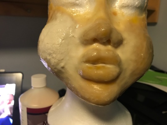
Making prosthetics for the first time
Inspired by Rachel McLean’s characters I created some prosthetics for the first time. I created a series of noses as I thought they would be easiest. I used a polystyrene egg, play doe to create the shape and the liquid latex and tissue to create the actual mould. I made them in to weird and unnatural shapes.
Questions I thought of
-who would wear them? If I were to follow Rachel Mclean I would have one person wearing them, and acting with themselves.
-Why? It could look less real, it could be in there imagination. More dream like or a problems re-enacting, inner demons or seeing yourself in others.
How would I create what I’m trying to describe- it would be through a green screen performance and have animated elements to it to continue the real or not real theme.
What’s the next step - I’ve started to make full makes, I have made a traditional dolls head, I wanted to cover up the whole face with something new.
So far they have been interesting to work with, they look fun, I have been playing around with facelessness so that might be the direction next, blocking stuff out instead. I like that it looks costumy, and weird as I don’t want the person to look too realistic.
I don’t think I’m going to use the exact ones that I have made but now I know how to make them and how to use the paternal. I like that i can now manipulate the way the person looks without going in to edit it.

0 notes
Link
Live action and animation combo I made a short video using green screen and two volunteers to help me. I used a 7D camera and a 50m lens which I booked from hires and loans, the camera i booked had a different memory stick size which I didn't realise do i had to book out a card reader as well. I created a prop which i would use as a fruit and i got one volunteer to hold the fruit in place and the other to reach up and be the hand and pull down the fruit. I then put this in to after effects and added in the background. It looked really good with the animation. There was a lot of shadowing and issues because i held the camera free hand so i had to use the drawing tool, and some other methods to remove them. How could i make this work on a larger scale? I would have to consider new scenery and worked on a larger area of green screen, probably in studio b. I would hire a proper actress and create actual props for her to use. I would have to buy, create or work with someone in fashion to create the clothing and have a few other things in place. Why does the combination work well? The contrast between the to makes the image more interesting and impressive. This technique makes the line between real and fake less clear. This also looks quite theatrical. It was inspired by Rachel McClean who uses a very similar technique. All together i think this process works well, it could be longer and have more going on, but i intent to do that in the future. The prop u used wasn’t very good and ill need to make a 3d one in the future. My camera work needs to be more steady and the lighting needs to be fixed on the green screen. Story lines and so on need to be added in as well.
0 notes
Link
This was my first micro project.
I spent the weekend creating prosthetics and masks as I wanted to be able to use them in my project. In the end I created this paper mache head with blonde hair and no facial features. I brought it in to uni and using a green screen that we took from the shell, I asked my friend to help me out by putting on the mask and sitting on a chair. I told her to sit there and I recorded while I watched her movements. I asked her to do drawings for some parts of this and others I just wanted her to move slightly. After all this I put the footage in to after effects added in the back ground edited the colours added some effects and then added the sound. The sound brought the piece together and revealed why she was sitting there the whole time. The sound was edited from a Jeremy Kyle clip I found online. Of two people arguing, I edited this and made the speech blurry, so it would sound like it was coming from a different room.
Why is ithe sound coming from a different room?
I wanted it to seem like she was sat in a waiting room, listening to these people argue as if it was about her.
Why doesn’t she have a face?
She cant communicate with the people who are arguing, in my head it’s like she doesn’t have a voice, so i was trying to visually represent that.
Who or what does she represent?
I modelled the head after what i looked like as a child, I spoke to a few people about this and they saw that themselves.
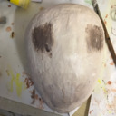
I made the mask out of paper mache and used an egg to make the shape. After it dried I covered it in a layer of modelling clay to make it stronger and then painted over the top, the hair was made of modelling clay too.
I think the low quality of the green screen works really well when it doesn’t work perfectly, in parts it removed part of the character, like she wasn’t even there. Plus the quality of the mask was poor but worked with this is a weird way.
I think the test went well, the over all aesthetic looks cool, the green screen could have more work, and the footage could be used again. The sound could be played with more and could give the whole thing a new meaning. But for my first test with everything it was quite good.
0 notes