
maxlawesu6graphicsexam
Max Lawes U6 Graphics Exam
34 posts
Don't wanna be here? Send us removal request.
Last Seen Blogs
astr-hal
guything gaming

reddg65
RED

shimmyshammyeden-blog
shimmyshammyeden
bomb26shell
Quake
f-u-c-k-edup
New Blog Im Back Bitches


Photo
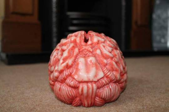


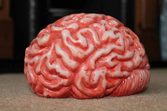

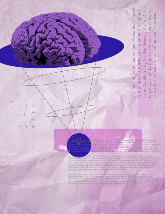
here are pictures of the brain for me to use in the exam. I took these images for the exam so i could use primary imagery for a brain i had to use photoshop to cut out the image and also use content aware and the stamp tool to cover the money slot. i will be using these images a prime aspect of all my pieces which will help me show off the brain and also add a common factor in all my posters to bring them together.
0 notes
Photo
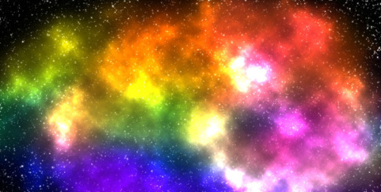
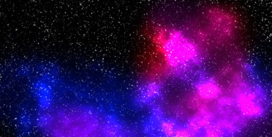
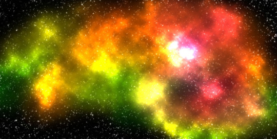
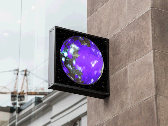
space templates i can make to help for design in my exam
i created this using photoshop by adding 100% sound to a blank black page and then manipulating the levels to create a base line of stars. i did this again but changed the levels so there wore larger but fewer stars to add perspective. i then rendered in clouds and added a colour dodge effect and then on another layer above i used a soft brush on 10% to add the colourful cosmic clouds to add to the final space feeling.
0 notes
Photo

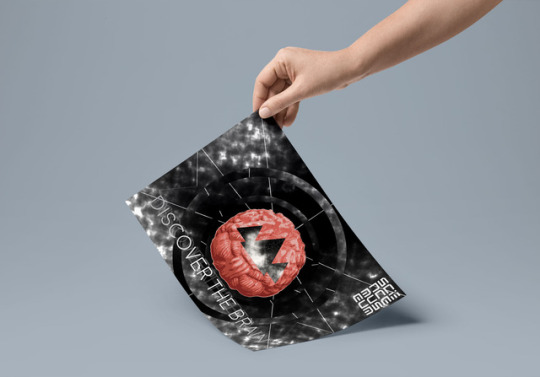
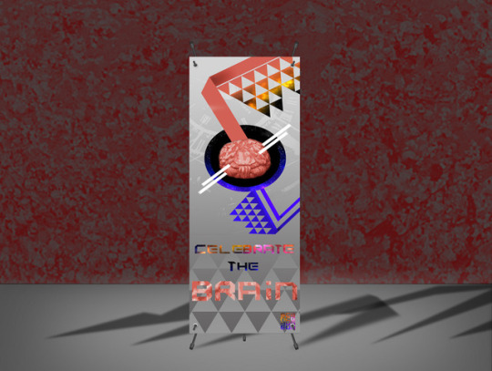
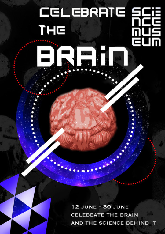
Initial Idea for exam poster.
this piece is going to be my first initial idea that will include most of my artists ideas in my own way. I will be adding more to the background to make it more layered. i have tried using a space design to show off the size of the brain and show the brain is as big and powerful as space and it also works together with the brief for my exam as i intend to be making the posters for the Science museum.
0 notes
Photo
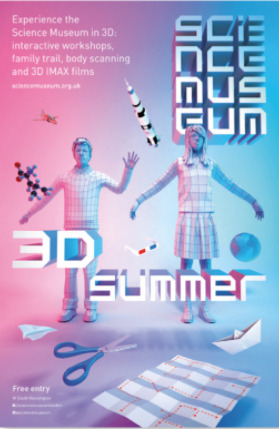


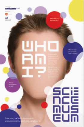


I haver taken some National Science Museum posters in the past to show me what there posters are like and what i need to use e.g text is always the same or similar i will take inspiration from my artists and then incorporate the design of theses posters as well.
0 notes
Text
Final thoughts before exam
ive now chosen my artists and know that I want to do celebrating the brain in the exam and I have chosen to use the Science museum as the client for my exam I think it is a good client as it is all connected to science and it is a place that allows exhibitions and has many opportunities to be displayed.
0 notes
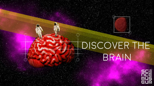
Photo
this is a GIF that i will be re creating and improving in the exam to give alternatives to a poster and these could be on websites as an advert. I will be putting this on a mock up as an advert/digital advertisement.
0 notes
Photo


Martin O’neill inspired pieces
the bottom images is a very close interpretation of Martin O’neills work as shown in the artist analysis, I have taken various images I have taken and put them together to create an inspired piece. i made myself in black and white with a tint of blue as martin O’neill had done and added a gradient backdrop to make sure no attention is lost on the foreground image, I like the way I could use this technique to show the power of the brain as it comes out of my had so I will try to use it in my own pieces in the exam.
The top image is also a representation of one of Martin O’neill works, I took an image of myself and added images of flowers that appear to be coming out of a part of my cheek that has been moved way from my face like his image. I cant see a clear use of this technique but i will try to introduce the brain into the piece and see if I could create a GIF from the idea.
0 notes
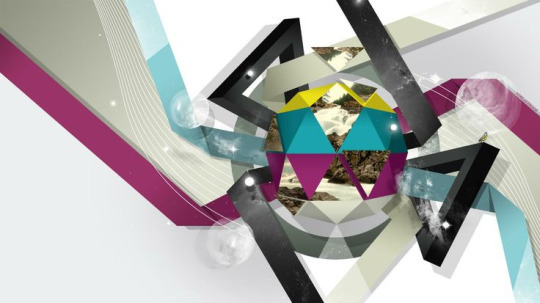
Photo

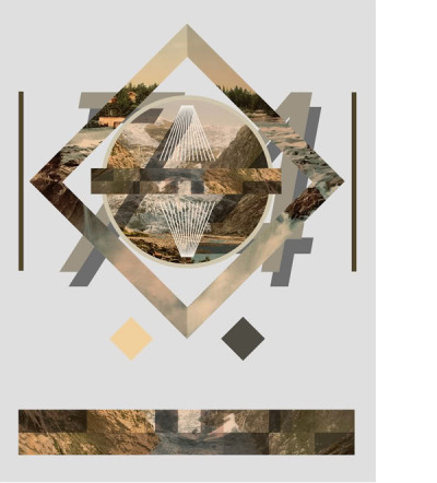
Here is my Mike Lyhgoe inspired response, I tried to create the geometric shapes and the absurdity of Lyhgoe’s creations I done this by taking the geometric shapes and layered them on top of the space background. I then deleted selections of the image and then inverted the colour of space in one of the loops, my most successful part of this image is the shape cupping the planet in the top right because it is interacting with the image behind and it has a juxtaposition of reality and surrealism which I can show off as the the physical attributes of how amazing the brain is and the equally amazing power of the mind so I will be carrying this technique of Lythgoe’s work into my final piece.
0 notes
Photo


Mike Lythgoe
I chose to look at the work of Mike Lythgoe because I wanted to study an illustrator that would help me create a contemporary feel to my art work and designs as well as someone who would help me to create a strong composition with lots of colours and images. I like the way he combines shapes and images together with bold colours. He uses a limited range of letters and words, in addition the first image relates to space and atmosphere, and to add effect they added the stars effect to the inner circle to make it relate more to space.
Mike Lythgoe uses a wide variety of different media such as images, shapes, bold colours. He mixes colours and photography’s together which shows his wide range of techniques, which I will incorporate in my work, he sometime uses dark colours such as black, most of his art work relates to mountains, hills and animals also. His work is mostly done by computer and not by hand. His composition is very effective and stands out a lot, the reason being is it is placed all over the canvas. The piece has a dominant feature which is placed in the middle in the piece. The use of limited colours help you guide your eye around the page, also the use of limited letters also help you guide your eye around the page and hold the design together. Images and a plain colour are used in the background to give the main focus piece, depth as well as a strong use of scale.
The use of colours relate to the time of history, as one of the images relate to space and atmosphere which suggests/ talks about time and history and the first person to walk on the moon and discover the galaxy and the planets. Some of the pieces created are modern and links to the 21st century.
Mike Lythgoe is an artist who created pieces using primary images and shapes and colours, as you see above, there are images within the shapes, which shows the viewer, what the piece is about and why he added that particular image to that piece, the pieces have some relevance to the modern society and teenagers and can look at the piece and can relate to it and talk about it in more depth.
I am going to implement his style of work into my work, for instance I will add shapes and varies colours to make the piece stand out and put the shapes in all sorts of formats, in different ways, in terms of position of the shape in the piece. I will use Adobe Photoshop to create his techniques, and to create effective designs, I will try and use his work to show the imagination of the brain and how complicated and advanced it is.
0 notes
Photo


Martin O’neill
London born Irish bred Martin O’Neill is an illustrator & artist who creates collages for a wide range of International clients encompassing publishing, advertising, design & installation work. His work can be seen frequently in the UK and US press. He regularly exhibits his personal collages, sketchbooks and prints & is a visiting lecturer across the UK. He lives and works on England’s South East coast with his wife and two daughters.
“If Peter Blake is the Paul McCartney of collage, then O’Neill is its Tom Waits, a pre-digital artist for a post-digital age. “
John L Walters. Editor Eye Magazine Eye 69
“Martin’s work evolves from a subtle alchemy of collage, silkscreen, photography, paint, and digital techniques. Years of hands on studio experimentation has resulted in his unique and instantly recognisable style of image making. Martin works from a large archive of found and self generated material and also works with supplied imagery.”
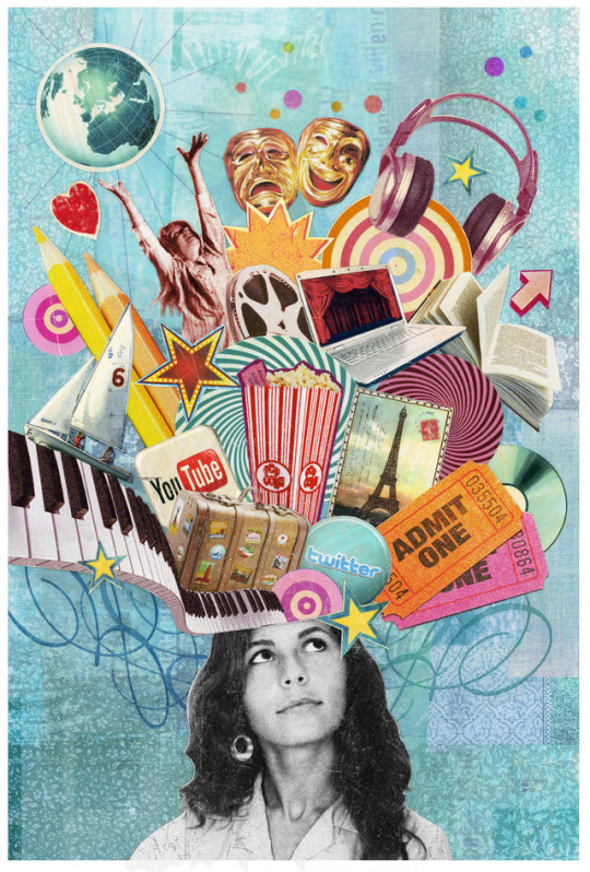
The above images are all created by Martin O’Neill. I am really drawn to the photo montage style that he uses and the way that he combines image and texture in order to create a visually interesting overall piece. I am looking to experiment with a similar style in order to produce some of the graphics for my work. I want to use the explosion of colour and the disorder of the pieces to simulate the amazing power of the brain.
0 notes
Text
Kacper Kiec
Kacper kiec is a photographer, graphic designer and a visual artist. He was born in Poland, Walbrzych of 1982. He claims to be a self taught graphics designer and now works for many different clients.
the reason i decided to choose this artist was because I like the use of geometric shapes in his art which has a simplicity to it but then he makes his pieces complex by adding images to those shapes or subjects in the piece to tie the image together making it all make sense. Given some of his work still looks as it doesn’t make any sense it still makes the more and possible others wonder why he chose to make what he made in this way.
Most of this artist work is contemporary, especially his graphics designs. Yet Kiec has a way of making his work appear to be vintage which makes it interesting because he is merging today’s technology with the past. I believe that Kiec’s works looks quite antiqued because of his choice of colour and subjects in his work, in these pieces the colours seems to be quite dim the majority of the time, and in early days, (The 1970 onward for instance) colours in a lot of things such as photographs, posters and merchandise were not as strong as they are nowadays. Which leads me to believe that it is to his full intention to make his work look as if there is some age to it, i think this is to appeal some of the older audience subliminally to trigger some form of nostalgic feeling.

0 notes
Photo


this is my work that is inspired by Kacper Kiec, my response is based on my end goal of the mind and brain so I took a stock image of a brain and used it as a focal point in my piece I then went to make the work look like Kiec’s this is shown by the lines and shapes with the hand written text to represent notes like a brain remembers information I then worked on the idea of crumpling paper to create a more realistic feel and inspire the hand made note feel I then went on experiment with the hue and lighting to see if there was any other combination of colours. I will be seeing to carry on aspects of Kiec’s work like the lines and geometric shapes and also the idea of having notes around the brain to symbolise the idea of the mind and remembering.
0 notes
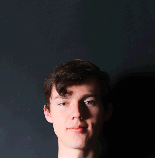
Photo

this is a piece on forgetting and how people forget faces most commonly shown in old age dementia, I have taken away the features of the face as I believe it is what happens when you forget a person if you suffer with dementia.
I used a mixture of the stamp tool and content aware to take the eyes and mouth away, it has worked well on some areas like the left eye but didn’t work well on the places where my eyes got darker as i could not get the right amount of shadow to blend together to the real shadow, it also hasn’t worked on the mouth as it can clearly be seen its been manipulated with the stamp tool.
0 notes