
me19ag
Alice Grama [me19ag]
Blog for COMM2126 Digital Media and the Senses
8 posts
Don't wanna be here? Send us removal request.
Last Seen Blogs

codableep
Untitled
embroideryart1
shu embroidery

miyo-ni
Mods Menma’s Tera

ajhaqxxjxia39
하라스카지노【 J A M 957。COM 】광명경륜결

800publicadjustersny
Public Insurance Adjuster New York
Text
COMM2126 Digital Media and the Senses Task 9 [me19ag]
This week’s content gave me interesting insights on data as a form of capitalist expropriation, monetisation of personal data, data extractivism, resistance practices, “data-doubles” and owning our digital selves. What inspired me most for this week’s task is Couldry’s and Mejias’ (2019) closing statement on how we should go about rejecting data colonialism - we should not reject all its uses and forms but recognise the current practices of resource appropriation and accompanying social order as a colonial process.
This task’s goal is to create a form of resistance to data colonisation. Within his article, Ricaurte (2019) highlights some resistance practices like data activism, algorithmic resistance, data justice and algorithmic accountability. Therefore, I got started on imagining a campaign as a piece of data activism.
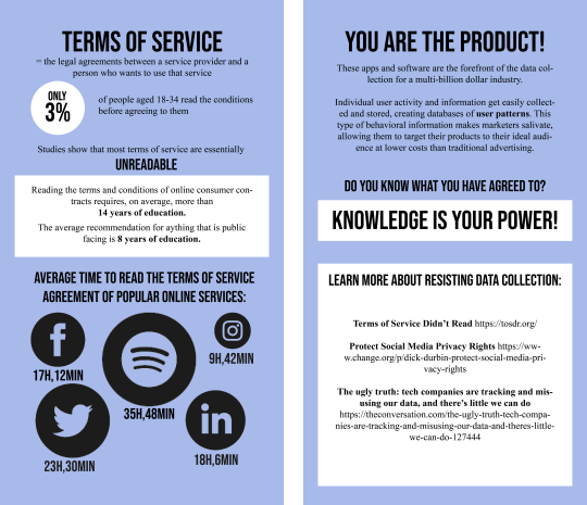
The campaign I propose was inspired by the comparison Couldry and Mejias (2019) make between the Spanish empire’s Requerimiento and today’s websites’ Terms of Service. The Requerimento was a proclamation read in Spanish by conquistadors to a non-Spanish speaking audience before they would attack and appropriate the land. The same way the foreign language couldn’t be understood back then, the incomprehensible language of Terms of Service can’t be understood now. At least not by the majority of people. When we accept the Terms of Service without reading them, we unconsciously give our consent to big companies to extract and exploit our personal data. Madianou (2019) calls attention to the ways in which today’s digital media business model is based on the provision of “free” services in exchange of raw, personal data. Except when we don’t pay for a product, we are the product (Budzyn, 2018). Our personal data gets sold to advertisers, hedge funds, market researchers, governments while tech companies gain authority over the production of knowledge and capacity to shape user behaviour. Acknowledging this absurd collection of personal data without informed consent is the first step to resist this practice of data colonialism.
The campaign’s aim is to first bring attention to the issues highlighted above and start difficult discussions about data privacy and more importantly, data property. Is your data yours? To what extent does it belong to the companies who own your social media platforms? Or to the third parties they share users’ data with?
References:
Budzyn, D. 2018. Owning Your Digital Self: Monetizing Your Personal Data | Dana Budzyn | TEDxPasadena. [Online]. Available from: https://youtu.be/H27PdSnusCQ.
Couldry, N. and Mejias, U. A. 2019. Data Colonialism: Rethinking Big Data’s Relation to the Contemporary Subject. Television & New Media. 20(4), pp. 336–349.
LePan, N. 2020. Visualizing the Length of the Fine Print, for 14 Popular Apps. [Online]. Available from: https://www.visualcapitalist.com/terms-of-service-visualizing-the-length-of-internet-agreements/.
Madianou, M. 2019. Technocolonialism: Digital Innovation and Data Practices in the Humanitarian Response to Refugee Crises. Social Media + Society. 5(3). pp. 1-13.
Patar, D. 2019. Most Online ‘Terms of Service’ Are Incomprehensible to Adults, Study Finds. [Online]. Available from: https://www.vice.com/en/article/xwbg7j/online-contract-terms-of-service-are-incomprehensible-to-adults-study-finds.
Ricaurte, P. 2019. Data Epistemologies, The Coloniality of Power, and Resistance. Television & New Media. 20(4). pp. 350–365.
Wagner, S. and Fernández-Ardèvol, M. 2016. Local content production and the political economy of the mobile app industries in Argentina and Bolivia. New Media & Society. 18(8), pp. 1768–1786.
0 notes
Text
COMM2126 Digital Media and the Senses Task 8 [me19ag]
This week’s conversation revolved around truth in digital media. We touched on fact checking methods in journalism during the reading, verification of user generated content using The Human Rights Digital Toolkit in the workshop and last but not least I dug deeper about truth on social media for this week’s task - building a tool for sensing truth on social media. The video linked below made it clear for me how much we need such a tool:
Are You Living an Insta Lie? Social Media Vs. Reality
youtube
Everyone lies on social media. Whether we realise it or not. Unfortunately we put up a sort of lie consensus - posting pictures and tagging #wokeuplikethis #healthy #livingmybestlife. But we all know life is not always as glamorous as it is on our social media profiles. We pick, choose and edit what we like about our lives and personalities. This has got me thinking - how could we possibly check values of truth within our social media posts? It’s not like images, tweets or posts are bodies that we could put under a polygraph test, measure their heart rate and see if they are lying. How could we create an algorithm that allowed us to uncover whether someone’s post on social media is true or false?
Douglas Nicol is the owner of a data-driven advertising agency that gave a very insightful TedX talk about deceit on social media. He worked on taking lots of factors like syntax, choice of words, etc. and fed them into an algorithm that would calculate a deceit score for social media posts. Unfortunately I was unable to find any of the source code to feed my curiosity about the way they approached it, but I pieced together a plan for what I think such an algorithm should do:

I included verification resources I found very useful on The Human Rights Digital Toolkit. I also think this algorithm should implement data verification practices common among journalists, as mentioned by Brandtzaeg et. al. (2016): verifying provenance, source, date and location.
References:
Brandtzaeg, P. B., Lüders, M., Spangenberg, J. , Rath-Wiggins, L. & Følstad, A. 2016. Emerging Journalistic Verification Practices Concerning Social Media Emerging Journalistic Verification Practices Concerning Social Media. in: Journalism Practice. 10(3). pp. 323-342.
Detecting deceit: are your friends lying on social media? | Douglas Nicol | TEDxMacquarieUniversity. 2015. [Online]. Available from: https://www.youtube.com/watch?v=Bzfl1C_HgAY
0 notes
Audio
This week’s content brought our focus upon resistance and how it materialises in imagery and sound. As for the workshop, we explored techniques of recording and editing sound.
I found the software we used, Audacity, very fun to experiment with. I chose to use my phone to record different mundane sounds throughout my day. To be honest, a challenge I encountered was remembering to record sounds. One thing that was lost with recording is the spontaneity with which noises occur in real life. Whenever I heard something that might be fun and interesting to use within my work, by the time I became fully aware of it and pulled my phone recording app out, it was gone. This made me realise how sometimes we are not fully aware of our sonic environment. I think we focus on what we would like to hear, just like we focus our sight on what interests us most. Is peripheral hearing a thing, just like it is in sight?
Some sounds I captured and used are a podcast and music playing on Spotify, my coffee grinder and espresso maker, an online lecture, keyboard clicking while I was working. I transferred them from my phone to my laptop and easily converted them from .m4a to a .wav online so I could import them in Audacity. Then I had a play around with my collage of sounds, easing the different pieces in and out, changing amplifications, volume levels, speeds.
What surprised me most while recording sounds for this task is the amount of music I listen to on a daily basis. I have to admit I am always surprised at the end of each year when I get my statistics from Spotify consisting of thousands of minutes of music played. Sounds like music and podcasts have become such a big part of my life that I hardly notice how deeply ingrained these habits have become.
References:
LaBelle, B. 2018. Sonic Agency: Sound and Emergent Forms of Resistance. Goldsmiths University Press: London. pp. 2-22.
0 notes
Text
COMM2126 Digital Media and the Senses Task 5 [me19ag]
For this week’s task I am disrupting the data tracking on my wearable device and analysing its impact on me and the services that I receive. I am wearing my Apple Watch for self-knowledge but it’s interesting to think that, just as Crawford (2015) points out, in this age of networked connectivity, the system that is supposed to serve me becomes a tool for many other intermediaries. The data I get is a personalised report but the system around them is built for mass collection and analysis.
The Apple Watch provides activity tracking consisting of 3 rings: move, exercise, and stand.

The first possible alteration is obvious, as users can set their own goals. If I were to change them to very small values I could easily reach a goal of exercising for, let’s say, one minute a day, instead of my current goal of 60 minutes/day. However, I wanted to see how I can cheat my Apple Watch into thinking I reached my real daily goals.
To alter the status of my rings, I used the Health app on my iPhone. This app offers great health insights via your Apple Watch and connected third-party apps and it also allows you to enter health and fitness data manually. To make the data stick, you have to enter it as a workout.

In the workouts section you can easily Add Data, where it asks you for details like the activity type, the number of kilocalories burned and the duration of your activity. The kilocalories you enter are your Active Calories and will be directly added to your Move ring once your Workout is saved. The Move ring is easily tricked by adding data manually.
The data manipulation on an Apple Watch does however have its limitations, as you can’t control your step count nor will it be affected by exercise data you manually enter. Also, you can't manually control your standing hours like you can exercise minutes or calorie burn. Standing hours will be counted accordingly for fake workouts. You can also go back and delete the falsified data by accessing your data log.
Another option of cheating your Apple Watch I have read about are: waving your wrist (like crazy), similar to the Unfit-Bit project. Your watch will assume you're moving and will tack on points to your step count, Move goal, Stand goal, even Exercise minutes if you do it long enough. Or you can just hold your arm up, it supposedly earns you hours towards your stand goal. Another way is to pretend you are someone else and maximise your activity - you can do this by altering your personal data (age, sex, height, and weight).
The impact these falsified data has is obvious in the average sections, which provides charts of my activity in the past 7 days, month or year. So you can very easily make your wearable device think you are a more active, healthier person than you actually are.
My hacking changes how the service represents and communicates with me - during a normal day I would get regular reminders to stand up and move for a minute. Let’s not forget about the little notifications saying “You can still make it!”, encouraging me to workout a little before the day is over. They stop if my tracking device thinks that I have done enough for the day.
References:
Crawford, L. 2015. Our metrics, ourselves: A hundred years of self-tracking from the weight scale to the wrist wearable device. European Journal of Cultural Studies. 18(4-5), pp. 479–496.
Fritsch, K. 2018. Towards an Emancipatory Understanding of Widespread Datafication.
Keller, J. 2015. Apple fitness chief Jay Blahnik talks up the Apple Watch's fitness advantages. Available from: https://www.imore.com/apple-fitness-chief-jay-blahnik-talks-apple-watchs-fitness-advantages
Peterson, J. 2018. How to cheat your Apple Watch Rings. Available from: https://ios.gadgethacks.com/how-to/cheat-your-apple-watch-rings-0191261/
Rosenfield, S. 2015. Apple’s Fitness Guru Opens Up About the Watch. [Online]. Available from: https://www.outsideonline.com/2006026/apples-fitness-guru-opens-about-watch
0 notes
Text
COMM2126 Digital Media and the Senses Task 4 [me19ag]
Within this week’s task I used the provided project generator (http://eenjla.leedsnewmedia.net/comm2126-ideas.html) that challenged me to think critically about an issue and build something as a response. After shuffling through a few screens in order to get a feel of the generator, I stuck to an idea that I really liked: Designing a brand that tells stories of citizens. I started brainstorming using techniques described in the workshop and this is what I came up with:
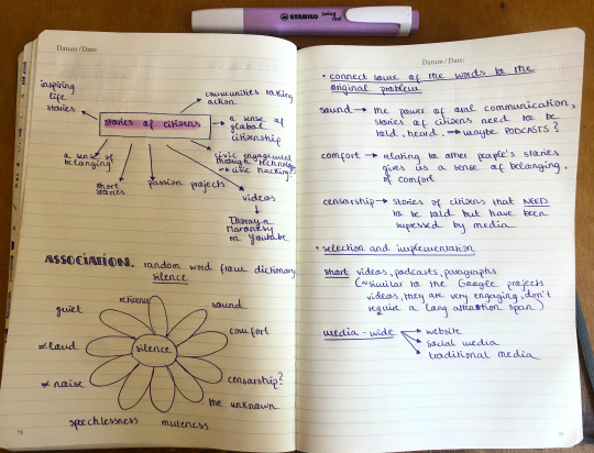
I think now, during the COVID-19 pandemic, sticking together as people is more important than ever. We can develop a sense of global citizenship and belonging by growing closer through the power of speech and story telling (oral or socially distance friendly - written).
I think the brand I am designing should make use of media-wide platforms like an interactive website, social media as well as traditional media (newspapers, magazines), making it a media-rich product.
The content produced could be short videos or articles of citizens narrating inspiring life stories, passion projects, civic engagement. I think short, engaging snippets of information are the most suitable - similar to the featured videos on Google Experiments (https://experiments.withgoogle.com/). Hurwitz (2018) inspired me to take into consideration wether the project should aim for breadth (how many people it would reach) or depth (how much of an impact it would have on individuals).
My inspiration for this project and a great foundation to build on is a YouTube channel I have been following for a while - Thoraya Maronesy https://www.youtube.com/channel/UCV2cu49-22CyFyBbq2YFPGw .
Thoraya’s channel’s motto is: “I make films with strangers, about strangers, for strangers”. Her content varies from people anonymously sharing a secret on camera, telling their stories or answering hard, personal questions.
She has over 1.4M subscribers and a very supportive community. Her interactive short films and experiences with strangers have earned her more than 80 million total views. You get hooked on her videos and in the comment section, where users create a real sense of community and togetherness.
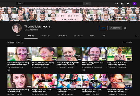
This is the related project that I decided to conduct some traditional content analysis on by looking at its interface and content. I focused on some of the components highlighted by Herring (2008): image, theme, feature and language analysis. The channel has 169 uploaded videos, featuring 63 videos of strangers answering questions, 6 videos of strangers sharing a secret, 29 videos of strangers calling their crush and 7 videos of people making touching phone calls.
The narrative that Thoraya’s interactive videos follow is embracing secrets, fears, pain and challenges that we all encounter in our everyday lives. The rhetoric of the images displayed in the thumbnails is obvious: they hold and convey strong emotions, both positive and negative. For me, it’s almost as if the pictures are saying - you must have experienced this at one point in your life and we are connected through these emotions even though we have never met and probably never will. This is exactly what I want for my brand to create when telling the stories of citizens.
Researching similar projects and data analysis plays a big role in designing my desired brand, just like it did in food marketing to children (Hurwitz, 2018). It will shape the debate, the social validity and the real world impact of my project.
References:
Herring, S.C. 2009. Web Content Analysis: Expanding the Paradigm. In J. Hunsinger, M. Allen, & L. Klastrup (Eds.), The International Handbook of Internet Research. Springer Verlag.
Hurwitz, L. B, Alvarez, A. L, Lauricella, A. R., Rousse, T. H., Montague, H. and Wartella, E. 2018. Content analysis across new media platforms: Methodological considerations for capturing media-rich data. New Media & Society. 20(2), pp. 532–548.
0 notes
Text
COMM2126 Digital Media and the Senses Task 3 [me19ag]
This week’s task challenged us to download a data set and represent it using Tableau, a free platform for creating and visualising data. Manovich (2011) mentions it along other similar sites, like Many Eyes, and recognises them as a powerful tools for information visualisation because of their accessibility.
I encountered errors while trying to download data from the suggested site, https://data.worldbank.org/ so I ended up using a spreadsheet from https://data.unicef.org/ about the youth literacy rates.
My excel file:

I imported it into Tableau and started playing around with data visualisations and I ended up with three sheets that materialise my dataset:
The first one is a Mercato projection depicting different levels of literacy worldwide. According to Manovich’s (2011) view I would call it a pre-defined layout in which I am flowing an already existing dataset. The mapping makes use of graphical elements and visual dimensions like different colors and shades. This way we can easily interpret the properties of our data - the darker the shade of red, the higher percentage of literacy there is in that region.

https://public.tableau.com/profile/alice.grama#!/vizhome/Regionalliteracyratesmap/RegionalLiteracyRatemap?publish=yes
The Unicef website provides us with an interesting piece of information, palpable in my visualisation: 70 per cent of the countries and areas for which data are available have eradicated or nearly eradicated illiteracy among youth. We can also notice how in several countries in West and Central Africa youth literacy rates are very low (they remain less than 50 per cent).
The second visualisation gives us a better view of literacy rates in different regions. I think this square chart resembles the principle of the tag cloud explained by Manovich (2011). It visually depicts the data by varying the size of graphical elements - squares - to represent literacy rates. Similar to the world map, the use of non-spatial variables like shading and color add meaning to the information.
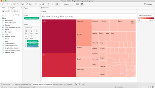
https://public.tableau.com/profile/alice.grama#!/vizhome/Regionalliteracyratessquares/RegionalLiteracyRatesquares?publish=yes
The third visualisation I created enables us to focus on gender equality in literacy. I used a bar chart, originally created by William Playfair more than 300 years ago, a method that utilises reduction (Manovich, 2011).

https://public.tableau.com/profile/alice.grama#!/vizhome/Regionalliteracyratesbygender/RegionalLiteracyRatebygender?publish=yes
This chart proves how a spatial variable like size is used to reveal key differences in data, also highlighting patterns and relations.
In about 2/3 of countries, young men and women have the same literacy rates. However, in many countries, particularly in West and Central Africa and South Asia, the literacy rate for women is considerably smaller than their male counterparts. The way the visualisation is built - the side-by-side bars - makes us notice the discrepancies between genders.
The way I framed the last visualisation sadly narrates differences in gender regarding literacy in some regions. I think this links directly to D'Ignazio and Klein’s (2020) concern about gender inequality.
References:
D'Ignazio, C. and Klein, L. 2020. 3. On Rational, Scientific, Objective Viewpoints from Mythical, Imaginary, Impossible Standpoints. Data Feminism. pp. 2-32.
Manovich, L. 2011. What is visualisation? Visual Studies. 26(1). pp. 36-49.
Youth literacy rate, population aged 15-24. 2019. [Online]. Available from: https://data.unicef.org/topic/education/literacy/
0 notes
Text
COMM2126 Digital Media and the Senses Task 2 [me19ag]
For this week’s task we were asked to select a topic that interests us and use scraping tools to collect data about it.
My choice of topic is The Crown, a Netflix original series. The series follows the life and time of Queen Elizabeth II and plays off of real life events and how they affected the royal family. Of course, creator Peter Morgan’s series is a TV show, so it is a dramatic interpretation of the events - it is not made with any endorsement of the royal household (Donald McCabe, the Queen’s communication secretary).
I thought this would be an interesting object of analysis and expected loads of data since a new season of the series has been recently announced.
I started off by scraping data off the official Instagram page of the series (https://www.instagram.com/thecrownnetflix) using ScrapeHero.

I set the number of posts to scrape to 10 and these are the results I got:
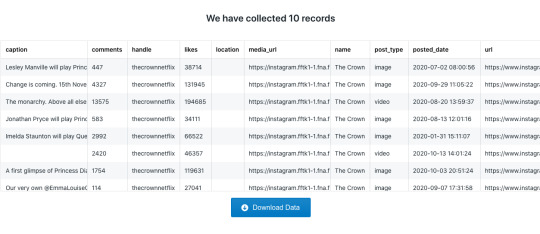
I chose to analyse the data within the browser rather than downloading it into Excel because this way I could also see the captions of the pictures.
We can see from afar that the most interacted with post is the one announcing the arrival date of the 4th season of the series. I was expecting this since the majority of the followers are fans of the show, expressing their love and support for the cast.
From a semiotic point of view, I chose to analyse three pictures.

This first one captures Emma Corrin, the actress who will be interpreting Princess Diana in the 4th season of the TV series. Everything within the set is iconic - it resembles a room in the Buckingham Palace, we recognise it and is an easy symbol to interpret. The elegance of the setting goes hand in hand with the costume design that is here highlighted - an interpretation of Princess Diana’s wedding dress. I think it symbolises the spirit and style of an exceptional formal event in the Royal family.
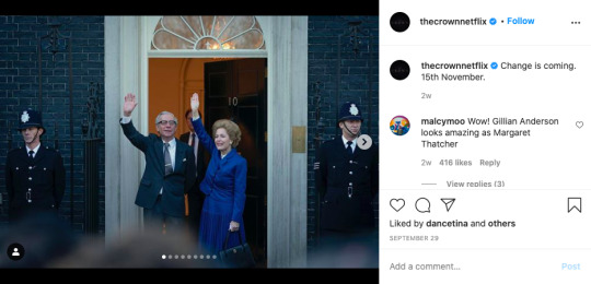
The second image is also very rich in semiotic meaning. We recognise the set as being in front of the Prime Minister’s Office, 10 Downing Street. This is a perfect example how meaning is shifted from a connotative level to a denotative level - we have the social knowledge of this famous place and we can recognise the female character as Margaret Tatcher.
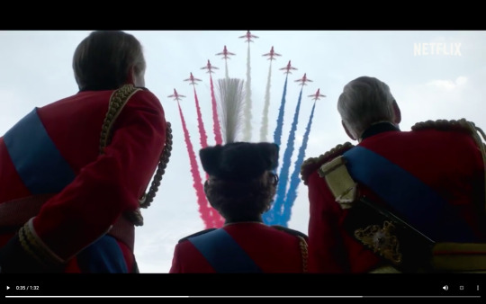
Last but not least, I decided to analyse a shot from a video posted on the series’ instagram page. This one depicts an aircraft parade. I think it symbolises the progress and strength of the nation. The red white and blue smoke traces are an indexical symbol that is logically connected to what they stand for - the flag of the United Kingdom and the Royal Air Force.
The second set of records I decided to scrape and have a look at were the first 10 results from searching the hashtag #thecrown on Instagram.

The data collection returned information about 10 posts. I was surprised that even though I pasted the link from the page pictured above (top posts), the scraper gathered data about the most recent posts.

Results from searching the most recent posts tagged #thecrown:
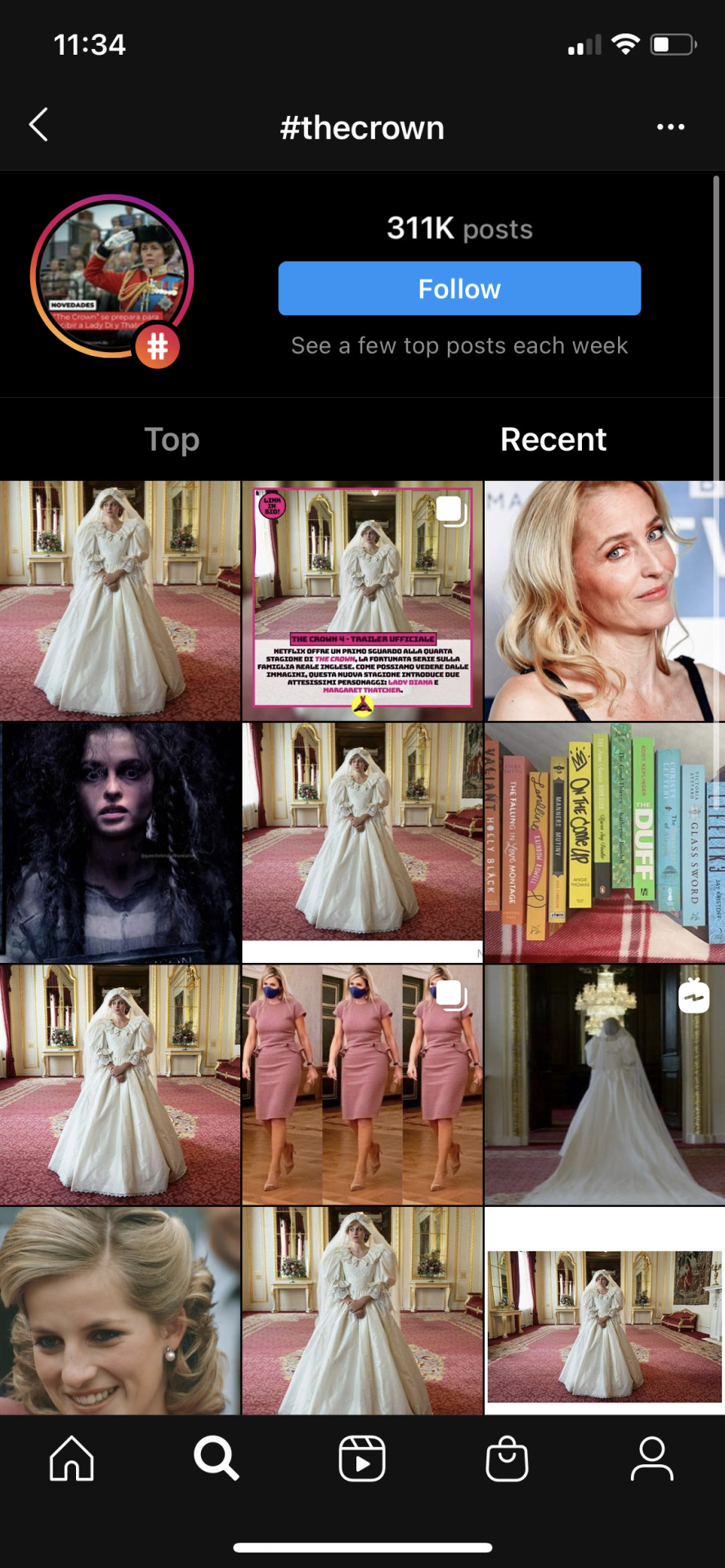
A few things caught my eye by analysing these records - not all the pictures tagged #thecrown were referring to the series. One depicted King Willem-Alexander and Queen Maxima of The Netherlands while another one featured a couple of books. The vast majority (8/10) did, however, feature pictures related to the birtish TV show and it’s cast.
Last but not least, I decided to scratch data from Twitter to see the show’s fans reaction on the day the trailer for the 4th season was released - the 20th of August 2020.
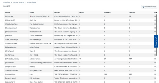
Using the advanced Twitter search, I limited the time frame between the 20th and the 21st of August, I excluded replies and retweets and I ended up with 73 tweets. We can clearly see that fans are buzzing for the new season of the show - “Booking that weekend off work....”, “THE CROWN IS COMING OUT NOVEMBER 15TH AND WE GET TO SEE PRINCESS DIANA I’M - SCREAMING”.
To sum up, I think this data scraping task made quite an impression on me. It is amazing to see how much we can learn about a subject just by analysing social media and the semiotic meanings behind texts.
References:
Chandler, D. Semiotics for beginners. Available from: http://visual-memory.co.uk/daniel/Documents/S4B/?LMCL=nkmZwf
The Crown (TV Series) on IMDb. Available from: https://www.imdb.com/title/tt4786824/?ref_=nv_sr_srsg_0
Thurlow, C., Aiello, G. and Portmann, L. 2020. Visualizing teens and technology: A social semiotic analysis of stock photography and news media imagery. New Media & Society. 22(3), pp. 528–549.
Ponievozik, J. 2019. Review: ‘The Crown’ and the Burdens of a No-Drama Queen. The New York Times. 14 November. Available from: https://www.nytimes.com/2019/11/14/arts/television/the-crown-review-netflix.html
The Queen does NOT approve of Netflix's 'The Crown' - https://www.youtube.com/watch?v=kdIG_ZsrdUs
0 notes
Text
COMM2126 Digital Media and the Senses Task 1 [me19ag]
For this week’s task we were asked to creatively map our learning space in order to know it differently.
At first sight, I expected this to be an easy task. I might have complicated it by taking a different approach but I am proud that I challenged myself and gained insight about multi-sensory mapping that I wouldn’t have had I taken the easy route. I could have gone for illustrations - as a website from the suggested related projects inspired me to - https://sensorymaps.com/ . But I chose to make a video, challenging my newly developed skills in a software we are learning for another module, COMM2870 Motion Graphics. Using Adobe After Effects to represent the different sensorial experiences in my room meant I had the opportunity to get creative: I took pictures, videos and recordings in order to capture vision, sound, smell and touch. This process made me realise how extremely intertwined our senses are, which is why McLuhan and Howes’ concern about how one sense might be dominant or subordinate to another got me thinking. At first I thought that vision is at the top of the hierarchy of the senses, but doing research and working on my mapping I reached the conclusion they are interdependent, intertwined just like a spider web.
My overall experience of mapping my room was intellectually stimulating and frustrating at the same time. Working with a software I was not yet comfortable with and having difficulties just made me realise the amount of time and energy I have invested for this task. Be that as it may, I gained deeper insights and a better understanding of this week’s lecture about the tight relation between digital media and the senses. To conclude with, the medium I chose to map with is certainly a mixed media, a“mixture of sensory, perceptual and semiotic elements” (Mitchell, 2005, cited in Pink, 2015, p. 9).
https://youtu.be/EUw76WFoekc
youtube
References:
Mattern, S. 2015. Deep Mapping the Media City. University of Minnesota Press: Minneapolis. Available from: https://wordsinspace.net/shannon/wp-content/uploads/2017/08/mattern_deepmapping.pdf
Pink S. 2015. Approaching Media through the Senses: Between Experience and Representation. Media International Australia. 154(1), pp. 5-14.
1 note
·
View note