Last Seen Blogs
demigardess
DemiGardess

marissafonte
Marissa Fonte
thesolitarysoul
रंजिश - ए - ग़म
themostat
four mice in a trenchcoat

revive1ne
Revive1
Text
Bibliography
List of Websites:
Sundberg, M., 2022. Stand Still Stay Silent [online] Available at: http://sssscomic.com/ [Accessed 10 March 2023]
Sundberg, M., 2023. Hummingfluff Studio [online] Available at: https://www.hummingfluff.com/ [Accessed 10 March 2023]
FabB, 2019. Stand Still Stay Silent Week – Interview Minna Sundberg [online] Available at: https://chroniquescomics.fr/stand-still-stay-silent-week-interview-minna-sundberg/ [Accessed 10 March 2023]
Sundberg, M., 2023. Hummingfluff (YouTube channel) [online] Available at: https://www.youtube.com/c/Hummingfluff [Accessed 10 March 2023]
V&A Museum, 2021. Stained glass: an introduction [online] Available at: https://www.vam.ac.uk/articles/stained-glass-an-introduction [Accessed 10 March 2023]
Davidson, L., 2023. What Did People Wear in Medieval England? [online] Available at: https://www.historyhit.com/what-did-people-wear-in-medieval-england/ [Accessed 10 March 2023]
Cartwright, M., 2018. Clothes in Medieval England [online] Available at: https://www.worldhistory.org/article/1248/clothes-in-medieval-england/ [Accessed 10 March 2023]
List of Figures:
Figure 1. Minna SUNDBERG. ca. 2013-2022. No title. [digital]. Character Design References [online] Available at: https://characterdesignreferences.com/artist-of-the-week-13/minna-sundberg [Accessed 10 March 2023]
Figure 2. Minna SUNDBERG. ca. 2013-2022. No title. [digital]. Character Design References [online] Available at: https://characterdesignreferences.com/artist-of-the-week-13/minna-sundberg [Accessed 10 March 2023]
Figure 3. Minna SUNDBERG. ca. 2013-2022. No title. [digital]. Character Design References [online] Available at: https://characterdesignreferences.com/artist-of-the-week-13/minna-sundberg [Accessed 10 March 2023]
Figure 4. Minna SUNDBERG. ca. 2013-2022. No title. [digital]. Character Design References [online] Available at: https://characterdesignreferences.com/artist-of-the-week-13/minna-sundberg [Accessed 10 March 2023]
Figure 5. Minna SUNDBERG. ca. 2013-2022. No title. [digital]. Character Design References [online] Available at: https://characterdesignreferences.com/artist-of-the-week-13/minna-sundberg [Accessed 10 March 2023]
Figure 6. Minna SUNDBERG. ca. 2013-2022. No title. [digital]. Character Design References [online] Available at: https://characterdesignreferences.com/artist-of-the-week-13/minna-sundberg [Accessed 10 March 2023]
Figure 7. Minna SUNDBERG. ca. 2013-2022. No title. [digital]. Character Design References [online] Available at: https://characterdesignreferences.com/artist-of-the-week-13/minna-sundberg [Accessed 10 March 2023]
Figure 8. Minna SUNDBERG. ca. 2013-2022. No title. [digital]. Character Design References [online] Available at: https://characterdesignreferences.com/artist-of-the-week-13/minna-sundberg [Accessed 10 March 2023]
Figure 9. Minna SUNDBERG. ca. 2013-2022. No title. [digital]. Character Design References [online] Available at: https://characterdesignreferences.com/artist-of-the-week-13/minna-sundberg [Accessed 10 March 2023]
Figure 10. Minna SUNDBERG. ca. 2013-2022. No title. [digital]. Character Design References [online] Available at: https://characterdesignreferences.com/artist-of-the-week-13/minna-sundberg [Accessed 10 March 2023]
Figure 11. WolfyTheWitch. 2022. Screenshot from: Creature [Philza | PMV]. [digital]. YouTube [online] Available at: https://www.youtube.com/watch?v=A3FQObqGFkM [Accessed 10 March 2023]
Figure 12. WolfyTheWitch. 2022. Screenshot from: Creature [Philza | PMV]. [digital]. YouTube [online] Available at: https://www.youtube.com/watch?v=A3FQObqGFkM [Accessed 10 March 2023]
Figure 13. Akidachi. 2021. Screenshot from: A DISTORTION'S TRIAL [the magnus archives MV] (FLASHING WARNING). [digital]. YouTube [online] Available at: https://www.youtube.com/watch?v=p1aRjjbrM_o [Accessed 10 March 2023]
Figure 14. Akidachi. 2021. Screenshot from: A DISTORTION'S TRIAL [the magnus archives MV] (FLASHING WARNING). [digital]. YouTube [online] Available at: https://www.youtube.com/watch?v=p1aRjjbrM_o [Accessed 10 March 2023]
Figure 15. hex!. 2022. Screenshot from: W.I.T.C.H | Double Life SMP. [digital]. YouTube [online] Available at: https://www.youtube.com/watch?v=MhFDVkOANEs [Accessed 10 March 2023]
Figure 16. hex!. 2022. Screenshot from: W.I.T.C.H | Double Life SMP. [digital]. YouTube [online] Available at: https://www.youtube.com/watch?v=MhFDVkOANEs [Accessed 10 March 2023]
Figure 17. hex!. 2022. Screenshot from: W.I.T.C.H | Double Life SMP. [digital]. YouTube [online] Available at: https://www.youtube.com/watch?v=MhFDVkOANEs [Accessed 10 March 2023]
Figure 18. grace. 2020. Screenshot from: The Magnus Archives ||「PMV」|| Please Not Now. [digital]. YouTube [online] Available at: https://www.youtube.com/watch?v=mnEqQCs6LFg [Accessed 10 March 2023]
Figure 19. grace. 2020. Screenshot from: The Magnus Archives ||「PMV」|| Please Not Now. [digital]. YouTube [online] Available at: https://www.youtube.com/watch?v=mnEqQCs6LFg [Accessed 10 March 2023]
Figure 20. grace. 2020. Screenshot from: The Magnus Archives ||「PMV」|| Please Not Now. [digital]. YouTube [online] Available at: https://www.youtube.com/watch?v=mnEqQCs6LFg [Accessed 10 March 2023]
Figure 21. WolfyTheWitch. 2022. Creature [Philza | PMV]. [digital, video]. YouTube [online] Available at: https://www.youtube.com/watch?v=A3FQObqGFkM [Accessed 10 March 2023]
Figure 22. Akidachi. 2021. A DISTORTION'S TRIAL [the magnus archives MV] (FLASHING WARNING). [digital, animation]. YouTube [online] Available at: https://www.youtube.com/watch?v=p1aRjjbrM_o [Accessed 10 March 2023]
Figure 23. hex!. 2022. W.I.T.C.H | Double Life SMP. [digital, animation]. YouTube [online] Available at: https://www.youtube.com/watch?v=MhFDVkOANEs [Accessed 10 March 2023]
Figure 24. grace. 2020. The Magnus Archives ||「PMV」|| Please Not Now. [digital, animation]. YouTube [online] Available at: https://www.youtube.com/watch?v=mnEqQCs6LFg [Accessed 10 March 2023]
Figure 25. Unknown maker. ca. 1210 with later restorations. Panel showing a King from a Tree of Jesse window. [stained glass]. V&A [online]. Available at: https://www.vam.ac.uk/articles/stained-glass-an-introduction [Accessed 10 March 2023]
Figure 26. Unknown maker. ca. 1350-55. Panel showing the Annunciation to St Anne from the pilgrimage church of Maria Strassengel. [stained glass]. V&A [online]. Available at: https://www.vam.ac.uk/articles/stained-glass-an-introduction [Accessed 10 March 2023]
Figure 27. Unknown maker. ca. 1140-44. Detail from the border of a window. [stained glass]. V&A [online]. Available at: https://www.vam.ac.uk/articles/stained-glass-an-introduction [Accessed 10 March 2023]
Figure 28. Unknown maker. ca. 1200-20. Panel with foliage from a window border in Canterbury Cathedral. [stained glass]. V&A [online]. Available at: https://www.vam.ac.uk/articles/stained-glass-an-introduction [Accessed 10 March 2023]
Figure 29. Unknown maker. ca. 1300-25. Stained-glass panel depicting the top of a canopy. [stained glass]. V&A [online]. Available at: https://www.vam.ac.uk/articles/stained-glass-an-introduction [Accessed 10 March 2023]
Figure 30. Sir Joseph Noel PATON. 1884. Carnegie Historical Window in Dunfermline Abbey. [stained glass]. Andrew Carnegie Birthplace Museum [online]. Available at: https://www.carnegiebirthplace.com/blog/2019/08 [Accessed 10 March 2023]
Figure 31. Tiffany Studios. 1913. The Tiffany Window. [stained glass]. Andrew Carnegie Birthplace Museum [online]. Available at: https://www.carnegiebirthplace.com/blog/2019/08 [Accessed 10 March 2023]
Figure 32. Douglas STRACHAN. 1903. No title. [stained glass]. Andrew Carnegie Birthplace Museum [online]. Available at: https://www.carnegiebirthplace.com/blog/2019/08 [Accessed 10 March 2023]
Figure 33. Millie GRIFFITHS. 2023. Snowdrops Version 1. [digital]
Figure 34. Millie GRIFFITHS. 2023. Snowdrops Version 2. [digital]
Figure 35. Unknown maker. ca. 2010-23. Online clothing store photograph. From: FellAndFair [online] Available at: https://www.etsy.com/uk/listing/752790978/knights-surcoat [Accessed 10 March 2023]
Figure 36. Unknown maker. ca. 2010-23. Online clothing store photograph. From: FellAndFair [online] Available at: https://shop.fellandfair.com/products/surcoat [Accessed 10 March 2023]
Figure 37. Unknown maker. ca. 2010-23. Online clothing store photograph. From: FellAndFair [online] Available at: https://www.etsy.com/uk/listing/752791602/medieval-linen-tabard [Accessed 10 March 2023]
Figure 38. Unknown maker. ca. 2010-23. Online clothing store photograph. From: FolkOfTheWood [online] Available at: https://www.etsy.com/uk/listing/786614891/medieval-wool-cloak-hooded-cape [Accessed 10 March 2023]
Figure 39. Unknown maker. Unknown. Online clothing store photograph. From Kokosh’s medieval online shop [online] Available at: https://gambeson.pl/produkt/houppelande/ [Accessed 10 March 2023]
Figure 40. Albert KRETSCHMER. 1882. A.D. 500-1000, Anglo-Saxons. [unknown]. World History Encyclopedia [online] Available at: https://www.worldhistory.org/article/1248/clothes-in-medieval-england/ [Accessed 10 March 2023]
Figure 41. Albert KRETSCHMER. 1882. 1200, English. [unknown]. World History Encyclopedia [online] Available at: https://www.worldhistory.org/article/1248/clothes-in-medieval-england/ [Accessed 10 March 2023]
Figure 42. Albert KRETSCHMER. 1882. 1300-1400, English. [unknown]. World History Encyclopedia [online] Available at: https://www.worldhistory.org/article/1248/clothes-in-medieval-england/ [Accessed 10 March 2023]
Figure 43. Cicely Mary BARKER. ca. 1923-70. The Ribwort Plantain Fairy. [pen and ink, watercolour]. Flower Fairies [online] Available at: https://flowerfairies.com/ribwort-plantain-fairy/ [Accessed March 10 2023]
Figure 44. Cicely Mary BARKER. ca. 1923-70. The Elm Fairy. [pen and ink, watercolour]. Flower Fairies [online] Available at: https://flowerfairies.com/elm-tree-fairy/ [Accessed March 10 2023]
Figure 45. Cicely Mary BARKER. ca. 1923-70. The Beech Tree Fairy. [pen and ink, watercolour]. Flower Fairies [online] Available at: https://flowerfairies.com/beech-tree-fairy/ [Accessed March 10 2023]
Figure 46. Cicely Mary BARKER. ca. 1923-70. The Dead-nettle Fairy. [pen and ink, watercolour]. Flower Fairies [online] Available at: https://flowerfairies.com/dead-nettle-fairy/ [Accessed March 10 2023]
Figure 47. Cicely Mary BARKER. ca. 1923-70. The Sow Thistle Fairy. [pen and ink, watercolour]. Flower Fairies [online] Available at: https://flowerfairies.com/sow-thistle-fairy/ [Accessed March 10 2023]
Figure 48. Cicely Mary BARKER. ca. 1923-70. The Dog-violet Fairy. [pen and ink, watercolour]. Flower Fairies [online] Available at: https://flowerfairies.com/dog-violet-fairy/ [Accessed March 10 2023]
Figure 49. Millie GRIFFITHS. 2023. Eidar character sketches. [pencil]
Figure 50. Millie GRIFFITHS. 2023. Eidar character sketches. [pencil]
Figure 51. Millie GRIFFITHS. 2023. Eidar character reference sheet. [digital]
Figure 52. Millie GRIFFITHS. 2023. Eidar character reference sheet. [digital]
Figure 53. Millie GRIFFITHS. 2023. Eidar character reference sheet. [digital]
Figure 54. Millie GRIFFITHS. 2023. Dante character sketches. [pencil]
Figure 55. Millie GRIFFITHS. 2023. Dante character reference sheet. [digital]
Figure 56. Millie GRIFFITHS. 2023. Dante and Eidar mock illustration. [digital]
Figure 57. Millie GRIFFITHS. 2023. Thumbnail sketches. [pencil]
Figure 58. Millie GRIFFITHS. 2023. Thumbnail sketches. [pencil]
Figure 59. Millie GRIFFITHS. 2023. Thumbnail sketches. [pencil]
Figure 60. Unknown. Unkonwn. Model ship [model]. Falmouth: The Maritime Museum. Exhibition March 2023 to December 2024: Pirates. Photograph taken by the author 20 April 2023.
Figure 61. Unknown. Unkonwn. Model ship [model]. Falmouth: The Maritime Museum. Exhibition March 2023 to December 2024: Pirates. Photograph taken by the author 20 April 2023.
Figure 62. Unknown. Unkonwn. Captain Pugwash paraphernalia [mixed media]. Falmouth: The Maritime Museum. Exhibition March 2023 to December 2024: Pirates. Photograph taken by the author 20 April 2023.
Figure 63. Unknown. Unkonwn. Pirate costumes [clothing, mannequins]. Falmouth: The Maritime Museum. Exhibition March 2023 to December 2024: Pirates. Photograph taken by the author 20 April 2023.
Figure 64. Unknown. Unkonwn. Model ship [model]. Falmouth: The Maritime Museum. Exhibition March 2023 to December 2024: Pirates. Photograph taken by the author 20 April 2023.
Figure 65. Unknown. Unkonwn. Model ship [model]. Falmouth: The Maritime Museum. Exhibition March 2023 to December 2024: Pirates. Photograph taken by the author 20 April 2023.
Figure 66. Unknown. Unkonwn. Illustrated map [ink]. Falmouth: The Maritime Museum. Exhibition March 2023 to December 2024: Pirates. Photograph taken by the author 20 April 2023.
Figure 67. Unknown. Unkonwn. Old written document [ink]. Falmouth: The Maritime Museum. Exhibition March 2023 to December 2024: Pirates. Photograph taken by the author 20 April 2023.
Figure 68. Unknown. Unkonwn. Model ship [model]. Falmouth: The Maritime Museum. Exhibition March 2023 to December 2024: Pirates. Photograph taken by the author 20 April 2023.
Figure 69. Unknown. Unkonwn. Model ship-in-a-bottle [model]. Falmouth: The Maritime Museum. Exhibition March 2023 to December 2024: Pirates. Photograph taken by the author 20 April 2023.
Figure 70. Millie GRIFFITHS. 2023. IFY End of Year Show poster. [digital]
Figure 71. Brother posing for a reference photo. April 2023. Penzance, Cornwall. Photograph by the author.
Figure 72. Mother and brother posing for a reference photo. April 2023. Penzance, Cornwall. Photograph by the author.
Figure 73. Brother posing for a reference photo. April 2023. Penzance, Cornwall. Photograph by the author.
Figure 74. Brother posing for a reference photo. April 2023. Penzance, Cornwall. Photograph by the author.
Figure 75. Mother and brother posing for a reference photo. April 2023. Penzance, Cornwall. Photograph by the author.
Figure 76. Rocky valley with a river. April 2023. Nanquidno valley, Sennen, Cornwall. Photograph by the author.
Figure 77. Old stone ruins. May 2022. Carn Euny, Sancreed, Penzance, Cornwall. Photograph by the author.
Figure 78.Woodland. February 2023. Trevaylor Woods, Penzance, Cornwall. Photographed by the author.
Figure 79. English village on Google Street View 28 April 2023. [screenshot by the author]
Figure 80. Church Street, Lacock, England on Google Street View 28 April 2023. [screenshot by the author]
Figure 81. Millie GRIFFITHS. 2023. Wayfaring Stranger PMV illustration progress screenshot. [digital]
Figure 82. Millie GRIFFITHS. 2023. Wayfaring Stranger PMV illustration progress screenshot. [digital]
Figure 83. Millie GRIFFITHS. 2023. Wayfaring Stranger PMV illustration progress screenshot. [digital]
Figure 84. Millie GRIFFITHS. 2023. Wayfaring Stranger PMV illustration progress screenshot. [digital]
Figure 85. Millie GRIFFITHS. 2023. Wayfaring Stranger PMV illustration progress screenshot. [digital]
Figure 86. Millie GRIFFITHS. 2023. Wayfaring Stranger PMV illustration progress screenshot. [digital]
Figure 87. Millie GRIFFITHS. 2023. Wayfaring Stranger PMV illustration progress screenshot. [digital]
Figure 88. Millie GRIFFITHS. 2023. Wayfaring Stranger PMV illustration progress screenshot. [digital]
Figure 89. Millie GRIFFITHS. 2023. Wayfaring Stranger PMV illustration progress screenshot. [digital]
Figure 90. Millie GRIFFITHS. 2023. Wayfaring Stranger PMV illustration progress screenshot. [digital]
Figure 91. Millie GRIFFITHS. 2023. Wayfaring Stranger PMV. [digital, animation]. YouTube [online] Available at: https://www.youtube.com/watch?v=ibt2ytl_15M [Accessed 12 May 2023]. Song used: The Longest Johns. 2022. Wayfaring Stranger. [music]. YouTube [online] Available at: https://www.youtube.com/watch?v=DJzEiV1sGaY [Accessed 10 May 2023]
Figure 92. Wayfaring Stranger PMV on display at end of year show. May 2023. The Poly, Falmouth, Cornwall. Photograph by the author.
0 notes
Video
youtube

Figure 91. Figure 92.
After finishing all the line art, I went back through and began the colouring process with Photoshop’s basic round brush. As I’m making a PMV and as such was dealing with 16 full illustrations, I decided to keep the colouring simple with only block colours. I felt that it would have taken too long to include detail and shading in so many illustrations.
To keep things consistent throughout the PMV, I chose to reuse colours wherever I could. Most of the time I kept the same ‘grass’, ‘wood’ & ‘leaf’ colours throughout the scenes, and made sure to refer back to my character sheets to sample the correct colours using the eyedropper tool. Once I had coloured in each scene I then decided on type of lighting they had, and filled a new layer with either a block yellow or blue colour set to a lowered opacity and either the ‘hard light’ or ‘soft light’ blending mode. This made all the colours in the scene fit together better for a more unified feeling, while also helping to give a better impression of the weather/time of day.
As I’d decided much earlier on in the project, I also gave each of the illustrations a textured overlay with a leaf textured brush that comes with the basic Photoshop brush pack. I made this by setting the layer to the ‘soft light’ blend mode at around 30% opacity, and going over the whole image with multiple alternating layers of black and white with the leaf brush. On the two scenes with the wolf ‘demons’ I also created a second overlay like this to add an extra texture that was meant to emulate dappled light through a canopy of leaves, while on a few other scenes I created layers of coloured versions in specific areas to create the effect of more direct lighting - i.e. the glow from a moon, lantern, or campfire.
Once I’d finished and saved all the illustrations, making sure to save each aspect of a scene separately, I transferred them all over into the video editing software I was using (Shotcut) along with an audio recording of the song I’m using: Wayfaring Stranger. First, I needed to line them all up with the lyrics of the song, making sure they all lasted for the correct duration and that all layers for scenes were on the correct video tracks. Then I used keyframes to set up the blur and movement/resize filters anywhere I needed them, so that I could time the movement/blurring with the lyrics.
In the end, I think the PMV achieved its goal to tell a trailer-esque version of Eidar and Dante’s story. I’m pleased with a lot of the backgrounds and the way my line art & colouring/texturing style hints at the stained glass windows that inspired it. However, I do still think I could have improved my character art - especially the expressions - if I’d had more time for practice and trial & error. Given more time, I’d also have liked to see what the PMV looked like if I managed to add a lot more detail and shading to the illustrations.
0 notes
Photo


Figure 81. Figure 82. Figure 83. Figure 84. Figure 85. Figure 86. Figure 87. Figure 88. Figure 89. Figure 90.
For this project I ended up working on all the scenes simultaneously as I found it much easier to keep the line art consistent when I didn’t need to keep changing brush (and the size) to work on colouring. I decided to use a brush that emulates a pencil like texture for the line art as the texturing and slight transparency gave the illustrations some more variance than they would otherwise have had, which leant itself to the slightly rough and sketchy style I ended up using. I used this more rough style in part due to the fact it increased the speed at which I could work, and in part because it matches the imperfect and handmade look of stained glass.
For many of the scenes I planned to create some movement or blurring effect in the finished PMV, and so any time I wanted some form of change to happen I had to be very careful about how I split the line art up onto different layers so that I could save each section separately and layer them up in the video editing software later. Most of the time this just meant having a background and a foreground layer, however in some circumstances - like the moving cart in fig. 90- I needed a third layer when the moving object wasn’t at the forefront of the scene.
Overall, I’ve been especially proud of many of the backgrounds I illustrated for these scenes. Before this project I tended to end up with mainly simple ‘flat’ backgrounds when I drew scenes, rather than more dynamic perspectives, however with the help of my own reference images and screenshots of google street view I feel like I’ve started to begin to understand how create more 3D feeling backgrounds, as well as how to place characters and objects within these scenes. On the other hand, I do think I could improve the proportions and expressions of the characters in many of the scenes. Before the start of this year I’d hardly had any practice drawing people, so I am proud with how far I’ve come - especially when it comes to dynamic poses that aren’t explicitly from a singular reference image - but as I had to draw so many characters and scenes within this project I know I didn’t have the time to work on each individual one to the standards I’ve managed in some of my other illustrations, and so I fell back into the traps of struggling not to make their heads too big & ending up with over-the-top or slightly off expressions.
Because of the time constraints, there were also a few areas where I reused elements from one scene in another (not including scenes that were specifically designed to mirror each other). I kept this to Dante’s cart, as the two instances were already planned to be in the same position, and the background of scenes set in a town, since all three were taking place in the same town and as such I could justify using the same street to signify that. If I had had more time though, I would have at least illustrated a unique background for each of the town scenes, as that would have been more engaging and allow for more worldbuilding to be fleshed out in the small details of the background elements.
0 notes
Photo
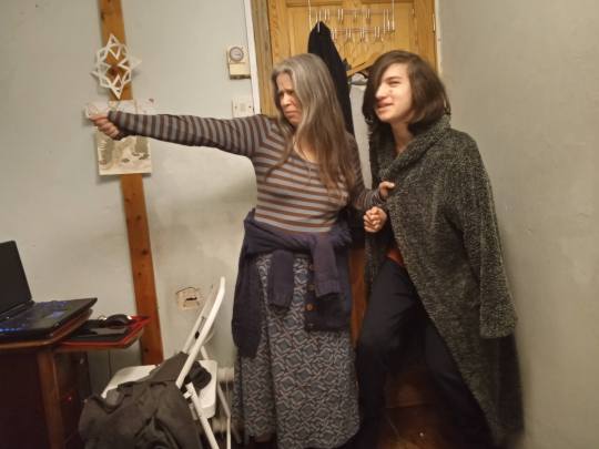


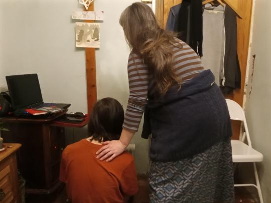


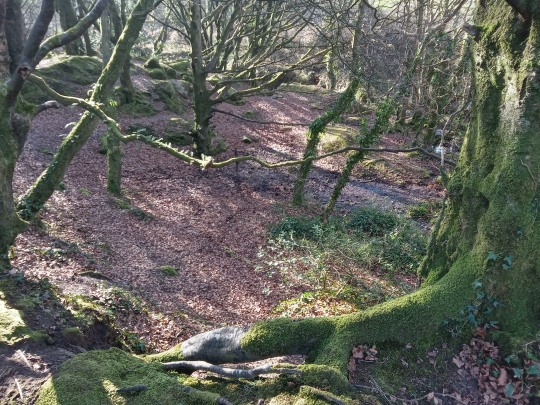
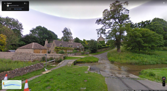

Figure 71. Figure 72. Figure 73. Figure 74. Figure 75. Figure 76. Figure 77. Figure 78. Figure 79. Figure 80.
Over the Easter holiday I took photographs to use as pose and setting references for some of the scenes in the PMV. I also used google maps street view to look at places I found in listings of ‘old medieval villages in the uk’ to use as references for any scenes in towns/villages.
0 notes
Photo
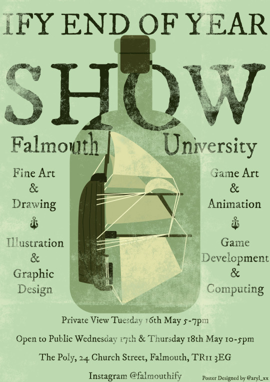
Figure 70.
Alongside this project, I designed this poster for our end of year show. As a group me and some friends on the course were talking about what Falmouth makes us think of, and the main consensus was of the beach & sea, which lead me to thinking of a simplistic ship-in-a-bottle poster design where the text is warped by the glass of the bottle. From there, I sketched it out on Photoshop before making the full version out of vector shapes. I kept each individual shape on its own separate layer while doing this so that I could go back and change any of the colours if I needed to. I also used masking layers with a screen printing texture brush to give the poster a somewhat old fashioned, found-at-sea atmosphere.
Overall, I’m pleased with the poster design - especially the colour scheme and the way the text is warped by the bottle. If I were to make this a second time however, I would like to try a design with a more detailed boat in the bottle, most likely something longer with more sails to give the impression of being a larger ship rather than just a small sailing boat.
0 notes
Photo
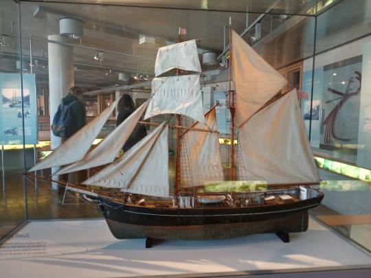

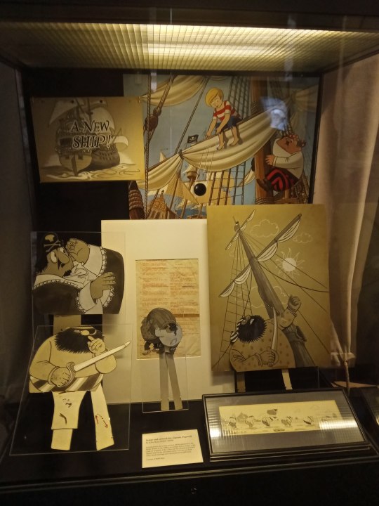


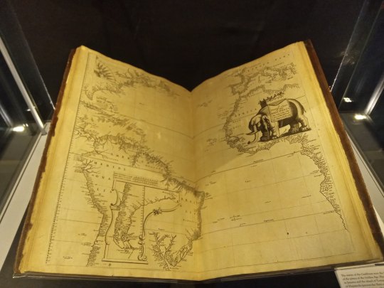

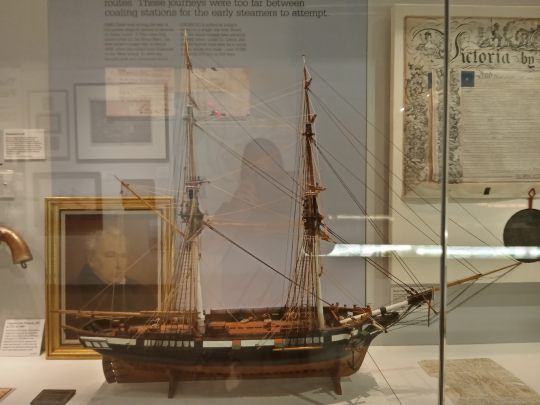

Figure 60. Figure 61. Figure 62. Figure 63. Figure 64. Figure 65. Figure 66. Figure 67. Figure 68. Figure 69.
The trip to the Maritime Museum to see the pirate exhibit was interesting, especially the old documents, maps and model ships. Although they aren’t of much use for this project, I took many photos of the boats as they would be great reference for any time I need to draw old sailing ships in the future.
0 notes
Photo


Figure 57. Figure 58. Figure 59.
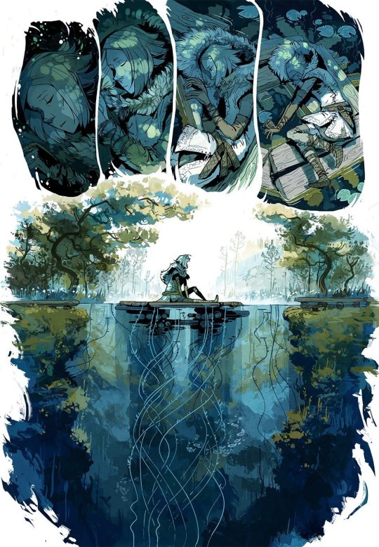
To begin making the PMV I sketched out thumbnails for each lyric of the section of the song I want to use. For each scene I wanted to keep the focus on the two main characters (Eidar and Dante), with the two of them being together in almost every scene as the PMV focuses on their meeting and travels together. I kept the sketches very simple as I was focusing on figuring out the way I wanted to tell the story and the overall impressions of each scene, more than what the scenes would actually turn out looking like. For some lyrics I already had a vivid image of how to portray the scenes, however with others I sketched multiple variations until I came to one I felt ‘clicked’.
As I was working on the thumbnail sketches I also created a version with written notes to keep my ideas in line and fill out details I couldn’t really portray in the sketches:
I am a poor wayfaring stranger – Dante selling wares in a village
Traveling through this world of woe – Dante with cart travelling past ruins
There is no sickness, toil or danger – Eidar waving goodbye to elven village
In that fair land to which I go – Eidar getting attacked by demons
I'm goin' home to see my mother – Eidar running in front of Dante’s cart
I'm goin' home, no more to roam – Dante holding Eidar at sword point with Eidar cowering
I'm just goin' over Jordan - Dante lowers the sword to the ground with Eidar cowering slightly less
I'm just goin' over home - Dante has dropped the sword and is holding Eidar’s hand as if pulling him to his feet
I know dark clouds will hover on me - Coming to the city for the first time (grand shot of city & surrounding countryside from atop a hill - Eidar and Dante silhouetted)
I know my path is rough and steep – Dante selling stuff with Eidar off to the side shrouded in shadows from his cloak, leaning against cart, arms crossed
But golden fields lie out before me – Both running from the guards
Where weary eyes no more shall weep – On the road travelling – sitting on the back of the cart, illuminated by a lantern between them, looking up at the stars
I'm goin' home to see my father - On the road travelling – exploring ruins, Eidar climbing a section while Dante watches?
I'm goin' home, no more to roam - On the road travelling – fighting back-to-back against demons, close up, grinning
I'm just goin' over Jordan - On the road travelling – stopping for camp by a river, relaxing/having fun
I'm just goin' over home – Standing outside Eidar’s village (make sure it’s recognisable as the same place as from ‘There is no sickness, toil or danger’) with it burnt to the ground/destroyed
0 notes
Photo
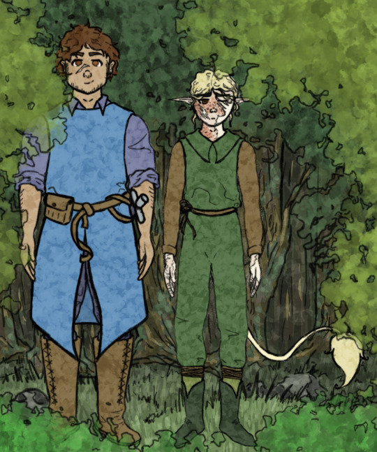
Figure 56.
After completing the character sheets for Eidar and Dante I decided to use the illustrations from those to create a quick mock-up scene. This was to help me visualise what the two characters would look like next to each other - especially when it comes to their relative heights to each other - as well as give me another chance to experiment with the style I may want to make the PMV in.
0 notes
Photo
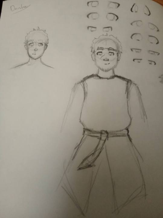
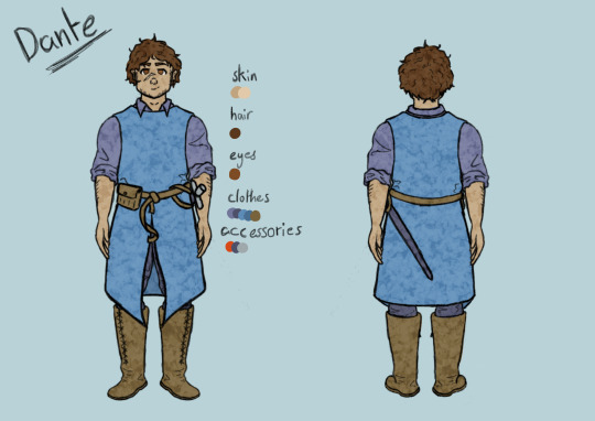
Figure 54. Figure 55.
When designing Dante I knew I wanted to go for a somewhat simpler design overall. He’s a rather successful snake-oil-salesman who travels from town to town selling his wares and has ties to some more illegal groups and business. He’s used to travelling alone with his cart, so I made sure to give him a sword as he’s the sort of person who’d always make sure he’s prepared to defend himself, and would wear practical - though slightly more specialised for fighting than Eidar’s - travelling clothes. As he’s also someone with a successful business, even if it’s shady, with a decent income, I decided to go with a blue colour scheme for his clothes as it’d be a more expensive dye in the medieval period, along with a small earring on his left ear fashioned from a red semi precious stone.
I spent quite a while trying to figure out what shape I should draw his eyes (see fig. 54) as I wanted them to be different from Eidar’s. In the end I went for a boxy kind of design that I felt reflected his calm personality and his ultimately good heart.
0 notes
Photo
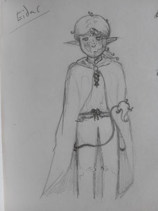


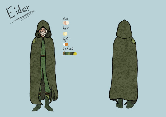
Figure 49. Figure 50. Figure 51. Figure 52. Figure 53.
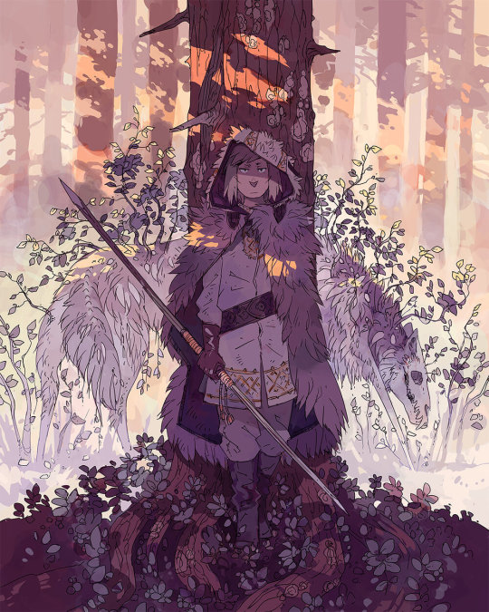
When beginning the character design process for Eidar I already knew most of the key features I wanted to include as he’s a character I created a few years ago, but had never drawn before. He’s an elf (though my own version of elves specific to this fantasy world, hence less stereotypical aspects like the tail) who was attacked by ‘demons’ (animals and/or people infected by a magical virus that makes them rabid) and managed to survive with the help of a group of mercenaries who stumbled across him. Usually if a victim survives they are just left with scars, however due to getting some of the ‘demon’s’ infected blood in his injuries and the magic of healing potions having replenished that blood as if it were his own, Eidar was left in a sort of halfway state where he has some of the physical features of a ‘demon’ (orange, goat like eyes being the most noticeable feature) while still keeping his sense of self and free will - leaving him shunned and having to hide in fear of being attacked for being a ‘demon’.
Because of this I knew I wanted Eidar to be covered in scars that looked like they were from a savage animal attack, especially on his hands, arms & face. This is because I felt as if his face/neck would be the most likely place for the ‘demons’ to attack, while his hands & arms would end up with the brunt of the damage as he used them to try and protect himself. I also knew I wanted his left eye to be damaged beyond repair from the attack, though to begin with I was planning on drawing it normally but without a pupil, instead as if it had a glassy sheen to imply blindness, before realising it felt like a more impactful injury if I left the eye as permanently closed instead as if it had been fully beyond saving. He’s also emaciated because he never fully recovered from the ‘demon’ attack and has been weaker ever since, while on top of that having to travel and live off scraps since the attack due to people finding out his secret and attacking him if he stays in one place too long.
When it came to his clothing I knew I wanted him to own a large cloak he could hide his ‘demon’ features & scars, as well as his elven characteristics, behind, as well as keep his clothing overall simple and focused on functionality as he’s constantly on the move and travelling. I added details to the cloak to highlight the ruggedness and just how long he’s been travelling for.
0 notes
Photo


Figure 43. Figure 44. Figure 45. Figure 46. Figure 47. Figure 48.
While researching medieval clothing I was reminded of Cicely Mary Barker’s flower fairy illustrations. I’ve always really liked many of the outfits in these paintings, and I decided I want to use them as inspiration for Eidar and Dante’s clothing when I move on to creating their character designs. Much of the fairies’ clothing has a distinctly medieval fantasy feeling to it, and yet some also use elements that feel more modern. One that I feel best shows this - and is also my favourite design - is the Ribwort Plantain Fairy (see fig. 43) as the rolled up/shorter sleeves, waistcoat, and style of belt are unlike what seemed common in the medieval period.
0 notes
Photo
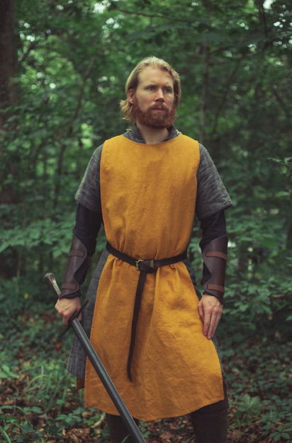


Figure 35. Figure 36. Figure 37. Figure 38. Figure 39. Figure 40. Figure 41. Figure 42.
As the world the story I want to tell in this project is set in is a medieval fantasy one, I decided to research medieval clothing for my character designs.
Clothing in the medieval period had less of a distinction between male and female than today, especially in the early medieval period, where it was common for everyone to wear dress-like garments under long tunics. Belts were common, as were broaches, and jewellery was very expensive and hard to come by - with laws about who could wear what jewellery appearing later in the period.
The differences that denoted whether clothing was for the rich or poor was predominately to do with the quality and rarity of the materials it was made out of, along with the rarity of the dye. Colours like red and purple were expensive and as such mostly worn by royalty and the extremely wealthy, whereas more muted, earthy tones were much easier to make and so more commonly worn by poorer citizens. The view on colours was ‘the brighter the better’ and dyes that didn’t fade were expensive, meaning how vibrant someone’s clothes were could give you some form of idea about their class standing.
It was common to wear some form of head covering when going outside to protect oneself from the sun in the summer and warm in the winter. The type of hat worn could indicate someone’s job or station in life, and they were an important part of medieval culture - a person could even get criminally charged with assault for knocking some else’s hat off their head, it was such a terrible insult. Another common accessory were cloaks or mantles. These came in a multitude of different shapes and sizes and were usually made from roughly round or square pieces of fabric. They could have hoods or not, and were commonly fastened at the shoulder for ease of drawing a sword.
0 notes
Photo
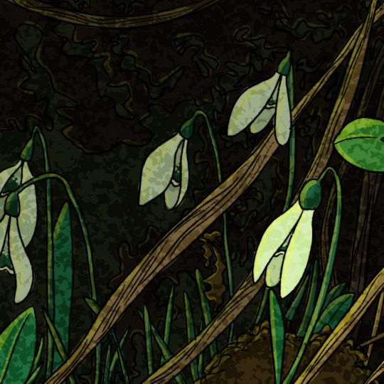

Figure 33. Figure 34.
To explore a stained glass inspired style I created two versions of a simple illustration on Photoshop using different brushes to colour the scene - testing to see which looked more in line with the effect of stained glass windows. For my first test (see fig. 33) I used the basic round brush that Photoshop comes with, however for the second version (see fig. 34) I used watercolour brushed instead. To create the impression of a slightly fuzzy edge that some stained glass windows can give off, I also created a second layer of my line art where I blurred it a small amount with the ‘gaussian blur’ effect.
In the end I think the more vibrant colours of the first version stood out and matched the atmosphere of a stained glass window more, and that along with the fact that the process of using the watercolour brushed took much longer has made me decide to use this method going forward in this project.
0 notes
Photo


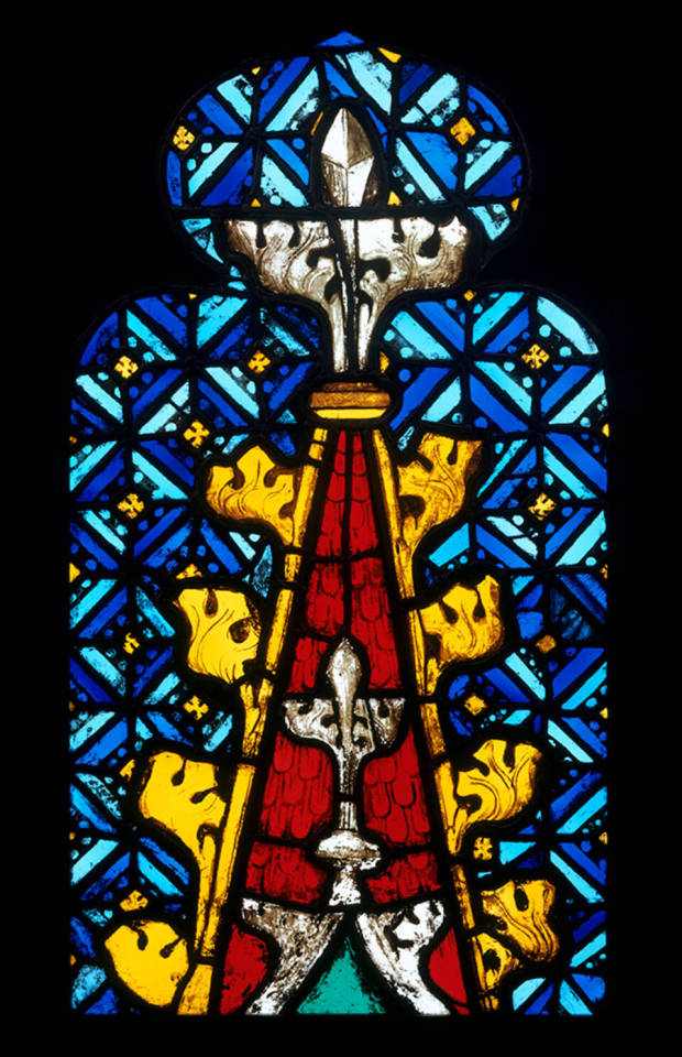


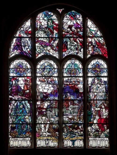
Figure 25. Figure 26. Figure 27. Figure 28. Figure 29. Figure 30. Figure 31. Figure 32.
Stained glass windows are made with the technique of using coloured and painted glass held together with strips of lead to depict usually intricate scenes or patterns. It was popular with religions and the elite of society for much of history, being especially popular within Europe between 1150 - 1550.
The process for creating stained glass windows has barely changed since the twelfth century, and begins with creating sheets of glass to work with. The two ingredients to making glass are sand and ash (for their silica and alkali components), and to create coloured glass powdered metallic oxides would be added during the melting process. Some of these coloured glasses however, especially red, would come out too dark to see light through, so many glass blowers would dip clear glass into the dyed version and work the two together to create a more transparent, but ultimately streaky looking, alternative. This was known as ‘flashed glass’. Because of the expensive prices of coloured glass over its plain counterpart, many stained glass windows would reuse what materials they could.
From there the glass would need to be cut into the needed shapes - which was done with a heating iron in the medieval period and more frequently a diamond cutter from the sixteenth century onwards - before being painted with special glass paints. Finally, the window was assembled by fitting each piece of glass into H shaped pieces of lead called cames which were soldered onto one another to secure the panels. After the cames were in place, putty was rubbed between the glass and lead to make it waterproof and the assembled panel of glass would be attached with lead strips to an iron-work set into the window, which was meant to help support the weight of the glass.
Because of the translucent nature of glass and the way this contrasts with the black of the lead, stained glass windows tend to have a very recognisable style that highlights bold lines and bright, sometimes ethereal looking, colours. I want to take inspiration from this style in this project as I feel it comes with many connotations of myth, legend, and the fantastical - which fits the way I want to tell a portion of a fantasy tale without words through my PMV.
0 notes
Photo


youtube
youtube
youtube
youtube
Figure 11. Figure 12. Figure 13. Figure 14. Figure 15. Figure 16. Figure 17. Figure 18. Figure 19. Figure 20. Figure 21. Figure 22. Figure 23. Figure 24.
PMV is an acronym for ‘picture music video’, an internet term for a type of short piece of visual storytelling - usually using 2D digital drawings - accompanied by a song. It is most notably found on YouTube, but can also be found on other social media sites too where videos are able to be posted. While many PMVs use the lyrics of the song to help illustrate the story they are trying to tell, most don’t intend to focus on the song itself in the way a normal music video might; instead they tend to focus on either telling an original story, or alternatively (as is the case with the four examples) they pay homage to some story or other type of fanbase the creator enjoys.
The art used in a PMV can vary in style and quality massively, going from a much more rough mock-up look that borders on an animatic, to something much more polished, however what keeps them apart from a full animation is the lack of major movement. Some PMVs use solely still images, however it is more common to see each illustration built up in layers that can glide separately to each other to create the illusion of movement. Meanwhile, there are also some PMVs that include small amounts of simple animation, however it’s usually either only a small movement, or choppy with only the minimum frames needed to get the point across if larger movement is needed. Many PMVs also include the lyrics of the song in the illustrations, but this isn’t true of every PMV and is especially unlikely if the song being used has lyrics that don’t quite match up with the story being told - i.e. the song might have been chosen more for the atmosphere and general themes than for specific events detailed in the lyrics.
I have personally always been drawn to PMVs, as well as other similar modes of online storytelling, as they tend to ‘tell a story without actually telling a story’ so to speak. When I watch a PMV about some story I already know and love I can immediately spot all the references and know exactly what’s going on, while watching a PMV for something I have no prior knowledge of feels much more like watching a trailer for that story. I can gleam the broad strokes of the plot, but much is still left up for interpretation as with only images and no prior context it’s much harder to ascertain specifics of characters and plots - especially if the PMV focuses on a large chunk of the story within the few minutes of a song. I’ve never found this off-putting however, instead it draws me in, like a trailer, giving me enough to pique my interest and create questions, while not spoiling too much.
0 notes
Photo


(Images are ordered top to bottom for each post)
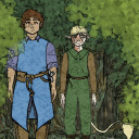
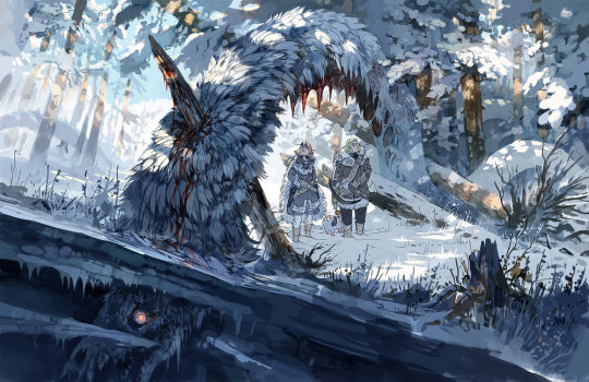
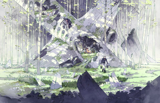
Figure 1. Figure 2. Figure 3. Figure 4. Figure 5. Figure 6. Figure 7. Figure 8. Figure 9. Figure 10.
Minna Sundberg is a Swedish-speaking Finnish illustrator who was born in Sweden, but moved back to Finland with her family when she was 7. She began creating comics when she was 12 as many of her online friends were making their own, even though she wasn’t particularly interested in them, however she came to find that she enjoyed it. It became a hobby for her from then on, but it wasn’t until her time studying Graphic Design at the School of Industrial Arts in Helsinki that she began thinking about getting into comics seriously. She began this by working on the 556 page comic A Redtail’s Dream in her spare time throughout her course. After graduating she began work on her largest comic so far: Stand Still Stay Silent, which started in 2013 and ended in 2022 - which became her full time job while she was making it, even selling merchandise and physical hardback copies of the comic.
Much of Sundberg’s work is inspired by Nordic culture and mythology. Stand Still Stay Silent is also heavily inspired by her love of post-apocalyptic stories - especially ones involving pandemics and mutated monsters.
Her art is painted digitally using mainly Clip Studio Paint, moving into Photoshop at times when colouring for the use of specific brushes. She would begin adding colour very loosely with a blocky semi-transparent brush, before moving on to adding detail with a opaque round brush, all on a singular layer below the line art.
Sundberg’s art has been a big inspiration for me for years since I first discovered Stand Still Stay Silent online. I was immediately drawn to the hauntingly beautiful monsters and scenes of decay she depicts throughout the comic, as I have always been especially interested in themes of fantasy, supernatural & horror throughout any form of storytelling. I also find myself drawn to ‘pretty’ art styles with probably more stylised, cartoony characters/defining features, and I found that Sundberg’s illustrations hit that perfect spot for me between cute/pretty, sophisticated beauty, and horror. Her use of overarching colour schemes in her illustrations and comic pages is another aspect that draws me to her artwork. The way the colour emphasises the mood/tone of the scene and brings it together into a very cohesive feeling product (especially when it comes to comic pages that keep a consistent colour scheme throughout) is something I have always felt inspired to try and emulate in my own work, even if I have never really ended up doing it so fully so far. The detail and delicate line art, along with the way she almost makes her digital art feel like watercolour, also drew me to her work.
1 note
·
View note
Text
Final Major Project
For my FMP I plan on making a PMV (’Picture Music Video’ - an internet term for a video comprised of illustrations shown in time with a song, usually telling a story along with the help of the lyrics) about a fantasy story I created a few years ago. I plan on using the first 2:18 of the cover of the song Wayfaring Stranger by The Longest Johns, as I feel the lyrics and slow pace of the song match up with the story I want to tell without being too much work (as with a faster paced song I’d need to create more illustrations to produce the same length of video).
0 notes