
Last Seen Blogs

keonhacainexus
keonhacainexus

shinyhide
Shinyhide


shark-tank-keto-acv-gummies-buy
Shark Tank Keto ACV Gummies

livingcleanhomestead
Untitled
Text
10 Reasons Your WordPress Site Will Get Hacked (and How to Stop It)

A hacked WordPress site is as damaging as having your home burgled. It can completely shatter your peace of mind and adversely impact your online business.
Why do hackers target WordPress sites? The answer is relatively simple: WordPress is the single biggest platform for website creation these days, so there’s a larger base to attack; this attracts the attention of online criminals.
So, how can a hack impact your website?
Depending on the type of attack, your website could suffer any of the following:
It could be defaced completely;
It could load or operate very slowly on any device;
It could completely crash and malfunction;
It could display the dreadful “White Screen of Death”;
Its incoming visitors could be redirected to other suspicious websites;
It could lose all your valuable customer data.
This list is not exhaustive but you get the idea.
Now that we know how a successful hack can impact your website and online business, let us look at the top 10 reasons behind WP hacks and prevent them.
1. An Insecure Web Host
Like any website, WordPress is hosted on a web host or server. Unfortunately, most site owners do not pay much attention to the web host they select and choose the cheapest they can find. For example, it is more affordable to host a website on a shared hosting plan — one that shares its server resources with many other websites like yours.
This can make your site vulnerable to hackers as a successful hack into any website on the shared server. A single hacked site can consume the overall server bandwidth and impact all the other sites’ performance.
The only way to fix this problem is to opt for a reliable host and a virtual or dedicated server.
Pro tip: If you’re already using a shared hosting plan, check with your hosts if they offer VPS hosting and make the switch.
2. Use of Weak Passwords
Weak passwords are the main reason behind successful brute force attacks that target your account. Even to this day, users continue to use weak and common passwords like “password” or “123456”; if you’re one of them, your website could land in trouble!
Guessing weak passwords allows hackers to enter the admin accounts where they can inflict the maximum damage.
How do you fix this problem? Simple, ensure all your account users (including admin users) configure strong passwords for their login credentials. With at least 8 characters, passwords must be a mix of upper- and lower-case alphabets, numbers, and symbols.
For added safety, install a password management tool that can automatically generate and store strong passwords.
Pro tip: You can use a plugin to reset passwords for all your users.
3. An Outdated WP Version
Outdated software is among the most common reasons why websites get hacked. Despite being free to download, most site users defer updating their site to the latest version, for fears of updates causing their site to crash.
Hackers take advantage of any vulnerability or bug in an older version and cause issues like SQL Injections, WP-VCD Malware, SEO Spam & other major issues like website redirecting to another site.
How do you solve this problem? When you see a notification about an update on your dashboard, update your site as soon as possible.
Pro tip: If you are worried about updates crashing your live website, you can first test the updates on a staging site.
4. Outdated WP Plugins and Themes
Similar to the previous point, hackers also take advantage of outdated, unused, or abandoned plugins and themes installed on websites. With over 55,000 plugins and themes that are available, it is easy to install a plugin or theme, even from unsafe or untrusted websites.
Plus, many users do not update their installed plugins/themes to the latest version or do not find the updated version. This makes it easier for hackers to do their job & infect sites.
How do you avoid this problem? As with the core WP version, update each of your installed plugins/themes on your site regularly. Take stock of all the unused ones and remove them or replace them with better alternatives.
You can update your plugins/themes from your hosting account.
Pro tip: We suggest setting aside time every week to run updates. Test them on a staging site and then update your site.
5. Common Admin Usernames
In addition to weak passwords, users also create common usernames that are easy to guess.
This includes common usernames for admin users like – “admin”, “admin1”, or “admin123”. Common admin usernames make it easier for hackers to get into admin accounts and control backend files in your WP installation.
How do you avoid this problem? If you are using any such usernames that are easy to guess, change them immediately to a unique username. The easiest way of doing it is through your hosting account’s user management tool, by deleting the previous admin user and creating a new admin user with a unique username.
As the first step, change the default username of your admin user and limit users who have administrator privileges.
Pro tip: WordPress has 6 different user roles with limited permissions. Only grant admin access to users who really need it.
6. Use of Nulled Plugins/Themes
Coming back to the importance of plugins/themes, users have access to many websites that sell nulled or pirated copies of popular and paid plugins and themes. While these are free to use, they are often riddled with malware. They can compromise your website’s overall security and make it easier for hackers to exploit.
Being a pirated copy, nulled plugins/themes do not have any available updates from its development team, hence will not have any security fixes.
How do you fix this problem? Simple, for a start, only download original plugins and themes from trusted websites and marketplaces.
Pro tip: If you don’t wish to pay for paid or premium plugins and themes, opt for a free version of the same tools that will have limited features but are still safer to use than the nulled version.
7. Unprotected Access to wp-admin Folder
To take control of your site, hackers often try to break into and control your wp-admin folder in your installation. As the website owner, you must take measures to protect your wp-admin directory.
How can you protect your wp-admin folder? First, restrict the number of users having access to this critical folder. Additionally, apply for password protection as an added layer of security for access to the wp-admin folder. You can do this using the “Password Protection Directories” feature of the cPanel in your web host account.
Pro tip: Besides these fixes, you can also implement Two Factor Authentication (or 2FA) protection for all your admin accounts.
8. Non-SSL Website
You can easily migrate your HTTP website to HTTPS by installing an SSL certificate on your site. SSL (or Secure Socket Layer) is a secure mode of encrypting any data transmission between your web server and the client browser.
Without this encryption, hackers can intercept the data and steal it. Plus, a non-secure website can have many negative implications for your business – lower SEO ranking, loss of customer trust, or a drop in incoming traffic.
How do you fix this problem? You can quickly obtain an SSL certificate from your hosting company or SSL providers. It encrypts all data that is sent from and received by your website.
Pro tip: You can get a free SSL certificate from places like Let’s Encrypt, but these provide limit protection that will only be sufficient for a starter site or small site.
9. No Firewall Protection
Lack of firewall protection is another common reason why hackers can bypass website security measures and infiltrate the backend resources. Firewalls are the last line of defence against hackers and work like the security alarm installed on your house. Firewalls monitor web requests coming from various IP addresses, including the suspicious (or bad) ones.
They can identify and block requests that are known to be malicious in the past, thus preventing easy access for hackers to your website domain. Web application firewalls can thwart various attacks, including brute force attacks, XSS, and SQL injections.
Pro tip: A firewall provides much-needed security and is your first line of defence. But it’s important to also have a malware scanner installed.
10. Lack of WordPress Hardening Measures
Typically, hackers target the most vulnerable areas or weaknesses within a WP installation, to illegally access or damage the website. The WordPress team has identified these vulnerable areas and has devised a list of 12 hardening measures recommended for every website.
A few of these include:
Disabling the File Editor;
Preventing PHP execution in untrusted folders;
Changing the security keys;
Disallowing plugin installations;
Automatic logout of inactive users;
How do you implement these hardening measures? While some steps are easy to understand, others require the technical expertise of how WordPress works.
Pro tip: You can implement hardening measures on your own. However, some measures require technical expertise so in these cases, it’s much easier and safer to use a plugin.
Featured image via Pexels.
Source p img {display:inline-block; margin-right:10px;} .alignleft {float:left;} p.showcase {clear:both;} body#browserfriendly p, body#podcast p, div#emailbody p{margin:0;}
from Webdesigner Depot https://www.webdesignerdepot.com/2020/11/10-reasons-your-wordpress-site-will-get-hacked-and-how-to-stop-it/
0 notes
Text
How to Design a Contact Page That Drives Engagement
How can your customer reach you? If a client arrives on your website after searching on Google, what can they do to take the next step in a relationship with your brand, without buying anything?
One of the primary aims of any website is to drive conversions. However, it usually takes between 5 and 8 touchpoints to generate a viable sales lead. People don’t want to convert straight away.
Since building a relationship with customers is crucial to success, it makes sense that the contact page would be an essential part of driving results. Unfortunately, a lot of website owners pay virtually no attention to that page. They ask their designer to create a page with their address and phone number on – and that’s it.
What many business owners don’t realize, is that the contact page is the door to deeper, more lucrative relationships with potential prospects. The design of this essential website element needs to be fantastic to drive results.
So, where do you start?
Defining a Well-Designed Contact Page
Let’s start with the basics, what makes a great contact page?
The complete answer to that question depends on the target audience. Some customers will want to see fun and friendly contact pages, complete with social media sharing buttons. Others will want to see a map that shows them exactly how to reach an office or business.
There are a few golden rules to keep in mind, of course. Contact pages should be:
Easy to find: Don’t hide the link to the contact page on the website footer. Make it easy for customers to find out how they can get in touch.
Simple: Don’t put too much content on this page or it will overwhelm your audience. Just let them know where they can go to get answers to various questions.
Professional: Even if you have a friendly brand personality, your contact form still needs to be grammatically correct and well-designed to show a professional edge.
Convenient: Make your phone number clickable so customers can use it on Skype. The same can apply for your email address. Provide easy access to social media profiles, and if you have a contact form – keep it short and sweet.
Informative: Include all of your contact information in the same place. This may include your address, a map to your location, social media pages, email addresses, and even forums.
Accurate: Ensure that the information on your contact page matches the information listed elsewhere. Check directories and Google my Business listings to be sure.
Attractive: Yes, a contact page needs to look good too. Plenty of white space will make essential information stand out. A good layout will guide the eye through the page.
Consistent: Make sure the contact form on your website matches the brand personality that appears on all of your other pages.
Take a look at the Tune Contact page:
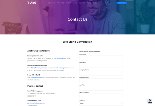
It’s beautifully laid out, with clear information that’s easy to read. The company shows exactly why customers might want to get in touch and how they can reach out. As you scroll through the page, you’ll find additional office locations, email addresses for different teams (sales and support), and links to social media accounts too.
How to Drive Engagement on a Contact Us Page
A good contact page needs to look fantastic, showcase the company’s personality, and capture audience attention. However, there’s a big difference between a contact page that gets the job done, and one that convinces your audience they have to connect with you.
Here are some excellent ways to make your contact us page stand out.
Step 1: Using Color Correctly
Color and color psychology have a massive impact on user experience.
Studies constantly demonstrate the conversion powers of having the right shades on certain pages throughout your website. For instance, changing a CTA button from red to green can increase click-through rates by 27%.
However, every audience is different. The colors that drive engagement on a contact page for your company will depend on your target customer. A/B testing color palettes that match your brand personality is a good way to get started.
One interesting example of colors that make the right impact on a Contact Us page comes from Hubspot. Here, the brand maintains it’s brand color (orange), but it also introduces some new shades that convey trustworthiness and professionalism.
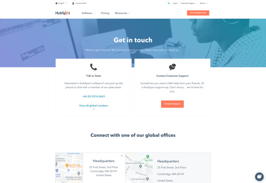
Blue is the most calming and credible color for any brand, The gradient that Hubspot uses here blends perfectly with its brand identity, allowing for a stunning contact page, with CTA buttons that still stand out.
Experiment with colors that can generate the right emotional response from your audience, but don’t ignore the golden rules of color in web design. You still need to showcase your brand identity, and you still need a way of making crucial information stand out.
Step 2: Humanizing the Customer Service Team
Some of the customers that arrive at a contact page are interested in your product or inspired by the potential of your service. Other customers will be looking for assistance because they’re frustrated with something or stressed out.
If you’ve ever had a problem with a product and wanted to reach out to the brand about it, you’ve probably noticed how annoying it is to find a blank contact page with nothing but an email address. The lack of effort and humanity in the contact page is enough to convince you that you probably won’t get a response.
But what if you add some happy smiling faces to the page?
Research indicates that brains are fine-tuned to recognize and appreciate human faces. Having a picture of your customer service team, or just any human being on your contact page makes you instantly more approachable. Your customers start to feel like they’re reaching out to a person – not an empty website.
Look at how engaging and personalized this contact page from Amber McCue looks:
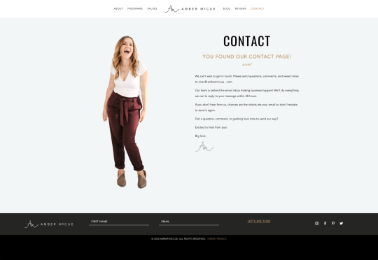
Although you can show any human face on your contact page and potentially get results, showing your actual agents will be more likely to drive positive results. It’s a great way to showcase the authenticity and humanity of your team.
Step 3: Making it Easy to Find
A surprisingly large amount of the time, companies shove their contact information into the footer of their website, forcing customers to spend forever looking for them. However, your audience might not want to spend an age searching for your details if they’re in a hurry to get answers.
Stowing a contact page in a footer is also a problem for those visiting your website via mobile, as they might not be able to see all your footer details and links as well.
A Contact Us page doesn’t have to be a massive part of your website navigation if you don’t want it to be. However, it should be one of the first things your audience can see. Putting the information on the header of your website, or even sticking it to the top of the page as your users scroll is very helpful.
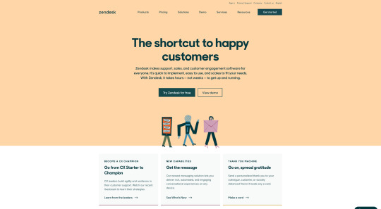
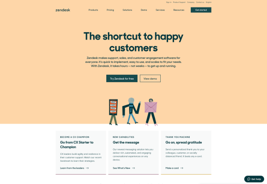
Zendesk makes it easy for customers to get in touch in multiple ways. First, the Contact section of the website is clear at the top of the page. Secondly, if you start scrolling through the Zendesk website, a “Get Help” button pops up, so you don’t have to scroll back to find assistance:
Remember, aside from making sure that your contact page appears in the right part of your website, it’s also worth ensuring that it’s easy to understand. Don’t use unusual terms like “Chat”, or “Chill with us”. Stick to tried-and-true options like Help, Contact, or Support.
Step 4: Making the Experience Relevant
There’s a reason why it’s practically impossible to find a one-size-fits-all contact page.
It’s because different customers need different things from your brand.
Some customers will be looking for the answer to a question; others will want to discuss something with your sales team. That’s why many companies are using adaptive contact pages that can change to suit the situation.
For instance, you may start by asking customers what they need help with. Zapier takes this approach with its Contact page:
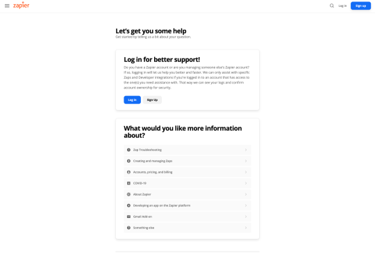
By asking the client what they need straight away, Zapier can make sure that the visitor finds the right information, and the right number or email address for the appropriate agent. You can even scroll down the help page and look for something in the available help centre, using the search bar. Or you can click on View our experts to hire a Zapier pro.
Creating a dynamic and customized experience like this does a few things. First, it ensures that the customer will reach the right person to help them first-time around. This reduces the number of inappropriate calls your employees have to deal with, and the number of transfers.
Secondly, you deliver a better experience overall for your client, because they don’t have to repeat their issue to multiple people or start a massive email thread. They get the support they need immediately.
Dynamic contact pages can even save you some money and time. If clients decide to solve an issue themselves, using your resources, that’s great for your busy agents.
Step 5: Direct People to the Right Place
The central focus of your contact us page needs to be the available contact options. Centralizing the contact options on a page is an excellent way to make sure that they get the right amount of attention. Centralizing also means that your customers can spend less time searching for the contact details that they need, which is great for usability.
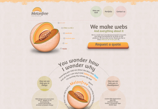
The Melonfree.com website uses a contact us form that’s centralized to immediately pull attention to the customer’s options for getting help.
Centralization isn’t the only way of using design principles to guide visitors on a contact page. According to Ray Hyman and Edmund Hick, increasing the number of choices on a page often increases the time it takes for people to make a decision.
When it comes to connecting with a brand, the right option for each customer will depend on the person and the situation they’re trying to overcome. For instance, a customer that needs to reset their password will probably be able to get the solution they need from an FAQ page.
On the other hand, someone who needs help using a new feature might need the guidance of a professional. To help guide customers to the right solution, Basecamp gives customers a variety of steps to follow to get the right solution fast.
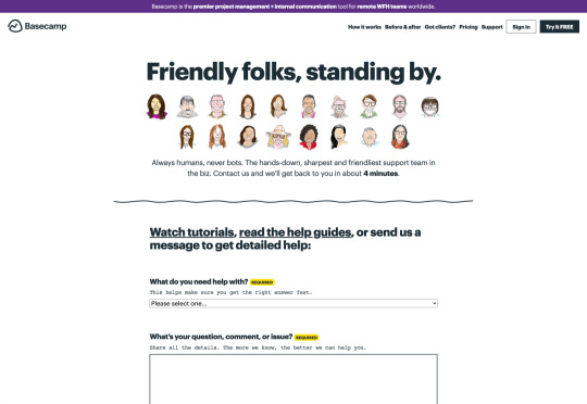
The main purpose of the contact page is to help customers get the right answer with an informative form. However, there are unobtrusive alternative options available too. If all you’re looking for is a way to help yourself fix a problem, you can click on the help guides link before you ever scroll down to the form.
Step 6: Support the Contact Team Too
The best contact us pages aren’t just a great way to improve customer experience. Well-designed solutions also help the customer service team to save time and stay productive.
One of the primary metrics that companies consider when evaluating the success of a service team, is the number of replies required before an issue is resolved. However, if the initial question from a customer doesn’t contain enough information, this number often increases.
Using the design of the contact form to access the right information helps with:
Automatically routing people to the right team member: Companies can set up segmentation rules that automatically send certain emails to different employees based on keywords. You might have questions that go to the sales team, and separate queries that you direct straight to the customer service team.
Show appropriate support options and FAQs: Remember to give the audience a chance to help themselves before they reach out for extra support. Links to an FAQ page or self-service options can really reduce the pressure on a team. Some companies even add automated chatbots to the mix to help with self-service.
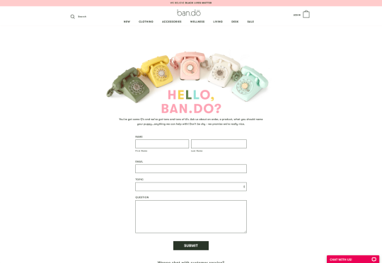
Prompt for extra context: Although not every customer will take advantage of an opportunity to add extra information to a form, some will. Adding a box to your contact form for “anything we need to know?” is a great way to generate more information. Ban.do includes a simple “question” box where customers can add as much detail as they like. An option to add screen shots or documents might be a nice touch too.
Building Your Own Contact Us Page
Every customer has their own specific set of needs. The right contact page for another business might not be the right one for you. That’s why it’s so important to take some time getting to know your customers and speaking to your support team.
When you’re planning your contact page, it helps to ask yourself some basic questions about what you want to achieve. For instance:
What kind of channels will our customers want to use to connect with us? Look at things like social media messaging, email, or phone calls. If you’ve got a relatively tech-savvy audience, then they might want to use things like instant messaging with chat bots too.
How can we direct clients to the appropriate channels in as little time as possible? Having a system in place to automatically route your customers to the right agent will reduce the time to resolution for your customers. The faster you solve problems, the better your reputation becomes.
What can we do to set customer expectations and build confidence before they speak to us? Designing a professional-looking contact page will increase customer confidence, while an FAQ section shows that you’re ready to answer common questions.
How can we showcase a unique brand personality without making the page complicated? Everything from using distinct brand colors on a contact page, to adding images and illustrations reminds customers that they’re in the right place.
What can we do to reduce the friction points in a customer’s path to contact? Avoid adding too many input options to a contact form and ensure that it’s easy to reach out when your clients have a problem.
Understanding exactly what your audience needs from you, and what they’re looking for when they come to your team for help reduces the effort involved for your client when they reach out for help. Remember, today’s digitally-savvy customers expect their interactions with companies to be as streamlined and simple as possible.
Make the Most of Your Contact Page
Contact pages are frequently an afterthought in the website design process. However, they’re one of the most valuable tools your company has. With a good contact page, you ensure that your customers can always reach you when they have problems. What’s more, you boost your chances of people wanting to reach out to the sales team too!
Good luck creating a contact page that encourages engagement from your target audience. Don’t forget to track your results from each design, and A/B test for optimization.
Source p img {display:inline-block; margin-right:10px;} .alignleft {float:left;} p.showcase {clear:both;} body#browserfriendly p, body#podcast p, div#emailbody p{margin:0;}
from Webdesigner Depot https://www.webdesignerdepot.com/2020/11/how-to-design-a-contact-page-that-drives-engagement/
0 notes
Text
So, You’Ve Won An Exciting Redesign…What Now?

The transitioning of power is fraught with difficulties. Different teams have different values, different experience, different expertise, different priorities, and that leads to different tooling, and different methodologies.
It’s tempting to think of web design as an end-to-end process, starting with research and concluding with metrics. The reality is that most designers and developers join projects part-way through an ongoing process.
That leaves us with a difficult choice: do we try and meet the client’s expectations with our own toolset, or adapt to the tools and processes that are already in place?
For anyone who’s taking over a web project from a different designer/developer/agency (D/D/A), here’s a practical guide to help you make a success of the transition.
Step 1: Find Out What Went Wrong
99.99% of the time, something broke down in the previous client-D/D/A relationship.
In my experience it’s almost never about money. Most clients are willing to pay above the basic market rate if they believe they’re receiving a good return on their investment. A client that tells you the previous D/D/A is simply too expensive is anticipating negotiating your fees.
happy clients don’t shop around
Occasionally you’ll find that a freelance designer has been headhunted by an agency, and is no longer available. Occasionally the company outgrows a D/D/A, moving into areas that the D/D/A doesn’t support. But these situations are rare, happy clients — even moderately content clients — don’t shop around. If they’re speaking to you, something motivated them to do so.
It is alarmingly common that a D/D/A simply goes AWOL. It’s most common at the lower end of the market where the sums of money involved are less likely to prompt a legal dispute. Frequently, an unreputable D/D/A will ghost a client in favour of a better, newer opportunity.
Sometimes the client hires a new manager, and the new manager ushers in revised expectations that the previous D/D/A can’t meet.
Most commonly, the previous D/D/A has dropped the ball one too many times — mistakes happen, and reasonable clients will tolerate them provided they are rectified promptly, but everyone has their limits.
Most clients will be more than happy to explain what went wrong in the previous relationship; it will inevitably be a one-sided explanation, but it will help you to understand the client’s expectations.
Be extremely wary of a client who doesn’t know what went wrong. Be even more wary of a client who talks about “upgrading” their outsourcing — they’re trying to flatter you. In these cases the client may well be hiding something — like their failure to pay invoices.
Remember: at some point the previous D/D/A was new, and excited about having a new client, was optimistic about the project, and it didn’t end well. The best way to not repeat mistakes is to learn from them, and to do that you need to know what they were.
Step 2: Carry Out a Comprehensive Audit
We’re often so eager to secure new work, that we rush to have the client sign on the dotted line, expecting to be able to tackle any problems later.
It is imperative that as a professional, you keep your promises. Before you make those promises, take your time to understand the project and related business. If a client is invested enough to sign a contract with you they won’t mind you doing due diligence first.
Is There Still a Relationship With the Previous Designer/Developer/Agency?
Clients rarely have a full picture of their project — they’re not web professionals, if they were they’d be building their own sites. Your best source of information is the previous D/D/A.
Before you contact the previous D/D/A check with your client; it’s possible they don’t know they’re being replaced yet. If your client is fine with it, then reach out.
When you speak to the previous D/D/A be sensitive to the fact that you’re taking money out of their pocket. Certainly the previous D/D/A may tell you where to go, they may ignore you altogether, but most will be pragmatic about handing over a project if only to ensure their final invoice to their now ex-client is paid promptly.
Every site has its idiosyncrasies, if you can establish a friendly rapport with the previous D/D/A then the transition will be considerably less bumpy.
Who Controls the Domain Name(s)?
In my opinion a company’s domain name(s) should always be held by the company; it’s such an essential business asset that it should be guarded as jealously as the company’s bank accounts.
Unfortunately there are businesses that outsource everything to do with the web. If the break with the previous D/D/A is acrimonious then securing the domain name could be problematic.
It’s not your job to secure the domain name — you have no leverage, the client does. It is your job to impress upon the client how mission-critical the domain name(s) is.
Who Controls the Hosting?
Hosting arrangements vary from project to project. It’s not uncommon, nor unreasonable, for the previous D/D/A to be hosting the client’s site on their own space. If that is the case, be prepared to migrate it quickly either to your own server, or a dedicated space.
If you’re migrating onto a new space pay particular attention to the email provision. Taking over a project usually means taking over a live project, and that usually means email accounts.
In any case, you need full access to the hosting space. You certainly need FTP access, you probably need SSH access.
In addition to hosting, check if your client’s site uses a CDN, and if it does, who has control of it.
Backend Source Code
Once you have FTP access to the hosting server you can probably grab all backend code from the server.
The benefit of grabbing the code from the server — as opposed to accepting files from the previous D/D/A — is that you can be absolutely certain you’re getting the current (working) code.
If the client has broken with the previous D/D/A because they were unable to deliver on a particular task, you do not want to be working with files that have been partially modified.
Fresh Installs
If you’re working with something like a CMS, it’s often a good idea to run a fresh install on your server, and then copy across any templates, plugins, and migrate the database.
Frontend Source Code
When it comes to acquiring source code, frontend code is far more problematic than backend.
frontend code is far more problematic than backend
If the previous D/D/A is even part-way competent then the CSS and JavaScript on the web space is minified. Minified CSS is not too problematic and can be unminified fairly easily, but you do not want to be unpicking a minified JavaScript file — I once had a project in which a developer had minified his own code in the same file with all of his dependencies, including both Vue and jQuery [yes, I know].
Dealing with frontend source code can take on an additional dimension if you discover that the previous D/D/A used techniques you don’t — using Less instead of Sass, or writing scripts in TypeScript.
Unminifying CSS & JavaScript
Unminifying (or beautifying, or prettifying) code is reasonably easy. There are tools online that will help, including Unminify, Online CSS Unminifier, FreeFormatter, JS Minify Unminify, and more. You’ll also find plenty of extensions for code editors including HTML-CSS-JS Prettify for Sublime Text, and Atom-Beautify for Atom. You’ll find that some editors have the functionality built in.
A word of warning: code beautification does not restore comments, and in the case of JavaScript, does not unobfuscate variable names. Beautifying code is no substitute for a copy of the original, unminified source code.
Emergency Measures
If unminifying the source code isn’t possible for any reason, or more likely, the unminified JavaScript still looks like minified code — albeit nicely formatted minified code — then your last resort is to import the code and override it where necessary.
The first thing to do in this case is to explain the situation to your client. Make sure they understand this is a temporary patch that you’ll iron-out as you rebuild parts of the project.
Then, copy and paste the old minified code into a fresh project setup. For CSS that probably means creating a legacy.scss file, including the old CSS, and importing it into your own Sass. For JavaScript, create a legacy.js file, add all the old JS, and import that.
This will result in a much bigger set of files than necessary, you may end up using !important in your style declarations [yuck], and you’ll trigger lots of Lighthouse warnings about surplus code.
However, in the likely event that your client has a long list of changes they wanted live yesterday, this dirty hack will give you a working site that you can then rebuild piece by piece over time.
Assets
Assets normally means images, and images can normally be grabbed via FTP.
Occasionally — although less occasionally now image files rarely contain text — you’ll need the source files to make changes to images.
Whether or not the client has them, or if the previous D/D/A will hand them over, depends largely on the agreement between the client and the previous D/D/A.
Most businesses are reasonably aware of the importance of brand assets, so you’ll probably find they at least have a copy of their logo; whether it’s an SVG or a JPG is another matter entirely. Impress upon them the importance of locating those files for you.
Third Party Code
It is rare to receive a project that doesn’t rely on third party code. That third party code is probably entwined in the custom source code, and unpicking it is a time-consuming job.
It is very likely the previous D/D/A used a library or framework, and given the increasing number of them, it’s even more likely that the library or framework they used is not the one you prefer.
Whether you choose to unpick the code and swap out the previous D/D/A’s dependencies for your own preferences (usually faster in the long term), or whether you choose to work with what you’re given (usually faster in the short term) is entirely up to you.
In my experience it’s no hardship to pick up another CSS library; switching from one JavaScript framework to another is a substantially bigger job involving not just syntax but core concepts.
Beware Build Environments
Everyone has their own way of doing things. Some D/D/As embrace build environments, some do not. Some build environments are simple to use, some are not. Some build environments are adaptable to your process, some are not.
Unlike adopting a library, or even a framework, adopting a new build process is rarely a good idea
Build environments are numerous — Gulp, Grunt, and Webpack are all popular — and D/D/As are almost as opinionated about them as they are about CMS.
In lieu of raw files, it’s not uncommon for the previous D/D/A to tell you to “just run such-and-such CLI” command, to match up your local environment to theirs. Unlike adopting a library, or even a framework, adopting a new build process is rarely a good idea because you’re relegating yourself from expert to novice at a time when you’ve yet to earn your new client’s trust.
Stand your ground. Their approach failed, that’s why you’ve been brought in. You do you.
Who is Licensed?
Any third part code that has been paid for is licensed. Always check who holds these licenses. As well as being legally required, valid licenses are normally required for updates, bug fixes, and in some cases support.
Common pitfalls include: font licenses (which may be licensed under the previous D/D/A’s Creative Cloud, Fontstand, Monotype, etc. account); stock image licenses (which may be licensed for use by the previous D/D/A alone); and plugins (which are frequently bulk-licensed to D/D/As in bundles).
It’s depressingly common to find clients using unlicensed assets. On more than one occasion I’ve had to explain to a client the potential consequences of using pirated fonts.
Fortunately it’s increasingly common for third party providers to attach a licence to a specified domain, which means you may be able to claim the licence on behalf of your client. Major suppliers like CMS and ecommerce solutions frequently have an option for the previous developer to release a licence and allow you to claim it.
In the case of licensing, if you’re unsure, do not be afraid to reach out to the third party provider and check with them if your client is licensed once they break ties with their previous D/D/A.
The only thing that sours a client relationship faster than telling them they need to buy a license they thought they’d already paid for, is telling them they’re being sued for copyright infringement.
Protect your client, and protect yourself, by making sure everything is licensed properly. If you can get something in writing to that effect from the previous D/D/A, do.
Who Has the Research and Analytics?
One of the major benefits of taking over a site, as opposed to building from scratch, is that you have a measurable set of site-specific data to guide your decision making.
This only applies if you have the data, so ask to be added to the client’s analytics account.
There’s a strong chance that the design research carried out by the previous D/D/A is considered an internal document, not a deliverable, by the previous D/D/A. Check with your client: if they paid for the research (is it specified on an invoice?) then they’re entitled to a copy.
We Have a Blog Too…
Clients have a tendency to use the term “website” as a catch-all term for everything digital.
When you take responsibility for a website, you’re almost always expected to take responsibility for any digital service the client uses. That means, newsletter services like Mailchimp, customer service accounts like Intercom, and 227,000 page WordPress blogs that they forgot to mention in the initial brief.
Repeat the whole of Step 2 for every additional app, micro-site, blog, and anything else the client has, unless you are expressly told by the client not to.
Step 3: The Point of No Return
Up until now, you haven’t asked the client to sign on the dotted line. This whole process is part of your due diligence.
By checking these things you can identify unforeseen problems, and potential costs. Are you tied to an obscure build process? Do you need to relicense the CMS? Do you need to recreate all of the site assets?
Some of these conversations are hard to have, but the time to have them is now
If there is any question of the project being more complex than anticipated, have an honest conversation with your client — they will appreciate your transparency, and they’ll appreciate being kept informed. Any client who doesn’t value a clear picture of what they’re paying you for, isn’t a client you want.
Some of these conversations are hard to have, but the time to have them is now, not three months down the line.
This is the point of no return. From this point on, any problems aren’t the previous D/D/A’s, they’re yours.
Change the Passwords
For every service you have, from the newsletter login, to the CMS login, to the FTP details, change the password. (Make sure you notify the client.)
Set Up a Staging Site
You’re going to need a staging site so your new client can preview the work you’ve done for them.
Set the staging site up immediately, before you’ve made any changes to the code. In doing so you’ll discover early on if there are files missing, or issues with the files you do have.
Successfully Transitioning a Project
When a client commissions a site from scratch they are filled with expectation. The fact that they are leaving their previous D/D/A and seeking you out demonstrates that their experience fell short of their hopes.
You now have a client with realistic — perhaps even pessimistic — expectations. You have a benchmark against which your work can be objectively measured.
When problems arise, as they invariably will, never try to blame the previous D/D/A; it was your job to assess the state of play before you started work. If there is an issue with legacy assets, you should have brought it to your client’s attention early on.
If you learn from the previous D/D/A’s mistakes, you won’t be handing the project on to someone else any time soon.
Featured image via Unsplash.
Source p img {display:inline-block; margin-right:10px;} .alignleft {float:left;} p.showcase {clear:both;} body#browserfriendly p, body#podcast p, div#emailbody p{margin:0;}
from Webdesigner Depot https://www.webdesignerdepot.com/2020/11/so-youve-won-an-exciting-redesignwhat-now/
0 notes
Text
Popular Design News of the Week: November 2, 2020 – November 8, 2020

Every week users submit a lot of interesting stuff on our sister site Webdesigner News, highlighting great content from around the web that can be of interest to web designers.
The best way to keep track of all the great stories and news being posted is simply to check out the Webdesigner News site, however, in case you missed some here’s a quick and useful compilation of the most popular designer news that we curated from the past week.
Gmail’s New Logo is a Mess – This Amateur Designer Fixed it
GitHub Source Code Leak
What’s the Average Web Designer’s Salary? A Deep Dive into 2020
All the Resources You Need for Front End Development
Flat Illustrations – 100 Neat Illustrations for Websites and Apps
15 WordPress Plugins Every Content Creator Needs
9 Essential Elements of a Modern Website Design
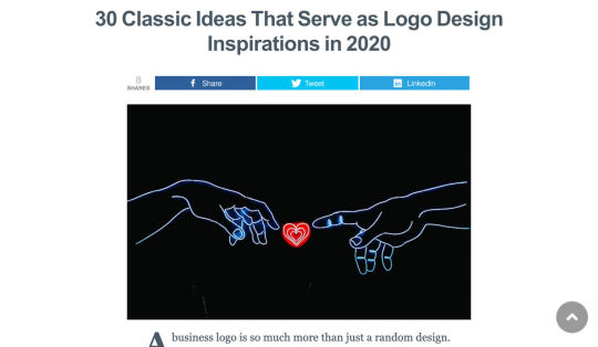
30 Classic Ideas that Serve as Logo Design Inspirations in 2020
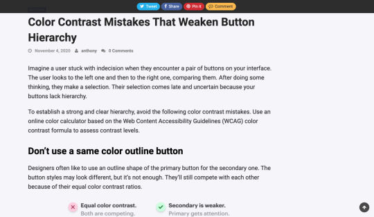
Color Contrast Mistakes that Weaken Button Hierarchy
How to Improve Conversions Using Color Psychology

20+ Free Design Resources for Developers
CSS Grid Layout Module Level 3
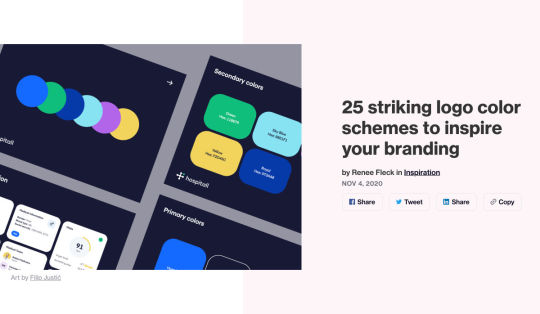
25 Striking Logo Color Schemes to Inspire your Branding
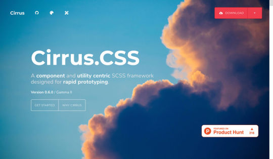
Cirrus V0.6 – A Component Centric CSS Framework for Fast Prototyping
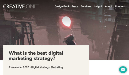
What is the Best Digital Marketing Strategy?
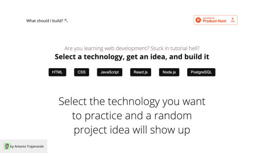
What Should I Build? – Project Ideas for People Who are Learning Web Development
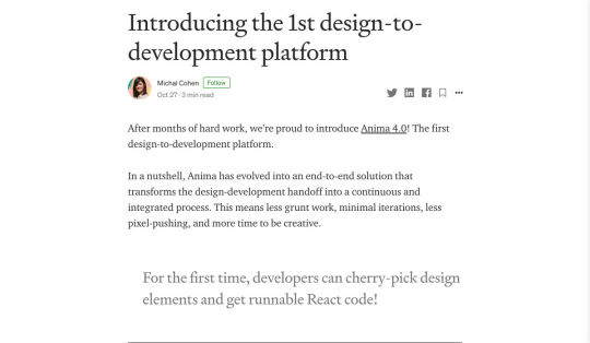
Introducing the 1st Design-to-Development Platform
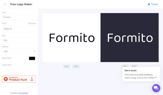
Free Typography Logo Maker
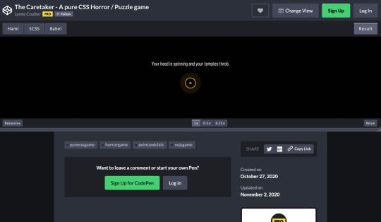
The Caretaker – A Pure CSS Horror/Puzzle Game
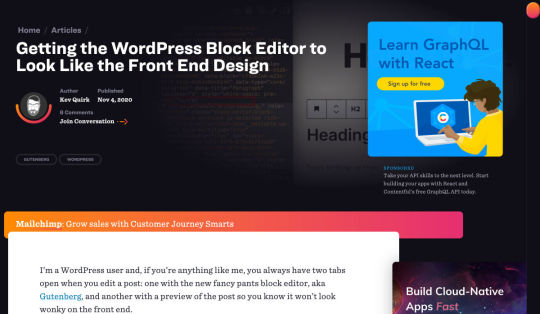
Getting the WordPress Block Editor to Look like the Front End Design
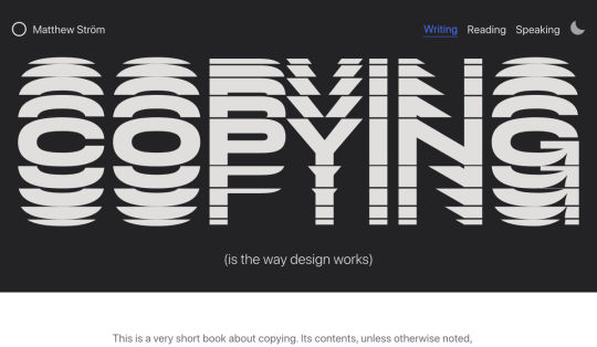
Copying is the Way Design Works
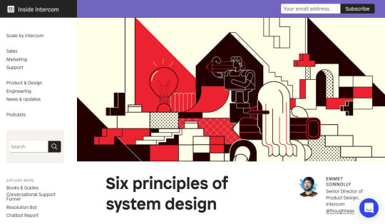
Six Principles of System Design
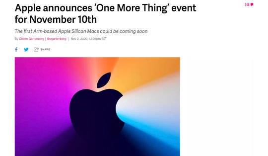
Apple Silicon Mac Event Announced
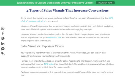
4 Types of Sales Visuals that Increase Conversions
Chasing the Pixel-Perfect Dream
Want more? No problem! Keep track of top design news from around the web with Webdesigner News.
Source p img {display:inline-block; margin-right:10px;} .alignleft {float:left;} p.showcase {clear:both;} body#browserfriendly p, body#podcast p, div#emailbody p{margin:0;}
from Webdesigner Depot https://www.webdesignerdepot.com/2020/11/popular-design-news-of-the-week-november-2-2020-november-8-2020/
0 notes
Text
9 Ways To Boost Your Domain Authority

Domain Authority (DA) is a ranking metric that predicts how well a site will rank online. It goes by a scale of 1 to 100 — the closer you are to 100, the better your odds of ranking in search engine result pages (SERPs), thus giving you more clicks.
To see how your site currently ranks, visit Moz’s free Link Explorer to test your DA. Just type your website URL in the search bar and click “Analyze”. Just remember: don’t kick yourself if your DA is smaller than 30 to 50. If you follow these 9 tips today, you’ll most definitely see your DA score improve.
1. Domain Name Age
You know that old saying, right? Wisdom comes with age. Well, guess what? The same is true for your domain name. If your domain name doesn’t have an ‘old’ age, then it’ll rank lower, and users online might not see your site as legitimate.
But with an older domain name, not only will users see your site as more legitimate, but it’ll also have a much higher DA score than younger domain names. In other words, every time you change your domain, you might be doing more harm than good to it, since you’re actually knocking down the credibility you’ve built up over the years by starting from scratch.
Therefore, pick an easy-to-remember domain name that’s not only relevant to your niche, but it’s also something that you’re willing to keep for a very long time.
2. On-Page Optimization
Then, it’s time to optimize all the following on your pages:
Code;
Content;
Site structure;
Metatags;
Other on-page elements (H1, Title tags, Image alt tag, Site architecture, etc.).
Improving your DA with optimization can make your site be more search-engine-friendly.
3. Create Great Content
Want to attract high-quality links from multiple domains in your niche? Good news! More attraction to your site comes from creating high-quality content that appeals to your target audience. Otherwise, poor-quality content will only scare people away.
So, in providing the best content possible, that will definitely help you improve your DA score (and even give you many additional SEO benefits).
4. Internal Link Improvement
Why worry about earning external links when your internal links need the most attention? Yes, focusing too much on external links can make you lose sight of linking internally.
So, why internal links? These links help nudge visitors to what they’re trying to look for on your website. In that way, visitors are getting the best user experience, while you reap the rewards of having an increased DA score.
5. Link Profile Clean-Up
Having a clean link profile is essential, since it helps you obtain and maintain a great DA score. So, to clean up your link profile, you must remove the bad links from it.
In this process, you can use tools like:
Moz Explore;
Ahrefs Backlink Checker;
SEMrush Backlink Audit Tool.
These tools help you figure out any inappropriate or unwanted links.
After the link audit is complete, contact the website owners to have them either delete the link or add the “nofollow tag” (devalues the link). If this doesn’t work, use the Google Disavow tool to remove said links from your profile.
6. Know Your Niche
When running a site, it’s important for you to be the expert in what you have to offer online – and your DA is no exception to this. Becoming an authoritative figure in your niche allows you to gain the confidence of readers, while providing expert advice to the community.
If you have amazing content (i.e. guest blogs on industry-related forums) and clever ways to engage your target audience, then people will see you as an authority to your niche. This not only enhances your brand, but also increases your DA score.
7. Be Mobile-Friendly
Nowadays, people are on their phones, tablets, etc. Whatever device that they can use on the go, they’ll use. In other words, mobile isn’t just the way of the future – it’s happening right now, outpacing laptops since 2014. So, if your website isn’t mobile-friendly yet, then now is the time to fix that!
If your website hasn’t been optimized for mobile use yet, not only will it hurt your search rankings (since Google favors mobile-friendly sites), but you’ll also lose out on users visiting your site to begin with.
So, go to Google’s Mobile-Friendly Test, and then run a test for your domain. Afterwards, Google will give you a detailed report of how mobile-friendly your site is, and what you can do to improve it.
8. Improve Page Speed
Let’s face it: No one likes to wait for a webpage to load; they want quick results. So, if your site isn’t loading fast enough, then users will get frustrated and most likely go to another site. So, why not improve your page speed?
First, find the cause of your website running slower than it should. You can do this by running your website through Google’s PageSpeed Insights; it’ll analyze the speed of your site. And then, it will identify some effective ways for you to make your site faster and consequently improve your DA score.
9. Utilize Social Media
Finally, it’s important to increase your social signals, when it comes to gaining more authority with your domain. While search engines like Google won’t insist that sites make social signals a priority to increase their rankings, site runners must still take advantage of social media to do the following:
Promote their sites;
Promote their products and services;
Tell people about any events and contests.
As a result, sites are more likely to get likes, shares, and tweets through social media, versus going solo in search engines.
Conclusion
Domain authority is extremely important for your site. First, DA allows you to analyze how well your website does in the search space. Plus, it allows you to compare the performance of your website with that of your rival sites, thus showing you where you stand in search engine results.
So, why not get your site thriving today by improving and maintaining your DA score today? Your site will thank you for it!
Featured image via Unsplash.
Source p img {display:inline-block; margin-right:10px;} .alignleft {float:left;} p.showcase {clear:both;} body#browserfriendly p, body#podcast p, div#emailbody p{margin:0;}
from Webdesigner Depot https://www.webdesignerdepot.com/2020/11/9-ways-to-boost-your-domain-authority/
0 notes
Text
Branding 101: Creating the Visual Identity for Your Business

There are so many things to think about when first starting a business. What will your business offer? How will this differ from existing solutions? Who will benefit most from your offering? And why are you so passionate about this?
If you haven’t done so yet, work through this exercise to come up with your brand identity and business name.
Once you’ve figured out your brand identity, you have to create a visual identity — also referred to as brand imagery — to go along with it.
While you could easily throw together visual elements that speak to you, your goal should be to choose visuals that resonate with your audience. So, building your visual identity is going to require some work.
In the following post, we’re going to look at how your brand’s visual style can give off certain signals to those who encounter it (and how to use those to your advantage). We’ll also break down what you need, to piece together your visual identity.
The Power of Visual Identity
Each of the design choices you make that website visitors, social media followers, and customers can see will impact how they approach your brand. Are you a fun-loving company that caters to a younger crowd? Do you create high-tech products that solve serious global problems? Are you a successful entrepreneur who’s reshaping the way we talk to one another?
When done right, our brand visuals convey our brand’s personality, values, and mission without having to use any words.
Think about your favorite clothing brand. What do you picture? Let’s use Athleta as an example.
The logo is probably the first visual element that comes to my mind:

The grey radial shape is one I’m very familiar with. It’s on their website, their social media, and it’s usually imprinted somewhere on their clothing.
The second thing I think about when I think of Athleta is its physical imagery:
Rather than include images of the clothing on its own, there’s often someone wearing Athleta clothes while hiking along a trail, walking on a beach, or working out in a studio.
There’s so much that just these two visual elements tell us about this brand:
Athleta targets active female consumers; we see this in its images and CTAs. The fine touches and shape of the logo may suggest this as well.
Athleta creates understated but highly functional clothing; we see this in the product photos as well as in the brand’s use of neutral colors and fonts across its designs.
Athleta’s mission is to help customers have a healthier and more balanced life; we see this in its product photos, but we also get a sense of this from the simple symmetric structure of the logo.
There are overt ways to use visuals in your branding (usually through your choice of photos or illustrations). But there are also ways to subtly convey more about your company, what it does, and for whom you work through your choice of colors, fonts, structure, and more.
How to Create a Visual Identity for Your Brand
Let’s walk through each of the elements you need to pull together to create your visual identity:
The Color Palette
Like with everything else in business, you’re here to give your audience something they need, so they have to be at the forefront of your decisions — including which colors you put into your brand’s palette.
So, where do you start in choosing a color palette for your site and other marketing channels?
Let’s take a systematic approach.
1. Choose a Primary Color
Go to the Canva color meanings and symbolism tool.
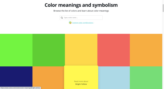
Have a look through the colors and find one that feels good to you. Open up the page and read more about what the color means:
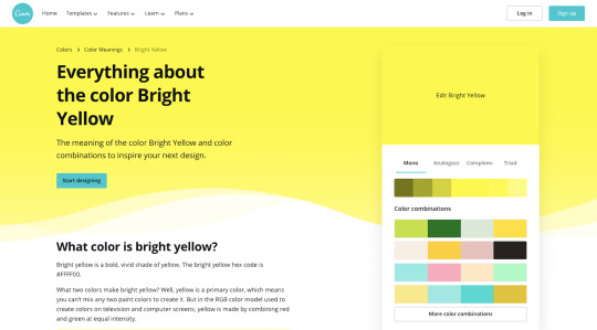
You’ll find the following on each page:
A brief history on the color;
How it’s been used by people over the years;
What it’s symbolized over the years and around the world;
How to use the psychology of the color to affect people (i.e. your audience);
Alternate shades and colors if this particular one doesn’t send the right signals;
Colors that pair nicely with this one.
While it’s important to consider how colors evoke different emotions, it shouldn’t be the only driving force. Your primary focus should be to choose colors that positively affect the user experience. In other words, you don’t want them to get in the way or distract prospects from getting to know your brand and eventually converting.
2. Create a Full Color Palette
Once you’ve picked a primary color, you need to come up with a color palette. You’ll want one or two colors to use in your logo and a full color palette for your website and other branded channels.
You can use Canva’s palette suggestions (in the top-right corner of the color page) to create a basic color palette.
For something a little more robust, use Material Design Palette:
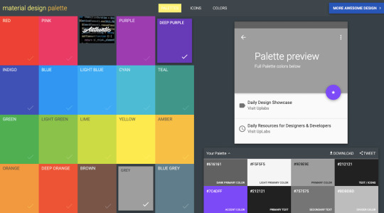
Color options are a bit limited, but it does a good job of spelling out where you should use each color. You can then adjust the color palette as you see fit.
Typography
The design and pairing of your fonts can greatly impact the way people respond to your brand and the words you’ve written about it.
So, the goal with typography is to make your words easy to read while also giving hints about your company’s personality and style.
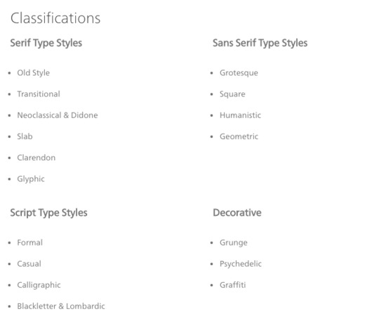
1. Understand Font Styles
Figure out what style of font goes best with your brand identity.
This is the simplest way to categorize fonts:
Sans serif: These are simple fonts without any “feet” (lines at the ends of letters).
Serif: These are more traditional-looking fonts (the kinds you see in literature and newspapers) with feet.
Script: These are cursive and curly fonts that mimic handwriting.
Display: These are fonts designed specifically to appear in logos, hero images, and advertising because of their large, bold styling.
Monospaced: These are fonts with characters that comprise the same amount of horizontal space, often resembling typewritten text.
You can break these down even further and really get to the root of the style. Fonts.com has a great explainer page on each of these classifications:
Here are some sources to help you find fonts for your brand:
Google Fonts
Open source fonts
JavaScript library plugins
Independent font foundries
2. Settle on Two or Three Fonts
Choose two or three fonts for your brand. Max. Anything more than that will create a distracting and overwhelming interface for your audience.
You’ll need:
A font for your header text. It needs to look good in big sizes, be easy to read, and easy to identify from other text when scanning through a page or document.
A font for your body text. It needs to look good in small sizes (16 pixels and up) and be highly legible.
Optional: A font for your logo and hero images. It wouldn’t stray too far from the style of your headers, but if you need something a bit more decorative or unique, you can use a different font family for this.
If you find that you need more variety in your fonts to create a clearer hierarchy on the page or to call out certain elements, use superfamilies with dozens or even over a hundred different styles. That way, your users’ eyes won’t get fatigued from having to switch between too many font types.
3. Learn Font Pairing Rules
To pair fonts, use styles that contrast yet complement one another. Ultimately, you want the pairing of your fonts to send a cohesive message to your audience.
For example, a sans serif header and serif body are a common way to combine fonts. Like this pairing of Fira Sans and Merriweather from the FontPair website:
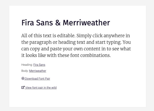
This modern-looking duo sends the message that: “Your comfort is priority #1 for us. Take your time reading and enjoy.”
There are tons of ways to make varying styles play off one another while sending the right signals to your audience: A safe serif with a retro cursive header font to come off as a playful, yet professional brand; a futuristic header and a neutral sans serif body font to give your product pages a very techy feel; and so on…
Once you have one or two fonts you like the vibe of, use FontPair to track down a good complement to the one you want to use.
Imagery
We can use this as a blanket category for any visual content you might use in your branding:
Photos
Videos
Illustrations
Icons
Backgrounds
Textures
Animations or GIFs
But just because there’s all this content to use, that doesn’t mean it should all appear on the same site to represent the same brand. You’ll want to narrow it down based on your company’s personality and how the style of imagery fits with it.
1. Photos vs. Illustrations
You can alter your brand’s voice and style based on the kind of imagery you use.
For instance, tech companies like Stripe often use illustration in their brand designs:
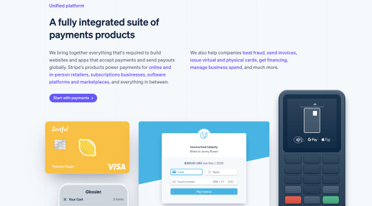
Even though SaaS companies sell one type of product, their audiences are usually quite vast, so it would be hard to find photos that represent everyone. And it’s not like users are focused on their relationships with the people behind the scenes. These companies put technology into the hands of their users, so it’s best to let the product shine and not the people. This opens up the door for some fun and creative possibilities with illustrations.
That said, choosing photos over illustrations doesn’t completely bar you from using vector graphics and icons. You can mix-and-match those visuals so long as they blend well with one another. What you don’t want to do is to mix two very different styles that say different things about your brand at once.
To decide what’s best for your brand, approach this from your users’ point-of-view. What kind of visuals will help them connect to your brand and what you sell?
2. Style
It’s not just the type of image you use that impacts your brand identity. It’s the style you apply to those visuals that can transform your visuals, putting visitors in a different time, place, or headspace.
Will you apply a filter to give your photos a similar look and feel?
Will you place each of your product photos against the same backdrop for a uniform look?
Will you use a completely new style of imagery for one of your product lines the way Apple has done for the iPhone 12?

There’s nothing wrong with using out-of-the-box imagery. However, if they don’t give off quite the right tone, don’t be afraid to use your design skills to make adjustments and cater them to your own style.
Logo
Your logo is the last of the visual elements you’ll need to invest some time in. The good news is that you’ve already done most of the legwork:
You’ve defined your brand’s identity.
You’ve given your business a name.
You’ve selected the main visual components that will represent your brand: colors, fonts, and images.
That’s really all you need to create a logo that is relevant, unique, attractive, potent, and memorable.
That and a way to bring it all together. You have a few options.
Option #1: If you’re a graphic designer, you can create your own from-scratch.
Option #2: If you want help getting started, you can use a tool like Wix Logo Maker:
You’ll fill out a short questionnaire and then receive dozens of pre-made logos to start with. You’ll later have the chance to customize the design to your liking.
Option #3: You can hire someone to design a totally custom logo.
Wrapping Up
In the next post in this three-part series, we’re going to look at the next step:
Getting your business online.
We’ll take everything you’ve done so far in coming up with a business name, brand identity, and now visual identity, and put it towards your website and the marketing channels that are best for your business.
Source p img {display:inline-block; margin-right:10px;} .alignleft {float:left;} p.showcase {clear:both;} body#browserfriendly p, body#podcast p, div#emailbody p{margin:0;}
from Webdesigner Depot https://www.webdesignerdepot.com/2020/11/branding-101-creating-the-visual-identity-for-your-business/
0 notes
Text
3 Essential Design Trends, November 2020
As we turn the corner into the final part of the year, many of the new websites and redesigns that we see during much of the rest of the year tend to slow down. Many businesses are focusing on fourth quarter and holiday sales.
With that being said, there are plenty of holiday flourishes already showing up on many websites. But there are still a few trends that don’t have a holiday theme.
Here’s what’s trending in design this month.
1. Beautiful Connectivity
Web elements that merge and flow into one another can be difficult to design but the payoff is totally worthwhile. This website design trend exemplifies connected elements in a way that’s beautiful and mesmerizing.
You can accomplish it with static elements or interactivity; the common theme is that design parts enter the space of one another and merge in ways that are seamless and visually interesting.
The thing that makes it exceptionally tricky is responsiveness. To ensure that pieces work well at all sizes when they overlap or encroach on the space of one another takes a lot of planning and testing.
Here are a few examples of projects that do it well – and each one does it in a different way.
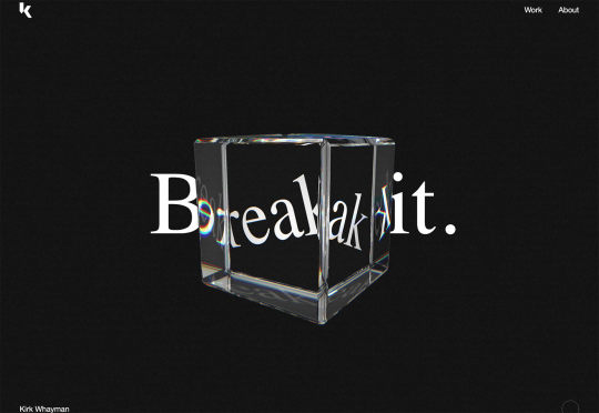
Kirk Whayman’s website uses a floating ice cube over simple lettering. The interactivity is spot on here with hover actions that allow you to move the block with the letters refracting in an expected manner. (It would be easy to play with it all day.) But the coolest interaction happens when you “break it” (click on the cube). The elements continue to merge and interact in a new and different way.
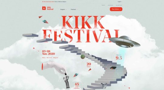
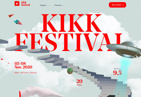
Kikk Festival uses animations and giant scrollable illustrations and plenty of elements that overlap within the space. What’s neat is that everything on this canvas seems to touch everything else. The staircase design encourages scrolling and lettering and smaller animated elements all connect to the steps in the sky motif.
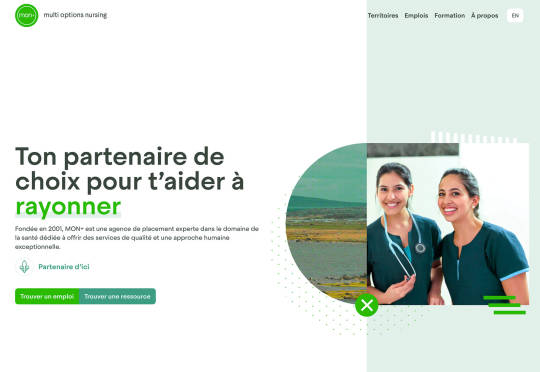
Multi Options Nursing takes a totally different approach. It uses a static split screen with a photo on the right side that merges into a round graphic element. It takes two not-s-interesting images and makes something out of them. The design carries this theme below the scroll as well and this style of image presentation carries a nice visual weight without feeling heavy.
2. Almost Brutalism
Brutalism just seems to keep coming back around. For those that love this trend, it keeps evolving as well.
The latest styles of brutalism are a little less mono but still pretty sharp with harsh lines, questionable type readability, and a lot going on in a compressed space. These projects also seem to be embracing color and alternative font choices more readily.
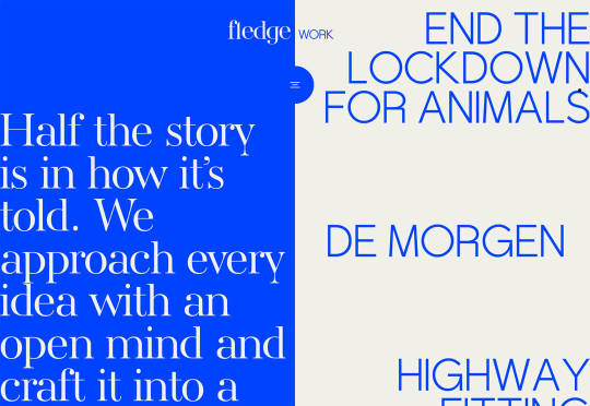
Fledge uses a split screen – still a dominant trend two years running – with a blue that’s almost too bright with an almost white offset color. The text is big and smooshed into the space tightly. Depending on the breakpoint, you might not even get the whole phrase on the left side. The design challenge is what are you supposed to do here? There are some hover animation cues, but they aren’t very direct.
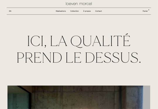
Loeven Morcel’s design has hints of brutalism and elements of elegance. What makes this design skew toward the brutal side is use of space and typography. Like the previous example, it falls into the territory of “what should I do here” with some concerns about readability. Most of these issues are resolved on the scroll if you move beyond the homepage.
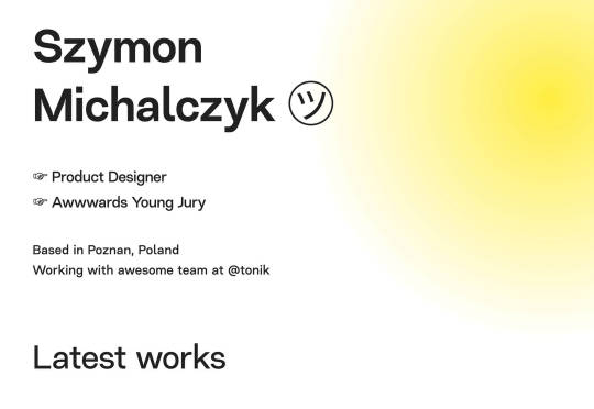
Szymon Michalczyl’s site is another that is close to brutal in style but has an element of sleekness that doesn’t quite carry it over the edge. The simple framework has that brutalist feel but the use of simple, clean fonts with plenty of space pulls it back into a more mainstream design scheme.
3. Beige Everything
Is a shade of beige the color of the year for 2020? Or is it just how we all feel?
Beige backgrounds are everywhere, making this one of those design trends that you can’t miss. The good news is that designers are playing with different shades of beige as well as warm and cool variations. Beige on its own can take on some of the color from accent hues and imagery, so that’s important to keep in mind when using this in the background.
The other variable is how saturated to make beige coloring. Most designs are using some of the more muted options while mostly playing with the levels of green and red. But darker beiges are also an option.
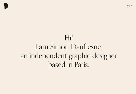
Simon Daufresne uses a beige that is the color that comes to mind when you think beige. It’s simple, a hint reddish, and is used with black only to maintain true color.
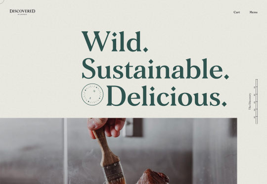
Discovered Wildfoods uses a more neutral feeling beige with a more green undertone (or is that color feel coming from other design elements). The neutral and natural color fits the brand and association this website is trying to create.
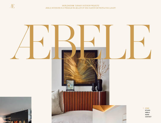
Aebele Interiors also uses a more traditional beige but with a bold mustard accent that makes the color feel exceptionally warm. What’s nice about this color combination is that in small sizes the mustard colored-type almost falls into the beige background, but at larger sizes seems to almost jump off the screen. It’s an interesting color juxtaposition.
Conclusion
Personally, this month’s trends are a mixed bag. I love the lines and interactivity of the beautifully connected examples. It shows that elements can cross and work together well.
On the flip side, brutalism and beige just aren’t my style. But apparently, they appeal to a lot of people based on the number of projects using these styles. What do you think? I’d love to know how you feel about these trends. Let me know on Twitter.
Source p img {display:inline-block; margin-right:10px;} .alignleft {float:left;} p.showcase {clear:both;} body#browserfriendly p, body#podcast p, div#emailbody p{margin:0;}
from Webdesigner Depot https://www.webdesignerdepot.com/2020/11/3-essential-design-trends-november-2020/
0 notes
Text
Popular Design News of the Week: October 26, 2020 – November 1, 2020

Every week users submit a lot of interesting stuff on our sister site Webdesigner News, highlighting great content from around the web that can be of interest to web designers.
The best way to keep track of all the great stories and news being posted is simply to check out the Webdesigner News site, however, in case you missed some here’s a quick and useful compilation of the most popular designer news that we curated from the past week.
Minimal CSS Frameworks
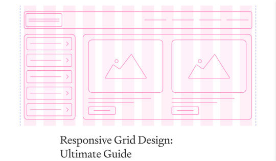
Responsive Grid Design: Ultimate Guide
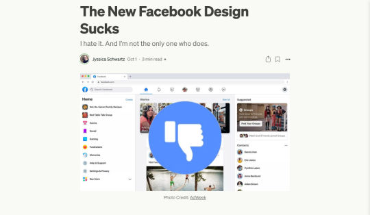
The New Facebook Design Sucks
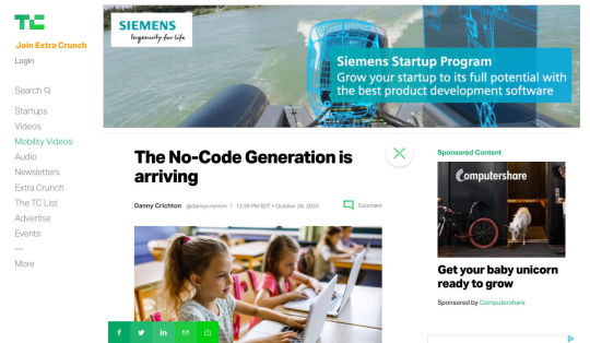
The No-Code Generation is Arriving
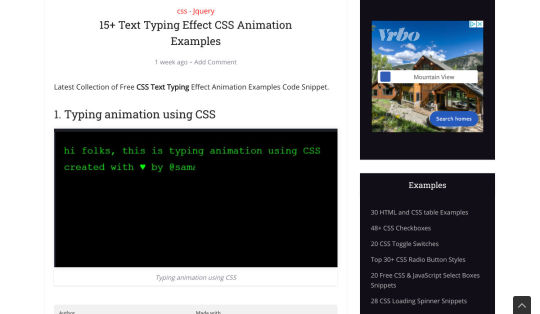
15+ Text Typing Effect CSS Animation Examples
AppSheet by Google Workspace – No-code App Building Platform
Ecommerce Development Trends: The 2021 Edition
How Videos Can Boost your Website Ranking Results
5 Small Business Website Essentials You Need for your Site
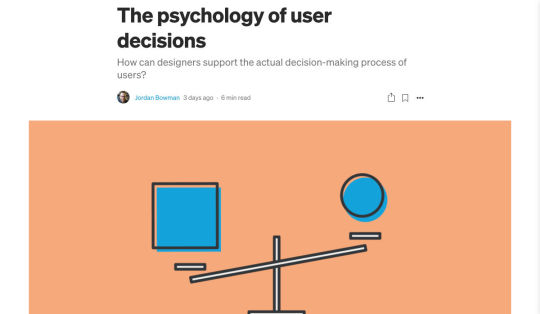
The Psychology of User Decisions
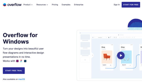
Overflow for Windows – User Flow Diagramming Tool for Designers
How to Create an AI that Chats like You on WhatsApp

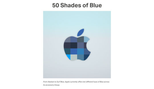
‘50 Shades of Blue’
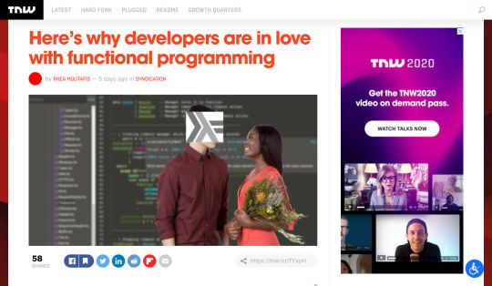
Here’s Why Developers are in Love with Functional Programming
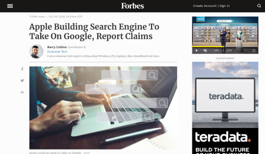
Apple Building Search Engine to Take on Google, Report Claims
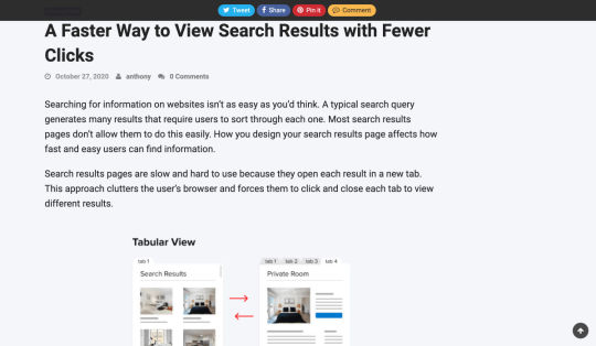
A Faster Way to View Search Results with Less Clicking
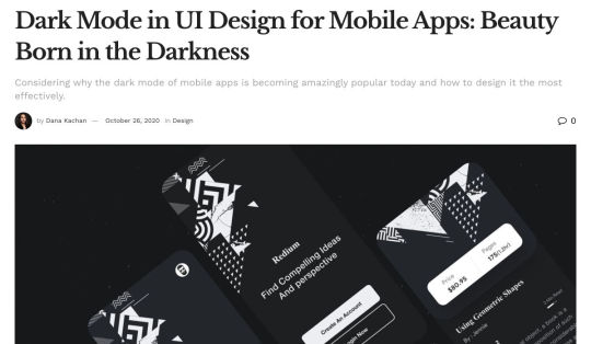
Dark Mode in UI Design for Mobile Apps: Beauty Born in the Darkness
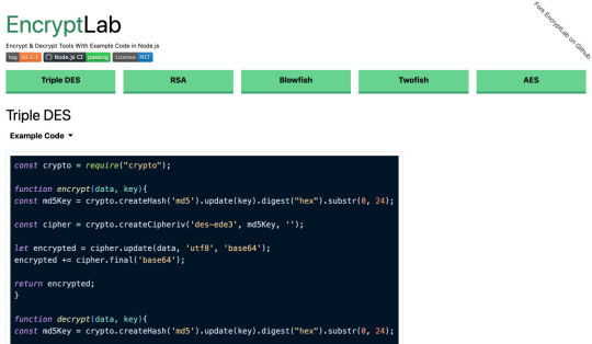
EncryptLab – A Collection of Free and Comprehensive Encryption Tools
Part of your World: Why We’re Proud to Build a Truly Native Mac App
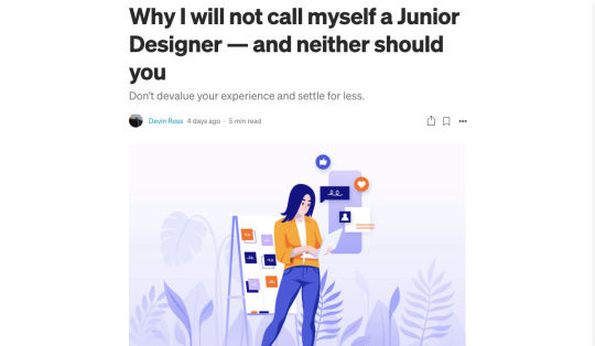
Why I will not Call Myself a Junior Designer - and Neither Should You
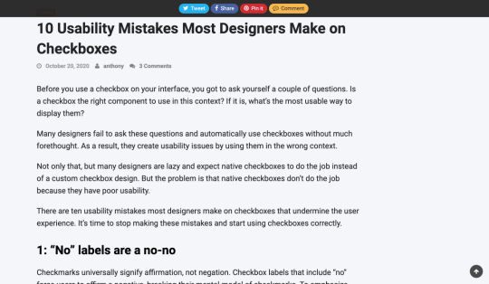
10 Usability Mistakes Most Designers Make on Checkboxes
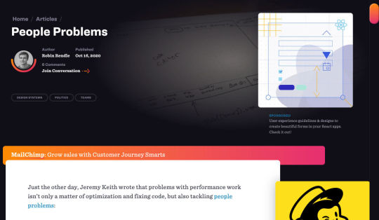
People Problems
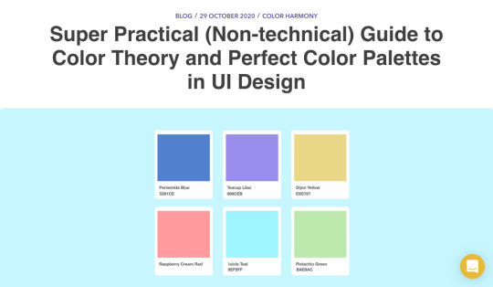
Practical Guide to Color Theory for UI Designers
Following the 2020 U.S. Election with Google

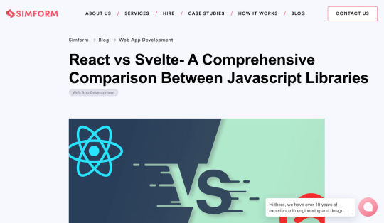
React Vs Svelte – A Comprehensive Comparison Between Javascript Libraries
Want more? No problem! Keep track of top design news from around the web with Webdesigner News.
Source p img {display:inline-block; margin-right:10px;} .alignleft {float:left;} p.showcase {clear:both;} body#browserfriendly p, body#podcast p, div#emailbody p{margin:0;}
from Webdesigner Depot https://www.webdesignerdepot.com/2020/11/popular-design-news-of-the-week-october-26-2020-november-1-2020/
0 notes
Text
Everything You Need to Know About Websites And Privacy Laws

When it comes to compliance, website developers need to keep their eyes on more than just ADA regulations and Section 508. Privacy laws are a big consideration and decisions on how to build privacy into a website start with architects.
And that’s exactly what website developers (and designers!) are. They build up attractive, functional websites and apps for their clients. Yes, they work closely with clients, copywriters, vendors, and other professionals to get the job done, but the developers are the ones who put it all together.
That’s why it’s critical that website developers are well-versed in marketing privacy laws — these regulations directly impact the end results of their work. But how does a website architect create a digital platform that honors both user privacy and the needs of their clients?
What Privacy Laws Are Important For Web Developers?
The two biggest privacy laws that web developers need to keep tabs on are the General Data Protection Regulations (GDPR) and the California Consumer Privacy Act (CCPA). Each law has its own unique scope and provisions, but they both shifted the landscape in defining an individual’s rights to their personal data and set mechanisms for how these rights would be protected and enforced.
Each regulation also carries with it fines, fees, and legal measures for non-compliance. These can be substantial. And if that’s not enough, there’s an ever-increasing consumer demand for websites that prioritize privacy and security. Consider these statistics:
82% of Americans surveyed say they are concerned about the security of their online data
79% of adults claim they are very or somewhat worried about how companies use the data they collect about them
63% of Americans believe they understand very little or nothing at all about privacy laws and regulations that are intended to protect their data
How Can Developers Implement These Laws?
Privacy by Design is Critical for Websites
Under GDPR, web developers are required to adopt the Privacy by Design framework, which is a multi-point methodology intended to standardize data protection measures.
Building privacy into websites shouldn’t happen at the end stages. It should start with how the websites are conceptualized in the first place. Here are points to prioritize:
Minimize that data you’re collecting and pseudonymize it to protect data privacy
Are you capturing consent? How? Where?
Integrating security measures to protect data — anytime you capture data or implement a third party product, a security risk is born.
Knowing where you’re introducing privacy and data sharing notices
Implement just-in-time notices to provide consumers transparency and build trust
Giving your users the opportunity to manage their personal data
Let’s look at these a little more closely…
Data Minimization is the Goal
Data minimization is an important principle embedded in GDPR. Data minimization itself is a pretty straightforward concept: organizations should limit how much personal data they collect and only process the information necessary to accomplish their business purposes. Once the data is no longer useful, it should be deleted.
For web developers, this means several things. When it comes to building websites, forms, cookies, and other methods should only ask for essential information. For example, if you are creating a pop-up to collect email addresses, don’t ask for their location unless it’s relevant to the email list and better serving their needs.
How and Where Do You Introduce Privacy Policies and Notices?
Let’s say you take data minimization seriously. That’s great! Now you need to put those data collection practices into words and share them with your customers.
Privacy policies and notices are a big part of both GDPR and CCPA. Both the CCPA and the GDPR mandate that your privacy policy detail why you’re collecting information and how it will be used, as well as what the individual’s rights are and how they can exercise them.
CCPA takes a slightly different angle, requiring privacy policies to disclose if the business sells personal data and what third parties have access to the data. CCPA also dictates that privacy policies and notices are current, updated at least annually. (Nota bene: GDPR also asks for updated privacy documents, but doesn’t specify frequency.)
How does this translate from policy into web development?
If you’re collecting data to improve user experience, allow for targeted ads, or sharing information with third-parties, this information will need to be included in a privacy notice. Remember, CCPA works with a broad definition of selling data, so you may need to account for a “Do Not Sell” link on your home page.
Considering using data beyond these purposes? Plan to obtain explicit user consent for each additional purpose.
What’s your plan for the data after the user gives it to you? Where is it stored? Who has access to it? How long are you keeping it? These are all questions that a website developer should consider, and that needs to go into a privacy notice.
Just-in-Time Notices for Transparency and Trust
Part of Privacy by Design is the use of individual components of your website to create transparency and support compliance. From a development and design perspective, this means you should always be looking for ways to communicate the hows and whys of data collection.
Yes, your privacy policies and notices aid in this, but going beyond these pieces is important. Customers recognize when businesses go the extra mile for them, after all.
So consider implementing just-in-time notices at points where users enter their information. These notices are a chance to share your data collection practices with your users. It’s transparent! It’s open! It aids in consumer awareness!
Keep Users in the Loop
Want to win over your customers? Make it as easy as possible for them to manage their personal data and how it’s being used. This starts with making sure they are aware of why you’re requesting their information and how you’re planning on using it for the website. You should also:
Get user consent — clear and unambiguous user consent — prior to gathering any data at all. This includes cookies.
Don’t pre-tick boxes for consent. Just don’t. (It’s bad practice AND it’s against GDPR.)
Link to all legal documents on the site. Users should be required to agree to them before using the service.
Want to send marketing communications like email newsletters to your customers? Make sure they agree to this. Expressly.
One helpful tool for keeping users in the loop is a marketing preference center. A marketing preference center allows users easy access to their information. From there, they can manage, edit, and delete their information at their discretion.
Bonus? A marketing preference center is an excellent point at which to communicate a business’ commitment to privacy. While users will pick up this through all the discrete elements of privacy on your website, putting it all into one hub that also allows users control over their data really reinforces this message.
Remember, it’s not just on the consumer to manage their data. Web developers should commit to managing the data in their systems. This means they should:
Maintain accurate and clean records of users’ data consent preferences
Send regular reminders to users to update their personal information in your system
If a user deletes their account, promptly delete all of their personal information
If your client goes out of business or is sold, they should delete all personal information in their system
Make it User Friendly
A final point: making your websites user friendly is important regardless of privacy compliance. Users expect websites that don’t make them think deeply about, or worry about, their privacy. Make it accessible and easy. Don’t make people figure it out on their own.
Give them value for sharing their data
Your users don’t have to share their data. They’re choosing to. So in exchange for their personal information, make sure you’re using it to provide a user-friendly website. Offer them a secure, enjoyable experience.
But don’t ask for more than you need
Let’s loop back around to this point again. While consumer data can help you build a better website, don’t plan your websites around it and don’t demand data to create a good experience.
Usability, web design, and website security; all of these things benefit from consumer data. But privacy laws should always guide how any personal data is collected and used, and respect for consumers’ individual rights, and honoring their privacy should be top-of-mind for web developers.
Featured image via Pexels.
Source p img {display:inline-block; margin-right:10px;} .alignleft {float:left;} p.showcase {clear:both;} body#browserfriendly p, body#podcast p, div#emailbody p{margin:0;}
from Webdesigner Depot https://www.webdesignerdepot.com/2020/10/everything-you-need-to-know-about-websites-and-privacy-laws/
0 notes
Text
You Won’t Win SEO With Hacks, Here Are 3 Winning SEO Strategies

The world of search engine optimization was born with all sorts of different hacks and shortcuts that many people use in an effort to grow their business.
Knowing effective SEO tricks would be incredibly profitable, but unfortunately it’s not that easy
This becomes evident as soon as you do a Google search about anything SEO-related, only to find pages and more pages replete with blog posts and videos disclosing all the tips and tricks you “need to know” in order to achieve the best SEO results, in the fastest way possible.
Knowing effective SEO tricks would be incredibly profitable, but unfortunately it’s not that easy.
In its essence, SEO isn’t about hacks, shortcuts, and hidden optimizations, but rather about resource allocation. Keep reading to learn why!
Be Careful About Over-Reliance on Hacks
Before we start talking about resources, it’s important to understand why the quick and easy SEO hacks we’ve all read about online aren’t as reliable as they might seem.
The reality is that yes, there are some traditional hacks and optimization tactics that many people swear by. However, SEO has become way too competitive for these hacks to still work.
Think about it: anyone can learn about these hacks and shortcuts in a matter of seconds, which means that anyone can use them, which means that they’re not going to help your website stand out. By way of example, when thinking about keyword usage, many websites simply decide to put them everywhere on their website, without actually planning and strategizing. Perhaps years ago, doing so would lead to excellent results, but that’s not the case anymore.
What I want to go over, and what I mean with this article, is that when developing your SEO plan, you should think less about hacks, and try to focus on strategy and resources instead.
As tempting as they might be, most SEO hacks won’t really go that far.
What does go far are those strategies and resource allocation decisions, which you can master as long as you know three things:
Who your competitors are;
What you have;
and What strengths you can double down on.
Base Your SEO Strategies on Your Business’s Resources
So, SEO is about resource allocation – we know that now…but what exactly does that mean?
Well, this logic is based on something you might have heard of before, and that is the three pillars of SEO.
As a refresher, everything in SEO revolves around three pillars:
Link building and referring domains;
Content development and content marketing;
Technical SEO.
Many businesses have a limited digital marketing budget and, as if that wasn’t enough, their SEO budget tends to be even more restricted.
This means that we can’t try every hack out there or do every campaign we can come up with, hoping it will lead to positive results. On the contrary, it means we need to be methodical and understand which strategies have the most potential and are actually worth exploring.
In summary, there’s one big challenge that every SEO team and company experiences, and that is the limitation of resources versus possible operations, and that leads us to a question: what mix of SEO pillars will give us a good shot at ranking high and surpassing our competitors?
Develop Your SEO Strategies Based on Your Inherent Strengths
The mistake that a lot of business owners make after reading SEO articles or hearing about amazing case studies is that they try and copy the strategies they learned about, from beginning to end.
However, contextually, each case study or article could refer to a strategy that was specifically optimized for a different type of business.
So, although copying what other successful businesses can work in certain situations when speaking about SEO, it’s best to borrow ideas and use the ones that fit your inherent strengths.
Based on the pillars of SEO that we discussed earlier, there are three strong points that a company can have:
If You Have a Strong Network…
Some businesses don’t have the resources to create an in-house content development team or outsource writing services.
However, they have another strong suit, which lies in their ability to go out into their community, speak, and be heard. They can do this because they have built a strong network over the years and, in cases like this, what we often do is use a backlinking approach.
When working with businesses that have a strong community presence, go out and double down on their network. Pitch their relevant contacts for guest speakership and guest posts, building thought leadership, while also driving links to their website.
If You’re Not That Popular But Are Good With Words…
Right now, some of you might be thinking: “Yeah, well, that’s easy when you’ve built the exposure, but not all of us are lucky enough to be well-known”.
Listen, I get it, we’ve all been in that position.
For clients and businesses that feel like they don’t have the brand equity or exposure to develop a strong backlinking strategy, opt for another route, and invest much more on content (and/or technical SEO, see below).
If the client has a team who’s ready to put its head down and get to work, then focus on producing a lot of content for their website.
Ultimately, the goal is to build a content library that is thorough and expansive, and that provides the client with more opportunities for keyword rankings, while also reinforcing the relevance of their website for those specific SEO keywords.
If Technical Knowledge is Your Forte…
You may not like (or have time) to write and you may not have a strong community presence, but if you have advanced technical skills and the ability to create a strong website quickly, then there’s another approach you can take.
This leads us into the third pillar of SEO: technical SEO.
This solution is indicated for technical teams that can create large websites, databases and user experiences in no time, and it is typically adopted by tech startups that are trying to create an app that provides user value.
First and foremost, winning at technical SEO requires strong technical skills that will allow you to build the web assets that you need, but that’s not all. It also requires you to understand how you can double down on these skills and manage large websites in the rather complex Google ecosystem.
So you need, for example, to know how you can get Google to notice and properly index the new pages you create on your website, even if you already have 100,000 pre-existing pages.
Or to ensure that each of your new pages is properly optimized for the best keywords.
Needless to say, using technical SEO does become a complex operation. However, when done right, it can lead your SEO to grow by sheer size, with the hopes that certain relevant keywords will start to rank for your business naturally.
Conclusion: Your Strategy Will Probably Be a Combination of the Three Pillars
When it comes to SEO, honing in on your strengths and accepting the fact that you can’t do everything is definitely the way to go.
When you’re running an SEO campaign, you should always focus on what you’re good at, know your resources, and augment what you already master – and that will put you in the right direction.
By focusing your resources on any of the pillars of SEO (or even a mix of them), you substantially increase your chances of achieving long-term success, which will not happen if you go for hacks and shortcuts instead.
A long-term, highly-organized, resource-allocated SEO strategy won’t only guarantee continuous success, but it can ultimately become self-sustaining, meaning that it will allow you to keep growing and growing, becoming an organic part of your marketing plan.
I’ve seen a lot of people try SEO hacks for two weeks, only to realize that they didn’t work and that their efforts had been in vain.
It’s unfortunate because by doing so, you’re turning your back on a marketing channel that is very valuable to a lot of people, and these hacks trick people into thinking it’ll be overnight.
So remember, resource allocation over hacks and shortcuts!
Source p img {display:inline-block; margin-right:10px;} .alignleft {float:left;} p.showcase {clear:both;} body#browserfriendly p, body#podcast p, div#emailbody p{margin:0;}
from Webdesigner Depot https://www.webdesignerdepot.com/2020/10/you-wont-win-seo-with-hacks-here-are-3-winning-seo-strategies/
0 notes
Text
20 Freshest Web Designs, October 2020

We have become so used to using web sites just to buy stuff that it is easy to forget that the web has more to offer. So this month we’ve included some because-it’s-interesting sites, some micro-sites and some just-for-the-sake-of-it projects.
Many of these are about selling or promoting products and services too, but in a more oblique way that is frequently more engaging than a straightforward sales site.
Micro sites can be a great way of including content that doesn’t fit in neatly with the rest of the main site, or is temporary, or to show a lighter, more fun side of a brand. And a well thought out micro site can act as a gateway to pull in even more visitors to its ‘parent’ site.
Your World Your Way
Your World Your Way is an interactive portal for the University of Auckland. An optional questionnaire customizes the experience, and clearly a lot of effort has gone into this in terms of the questions and possible answers, and the presentation. It is engaging and enjoyable to use, and the information provides links to the main University of Auckland website.
Blind Barber
This micro site is to celebrate 10 years of barber shop chain Blind Barber, which started as one shop with a bar in the back room, in New York’s East Village. An entirely black and white design provides a clean backdrop for color photos and videos, and some great scrolling animations give a pleasing flow to the content.
Brews & Grooves
Brews & Grooves pairs records with different beer. Although a ‘fun’ project, it is still a well designed piece of work with some vintage style typography and some pleasing rollover animation effects. It is an effective advert for those involved in creating it, as listed in on its ‘credits’ page.
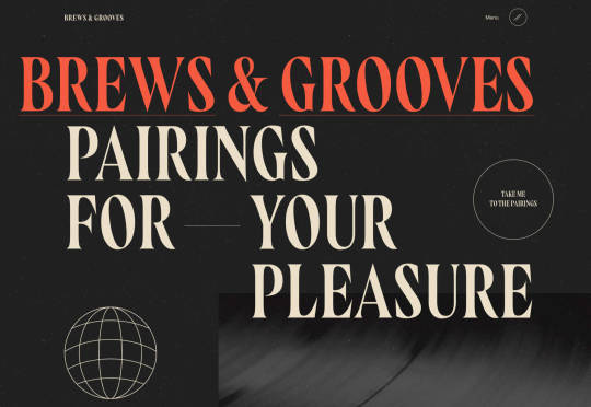
Gucci Bloom
As part of a new campaign to promote it’s ‘Bloom’ perfumes, Gucci have created a Gucci Bloom game. The player has to pick up flowers and perfume bottles, but miss a flower and the vines get in your way.
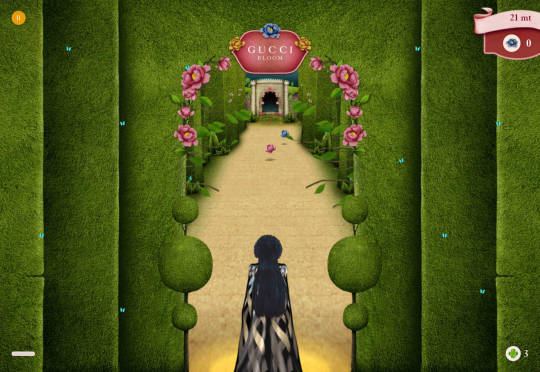
808303Studio
808303Studio is a digital musical instrument that emulates a Roland TR-808 drum machine and TB-303 bass synthesizer, created in conjunction with the Design Museum (London). It’s fully programmable and there is even short video tutorial with A Guy Called Gerald on how to use it.
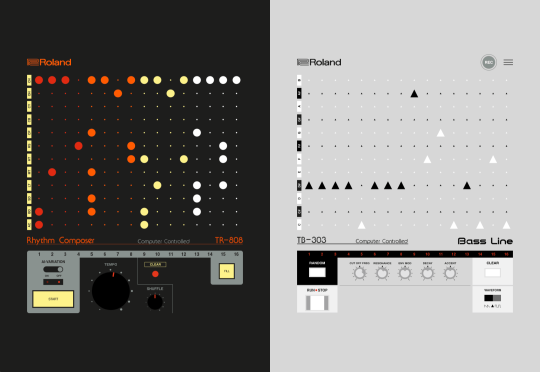
Aelfie
Aelfie is a home furnishings brand with a focus on bold patterns and bright color. Their site reflects this with its use of block color, irregular grid, drawings, and type that feels a little off-kilter. It creates a hand-made feel that embodies the brand aesthetic rather well.
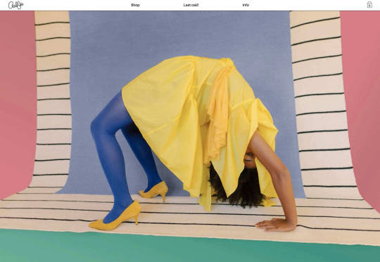
Media Election 2020
As we approach one of the most significant, not to mention acrimonious, elections in US history, Media Election 2020 uses AI to analyze the volume of media attention each candidate receives, in real time.
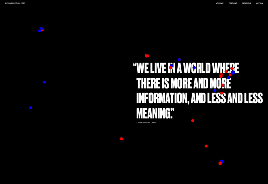
Curbed
Magazine website Curbed has now become a part of New York magazine, and had a redesign in the process. It follows a discernible grid, but distorts it just enough to create an edge. The highlighter color frames, and underlines on rollover, add movement and ‘cool’.
WFN
The WFN (Women’s Funding Network) is an alliance of funds and foundations working to promote gender equity and social change internationally. The site is clean, with strong typography and a sophisticated color palette.
The Fabric of America
Internet, telephone and TV service provider Xfinity is behind the Fabric of America project. It is a collection of voice recordings, the idea being that each voice, and each person’s story, is a thread that makes up the flag that we see on the screen.
Minimal Ceramics
Minimal Ceramics is a concept site, showcasing the work of London based potter, Tom Crew. The design of the site reflects the simplicity of the showcased work, using great photography and simple typography.
Normal Now
Normal Now is part of an awareness campaign to highlight to consumers the positives of electric cars. Taking a fun approach to engage consumers in a serious subject, it uses a fake retro tech style.
Superfood Gin
Superfood Gin is a gin made using superfood botanicals, that claims to be fruity and fresh rather than crisp and peppery. The soft color palette, along with the soft lines and curves in the background illustrations, reflect this well.
Maison Louis Marie
Maison Louis Marie is a natural fragrance company. While this site does nothing really groundbreaking, it does it well. Botanical drawings on a white background, along with clean typography, help create a refined, luxury feel.
Think Economia
Think Economia is a platform taking a fresh look at economics and the future of economic growth. It doesn’t sound like the most exciting subject, but it is presented here in a playful and intriguing way.
Chernobyl
From Uprock, a Russian design studio that also offers courses in web design, Chernobyl is a thought provoking exposition of the Chernobyl disaster. The design aesthetic is muted, allowing the images their deserved impact, and the brief sections of text to be absorbed.

Declamatuus
Declamatuus is a lingerie company selling gift sets. What stands out here is what you don’t see — live models in underwear. Instead the outline of the body is created with animated particles.
Odisea
Odisea Expedition is a documentary series following two friends, a surfer and a snowboarder, as they explore remote parts of the world. The photographs and video are everything here, and all other elements are kept minimal to avoid detracting from them.
Riffyn
Riffyn Nexus is a ‘Process Data System’ for storing and analyzing scientific data for laboratories. It is a very corporate site and yet it is put together in such a way that doesn’t feel dull.
Maison du Net
This site for digital design agency Maison du Net takes a risk mixing corporate with cutesy, but it works. Offset frames and underlines create interest without overdoing it, and the very bright green is used sparingly enough to liven things up without being overwhelming.
Source p img {display:inline-block; margin-right:10px;} .alignleft {float:left;} p.showcase {clear:both;} body#browserfriendly p, body#podcast p, div#emailbody p{margin:0;}
from Webdesigner Depot https://www.webdesignerdepot.com/2020/10/20-freshest-web-designs-october-2020/
0 notes
Text
Popular Design News of the Week: October 19, 2020 – October 25, 2020

Every week users submit a lot of interesting stuff on our sister site Webdesigner News, highlighting great content from around the web that can be of interest to web designers.
The best way to keep track of all the great stories and news being posted is simply to check out the Webdesigner News site, however, in case you missed some here’s a quick and useful compilation of the most popular designer news that we curated from the past week.
Neonpad.io – A Neon Plain Text Editor in the Browser
Why Software Developers Might Be Obsolete by 2030
CSS Background Patterns by MagicPattern
Tailwind CSS: How to Build Websites Using a Utility-First CSS Framework
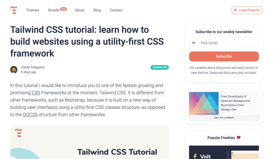
5 Landing Page Optimization Techniques You Haven’t Tried
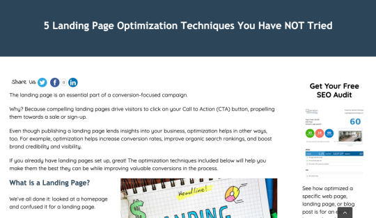
5 Useful Typography Tools You Never Knew You Needed
CSS for the Minimalist: Exploring Classless CSS
Technical SEO: A Complete Step-by-step on How to Leverage your Website
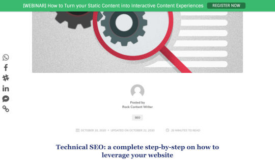
Material-UI Builder – React Editor for Busy Developers
Versus – Find Alternatives to a Product or Service
StellarX – Create Collaborative Spaces & Rich Simulations Without Code
Project Scheduling 101: What it is + How to do it
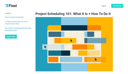
3 Ways to Know if your Design is Good
My Chatbot is Dead – Why Yours Should Probably Be Too
How to Make a Memorable Freelance Portfolio

The Grumpy Designer’s WordPress Plugin Pet Peeves
The Difference Between Information Architecture and UX Design
How to Secure Sites for 2020 Holiday Shopping
Finding Logo Fonts that Fit your Brand
How to Create a Web App Manifest
A Step-by-step Process for Creating Responsive Logo Designs
The Top 21 Playable Interactive Websites

How to Become a Design Mentor
An Introduction to Inclusive Design
5 Design Lessons from Great Writers
Want more? No problem! Keep track of top design news from around the web with Webdesigner News.
Source p img {display:inline-block; margin-right:10px;} .alignleft {float:left;} p.showcase {clear:both;} body#browserfriendly p, body#podcast p, div#emailbody p{margin:0;}
from Webdesigner Depot https://www.webdesignerdepot.com/2020/10/popular-design-news-of-the-week-october-19-2020-october-25-2020/
0 notes
Text
5 Biggest Challenges Web Design Agencies Face

With billions of internet users worldwide spending several hours online each day, the online presence of brands is now a necessary avenue for building, boosting, and maintaining positive value and attracting and interacting with customers.
This has created increasing pressure for web design agencies when creating and managing websites. This pressure is multiplied by all the projects that web design agencies have to handle at one time. This is because different clients demand different things for their websites, whether it’s a signature feature or specialized functionality.
Hence, it’s vital that the tools the agencies use to work are simple enough and suited to the tasks they have to accomplish in order to build and maintain these projects. Having the right tools can increase efficiency and effectiveness in managing websites.
Challenges in Modern Web Design
Building a website with all the essentials in mind is always easier said than done. Websites have to be both functional and easy on the eyes to invite traffic, disseminate information, or appeal a product or service to a target audience, and all while having an attractive and convenient interface.
The good news is that it’s perfectly possible to design a quality website and without spending a fortune to do so. Below are some of the challenges that web design agencies face when trying to deliver and reconcile efficient user experience and effective user interface in web design.
1. Appealing User Experience
Designing a good website means ensuring that the user experience is appealing to a general audience, but this is one of the most difficult parts of web design. Agencies must be careful not to turn off users with a confusing user experience. For instance, making important information difficult to find on web pages, using technical jargon that ordinary users wouldn’t understand, and focusing too much on the design rather than the overall experience are a few big mistakes that no designer should ever commit.
Instead, web design agencies should focus not only on making the design look good but also on making the experience smooth and fast for the regular site visitor. This includes improving design elements to make navigation easier as well as optimizing webpage load speeds.
2. Working With a Budget
It’s common for the client and the web design agency’s budgets to not line up at all times. Either the client will find the project quote too high, or the designer will find the client’s budget too low. The cost of a web design project can vary greatly, depending on what needs to be done.
Although having to build a good website on a budget may be difficult, it’s important for both parties to come up with a set amount before the project even starts. The client should always specify what they want to achieve and how much they’re willing to pay to get it, and the agency should let the client know beforehand if this is possible.
3. Integrating Third-Party Functionality
Sometimes, clients may make requests for third-party functions that may not be easily integrated into the site. To prevent this, web design agencies should always consider integration when building a site. Most businesses and companies now have at least one social media account, so it doesn’t make sense for their site to remain disconnected.
When a website visitor shares an excerpt on a social media site like Facebook, Pinterest, or Twitter, other people who can see their posts may become interested in visiting the original post on the website. Properly integrating third-party applications and functions into a website can get it more online presence and popularity.
4. Suitability to Different Devices
There are many devices that people can use to access the web. From smartphones to desktop computers, from cars to game consoles, and even wristwatches and digital cameras, all of these can be web-enabled as long as there’s an available internet connection.
Websites nowadays should always be compatible with any of the devices people might use to go to the website. They should look pleasing and load fast regardless of what device a visitor is using.
5. Security of Personal Information
Most websites require personal or financial information, whether for account verification, for website subscription, or something else. Websites should be designed with personal security in mind, which is even more important since hacking has been on the rise since the coronavirus hit.
One of the biggest threats that websites face today is phishing, or when an attacker will pretend to be a trusted contact and attempt to compel you to click a malicious link. Another is ransomware, or where cybercriminals hold customer data for ransom and attempt to extort online business owners. Yet one more is SQL injections, or where hackers will attempt to execute malicious SQL commands in your website’s database.
The best practices in regards to web design to mitigate these risks include third-party plugins and themes, keeping all of your software up to date, setting your web applications so they run the fewest privileges possible, and utilizing SSL certificates and HTTPS protocols.
Adopting Site-Building Platforms
Gone are the days where you had to be technologically gifted to design a website from scratch, usually through manual HTML codes. Back then, you had to know your way around the web if you wanted to set-up and manage a site of your own.
Now, there are a lot of good website builders that allow you to create websites in a faster period of time. Even web design agencies now make use of such builders in order to make the job easier and more convenient. Not to mention, it allows agencies to focus on the design alone.
Although these platforms offer predesigned templates based on the most common purposes of websites, they normally allow the user to white label the website into the branding specific to the business or agenda of the website owner. The text styles, colors, and sizes coordinated to the website’s theme, and colors can be designed specifically to match the business or organization’s image and identity.
Simply put, creating websites through a web builder platform can provide web design agencies with easy-to-understand tools that their teams and members can all uniformly use to more effectively and more efficiently handle all their projects.
With services that allow mobile optimization, site management, and even drag-and-drop editing, web design agencies can now better manage their projects and finish with their tasks more quickly.
Not only that, by using white labelling, services can conserve their time and energy into focusing on creating the best website for their client. With all the website builders currently available on the market today, just picking the right one can give web design agencies the best tools to use when creating, designing, and maintaining websites.
Featured image via Pexels.
Source p img {display:inline-block; margin-right:10px;} .alignleft {float:left;} p.showcase {clear:both;} body#browserfriendly p, body#podcast p, div#emailbody p{margin:0;}
from Webdesigner Depot https://www.webdesignerdepot.com/2020/10/5-biggest-challenges-web-design-agencies-face/
0 notes
Text
Making Minimalism Functional in Web Design
Today, great design isn’t just about conveying the right amount of information in a certain number of pages.
There’s more to creating the perfect website than experimenting with visuals and sound. Designers need to think carefully about how each element of their site impacts the overall user experience.
After all, with billions of websites available to explore, it takes something truly immersive to convince your client’s audience that they should stay on their pages. The more convenient and attractive your websites are, the more likely it is that visitors will want to stick around.
Minimalism, one of the more popular styles of web design from the last few years, can sometimes assist designers in making attractive and effective websites more functional.
The less clutter and confusion there is on a page, the easier it is to navigate.
So, how do you embrace the benefits of functional minimalism?
Understanding Functional Minimalism
Many webs designers are convinced that minimalism is all about aesthetics.
They see a website like Hugeinc.com and assume that the minimalist appearance is all about making the website as attractive as possible.
However, the underlying ideas of minimalism in web design go much deeper than this. The history of minimalist design begins with Japanese culture. Japan has long focused on balancing simplicity and beauty with its architecture, interior design, and even graphic design. In the Western world, minimalism got its day in the sun in the web design environment, after customers endured years of cluttered and complicated web pages with difficult navigation, overwhelming information and clashing graphics.
Designers began to experiment with the idea that less really could be more — particularly when it came to the digital landscape.
The Functional Rules of Minimalist Web Design
For a while, minimalism was the most popular style for a website. During 2018, in particular, minimalist web design soared to the top of the designer demand list, as companies fell in love with a combination of white space, simple navigation and bold text.
While now, there are other design trends stepping into the industry, designers can still benefit from exploring some of the essential rules of functional minimalism. After all, visual complexity has been proven to damage a person’s perception of a website.
Additionally, a study conducted by the EyeQuant group found that a clean and simple design can lead to a lower bounce rate. Minimalism gives viewers less to contend with on a page, which can allow for a simpler and more straightforward experience. Additionally, a clean website can also drive additional benefits, including faster loading times, better responsivity between screen sizes and more.
Because you’re only using a few images and well-spaced text, you can even experiment with different strategies, like graphics and dynamic fonts. Look at the Manuel Rueda website, for instance, it’s a great example of how a minimalist design can be brimming with activity.
So, how can any designer use the principles of functional minimalism?
1. Focus on the Essentials
First, just like when designing a landing page, designers need to ensure that they’re concentrating only on the elements in the page that really need to be there.
This means removing anything on the website that doesn’t support the end-goals of the specific page that the viewer is using. Any pictures, background noise, buttons, or even navigation features that aren’t going to support the initial experience that the visitor needs, must go.
Think about what’s going to distract your visitors from the things that are important and concentrate on giving everything a purpose. For instance, the Plus63.org website instantly introduces the visitors to the purpose of the website, then allows users to scroll down to get more information. The data is spread clearly through the home page, pulling the viewer into a story.
2. Embrace the Positives of Negative Space
Negative space is one of the fundamental components of good minimalist web design.
Every part of a good website doesn’t need to be filled with noise to make a difference. White, or negative space can help to give your viewer the room they need to fully understand the experience that they’re getting.
From a functional perspective, it’s the difference between placing someone in an overflowing storage container and asking them to find what they need or placing them in a room where items are carefully spaced out, labelled, and waiting for discovery.
The Hatchinc.co website uses negative space to ensure that information is easy to consume. You can find the different pages of the site easily, the social media buttons, and the newsletter subscription tool. Plus, you get a chance to see some of the work behind the site.
3. Make it Obvious
One of the biggest problems that consumers have encountered in recent years, is the concept of “choice overload”.
Whether you’re in a store, or on a website, you’re never sure what to do first. Do you check out the blog posts on the site to learn more about the authority of the company? Do you visit the “About” page, to see where the brand come from? Do you head to their product pages?
As a designer, functional minimalism can help you to make it obvious what your audience should do next. As soon as you arrive on the AYR.com website, you’re not overwhelmed with choice. You can either head to your bag, “shop now”, or check the menu.
Since the “Shop Now” CTA is the biggest and most compelling, the chances are that most visitors will click that first, increasing the company’s chance of conversions.
4. Simplify the Navigation (But Don’t Hide It)
The AYR.com example above brings us to another concept of functional minimalism.
While minimalism and simplicity aren’t always the same thing, they should go hand-in-hand. When you’re designing for functional minimalism, you should be concentrating on helping visitors to accomplish tasks as quickly and easily as possible, without distraction.
That means that rather than overwhelming your audience with a huge selection of pages that they can visit at the top or side of the screen, it may be worth looking into simpler navigation options. A single menu icon that expands into a full list of items remains a popular design choice – particularly in the era of mobile web design.
For instance, look at the simple menu on newvision-opticien.com.
With this basic approach, designers can ensure that visitors are more likely to click through to the pages that their clients want their customers to visit. They can still find what they need in the menu, but it’s not taking up space on the page, or distracting them.
5. Set Great Expectations with the Top of the Screen
Functional minimalism can also help today’s designers to more quickly capture the attention of their visitors from the moment they click into a website.
The content that’s visible at the top of the page for your visitors is what will encourage them to take the next step in their online experience. Make sure that you’re providing something that keeps your audience interested and gives them the information they need.
That way, you’ll lower the risk of high bounce rates for your clients, while also taking advantage of minimalism’s ability to deliver quick access to information for your audience.
At the top of the page, the Kerem.co website instantly introduces the visitor into what the website is all about, and what they should do next.
You can even deliver more information in one chunk at the top of the page, without cluttering the environment, by using good UI animation.
Consider implementing a slideshow of pictures that flip from one image to the next, or a font section that dynamically changes as your audience has chance to read each sentence.
6. Use Functional Minimalism in the Right Spaces
Remember, functional minimalism isn’t just for home pages.
Depending on what you want to accomplish for your client, you could also embed the components of minimalism into landing pages, portfolios, and squeeze pages too.
After all, when there’s less clutter and confusion on a page to distract a potential audience, there’s a greater chance that your visitors will scroll to the bottom of the page and complete a conversion. For instance, look at how simple and attractive the Muzzleapp.com landing page is.
The page provides useful information and tells customers exactly what they need to do next. There’s no confusion, no complexity, and nothing to hold visitors back.
Just be careful. While functional minimalism can be very useful, it won’t be right for every website. A lack of elements can be harmful to websites that rely heavily on content. That’s because low information density will force your user to scroll excessively for the content that they need. Using functional minimalism correctly requires a careful evaluation of where this technique will be the most suitable.
Minimalism Can be Functional
A minimalist design isn’t just an aesthetic choice. The right aspects of minimalism can simplify interfaces on the web by eliminating unnecessary elements and reducing content that doesn’t support an end goal.
The key is to ensure that you’re focusing on a combination of aesthetics and usability when creating the right design. An easy-to-navigate and beautiful website can be a powerful tool for any business.
Source p img {display:inline-block; margin-right:10px;} .alignleft {float:left;} p.showcase {clear:both;} body#browserfriendly p, body#podcast p, div#emailbody p{margin:0;}
from Webdesigner Depot https://www.webdesignerdepot.com/2020/10/making-minimalism-functional-in-web-design/
0 notes
Text
Top New CMS Plugins, October 2020

Plugins offer a ton of benefits to developers and website administrators; from flexibility, to saving time in development, the right plugin is priceless to a project.
In this article, we’ll cover a list of the best new plugins for October 2020. You’ll find useful plugins for WordPress, Craft, Shopify, and Joomla.
Let’s get started.
WordPress
Sticky Post Expire
Sticky Post Expire is a simple plugin for WordPress that allows you to add an expiration date to your sticky posts. When the expiration date you set on a post expires, the post will automatically no longer be sticky. All you need to do is install/enable the plugin and a meta checkbox will appear in your posts admin area. It’s in this checkbox you will set the post’s expiration date.
Product page shipping calculator for WooCommerce
The Product Page Shipping Calculator plugin allows your customers to calculate the cost of shipping before adding the product to their cart. The plugin also allows customers to see the available shipping methods for their area. If the product cannot be shipped to the customer’s location, the plugin will notify the customer. All calculations are done using Ajax, so you don’t have to worry about the plugin slowing down your site.
Payment Page
Payment Page makes it easy to collect payments on your WordPress website. The plugin allows you to connect to any payment gateway platform of choice. You can also receive one-time or recurring payments using Payment Page. The plugin comes with beautifully designed templates that you can customize to fit your brand and style. The form builder helps you increase your sales and conversions. You can collect payment in any currency. After payment, customers will also receive a confirmation message.
WP Roadmap
Wp Roadmap is a product feedback board for WordPress. The plugins allow you to display your company’s product roadmap on your WordPress website or blog. The plugin will display your new products, business developments, upcoming events, achievements, awards, and future projects on your site. WP Roadmap also gives you the option to collect and create feedback boards. The plugin comes with an intuitive interface and works with any WordPress theme.
LiveSession
LiveSession is a session replay plugin for WordPress. The plugin allows you to record everything happening on your site, including clicks, scrolls, and mouse movements. This plugin helps you understand how your visitors interact with your website. You can rewatch the videos as many times as you like. Instead of recording every single visitor on your site, LiveSession will record visitors with a high engagement score.
The plugin also comes with a feature called Rage Clicks. This feature helps you identify when visitors encounter Javascript errors. The plugin also has a beta feature called Clickmap. It helps you identify the specific elements on your site that visitors clicked and how many times. There is also a heatmap feature that identifies which pages on your site get the most interaction. The plugin is very useful in improving your user experience (UX) and conversion rates. It easily integrates with Google Analytics, Segment, Intercom, LiveChat, HelpScout, Olark, Wix, Shopify, and WooCommerce.
Auction Feed
Auction Feed makes it easy to display eBay items on your WordPress website. Visitors to your website will be able to search and buy products directly from your site. The plugin comes with a variety of styles to fit any WordPress theme. You can also add a product description above or below the product image. Customers won’t have to leave your website before making their purchases. The plugin is also free to use.
Floating Related Posts
Floating Related Posts is a WordPress plugin that allows you to display a banner with a list of related posts on your website. The banner can appear at the top or bottom of the web page. You can set the banner to pop up using a time filter or scroll trigger. The plugin is also compatible with Google Analytics. You can customize the banner background color, font size, button style, and text color. The plugin can be translated into any language.
Simple Restrict Content
The Simple Restrict Content plugin allows you to restrict the content that visitors can access on your WordPress site. You can choose who can access content on your website by setting up roles. The simple lightweight plugin restricts different content types, including, posts, web pages, and WooCommerce products. The plugin is available in Spanish and English.
Easy Video Publisher
Easy Video Publisher is a WordPress plugin that allows you to easily publish YouTube videos on your website. You can import YouTube videos from multiple channels. You can also schedule the YouTube videos to automatically upload to your website. Note that a YouTube API key is needed to import multiple videos at a time from a specific channel. The plugin allows you to use multiple API keys.
Preloader Awesome
Preloader Awesome is a preloader plugin for WordPress that allows you to create a page preloader interface while the rest of the webpage is still loading. Preloaders are interface elements that notify visitors that your website hasn’t crashed, just processing before serving content. Some of the features of the plugin include 14 page transition styles, progress bar, GIF support, 10+ default CSS loader, progress status counter, unlimited color, and counter font size options. The plugin is responsive and works on all modern browsers.
Menu Hover Effect
The Menu Hover Effect plugin allows you to add hover effects to the menu bar on your website. With this plugin, you don’t need to learn CSS. This plugin gives you 20 CSS menu hover options to choose from. It is a lightweight plugin and won’t affect your website speed.
Better Comments
The Better Comments plugin allows WordPress users to easily customize the comment section of their website. With the plugin, you can customize the look of your comment form fields, match the submit button with the colors of your site, and hide the comment’s date. The plugin also allows you to create a comment policy section. You can further customize the comment fields to highlight when they are selected and typed in. If you find rounded avatars common, the plugin also offers a hexagonal avatar option.
WP Pocket URLs
WP Pocket URLs is a handy WordPress Plugin that helps you manage your affiliate links. The plugin allows users to automatically shorten and track any affiliate link on their website. You can also manually shorten the links on your website. Each time a visitor clicks on a link you get access to information like click date/time, country, IP address, etc. You can also categorize your links and also create custom permalinks. There is also a dashboard widget that displays your top 10 links. On the “Reports” page, you can generate clicks reports. You can filter the reports by Month/Year, link category, country, and link title.
Craft CMS
Formie
Formie is a Craft CMS plugin that allows you to create user-friendly forms. The plugin comes with a drag and drop builder for creating forms. You can store user form submissions in your control panel in case you want to review them later. When a user submits a form, you will get an email notification. Formie also has an in-built keyword blocking feature to protect you from spam. The plugin has several integrationS: API for Elements, Address Providers, Captchas, CRM tools, Webhooks, and Email Marketing software. You can also create your custom integration. You can add over 25 fields to your forms using Formie.
Craftagram
Craftagram is a Craft CMS plugin for adding any Instagram feed to your website. Since the plugin uses the official Instagram API, you don’t have to worry about your website getting blacklisted. Craftagram also handles pagination for your Instagram feed.
Shopify
We’re Open
We’re Open is a handy plugin for Shopify users. The plugin lets your customers know when you are open to receive new orders. Once your business hours are close, customers won’t be able to make new orders. A message will be displayed in your store that you are closed. The plugin ensures that you only receive orders when you are open. It works in any time zone and the API easily integrates with mobile apps.
Punch Metrics
Punch Metrics is a Shopify Plugin that helps you track your store’s visitors and also analyze their behavior. The plugin offers real-time data on your site’s visitors, the pages that see the most engagement, and which devices are the most popular. You can also record and replay visitors’ sessions so you can know exactly what they did on your site. Punch Metrics also has a heatmap tracking feature to understand which elements on your site get the most clicks.
Joomla
Simple Sliders
Simple Sliders is a content plugin for Joomla. The plugin allows users to easily create accordion sliders in their articles. You can add the sliders to your Joomla articles by adding this code:
{slider title="Slider 1 Title" class="blue"} Slider 1 content. {slider title="Slider 2 Title" class="red"} Slider 2 content. {/sliders}
Jitsi Conferencing
Jitsi Conferencing is a video conferencing plugin for Joomla. The plugin will allow you to host meetings and easily connect with your clients. The module is simple and effective to use.
Featured image via Unsplash.
Source p img {display:inline-block; margin-right:10px;} .alignleft {float:left;} p.showcase {clear:both;} body#browserfriendly p, body#podcast p, div#emailbody p{margin:0;}
from Webdesigner Depot https://www.webdesignerdepot.com/2020/10/top-new-cms-plugins-october-2020/
0 notes
Text
Popular Design News of the Week: October 12, 2020 – October 18, 2020
Every week users submit a lot of interesting stuff on our sister site Webdesigner News, highlighting great content from around the web that can be of interest to web designers.
The best way to keep track of all the great stories and news being posted is simply to check out the Webdesigner News site, however, in case you missed some here’s a quick and useful compilation of the most popular designer news that we curated from the past week.
34 Impressive Examples of Fullscreen Navigation Menus
Radix Icons – An Open Source Crisp Set of 15×15 Icons
Nocode – Turn Google Docs into a Website
How to Design a Great Dashboard for your UI
The Most Futura. Ever.
5 Mistakes to Avoid When Designing your Nonprofit Website
UCalc – Functional Calcs and Forms
AreYouInterested – A Super-Simple Landing Page Builder for Bulk Idea Validation
Unlearning to Learn Design

Just FYI: Acronyms are Hurting your UX and ROI
3 Concrete Steps to Learning a Programming Language

MathJax – Beautiful and Accessible Math in all Browsers
What is a WordPress Child Theme?
How to Create a UX Writing Portfolio
A Step-By-Step Guide to User Experience Research
5 Most Common Mistakes in FinTech Design
31 Ways to Improve your Web Design Skills
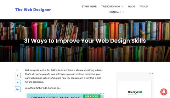
Designing the Ada Lovelace Hashflag Emoji
Powered by Buttons – An Acquisition Channel Nobody is Talking About
Top 10 Tools for Managing Remote Teams Efficiently
Email Design Accessibility: Why it is Important to Improve it
Why Web Design Client Referrals Aren’t a Slam-Dunk
Host Rider: A Game for Learning CSS Flexbox
Stanza – Learn Coding Concepts Faster
How to Present your Logos to the Client
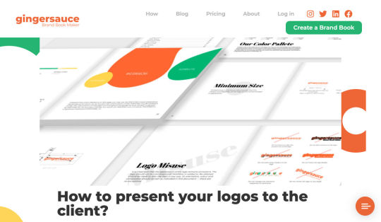
Want more? No problem! Keep track of top design news from around the web with Webdesigner News.
Source p img {display:inline-block; margin-right:10px;} .alignleft {float:left;} p.showcase {clear:both;} body#browserfriendly p, body#podcast p, div#emailbody p{margin:0;}
from Webdesigner Depot https://www.webdesignerdepot.com/2020/10/popular-design-news-of-the-week-october-12-2020-october-18-2020/
0 notes
Text
How to Get Dark Mode Design Right
Dark themes are everywhere these days.
As human beings continue to spend more of their time interacting with technology, dark themes provide a more relaxing way to engage with the digital world. More often than not, these themes are easier on the eyes, more attractive, and perfect for the dedicated user.
Throughout 2020, countless leading brands have debuted their own version of the dark theme. Google has a solution for your Drive, while Apple and Android have built dark theme performance right into their operating systems.
If you haven’t learned how to make the most out of dark mode yet, then you could be missing out on an excellent opportunity to differentiate your design skills, and earn more clients going forward.
Why Dark Mode?
Before we dive too deeply into the possibilities of creating your own dark theme, let’s examine what dark mode is, and why it’s so effective.
Ultimately, dark themes are created to reduce the amount of luminance emitted by everything from your desktop and laptop, to your smartphone and smartwatch. Dark themes help to improve the visual ergonomics of design, by reducing eye strain, adjusting brightness to suit current lighting conditions, and more. Additionally, many dark mode offerings are also fantastic at conserving battery life.
Here are some of the main benefits of adding dark themes to your design portfolio.
Better user experience: A focus on user experience is one of the most important trends of the digital age. You need to be willing to deliver incredible experiences to everyone who visits your website if you want to stand out today. Dark mode reduces everything from eye strain, to battery power consumption. This helps to keep customers on a website for longer.
Innovation and cutting edge appeal: Most companies want to prove that they can stay on the cutting edge of their industry. The ability to offer an opt-in dark mode version of a website theme or appearance can help your clients to stand out from the crowd. As the environment becomes more mobile-focused, more companies will be looking for designers that can provide the best mobile experiences.
Support for universal design: Dark mode isn’t just great for people who have light sensitivity at night. This solution could be more comfortable for visually-impaired users who would struggle with eye strain when visiting your websites otherwise. If you want your content to be more inclusive for a wider range of viewers, then learning how to design for dark mode is a good way to start.
Best Practices When Designing for Dark Mode
Designing for dark mode is easier than you’d think. Most of the time, it involves simply thinking about how you can replace some of the brighter, more overwhelming aspects of your site, with something deeper and darker.
Here are some useful tips that will get you moving in the right direction.
1. Experiment with Colors
A big issue for a lot of web designers when it comes to developing a dark mode solution is that they get too caught up with things like pure white text against pure black backgrounds. However, this high-contrast option can be a little much after a while.
It’s often much easier to use a dark grey as your primary surface color, instead of a true black. Additionally, rather than using bright white, think about slightly off-white alternatives that will be warmer to the eye.
Experiment with surfaces and color combinations that are unlikely to cause too much eye strain. Dark grey foundations often offer a wider range of depth, too, because you can demonstrate shadows on grey.
Additionally, when you are experimenting with colors, remember that saturated colors often vibrate painfully against very dark surfaces, making them harder to read. Desaturating your colors will help to reduce the contrast and make your websites more welcoming.
Lighter tones in the 200-50 range will have better readability on dark themes. However, you can always experiment with your choices. Google Material Design recommends using a contrast level of around 15:8:1 between your background and text.
2. Consider the Emotional Impact
Much of the effort involved with dark mode design is figuring out how certain colors work together. It’s easy to get carried away with stark contrasts, particularly when you’re used to working with a white background. However, you need to remember that you’re designing for a user that’s primarily looking for an easier and more subdued browsing experience.
While you’re working, remember to consider the emotional aspect of the design too. The emotion in colors can make or break a buyer’s journey in any environment. However, an often overlooked-aspect of color psychology, is that people perceive shades differently when they’re on a black background.
For instance, think of the color green. On a light background, it conveys nature and even financial wealth. However, on a dark background, the same green could come across as something venomous, toxic, or even sickly. It’s important to think about the kind of impressions end users are going to get when they arrive on your site.
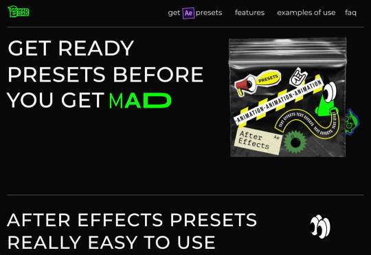
3. Give Users the Freedom to Choose
One of the biggest mistakes you can make when you begin designing for dark mode, is thinking that you should focus entirely on your dark themes, and nothing else. This lines you up for a problem if you interact with users who want the best of both worlds. If you’re designing for apps in particular, you’re going to need web pages that can switch naturally between light and dark themes.
Learning how to implement both a dark mode and a light mode option into the desks you create will help you to reach a wider selection of customers. Remember, you’ll need to test the performance and impact of your designs in both themes, to check that they deliver the same kind of experience, no matter how your user chooses to browse.
Although dark mode should offer a different experience to end-users, it still needs to feel as though they’re browsing on the same website. That means that you’re going to need to experiment with the most natural combination of light and dark mode options.
4. Remember the Basics
Remember, although the three tips above will help you to get on the right path for dark mode design, you’ll also need to consider the opportunities and limitations of the platforms that you’re designing for. The kind of dark mode experience you can deliver for Google Chrome websites is going to be very different to what you can create for something running on iOS.

Examining the documentation provided by the system that you’re designing for will help you to develop something with a close insight into what’s actually possible.
Other top tips for dark mode design include:
Focus on your content: Make sure that your content stands out on the page, without being too overwhelming.
Test your design: In both light and dark appearances, you need to make sure everything is working as it should be.
Adopt vibrancy for your interfaces: Vibrancy helps to improve the contrast between your background and foreground.
Use semantic colors: Semantic colors adapt to the current appearance of a website automatically. Hard-coded color values that don’t adapt can seem more aggressive.
Desktop tinting: Try experiment with things like transparency and filters to give your websites and apps a slightly warmer tint – ideal for late-night browsing
Icons: Use individual glyphs and icons for dark and light modes if necessary.
Ready to Design for Dark Mode?
Preparing your web development and design portfolio for an era addicted to dark mode can be a complex experience. You need to think carefully about how people are going to browse through your websites and apps when they’re searching for something more subtle, and less visually overwhelming than the websites that we’re used to making.
The most important thing to remember is that everything on your website or application should look just as beautifully tailor-made in dark mode as it does in light mode. Simply adding a dynamic black background when people want to switch settings in an app isn’t enough. You need to go in-depth with your designs and examine how different fonts, colors, and images work together.
Source p img {display:inline-block; margin-right:10px;} .alignleft {float:left;} p.showcase {clear:both;} body#browserfriendly p, body#podcast p, div#emailbody p{margin:0;}
from Webdesigner Depot https://www.webdesignerdepot.com/2020/10/how-to-get-dark-mode-design-right/
0 notes