
mt-desn-2019
DESN 1011 - Creative Design Process
Molly Tappouras, c3330294, 2019 - Assessment 3 Tumblr process blog
45 posts
Don't wanna be here? Send us removal request.
Last Seen Blogs

waqdgb
无标题
cherrydrop-rambles
Cherrydrop [Electric Boogaloo]

canvasclay7780
Untitled
opinik
opinik
wicked-blackbird-1990
Blackbird, fly
Photo

WEEK 13 - PIN UP
Finally, this stupid shit is done. Not gonna lie, I didn't like this assessment one bit. My team-mate Daniel was great, and I thank him for all of his hard work and for putting up with me.
First of all...why does it need to be that big? It can’t even fit on the backing stands the right way up, it really didn't need to be that big.
0 notes
Photo


WEEK 12 - FLAT-MAG UPDATE
(this is not the final font that will be used for the final print)
0 notes
Photo
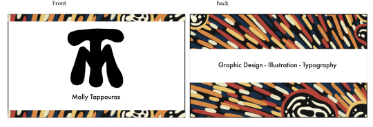

WEEK 11 - Personal Branding and Logo
I wanted to use a graphic I made for the calendar assessment. I would also put stuff like phone number and email, but because tumblr is a public website I left those off.
0 notes
Photo


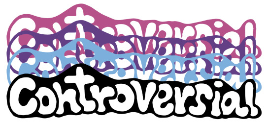

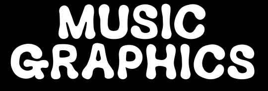
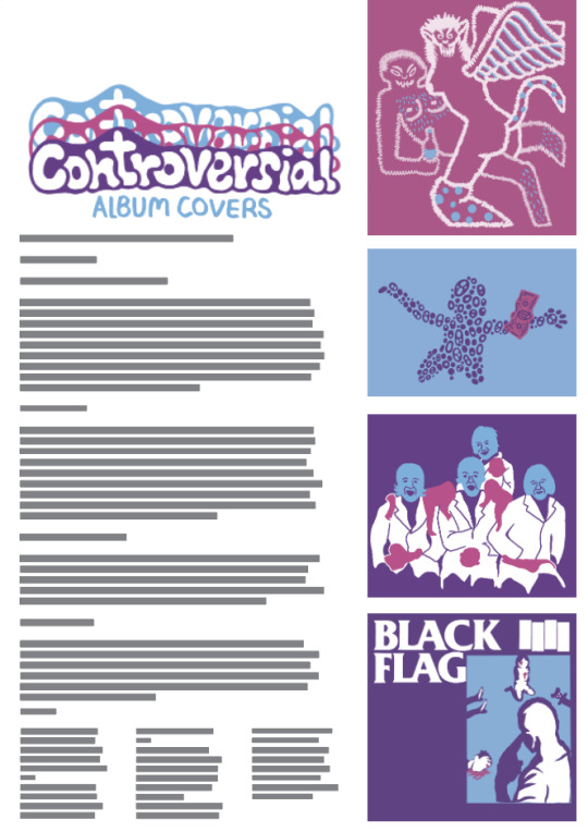
WEEK 11 - Flat mag elements
These are some of the titles and graphics that are to be included in the flat-mag. I dont know if we are allowed to use black? These will have to be changed if we arnt.
0 notes
Photo


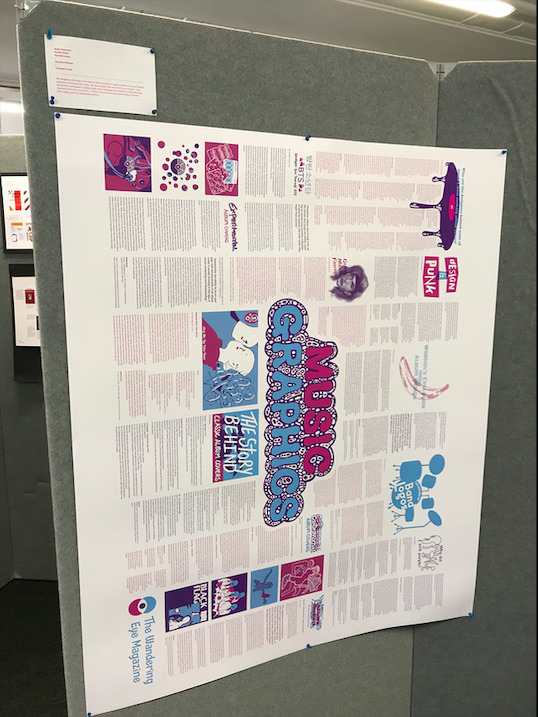
WEEK 10 - PRESENTATION OF FLAT-MAG PROGRESS
This is the progress so far for our flat-mag poster. It’s going to be difficult with just two group member, however i am determined to do the project well.
0 notes
Photo

WEEK 9 - FLAT MAG PROGRESS
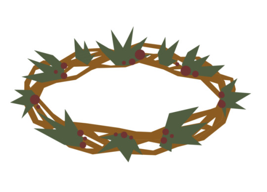
Here is a bit of a layout for the flat mag with a illustration that kind of interacts with the article.
0 notes
Photo

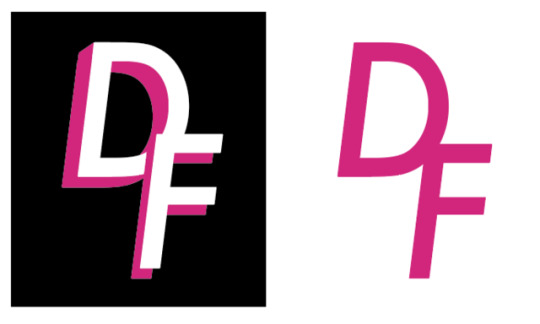
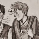
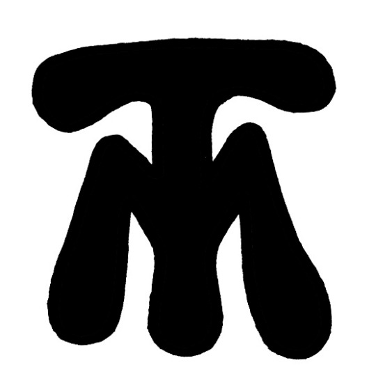
WEEK 9 WEEKLY TASK - PERSONAL LOGO
For this task we had to create a personal logo for our class mate. For Daniel Farrell I went for a punk/grunge vibe with an illustration element.
1 note
·
View note
Photo


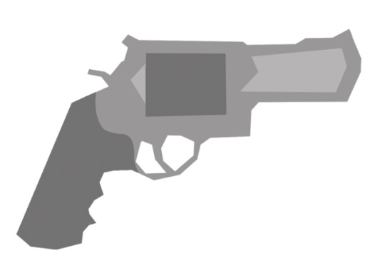
WEEK 8 WEEKLY TASK - MOVIE ICONS
for this task we had to pick a movie and recreate certain items and plot points as little icons. I decided to choose the dead poets society.
1 note
·
View note
Photo
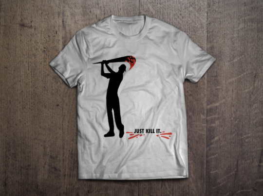


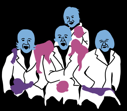
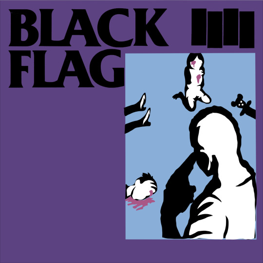
WEEK 7 - APPROPRIATION T-SHIRT DESIGN ACTIVITY
I’ve never personally liked this type of thing, very rarely have I seen an appropriation design that I would like enough to wear on a t-shirt. My design is no different of course.
0 notes
Photo


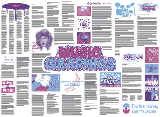
WEEK 6 - THE WANDERING EYE POSTER ACTIVITY
A poster to advertise the up-coming flat mag task. I also included a couple of sketch ideas i had.
0 notes
Photo

WEEK 5 - PIN-UP
whooo! that was stressful. had a bit of a hard time printing and binding for multiple stupid reasons. but now its all done and it looks pretty fucking cool if i do say so myself. the paper is a little curved as it just came out of the printer, but it looks like a real-ass product that i could see in a store or something. very cool.
0 notes
Photo


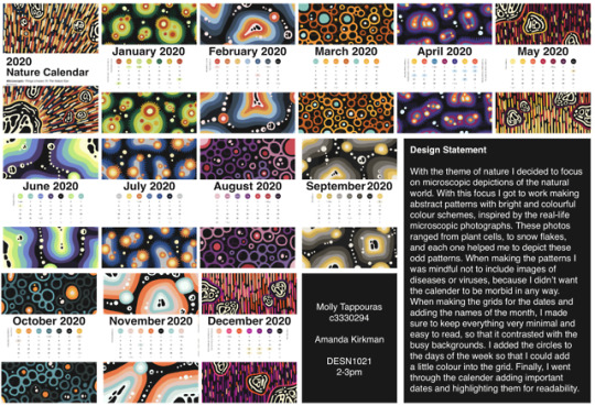
WEEK 4 - SENT THE CALENDAR OFF TO THE PRINTERS
Its done and getting printed
0 notes
Photo


WEEK 4 - PRESENTATION SLIDES
Here are the slides from the in-class presentation
0 notes
Photo
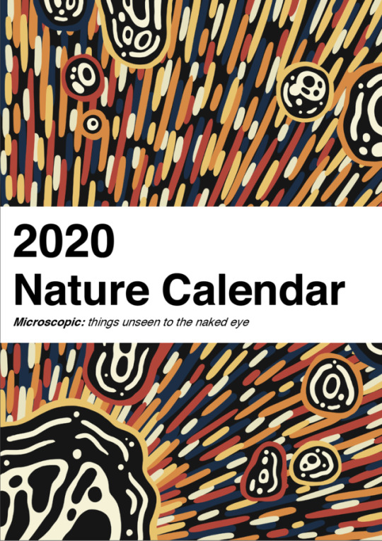


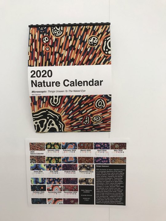
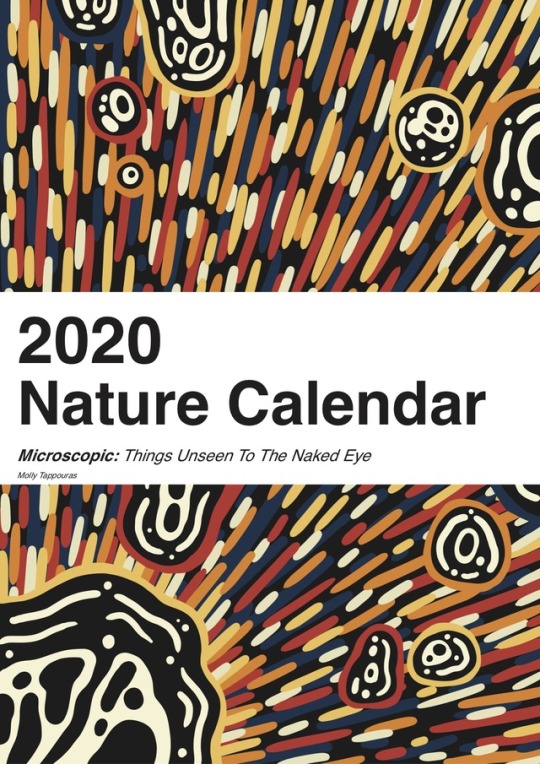
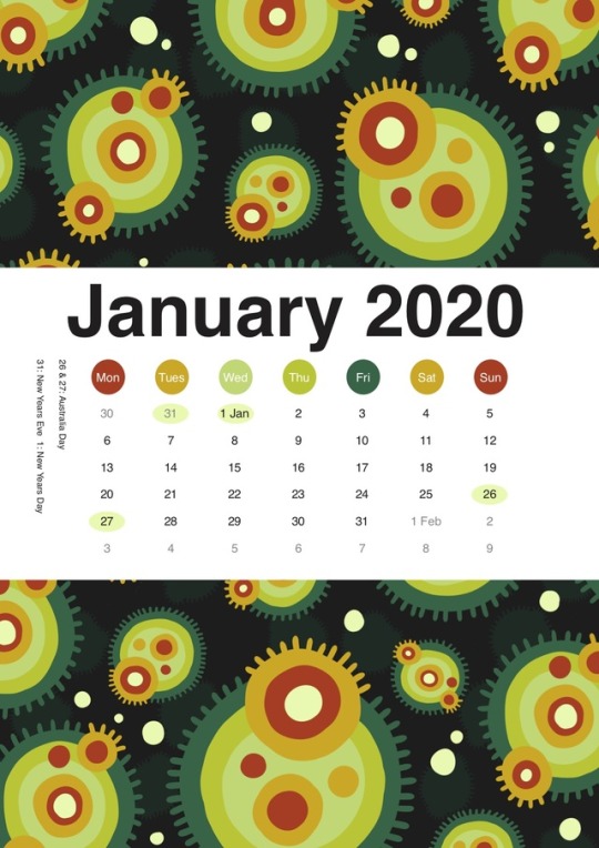
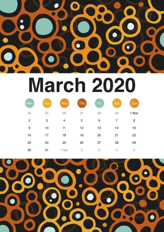
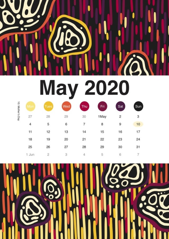
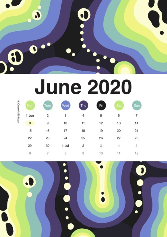
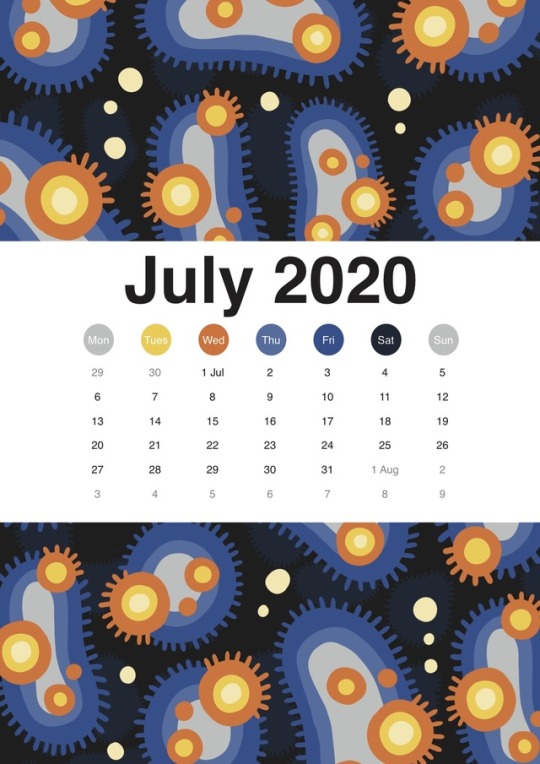
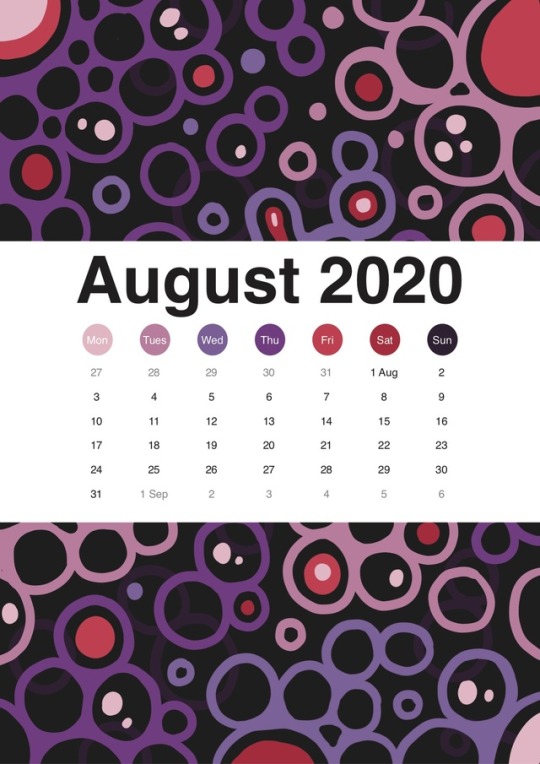
WEEK 4 - CALENDAR PROGRESS
a real start on the calendar now that all of the patterns are finished. I’m going to keep the typography and presence of the calendar aspect pretty minimal and clean to contrast with the busy patterns.
0 notes
Photo
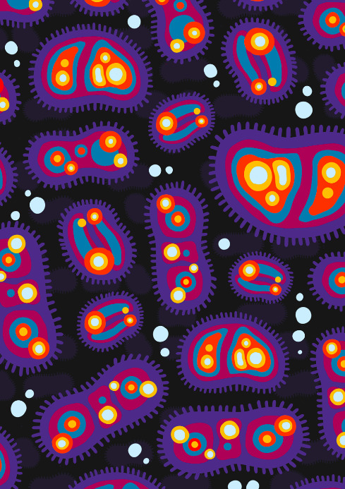
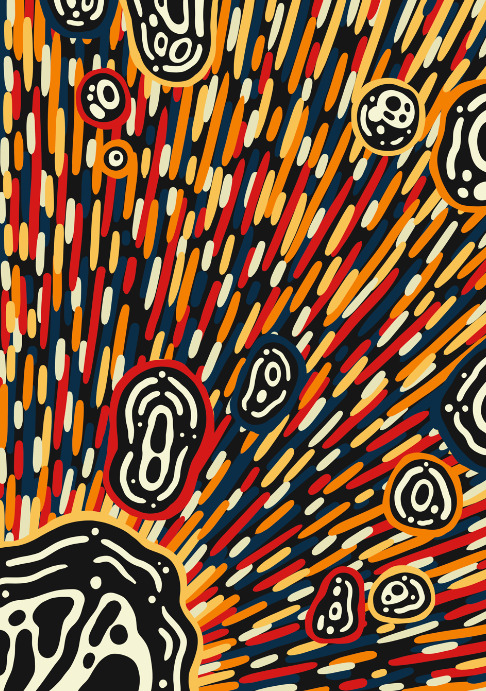
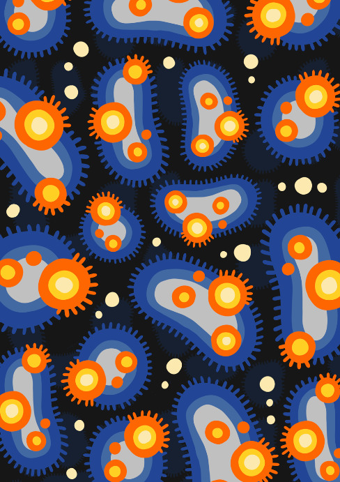


WEEK 3 - PATTERN UPDATE
Made some edits here and there and some new patterns.
1 note
·
View note
Photo

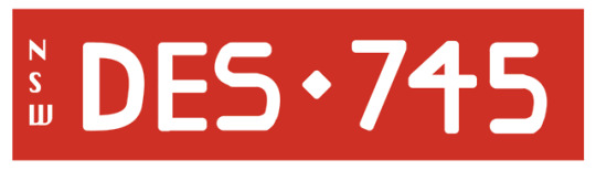
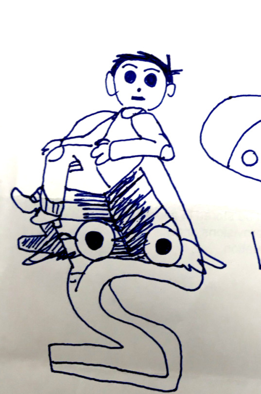
WEEK 3 - WEEKLY TASK THREE
I am actually ashamed at how bad this is, but I’m not going to do anything about it. Its just bad, look at that ‘S’...its an affront to every typographer in existence. Not much else to say about this...
0 notes
Photo

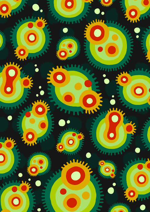
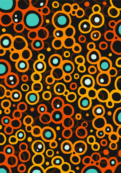
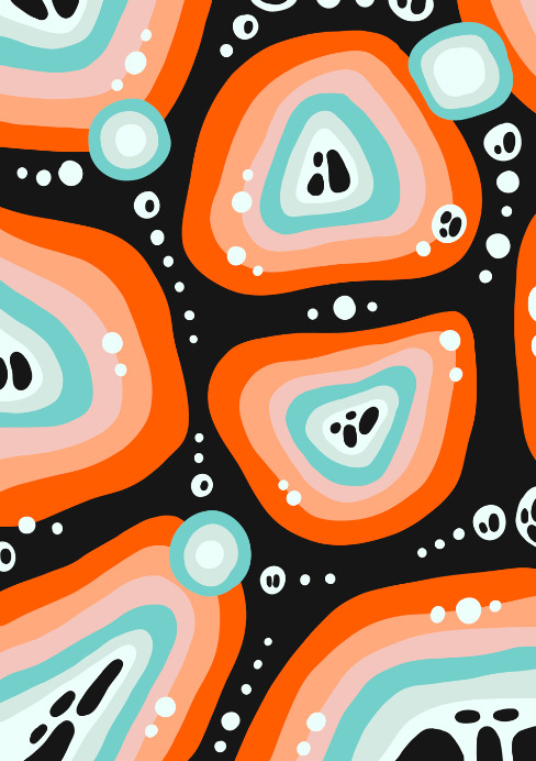
WEEK 3 - NEW PATTERN
A new pattern to use for the calendar. Looks pretty cool
0 notes