
Last Seen Blogs
aluwir
Aluwir - AKA Brian H. Gill
ssunshineehey
sunshinelew

fithediddleadee
Sans titre


daylife-sims
Angel Number 2424 Meaning: Symbolism & Significance
Text
The final Chapter.
When I entered the Media Design program, I had some prior knowledge about the field. I worked as a freelance graphic designer for some time and interned as a graphic designer at a non-profit organization. However, I was lacking the theoretical knowledge and a deeper understanding of field practices and methodology. Every course during the past twelve months helped me to expand my knowledge about the Media Designer profession and add to my skill set.
First and foremost, I have learned that design is not only a pretty image. Like many others, I was under the impression that all it takes for the design to be successful is a good combination of imagery, colors, and typography. In reality, what makes a design special is Narrative or story. Storytelling is an important part of Media Design. A good narrative is what allows a designer to communicate with the target audience and deliver the message. Which brings us to the next valuable learning outcome – the importance of knowing the needs of your target audience. It is important for designers to remember that unlike traditional art, graphic design is not meant to express designer’s personal taste, views and opinion. The designer can establish their personal style; however, the purpose of design is to communicate a message required by a particular project. It is highly important to avoid self-referring and unconsciously influencing your work with individual tastes. Planning, research and analysis are just as crucial as designing process itself. Those stages include meeting the client and identifying their needs, analysis of the target group and the effective techniques to deliver the information. And, in the end of the project, collecting the feedback and evaluating the outcome. Last but not least, every designer must respect moral and ethical guidelines.
During the past year, I have learned, that the toughest part of a job as a Media Designer for me is being able to explain my design decisions. I mostly had to do it in the written form, which is even harder since English is not my native language. I do, however, notice a significant progress.
Last year I challenged myself by deciding to go back to school and receive an additional education. I had to adjust to entirely new system and learn about the field which was far from my initial field of studies (Russian Language and Literature). Through ups and downs, success and failures I have survived this year and learned a lot more than I ever hoped. There is still much to do and there is always room for improvement. I am excited about the new chapter in my life.
This program is a valuable experience of a lifetime. I appreciate the opportunity to gain new skills and expand my knowledge and depth of understanding of the Media Design field.
0 notes
Text
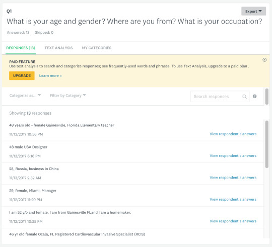
Questionnaire Project.
My questionnaire included 5 “yes or no” questions, multiple-choice questions, and 2 questions with a scale from 0 to 10. For a few questions, the respondent had to choose one correct answer, in some, where they had an option to write in the answer.
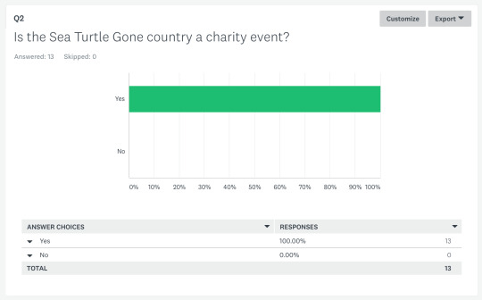
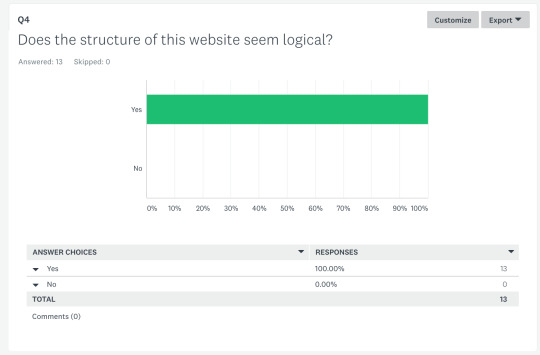
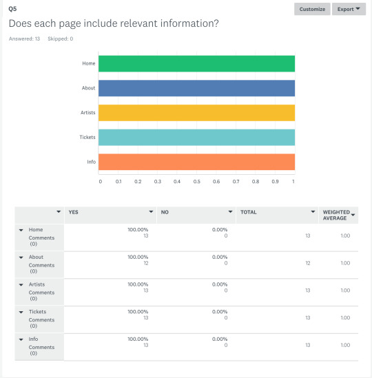
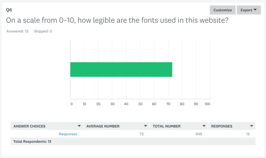
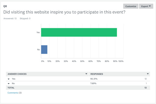
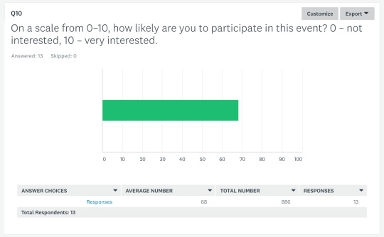
I had a total of 13 respondents. Most answers were straightforward. None of the respondents wrote in the optional feedback sections.
The overall feedback was positive. The main concern was raised in regard to the legibility of the fonts. However, the responses regarding the font issue were very different. For example, one person rated the legibility of the fonts on a scale from 0 to 10 with a “4”, and the next person rated “10”. The Average number is "7".
While analyzing the responses, I regretted not adding a question that would help me identify the people outside of the target group. People who do not like country music and are not involved in the work of the organizations that work for the protection of the environment are more likely to leave negative feedback.
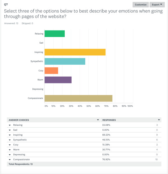
The most popular selections for the crucial question "Select three of the options below to best describe your emotions when going through pages of the website?" are "Inspiring", "Compassionate", and “Sympathetic”. This is what I was going for, and I am very happy with the results of the survey.

0 notes
Text
Multi-Platform Delivery
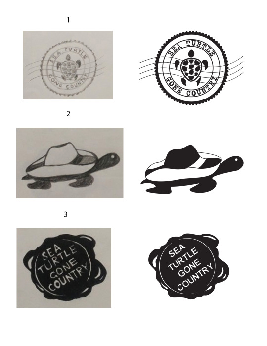
This month was dedicated to improving the logo and the promotional video for the Sea Turtle Gone Country event. Based on the feedback received from the Design Committee, the logo was the weak point of the original presentation. The previous logo did not work well with the updated theme and did not look professional. The goal was to achieve stylistic unity and create a logo that communicates the spirit of the event and complements other elements of the brand identity. I have used Prestige Elite Std Bald typeface. It looks like a combination of two fonts used in the moodboard (Horseback Slab and Typical Writer). A have used the “Simplify” effect to make the lines less perfect or bulky and smooth out the sharp corners. The colors used in the logo are consistent with the moodboard.
For the motion graphic logo, I have used the “Type over Water” effect. The video of a sea turtle appears in the letters and slowly transforms into the original colors. Additionally, some special effects have been added to the swirls and lines for decorative reasons. In the process, I have learned to use the Write-on effect in the Adobe After Effects which was very exciting.
youtube
The promotional video is missing the voiceover. I am planning to add it as soon as possible. It turned out finding a voice that sounds professional and suitable for the event is quite a challenge. Slight changes were implemented in the footage.
youtube
0 notes
Text
Mastery Journal Reflection. Design Integration.
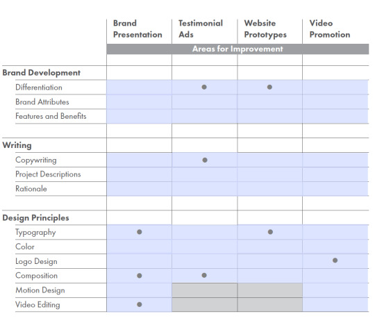
This month I worked towards improving two of my projects from the previous courses based on the Design Committee review. During weeks 1 and 2 I worked with the Rainy Day Toys brand video presentation. The areas for improvement, based on the Design Committee feedback were Typography, Composition, and Video Editing. There were a few problems with the original presentation. First of all, it seemed too rushed. The voiceover was inconsistent with the slides, and some of the slides contained an excessive amount of text. Additionally, It was suggested to put more emphasis into the description of my logo and further explain the designer's decisions.
https://www.behance.net/gallery/50730307/The-Rainy-Day-Toys
youtube
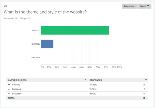
The project selected for During weeks 3 and 4 of the course was the “Sea Turtle Gone Country” event website mockup. The Design Committee stated that the theme has not been applied correctly. The mockup looked too Old Western whereas the intended style was Country. My goal was to redesign the mockup keeping the elements that complement country theme and eliminating the Old Western look. I began with redesigning the moodboard. For the updated design, I created new background textures, updated the color pallet and imagery. The new version of the website contains more visual information about the sea turtles. The amount of body copy has been reduced.
0 notes
Text
Design Strategies and Motivation
This course gave me an opportunity to work on one of the previous projects and bring it to the next level using the knowledge gained from the beginning of the program until now.
The first two weeks included the research paper on Human-Centered Design and creating the plan of action for the Enrichment Track.
The project I chose for improvement during the 3rd and 4th weeks was Testimonial Ads created for the Effective Copywriting class. Based on the feedback provided by the Design Committee, the areas to improve are Differentiation, Copywriting, Composition.
The original Testimonial ads for the Adoption Exchange nonprofit did not work as a campaign series.
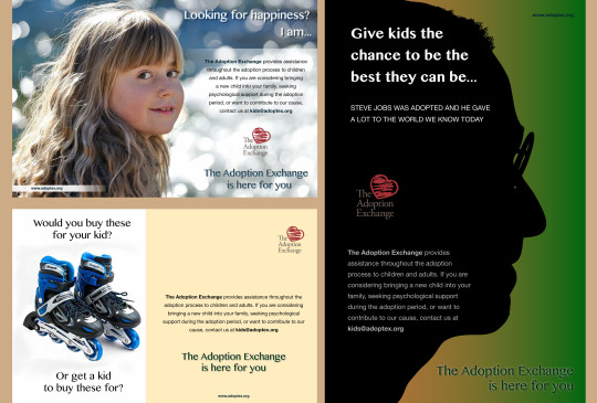
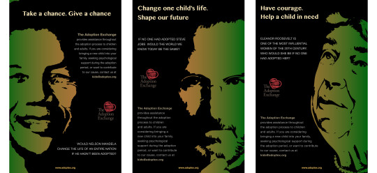
To achieve consistency two of the ads were redesigned. The most successful ad was the “Steve Jobs” ad. It represents the goal of the campaign which is to raise awareness and demonstrate the positive effect of adoption on the society. I researched well-known people who were adopted and made a significant contribution to the society. Those personas were used as an inspiring example in the new testimonial ads.
After receiving professor’s feedback and the feedback from the peers, I have implemented a few changes. I have changed the informational text from a statement format to a rhetorical question. The tagline in the Steve Jobs ad has been changed from "Give kids a chance to be the best they can be" to "Change one child's life. Shape our future". The black silhouette of Steve Jobs used originally did not match the style of images used in the newer ads. The image has been changed to show more detail of Steve Job’s face and create a stylistic consistency. Additionally, some minor changes and tweaks were implemented in the designs.
0 notes
Text
Organizational Structures Reflection.
The Organizational Structures course has introduced me to the process of creating motion graphics with Adobe After Effects. I was not familiar with this software, and it definitely took quite a bit of time to get familiarized with it. The reading materials and the research paper assignment have helped me understand the laws and rules of animation. I’ve learned about the types of video, such as motion graphics, animation, and live action video, as well as the use of each type to communicate a particular idea and receive a desired response within the target audience. The reading assignment explained the importance of audio and the ways to impact the target audience and communicate the brand’s ideals, purpose and narrative through the use of sounds, voice, and music.
While working on the animated logos and the video during this month, I used Adobe Illustrator, Photoshop, After Effects, Sony Vegas Pro, and IMovie. The promo video for the Sea Turtle gone country fictional event assignment was a good way to practice building a strong and convincing promotional video. The challenge was to stay faithful to the theme and style of the moodboard and place the multiple elements together piece by piece in a hierarchal order. This goes in line with what we’ve learned about consistency and building a strong narrative.
youtube
0 notes
Text
Design Research Reflection.
There are many duties listed in the average web designer’s job description. They include all phases and aspects of creating a website from the very first meeting with the client until delivering the finished fully operational product. Jason Beaird and James George, the authors of “The Principals of Beautiful Web design” indicate three essential steps or stages in the process of creating a successful website. Those are “Discovery”, “Exploration” and “Implementation”. In the beginning, the web designer gathers the data about the client, which helps to indicate the purpose of the website. Then organizes it into a logical structure, keeping the relevant information in order to fulfill the purpose of the website. The third step is combining all of the little pieces together and providing functionality.
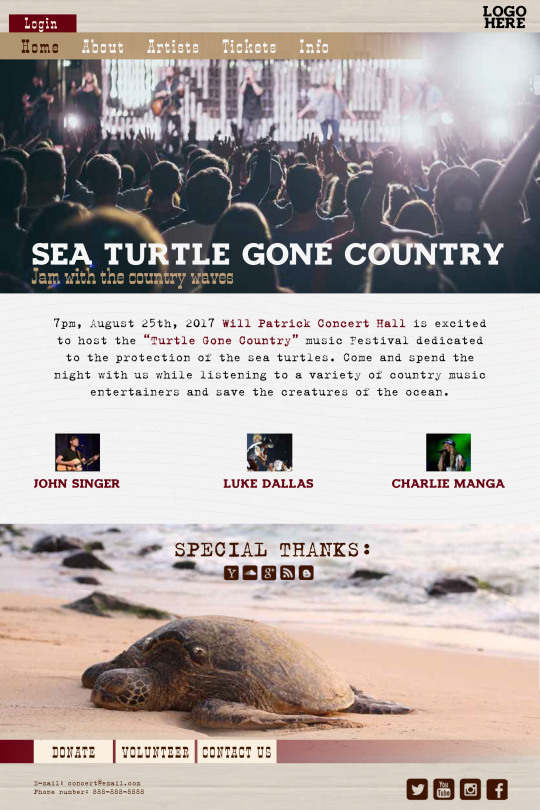
During this month, I created moodboards, wireframes, and website comps for a fictional event “Sea Turtle Gone Country”. It is a country music concert dedicated to the protection of the sea turtles and raising awareness about the potentially irreversible declining of their population. The target audience includes fans of country music – people of different age, professions, sex, social status. As well as wealthy people looking to donate money to a good cause and people dedicated to the protection of the environment.
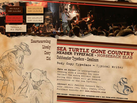
When designing the moodboard, I intended to create a feeling of an old poster. This effect was achieved by utilizing the “Old Paper” texture for the background along with old-fashioned typefaces (“Horseback Slab” and “Smokum” for the headers and subheaders respectively, and “Typical Writer” for the body copy). The colors in the pallet are warm and cozy (they include shades of red, brown and beige). The imagery is meant to complement the overall feeling of the moodboard – it is consistent in style and tone. Some of the images were altered with the pencil sketch effect to add originality and support the theme and style.

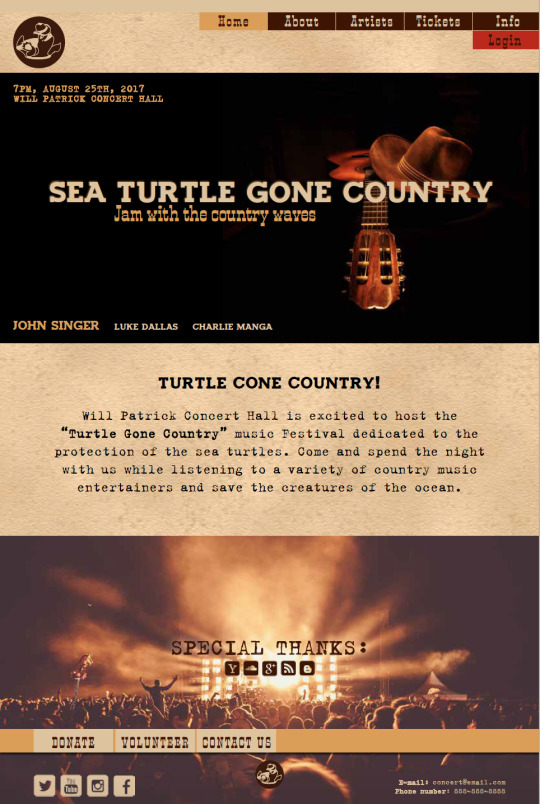
Each page of the website contains a specific piece of information. The navigation bar is placed on the right side of the header of each page and is easily accessible and noticeable. The event logo is positioned on the left side of the header, and a smaller version in the center of the footer. Each logo serves as a link to the "Home" page. The footer and the header area are consistent throughout the entire website.
The “Home” page is utilized to attract visitors to the event and register an account. It briefly describes the event and its purpose and contains colorful images that immediately create an understanding of what is to be expected from the advertised event. In the footer, we see the logos of the organizations that sponsor the concert and hyperlinks to the social media. The footer also contains “Donate”, “Volunteer” and “Contact” buttons for the people who may not purchase the tickets to attend the event, but wish to contribute to the cause in other ways.
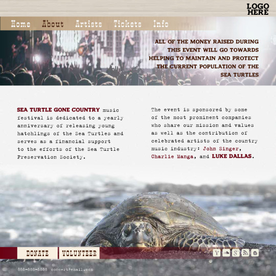
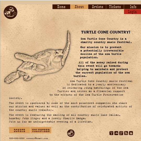
The “About” page offers the information about the history of the event, participating parties, and describes the purpose and the goals.
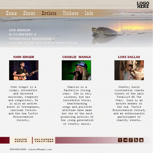
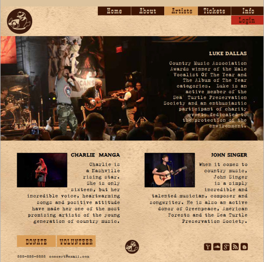
The “Artists” Page presents the information about the singers featuring in the concert and their contribution to the cause of the event.
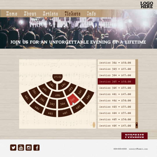
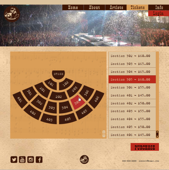
The “Tickets” page has an interactive map of the concert hall as well as a table with a vertical scroll with the tickets prices. Mouse click on one of the sections on the map highlights the selected section as well as the ticket price in the table.
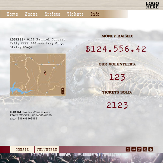
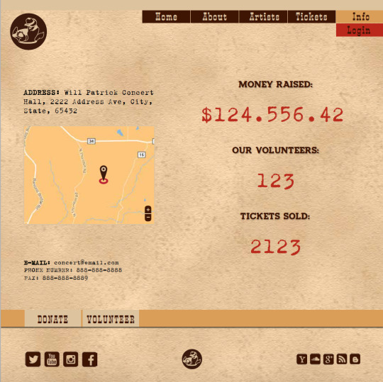
The “Info” page provides the address of the location of the concert hall along with stylized interactive Google map. The right side of the page contains information about the number of volunteers, money raised and tickets sold during the preparation for the event. That information is updated automatically, this way the visitors can monitor the progress and get inspired to get involved.
This course helped me realize that I don’t need to know coding to participate in the process of creating a website. However, moving forward I want to learn about the technical aspects of building a website. Understanding all of the aspects of any task makes one a better professional and provides effective communication with colleagues and clients.
References:
George, J., & Beaird, J. (2014). The Principles of Beautiful Web Design, 3rd Edition. SitePoint.
0 notes