nanmyersart
Nan Myers
I am a junior in high school, this is my art blog to showcase my projects and process.
29 posts
Don't wanna be here? Send us removal request.
Last Seen Blogs


skillsstrategies
Untitled
nestsandburrowslove
Nests And Burrows On Etsy
payasrn
Asrın
georgewriter
Writer & Story Editor
Photo

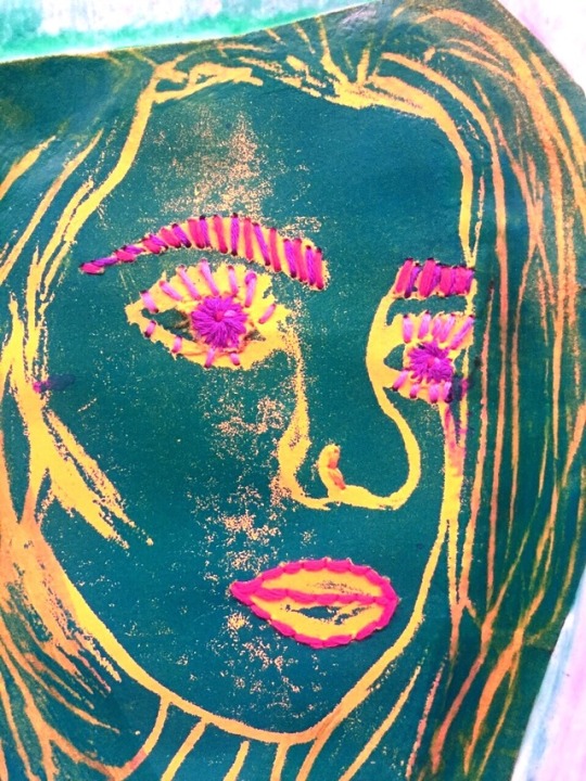
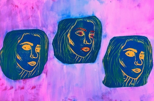
My printmaking project was a foam plate print of one of my best friends, Belle. I made three prints by carving her face into a foam plate, (like what raw chicken comes on ) and rolling it over with ink, flipping it, and rolling the back. After I had three solid prints, I used brightly colored contrasting embroidery floss to outline her features in the center print. Unfortunately, this didn’t turn out as cool as I thought it would. Although it is a nice piece, I have gifted it to Belle, the subject. She has known me as long as I have been alive, and she is probably the person who knows me the best. So now, although I am not 100% pleased with my printmaking project, Belle is.
0 notes


Photo


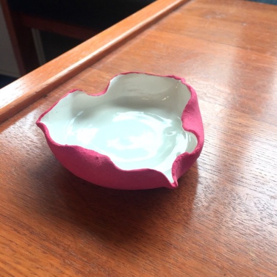
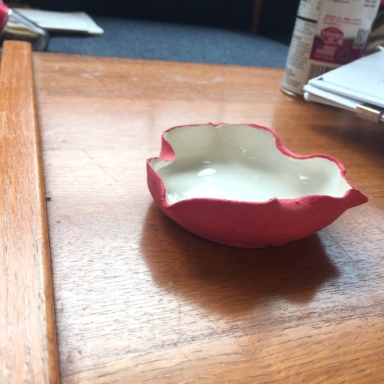
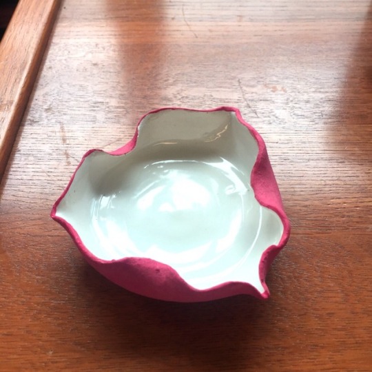
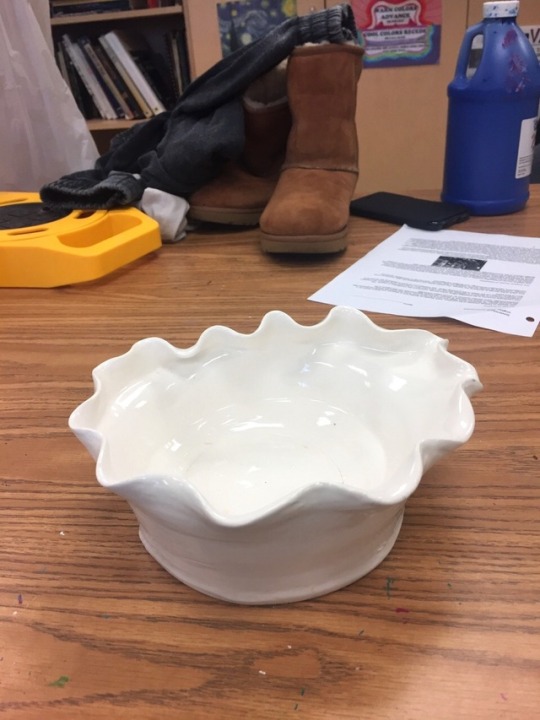
For my second clay project, I experimented with glazing more than I had previously. On the wheel, I threw two small trays, then used my hands to flute the edges. This ended up looking really elegant. I glazed the blue one completely blue first, and then filled the inside with white glaze. It, in the kiln, for some reason, cracked through the glaze in almost a perfect circle in the middle. I’ not sure why it did this, but I think it adds to the piece. The second one is matte red-orange, with a solid shiny white in the inside.
0 notes
Photo
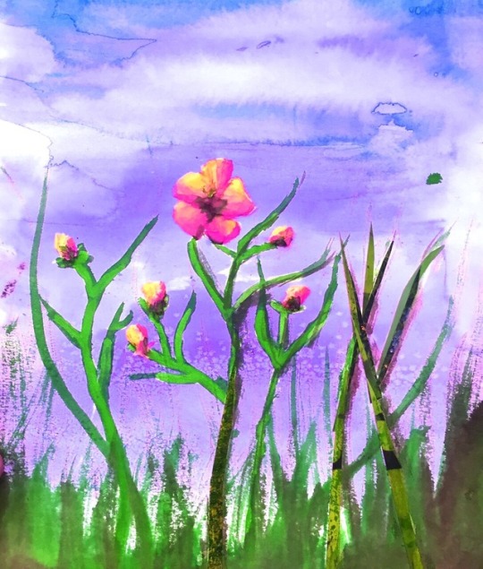

A small project we had this year was the Virginia Wilfdflower painting. I’m pretty sure that it was originally for a contest, and I used watercolor and collage. Personally, I’ don’t love this painting, but I would like to build on this idea and maybe redo it with a more focused approach.
0 notes
Photo
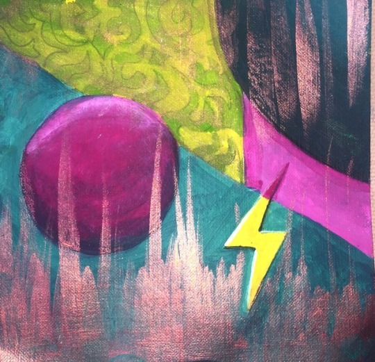
The split complementary color painting was very simple. Our class was taught about color theory, and we used acrylic paint and water to create a simple design on a small 3x3 grid. We were taught about composition, to not overly crowding the picture, and about split complimentary colors. To find a color’s split complementary colors, you use the colors to the right and left of the color directly across the color wheel from the first color. I used red, yellow-green, and blue-green. My composition shows balance, is interesting and is shaded for space. I did not enjoy the painting part of the lesson, but color theory is something I wish to learn more about.
0 notes
Photo


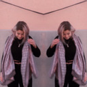
For our self portraits, we were instructed to choose a selfie or photo of ourselves, and only draw the contour lines,with no shading, on a clear plastic sheet. This was the transparent outline to our collages, which were attached underneath to the plastic. I really did not like the plastic sheet, although it improved many of my classmates work on their projects. It trapped in the texture I added with tissue paper on my hair and such. I used a photograph of me in McGuffey Art Center around Christmas time. My boyfriend, Andrew, took it of me, and I am not looking directly at the camera. My hair is bright pink in the photo. McGuffey is one of my favorite places to spend time, and I was particularly happy when that photo was taken. I used a variety of different medias. Primarily, I used ink, Watercolor, and collage from both mageszines and tissue paper. In the background, I used oil pastels as a waxy resist, combined with watercolor,to draw in the glass windowpanes behind me in the photo. This creates a pattern that unifies the background and directs more attention to my hair and face. Overall, I am happy with the finished product, although I would like to retry this assignment on a larger scale.
1 note
·
View note

Photo
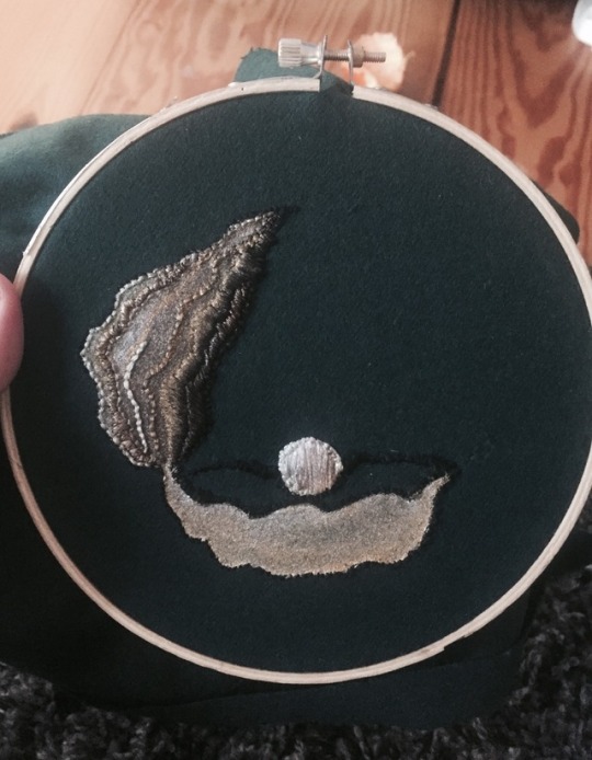
For the book title project, we were asked to choose a book title and make a piece of art that related to the title. I chose The Pearl by John Steinbeck. I enjoy this book, but I also chose it because it focused on one object, and the title wasn’t too open ended. Originally, I was going to draw a still life of an oyster, but I wanted to experiment with embroidery some more. I used embroidery floss and acrylic paint on a green scrap piece of 100% wool. As I found out, the wool is VERY hard to keep threads neat. I think this is at mastery learning, however, I am not finished with it. I think I will make it into a patch and sew it onto a piece of clothing that I find fit. My piece depicting the oyster, in my opinion, is well- balanced, proportional and thoughtful in used of color.. At first, while I was sketching out ideas, I kept drawing the oyster opening towards you. After re drawing it a few times, this seemed a little cheesey to me, like something out of The Little Mermaid. The Pearl, in the book, is actually a very dark object, and brings bad luck to any and all who come across it. I wanted to portray this mood with darker, muted colors, (green, brown, and black) while still using emphasis on the pearl, in all its glory. I really liked this project prompt. Everyone's pieces looked very different, from each other and from what would be expected. For example, there was a book titled The Girl in the Tangerine Scarf, which was about an Islamic woman. A fellow student drew the silhouette of a woman dangling from a orange silk lyra strap. Although it was titled they same, these two images couldn’t have been more different. I hope to finish this piece (just hem it and such) and show off my wearable art.
2 notes
·
View notes
Photo
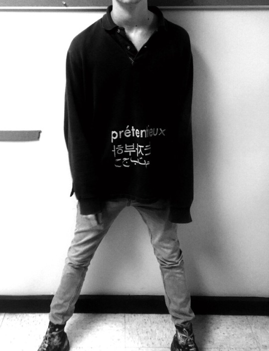


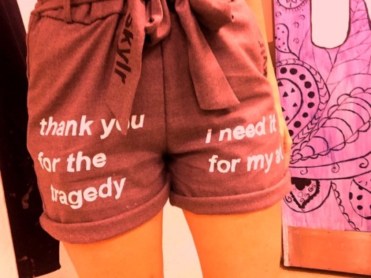
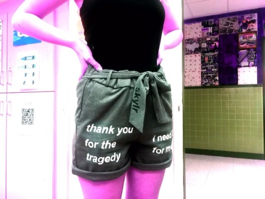

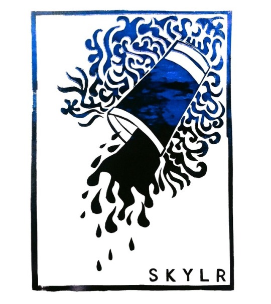
Identity is something many people struggle with. As a teenager, it can be especially hard to know who who are. In the Identity project, I was challenged with this insecurity that most of us have deeply rooted inside of us. When this was assigned, it was the end of winter. The drab that hangs in the air after the whirlwind of the holidays die down, to me, is unbearable. At this point, although it was only a few months ago, I wasn't doing well emotionally, or mentally, at all. While I was planning for this project, or rather, not planning, I felt extremely stuck. The questions Mr. Sherogan gave to guide us only helped me to wallow further into me feeling sorry for myself. In my eyes, many of the things I once thought defined me didn’t apply anymore, or seemed silly. I don’t think I had experienced true “artist’s block” before. I left this project at the bottom of my To-Do list for almost 2 months. In all honestly, it would be nice to say that I met all the benchmarks for this project. It was on my mind this whole semester, but I really struggled with this assignment. It had the opportunity to be extremely personal, yet, many of my peer’s projects, to me at least, seemed mundane. As much as I tried, I had a lot of issues in just starting the process. I lacked passion. As I sat in bed at night, on days where my mental weight was too much to handle, I watched runway shows. Maison Martin Margiela. Prada Resort 2018. Gucci Cruise, and so many more. I started to understand how haute couture is designed and manufactured. This was something I really got excited about, even amidst my meltdowns. For Andrew’s birthday, my boyfriend, I made him a shirt that reads “prétentieux”, followed by the same word in korean and arabic. Pretentious. This was somewhat poking fun at Andrew, teasing him for coming off uppity sometimes. For the gift, I dyed a vintage Polo Ralph Lauren long sleeve shirt with two packs of black rit dye. I then screen printed on the translations, as well as a small “skylr” on the back, in between the shoulder blades. It all made sense then. I decided to create a mini-collection of screen printed and altered clothing as my Identity project. I found all 3 pieces of clothing I needed. A yellow and blue scarf, which i dyed a soft grey wash all-over, from Florence. It is 100% silk. I got this for free from my mother. Thrift shops are abound with vintage pieces. I found a creme crepe top, from the brand Free People, and it was mine for only 4 dollars, along with a dark orange makeup stain on the mock turtleneck collar.Nothing a bottle of dye can’t fix. And finally, I found a use for a pair of pants that I really liked but had no idea what to wear with. I am going to hem them into shorts soon. The words I chose to use can be interpreted a variety of ways. On my shirt, in bleeding black and white lettering, it says, “not the best but still good.” It’s a encouragement to me, a reminder to be kind to myself even when I’m not doing the best, but I’m still okay. The screen printing is not how traditional screen printing is done. With the dye still in the shirt, I screen printed the black lettering while the shirt was still wet. I let the ink and dye dry completely overnight, allowing the black ink to bleed. I then screen printed the white lettering on, slightly offset for dimensionality. On the legs of my pants, (soon to be shorts,) it reads “thank you for the tragedy, I need it for my art” Although this seems like something sarcastic (it is meant to), it is also a personal reminder that the things I have to deal with are shaping who I am and making me a better person, and probably, a better artist. The scarf, I printed my skylr logos on it. Because we were out of the vinyl stencil paper normally used for the screen printing, I was on a quest to find my own. Unfortunately, it was backordered on Amazon until June 9th, which would be far too late. I decided to take a risk and use wall vinyl instead, which worked out well. I screen printed and dyed myself into a frenzy. Finally I have these pieces completed to share. Identity. It is more that your name, where you live, who you come from. Identity is the part of you that you can choose for yourself. For a long time, I chose negative things to surround myself with,and that became my identity. I was so deeply unhappy. Even my art reflected this, gruesome doodles and monotone figures. I'm becoming the person I want to be. More and more, I find myself casting that old person away, and now, my art reflects that.
0 notes
Photo


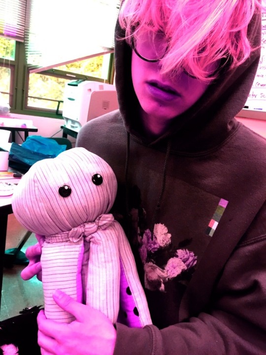
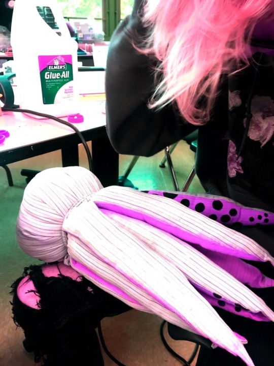
My final project this year was one of the largest. Our class had a sculpture assignment: make a sea creature that was 8x8 and made of recycled material. I have always thought octopuses are cool, and so I decided to sew a stuffed animal. I used an old bedsheet for the cloth, and the inside of a cushion for the stuffing, as well as old buttons for his eyes. I used screen printing ink to paint the underside of his tentacles pink with black suction cup things. This took a really really long time, and in hindsight, I would have done it before sewing and stuffing him. He ended up looking really cute. It shows pattern in the tentacles, contrast in the color choices, and it, as far as sculptures go, is perfectly able to be played with. I’m very proud of this project, because I drew my own pattern for it and sewed it all within two days. I, if given the time, would do this again, except make 5-10 and sell them around to local placed for kids.
0 notes