
Last Seen Blogs

thekdramanoob
because you're worth it

thevinylfool-blog
youtube.com/c/thevinylfool
figureskatingcostumes
Figure Skating Costumes

the-ginger-fox-uk
Just A Ginger Guy
Text
Intersections Project Part 3
Final Outcome:
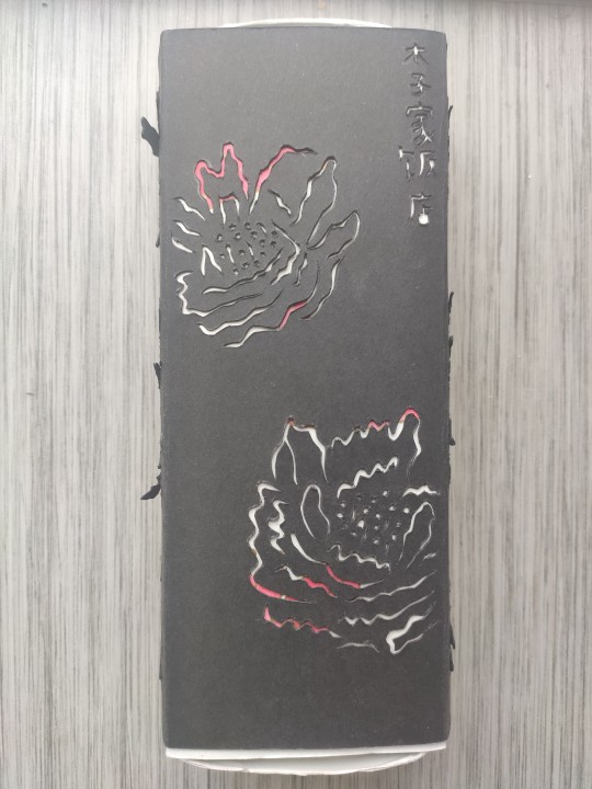

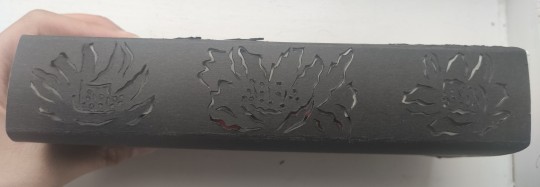
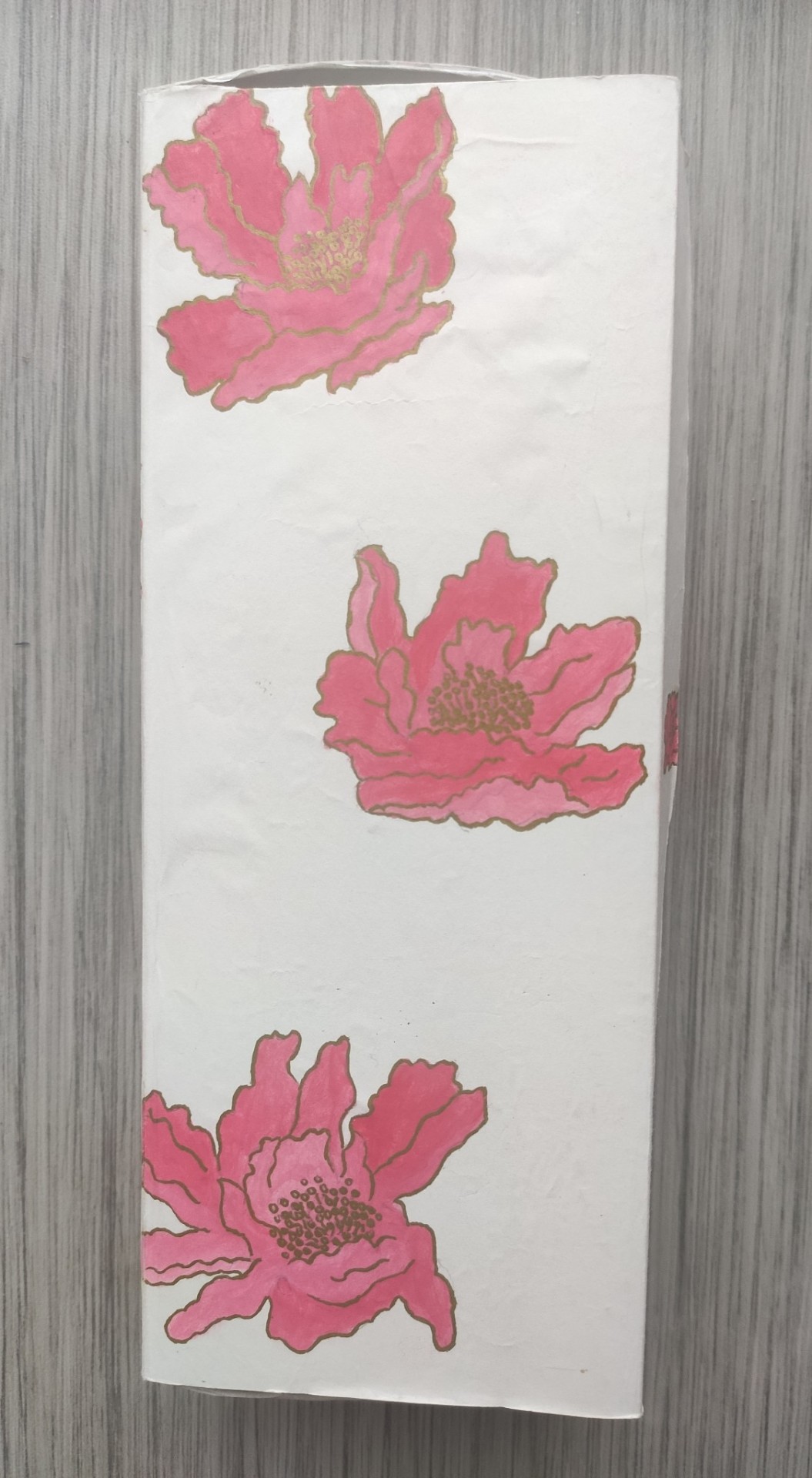
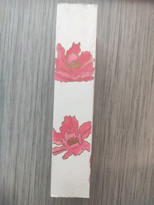
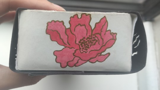

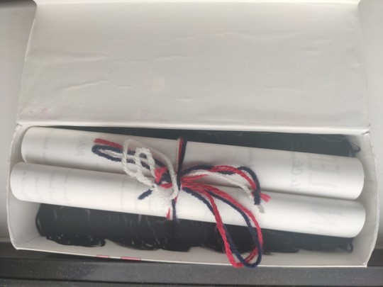

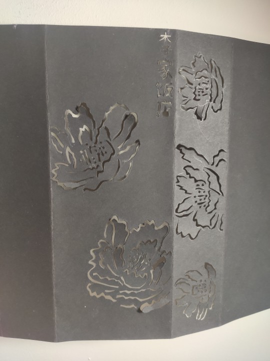
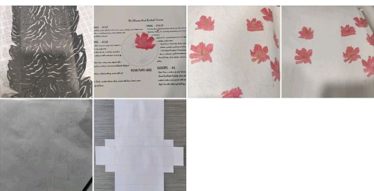
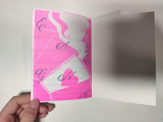
For my final outcome, I created a box containing a Chinese designed scroll, with an English menu inside. The outer sleeve was cut out with a scalpel, and inspired by the Chinese red envelopes. The flowers chosen were inspired by pink roses that are grown in Britain, such as the Pink Flower Carpet Procumbent Rose. The sleeve also contains the name of the restaurant in Chinese. The box contains a traditional Chinese style painting, with the use of block colours and outlined edges of this same rose. It has been painted on thin Chinese calligraphy paper, and painted with Chinese brushes. I have also cut out a lining for the box, to link both the sleeve and the box together. The box contains a a scroll, tied up with the British colours, red, white and blue. The menu contains everything needed for the meal, acting as a table cloth, as well as also providing cutlery. I originally wanted the menu to be printed on the same Chinese paper, however testing this did not work, so is printed on the thinnest paper possible. It contains the same water coloured roses as well as Chinese calligraphy. My aim for this piece, was to link both my British and Chinese culture, as well as making going to a restaurant, even more exciting and interactive. All that would be placed in front of you is a box in which you would have to open, almost like opening a birthday present at a restaurant.
0 notes
Text
Intersections Part 2
I started experimenting with the design of the box:

I decided for the box to be kept white instead so the lucky colour red, so that the watercolour painting could be seen.
These are images that inspired the cutting out of sleeve of the box, found on Pinterest:

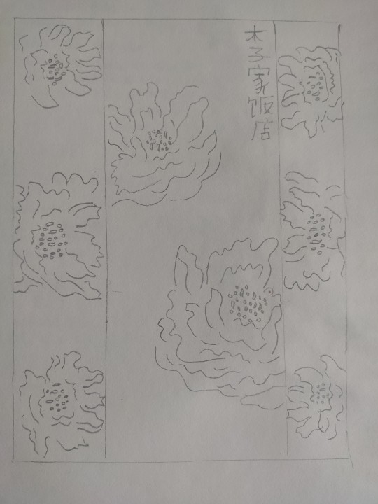
Sketchbook Plan Of Sleeve Inspired By Procumbent Roses Grown In Britain:
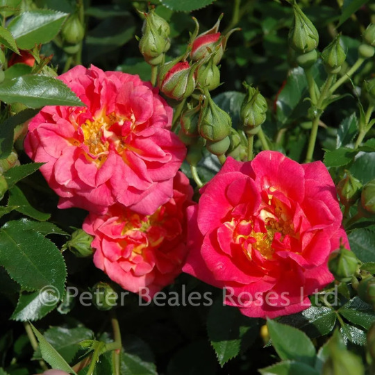
Procumbent Roses:
This is a mock up of the sleeve of my box:
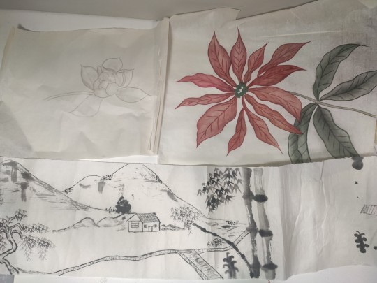
I also used this plan, in order to paint the same flowers but in water colours, in a traditional style, using traditional paint brushes.
This is a mock up of the box paintings:

After the one to one tutorials with Mark, I decided that the menu should either have a Chinese style menu design, with English food, or an English style menu design, with Chinese food, as fusing them was a step too far, and the piece would have lost it's elegancy.
One of the ideas I had, after speaking to Mark, was to create a cheap looking, English- pub style menu, to create a sense of surprise, as there would be juxtaposition with the elegancy of the box.
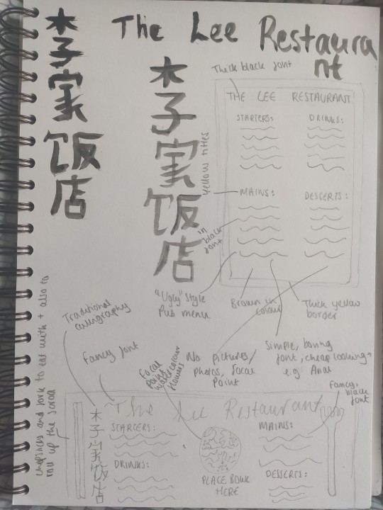
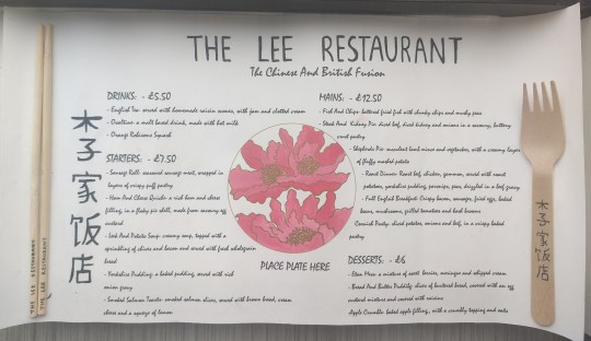
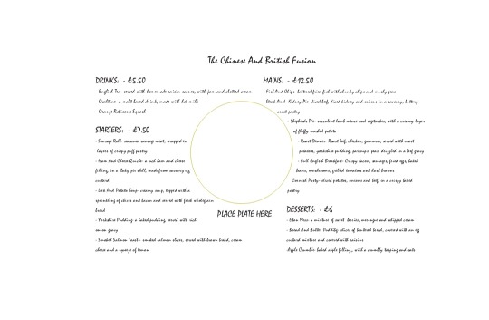
The other original idea I had, was to create a fancy, elegant Chinese style menu to match the box, and this was the idea I decided to go with. I wanted to create a design in which the box would be placed on the table in the restaurant, and contain everything that was needed for the meal. Therefore, I decided to create the menu landscape, so the fork and chopsticks were in the correct placement to eat with when opening the menu, as well as acting as supports for when the scroll was rolled up. I wanted the menu to be made out of thin Chinese calligraphy paper, and to act like a table mat for the food. This was inspired from the traditional Chinese meal, Dim Sum in which the table cloth is made of a thin paper like material, and thrown away after used.
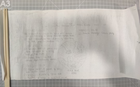
Menu completed on InDesign:
Process Photos:
0 notes
Text
Intersections Project Part 1
Initial Ideas Mind Map For The Intersections Brief:
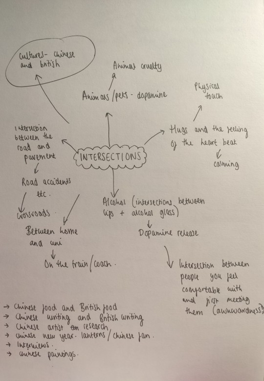
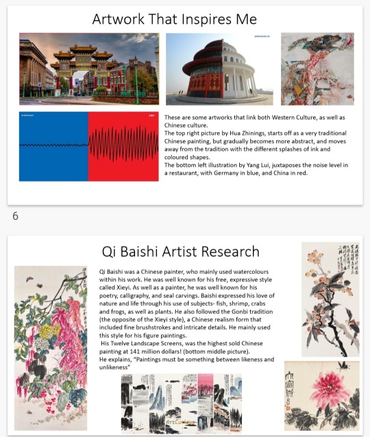
For the intersections brief, I decided that I wanted to fuse both my Chinese and British culture. I started off by looking at things that represent my British culture, things that represent my Chinese culture, and things that represent both cultures. I began researching a traditional Chinese painter, Qi Baishi, and chinese calligraphy writing, as these were things I wanted to include in my outcome. Something that also interested me was the use of round tables in a Chinese restaurant to allow people to become closer and to talk more easily, in comparison to square tables in Britain.


After presenting my research presentation, and speaking to Rich, I decided I wanted to focus specifically on one aspect of both cultures. As food is a major difference in both cultures, I decided I wanted to focus on this.
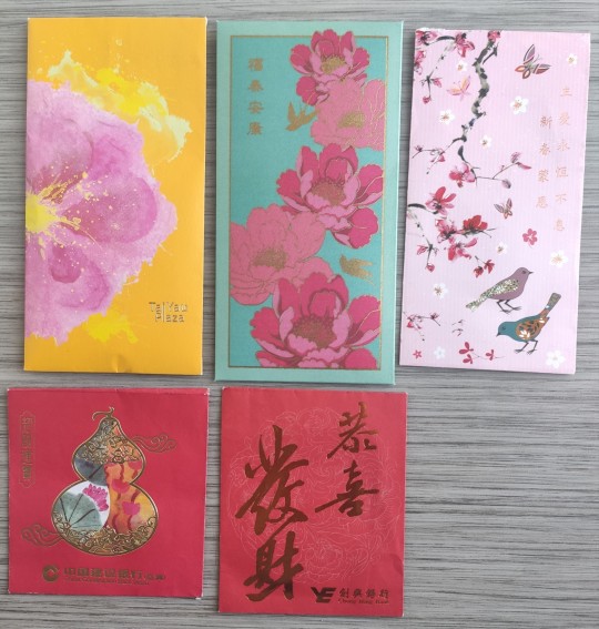
I took inspiration from traditional red envelope designs, that are filled with money on Chinese New Year, as well as traditional paintings and calligraphy done by my grandma.
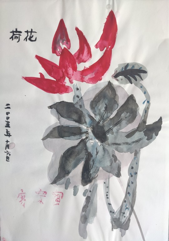
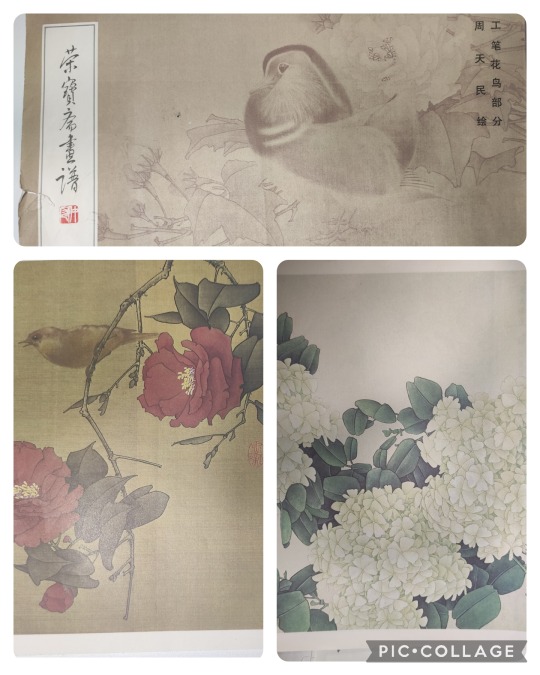
I also took inspiration from a Chinese painting book:
https://vm.tiktok.com/ZGeewMWBv/
From this video, I thought about fusing traditional British and Chinese foods, and creating a menu.
I decided that I wanted to create a menu of fused foods, presented on a traditional Chinese- like scroll, and in a box, to make the piece more interactive (inspired by the library talk)
Here are a few of initial ideas on how I wanted the box to be presented:
I also listed out traditional foods of each culture to see which foods could be fused together.
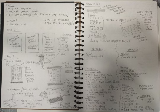
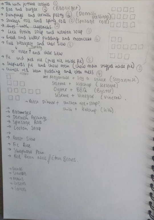
Here are a few of the fused food ideas I had:
I originally wanted my piece to be a photography piece of the food, but based on the previous photos I had taken, I decided not to, as they didn't have the elegance to them that I wanted.
0 notes
Text
Contextual Studies Lecture
In this lecture, we learnt about the history of art, in particular, the history of patterns and text within art.
0 notes
Text
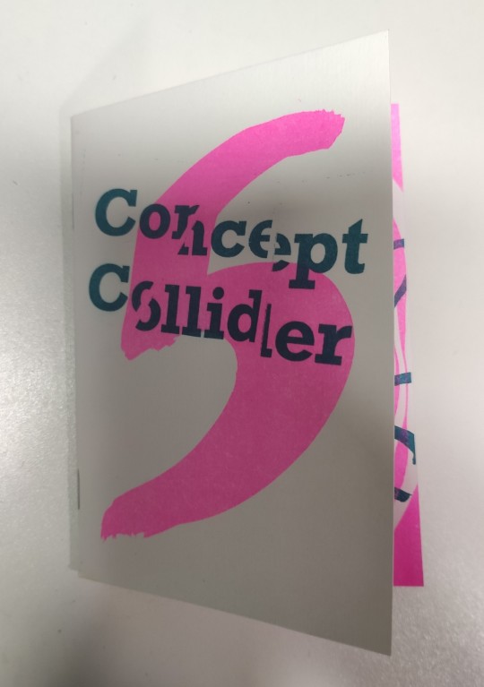
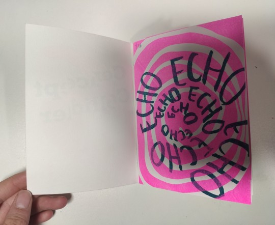
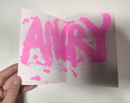
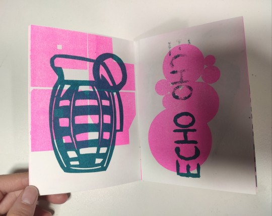
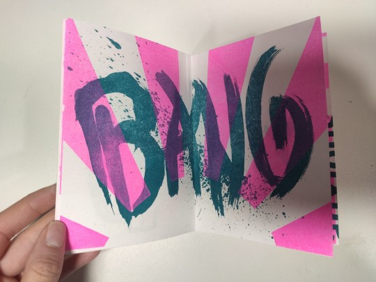
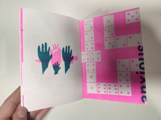
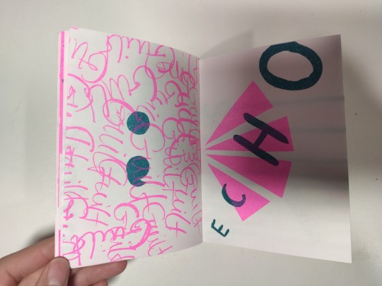
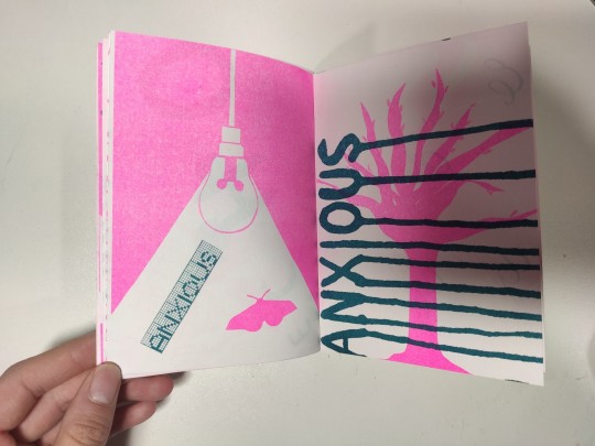
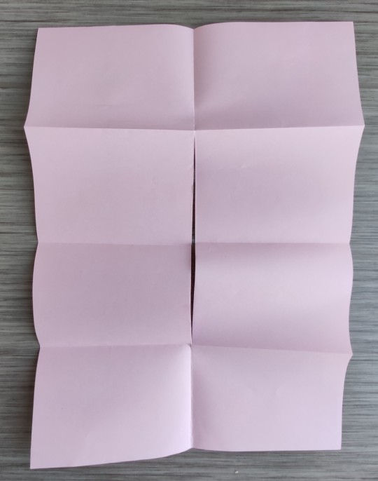
Binding Of The Concept Colliders
We folded the A3 sheets of our risograph prints in a certain way, to create a book of them in the order we wanted. We then used the stapler to bind them together, and ensured that the pages were lined up to standard rule to get the staples at equal distances. The guillotine was then used to trim down the edges of the book.

0 notes
Text
Indesign 3 Induction
We covered:
More text formatting
Page numbering
Reformatting with styles
Auto and manual pagination


0 notes
Text
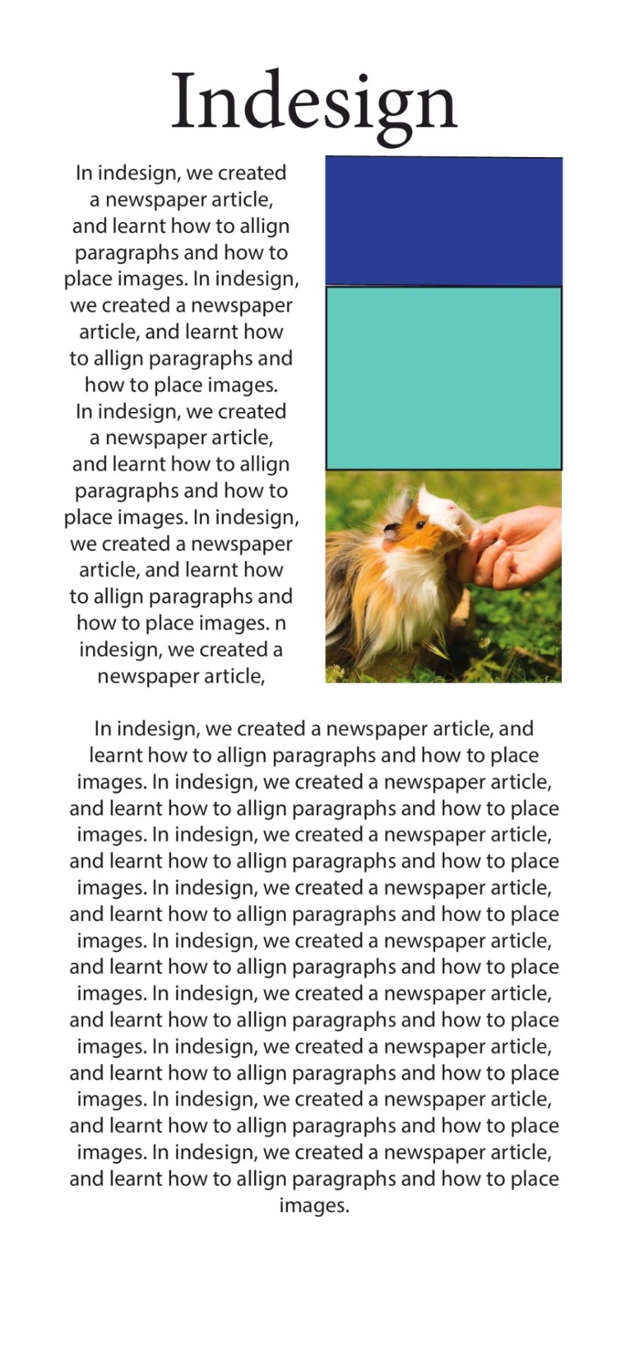
Indesign 2 Induction
We covered:
Setting up a roll fold leaflet document
Paragraph styles
Character styles
Object styles
Drop caps


0 notes
Text
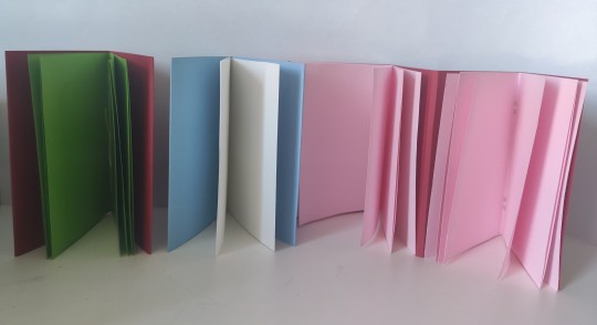
Bookbinding Workshop
In this workshop, we were introduced to different bookbinding techniques. We were able to make several books such as the Saddle Stitched book, the Circle Accordion, and the Brochure Binding book.

0 notes
Text
Indesign 1 Induction
We covered:
Setting up documents
Grids/ margins/ bleed
Indesign workspace and tools
Parent pages and overriding parent pages
Baseline grid
Setting up a spread/ moving pages
Links and source files
Frames and placing images
Selection tool vs direct selection tool
Text boxes- threaded text, text wrap, hyphenation, text alignment
Saving, exporting and packaging documents

0 notes
Text
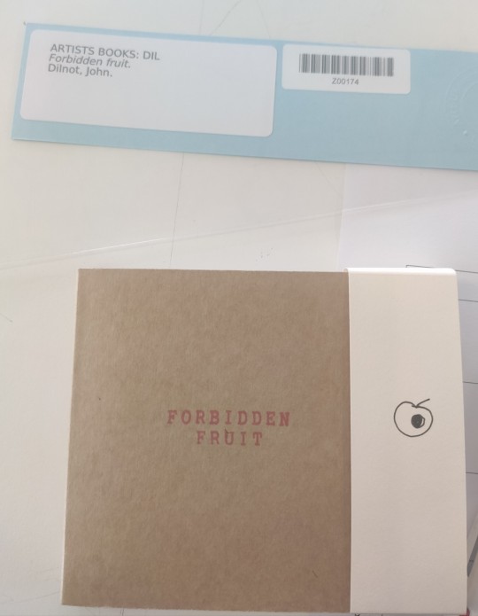
Artist Book Talk/ Library Introduction
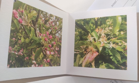
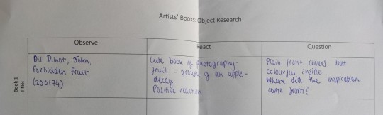
We were introduced to a collection of books and zines, including children's books, in which we looked at how the author made the books engaging and playful to keep children interested. A lot of the books were very interactive and hands-on, which has inspired me to possibly create a book which includes more involvement from the audience for the Intersections Project. One of the books I particularly enjoyed was Forbidden Fruit, by Dilnot John; it has inspired me to possibly create a photography based book.
0 notes
Text
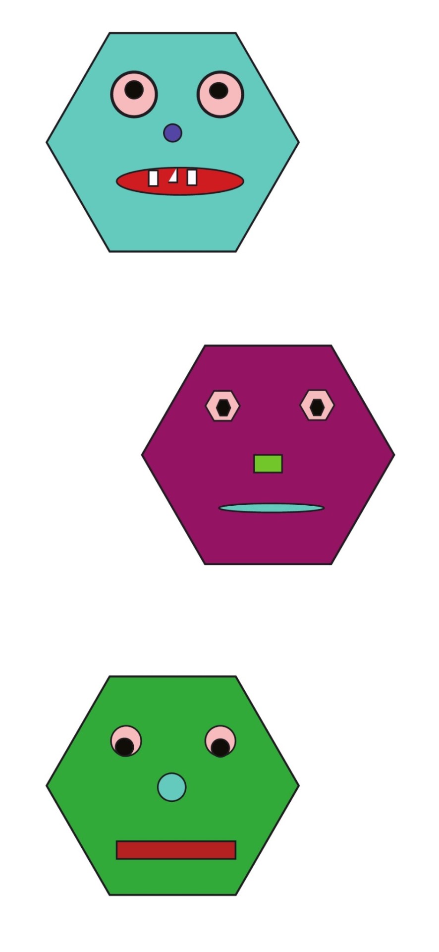
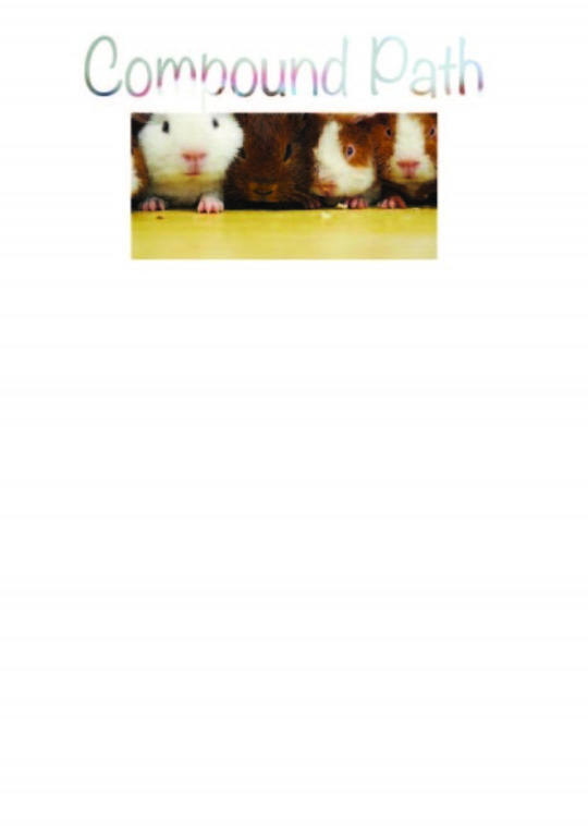
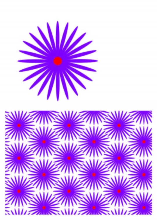
Illustrator 2 Induction
We covered:
Shapes and corner radius options
Transformation tools
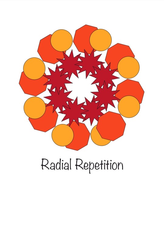
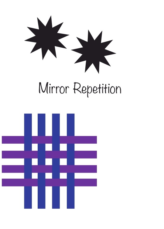
Repetitions
Intertwining objects
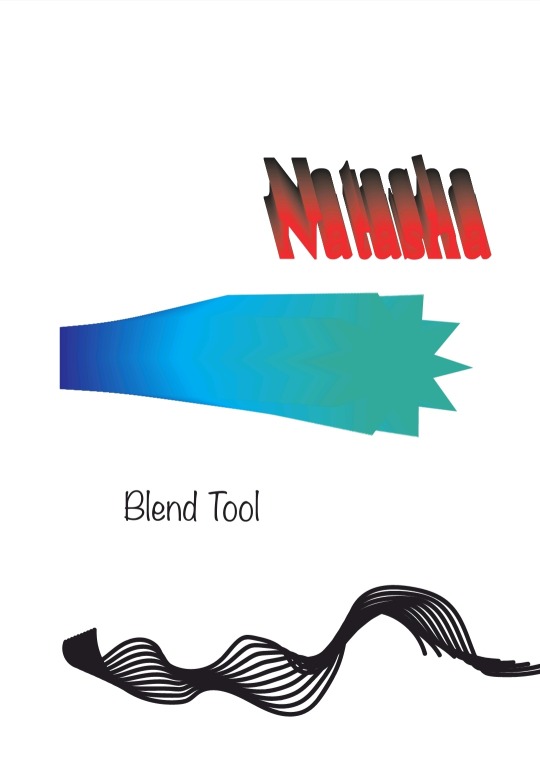
Blend tool
Image tracing
Illustrator Effects: 3D and materials, warp
Envelope distort


0 notes
Text
Contextual Studies Lecture
In this lecture, we learnt about the different ways to collect research, and how to successfully collect information in order to generate an idea. We visually created posters/ mind maps on how our minds go about researching, and selecting certain information, both individually, and as a group.


0 notes
Text
Illustrator 1 Induction
We covered:
The Illustrator workspace
Setting up your Illustrator document
Colour swatches
Pen tool
Type
Clipping masks
Creating complex shapes
Patterns
Image tracing


0 notes
Text
A Different Point Of View
Source A: Beneficial Shock- The Together/ Apart Issue
Source B: Issue 013 June 2004- Rem Koolhaas, New York, New Positions Stories From Milan Shin + Tomoko Azumi Berlin Architecture
Source A:
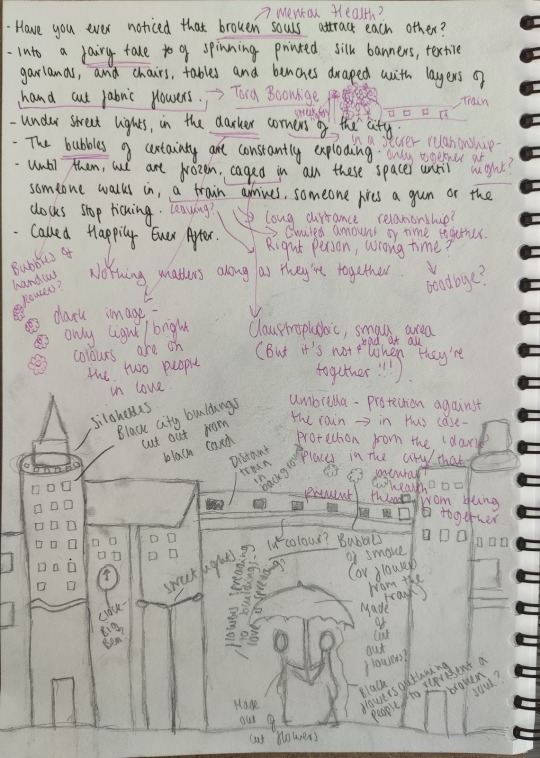
"Have you ever noticed that broken souls attract each other?" (pg 60)
"Under street lights, in the darker corners of the city." (pg 60)
"Until then, we are frozen, caged in all these spaces until someone walks in, a train arrives, someone fires a gun or the clocks stop ticking." (pg 22)
Source B:
"Into a fairy tale forest of spinning printed silk banners, textile garlands, and chairs, tables and benches draped with layers of hand cut fabric flowers." (pg 57)
"The bubbles of certainty are constantly exploding." (pg 75)
"Called Happily Ever After." (pg 57)
Third Story:
A: "Have you ever noticed that broken souls attract each other?"
B: "Into a fairy tale forest of spinning printed silk banners, textile garlands, and chairs, tables and benches draped with layers of hand cut fabric flowers."
A: "Under street lights, in the darker corners of the city."
B: "The bubbles of certainty are constantly exploding."
A: "Until then, we are frozen, caged in all these spaces until someone walks in, a train arrives, someone fires a gun or the clocks stop ticking."
B: "Called Happily Ever After."
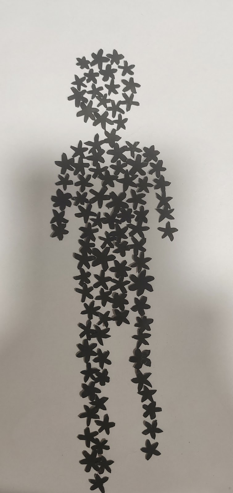
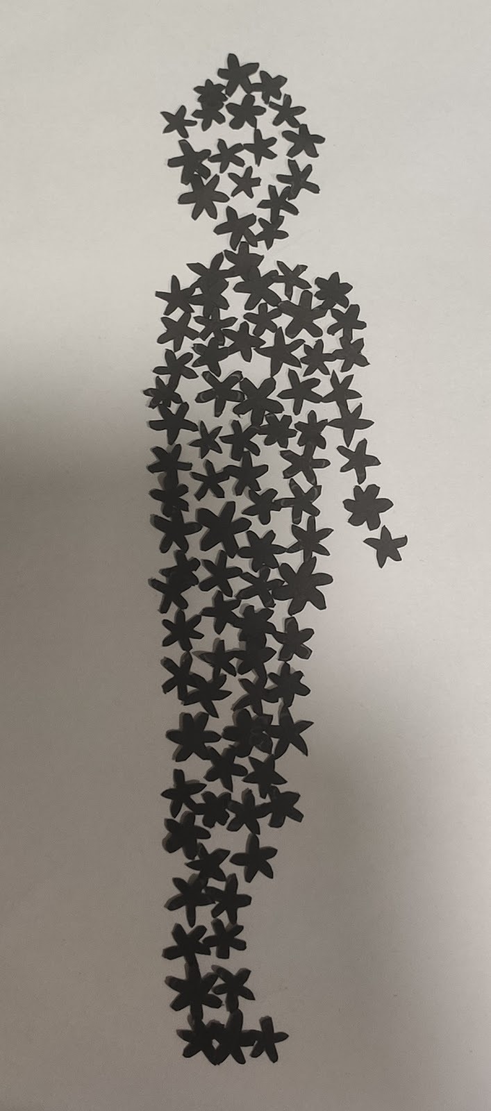
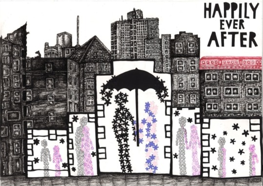
In this piece, I wanted to tell the story of two people who are happily together, however one of them (the boy) is struggling with their mental health. They start off meeting each other, and start a close relationship. As time goes on, the boy begins to feel happier, and the love and positive energy is transferred from the girl. When they are together, nothing else matters but them. The black flowers represent negative energy, whilst the pink and purple flowers represent a more positive energy. As time goes on further, the boy understands that they can no longer be together, he has to work on himself, and believes that he is not good enough for the girl. He distances himself, and they end up breaking off the relationship. By the end of the story, the boy is filled with more love and positive energy (and therefore has more pink and purple flowers within him), than when he was by himself, and the girl is filled with negative energy from the break up, and the loss of the boy (and therefore has more black flowers within her).
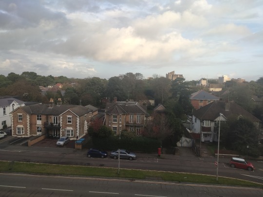
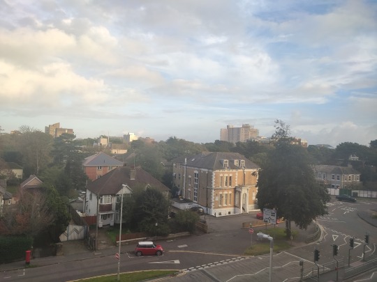
My third story reminded me of a love story. “Broken Souls” made me think of mental health problems, whilst the “fairy tale forest” reminded me of a dreamy, loving environment. “Darker corners of the city” made me think of a dark, gloomy, unwelcoming atmosphere, along with being “caged in”, something unpleasant. To link these two contrasting descriptions, I wanted to represent a dark gloomy surrounding (using dark black fine liner), with two people in a more positive environment (using flowers), to show that all the bad things are forgotten about when they are together. The umbrella in the middle image, protects both the people from all the negative energy around them (the black flowers that are pouring down beside them). To represent the city, I chose to draw the buildings as seen from my bedroom, on the fourth floor. I have lived here in Bournemouth for one month, so I wanted these buildings in my drawing to represent new beginnings and new futures for the two people. I used a scalpel to cut borders to represent “caged in spaces” and to focus the audience's attention on the two people. The red train in the background represents distancing, and leaving. I wanted it to stand out from the dark imagery, a focal point to the eye, as well as an important part of my story. I chose to call my piece “Happily Ever After”, a happy start and middle to the relationship, and in another point of view, a happy ending, as the best decision for the two people was to break off the relationship, for them to live happy, separate lives in the future.
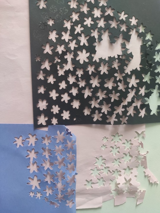
Tord Boontje inspired the use of the hand cut flowers. His works include flower table lights that are laser cut from steel, and then hand formed. One of his pieces that inspired me was called Bouquet. This piece was inspired by Boontje’s mother’s Swedish home, in which he admired the flowers in the garden and vases. He composed this piece using flowers from here, in which he pressed in a book and scanned to add to the drawing process. He then used a computer controlled plotter cutter to cut the flowers and leaves out from his chosen material, a matt, white sheet of plastic. This created a beautiful, delicate, romantic arrangement of flowers and leaves, something I wanted to similarly create.
Bouquet by Tord Boontje:
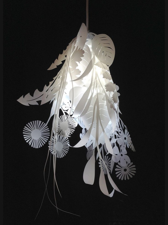
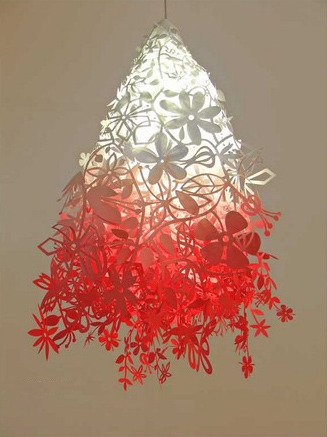
Another piece by Tord Boontje, that has inspired me:
Reference Pictures Of The Buildings From My Bedroom Window:
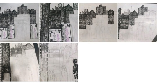
Experimenting With The Cutting Out Of Flowers And The Placement Of People:
Plan For My Third Story:
Process Photos:
Final Outcome:
0 notes
Text
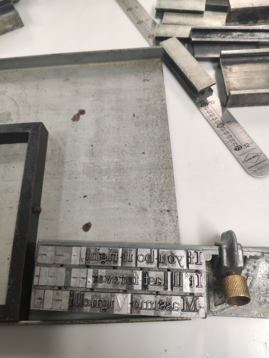
Letterpress Workshop
Here, we learnt how to set type by hand using a composing stick. I used “mids” as spaces between each word, and placed the same size lead between each line. I was then able to transfer my type to the chase, and to tighten it. I used the form rollers to spread the ink over my type, and used the letterpress to create an imprint of my chosen quote, to proof it.
0 notes
Text
Typography Workshop
In this workshop, we learnt the importance of typography, in order to add meanings and character to words to communicate a message. I used Adobe Capture to explore different fonts and understood the importance of kerning as well as practicing it myself. Inspired by Joseph Müller Brockmann, I sketched layouts as grids, creating thumbnails to gain a deeper understanding of placement and positioning.


In this quick exercise, I found it a lot faster to find the luxury items, when the font was more elegant and luxurious like.

0 notes
Text
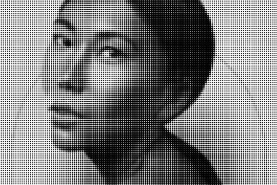
Photoshop 2 Induction
We covered:
Duotone and gradient map filters
Half tone imagery
Procreate to Photoshop
Using Photoshop to create mockups

0 notes