Last Seen Blogs

xxxhellfireravenxxx
Fan Art, Photos and General Blorbo Content
kingmaxons
the selection

rockwtmen
isa
Text
WOII: Summary
My experience with the World Of Ideas and Imagination module (WOII) has been very fun, interesting, and educational. Aside from learning the different topics and concepts throughout this semester, I was glad to be able to experience learning them through the various different activities. The trip to the museum with our classmates and friends was very fun, and most of every class had activities where we got to move around and experience the world of design for ourselves. Overall, I find that WOII has been very useful to me, I have been able to apply what I’ve learnt to the rest of my modules and throughout this semester's design training and it has helped me in my steps to becoming a designer. I feel strongly that each lesson has succeeded in helping me learn more about design and its history, from the different techniques, how it has evolved in the past, and to its present. My overall takeaway from this module is that I feel that it is necessary to learn as much as possible and to draw from the different lessons WOII has had to offer in order to better understand and apply ourselves as designers. I hope that as I continue to progress in my journey I will be able to apply what I have learnt from this module into my work.
[word count: 224]
0 notes
Text
WK 11 WOII: Postmodernism
Postmodernism is a direct contrast to the idea of modernism, which talks about traditionality and simplicity. Focusing more so on form over function rather than the expression of a certain design. Modernism is very minimalistic in nature with a very “less is more” type of approach to design. Postmodernism however, focuses more on the playfulness and experimental ideas of art and design. Postmodernism introduces more diversity, and goes against the idea that there is only one way to design and create, approaching design with a more “less is boring” attitude. Postmodernism plays around with the reinvention and dramatisation of design, playing with bold colours and unorthodox layouts and compositions and ideas leading to very interesting and iconic works of art, utilising various techniques and blending them with one another to create something bold and new. Andy Warhol, a famous postmodern artist, once stated “You need to let the things that would ordinarily bore you suddenly thrill you.” To me this perfectly summarises Postmodernism as a concept whilst further emphasising that even basic and functional things can be made exciting and interesting through the right creative lens and approach.
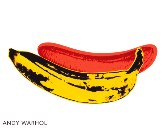
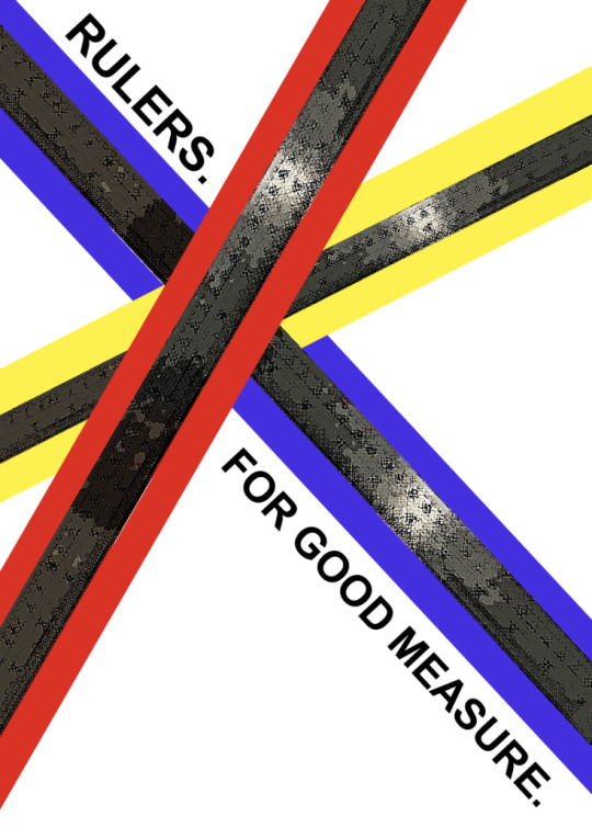
For this week's activity, we paired up to make a postmodernist poster based off of a regular everyday item within our surroundings. Me and my partner Jian Zhou decided that the object of our choice would be a ruler. Simple but effective. We then conducted research to study and learn about what postmodernist posters looked like and the type of vibe and attitude it conveyed. With help from certain keywords and techniques, we worked hard to find ways to accurately replicate the usual approach to postmodern design. Utilising colours and unorthodox composition to carry across a more playful feel to the design. Type could be improved but overall, not a bad first attempt in my opinion.
Through this week’s lesson I have learned more about the postmodernist approach to design, and look forward to applying the techniques and principles to my future work and assignments.
[word count: 328]
References:
Image References:
0 notes
Text
WK 10 WOII: Post-Structuralism
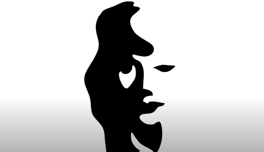
Post-Structuralism as an idea puts forth the theory that the objective “truth” is not set in stone. Post-structuralism refers to, and develops upon the perspective that things could have multiple meanings, and that “truth” and meanings can change according to the audience. Audiences can look at the same object and draw different conclusions from their own opinions and ways of thinking. An example could be that people are able to find their own interpretations and ideas when looking at optical illusions. Optical Illusions often rely on the viewer to draw their own connections and conclusions to the artwork within a certain theme or concept, but many people will draw separate interpretations from others.
Post-Structuralism as posited by Jacques Derrida is as follows, “Post-structuralism is more interested in the meaning and orders of texts than structuralism”. This further indicates that the meaning of the things we consume over all forms of media and art, are what we assign to them. And what we interpret and draw for ourselves.
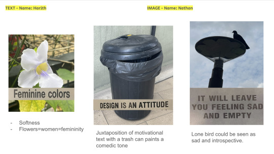
For this week’s activity, we were partnered up at random to find and photograph different texts and images to combine and create outcomes to try and draw our own conclusions from in order to present to the rest of the class. I was part of the group that had gone on to photograph imagery, and my groupmate Harith was assigned with photographing text. Together, we managed to combine and come to some rather interesting outcomes. Finding texts and imagery that would not at first glance make a lot of sense put together, but working together to deconstruct and find meaning around it.
Overall during this lesson activity I learned that through the lens of Post-Structuralism, perspectives and views can vary from person to person, people interpret things differently and draw conclusions based on their interpretations and ways of thinking. I also realised that people unknowingly practise this everyday, always forming their own opinions on different things, re-thinking and re-interpreting things they see and interact with constantly.
[word count: 333]
References:
Image references:
0 notes
Text
WK 3 WOII: Semiotics
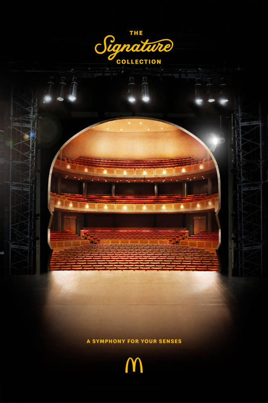
Semiotics is the study of symbols used for the purpose of communication, Symbols, icons, and other non-linguistic forms of communication can be included under Semiotics. Understanding Semiotics can be narrowed down to three key processes. Sign, Signifier, and Signified. Sign refers to an obvious and clear form and/or representation of something. Signifier refers to the image or the object in question, and Signified refers to whatever reaction the signifier evokes, such as perhaps emotional responses. During today’s class activity, we were tasked with selecting a piece of promotional material and within our groups, did our best to dissect and properly apply semiotics to the best of our abilities. We had chosen and presented a McDonalds ad we thought was quite interesting.
For my weekly reflection, I’ve decided to go with this Volkswagen advertisement promoting its precision parking features. The image depicts a small porcupine between two bags of goldfish with its prickly spines standing upwards. The easily damageable plastic bags containing fish placed around the tiny porcupine indicate that the fish are in a precarious situation, or that the porcupine is at risk of damaging the fish bags or even putting the fish in danger. However, the fish are unharmed and safe because in reality, while the porcupine is close to the fishes, his spines are not touching and therefore unable to damage the fish. In relation to the advertisement, this carries across the impression of how Volkswagen's precision parking features are above satisfactory, representing that no matter how tight the squeeze, no damage will come to your car or anyone else's. This advertisement is most likely geared towards anyone who drives, or people looking to upgrade to a car with more intuitive and advanced features

[ word count: 286 ]
0 notes
Text
WK 4 & 5 WOII : Analysing Design
How to analyse a work of design.
Learning how to analyse works of design can be broken down into simple steps. Process and Purpose, Subject Matter and Meanings, Choice and use of medium, Aspects of form, and Context of Piece.
All these aspects individually contribute to the very important ability to analyse and identify works of design. Breaking down this process helps us to understand the importance of each aspect of analysing. And in turn, makes it easier to understand what we are looking at.
During week 4’s activity, we learned to analyse more about the different objects the rest of our class presented, and learned to draw similarities and differences between each item through the processes listed above. Through this activity, It was very interesting to learn about and group the different objects my classmates brought. Each with different methods of craftsmanship, sentimentality, materials, and manufacturing. Overall, it was a fun and interesting experience.

MUSEUM VISIT:


During this weeks museum visit, we were individually tasked with finding and photographing the different museum art and artifacts we found interesting to document and apply what we learned about analysing design to the things we found interesting. Above are some of the things I found the most interesting, and below are the pieces I selected for analysis.
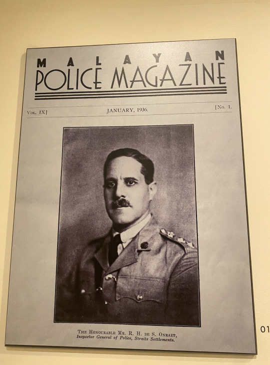
Image 1:
Police Magazine poster from the year 1936, consisting of a photographed police officer during the time period when Singapore's police force was first founded. This magazine was presumably printed to promote said police force, to inform and declare that Singapore was now able to enforce its streets and protect its citizens. The poster uses an older thin and retro lettering, depicting what can be assumed as a senior police officer.
Image 2:
Japanese film poster depicting a soldier in the midst of a battle. Poster is painted and filled with vibrant red lettering and graphics. These war posters were incredibly common at the time, all of them utilising very similar types and the colour red. The contrast of red on black and white ink helped to convey certain messages effectively due to its vibrancy and aggressive vibe. The Illustration for the poster seems to be sketched out, and depicting a battlefield that the Japanese had won over based on the title.
[word count: 376]
0 notes
Text
WK1 WOII: Phenomenology
Phenomenology refers to the study of lived experience, or more so the study of phenomena that comes with experiencing and living life as a part of the world. Phenomenology is the pursuit of understanding the world around us and the way we interpret it through our perspectives as human beings. Phenomenology applied in the context of art, helps us to understand and draw our own conclusions and perceptions of art. Each person interprets and evaluates art differently two people may look at the same piece of art but see it differently depending on the context in which they are viewing it from.
For this class’s activity, we were tasked to draw or collect/photograph imagery that we related to our interpretation of “shadows” or “time”. For me, I identified with and chose to go with shadows.

For Image one, I chose to illustrate how shadows are in a way, reflections. Only that they are not “real” reflections. They don’t have features and they don’t display any unique qualities the way real reflections do. They are dark and blank copies of ourselves. Relating to this sometimes we feel like shadows to people we compare ourselves to, or the people we used to be. Sometimes we tell ourselves that we aren’t at our best or we only exist as a lesser version of our former selves.
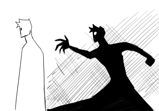
In a very similar theme, Image two represents how shadows are never equal to or on the same level as us. When we move, our shadows trail behind us, never physically able to catch up, never able to surpass. Sometimes we tell ourselves that we can never compare to what we used to be, or that we’ll never be able to surpass the people we compare ourselves to.
[ word count: 291]
1 note
·
View note