Text
Art analysis essay
It has taken me a long time to find my art style and find the processes and techniques that really work for me. My art style is very abstract, bold, interpretive, colourful, simple and unrealistic so for me, lino printing is the way for me to showcase my work in the best possible way, as everything can be cut out very simple and geometric. I really like that lino prints can be as simple as one colour as an image, or one colour on a coloured background you have created yourself but can also be done in layers allowing you to add in many colours and create something very interesting. There are always chances to add in more detail to create realistic pieces based on your personal preference, I also like how quickly lino prints can be made and how many you can make in such a short time. Therefore, in this essay I will be talking about lino cut prints and printmakers who use lino cut in their work.
Lino printing is a creative process where you carve or cut and image into a sheet of lino, you then get an ink of your choosing and roll it onto the block the image is carved onto, ready to then place paper on top using pressure, creating an image. After doing some research into the history of lino printing , I’ve learned that lino was first invented around the 1800s and was used by amateur printers as it was much cheaper to get and as it’s a very soft material it was much easier to create an image than in much tougher materials such as wood and metal. Lino prints became much more recognised and used around the 20th century, with German expressionists and Russian constructivist movements. It really took off in the UK when the school of modern art opened in London around 1925, the process was being taught there in classes to inspiring young artists encouraging them to use it in their artwork, the held a lino print exhibition in 1929 (Boarding All Rows, 2020). Lino printing was used massively by Pablo Picasso in the late 1950s, he enjoyed the process as it was good for graphic style posters. It was also known he enjoyed how simple the lino prints could be, with the blocks of colour and shape creating a series of interesting images, he managed to advance the process hugely by printing different layers in different colours (Great North Art Show, 2021)
Pablo Picasso
This is a lino print done by Pablo Picasso in the 1960s, called Portrait de Jacqueline au chapeau de paille (Artnet Auctions, 2020). Upon first looking at this image there is a clear face of a person which makes up the piece, I like this image as it’s not just a simple print of a face. The face is made up of different coloured thick lines, that seem to be quite rounded giving it more of a face like structure but still very distorted. He has left the background as one solid colour which allows very little distraction from the face itself which I think is much better to look at. I feel like there is a strong expression conveyed on the face, it to me looks like an intense stare with also distress. I believe this as one eye on the left side of the face has been made bold, thick and wide open looking intense and almost shocked , whereas the eye on the right hand side of the face has been done half open with curved out lines which to me indicate distress or discomfort. Picasso has also chosen to use an orangey red down the centre of the face and not anywhere else, possibly indicating the face may be split in half. I feel overall this piece has a very strange mood to it, it’s giving off elements of stress with the expression and it looks although the lines are imitating items being stacked up on top of the figure. This shows an element of suspense and although they may fall and ruin the face, which could link to the expression, the tension and chance that the stacked items may fall at any given moment. I generally really like this piece its very abstract and bold, Picasso has given lots of different parts to look at and interpret which I really enjoy when looking at any art.

Lil Tschudi.
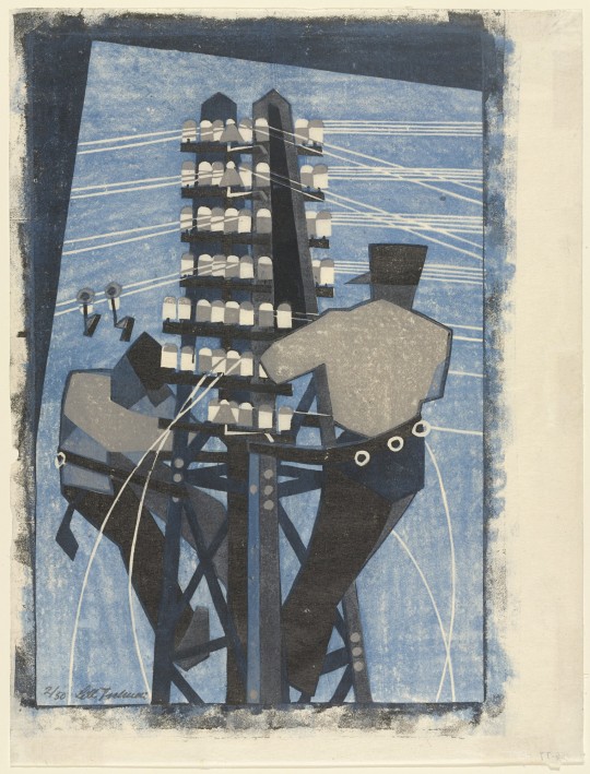
This is a lino print by Lil Tschudi called fixing the wire, 1932 (The Museum of Modern Art, 2021). In this piece there are two figures, they are very geometric and slightly abstract. Although the figures are a big part of the piece, they are both off to either side whereas the what seems to be an electricity tower is centred, implying that this was the intended focal point. It also stands much taller than both figures, again drawing you towards that before anything else in the piece. I feel although the general tone of the piece is very calm, seems although it’s a bright day with a clear blue sky and if this was real life both figures would be whistling along to a simple tune, getting their work done, with the slight interference from tweeting birds. The colours used are all different variations of blue some dark tones and some lighter tones, with the slight addition of greys. I feel like the colours used are a little boring to look at but do work with the piece and contribute to the all round calm and relaxing mood the piece gives off. Another thing I noticed about this piece is the way it fits the paper. It doesn’t fill the whole page and goes off towards the right-hand side of the page, I feel this adds a little mystery to the image and implies that there are possibly buildings surrounding the figures or other objects. Which could also indicate that there very high up, possibly changing the mood of the piece entirely, as that could imply the blues weren’t used for calm and relaxing and actually changing the blue tones to sadness, depressed, loss and although something bad has happened or may happen.
Holly Meade
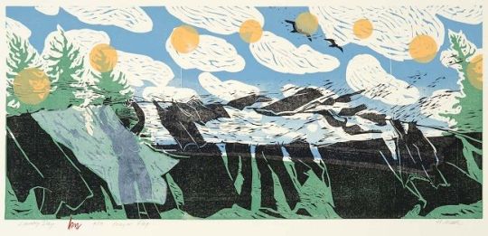
This is a lino print by Holly Meade called Laundry day prayer flag, 2009 (The Pollock-Krasner Foundation, 2021). I really love this image for many reasons, for one; on first glace I can determine that there isn’t a centred focal point your eyes just dart all over the piece trying to take in all parts of this amazing piece, which isn’t usually what happens in pieces of art. I can see there is a figure off to the left hand side that looks to be putting up the laundry, she has placed the figure under an almost transparent sheet, implying that the figure could possibly be what she intended you to really look at first after looking into it more. The colours used in the print are very simplistic and true to real life, which I feel fits well as the image itself as it’s not very realistic at all, its very flowy and free, giving the all round mood of the piece to be very summery, happy, fresh and almost childlike. All the laundry is also blowing in one direction, towards the right side of the image, implying this was a warm summer day with a strong breeze, another thing that your eyes instantly look at. There are trees placed into the corners of either side which also look although they are blowing int the wind and the lines aren’t realistic and look almost wavy, contributing to the childlike feel. There are yellow circles painted onto the sky also which I think could be the sun, but to keep with her unrealistic block style she has added in multiple, possibly indicating this was the sun rising and setting through the day. Although the figure spent their entire day outside enjoying and taking in their surroundings that is nature, which continues to give a very fresh and free energy to the image.
All the prints I have chosen to write about are all very abstract and unrealistic pieces, that all use bold shapes and are hard to figure out by just looking at them you have to really look and see what is going on and why which I really find interesting about artwork. I feel although their artwork shows lino printing as creative and expressional, allowing it to truly reflect my work and why I love this process over all the other ones to create prints with. I take inspiration from all art I see but some more than others, I enjoy Picassos strong lines and the bold but subdued colours he has used. I love the simplicity of Lil Tschudis piece and still with the geometric and not fully realistic shapes and figures she has created. Finally, I love the childlike feel to Holly Meads work and the freeness it gives you when you look at her images, with the unrealistic and abstract look to it but still real enough to understand her image.
Bibliography
Artnet Auction (2020) Artnet Auctions Presents: This 1960’s Picasso Linocut Played a Key Role in the Artist’s Long History of Printmaking, Online Available at: https://news.artnet.com/partner-content/artnet-auctions-presents-1960s-linocut-pablo-picasso[Accessed: 13/3/21]
Boarding All Rows (2020) The History of Lino Printing and its Artists, Online Available at: https://www.boardingrows.com/history-of-lino-printing-and-famous-linocut-artists[Accessed: 13/3/21]
Great North Art Show (2021) The History and Process of Linocut Print: From Paupers to Picasso, Online Available at: https://greatnorthartshow.co.uk/the-history-and-process-of-linocut-print-from-paupers-to-picasso[Accessed: 14/3/21]
The Museum of Modern Art (2021) Lill Tschudi Swiss, 1911-2004, Online Available at: https://www.moma.org/artists/5954[Accessed: 14/3/21]
The Pollock-Krasner Foundation (2021) Holly Meade, Online Available at: https://www.pkf-imagecollection.org/artist/Holly_Meade/works/7545[Accessed: 14/3/21]
word count: 1503
0 notes
Text
art and design analysis
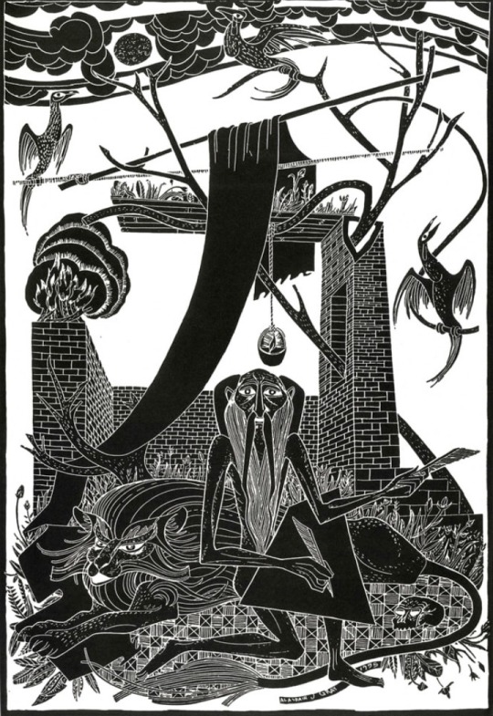
I’m looking at a piece by Alasdair Gray called Saint jerome. There is a figure cantered at the bottom of the piece, which is larger and more bold for me than the other objects in the piece indicating that this was intended to be the main focal point in the piece and draws you in. The figure also appears to be unrealistic and almost geometric, which makes the piece very interesting to look at and it looks although he has exaggerated most objects within the piece creating a much more abstract piece. The overall tone of the piece seems to me like it’s sad and almost devestating due to the dark colour that’s used throughout the entire image and the expression on the figures face, of an elderly man seems unhappy and almost expressionless. The piece as a whole gives off an almost end of the world energy, everything looks partly destroyed although there isn’t much around them as if something bad happened, and there all that’s left. He has layed out the piece i feel from the bottom to the top as he has placed more objects and blocks of pattern and the bottom of the piece with very little open space. As it works up to the top three is less objects it seems to just be branches and birds with much more open space, indicating it’s going up to the sky. This makes the composition seem much more realistic and although it’s split into the ground and the sky.
0 notes
Text
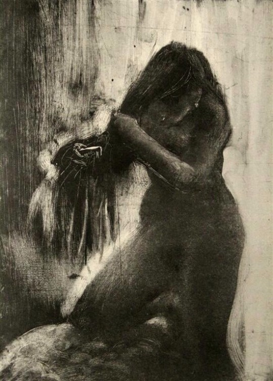
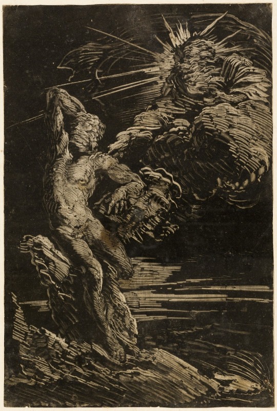
monotype is a printing process that creates very unique images, no two prints are the same. In the 1640s an artist called Antoon Stallaert created his first ever monotypes and today is known as the creator of monotype as a printmaking technique. Another artist who created monotypes was called Giovanni Benedetto Castiglione between 1640-1665, he was one of the first artists to create a monotype on copper etching plates creating beautiful designs. Monotypes can be made using many different materials the most popular being metal and glass. In the 1650s an artist called rembrant used glass to create his designs and prints, he used the technique of dry point on his work, and in order to make the print exactly the way he wanted he inked up his plates and wiped it all down each time he did a part to make it different and done the way he intended. He also reworked it by moving the ink around the plate using different materials like rags, his fingers and brushes for more precise results, which is part of the technique printmakers use today.
Britannica (2021) www.britannica.com [Accessed: 18 january 2021].
Monoprints (2012) www.monoprints.com [Accessed: 18 January 2021].
Kim Herringe (2020) www.kimherringe.com.au [Accessed: 18 January 2021].
The Tate (ND) www.tate.org [Accessed: 18 January 2021].
0 notes
Text

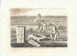
Engraving dates back to 3000BC. Designs have been found on cave walls, bones and stones proving it to be a very old artform. Engraving helped the development of the printing press greatly, as the Sumerians; one of the first groups of people to use engraving, would engrave designs on large cylinder seals created from stone and then rolled them out onto clay leaving imprints of their designs. Then advancing and creating a more technical term; the printing press, used by printmakers today. Engraving also was used in the 15th century and engraving was believed to of originated in Germanys, rhine valley during the 1430s, by creating incisions into mental and putting ink over the top in order to create a print from it, it is believed this was done by German printmakers. This technique was used massively with goldsmiths, adding to their work. They began taking prints from their work in order to keep them, this then advanced to creating images on copper plates to then take to paper, mostly known as old master prints.
The Tate (ND) www.tate.org.uk [Accessed: 18 January 2021].
Britannica (2021) www.britannica.com [Accessed: 18 January 2021].
Wikipedia (ND) www.en.m.wikipedia.org [Accessed; 18 January 2021].
0 notes